10,000 search results
(0.021 seconds)
- Anecdote JNL by Jeff Levine,
$29.00Anecdote JNL gives a serif treatment to Haute Couture JNL, which in turn was modeled after die-cut cardboard letters and numbers used for displays, signs and show cards. - Bargo by Look Minus Today,
$10.00 Introducing Bargo - Sans Serif 3 Styles by Look Minus Today. Behind these 3 styles, we want to combine a typeface that can provide a different perspective. Regular which gives
 - Sense by Shinntype,
$29.00 Modernist sans serif with a "big" look and lots of weights. Compact, elegant and strong, Sense commands any kind of page -- from the largest headline to the smallest text.
 - Print Shop Classics JNL by Jeff Levine,
$29.00 Print Shop Classics JNL is comprised of twenty-six decorative letterpress ornaments from vintage source material along with the words "Welcome" and "Introducing" on the period and comma keys.
 - Revue by ITC,
$29.99Revue is a display face originally designed for Letraset. The heavy sans serif letterforms of this font are ideal for use in signage, on posters and in advertising display. - Tenso Slab by exljbris,
$- Tenso Slab is a versatile and playful Slab Serif based on the -in 2013 released- Tenso, which is a an economic running sans serif with a lot of character.
 - P22 Kaz by IHOF,
$24.95 Kaz is a casual yet sturdy hand lettering font somewhere between architectural hand lettering and "comic sans". Kaz Thin offers a variation for the look of a thinner pen.
 - Table Wood JNL by Jeff Levine,
$29.00 Concave Tuscan Extra Condensed is a classic wood type sans serif design that is the basis for Table Wood JNL, which is available in both regular and oblique versions.
 - Convicted JNL by Jeff Levine,
$29.00 Convicted JNL is a condensed, chamfered sans serif type design inspired by opening credits from the 1940 film of the same name – available in both regular and oblique versions.
 - Pantra by Nicolas Deslé,
$19.90 Pantra is a minimal and clear geometric sans. Pantra is clear, approachable, and effective in both headings and paragraphs and comes in 4 weights: light, regular, medium and bold.
 - Element M One by ElementM,
$20.00 Element M One is a clear and bright typeface with a touch of futurism. Specially made for signing, posters, covers and corporate identities. Also a perfect typeface for headlines.
 - Case Lot JNL by Jeff Levine,
$29.00 A style example found within the pages of a vintage type foundry catalog inspired Case Lot JNL. The design is a classic early 20th Century sans with chamfered corners.
 - KG By The Grace Of God by Kimberly Geswein,
$5.00 Inspired by the decayed lettering on the signs at Siesta Key beach painted on weather-worn old wood in Florida, these letters are made to look like peeling paint.
 - Batilla by Supfonts,
$18.00 Batilla it is cute handwritten chick font with exquisite accents. This font is perfect for branding, cricut projects, wedding invitations, logos, vinyl, svg files, stickers, cards, signs and more!
 - Hegsro by Baqoos,
$18.00 Hegsro is a apropos modernist linear sans apt for headline, editorial, branding, packaging, printed materials and typographic applications. 240+ glyphs with ligatures and fractions available in opentype .otf format
 - Borve by Baqoos,
$18.00 Borve is a compositional expanded tech sans apt for headline, editorial, branding, packaging, printed materials and typographic applications. 240+ glyphs with ligatures and fractions available in opentype .otf format
 - Marqana by AEN Creative Studio,
$15.00 Marqana is an elegant and modern sans serif font. This font is ideal for writing web designs, business cards, or pretty much anything else that requires a unique touch.
 - PL Fiedler Gothic by Monotype,
$29.99PL Fiedler Gothic Bold is a display sans serif designed by Hal Fiedler. The distinguishing characters in the PL Fiedler Gothic Bold font are lower case q and t. - Jonah Brush by Jonahfonts,
$19.00 As once a sign-painter in my younger years I loved the quick brush strokes used to turn out quick 'Sale' posters. I tried to relive in this font.
 - Tandem by Présence Typo,
$36.00Tandem is a set of opened capitals constructed on a Futura frame. Each sign exists in two versions aimed to be mixed-up to add rhythm to the words. - Rahere Roman Display by ULGA Type,
$30.00 Rahere Roman Display is an elegant design with flared stems and subtle old style features, influenced by Berthold Wolpe’s wonderful Albertus font and (to a lesser extent) fonts based on Roman square capitals. It’s a classic design for the modern age, appealing to serious typographers, graphic designers and anyone looking for a beautiful, multipurpose font that also offers value for money. Originally conceived as a display companion for the Rahere Sans typeface family, Rahere Roman harmonizes perfectly with its sans counterpart: use it for headings, sub-headings or pull-out quotes. Want an eye-catching introduction? The small caps have been sized to optically align with the x-height of Rahere Sans or start a paragraph with a swash drop cap. There are also ornaments and devices on hand to spice things up. Of course, Rahere Roman Display works beautifully as a standalone font too. Although predominantly a display font, with a quick flick of its lowercase switch, Rahere Roman transforms effortlessly into a readable text font. Like a Swiss Army Knife, this is a hugely versatile font, capable of conveying different messages from classic and romantic to historical and modern. It’s suitable for a wide range of applications including: branding, posters, advertising, packaging, labels, signage, wedding stationery, museums, art galleries and book covers. Weighing in at well over 2,000 glyphs, Rahere Roman contains a myriad of alternative characters (mostly capitals) including two sets of small caps that allow certain letter combinations - such as RO, LA, LI, TY, etc. - to mimic ligatures. The advantage of this is that if letter spacing is increased or decreased, the letter combinations aren’t fixed and can move too, which helps the space between letters to remain even. However, for lovers of ligatures there is still a bucketload of goodies to play with, including the obligatory ‘OO’ ligature. If that’s not enough, the font also contains start & end swashes, alternative numerals, seven ampersands, ornaments and devices. .ss01 - Initial swash capitals .ss06 - Superior small capitals (aligned to the cap height) .ss07 - Small capitals (sitting on the baseline)
 - Rahere Informal by ULGA Type,
$18.99 Rahere Informal is a slab semi-serif typeface that has a seriously charming personality and a little spring in its step. Serifs bend and flick, giving the characters a spirited, almost calligraphic feel. It's lively and friendly without being whimsical, great for messages that need a casual but credible tone with a bit of zing in the mix. Rahere Informal is suitable for a wide range of applications such as information signage, packaging, advertising, brochures, catalogues, screen text, visual identities and opera festivals. Want an annual report that pleases the board, shareholders and investors? Set it in Rahere Informal - that’ll put a smile on everyone’s face. The family comes in six weights from light to extra bold with corresponding italics. The lighter weights are more delicate, an evenly-spaced flamboyance of flamingos basking in the sun. As the weights get heavier, characters transform into a tight-knit group of line dancing rhinos. All styles contain a set of swash caps, a few ligatures and alternatives. Nice. The character set covers most European languages plus Vietnamese. Each weight contains lining & non-aligning numerals in both proportional & tabular spacing. The tabular numerals share the same width across all weights and styles (matching Rahere Sans and Rahere Slab). If a companion sans serif is needed, Rahere Sans is the ideal partner. They are both part of the extended Rahere typeface family and have been designed to complement each other. Seriously charming, charmingly serious. Seriously, what more do you want from a typeface? Rahere, founder of St Barts in London The typeface is named after Rahere, a 12th-century Anglo-Norman priest, who founded the Priory of the Hospital of St Bartholomew, London in 1123. In 2007 I was successfully treated at Barts for relapsed testicular cancer so I’m indebted to all the doctors, nurses and support staff who work there. A special shout out to Orchid Cancer – a UK charity that helps men affected by cancer – who funded the research for my treatment.
 - Sanserata by TypeTogether,
$49.00 Dr. Gerard Unger expands the concept of Sanserata to a sans type family with Sanserata, adding specific characteristics which improve reading. Sanserata’s originality does not overtly present itself at text sizes. Rather, at those sizes, it draws upon its enormous x-height, short extenders, and articulated terminals to improve readability, especially on screens. Having articulated terminals means characters flare as they near their end, but readers likely won’t notice. What they would notice is that their ability to take in more content in a line of text is improved because the lettershapes are more defined. Articulation also makes clearer text from digital sources, where rectangular endings tend to get rounded by the emission of light from the screen. Lately there seems a whispered discontent with the lack of progress in the sans serif category. Designs can either stretch too far beyond what is accepted or be too bland to be considered new. Sanserata’s strength is in being vivid and unique without being off-putting. This bodes well for designers of paragraphs and of branding schemes since, with Sanserata’s two flavors, it is well able to capture attention or simply set the tone. Sanserata’s first voice is a generous, friendly, and even cheerful sans serif. But when using the alternate letterforms its voice becomes more businesslike, though still with nice curves, generous proportions, and a pleasant character. Sanserata comes in seven weights with matching italics, covers the Latin Extended character set, and is loaded with extras. Its OpenType features allow for the implementation of typographic niceties such as small caps, both tabular and proportional lining and oldstyle figures, ligatures, alternate characters, case-sensitive variants, and fractions. The complete Sanserata family, along with our entire catalogue, has been optimised for today’s varied screen uses. Dr Unger worked with Tom Grace on the production of Sanserata. For extended branding use with Sanserata, check out Sanserata, the contemporary, eclectic typeface drawn from roots in Romanesque Europe.
 - Smallstep Pro by Evolutionfonts,
$- Smallstep - One geometric sans serif with a free spirit. If we presume that geometric typefaces play with the idea of what typography would look like in the future when all unnecessary elements would disappear, than most of their designers seem to envision the future in a rather metropolisque kind of way. We love geometric faces, but the cold and heartless feelings that most of them leave is just not our cup of tea. That is why we are happy to bring some optimism in that genre with our new typeface. We called it Smallstep. Smallstep is a typeface that follows the traditions of classic geometric sans serifs like “Futura”, but is at the same time friendly and whimsical. We took the liberty to deviate from the standard sans serif glyphs while drawing some characters (such as ”a” and ”r” ), others (“w” “k”) are completely redesigned. Probably the biggest trademark of this typeface is the way vertical lines in most lower case characters are “cut” so they end in a 60 degree angle. Smallstep is over all a expressive face, which means it brings some emotions to your design and feelings in itself, and should be used accordingly. Other than that, it is suitable for both headline and body text, print and web. So what kind of name is “Smallstep”? We view the type design process as a form of evolution: There can be no typeface that differs drastically from the current standards, since its characters would be unrecognizable and thus unreadable. But at the same time there are hundreds of faces that differ a little, and still manage to make a difference by moving with small steps towards better and more refined looks. Smallstep consist of 4 weights, that cover all the features, that are expected of a modern Opentype face: kerning pairs, ligatures, true italics and alternative characters, plus a set of symbols, that will help you start off your designs more easily.
 - Grava by Positype,
$35.00 Grava is Neil Summerour’s injection of warmth within the geometric sans font category. Historically, geometric sans families have been based on primal shapes — triangle, circle, square — and the more closely they held to those rigid rules, the more internal inconsistencies they showed. Angles won’t match up correctly, letters will lean, overshoots complicate clean typesetting, and idealized circles become grotesque and unwieldy in some weights. Because of issues like these, geometric sans fonts have a reputation of being cold, austere, even a bit “off”. Grava was made to hold a T-square and triangle in one hand while giving a welcoming handshake with the other. The Grava font family comes in two styles (a normal and a Display), each with 20 weights (Thin to Ultra) and paired with italics. Its design allowed the three scripts of Latin, Cyrillic, and Greek to emerge seamlessly, ensuring Grava will find its home in multilingual publications. Even better, each character in the three scripts is spaced with every other character for a beautifully matched fit, and it’s a buy-one-get-all-three deal since they are all packaged together. The normal style’s large x-height won’t let you down in paragraphs, headings, and any call-out text. And have you seen the angles on those numerals? Pairing Grava’s numerals on a jersey is sure to catch some eyes, just sayin'. Grava Display is purposefully quirky and sharp, and made for poster sizes, book and album covers, and those websites with a well-defined character — somewhere between playfully self-aware and overtly vintage. Flat edges are abandoned to make way for sharp points and conspicuousness, for geometrical attitude and respectful expressiveness. Corporate reports use Grava Display to take on a professional and current look. The optional ligatures (N–T, L–L, G–A, C–O, almost anywhere an ‘A’ is placed, and more) in both the normal and Display styles invoke a midcentury modernist and high art feel. Now that introductions are done, you can let go of Grava’s hand and put it to work for you.
 - LHF Henderson by Letterhead Fonts,
$35.00 An excellent example of early 1900's sign artistry. This Letterhead Fonts' revised version of Mike Henderson's bold font features all new spacing, kerning and improved characters. Includes 6 alternates.
 - Rose Boutique by Supfonts,
$15.00 Rose Boutique it is cute handwritten chick font with exquisite accents. This font is perfect for branding, cricut projects, wedding invitations, logos, vinyl, svg files, stickers, cards, signs and more!
 - Burpee by Yock Mercado,
$12.00 Burpee is a basic condensed sans typeface, designed for headlines that needs be powerful and punchy, Burpee is inspired in sports, looking for a visual impact that get the attention.
 - Houseguest PB by Pink Broccoli,
$14.00 Houseguest is fun, childish, heavyweight offbeat sans serif font with an alternate caps set, and a stylistic alternates to swap in a handful of lowercase styles for a unicase mix.
 - Illumini by The Infamous Foundry,
$39.00 Illumini is a thin and rounded neoish sans-serif suitable for everything from logotypes to large text blocks. It contains several of the traditional ligatures normally found in serif fonts.
 - Letterpress Leftovers JNL by Jeff Levine,
$29.00 Letterpress Leftovers JNL gathers twenty-six vintage letterpress cuts on a variety of themes as well as an attractive wood type border in various positions on the 0-9 keys.
 - Sixpak by Vic Fieger,
$9.99Sixpak is rooted in the concept of creating a font in which each individual character is composed of no more than six squares with rounded corners, to resemble enlarged pixels. - MBF Moonlander by Moonbandit,
$15.00 Moonlander, a modern bold and wide sans serif font.This clean and sharp typeface is inspired from the lively urban lifestyle and can be perfect as a headline, title, logo, branding.
 - Pool Deck JNL by Jeff Levine,
$29.00 There's nothing too fancy about Pool Deck JNL, which is based on an older typeface design. It's your basic sans serif condensed type style with a few unconventional letter shapes.
 - Mango Tango by Supfonts,
$15.00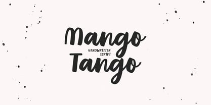 Mango Tango it is cute handwritten chick font with exquisite accents. This font is perfect for branding, cricut projects, wedding invitations, logos, vinyl, svg files, stickers, cards, signs and more!
 - Sandy by Oleg Stepanov,
$15.00 Sandy is a handwritten sans serif font, based on shapes made with ink brush. Sandy is a lively and informal typeface with good readability. Most of European languages are supported.
 - Borsga by Baqoos,
$18.00 Borsga is a mono fraction linear sans apt for headline, editorial, branding, packaging, printed materials and typographic applications. 200+ glyphs with ligatures, fractions provided in opentype .otf and .woff format.
 - Berona by Alex Camacho Studio,
$15.00 Berona font family is a variable geometric sans serif with a modern display purpose. The dynamic sharp edges makes it ideal to be used in a medium and big scale.
 - Episodian by Atlantic Fonts,
$26.00 Episodian is a retro-modern san-serif family with a sci-fi, techno edge and contemporary elegance of its own. Episodian now includes regular and bold with corresponding italic fonts.
 - Leaner by Kulturrrno,
$9.00 "Leaner" is uppercase sans-serif typeface. It’s clean and universal. Best for logos and heading. Extended latin glyphs Uppercase letters Thin / Regular / Bold weights + Same italics Numbers & punctuation That's it!