4,371 search results
(0.018 seconds)
- JH Zoya Cyrillic by JH Fonts,
$49.00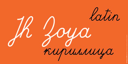 JH Zoya is an advanced Latin and Cyrillic script. It includes over 1500 characters to simulate school handwritten calligraphy. продвинутый кириллический курсивный шрифт. Он включает в себя множество персонажей для имитации школьной рукописной каллиграфии.
 - Faux Arabic by Page Studio Graphics,
$24.00 Based on Arabic calligraphic script, this simulation font includes upper and lower case Western alphabets, numerals, basic punctuation and several ligatures, as well as the Islamic crescent symbol and a typical Arabic geometric design.
 - Flambster by PizzaDude.dk,
$20.00Flambster is an uneven and quickly scribbled font - perfect to simulate ... well, uneven and quickly scribbled text! :) Comes with a good handful of ligatures! You will need to use OpenType supporting applications to use the autoligatures. - Psychopath Note by Pitt's Hand,
$7.00 I work as a comic letterer for an Italian publisher. I created this font to write the Italian version of a Batman comic. We needed a style of writing that simulated imprecise handwriting that could change in letters and space. I didn't have one, so I decided to make one by myself. It is the first font created with criteria, and after having adjusted it, I propose it to you here. Valid for lettering comics, or for titles and graphic design when you need a simulated handwritten note, which is credible but still easy to manage.
 - Infilto by PizzaDude.dk,
$20.00Infilto is a scribbled font, simulating hasty written letters. Comes with loads of ligatures for both double letters/numbers and the most common letter combinations... You will need to use OpenType supporting applications to use the autoligatures. - JH Mabel by JH Fonts,
$40.00 JH Mabel is a modern cursive typeface; it has three weights: light, medium and bold. It is a smart type and consists of extra characters to simulate real handwriting. Typical use: branding, greeting cards, long runing text.
 - FF Littles by FontFont,
$30.99 German type designer Simone May created this display FontFont in 1995. The font is ideally suited for poster and billboards. FF Littles provides advanced typographical support with features such as ligatures. It comes with proportional lining figures.
 - Plantain by CastleType,
$49.00 Plantain Stencil is based on Plantain which in turn is my interpretation of Plantin Adweight, which was one of my first commissioned projects (by Smarter Image, long before they went bankrupt). Plantin Adweight is one of the most beautiful designs of the Plantin family, which is a modern revival typeface, cut under the direction of F. H. Pierpont in 1913, who based the design on that of a famous 16th century printer, Christophe Plantin, for whom Pierpont’s font was named. The stencil cut of Plantain adds a bit of sparkle to the design. Supports most European languages that use the Latin alphabet.
 - Golden Motion by Allouse Studio,
$16.00 Golden Motion a Modern Handwritting Calligaraphy Font that give you ton extras for your need. Beginning Swash Uppercase, Lowercase, Ending Swash Lowercase, Stylistic ampersand and letter t, stylistic set for b, d, f, h, k, l, g, j, y, z. We highly recommend using a program that supports OpenType features and Glyphs panels like many of Adobe apps and Corel Draw, so you can see and access all Glyph variations. Golden Motion is perfect for any tittles, logo, product packaging, branding project, megazine, social media, wedding, or just used to express words above the background. Golden Motion also come with Multi-Lingual Support.
 - French Plug by HiH,
$8.00 Frank H. Atkinson was a popular Art Nouveau sign painter in Chicago, Illinois. He designed signs for the Cadillac Motor Car Co., Chicago Academy of Fine Arts and the department store Marshall Field. Oddly enough, he even designed signs for other sign painters. In 1908 he published a book, Sign Painting, which sold well. French Plug, a bold, rounded, all-cap design in an American Art Nouveau style from that book. It has a relaxed, easy-going informality that is useful for ads and flyers. It also would have fit very nicely with many French posters of the period.
 - Ollykers by Maulana Creative,
$9.00 Ollykers is a Brush script font, With a rough stroke brush and fun character. It has Opentype features of ligatures, alternate lowercase, swashes and couple of cursive characters lowercase such as b,d,g,h,k,t. Makes it a perfect choice for branding and digital designs. Use this font for logos, social media, websites, blogs, instagram, social media, business cards, branding, and more! Ollykers brush script font support multilingual more than 100+ language. and good pair for your secondary text font with sans or serif. Make a stunning work with Ollykers brush script font. Cheers, Maulana Creative
 - Oracul Decorative by Struvictory.art,
$16.00 Oracul is a modern display font with Bohemian motives. The font is created in a psychedelic retro style and decorated with the stars. Oracul includes stylistic alternates and ligatures. The font is suitable for the design on the theme of astrology, mysticism, spirituality, witchcraft, magic, esotericism, fortune-telling, tarot. Oracul has extensive language support, it includes English, French, German, Italian, Spanish, Portuguese, Danish, Norwegian, Swedish, Finnish, Estonian, Turkish. Oracul font includes stylistic alternates for symbols: E, H, I, J, L, O, Q, T, U, Y. There are also ligatures: MA, RA, KA, XA, AA, AM, RM, OO.
 - Gramma by CAST,
$45.00 Gramma is a compact sans with big x-height, a robust and balanced typeface that work well both for headlines and main bodies of text. The initial constructions, assembled from a few well-defined geometric modules, were later polished into more organic forms; the letters’ arches are quite squared, and the counters and other internal negative spaces push outward, creating a tension that balances the forms’ compression. Gramma’s most evident characteristic is its “bird-beak” terminals (present in many letters, including the c, e, f, s...) that replicate the unconnected junctures between stem and curve, visible in the a,b,d,g,h.
 - Good Song by Ocha Puyaber,
$10.00 Good Song is a cursive font based on the USA's teaching script. It can be written in Carolinian, Sioux, Oʼodham, Southern Athabaskan, Hawaiian, and Samoan from USA. It can also be written in Dutch, Maltese, Aymara, Mapuche, Rapa Nui, and other languages. This font family is cute. The style is wide and rounded. It has wide and open loops. The strokes are drawn with a round cap tool, with no contrast. It is cursive and connected. The form is upright. It is easy to read in the USA. Part H has capitals with High starts. Part L has capitals with low starts.
 - Dare by Device,
$39.00 Dare is a bold, single-weight titling font in capitals only. It is built from flat-pen strokes, with looping bowls and sharp, incised darts. It borrows a pinch of the hand-drawn swagger of Bauer's Cartoon (designed in 1936 by H. A. Trafton), used as Dan Dare's signature logo in the British boy's comic Eagle, and also the upward-pointing serifs of machine-moderne typefaces such as Dynamo (designed by K. Sommer for Ludwig & Mayer in 1930). Suitable for book covers, magazines, branding, packaging – any place where an impactful, contemporary statement is required, but still with an undertone of 20th century tradition.
 - Adios Script Pro by Sudtipos,
$99.00 Romantic, decorative Adios Script is one of Alejandro Paul’s most elaborate and technically refined faces to date. Inspired by designs in “how-to” commercial lettering guides of the 1940s, it has been refined and brought into the 21st century through a huge variety of ornate swash letterforms. The lowercase “h” alone offers 43 variants. Hundreds of ornamental ascenders and descenders allow a beautiful interplay of strokes and combinations, while avoiding overlaps or conflicts. Adios Script features a mind-boggling 1,470 characters in total, in OpenType format. Adios Script received a Certificate of Excellence from the Type Directors Club.
 - 1883 Fraktur by GLC,
$38.00 This family was inspired by the set of fonts used in the end of 1800s by the famous J. H. Geiger, printer in Lahr (Germany), especially these used to print an almanac for the year 1883. It is a Fraktur pattern, with two styles, as a few others incomplete fonts also used for this work were Blackletters from other patterns. Both were used in two size, for titles, subtitles, main text and notes. This font contains standard ligatures and German historical ligatures (German double s, long s, tz, ch, ck...) and diacritics. 1543 German Deluxe Initials may be used in complement this family.
 - Hammer and Tongs by Komet & Flicker,
$10.00 Hammer & Tongs works great for all kinds of branding projects, advertising, websites, packaging, and posters – essentially anywhere you need bold, strong communication. Inspired by the lettering found on military vehicles, this font works great for headlines and is effective for short blocks of body copy. H&T also has a strong retro industrial/athletic vibe and works well for modern-vintage style designs. This font is available in two styles: a Hard version with sharp, crisp edges and a Soft version with rounded corners. Both styles include a complete set of numbers, punctuation marks, and extended characters.
 - Mailart Rubberstamp by K-Type,
$20.00 The Mailart Rubberstamp font was inspired by rubberstamped envelopes and artworks by Mailartists Jonathan Stangroom, H. R. Fricker and Flea Art, and the typeface Clarendon Condensed. Mailart Rubberstamp now has an additional Bold weight and complimentary Obliques. The typeface has also been updated with subtle outline improvements, a bigger repertoire of European accented characters, and more consistent, slightly tighter spacing; increase the tracking to recreate the more relaxed, rustic appearance of the earlier version. The fonts are derived from the individually rubber-stamped letters on printed and collaged envelopes received from mailartists, and the typeface Clarendon Condensed.
 - Olyford Variable by NicolassFonts,
$148.99 Olyford Variable font is a contemporary sans serif typeface that is derived from the Olyford font family. It features a range of weights and italics. OpenType features: Access All Alternates, Stylistic Alternates (Alternative n, m, p, q, r, u), Stylistic Set 1 (Alternative K, k), Stylistic Set 2 (Alternative W), Stylistic Set 3 (Alternative t), Stylistic Set 4 (Alternative w), Stylistic Set 5 (Alternative 5), Stylistic Set 6 (Alternative ¢, $, €, ₽, ¥), Stylistic Set 7 (Alternative Đ, Ħ, Ð, ≠, ∫), Standard Ligatures, Discretionary Ligatures, Proportional Figures, Tabular Figures, Case-Sensitive Forms, Fractions, Kerning, Denominators, Numerators, Scientific Inferiors, Subscript, Superscript, Ordinals, Localized Forms.
 - VVDS Rashfield by Vintage Voyage Design Supply,
$20.00 Rashfield is a soft serif type family in 5 weights and italics. Inspired by classical Windsor mood in Woody Allen movie titles, with outward bent h, m, n and a lot of modern alternates. Softly character with a hint of retro feeling. Rashfield has a lots of stylistic alternates that makes it very playful in various uses like logos, prints, branding, web design, packaging and more. Use it to create short powerful phrases and headlines and also use it in longer text like paragraphs and block texts. Perfect for modern projects with a little retro mood feel.
 - XPawnShop by Ingrimayne Type,
$5.00 XPawnShop is a typographical chess font; the pieces are letters. The Pawn is an awkward letter P, the knight is a horse in the shape of an h, the bishop is a decorative letter B, the rook is an elephant with an R shape, the queen is a Q, and the king is an ornate K. Two other XPawnShop fonts are made of very simple pieces, but as a bonus, both have the set of dominoes from the unicode block 1F030 to 1F093. The key layout is a bit complicated; see the key guide for detailed information on how to position pieces correctly.
 - Good Love Song by Ocha Puyaber,
$10.00 Good Love Song is a cursive font family. It is inspired by love, hearts, and USA’s script. It can be written in Carolinian, Sioux, O'odham, Southern Athabaskan, Hawaiian, Samoan, Dutch, Maltese, Aymara, Mapuche, Rapa Nui, and other Latin alphabet languages. This font family is cute and fun. It has many heart decorations. The strokes are drawn with a round cap tool, with no contrast. The form is upright. Parts H have capitals with High starts. Parts L have capitals with Low starts. Parts U are love line Unions. It can be used with the font Good Song.
 - Vanitas by Reserves,
$49.00Vanitas is an elegant high contrast contemporary sans. It is rooted in the style of a classic didone, excluding the typical serifs and ball terminals as well as being designed with a cleaner, more reductionist appearance. Strict attention was given to the cohesiveness and balance between letterforms as well as the careful refinement of all curves. Stylistically, Vanitas’ alluring, sophisticated sensibility is directly inspired by high fashion. The upright styles are complimented by a pairing of optically adjusted true italics, which were purposefully adapted to retain the sharpness of their counterparts. Abandoning traditionally executed cursive italic letterforms retains Vanitas’ sharp characteristic through each style. Features include: Precision kerning Standard Ligatures set including ‘f’ ligatures (fb, ff, fh, fi, fj, fk, fl ffb, ffh, ffi, ffj, ffk, ffl, ffy, ae, oe, AE, OE) Discretionary Ligatures set including (st, ct, No) Alternate characters (H, A, AE, Q, $, h circumflex, ¶ and numero sign) Case forms (shifts various punctuation marks up to a position that works better with all-capital sequences) Capital Spacing (globally adjusts inter-glyph spacing for all-capital text) Slashed zero Full set of numerators/denominators Tabular Lining, Proportional Lining, Tabular Oldstyle and Proportional Oldstyle Figures Automatic fraction feature (supports any fraction combination) Extended language support (Latin-1 and Latin Extended-A) *Requires an application with OpenType and/or Unicode support. - Josefov by Ingo,
$28.00 A narrow, modern Slab Serif. JOSEFOV is directly derived from the sans serif text font ”Hedwig“. Therefore, of course, it pairs best with “Hedwig”. The basic thought was to create a font with heavy rounded serifs in the style of ”Clarendon“ but which hardly reminds one of that particular font. The form principle of rounded serifs is applied whenever possible — for example at the points where the individual strokes of the characters join one another. JOSEFOV seems very technical, very constructed (and truly is). In order to soften up the rigid impression, the serifs are applied at some points contrary to the tradition handed down, as with the upper case A C G K M V W and the lower case a b d h i j k l s t. Historically there is no example of the laterally oriented serifs of capital and small s (S) and C G. On the other hand, the double-sided serifs on the stems of b d h k l appear at the beginning of modern times in the very first serif types from five hundred years ago. The double-sided serifs of A M V W were also customary in the first decades of printing. JOSEVOV is particularly suitable for topics such as nature, folklore, culture, music, nutrition.
 - Chalice by Canada Type,
$24.95Chalice is a new original Canada Type family inspired by two different engraving eras and locations: Medieval England and 19th century Russia. Chalice's construct is geometric at heart, though the wedge serifs and their contribution to the overall idiosyncrasies of the counterspace give it a spirit entirely different from usual geometric types. Chalice's personality is that of a knowledgeable advisor, clinical yet old-fashioned, aware yet unsurprised, secular yet serene, clear yet artistic, hungry yet redeemable. Chalice comes in 4 weights, light to black, that range in expression from a sobering wise whisper of confidence all the way to the bells and whistles of Judgment Day. Such flexibility in expression among the different weights of the same typeface of this kind is quite rare, and will be appreciated by discriminating graphic artists who require more than just another tombstone type. Chalice's character set comes fully loaded across all 4 weights. Two dozen alternates are built into the map, including unicase variations on the a and e, double-barred alternatives for A, E, F, H and S, and connecting versions of b, d, f, h and t. Such variety gives the user to subtly define the set type without overpowering it. Chalice comes in all popular font formats, and is available in single weights, as well as one complete affordable package. - JH Diwani by JH Fonts,
$120.00 JH Diwani simplified black is an advanced Arabic font simulating the Diwani Calligraphy with its finest details. Its typical usage: Wedding / greeting cards , headlines, poetry, and books. Please note that Arabic Kashida is not available for this font.
 - JH Diwani Simplified Light by JH Fonts,
$120.00 JH Diwani Simplified Light is an advanced Arabic font simulating the Diwani Calligraphy with its finest details. Its typical usage: Wedding / greeting cards, headlines, poetry, and books. Please note that Arabic Kashida is not available for this font.
 - Vingiloth by Mr. Typeman,
$12.00 Vingiloth is a delicate script which simulates natural handwriting. Vingiloth includes Vingiloth Regular and Vingiloth Caps, designed to contrast and compliment each other with elegant beauty and contemporary style, making it an excellent fit for projects of all types.
 - Wire Mesh JNL by Jeff Levine,
$29.00Wire Mesh JNL is an outline variation of the same design that produced Shady Characters JNL (lettering printed over a simulated halftone). This time around, the end effect gives the impression of looking at lettering cut out of a mesh screen. - Indoxine by PizzaDude.dk,
$20.00Indoxine is a scribbled font, simulating hasty written letters with occasional inkblobs. Comes with ligatures for both double upper/lower letters and numbers, in regular and black versions! You will need to use OpenType supporting applications to use the autoligatures. - Ashkelon NF by Nick's Fonts,
$10.00This heavyweight poster sans is based on the typeface Samson, designed by Robert Hunter Middleton for the Ludlow Type Foundry in 1940. The slanted uprights suggesting brushwork make this face a perfect choice for casually commanding headlines. Both versions include the complete Latin 1252, Central European 1250 and Turkish 1254 character sets, with localization for Lithuanian, Moldovan and Romanian. - Botanical Scribe by Three Islands Press,
$39.00 The Raphael of Flowers is what they called Pierre-Joseph Redouté a couple hundred years ago. The Belgian native became famous in France, where he painted floral watercolors for both Marie Antoinnette and Empress Josephine. But what cemented his legacy was his perfection of a stipple engraving technique that brought his art to the masses. Botanical Scribe is modeled after the neat, cursive hand-inscribed legends on these antique prints. Because it simulates handlettering, the font retains a warm, organic quality not seen in fancy modern scripts while remaining both elegant and legible. (Its many ligatures lends to this authenticity.) Good for formal invitations or historical simulations.
 - Aitos by Monotype,
$29.99Kevin Simpson was five years old when the stylized "E" of the Electrolux vacuum cleaner logo caught his eye. This is his earliest recollection of an interest that ultimately became an obsession. Type remains his major preoccupation, and he admits to attempting to work a good typeface design into any project where he can get away with it. Aitos was inspired by a metal sculpture Simpson saw while driving through the French countryside. "The statue was very strong. It was heavily weathered and had obviously been there for some time, yet it also seemed very delicate and light." Aitos, like the statue, is a rugged design. At first glance, it is chunky and bold, perhaps a little jarring. If you look again, however, you'll see it has refined qualities. Aitos commands attention - yet is still affable. - Jaggy by ParaType,
$30.00 The script designed for ParaType in 2006 by Isabella Chaeva. Based on informal handwriting, its characters have rough jaggy contours. In small sizes, the face simulates an effect of handwriting by felt pen on rough paper. For use in advertising and display typography.
 - FF A Lazy Day by FontFont,
$30.99 German type designer Simone May created this display FontFont in 1995. The font is ideally suited for festive occasions and poster and billboard projects. FF A Lazy Day provides advanced typographical support with features such as ligatures and comes with tabular lining figures.
 - Armin Grotesk by W Type Foundry,
$25.00 As a graphic designer, sometimes it’s impossible not to be inspired by the Swiss Style, specifically the work of Armin Hofmann, who is one of its best exponents. Grids and grotesk and neo-grotesk typefaces are a fundamental part of the tools that make this aesthetic possible. A visual language that has caused full admiration since we were students. Therefore, we decided to design Armin as an homage to Hofmann’s work. Technically, we added stylistic sets applied to the letters –G, R, a, g, h, l, m, n, r, t, u, y– to make Armin more eclectic and suitable for the creation of any visual language.
 - Enfluence by Thera Type,
$9.00 Enfluence is a modern typeface perfect for titles and short texts. It could worked in print and digital mediums. It depicts a fresh and modern image but with some winks to older typefaces. About the shape of the letter, it was built with a wide “x” height, short ascendants and descendants, a high contrast, angular serif, and some round terminals. Some letters such as “m, n, h” show a light inclination in the right stem. These characteristics give this typeface great readability with a strong attraction to the eye for its cool forms. Not enough? Also includes a set of ornamental capital letters perfect for the creation of awesome designs.
 - Bodoni Campanile Pro by Red Rooster Collection,
$60.00 Bodoni Campanile Pro is a font that bridges the gap between a “fat” and a compressed traditional serif typeface. It was originally designed in 1936 by Robert H. Middleton for Ludlow. International TypeFounders exclusively licensed the family from the Ludlow Collection, and Steve Jackaman (ITF) produced a digital version in 1998. Jackaman completely redrew the font for its 2017 release. Bodoni Campanile Pro, much like its transitional status as a font, is successful in both formal and casual roles. The free-flowing aspects of the family, seen especially in the lowercase ‘g’ and the leg of the uppercase ‘R,’ give the family an air of elegance.
 - Herold by HiH,
$10.00 Herold is a bold Art Nouveau advertising face released by H. Berthold, Berlin, Germany in 1901. It is also seen under the name “Herold Reklame.” The design is attributed to Hermann Hoffmann by the Klingspor Museum. A herold (‘herald’ in English, ‘heraldus’ in Latin) is one who delivers proclamations and announcements. Medieval heralds are often pictured with a horn with which to get everyone’s attention prior to performing his function. His only PA system was his own voice. Left and right glyphs of a herald with horn may be found at positions 137 and 172. Herold is quite compact with a high x-height, just right for making -- what else? -- announcements.