4,371 search results
(0.021 seconds)
- Okule by Raditya Type,
$17.00 OKULE is a unique futuristic and retro sci-fi typeface design. This font is suitable for modern and retro games, racing, street themes, hypebeast, sci-fi, etc. Use this font for your design projects and cool apps.
 - Skylarr Scott by Gassstype,
$27.00 Skylarr Scott - Handwritten Brush font with a Rough style and dramatic movement. This font is great for your next creative project such as logos, printed quotes, invitations, cards, product packaging, headers, Logotype, Letterhead, Poster, Label, and etc.
 - Leitmotiv by GRIN3 (Nowak),
$19.00Leitmotiv is a handwritten calligraphy font which can be used for invitations, greeting cards, posters, advertising, weddings, books, menus etc. Language support includes Western, Central and Eastern European character sets, as well as Baltic and Turkish languages. - Grayson by Rillatype,
$15.00 Introducing, Grayson Serif. Grayson is a swash serif font that have an unique look to give your design a little bit of elegant but still feminine. this font is perfect for magazine, headline, editorial, instagram pst, etc.
 - Instabread by Motokiwo,
$12.00 Instabread, a bold script font that is suitable for headline, logotype, apparel, invitation, branding, packaging, advertising etc. This typeface is comes in uppercase, lowercase, large range of punctuation, symbols & numerals, contextual alternates and ligatures, also support multilingual.
 - Beatney by Blankids,
$24.00 Introducing of our new product the name is Beatney a Classy Signature Font. Beatney inspired by modern script style this font is a fun theme very good for display, tshirt design, craft, quote sign, logotype and etc
 - Bad Habits by Gassstype,
$27.00 Bad Habits - Handwritten Brush font with a Rough style and dramatic movement. This font is great for your next creative project such as logos, printed quotes, invitations, cards, product packaging, headers, Logotype, Letterhead, Poster, Label, and etc.
 - Congratulatory Womens Day by Dmitriy Shchetinskiy,
$19.00 Congratulatory Womens Day font consist of 36 calligraphic greetings letterings. Letterings are original and handwritten. This font makes it possible to use high quality calligraphy in your projects - greeting cards, certificates, invitation cards, letters of commendation etc.
 - Ludwig by Supfonts,
$15.00 Meet my new signature script Ludwig! Ludwig includes 158 ligatures, full set of uppercase and lowercase letters, multilingual symbols, numerals and punctuation. This is so perfect for invitations, monograms etc. It includes Multilingual support and 158 Ligatures.
 - Arrany by Arkrist Letter,
$14.00 Arrany is a unique, sweet, and cute display font. It is very suitable for logo designs, product tags, product names, celebration events, etc. Get inspired by its playful touch and create the most attractive and joyful projects!
 - Break Stones by FHFont,
$17.00 Break Stones is Script Brush Font with Vintage Style, include 1218 Glyphs and so much opentype feature include of the font. Suitable for design, element design, wedding, event, t-shirt, logo, badges, sticker, and awesome work, etc...
 - KG Neatly Printed by Kimberly Geswein,
$5.00 This neat, handwritten font is intended for educators who create teaching resources for children. It is highly legible for new readers and is thin enough to be used for the body of text on student-read documents.
 - Maxos by Mysterylab,
$17.00 Maxos is a modern hyper-stylized font that is simultaneously sleek & futuristic, yet retro & whimsical. This font package contains two variations: Extra Bold and Extra Bold Oblique. Excellent for posters, album graphics, motorsports, sports, high-tech, etc.
 - Royal Wedding by Nirmana Visual,
$22.00 Introducing our new gorgeous calligraphy font, Royal Wedding A beautiful script for those who wish to enhance their designs with elegance and style. Royal Wedding suitable for many projects related to the wedding industry (stationery, logo, etc.)
 - Spedora by Fromletterel,
$12.00 Spedora is a curly and cute display font. Expertly designed to make your creation look out of this world, this font will look gorgeous on a variety of ideas such as posters, stickers, social media materials, etc.
 - The Diamonds by Krntype Studio,
$16.00 The Diamonds is a stylish hand-writen script font. designed to display luxury and shopisticated writing. With this font, you can built an amazing work. Such as stylish luxury branding & logos, packaging, handwritten quotes, merchandising, advertising, etc.
 - Satellite by Dingbatcave,
$15.00Cool doodads from the cold war...spaceships, moderne coffee pots, boomerangs, cocktail glasses, etc. A must for decorating your cyber-bachelor pad; a requirement for the retro lounge crowd. Don't be a square, daddio, get Satellite today! - Rosenberg Textile MF by Masterfont,
$59.00 A practical font family with 4 weights for all your day by day design needs: headlines, body text, signage etc. High legibility at small sizes. An extended sans serif typeface that provides unique softness appearance without losing legibility.
 - Falange by Vozzy,
$10.00 Introducing a hand-drawn bone-style label font named "Falange". Typeface includes five styles and contains a huge additional and multilingual characters. This font will good viewed on any retro design like poster, t-shirt, label, logo etc.
 - Kolyada by Tkachev,
$29.00 Kolyada is a modernist semi-serif with a friendly nature. This type is well-suited for use in retail, magazines, logotypes, books, etc. It comes with 4 styles, from Ultra Light to Medium, each with its Upright Italics.
 - Abimanyu by Goodigital13,
$20.00 perfect for branding, photography, invitations, quotes, watermarks, advertisements, product designs, labels, and much more!. it will make your design project more beautiful. The font is suitable for any design like branding, fashion, print template, quotes, wedding and etc.
 - Gamata by Rillatype,
$15.00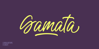 Introducing, Gamata Brush Script. Gamata is a brush script with natural feel that make this font is perfect for branding, packaging, book, logol labels, etc. Features : uppercase & lowercase numbers and punctuation multilingual alternates / swashes and ligatures PUA encoded
 - Handy Casual Condensed by My Creative Land,
$12.00 Handy Casual Condensed is an informal non-linking brush script that was inspired by hand lettering from 60's posters. This font combines a unique character with tons of Open Type features including ligatures, catchwords, stylistic alternates etc.
 - Tenebrous by Muksal Creatives,
$10.00 Tenebrous is modern family of Display sans serif fonts. Koumon has 9 families font, starting from the small thin to the largest black. This typeface is versatile and can be used successfully in magazines, posters, branding, websites, etc.
 - Ecentric by Redy Studio,
$21.00 Ecentric is a bold font inspired by the vintage style of letters on posters, bagde, packaging, labels from antiquity. The classic feel is really perfect you who needs a vintage typeface for logotype, apparel, branding, packaging, quote etc.
 - Sereno by Robert Corseanschi,
$19.99 This font family includes six very unique font styles & weights. The font styles are applicable for any type of graphic design - web, print, motion graphics, etc. and perfect for t-shirts and other items like posters and logos.
 - Alibabe by Almarkha Type,
$25.00 Introducing Alibabe Authentic Display Font, Inspired by Food Logo style and combination with Cute Craft style. that will fulfill your design needs for quotes,sporty theme, logotype, wordmark, etc. This has many opentype features and support multi language.
 - Stripes Pattern by Crumphand,
$20.00 Hello, here's the new fonts Stripes Pattern. Inspired by children book. The font is cute, good for your comic, brand, youtube, movie production etc. What's Included Inside The Fonts ? Uppercase Lowercase Symbols Numerals European Multilingual Thank you, Regards!
 - Shutter Stone by Sarid Ezra,
$13.00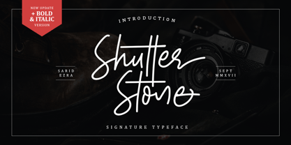 Introducing, Shutter Stone. Another Signature Script Font for you! Shutter Stone is handwritten font that contain stylistic alternate, swash, etc to create your own customised signature. This font is also support multi language. Also Support PUA. Thank You!
 - Rollicking Polly by Happy Heart Fonts,
$19.99 This is my frilly, girly font I created in 2011. It's my version of my teenage handwriting. I hope you enjoy it and use it often. It's perfect for fun scrap-booking projects or making cute tags etc.
 - Ceuphoria by Atasi Studio,
$18.00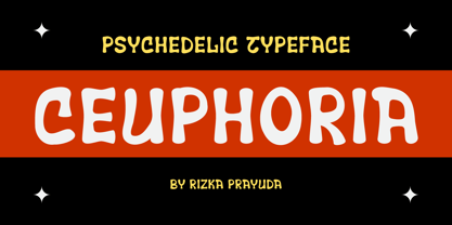 Ceuphoria is a display groovy font with a psychedelic look and trippy effect. Ceuphoria is ready and Perfectly fit for your logo designs, music projects & social media posts, event poster, brand imagery, product packaging, handwritten quotes, merchandise, etc.
 - GHEA Pastar by Edik Ghabuzyan,
$40.00 This Heavy weight Display font includes Basic Latin, Latin 1 Supplement, Latin extended A, Cyrillic, Armenian. May be used in titles, posters, labels, etc. The structure of glyphs does not require kerning for any pairs! Criation year: 2021
 - Pitlines by Mevstory Studio,
$20.00 Pitlines is a display fonts collection. Pitlineswill perfect for many project: fashion, magazines, logo, branding, photography, quotes, blog header, poster, advertisements, etc. Files Includes: Pitliness Regular.otf Pitlines Italic.otf What's Included? Uppercase & alternate uppercase letters, numbers, punctuation Multilingual support
 - Volantene Script by Catharsis Fonts,
$- Volantene Script is a fully equipped display typeface inspired by the fine penmanship of Lady Talisa Maegyr-Stark. The lowercase letters are crafted to be as faithful as possible to the lady�s hand-written forms, while the uppercase, figures, symbols, and punctuations are original designs by Catharsis Fonts (Christian Thalmann) matching the lowercase in style. Volantene Script comes with an extensive character set and OpenType features like ligatures and contextual alternates. The common romanization of High Valyrian uses macrons (??????) to mark long vowels. Since these are difficult to type with most keyboard mappings, Volantene Script offers macron-shaped diaereses (������), which are easily accessible. Volantene Script was completed within a week�s time. The name is derived from the free city of Volantis, where Lady Talisa grew up and learned to write. This font is dedicated to Simone. Geros ilas!
 - Old Man Eloquent by Three Islands Press,
$29.00 John Quincy Adams, sixth President of the United States, didn't hit his stride until he'd left that lofty office. It was during his many years in Congress that he assured his legacy, not least because of his long, masterful oratory opposing slavery. His speeches, in fact, won him the nickname "Old Man Eloquent." So when I decided to simulate Adams's penmanship in his legendary diary (which he kept for nearly 70 years), it seemed fitting to call the font by that name. I focused on his handwriting from about 1810, when he was Ambassador to Russia, but also consulted pages from later years. Old Man Eloquent has both regular and bold weights. The OpenType version has more than 450 glyphs, including alternate uppercase characters, old-style and lining figures, and numerous ligatures; all formats contain several common (English) words.
 - Supera Gothic by W Type Foundry,
$25.00 Supera Gothic is a design inspired by the early geometric and humanist typefaces of the 20th century. Its characters draw inspiration from Erbar Grotesk by Jakob Erbar and Johnston by Edward Johnston; hence, in heavier weights, the “f” and “t” bars are pointed which honor Erbar’s work, and Supera’s uppercases and numbers reflect Johnston’s proportions and features. The result is a sans serif family with both, a historical and modern touch perfectly suited for all types of graphic works. Super Gothic comes in 9 weights plus its matching italics and is equipped with a large range of opentype features. Fun fact, Erbar had attended calligraphy classes carried out by Anna Simons, who was a former student of Johnston (Tracy, 1986). Maybe in modern times, they had met through social media, and some collaborative work would have risen, who knows.
 - Schism One by Alias,
$55.00 Schism is a modulated sans-serif, originally developed from our Alias Didot typeface, as a serif-less version of the same design. It was expanded to three sub-families, with the thin stroke getting progressively heavier from Schism One to Schism Three. The different versions explore how this change in contrast between thick and thin strokes changes the character of the letterforms. The shape is maintained, but the emphasis shifts from rounded to angular, elegant to incised. Schism One has high contrast, and the same weight of thin stroke from Light to Black. Letter endings are at horizontal or vertical, giving a pinched, constricted shape for characters such as a, c, e and s. The h, m, n and u have a sharp connection between curve and vertical, and are high shouldered, giving a slightly square shape. The r and y have a thick stress at their horizontal endings, which makes them impactful and striking at bolder weights. Though derived from an elegant, classic form, Schism feels austere rather than flowery. It doesn’t have the flourishes of other modulated sans typefaces, its aesthetic more a kind of graphic-tinged utility. While in Schism Two and Three the thin stroke gets progressively heavier, the connections between vertical and curves — in a, b, n etc — remain cut to an incised point throughout. The effect is that Schism looks chiselled and textural across all weights. Forms maintain a clear, defined shape even in Bold and Black, and don’t have the bloated, wide and heavy appearance heavy weights can have. The change in the thickness of the thin stroke in different versions of the same weight of a typeface is called grading. This is often used when the types are to used in problematic print surfaces such as newsprint, or at small sizes — where thin strokes might bleed, and counters fill in and lose clarity, or detail might be lost or be too thin to register. The different gradings are incremental and can be quite subtle. In Schism it is extreme, and used as a design device, giving three connected but separate styles, from Sans-Didot to almost-Grotesk. The name Schism suggests the differences in shape and style in Schism One, Two and Three. Three styles with distinct differences, from the same start point.
 - Schism Three by Alias,
$55.00 Schism is a modulated sans-serif, originally developed from our Alias Didot typeface, as a serif-less version of the same design. It was expanded to three sub-families, with the thin stroke getting progressively heavier from Schism One to Schism Three. The different versions explore how this change in contrast between thick and thin strokes changes the character of the letterforms. The shape is maintained, but the emphasis shifts from rounded to angular, elegant to incised. Schism One has high contrast, and the same weight of thin stroke from Light to Black. Letter endings are at horizontal or vertical, giving a pinched, constricted shape for characters such as a, c, e and s. The h, m, n and u have a sharp connection between curve and vertical, and are high shouldered, giving a slightly square shape. The r and y have a thick stress at their horizontal endings, which makes them impactful and striking at bolder weights. Though derived from an elegant, classic form, Schism feels austere rather than flowery. It doesn’t have the flourishes of other modulated sans typefaces, its aesthetic more a kind of graphic-tinged utility. While in Schism Two and Three the thin stroke gets progressively heavier, the connections between vertical and curves — in a, b, n etc — remain cut to an incised point throughout. The effect is that Schism looks chiselled and textural across all weights. Forms maintain a clear, defined shape even in Bold and Black, and don’t have the bloated, wide and heavy appearance heavy weights can have. The change in the thickness of the thin stroke in different versions of the same weight of a typeface is called grading. This is often used when the types are to used in problematic print surfaces such as newsprint, or at small sizes — where thin strokes might bleed, and counters fill in and lose clarity, or detail might be lost or be too thin to register. The different gradings are incremental and can be quite subtle. In Schism it is extreme, and used as a design device, giving three connected but separate styles, from Sans-Didot to almost-Grotesk. The name Schism suggests the differences in shape and style in Schism One, Two and Three. Three styles with distinct differences, from the same start point.
 - Schism Two by Alias,
$55.00 Schism is a modulated sans-serif, originally developed from our Alias Didot typeface, as a serif-less version of the same design. It was expanded to three sub-families, with the thin stroke getting progressively heavier from Schism One to Schism Three. The different versions explore how this change in contrast between thick and thin strokes changes the character of the letterforms. The shape is maintained, but the emphasis shifts from rounded to angular, elegant to incised. Schism One has high contrast, and the same weight of thin stroke from Light to Black. Letter endings are at horizontal or vertical, giving a pinched, constricted shape for characters such as a, c, e and s. The h, m, n and u have a sharp connection between curve and vertical, and are high shouldered, giving a slightly square shape. The r and y have a thick stress at their horizontal endings, which makes them impactful and striking at bolder weights. Though derived from an elegant, classic form, Schism feels austere rather than flowery. It doesn’t have the flourishes of other modulated sans typefaces, its aesthetic more a kind of graphic-tinged utility. While in Schism Two and Three the thin stroke gets progressively heavier, the connections between vertical and curves — in a, b, n etc — remain cut to an incised point throughout. The effect is that Schism looks chiselled and textural across all weights. Forms maintain a clear, defined shape even in Bold and Black, and don’t have the bloated, wide and heavy appearance heavy weights can have. The change in the thickness of the thin stroke in different versions of the same weight of a typeface is called grading. This is often used when the types are to used in problematic print surfaces such as newsprint, or at small sizes — where thin strokes might bleed, and counters fill in and lose clarity, or detail might be lost or be too thin to register. The different gradings are incremental and can be quite subtle. In Schism it is extreme, and used as a design device, giving three connected but separate styles, from Sans-Didot to almost-Grotesk. The name Schism suggests the differences in shape and style in Schism One, Two and Three. Three styles with distinct differences, from the same start point.
 - Delgado Sans by Gaslight,
$30.00 Delgado Sans is a logical extension of Delgado. Not only were the serif removed, some glyphs were updated. Delgado Sans is strong, elegant and playful and very good for titles, fashion situation, posters etc... Numerous ligatures vary your design.