10,000 search results
(0.057 seconds)
- Ando Round by JCFonts,
$30.00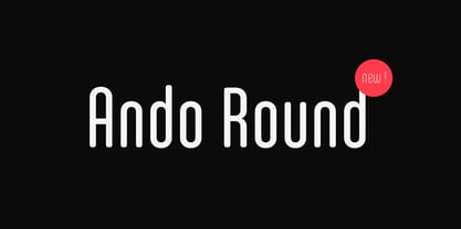 This is the rounded version of Ando, an elegant geometric typeface with smooth curves, designed for headlines. Six styles are available, with the same OpenType features as the original: stylistic alternates, case sensitive forms, tabular figures, and more!
 - Nouveau Sans JNL by Jeff Levine,
$29.00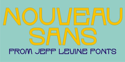 Based on a few examples of an Art Nouveau-inspired wood type, Nouveau Sans JNL has an interesting mix of angles, curves and general letter shapes that are reminiscent of the period preceding the Art Deco streamline movement.
 - Willoughby JNL by Jeff Levine,
$29.00Willoughby JNL by Jeff Levine is a typeface whose lettering was inspired by a 1950s package of toothpaste. Slightly Deco, it also fits well into 1950s-retro projects. This type design is best used at large point sizes. - Oksana Text Std by AndrijType,
$25.00Oksana Text is the demure version of Oksana, with shorted serifs, higher contrast, more slender proportions. In six weights from Thin to Black and with the real italic, this typeface is suitable for longer text with rich typography. - Oksana Text Alt by AndrijType,
$25.00Oksana Text is the demure version of Oksana, with shorted serifs, higher contrast, more slender proportions. In six weights from Thin to Black and with the real italic, this typeface is suitable for longer text with rich typography. - Spargo by Greater Albion Typefounders,
$8.50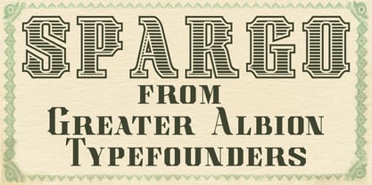 Spargo is inspired by 20s and 30s American typefaces, often seen on share certificates and other securities. Spargo is offered in six all capitals display typefaces. Bring a touch of inter-war America to your next design project!
 - VLNL Duct by VetteLetters,
$35.00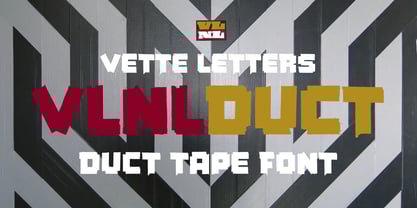 Duct tape is one of the most versatile adhesive materials known today. From fixing the bumper of your car that keeps falling off, to creating a sturdy wallet. From alternative wrapping to sticking a friend to the wall, Duct tape is there. And it will stay there. It will stick to anything and hold for a very darn long time too! The cloth-backed tape was invented some time during World War II, and also proved itself useful as a base material for lettering. VLNL Duct was originally designed by DBXL as a logo for temporary Amsterdam restaurant BAUT. DBXL imagined an owner taping the name on the window of his shop using Duct tape. The font was used for all communication of the restaurant. Duct is a sturdy, rough all-caps typeface that will stick to anything.
 - Secca Soft by astype,
$42.00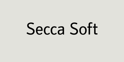 Secca Soft is the rounded sister of Secca font family. With its workhorse qualities, Secca Soft is perfectly suited for a wide range of applications - especially where legibility and economy are important factors. It comes with a wide language support and many typographic features and extras. The family comes in nine weights from Thin to Ultra Black - each with italics, small caps and italic small caps. While the weights from Light to Bold perform well in text sizes, the more extreme styles give extra freedom for Headlines & Signage. For setting tables and charts, Secca Soft offers tabular figures, fractions, currency signs and mathematic operators which share the same fixed width throughout the entire range of weights. This special feature is called "weight duplexing" and is a time saver for designers of annual reports and other figure-heavy texts.
 - Sequel Geo by OGJ Type Design,
$35.00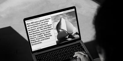 Sequel Geo is a geometric/neo-grotesque hybrid superfamily, influenced by formalized sans-serif typefaces from Germany and Swiss modernist type design—particularly Max Bill’s greek-styled lettering. 8 subfamilies and 120 individual fonts allow for a wide range of typographic expressions. Sequel Geo’s hallmark features, such as the circular “G” and punctuation, simple “t”, and two-story “a” turning one-story in bolder weights, persist throughout all styles. But it’s the formal and functional differences between subfamilies that let you really fine-tune your layouts. The three optical sizes of the core collection, “Body Text”, “Headline”, and “Display”, boast optimized spacing for the intended use. “Extended” packs some extra punch with 18 display-oriented styles. Finally, 48 “Graphic” styles in 4 subfamilies push to the Geometric side, replacing horizontal and vertical stroke endings with angular ones, simplifying letterforms. Sequel Geo is a journey through time and space. From 1920s Germany to 1950s Switzerland. All the while, its archetypal shapes are neutral yet confident, its appearance is classic.
 - Full Tools by Bülent Yüksel,
$9.00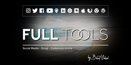 Full Tolls is the younger brother of original Full Sans, Full Neue and Full Slab. Full Tools started with Social Media Icons. In the following days coming new icons. For example "Full Tools - Communication" and "Full Tools - Emojis" and mode. To take up less space and simplifying icons on the web and phone apps. All icons bigger 110% from another Full Brothers. Full Tools is the perfect font for web use. You can enjoy using it. EMOJI ICONS - Amazed - Angry - Beard - Crying - Dead - Dissapointed - Embarrassed - Evil - Friendly - Happyness - Happy - Hilarious - In-love - Indifferent - Kiss - Laughing - Lovely - Muted - Nerd - Quiet - Sad - Scaret - Smile - Stress - Sunglasses - Suprised - Suspect - Thief - Tongue - Wink SOCIAL MEDIA ICONS - Amazon, - Android, - Apple, - Bechance, - Bing, - Box, - Buffer, - Creative Market, - Crome, - Delicious, - Deviantart, - Dribbble, - Dropbox, - Etsy, - Facebook, - Facebook Like, - Facebook Unlike, - Flckr, - Firefox, - Foursquare, - Google+, - Grafiport, - Hi5, - Howcast, - Html5, - Instagram, - Klikstarter, - Linkedin, - Messenger, - Myspace, - Myfonts, - Opera, - Path, - Paypal, - Periscope, - Pinterest, - Plaxo, - Quora, - Reddit, - Rss, - Shutterstock, - Skype, - Snapchat, - Spotify, - Stumbleupon, - Twitter, - Trello, - Tumblr, - Vimeo, - Vine, - WhatsApp, - Wikipedia, - Wordpress, - Yelp, - Youtube You can enjoy using it.
 - ZF Captiva by ZooFont,
$22.00 The name Captiva is derived from the word captivate, meaning 'enchanting' or 'capturing the heart'. Captiva is a geometric sans serif font with a harmonious blend of clean shapes and straight lines, diagonal lines, and curves. The simple yet sophisticated design shows a soft yet hard, hard yet beautiful appearance. It has a total of 9 thickness levels, and the edges and strokes are rounded to give the user a peaceful impression. The non-decorated form gives the user a comfortable reading of the text, and the high height value and wide inner space make it stand out from other fonts. In addition, it provides comfortable readability in various digital media as well as in general printing environments. Captiva has the following features: 9 thickness levels (from thin to heavy) extended latin 450+ glyphs fixed width numbers The Latin extension offers more than 130 languages with extensive multilingual Latin support for Western, Central, and Southeastern Europe.
 - Nebula by Muksal Creatives,
$17.00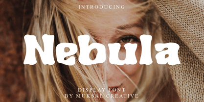 Nebula is a modern display font that captivates with its futuristic design and striking aesthetics. Created with a combination of geometric elements and artistic touches, Nebula features sharp lines and smooth contours, exuding an elegant and contemporary impression. When you encounter Nebula, your eyes are immediately drawn to its unique characteristics. This font combines creative geometric shapes with innovative typographic elements, creating an outstanding and attention-grabbing appearance. Each letter in Nebula is meticulously crafted, showcasing a perfect blend of clarity and creativity.The strength of Nebula lies in its perfect balance between boldness and sophistication. With various weights and thicknesses, this font allows you to express messages in an engaging and impressive manner. In other words, Nebula has the ability to emanate a distinct power and impression for every design project you undertake. Moreover, Nebula is versatile and adaptable to various design contexts. Whether you use it in advertisements, posters, logos, or other media, this font will deliver exceptional visual appeal. Its clarity and legibility ensure that your intended message remains clear, while its unique character adds a captivating and distinctive touch.
 - Optima Cyrillic by Linotype,
$65.00Many typefaces are distinctive or attractive at the expense of legibility and versatility. Not so the Optima® family. Simultaneously standing out and fitting in, there are few projects or imaging environments outside of its range. Although Optima is almost always grouped with sans serif typefaces, it should be considered a serifless roman. True to its Roman heritage, Optima has wide, full-bodied characters – especially in the capitals. Only the E, F and L deviate with narrow forms. Consistent with other Zapf designs, the cap S in Optima appears slightly top-heavy with a slight tilt to the right. The M is splayed, and the N, like a serif design, has light vertical strokes. The lowercase a and g in Optima are high-legibility two-storied designs. Optima can be set within a wide choice of line spacing values – from very tight to very open. In fact, there are few limits to the amount of white space that can be added between lines of text. Optima also benefits from a wide range of letter spacing capability. It can be set quite tight, or even slightly open – especially the capitals. If there are any guidelines, Optima should be set more open than tight. It’s not that readability is affected that much when Optima is set on the snug side; it’s just that the unhurried elegance and light gray typographic color created by the face are disrupted when letters are set too tight. Optima is also about as gregarious as a typeface can be. It mixes well with virtually any serif design and a surprisingly large number of sans serif faces. The Optima family is available in six weights, from roman to extra black, each with an italic counterpart. In addition, the family is available as a suite of OpenType® Pro fonts, providing for the automatic insertion of small caps, ligatures and alternate characters, in addition to offering an extended character set supporting most Central European and many Eastern European languages. When you’re ready to find its perfect pairing, browse these fantastic matches: Monotype Century Old Style™, Dante®, Frutiger® Serif, Joanna® Nova, Malabar™, and Soho®. - Optima by Linotype,
$45.99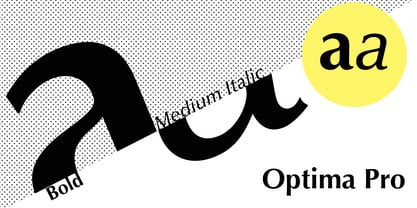 Many typefaces are distinctive or attractive at the expense of legibility and versatility. Not so the Optima® family. Simultaneously standing out and fitting in, there are few projects or imaging environments outside of its range. Although Optima is almost always grouped with sans serif typefaces, it should be considered a serifless roman. True to its Roman heritage, Optima has wide, full-bodied characters – especially in the capitals. Only the E, F and L deviate with narrow forms. Consistent with other Zapf designs, the cap S in Optima appears slightly top-heavy with a slight tilt to the right. The M is splayed, and the N, like a serif design, has light vertical strokes. The lowercase a and g in Optima are high-legibility two-storied designs. Optima can be set within a wide choice of line spacing values – from very tight to very open. In fact, there are few limits to the amount of white space that can be added between lines of text. Optima also benefits from a wide range of letter spacing capability. It can be set quite tight, or even slightly open – especially the capitals. If there are any guidelines, Optima should be set more open than tight. It’s not that readability is affected that much when Optima is set on the snug side; it’s just that the unhurried elegance and light gray typographic color created by the face are disrupted when letters are set too tight. Optima is also about as gregarious as a typeface can be. It mixes well with virtually any serif design and a surprisingly large number of sans serif faces. The Optima family is available in six weights, from roman to extra black, each with an italic counterpart. In addition, the family is available as a suite of OpenType® Pro fonts, providing for the automatic insertion of small caps, ligatures and alternate characters, in addition to offering an extended character set supporting most Central European and many Eastern European languages. When you’re ready to find its perfect pairing, browse these fantastic matches: Monotype Century Old Style™, Dante®, Frutiger® Serif, Joanna® Nova, Malabar™ and Soho®.
 - Olympian by Linotype,
$29.99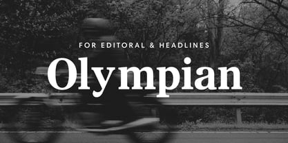 After the Second World War, the Ionic style replaced Modern Face as the favored typeface for newsprint. A couple decades later, it was in turn replaced by the next generation of newspaper fonts, a mix of Old Face, Transitional and Modern Face forms. Olympian itself tends toward the Old Face style but is nevertheless an example of this new generation, a result of a time of change and experimentation.
 - Overloaded by PizzaDude.dk,
$19.00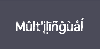 Overloaded is an excellent font for a wide variety of use - most likely something that needs a kind of worn look. Works well in both large and small sizes, that being headlines and/or display. Surprisingly versatile and will fit tons of different purposes. I put in 3 different versions of the lowercase letters for you to pick as you please, and play around with. Comes with multilingual support
 - Antique Stencil Borders JNL by Jeff Levine,
$29.00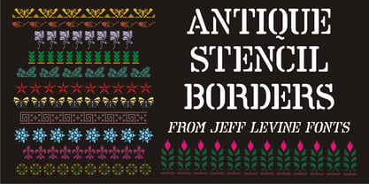 Antique Stencil Borders JNL collects twenty-six vintage border designs from various sources for complementing copy set in stencil lettering or in stand-alone decorative projects. NOTE: The purchase of this font does NOT include license to replicate the designs as commercial products for resale. To do so, a Derivative Products License must be obtained by contacting Jeff Levine. Contact information is found within the End User License Agreement.
 - Tapas by Fenotype,
$20.00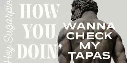 Tapas is a delicious multi type family with a little something for everyone's tastes and needs. The family consists of four distinct members that share same traits but communicate different aspects. Together they’ll create a bold and effortless mix of various flavors and accents. Naturally, the fonts can be used individually too. Use the Tapas type family in packaging, branding or editorial – wherever some delicious flavors are needed.
 - Altersan by Eko Bimantara,
$24.00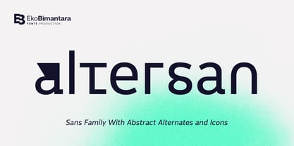 Altersan is sans serif font family with extraordinary abstract alternative glyphs and icons. The initial style is humanist grotesk sans which fit for various design purposes. The complete family consist of 8 styles from thin to black with each matching obliques. Its contain 477 glyphs which covered broad latin languages. The alternative glyphs can be accessed by activating the opentype feature; Stylistic Alternates and also by opening the glyphs panel.
 - Farm Doodles by Outside the Line,
$19.00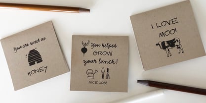 Farm Doodles... perfect collection of illustrations to be used for everything from the farm to table movement to the current weddings on a farm trend. 30 illustrations of farm animals... beehive, fish, bunny, chickens, cows, goat, sheep, pig and horse. Farm buildings, weather vane, windmill, tractor, milk can, hay bale, trees. And food... tomato, carrots, peas, spinach, apples, beets. Mix and match with other Outside the Line illustration fonts.
 - Rock Concert JNL by Jeff Levine,
$29.00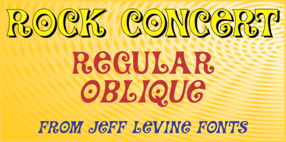 Rock Concert JNL is a playful free form type design inspired by the opening title and credits for the 1964 motion picture comedy “Send Me No Flowers” starring Rock Hudson, Doris Day, and Tony Randall. Strongly resembling hippie movement poster lettering of the mid-1960s, this fonts fits well with any retro project emulating the “Peace and Love” movement or (as its name implies) re-creating period piece rock concert posters.
 - Surimi by JCFonts,
$24.00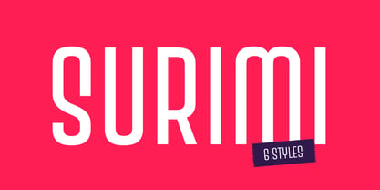 Surimi is a condensed display typeface available in six styles. Designed to stand out with its low crossbars and its unicase alternates, this cool little family will be great for titling and logotypes. The fonts include diacritics for western European langages, tabular and proportional figures, and 4 stylistic sets : ss01 : unicase alternates (A,E,W,Y) ss02 : alternate lowercase g ss03 : alternate lowercase l ss04 : alternate W and w
 - Quache by Mans Greback,
$29.00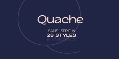 Quache is a flexible sans-serif, created by Måns Grebäck between 2018 and 2020. It has unique, stylish curvatures and is clear, legible and sharp with open letter forms. The font family consists of six weights and four widths, totaling in 28 main styles: Thin, Light, Regular, Bold, Black, Heavy and Condensed, Normal, Expanded, ExtraExpanded It supports Latin-based languages, and contains numbers and all symbols you'll ever need.
 - Santini by Canada Type,
$25.00Santini began as an experiment in mixing historical art deco, art nouveau, arts and crafts, and to a lesser extent Bauhaus sources. Surprised at the pleasant outcome of the experiment, we expanded it to become three weights, and included some alternates within the fonts themselves. Santini is an excellent choice for art- and architecture-related design, where the message needs to be conveyed in a clear yet sturdy and modern fashion. - EFCO Boldfrey by Ilham Herry,
$20.00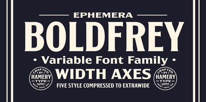 Inspired by vintage labels where there are many types of style in one design label, that's why Boldfrey came up with 6 styles, compressed to superwide for mixing and match each other for design needs. Boldfrey is also available in variable font format. Opentype features with stylistic character, lining figure, and ligature in Co. and LTD. Suitable in display needs, such as headline, logo, T-shirt, signage, poster, etc
 - Guile by Bunny Dojo,
$10.00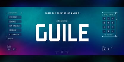 A timeless and mighty sans-serif, Guile's chiseled forms make the font ideal for reaching into history, while its minimalism and balance are fit for propelling into the future. Guile voraciously absorbs and enhances the style of its surroundings. In sports, it's a true team player, from the jerseys to the on-air presentation. In film, it's a blockbuster star, from the title treatment to the billing block.
 - Discopia by Konstantine Studio,
$17.00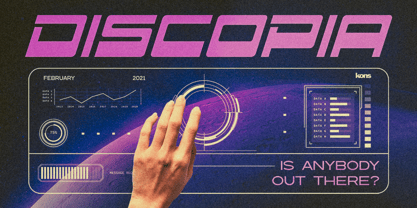 The invasion of futurism is begun. Came out prepared with our latest fonts collection, Discopia. Inspired by the visual of futuristic and techno-based design from the latest and upcoming trends. Perfectly fit for your gaming logo, branding, techno branding, digital assets, game design, UI, UX, synthwave, vaporwave, futuristic poster, contemporary typographic design, techwear apparel, vehicles design, prototype concept, anything you need a boost to the future, Discopia is here.
 - Decima Mono Round by TipografiaRamis,
$39.00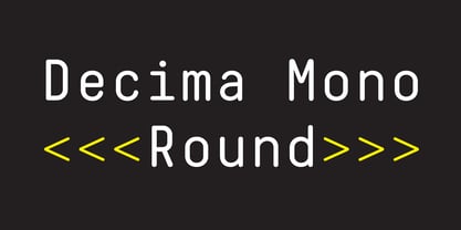 Decima Mono Round – another addition to the Decima fonts family. Decima Mono Round is a modern monospaced condensed sans serif family with classic geometric design, built in three weights and six styles. The letterforms in roman style are techno (engineered) in appearance, while italics remind one of elegant handwriting balanced with Roman geometry. The typeface is released in OpenType format with extended support for most Latin languages, as well as Cyrillic.
 - Night Halloween by Wyarecreatype,
$13.00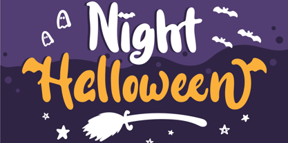 Night Halloween is a lovely halloween themed. Wide variety of halloween line art for Stylistic Alternates. Masterfully designed to become a true favourite, this font has the potential to bring each of your creative ideas to the highest level! Perfectly fit for the visual project such as logo, branding, poster, food and beverages, social media content, website, UI/UX design, youtube thumbnail, CV, mood board, wedding, you name it.
 - Liferdas by Sealoung,
$20.00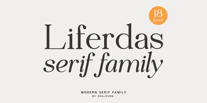 Liferdas is a mix of Old Style Roman Serif styles. The glyphs are formed in extended width, smooth strokes, moderate stem contrast, and soft edges to pursuing clarity, quick recognizable text, and a warm personality. The italics style is 13 degrees low slanted with redrawn lowercase which has shown in more organic and flowy forms. This font contains 9 weights with more than 245 glyphs that support extended multilingual.
 - Vintage Browner by Arterfak Project,
$19.00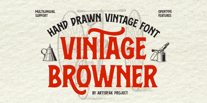 Vintage Browner is an exquisitely designed vintage-inspired typeface. Meticulously crafted with an original hand-drawn design, it exudes an old-school charm that is ideal for designs requiring a classic touch. This font is truly a perfect fit for vintage themes, including vintage logos, logotypes, packaging, storefronts, prints, t-shirts, decals, labels, and countless other possibilities. With its special characters, you can create your very own vintage aesthetic designs!
 - Extra Crunchy by Bogstav,
$18.00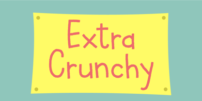 Extra Crunchy is my handwriting when I am eating cookies while drawing! No, it's true! I did eat a whole box of cookies while drawing this font! :) The letters are a bit jumpy, and have no steady x-height, however, your text may look a bit off, but it is clear and legible. Fits perfect for a children's book, a postcard/poster design or something else that needs that extra crunch :)
 - Pure Psychedelia by Mysterylab,
$19.00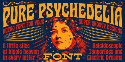 For a versatile timeless look that's sure to bring any groovy graphic idea to life, we have dubbed this offering: Pure Psychedelia. This condensed font is shot through with twin strands of modernized Art Nouveau and reimagined 1960s psych. This classic stylistic mélange is distilled down to a heady mix of hippy-trippy lava lamp blobs and assertively pointy end tapers, for a unique vibe and a dynamic linear flow.
 - Smart Cookie by PizzaDude.dk,
$15.00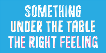 Smart Cookie is a happy and handmade font, ideal for packaging, posters or books (especially children's books!) It's highly legible and comes int 3 versions: Regular, Shine and Layer. Mix the Regular and Shine layer (using different colours) to make a cool shiny effect, or use the Shine version where the colours rely on the fore- and background colours...also a nice way of making your text stand out!
 - Billabong by Type Associates,
$32.95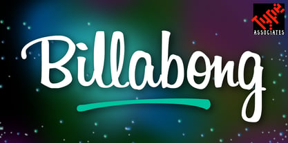 Billabong has its origins in the handlettered 40s and 50s script headings that seem to have endured especially in signage when style doesn't matter too much. Unlike today’s scripts Billabong is tightly spaced and Opentype font features allow for a myriad of ligatures to improve fit and evenness of color. Users can select their choice of strokes, ornaments and ending flourishes for added emphasis and style. Download comprehensive User Guide here.
 - Brodaers Expanded by Trustha,
$17.00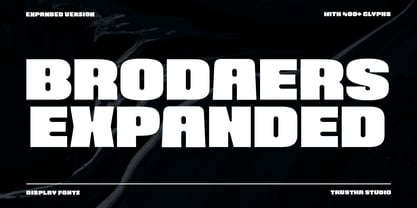 Brodaers Expanded is a display sans serif font. With the initial concept of the inner shape, made round. Comes in six styles, which makes it easier for the project you are working on, as well as alternative glyphs as an attractive option. Brodaers Expanded is an expanded version of Brodaers typeface. It comes with 400+ glyphs, which also include multilingual languages. Brodaers is perfect for headlines, branding, and many more.
 - Fomalhaut by Device,
$39.00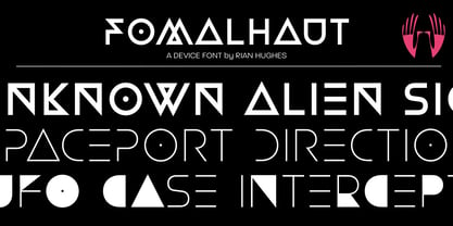 A modern, geometric sans serif display font with a hint of the future and the alien. The familiar letter-shapes are reimagined, with key stokes being placed in unusual positions without impacting the readability. The 'Solid' variants have certain counters filled in, creating a bold and unusual rhythm that is very effective in shorter settings. The different versions can be mixed for effect, while letterspacing adds a sharp, clean sophistication.
 - Noa by Linotype,
$29.99The Danish designer Nina Lee Storm designed Noa for use on television and computer screens during the late 1990s. She began her six-member type family with the creation of bitmap fonts, developing their print outlines only secondarily. Noa’s letters exhibit a tall x-height, coupled with very short ascenders and descenders. Storm is proud to report that her typeface also looks very “Danish.” Why don't you give it a try? - Renais by Wiescher Design,
$39.50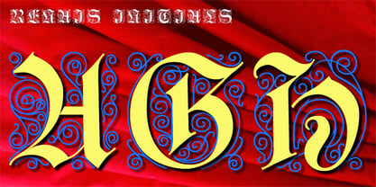 Renais is a set of Renaissance Initials. The embellished letters are on the keys A through Z. The letters without embellishments are on the lowercase letters a through z. The embellishments without the letters are in alphabetical order on the following keys: 1234567890!§$%&/()=?,.-;:_ You can superimpose the three forms for special effects, they are designed to fit exactly over each other. Have fun! Gert Wiescher - forever discovering old fonts!
 - Sunbeam by Kustomtype,
$25.00 Sunbeam is a new, classy & modern typeface that looks incredible! The contrasting lines and vibrant shapes give sunbeam a sleek and elegant look. Sunbeam is a versatile typeface that's full of character, using optical correction for better legibility, sunbeam is the perfect fit for graphic design, editorial design, magazines, posters, logotypes, brands and corporate design. Sunbeam is designed by Coert De Decker in 2019 and published by Kustomtype Font Foundry.