8,638 search results
(0.038 seconds)
- North by Trine Rask,
$40.00 North Family is a small type family designed for books and pages of text in smaller or bigger sizes. It has been designed with special care for the Scandinavian languages, their letter combinations and special characters, but contains accented characters for all european languages. North is a soft and warm typeface, legible and friendly, very suitable for setting text that you just want to be read as easy as possible. Also very usable for children books with its simple forms.
 - Marlos by Sronstudio,
$23.00 "Introducing 'Marlos,' a serif font that marries the elements of grace and boldness seamlessly. With its graceful serifs and commanding letterforms, 'Marlos' leaves a bold and lasting impression. Ideal for projects that demand a perfect balance between sophistication and impact, this font brings a touch of timeless elegance to your designs, making it a go-to choice for creating a powerful visual presence." Features: - Ligatures - Alternate - PUA Encoded - Multilingual support - Simple Installation - Work both on Mac and Windows Thank you very much :)
 - Dark Razoor Graffiti by Sipanji21,
$13.00 This Fonts designed so that users can use it more easily and make graffiti designs easier. Dark Razoor is very suitable for use in various media such as; packaging, logos, labels, posters, shirt designs, bulletins, typography, and many other media, especially with graffiti look. Features: All Caps PUA Encoded open Support for MAC or PC Simple installation for Adobe Illustrator, Corel Draw, Photoshop, or Procreate (New Updated) That's it! If you have any questions don't hesitate to ask! Stay Classy!
 - Raghill by Nurf Designs,
$19.00 Raghill is a sans serif font created using monoline. Its very modern and classy appearance makes it very suitable for use in your design needs to make it look better. Masterfully designed to become a true favorite, this font has the potential to bring your creative ideas to the highest level! Works on PC & Mac Simple installations Accessible in the Adobe Illustrator, Adobe Photoshop, Adobe InDesign, even work on Microsoft Word. PUA Encoded Characters – Fully accessible without additional design software.
 - Heart Garden by Letterhend,
$19.00 Thin and casual font with modern touch give aesthetic & simple font choice for your projects. This typeface has beautiful and modern look which is perfectly made to be applied especially in headline, logotype, apparel, invitation, branding, packaging, wedding card, advertising etc. Features : uppercase & lowercase numbers and punctuation multilingual alternates and ligatures PUA encoded We highly recommend using a program that supports OpenType features and Glyphs panels like many of Adobe apps and Corel Draw, so you can see and access all Glyph variations.
 - Summer Quest by Epiclinez,
$18.00 Remember that feeling of summer bliss? We designed a font with that same feeling in mind. Get your cool, refreshing look with Summer Quest. It's a bold, yet trendy font that can make your designs pop. Whether it's a poster, a greeting card, or a logo, this font can give you the right taste of summer for your product or service. So what’s included : Basic Latin Uppercase and Lowercase Numbers, symbols, and punctuations Multilingual Support. Simple Installations Works on PC & Mac
 - Tulisans by RGB Studio,
$14.00 Tulisans is a simple sans serif typeface, with semi-rounded edges for a smooth, clean look. It's perfect for logo designs, titles or subtitles, branding, and small amounts of text. Fonts include uppercase alphabet, numbers, and common symbols, and multilingual support. Files Include : Basic Latin A-Z and a-z Numbers Symbols PUA Encode Multilanguage Support Thanks and have a wonderful day, If you have any questions, please get in touch with us Don't forget to check out our other products.
 - Two Cents Plain JNL by Jeff Levine,
$29.00 Two Cents Plain JNL is a simple sans design for titling, sign work, display ads and so forth. The name is derived from the way folks in the Northeast used to ask for a glass of seltzer water at restaurants and soda fountains decades ago: "Give me a two cents plain." It was always cheaper to order plain seltzer than to have flavored syrup added, and this was especially true in the years during the Great Depression when every penny made a difference.
 - Mighty Risotto by Olivetype,
$18.00 Hungry for a cool texture script font? You're in luck! Mighty Risotto is a carefree signature script font with a wide spectrum of applications that gives you just the right feel for all projects. Introduce your new product with a custom logo, or make your next project stand out from the crowd with high-end typography. The possibility is endless. So what’s included : Basic Latin Uppercase and Lowercase Numbers, symbols, and punctuations Ligatures & Under Swashes Multilingual Support. Simple Installations Works on PC & Mac
 - Northwoods by Cultivated Mind,
$19.00 Northwoods is a simple, handwritten sans serif font family designed by Cindy Kinash. This family includes five weights and italics. Northwoods is a little different than most sans serifs being that it’s handwritten. You can use the fonts in multiple ways such as in design or textually. Try the bolder weights for display text and the lighter/italic weights for textual purposes. Northwoods is great for packaging, magazines, layouts, web design, corporate identity and marketing. Posters designed by Henry Barros.
 - Shallow Thoughts by Dumadi,
$18.00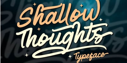 Shallow Thoughts is a modern script typeface created to enhance your designs. This font offers a simple yet stunning style with support Uppercase, Lowercase, Number, Symbol, Ligature, Multilingual, Alternative Style, SS01, ss02, ss03, and ss04. Shallow Thoughts very suitable for event titles, t-shirt design, posters, web, banner, book covers, social media, and other designs. Compatible with design studios such as Photoshop, Affinity Design, Adobe Illustrator or Silhouette. It makes it great for creative projects, Thank you, Toni Dzulham - Dumadistyle
 - Hardipe by Sarid Ezra,
$15.00 Hardipe is logo fonts with unique side that will make your logo and design looks more simple and stylish. With the unique characteristic lowercase, this font can make your logo even more stunning. You can use this font for any purpose, especially to make logotype. You can mix and match the uppercase and lowercase to make your logo more stand out. Hardipe also comes with italic version that have different vibes. This font also comes with number, symbol, and multilingual support!
 - Demilton by Prioritype,
$12.00 This minimalist and elegant looking font is ready to accompany your project. Simple but powerful and beautiful. Can be applied to packaging logos, wedding invitations, branding, creative posts, posters, quotes, landing pages, and much more to explore. See some of the previews above for reference. Features: -Uppercase -Lowercase -Numeral -Punctuation -Multilingual -Ligature Note : Open with a program that supports the Opentype feature and an glyphs panel is available to see more alternative characters. Sample programs like Adobe Illustrator and the like! Thanks.
 - Atziluth by Motokiwo,
$17.00 Atziluth is a gorgeous script font based on calligraphic style. This is an accessible and flexible display font, with tons of alternates and ligatures for branding or logotype purposes. It is perfect to use for various purposes such as branding, quotes, book / cover titles, posters, apparel design, product packaging, labels, special events or anything that need a graceful touch. Feature : Ton of glyphs (include Uppercase, Lowercase, Numerals & Punctuations, Accents, Ligatures, Alternates, and Swashes) Multilingual Support Works on PC & Mac Simple installation
 - Pierce Jameson by Grezline Studio,
$20.00 Pierce Jameson is a display font family with vintage aesthetic. This font was created to give your headlines and logotype projects a stylish touch. Pierce Jameson font is also usable in a wide range of works such as logos, covers, posters, quotes, product packaging, merchandise, social media and much more! Combine them to make your creative projects become more authentic! Feature : - Multilingual Language - Works on PC & Mac - Simple installations - Accessible in the Adobe Illustrator, Adobe Photoshop, Adobe InDesign, even works on Microsoft Word.
 - Hollie Mally by Good Java Studio,
$500.00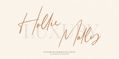 Hollie Mally handwritten font is a natural & modern script font. It's perfect for logos, invitations, stationery, wedding designs, social media posts, advertisements, product packaging, product designs, label, photography, watermark, special events or anything. This font includes ligatures and Multilingual support. What are the advantages of Hollie Mally? - Very simple installation - PUA Encoded open - Very great for branding, logotype, handlettering, invitations, or fashion branding. - Multilingual Support - Support for Adobe Illustrator, Corel Draw, Indesign or Adobe Photoshop - Support for MAC or WINDOWS
 - Lessa by Maculinc,
$15.00 Lessa is an elegant classic serif font family consisting of simple style serif fonts with a vintage look, with appropriate cursive calligraphy italics based on a number of humanist italic scripts, perfect for creating templates, posters, brochures, logos and more. This font consists of upright and italic fonts (10 in total) all of which have the same number in each letter, Lessa is equipped with multi-languages and is supported by various languages from various countries. Mail support : maculinc@gmail.com Thank you! Maculinc
 - Better Part Of Me by Epiclinez,
$18.00 Introducing Better Part of Me, a fun and quirky font for adding a touch of whimsy and personality to your designs. This eye-catching font is perfect for creating attention-grabbing headlines, posters, and logos. With its playful style and cheerful spirit, it's sure to brighten up your day. Better Part of Me font includes : Standard Latin Uppercase and Lowercase Numbers, symbols, and punctuations Multilingual Support. PUA Encoded and fully accessible without additional design software Simple Installations Works on PC & Mac Thank You.
 - Skyscraper by Fontop,
$12.00 Introducing the new serif and sans serif typeface SKYSCAPER. Inspired by NY city this elegant, simple, yet distinctive styles look great in posters, leaflets, books, magazines, presentations as well as logos and blog posts. The font also has two additional styles with different design of serifs. What is included in the pack of font family: Skyscraper Condensed Skyscraper Condensed Serif One Skyscraper Condensed Serif Two The font family is Latin multilingual and has uppercase letters, lowercase letters, numbers and basic punctuations.
 - Jostern by EMME grafica,
$14.99 Jostern is the first font designed by EMME Grafica. It's a simple bold, all caps, grunge, eye-catcher font, particularly suitable for titling, branding and typographic amusements. The unevenness of Jostern does not affect the heavy and cubital aspect of the font, but gives it the right roughness to be able to convey a slightly rough and harsh impression, like that of Jos Stern, the bitter character who will be the protagonist of a multimedia project currently under development at EMME Grafica.
 - Crystal by Cuda Wianki,
$30.00 Crystal is a very trendy two font system that could be layered to give You multiple possibilities in designing. When You use it with gradient it gives a faceted 3-D effect. What is more it can be outlined that gives an additional industrial look. Both fonts contains the same metricts so using them is so simple-just copy & paste in place in different layers and then play with colors, gradients, outlines as You like :) Crystal is great for headlines and logotypes.
 - Hasan Hiba by Hiba Studio,
$59.00 Hasan Hiba is an Arabic display typeface. It is useful for titles and graphic projects The font is based on the simple lines of Fatemic Kufi calligraphy. Hasan Hiba won the 5th place in Linotype’s first Arabic Type Design Competition. It supported Arabic, Persian and Urdu. In November, 2008, Hasan Hiba was upgraded by working with Mirjam Somers an award-winning Arabic type designer to the DecoType font format for use in WinSoft Tasmeem which is now bundled with InDesign CS4.
 - Easytype by Vitalik B. Old,
$5.00 Easytype is the first font family released by Vitalik B. Old. Yet simple, handwritten type feels in title as good as in a middle size paragraph. Both italic and italic bold styles got 999 characters in a set, including Latin, Cyrillic and Greek symbols. Full set of Basic, Additional, Extended and Advanced Latin symbols [452]; Full set of Basic and Extended characters in Cyrillic script [256]; Basic Greek character set [73] Font family was designed by y/y behance.net/youryourich
 - Vault by Graphicxell,
$19.00 inspired by the famous minimalist logo perfect for the purposes of designing templates, brochures, videos, advertising branding, logos, invitation, layout design, elegant crafting, beauty design and other What's Included : + Standard glyphs + International Accent + Works on PC & Mac + Simple installations Accessible in the Adobe Illustrator, Adobe Photoshop, Corel Draw. PUA Encoded Characters - Fully accessible without additional design software. Fonts include multilingual support Image used : All photographs/pictures/vector used in the preview are not included, they are intended for illustration purpose only. Thank You
 - Asittany Script by Javatypestd,
$10.00 Introducing Asittany Script is monoline script font which natural movement and elegant for signature style. Asittany Script is perfect for branding projects, logo, wedding designs, social media posts, advertisements, product packaging, product designs, label, photography, watermark, invitation, stationery and any projects that need handwriting taste. What’s Included : - Standard glyphs - Ligature - Works on PC & Mac - Simple installations - Accessible in the Adobe Illustrator, Adobe Photoshop, Adobe InDesign, even work on Microsoft Word. - PUA Encoded Characters – Fully accessible without additional design software. - Fonts include multilingual support
 - DT Skiart by Dragon Tongue Foundry,
$30.00 Looking for something between a Serif and Sans Serif font? Try the DT Skiart font. This high quality, versatile font has the professional feel of a Serif, but has the open readability of a Sans Serif. A smart crisp font with smooth simple lines. It has a medium to strong stroke contrast, with the vertical line being heavier than the horizontal line, and no serifs. The DT Skiart family is made up of 5 weights in both italic and normal.
 - Accord Alternate by Soneri Type,
$48.00 The main difference between Accord Alt and Accord is in the way curved strokes join with vertical stems in letters such as “bpn”. The Italics are designed at an italic angle of 10 degrees. All the letter forms have been kept similar while designing italic instead changing the form e.g. 'a' remains same double story in italic also instead changing it to single story. The intention is to keep it simple and neutral which helps communicate the corporate sense of professionalism.
 - Afons Infant by Andy Peat,
$9.00 About this font family Afons Infant has been designed for children’s storybooks; using round, single-decker letter forms to create simple, clear and readable stories that children are familiar. Features 5 weights (from thin to bold) Multi language Lowercase Numerals to blend with text Ligatures To be able to access alternative fonts, make sure the software you use can support opentype features such as Microsoft Word, Paint, Adobe, Corel draw and other applications. Designed and published by Andy Peat. Released April 2022
 - Olivette CF by Connary Fagen,
$35.00 With an extreme stroke contrast and wide, spacious construction, Olivette blends understated minimalism with elegance and expression. Olivette’s fine details shine at large sizes on screen and in print. Olivette CF pairs well with simple typefaces, set at smaller sizes, such as Greycliff CF and Artifex Hand CF. The key is to let Olivette breathe, setting it at large sizes with plenty of open space. All typefaces from Connary Fagen include free updates, including new features, and free technical support.
 - Jeniver Ellis by OCSstudio,
$14.00 Introducing my new font, Jennifer elis font made with a pen brush refined to look neat. like dance letters, smooth, clean and simple. Jennifer elis font are perfect for weddings, events, invitations, escort cards, table numbers, Quotes, displays, logos, blog sliders, special addresses, stamps, packaging, greeting cards, etc.Features: Basic Latin A-Z and a-z Numeral & Punctuation Ligatures 10 Alternate Swashes Script 592 Glyphs Sans 354 Glyphs Latin Pro Support Character ** Thank you for downloading my font, hopefully it’s useful **
 - Oceanwide Pro by California Type Foundry,
$47.00 A font perfect for not just one, but many projects! Introducing Oceanwide Pro, a sans that loves to be used in just about any situation! Designed with ultra clean lines and versatility in mind, Oceanwide wants to be your new favorite sans! Oceanwide’s ultra clean letters work anywhere you want to communicate orderliness and competence, and designed to build trust and rapport with your audience. Its wide proportions make it ideal for display and logo use. Oceanwide especially shines for white/bright letters on black/dark backgrounds! That’s because the inside shapes are nearly perfect circles in many weights. Here's a quick video tour of Oceanwide Pro by Dave Lawrence, including all the great things Oceanwide can be used for! We've tested Oceanwide for these industries, with stunning results!: Tech Arts Fashion & Style Business & Branding Corporations Logistics Architecture Food and many more... Oceanwide can be used for: Headers Subheadlines Logos Even body text, if tracked. Print & Screen The styles it can take are also many. It's great for: Modern/minimalist design Flat design Cut out design User Interface (UI) Technical designs In combination with text effects, even for grunge and other situations. And many others... DESIGN FEATURES Simplicity Tall x-height Hand-sloped obliques (italics) Narrow spacing Semi-wide proportions Expert kerning Well proportioned, usable lights & extra lights Large caps Great ALL CAPS MODE Uppercase punctuation Uppercase spacing with California Type Foundry’s Smart Tracking™ Advanced fraction support Proportional lining figures Thick joins Smooth curves Sturdy—great for textures and effects Variable font available Latin Pro character set for Central European languages. That's the writing for over 782 languages and transliterations worldwide! DESIGN STORY—THE FORGOTTEN SANS by Dave Lawrence, Lead Designer, California Type Foundry Adrian Frutiger was the 20th century master of sans, but I didn't realize he had made—not one—but TWO geometric sans! It wasn't until I had purchased the book “Adrian Frutiger: Typefaces”. I had hoped to someday meet Adrian Frutiger, but he passed away that very same year. Here is the story of Frutiger's forgotten sans. Back in 1968, Frutiger was approached by Pentagram to make a design for British Petroleum. They wanted a "new version of Futura". However, they wanted him to make a couple adjustments. First, they felt that Futura was "too fiddly." By this, they meant that it narrowed too much at the joins. (Joins are for example where the round and straight parts of the 'd' meet.) This is something that is necessary for small print text (to prevent ink clogging), but is not necessary at large sizes. Second, they wanted it to be entirely geometric, using the circular shape with minimal optical corrections. Unfortunately this font was not even used very consistently in the BP brand. A haphazard mix of Futura and Frutiger's BP font ensued. It was then replaced by another font design very soon after. My design is different in several ways. First, the commas and quotes are a more modern style. I tried his original commas, but these just didn’t work to 21st century eyes. Second, in his drawings, Frutiger went for a more standard u with a downstroke on the right. However, Oceanwide has a simpler u. Third, I made more optical adjustments. At the direction of his employer, Frutiger reluctantly put no font optical corrections into the letters. So I think my optical adjustments are similar to what Frutiger would have wanted. Fourth, I extended the weight into the light and extra light ranges. Fifth, the rest of the font I created according to the principles of Adrian Frutiger, but with no sources for inspiration. Here is Frutiger’s design philosophy, in his own words: “If you remember the shape of your spoon at lunch, it has to be the wrong shape. The spoon and the letter are tools; one to take food from the bowl, the other to take information off the page... When it is a good design, the reader has to feel comfortable because the letter is both banal and beautiful.” The words about the spoon were the ones I kept in my mind as I tried to make the curves ultra smooth, and the shapes ultra simple. Hopefully this font is a worthy successor to the font that inspired it. Released on the 93rd birthday of Adrian Frutiger, to celebrate the life and achievements of this amazing designer. ——————— Simplicity. Versatility. Oceanwide.
 - DIY Fantasy Stamp by TypoGraphicDesign,
$19.00 The typeface DIY Fantasy Stamp is designed in 2020 for the font foundry Typo Graphic Design by Manuel Viergutz. The display typeface is inspired by the crafts of 20s and 40s. The basis for this authentic stamp font was a letter case with a rubber stamp from Simplex. This analog character set of 85 stamps, was digitally extended to 500+ glyphs. 5 font-styles (Sharp, Dirty, Rough, Invert, Heavy) with 546 glyphs (Adobe Latin 3) incl. decorative extras like icons, arrows, dingbats, emojis, symbols, geometric shapes, catchwords, decorative ligatures (type the word #LOVE for ❤ or #SMILE for ☺ as OpenType-Feature dlig) and stylistic alternates (4 stylistic sets). For use in logos, magazines, posters, advertisement plus as webfont for decorative headlines. The font works best for display size. Have fun with this font & use the DEMO-FONT (with reduced glyph-set) FOR FREE! Font Specifications ■ Font Name: DIY Fantasy Stamp ■ Font Weights: Sharp, Dirty, Rough, Invert, Heavy + DEMO (with reduced glyph-set) ■ Font Category: Display for headline size ■ Glyph Set: 546 glyphs (Adobe Latin 3) ■ Specials: Decorative extras like arrows, emojis, ornaments, geometric shapes, catchwords, decorative ligatures (type the word #LOVE for ❤ or #SMILE for ☺ as OpenType Feature. dlig) and stylistic alternates (4 stylistic sets) ■ Design Date: 2020 ■ Type Designer: Manuel Viergutz
 - Eastman Condensed by Zetafonts,
$39.00 Discover here the Eastman Roman Family See the Eastman Grotesque Family Designed in 2020 for Zetafonts by Francesco Canovaro and Andrea Tartarelli with help from Solenn Bordeau and Cosimo Lorenzo Pancini, the original Eastman typeface family was conceived as a geometric sans workhorse family developed for maximum versatility both in display and text use. The original wide weight range has been complemented with three more additional widths, to give you maximum control over the appearance of text in your page. While Eastman Compressed and Eastman Condensed behave as space-saving condensed families, Eastman Grotesque adapts the family design style to humanist proportions. All share a solid monolinear design and a tall x-height that makes body text set in Eastman extremely readable on paper and on the screen. Influenced by Bauhaus ideals and contemporary minimalism, but with a nod to the pragmatic nature 19th century grotesques, Eastman has been developed as a highly reliable tool for design problem solving, and given all the features a graphic designer needs - from a wide language coverage (thanks to over one thousand and two hundred latin, Cyrillic and greek characters) to a complete set of open type features (including small capitals, positional numbers, case sensitive forms). The most impressive feature of all Eastman fonts remains the huge choice of alternate characters and stylistic sets that allows you to fine-tune your editorial and branding design by choosing unique, logo-ready variant letter shapes. Don’t want to lose too much time with the glyphs palette? Use the Eastman Alternate weights, thought for display use and presenting a selection of some of the more eye catching & unusual letter shapes available for the family.
 - Archemy by Sonic Savior,
$90.00Archemy is a restricted and obscure branch of Alchemy that deals specifically with the life, generation and transmutation of Metals. The Archemy font is primarily a magical and alchemical alphabet. It was created on initiative of Senior Zadith, in order to properly quote older alchemical manuscripts, without the need to insert handwritten symbols. The font combines a unique and elegant Roman alphabet with a set of the most frequently used planetary and alchemical symbols that are common in the Western Mystery Tradition, and as used by those involved in the Royal Art. The Archemy font contains a selection of symbols that are still used by practitioners of the Art today, and for the sake of completeness, a selection of less used and more arcane symbols that can be found in older alchemical texts. In addition a Hebrew Alphabet is included, which will supply practitioners of the Art with the glyphs related to Cabalistic studies. The Hebrew Alphabet in this font does not include vowel points, since they have no place in ancient Hebrew, nor in the Western Mystery Tradition. A selection of the most distinct glyphs as used in the Antediluvian font family - the Alphabet of the Ancients - is included for those that wish to include the archetypal and arcane quality of these glyphs from the dawn of history. By our knowledge there exists at this time no font that includes a selection of Alchemical symbols, let alone combines all of the above mentioned archetypal symbols of occult language in a single package. In that respect Archemy can be considered to be an “Arch” font. - ITC Tactile by ITC,
$29.99ITC Tactile is a puzzle of subtle typographic contradictions. Capitals have traditional epigraphic proportions, but the lowercase has a uniform optical width. Light weights are stately and elegant, but bold designs are almost jolly. This paradoxical alphabet even combines two distinctively different serif designs. Designer Joe Stitzlein says, “I wanted to create a modern and dynamic serif face that draws its forms from antiquity. I also wanted to have as much fun as possible with the drawing and architecture of each letter. Hopefully I've created a very legible typeface that grabs the reader's eye in a nice, 'tactile' way.” The apparent inconsistencies of the design are the result of careful consideration. Of the seemingly odd serif design, Stitzlein explains, “The transitional serif is an entry point for the eye into the letterform, and the long slab is an exit, leading to the next letter.” The result is a typeface that's easy to read at text sizes but offers surprising details when enlarged to display sizes, setting ITC Tactile apart from more traditional designs. While this is his first commercial typeface design, Stitzlein has ample experience creating custom typefaces for corporate branding, including companies such as Silicon Graphics and Sempra Energy. His graphic design business has served a wide range of clients, including Apple Computer and the 2002 Salt Lake City Olympics. The ITC Tactile family is available in three weights, with complementary italic designs and a suite of small caps for each of the roman designs. Stitzlein drew the small caps to match the height of the lowercase x-height, which enables “bi-form” or “unicase” setting in display copy. - Trinidad Neue by Sudaca Type Design Studio,
$40.00 Trinidad Neue™️ is a geohumanistic typeface developed by the Chilean Type Design Studio Sudaca. The origin of this work lies in an exercise of comparing classic Roman proportions (Trajan Columns) with the capital letter set of Futura by Paul Renner. I wanted to create my own Sans Serif interpretation of classic proportions. I started working with letters A, H, N, O, R and S. When I finished the uppercase set, this exercise transformed itself into a project. I started to develop a set of lowercase letters choosing as direct references Futura and Kabel by Rudolph Koch; always having in mind that the objective was to find a balance between the humanist and the rational or geometric. Here is when this group is formed, giving its name and identity to this family: Paul, Rudolph & Alexis. The result is a typeface with an elegant, modern and versatile aspect. Its seven stylistic sets make Trinidad Neue™️ into a Swiss army knife to compose short and medium texts for editorial design, branding, exhibitions, motion graphics, etc. The family consists of nine weight variants and its corresponding oblique versions. It counts with many OpenType characteristics in each variant, including small caps, seven stylistic sets that can be combined, standard ligatures and discretionals ligatures, proportional numerals, tabular numbers, fractions, superscript, subscript, normal punctuation and also aligned to small caps and capital letters, arrows, emojis and more. With more than 1000 glyphs, this typeface has a wide idiomatic range that includes more than 190 Latin languages. Trinidad Neue™ is the new and alternative version of LC Trinidad™.
 - Gelion by Halbfett,
$30.00 Gelion is a large family of geometric sans serif fonts. It ships both as two Variable Fonts or as 16 traditional fonts. Those static fonts span eight different weights, ranging from Extralight to Black. Each has an upright and an italic font on offer. The italics are carefully crafted, with an 8° slope. Gelion is inspired by 20th-century geometric sans serifs and classic neo-grotesque designs from the late 19th century and the middle of the 20th century. Its forms remain true to the gracefully geometric look of its classic predecessors, which will surely tick off any client’s long list of branding requirements. Letters in all of Gelion’s weights are drawn with virtually monolinear strokes. Its lowercase letters have a tall x-height. Yet, that still leaves enough room for the fonts’ diacritical marks. Gelion’s default “a” and “g” each have single-storey forms by default. The dots on the ‘i’, ‘j’, and diacritics are round, as are the punctuation marks. Gelion is an excellent choice for both corporate design and editorial design projects, thanks to its range of weights and its legibility in text. The fonts include a lot of ligatures, some monochromatic emoji, a set of arrows, lovely Roman Numerals, and more. Thanks to Gelion’s stylistic alternates, if a project comes up where you do not need a geometric vibe, you can activate Stylistic Set 1. That will replace many of the fonts’ letters with more humanistic-sans alternates, giving your text the feeling of a whole other type design with just one click. Last but not least, the descending “f” available in Gelion’s italics is a nice typographic trait.
 - P22 Underground Pro by P22 Type Foundry,
$49.95 The P22 Underground Pro font family started in 1997 as the first and only officially licensed revival of Edward Johnston’s London Underground railway lettering. The original design by Richard Kegler sought to be as true to the original as possible. In 2007 P22 revised and expanded the fonts into a massive character set with additional weights, language support, and stylistic alternates. Endeavoring to make this font family a more versatile and useful tool for a designer, P22 sought to add true italics to this stalwart type design. The only other existing italic interpretation of Johnston’s Underground type was executed by the inimitable Dave Farey and Richard Dawson at Housestyle Graphics. We asked Dave Farey to imagine an Underground italic that would pair well with the P22 Underground, done as if Edward Johnston himself might approach the design challenge. This new italic version was then expanded for all six of the existing P22 Underground weights and characters sets by James Todd of JTD Type. Final mastering of the P22 Underground Pro roman and italic with a streamlined yet still expansive language coverage by P22 partner Patrick Griffin of Canada Type. These refinements remain true to the original Johnston design while employing contemporary typographic finesse to create six weights with optional alternates to increase legibility. The new P22 Underground Pro family is now a rock-solid and very versatile humanist sans serif font family that should be a cornerstone of any designer’s typographic toolkit. After five years in development, the new P22 Underground Pro is the most iconic and useful font family ever presented by P22 Type Foundry.
 - Diotima Classic by Linotype,
$29.99Diotima Classic is a total upheaval for the 21st century of Gudrun Zapf von Hesse's mid-20th-century Diotima, one of the most beautiful types ever cast in metal. Its roots lay in a calligraphic sheet written by Gudrun Zapf von Hesse. The text was the Hyperion to Diotima" by Friedrich Hölderlin; Diotima is the name of a Greek priestess in Plato's dialogue about love. In the philosopher's imagination, she should appear slim and beautiful. In 1948, Gudrun Zapf von Hesse finished the typeface's Roman. The Diotima family was released as a metal typeface for hand setting by D. Stempel AG in 1951-53. This original Diotima is a festive design particularly suited to invitations, programs, and poems. The delicate Italic drew attention to text passages that should be emphasized. Linotype's previous digital Diotima only had one weight, which looked great in display sizes, but was too thin for text setting. Diotima Classic has four weights. The new Regular has more robust serifs and thicker hairlines, making it more appropriate for text sizes. The Diotima variation with finer serif remains under the name Light. Gudrun Zapf von Hesse also took the opportunity in 2008 to add an extremely heavy weight to the family. In comparison to the old Diotima, letterforms of the Diotima Classic are more harmonious and balanced. The rhythm of the Italic letters in Diotima Classic is more consistent. The lining figures of the Diotima Classic align with caps, and the letter spacing of the tabular lining figures in Diotima Classic is significantly better. The forms of the figures have been improved as well." - Natom Pro by Mostardesign,
$25.00 A family of fonts with rhythm. Natom Pro is a modern and geometric font family adapted to the professional requirements of graphic designers, web designers and mobile application developers. Comprised of 19 styles including 8 styles designed especially for the design of headlines, Natom Pro is a very versatile family of fonts that can be used in many projects such as editorial design, branding or corporate identity creation, design of posters or logos, the creation of websites or the development of mobile applications. This font, with a resolutely contemporary aspect, also hides a unique typographic design since it has 2 distinct styles (Title and Roman) which have 2 different typographic rhythms in order to graphically differentiate the appearance of titles, subtitles and long paragraphs. With this design of rhythmically differentiated glyphs according to the styles, the headlines have a very graphic aspect while the long texts have a more classic aspect in order to keep optimal readability in all scenarios. Its architecture is also very modern since it was designed and drawn with particular attention to the geometry of the forms with clear and open endings cut at 90 degrees. The number of styles has also been simplified with the most used thicknesses (Extra Light, Light, Regular, Medium, Bold and Black) in order to speed up your graphic design process. For the more experienced designers, Natom Pro is also available in a variable version. Natom Pro is also equipped with powerful OpenType features like case sensitivity, true small caps, full ligature set, tabular figures for tables, « old styles figures » to elegantly insert figures into your sentences, numbers circled or even alternative characters to satisfy the most demanding professionals.