10,000 search results
(0.193 seconds)
- Rufina by TipoType,
$16.00 Rufina was as tall and thin as a reed. Elegant but with that distance that well-defined forms seem to impose. Her voice, however, was sweeter, closer, and when she spoke her name, like a slow whisper, one felt like what she had come to say could be read in her image. Rufina’s story can only be told through a detour because her origin does not coincide with her birth. Rufina was born on a Sunday afternoon while her father was drawing black letters on a white background, and her mother was trying to join those same letters to form words that could tell a story. But her origin goes much further back, and that is why she is pierced by a story that precedes her, even though it is not her own. Maybe her origin can be traced back to that autumn night in which that tall man with that distant demeanor ran into that woman with that sweet smile and elegant aspect. He looked at her in such a way that he was trapped by that gaze, even though they found no words to say to each other, and they stayed in silence. Somehow, some words leaked into that gaze because since that moment they were never apart again. Later, after they started talking, projects started coming up and then coexistence and arguments, routines and mismatches. But in that chaos of crossed words in their life together, something was stable through the silence of the gazes. In those gazes, the silent words sustained that indescribable love that they didn’t even try to understand. And in one of those silences, Rufina appeared, when that man told that woman that he needed a text to try out his new font, and she saw him look at her with that same fascination of the first time, and she started to write something with those forms that he was giving her as a gift. Rufina was as tall and thin as a reed, wrote her mother when Rufina was born. Photo (Fragilité): Karin Topolanski / Post: Raw (www.raw.com.uy) - María Pérez Gutiérrez
 - Thump by Typodermic,
$11.95 Looking for a font that packs a punch? Look no further than Thump! This bold and beautiful sans-serif typeface is just what you need to add some oomph to your designs. Thump is a font that isn’t afraid to be itself. Its heavy letterforms demand attention and exude confidence. But don’t let its weight intimidate you—Thump is actually quite easygoing. Its relaxed letterforms create a friendly, approachable vibe that’s perfect for any project. One of the best things about Thump is its rich, thick strokes. They give your text a sense of depth and texture that’s hard to achieve with other fonts. It’s the perfect way to add a little fun and unfettered style to your message. But Thump isn’t just a pretty face—it’s also smart. Thanks to OpenType technology, common letter pairs are automatically swapped to create a more genuine, hand lettered impression. It’s the kind of attention to detail that sets Thump apart from the rest. So whether you’re creating a poster, a brochure, or a social media graphic, Thump is the perfect choice. It’s bold, it’s beautiful, and it’s ready to help you make a statement. Give it a try and see for yourself! Most Latin-based European writing systems are supported, including the following languages. Afaan Oromo, Afar, Afrikaans, Albanian, Alsatian, Aromanian, Aymara, Bashkir (Latin), Basque, Belarusian (Latin), Bemba, Bikol, Bosnian, Breton, Cape Verdean, Creole, Catalan, Cebuano, Chamorro, Chavacano, Chichewa, Crimean Tatar (Latin), Croatian, Czech, Danish, Dawan, Dholuo, Dutch, English, Estonian, Faroese, Fijian, Filipino, Finnish, French, Frisian, Friulian, Gagauz (Latin), Galician, Ganda, Genoese, German, Greenlandic, Guadeloupean Creole, Haitian Creole, Hawaiian, Hiligaynon, Hungarian, Icelandic, Ilocano, Indonesian, Irish, Italian, Jamaican, Kaqchikel, Karakalpak (Latin), Kashubian, Kikongo, Kinyarwanda, Kirundi, Kurdish (Latin), Latvian, Lithuanian, Lombard, Low Saxon, Luxembourgish, Maasai, Makhuwa, Malay, Maltese, Māori, Moldovan, Montenegrin, Ndebele, Neapolitan, Norwegian, Novial, Occitan, Ossetian (Latin), Papiamento, Piedmontese, Polish, Portuguese, Quechua, Rarotongan, Romanian, Romansh, Sami, Sango, Saramaccan, Sardinian, Scottish Gaelic, Serbian (Latin), Shona, Sicilian, Silesian, Slovak, Slovenian, Somali, Sorbian, Sotho, Spanish, Swahili, Swazi, Swedish, Tagalog, Tahitian, Tetum, Tongan, Tshiluba, Tsonga, Tswana, Tumbuka, Turkish, Turkmen (Latin), Tuvaluan, Uzbek (Latin), Venetian, Vepsian, Vietnamese, Võro, Walloon, Waray-Waray, Wayuu, Welsh, Wolof, Xhosa, Yapese, Zapotec Zulu and Zuni.
 - Coco Gothic Pro by Zetafonts,
$39.00 Inspired by a biography of Coco Chanel and trying to capture the quintessential mood of classical fashion elegance, Cosimo Lorenzo Pancini designed Coco Gothic looking for the effect that the first geometric sans typefaces (like Futura, Kabel or the italian eponyms like Semplicità) had when printed on paper. The crisp modernist shapes acquired in printing charme and warmth through a slight rounding of the corners that is translated digitally in the design of Coco Gothic. This signature touch is enhanced by the inclusion of light humanist touches to the proportions of the letters, resulting in the unique mix that makes Coco Gothic one of our best sellers, with a look that is both contemporary and vintage. After six years from the original project (that has spawned in the meanwhile successful families like Cocogoose and Coco Sharp), we went back to the design to completely redraw and expand the original family, creating with a Pro version that has better on-screen readability, a wider weight range, variable type versions and more language coverage (with Coco Gothic Arabic adding a new script to the latin, greek and Cyrillic of the original). Coco Gothic Pro comes in three subfamilies, each with seven weights with matching italics and featuring an extended character set with open type support for small caps, ligatures, alternates, European languages, Greek and Cyrillic alphabets. The original, body-text optimised Coco Gothic and Coco Gothic Alternate subfamilies have been kept for compatibility with the previous version, while a new Coco Gothic Display subfamily has been developed with a complete redesign aimed at display usage, featuring tighter spacing and optimised letterforms. A distinguishing feature of Coco Gothic Pro is the inclusion of ten alternate historical sets that allow you to use the typeface as a true “typographic time machine”, selecting period letterforms that range from art deco and nouveau, to modernism and to eighties’ minimalism. Equipped with such an array of historical variants, Coco Gothic Pro becomes an encyclopedia of styles from the last century, ready to transform itself and adapt to the mood of your text.
 - Lady Rene by Sudtipos,
$59.00 Looking back on my production to date, neither so little nor so large, it does not come as a surprise to find myself now introducing Lady René. A brief review of my career would read as follows: graphic designer graduated from Buenos Aires University, a 10-year professorship in Typography in the same institution, an illustrator in the making. For almost 15 years now my work has focused on the design of editorial pieces, predominantly books and CD sleeves. Typography proper has always been central to my research projects. All my obsessions eventually embodied as much the search for a perfect, spotless text as for a daring and provoking one. In my view, "how-to-say-something" ranks highest amongst a graphic designer’s responsibilities. It was in this vein that I called in the written word to illustrate, to draw, to narrate. Why not reverse the saying and proclaim that “a word is worth a thousand images”? If so, one single word could trigger endless meanings, associations, ideas, and memories in every reader’s mind. Language, we know, has a strong power and is a living expression of a culture. In my illustrations, letters and drawings reunite in one synergy said and unsaid, the finiteness of the message and the freedom of the free reading. And this is how and when, Lady René, my first born type font sees the light of day conceived out of a love of illustration and a reverence for the written word, recalling the whimsicality of the handmade drawing and reflecting its sensitive, warmth and spontaneity. Enabled by the characteristics of Open Type and the hard, outstanding work of designer Ale Paul, Lady René succeeds in composing texts in a simple, organic way by means of its contextual and stylistic alternates, swash characters, ligatures and connecting words. A bundle of decorative miscellanea completes the set of signs, enabling the user considerable freedom to create new typographic landscapes. Lady René is then prepared, very much like a character in a short story, to come to life in the reader’s mind. I expect you will enjoy her as much as I did creating her. Laura Varsky
 - Noort by TypeTogether,
$51.60 Juan Bruce’s Noort is not a type family for wayfinding or mapmaking alone, but for clarifying information and engaging readers along their own journey. The information designer’s role is to bring clarity and style to overwhelming amounts of information, which fortunately is Noort’s purpose as well. Hierarchies submit to its will and layering colour only adds more presence to its active posture. Noort’s design uses the proven editorial text features of a large x-height, ample spacing, and low contrast to check all the boxes for paragraph text use. But it’s the long serifs, wide characters, and overall typographic presence that make it resilient and ease the task of reading in small point sizes. These details mean Noort is able to demonstrate importance not only with its five pitch-perfect weights, but with its brindled colour within a layout. Noort’s roman and italic styles play off each other by transplanting their design features. The roman style’s serifs are transferred in substance but expectedly increased in speed in the italic styles. And the italic’s inktraps and separated strokes are echoed amidst the roman’s upright structure. Where digitisation could have removed the influence of the hand, Noort retains the analogue nature of its creation. This antiphonal seeding of details creates a cohesive family that is as fascinating as it is functional. Noort’s axis and serifs have a slightly varying ductus — the directional flow that aids reading and character clarity. Its latent obviousness in text sizes immediately becomes its signature style when bumped up to subhead sizes. And since Noort’s counters are so wide and welcoming, its heavier weights can expand more within themselves than along their exterior edges. Noort’s ten total fonts cover the Latin A Extended glyph set to bring its unbordered, globetrotting sensibilities to your projects. OpenType features include ligatures, fractions, and several figure styles, along with mature-rather-than-overbearing swashes. Aligned with TypeTogether’s commitment to produce high-quality type for the global market, the complete Noort family can set digital and printed works with ease, capitalising on the dual needs of clear information and fascinating textual artistry.
 - Echowarp by Luxfont,
$18.00 Introducing Echowarp is an unusual COLORED font family. Main idea of this font is that a colored echo spreads and fades from minimalistic letters to the sides. Distorted letters give the effect of temporary refraction. The originality of this family is primarily suitable for a bold design. And if you add a random distortion in a graphics program to the finished heading written in this font, the inscription will turn into an absolutely unique and inimitable one. Futuristic set has 23 fonts in the family! Do not limit your imagination, because the font opens up a huge space for creative experiments. Check the quality before purchasing and try the FREE DEMO version of the font to make sure your software supports color fonts. Features: Free Demo font to check it works Letters with color echo & distortion 23 OTF SVG color fonts in the family Gradient and hologram fonts Kerning IMPORTANT: - OTF SVG fonts contain vector letters with gradients and transparency. - Multicolor OTF version of this font will show up only in apps that are compatible with color fonts, like Adobe Photoshop CC 2017.0.1 and above, Illustrator CC 2018. Learn more about color fonts & their support in third-party apps on www.colorfonts.wtf - Don't worry about what you can't see the preview of the font in the tab "Individual Styles" - all fonts are working and have passed technical inspection, but not displayed, they just because the website MyFonts is not yet able to show a preview of colored fonts. Then if you have software with support colored fonts - you can be sure that after installing fonts into the system you will be able to use them like every other classic font. Question/answer: How to install a font? The procedure for installing the font in the system has not changed. Install the font as you would install the classic OTF | TTF fonts. How can I change the font color to my color? Adobe Illustrator: Convert text to outline and easily change color to your taste as if you were repainting a simple vector shape. Adobe Photoshop: You can easily repaint text layer with Layer effects and color overlay. ld.luxfont@gmail.com
 - Elio & Oliver v2 by SilverStag,
$19.00 Embark on a journey of refined typography with the Elio & Oliver Font Family v2, an exquisite upgrade that seamlessly integrates italics into its nine meticulously crafted weights, so you will get 18 fonts, 9 weights - from Thin to Black, and an italics version for each of them. Inspired by the timeless elegance and undeniable allure of Italy, this sans serif typeface captures the essence of sophistication and refinement, now enhanced with a touch of expressive flair. Italic Magnificence - A Symphony of Style The new italics bring a captivating dimension to the Elio & Oliver family, adding a graceful fluidity and dynamic rhythm to your designs. Each italic weight complements its corresponding roman counterpart, creating a cohesive and harmonious visual aesthetic. Unveiling the Full Spectrum of Elegance From the delicate Ultra Light to the bold intensity of Black, Elio & Oliver v2 offers an expansive range of weights, allowing you to tailor your designs to any project or mood. Whether you're crafting elegant editorial layouts, crafting impactful branding materials, or crafting sophisticated digital interfaces, this font family seamlessly adapts to your creative vision. Language Versatility for Global Impact Recognizing the power of language diversity, Elio & Oliver v2 boasts full language support, enabling you to communicate your message effectively to a global audience. With seamless compatibility across English, Italian, French, Spanish, and beyond, this font embraces the richness and cultural nuances of diverse languages. Captivate Attention, Leave a Lasting Impression Elio & Oliver v2 elevates your creative projects to new heights of sophistication, infusing them with an aura of refined elegance. Its graceful curves, captivating italics, and versatile weights will effortlessly capture attention and leave a lasting impression on viewers. Step into the Realm of Timeless Design Immerse yourself in the world of Elio & Oliver v2, where every letter narrates a story and every curve embodies the essence of impeccable design. Let the spirit of Italian chicness and timeless elegance guide your creative endeavors. Unleash the Power of Elio & Oliver v2 and Elevate Your Designs Discover Elio & Oliver v2 and transform your creative projects into masterpieces of timeless elegance. Join the ranks of designers who elevate their work with this exquisite typeface and unleash the power of sophisticated typography. Happy creating everyone!
 - Comic Sans by Microsoft Corporation,
$49.00The Comic Sans® typeface, one of Microsoft's most popular designs, has received a makeover courtesy of Monotype Imaging. The company has introduced the four-font Comic Sans Pro family of typefaces. Featuring elements such as speech bubbles and cartoon dingbats, Comic Sans Pro extends the versatility of the original Comic Sans, designed by Vincent Connare for Microsoft in 1994. Hats off to Monotype Imaging for enlivening Comic Sans and getting it back to its roots as a comic book lettering face. Now everyone can write with more panache - and look even more like a pro using swashes, small caps and other typographic embellishments," said Connare. "Every day, millions of people rely on Comic Sans for countless applications ranging from scrapbooking to school projects," said Allan Haley, director of words and letters at Monotype Imaging. "Comic Sans is also a favorite in professional environments, used in medical information, instructions, ambulance signage, college exams, corporate mission statements and executive reprimands - even public letters from sports team owners to their fans. Breaking up with your spouse? Why not write a letter in Comic Sans Pro, embellished with a typographic whack!, pow! or bam! Comic Sans is everywhere, and now it's even better." The Comic Sans Pro family includes regular and bold fonts, in addition to two new italic and bold italic fonts drawn by Monotype Imaging's Terrance Weinzierl. "Our aim is to put the 'fun' back in 'functional.' We can't wait to see Comic Sans Pro used in everything from second wedding announcements to warning labels," said Weinzierl. "Long live Comic Sans!" Comic Sans Pro contains a versatile range of typographic features including swashes, small caps, ornaments, old style figures and stylistic alternates - all supported by the OpenType® font format. OpenType-savvy applications, such as Adobe® Creative Suite®, QuarkXPress® or Mellel™ software are required to access these features. Comic Sans Pro can also be used in new versions of Microsoft® Office including Microsoft Word 2010 and Microsoft Publisher 2010. In addition, Comic Sans Pro includes a set of ornaments and symbols, including speech bubbles, onomatopoeia and dingbats, pre-sized to work well as bullets." - Monarqy by Alit Design,
$20.00 Discover Monarqy - The Funky Retro Font with Dynamic Flair Get ready to transport your projects back to the rad era of the 1980s with Monarqy, a font that encapsulates the funky, retro style of the era while adding a contemporary twist. This font will infuse your designs with a vibrant, nostalgic energy that captures the essence of the 80s like no other. Why Monarqy Stands Out: Cool Dynamic Characteristics: Monarqy oozes character with its funky, dynamic design. Each letter exudes a sense of movement and excitement, making it the perfect choice for projects that demand a playful and energetic vibe. Ligatures for That Perfect Flow: Monarqy offers an extensive range of ligatures, ensuring that your text flows seamlessly, delivering a polished and professional appearance. This feature is a game-changer for designers who demand precision in their typography. Rich Character Set: With an impressive repertoire of 610 characters, Monarqy accommodates a wide array of design applications. Whether you're crafting headlines, branding, or body text, you'll find all the characters you need to bring your vision to life. Alternatives for Creative Freedom: Monarqy doesn't hold back when it comes to creative freedom. The font provides alternative characters that let you experiment and find the perfect fit for your design. Customize your text to match your unique style and vision effortlessly. Multilingual Support: Monarqy is your passport to the global design landscape. With comprehensive multilingual support, it effortlessly adapts to various languages and ensures your message resonates across borders. PUA Unicode: Monarqy is PUA (Private Use Area) encoded, allowing you to unlock even more creative potential. Access special characters and ornaments that will set your designs apart from the rest. Monarqy is Perfect for: Retro-themed designs 80s-inspired branding Party invitations and posters Apparel design Album covers Packaging and labels Editorial layouts And so much more! Reignite the spirit of the 80s with Monarqy and let your creativity shine. Whether you're working on a fun project or a professional design, this font will add that extra touch of style and nostalgia. Get your copy of Monarqy today and embark on a typographic journey back to the funky, retro world of the 80s!
 - FF Meta Variable by FontFont,
$344.99The FF Meta® design is a sans serif, humanist-style typeface that was designed by Erik Spiekermann for the West German Post Office (Deutsche Bundespost). It was subsequently released in 1991 by Spiekermann's company FontFont The FF Meta family, initially released as a commercial font in 1991, now comprises over sixty fonts. The FF Meta 2 family was released in 1992, the FF Meta Plus family in 1993, and in 1998 a facelift of the complete font family reclassified the FF Meta series and combined them into family-sets named FF Meta Normal, FF Meta Book, FF Meta Medium, FF Meta Bold and FF Meta Black. These are all available in Roman, italic, small caps and italic small caps. Between 1998 and 2005, further light stroke weights and a condensed family were introduced by Tagir Safayev and Olga Chayeva and were named: FF Meta Light and FF Meta Hairline. The last addition to the growing FF Meta font family is FF Meta Serif released by FSI in 2007. FF Meta Variable Roman is a single font file that features two axes: Weight and Width. For your convenience, the Weight and Width axes have preset instances. The Weight axis has a range from Hairline to Black. The Width axis provides a range of condensed values. This Roman (upright) font is provided as an option to customers who do not need Italics, and want to keep file sizes to a minimum. FF Meta Variable Italic is a single font file that features an italic design with two axes: Weight and Width. For your convenience, the Weight and Width axes have preset instances. The Weight axis has a range from Hairline to Black. The Width axis provides a range of condensed values. This Italic font is provided as an option to customers who do not need Roman (uprights), and want to keep file sizes to a minimum. FF Meta Variable Set is a single font file that features three axes: Weight, Width and Italic. For your convenience, the Weight and Width axes have preset instances. The Weight axis has a range from Hairline to Black. The Width axis provides a range of condensed values. The Italic axis is a switch between upright and italic - Midsole by Grype,
$16.00 Geometric/Technical style logotypes have been developed for car chrome labels since the early 1980’s, but automobile companies don't monopolize the style by any means. Shoe companies have a foothold in the geometric sans serif styles as well, and range from straightforward to full of techno styled play. Nonetheless, these logotypes all lack an expansive family which shows off all the logotypes are and what they "could" be and do. And that's where we come in. The Midsole Family finds its origin of inspiration in the CONVERSE shoe company logo, or an older version fo their logo, and from there expanded it into a 40 font family of weights, widths, and obliques. Midsole pays homage to the styling of the earlier logotype, including unicase variations to match the original look, while further evolving beyond the brand inspiration to yield a family that pulls on modern and historical styles. It adopts a sturdy yet approachable and recognizable style with its uniform stroke forms and curves, and goes on to include a lowercase, numerals, and a comprehensive range of weights, creating a straightforward, uncompromising collection of typefaces that lend a solid foundation and a broad range of expression for designers. Here’s what’s included with the Midsole Family bundle: 489 glyphs per style - including Capitals, Lowercase, Numerals, Punctuation and an extensive character set that covers multilingual support of latin based languages. (see the 10th graphic for a preview of the characters included) Stylistic Alternates - alternate characters and unicase variants for a less standardized text look. 4 weights in the family: Light, Regular, Medium & Bold. 4 obliques in the family, one for each weight: Light, Regular, Medium & Bold. Here’s why the Midsole Family is for you: - You’re in need of stylish sans font family with a range of weights and obliques. - You’re love that older CONVERSE letter styling, and want to design anything within that genre. - You’re looking for an alternative to Eurostile & Handel Gothic. - You’re looking for a clean techno typeface for your rave poster designs. - You just like to collect quality fonts to add to your design arsenal.
 - Scheme by Typodermic,
$11.95 Welcome to Scheme, the typeface that’s as friendly as it is stylish. With its rounded stroke ends, Scheme’s letterforms are soft and inviting, like a warm embrace from an old friend. But don’t let its gentle appearance fool you—this sans-serif typeface is ready to help you make a statement. Reminiscent of the technical lettering found on vintage typewriters, Scheme brings a touch of nostalgia to your design, while its vivacious curls and waves give it a modern twist. The creamy appearance of the font adds an extra layer of sophistication to your message. And with four different weights and italics to choose from, Scheme is versatile enough to adapt to any project. Whether you’re designing a logo or creating a marketing campaign, this typeface is sure to lend a reassuring equilibrium to your message. So why not give Scheme a try? With its friendly style and charming appeal, it’s sure to be a hit with your audience! Most Latin-based European, Vietnamese, Greek, and most Cyrillic-based writing systems are supported, including the following languages. Afaan Oromo, Afar, Afrikaans, Albanian, Alsatian, Aromanian, Aymara, Azerbaijani, Bashkir, Bashkir (Latin), Basque, Belarusian, Belarusian (Latin), Bemba, Bikol, Bosnian, Breton, Bulgarian, Buryat, Cape Verdean, Creole, Catalan, Cebuano, Chamorro, Chavacano, Chichewa, Crimean Tatar (Latin), Croatian, Czech, Danish, Dawan, Dholuo, Dungan, Dutch, English, Estonian, Faroese, Fijian, Filipino, Finnish, French, Frisian, Friulian, Gagauz (Latin), Galician, Ganda, Genoese, German, Gikuyu, Greenlandic, Guadeloupean Creole, Haitian Creole, Hawaiian, Hiligaynon, Hungarian, Icelandic, Igbo, Ilocano, Indonesian, Irish, Italian, Jamaican, Kaingang, Khalkha, Kalmyk, Kanuri, Kaqchikel, Karakalpak (Latin), Kashubian, Kazakh, Kikongo, Kinyarwanda, Kirundi, Komi-Permyak, Kurdish, Kurdish (Latin), Kyrgyz, Latvian, Lithuanian, Lombard, Low Saxon, Luxembourgish, Maasai, Macedonian, Makhuwa, Malay, Maltese, Māori, Moldovan, Montenegrin, Nahuatl, Ndebele, Neapolitan, Norwegian, Novial, Occitan, Ossetian, Ossetian (Latin), Papiamento, Piedmontese, Polish, Portuguese, Quechua, Rarotongan, Romanian, Romansh, Russian, Rusyn, Sami, Sango, Saramaccan, Sardinian, Scottish Gaelic, Serbian, Serbian (Latin), Shona, Sicilian, Silesian, Slovak, Slovenian, Somali, Sorbian, Sotho, Spanish, Swahili, Swazi, Swedish, Tagalog, Tahitian, Tajik, Tatar, Tetum, Tongan, Tshiluba, Tsonga, Tswana, Tumbuka, Turkish, Turkmen (Latin), Tuvaluan, Ukrainian, Uzbek, Uzbek (Latin), Venda, Venetian, Vepsian, Vietnamese, Võro, Walloon, Waray-Waray, Wayuu, Welsh, Wolof, Xavante, Xhosa, Yapese, Zapotec, Zarma, Zazaki, Zulu and Zuni.
 - Ruthyne by DM Studio,
$25.00 The Ruthyne Handwritten Font is a captivating and versatile typeface that embodies the beauty and warmth of human handwriting. With its flowing strokes and authentic character, this font adds a personal and elegant touch to your designs, making it perfect for greeting cards, invitations, branding, and various creative projects. Features: 1. Authentic Handwritten Style: The Ruthyne Font captures the authenticity and charm of natural handwriting. Its flowing strokes and genuine character lend an intimate and genuine feel to your text, making it suitable for projects that require a personal and human touch. 2. Versatile Application: This font is versatile and well-suited for a wide range of design projects. Use it in greeting cards, invitations, social media graphics, branding materials, and more to add a touch of personal elegance to your designs. 3. Uppercase and Lowercase Letters: The font includes both uppercase and lowercase letters, providing flexibility and creative freedom in your designs. Mix and match the cases to create visually appealing and balanced typography. 4. Punctuation and Symbols: In addition to the alphabet, the Ruthyne Font includes a comprehensive set of punctuation marks, numerals, and common symbols. This ensures consistency and ease of use when incorporating the font into your design projects. 5. Ligatures and Special Characters: The font offers a variety of ligatures and special characters that add character and uniqueness to your text. These unique glyphs create interesting connections between letters and decorative elements, allowing you to create personalized and visually appealing typography. 6. Easy to Use: Installing and utilizing the Ruthyne Handwritten Font is user-friendly. It's compatible with both Windows and Mac operating systems and seamlessly integrates into popular design software such as Adobe Photoshop, Illustrator, and InDesign. This ensures a smooth and efficient design workflow. Elevate your designs with the authentic and personal touch of the Ruthyne Handwritten Font. Let its flowing strokes and genuine character add a touch of elegance and human warmth to your greeting cards, invitations, and branding materials. Embrace the natural beauty of this font and create designs that resonate with sincerity and authenticity.
 - WebType by TeGeType,
$29.00 The WebType family was designed to be used on screen with web design applications.
 - Glam Rock MF by Masterfont,
$59.00 Either Futuristic or Space ship logo - it will sure fit to a mysterious poster.
 - Cherish by TypeSETit,
$24.95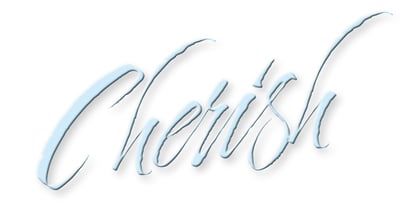 A gorgeous dry brush style that adds elegance and sophistication to your design creations.
 - Stained Glass by Funk King,
$5.00 Stained Glass can be used to created multi-layted effects reminiscent of stained glass.
 - EB Futuretro by Erik Bertell,
$9.95 Futuretro is a font that transfers you to a bygone age that never was.
 - AM Consist by Alexey Markin,
$50.00 This font I had, had only to wake up, sit down and draw it.
 - Westkreep by Pedro Teixeira,
$25.00 Westkreep is based on wood type with characters extremely wide relative to their height.
 - Boochie by Zang-O-Fonts,
$25.00Boochie is a fun font, created as a homage to 1960's movie posters. - Hebrew Rinat Kids by Samtype,
$34.00 This is font to help children read. The Diacritic Marks (Nikud) are 25% bigger.
 - Pinala by Typomancer,
$24.00 'Pinala', a playful script & sans fonts, contains light to bold weights for various designs.
 - QTSApril by QafType,
$30.00 April font was initially designed with a different style compared to other Arabic typefaces
 - Diskojuice by PizzaDude.dk,
$20.00Diskojuice is a font that just wants to party and burn up the dancefloor! - Old Towne Pro by RMU,
$40.00 Classic Western-style slab serif font extended to include Cyrillic and Greek letter forms.
 - Christmas by DNC,
$22.00This font enables users to spice up their seasonal greeting cards with Christmas symbols. - Golden Times by Intellecta Design,
$9.00a sort of cuts and dingbats from the 20's to 40's era - Monica by Weknow,
$25.00 Give a groovy fun simple rounded, fancy, a cute looks to any text project
 - Strandall by Patria Ari,
$15.00 Strandall is sharp display typeface inspired from warrior themes to support your brand/project.
 - LeeorPasta MF by Masterfont,
$59.00 This is what happens when you try to write with a bottle of sauce...
 - Jaipur by Vic Fieger,
$7.99This font was designed to resemble the Indo-Aryan scripts of the Indian subcontinent. - WarpLetunical by Ingrimayne Type,
$9.00 A warped version of the font Letunical, WarpLetunical has a Halloweenish feel to it.
 - LD Unique by Illustration Ink,
$3.00Download this "Unique" font…it'll add a whole new twist to your scrapbook journaling. - Rust Bucket by BA Graphics,
$45.00 A mild grunge, a simple distressed gothic with just enough roughness to be cool.
 - Avooka MF by Masterfont,
$59.00 The formal letter formal will have that impressive touch to you next annual report.
 - Paisley And Swirl Doodles by Outside the Line,
$19.0026 paisleys and 26 swirls to mix and match. All hand drawn of course. - Downtown Elegance - Personal use only

- Electrum by Tower of Babel,
$9.00 Electrum is an all-caps layered font that presents a plethora of permutations for any use. Inspired by handlettered signage of the 1950's and 60's, Electrum has one foot in the past and one in the present. Use a single weight, or mix and match weights to create a number of interesting and eye-catching combinations. The "lightning" weight is especially interesting and adds a bit of electricity to any design. Perfect for logos, packaging designs, or poster designs. Whatever the usage, Electrum can add some spark to your project!
 - Blackrocky by Letterara,
$18.00 Blackrocky is a natural dry brush font. a tough-looking font with natural strong brush touch ready to rock every design you make. this font has a striking look and a good flow font that can add a stylish to your designs. It’s perfect for logos, quotes, posters, packaging, movie title, youtube banner, clothing, and every other design which needs a strong touch. It is PUA encoded which means you can access all of the glyphs with ease! Add it confidently to your projects, and you will love the results.
