10,000 search results
(0.063 seconds)
- Crysh Graffiti by Fitrah Type,
$12.00 Crysh Graffiti is the newest typeface with a simple graffiti style. There are three styles of font. Regular, extrude, and line styles Inspired by a simple piece of graffiti. The entire typography has been designed to work on large sizes. This font is good to use on posters, zines, stickers, and t-shirts.
 - Screwby by Pink Broccoli,
$14.00 A slightly offbeat latin typestyle, Screwby started as a digitization of a film typeface called Surf by Lettergraphics. From there, this wonderful typeface was expanded into a giant family of fun widths and weights to play with: from spindly thin and light weights, to chunky bold and blacks. An all-around fantastic treat!
 - Clean Notes by The Arborie,
$11.00 Write beautifully and neatly with the Clean Notes font. It gives you the option to write beautiful and legible notes while maintaining a classic handwritten look. It's perfect for use in any note-taking app or computer. Think about using this font in a website or scrapbook to inject personality into any project.
 - Rigo by Katatrad,
$33.00 Rigo™ is a flexible family of modern sans serif. Rigo is characterized by some humanistic characteristics, its open part of negative space and its overall width make it highly legible and readable at small to large size. The openness helps Rigo to be a good performer on the screen as well.
 - Summer Fling by Comicraft,
$19.00 Summer Fling is a breezy brush script lettering font in the style of classic sign painting, complete with custom letter pairs and word ends to create authentic hand-painted feel. Consider this the perfect headline font for the Summer Blockbuster Romance you’re sure to pen in the warm, wine-soaked evenings ahead.
 - Shortline by Qwrtype Foundry,
$14.00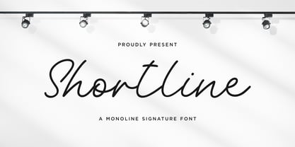 Proudly Present, Shortline Shortline is a Monoline Signature Font Shortline is perfect for product packaging, branding project, megazine, social media, wedding, or just used to express words above the background. Shortline also come with Multi-Lingual support. Enjoy the font, feel free to comment or feedback, send me PM or email. Thank you!
 - Stigma Halloween by Aldedesign,
$29.00 Stigma Halloween is a crafty and distinctive decorative font. With a combination of pixel-art and scary horror themes, this font has the potential to bring each of your creative ideas to the highest level! This font is PUA encoded which means you can access all of the glyphs and swashes with ease!
 - Starella Script by Mans Greback,
$59.00 Starella Script is a decorative typeface created by Måns Grebäck. It is bold, beautiful and works perfectly for majestic logotypes and graphics. Starella Script also includes alternate and swash letters, to give extra flexibility. Use underline to create a swash, example: S_tarella The typeface has support for all European, Latin based languages.
 - Brazil Pixo Reto by Just in Type,
$20.00In Brazil, young people sign their gang names on the top of São Paulo City buildings. Their letters are tall and structured just like the buildings that they have to scale. For them, typography has become an extreme sport. The font Brazil Pixo Reto pays homage to these new athletes of design. - Hypnotica by Deniart Systems,
$15.00 Hypnotize your audience! For a truly unusual eye-catching experience, this modern-day series, containing 52 geometrical and optical mofifs, can bewitch and fool the eyes with unexpected shifts in focus. Whether your documents are for print or screen, these symbols are sure to add a little fun to all your presentations.
 - Winterlady by Balpirick,
$15.00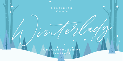 Proudly Present, Winterlady Font. Winterlady is a Beautiful Script Font. Winterlady is perfect for product packaging, branding project, business card, megazine, social media, wedding, or just used to express words above the background. Winterlady also multilingual support. Enjoy the font, feel free to comment or feedback, send me PM or email. Thank you!
 - Xspace by Artyway,
$14.00 I'm thrilled to present you a new futuristic typeface. Smooth humanistic forms and elongated proportions, modern trends dictate a new fashion in type design. Perfect for science research posters, modern futuristic logos, automotive type design and more. Check how it works and let me know, I am always glad to hear your opinion.
 - Candy Randy by Lauren Ashpole,
$15.00 Not inspired by any one thing, Candy Randy came about as an attempt to capture the feel of hours spent aimlessly perusing childrens' advertising and packaging from the early 1960s. It always reminds me a bit of Christmas and was named after an imaginary character in tales told to my youngest sister.
 - Westbum by Allouse Studio,
$16.00 Proudly Presenting, Westbum A Bold Handbrush Font. Westbum is perfect for any titles, logo, product packaging, branding project, megazine, social media, wedding, or just used to express words above the background. Westbum also come with Multi-Lingual Support. Enjoy the font, feel free to comment or feedback, send me PM or email.
 - Setir Paghoni by Attract Studio,
$20.00 Setir Paghoni is a modern serif font that uses unique ligatures to connect letters smoothly. Setir Paghoni comes with matching slanted trim. Perfect for adding a unique touch to wordmark logos, fashion headlines, editorial designs, branding projects, magazine titles and more. Included: 2 Weights (Roman & Oblique) PUA Encoded Ligatures Opentype Feature Multilanguange.
 - Kasih Putih by Tigade Std,
$15.00 Kasih Putih is a modern calligraphy font. It supports common international characters and comes with a set of alternates and ligatures. It is suitable for multiple projects from printed to digital products. It is nice to be printed on billboards, bottles or cups as well as for logos or design for apparel.
 - Timegoing by Allouse Studio,
$16.00 Proudly Presenting, Timegoing a Graffiti Street Font. Timegoing is perfect for any titles, logo, product packaging, branding project, megazine, social media, wedding, or just used to express words above the background. Timegoing come with Multi-Lingual Support. Enjoy the font, feel free to comment or feedback, send me PM or email. Thank You!
 - Hello Jack by Sipanji21,
$15.00 Hallo Jack is a funny, bold and cute display font with a sharp corner. Get inspired by its unique feel, and turn to add a lovely charm to any crafts project, this font suitable for any project about kids, children, or Student, like, book Cover, kids shirt, baby shower poster, and etc.
 - Linford by Yoga Letter,
$15.00 "Linford" is a very professional and elegant serif font. This font is very easy to use for all your work. This font comes with 8 elegant and attractive ligatures. This font can be used to promote all your business (branding, banners, posters, social media, hotel promotions, villas, companies, products, invitations, and more).
 - Backstreet by Letterara,
$12.00 Backstreet is a purely handwritten typeface with its own unique characteristics. It has an elegant, feminine style with good readability. Perfect for Valentine day, neon design, signatures, invitations, titles, and much more! To stay up to date for my latest job, follow me and let’s be friends because there will be many promos.
 - Billboard by Fenotype,
$19.95 Billboard is a swinging family of six fonts. The all-caps letters are soft and round but the letter shapes will keep your layout in order. The font has class-based kerning and automatic OpenType ligatures. To access the ligatures you only need to use an OpenType-aware application and write in CAPS.
 - Mothenary by Adante Creative,
$23.00 Introducing by Adante Creative Proudly Present, Mothenary Mothenary is A Beautiful Calligraphy Font Mothenary is perfect for product packaging, branding project, magazine, social media, wedding, or just used to express words above the background. Mothenary also multilingual support. Enjoy the font, feel free to comment or feedback, send me PM or email.
 - Dogiesland by Fype Co,
$14.00 Dogiesland! A cute and playful display font was created to bring a playful and little bit infantile feeling to any design. cute clean letters look simple and modern. All node was cleaned in fairly natural shape. Its friendly feel makes this font incredibly versatile, fitting a wide range of kids' design projects.
 - Sonderlina by Craft Supply Co,
$9.00 Sonderlina is a convenient and modern grotesk sans serif features low contrast details to cover small text purposes. It can be used to create almost all types of design projects like print materials. Just use your imagination and your project will become more alive and look great than ever with this typeface.
 - American Oak by Ian Barnard,
$15.00 I've always been drawn to the beautiful typography of whiskey, gin, rum & bourbon bottle labels, as they enhanced the history that is behind this aged old spirits. A combination of elegant scripts and rugged serifs, these labels give sensibility to the slow process which these spirits go through in the distilling process.
 - HU Masking Tape by Heummdesign,
$15.00 Masking tape, also known as painter's tape, is a type of pressure-sensitive tape made of a thin and easy-to-tear paper, and an easily released pressure-sensitive adhesive. It is available in a variety of widths. It is used mainly in painting, to mask off areas that should not be painted.
 - Bener by Illushvara,
$15.00 Bener is a stylist's elegant display font. Developt was basic in classic serif font brought to stylist with elegant style. Full glyphs uppercase with multilingual characters, perfectly made to be applied especially in logo, wedding, art gallery labels, magazines, greeting cards, fashion or more packaging perfume labels, or any type of promotion.
 - AT Glanela by Amera Type,
$15.00 The new fonts from Amera Type are designed in the latest styles and with more inspiration from contemporary typographic art. Glanela was created to complement our visual needs in writing titles, music, fashion and product branding Complete with lowercase and uppercase which have alternate and ligatures to complement every need, support 75+ languages
 - Steagal by insigne,
$24.75 I love geometric sans serifs, their crispness and rationality. Le Havre taps into this style, but for a while, I've wanted to create a font recalling the printed Futura of the 1940s, which seems to have an elusive quality all its own. After seeing an old manual on a World War II ship, I developed a plan for "Le Havre Metal" but chose to shelve the project due to Le Havre's small x-height. That's where Steagal comes in. When Robbie de Villiers and I began the Chatype project in early 2012 (a project which led one publication to label me the Edward Johnston of Chattanooga!), we started closely studying the vernacular lettering of Chattanooga. During that time, I also visited Switzerland, where I saw how designers were using a new, handmade aesthetic with a geometric base. I was motivated to make a new face combining some of these same influences. The primary inspiration for the new design came from the hand-lettering of sign painters in the United States, circa 1930s through 1950s. My Chatype research turned up a poster from the Tennessee Valley Authority in Chattanooga, Tennessee, which exhibited a number of quirks from the unique hand and style of one of these sign artists. Completing the first draft of Steagal, however, I found that the face appeared somewhat European in character. I turned then to the work of Morris Fuller Benton for a distinctly American take and discovered a number of features that would help define Steagal as a "1930s American" vernacular typeface--features I later learned also inspired Morris Fuller Benton's Eagle. The overall development of Steagal was surprisingly difficult, knowing when to deliberately distort optical artifacts and when to keep them in place. Part of type design is correcting optical illusions, and I found myself absentmindedly adjusting the optical effects. In the end, though, I was able to draw inspiration from period signs, inscriptions, period posters, and architecture while retaining just enough of the naive sensibility. Steagal has softened edges, which simulate brush strokes and retain the feeling of the human hand. The standard version has unique quirks that are not too intrusive. Overshoots have almost been eliminated, and joins have minimal corrections. The rounded forms are mathematically perfect, geometric figures without optical corrections. As a variation to the standard, the “Rough” version stands as the "bad signpainter" version with plenty of character. Steagal Regular comes in five weights and is packed with OpenType features. Steagal includes three Art Deco Alternate sets, optically compensated rounded forms, a monospaced variant, and numerous other features. In all, there are over 200 alternate characters. To see these features in action, please see the informative .pdf brochure. OpenType capable applications such as Quark or the Adobe Creative suite can take full advantage of the automatically replacing ligatures and alternates. Steagal also includes support for all Western European languages. Steagal is a great way to subtly draw attention to your work. Its unique quirks grab the eye with a authority that few typefaces possess. Embrace its vernacular, hand-brushed look, and see what this geometric sans serif can do for you.
 - Mrs Eaves XL Serif by Emigre,
$59.00 Originally designed in 1996, Mrs Eaves was Zuzana Licko’s first attempt at the design of a traditional typeface. It was styled after Baskerville, the famous transitional serif typeface designed in 1757 by John Baskerville in Birmingham, England. Mrs Eaves was named after Baskerville’s live in housekeeper, Sarah Eaves, whom he later married. One of Baskerville’s intents was to develop typefaces that pushed the contrast between thick and thin strokes, partially to show off the new printing and paper making techniques of his time. As a result his types were often criticized for being too perfect, stark, and difficult to read. Licko noticed that subsequent interpretations and revivals of Baskerville had continued along the same path of perfection, using as a model the qualities of the lead type itself, not the printed specimens. Upon studying books printed by Baskerville at the Bancroft Library in Berkeley, Licko decided to base her design on the printed samples which were heavier and had more character due to the imprint of lead type into paper and the resulting ink spread. She reduced the contrast while retaining the overall openness and lightness of Baskerville by giving the lower case characters a wider proportion. She then reduced the x-height relative to the cap height to avoid increasing the set width. There is something unique about Mrs Eaves and it’s difficult to define. Its individual characters are at times awkward looking—the W being narrow, the L uncommonly wide, the flare of the strokes leading into the serifs unusually pronounced. Taken individually, at first sight some of the characters don’t seem to fit together. The spacing is generally too loose for large bodies of text, it sort of rambles along. Yet when used in the right circumstance it imparts a very particular feel that sets it clearly apart from many likeminded types. It has an undefined quality that resonates with people. This paradox (imperfect yet pleasing) is perhaps best illustrated by design critic and historian Robin Kinross who has pointed out the limitation of the “loose” spacing that Licko employed, among other things, yet simultaneously designated the Mrs Eaves type specimen with an honorable mention in the 1999 American Center for Design competition. Proof, perhaps, that type is best judged in the context of its usage. Even with all its shortcomings, Mrs Eaves has outsold all Emigre fonts by twofold. On MyFonts, one of the largest on-line type sellers, Mrs Eaves has been among the 20 best selling types for years, listed among such classics as Helvetica, Univers, Bodoni and Franklin Gothic. Due to its commercial and popular success it has come to define the Emigre type foundry. While Licko initially set out to design a traditional text face, we never specified how Mrs Eaves could be best used. Typefaces will find their own way. But if there’s one particular common usage that stands out, it must be literary—Mrs Eaves loves to adorn book covers and relishes short blurbs on the flaps and backs of dust covers. Trips to bookstores are always a treat for us as we find our Mrs Eaves staring out at us from dozens of book covers in the most elegant compositions, each time surprising us with her many talents. And Mrs Eaves feels just as comfortable in a wide variety of other locales such as CD covers (Radiohead’s Hail to the Thief being our favorite), restaurant menus, logos, and poetry books, where it gives elegant presence to short texts. One area where Mrs Eaves seems less comfortable is in the setting of long texts, particularly in environments such as the interiors of books, magazines, and newspapers. It seems to handle long texts well only if there is ample space. A good example is the book /CD/DVD release The Band: A Musical History published by Capitol Records. Here, Mrs Eaves was given appropriate set width and generous line spacing. In such cases its wide proportions provide a luxurious feel which invites reading. Economy of space was not one of the goals behind the original Mrs Eaves design. With the introduction of Mrs Eaves XL, Licko addresses this issue. Since Mrs Eaves is one of our most popular typefaces, it’s not surprising that over the years we've received many suggestions for additions to the family. The predominant top three wishes are: greater space economy; the addition of a bold italic style; and the desire to pair it with a sans design. The XL series answers these requests with a comprehensive set of new fonts including a narrow, and a companion series of Mrs Eaves Sans styles to be released soon. The main distinguishing features of Mrs Eaves XL are its larger x-height with shorter ascenders and descenders and overall tighter spacing. These additional fonts expand the Mrs Eaves family for a larger variety of uses, specifically those requiring space economy. The larger x-height also allows a smaller point size to be used while maintaining readability. Mrs Eaves XL also has a narrow counterpart to the regular, with a set width of about 92 percent which fulfills even more compact uses. At first, this may not seem particularly narrow, but the goal was to provide an alternative to the regular that would work well as a compact text face while maintaining the full characteristics of the regular, rather than an extreme narrow which would be more suitable for headline use. Four years in the making, we're excited to finally let Mrs Eaves XL find its way into the world and see where and how it will pop up next.
 - VTC-SumiSlasherOne - Personal use only

- Red Nose Day - Personal use only

- VTC-KomikSkans-Two - Personal use only

- Planet Benson 2 - Unknown license

- HaruNami by PSY/OPS,
$32.00 HaruNami (“spring wave”) fuses Japanese ornamentation with the Roman alphabet. All the motifs in the typeface are based on traditional Japanese wave ornamentation. HaruNami has a unique stylistic system that ranges from Simple to Ornate. The Simple font is a purely functional sanserif that is ready to use as text type. The three other styles, Decorative, Embellished and Ornate, progressively apply the wave ornamentation to the capital letters. HaruNami Complete ships as a unified OpenType font, and as a set of individual fonts. If you're using an application that supports OpenType features, we recommend using the Unified font. The three decorated styles will be accessible as feature sets. Otherwise, you can install the individual fonts and use them in any application. (It is also all right to install the Unified and individual fonts simultaneously.)
 - Hiruko by Thinkdust,
$10.00 With 15 different styles and support for all sorts of languages, Hiruko is the open and easy sort of font that can be used in almost any situation, as long as you want your message to be readable. Smooth, simple and clear, Hiruko takes inspiration from both Swiss and Japanese styles, focusing on minimalism and function within its form, the idea that less is more and the careful, exquisite craftsmanship that makes such minor changes have a big impact. From extra-light to thick, black weights, in italics or in outlines, Hiruko can be used to convey messages in such a variety of styles that you’ll never be disappointed. Alternatively if you're looking for something a little more comprehensive, why not check out the follow up to this family Hiruko Pro.
 - Decrypt H1 by Type Innovations,
$39.00 Say hello to Decrypt H1—a geometric typeface that features highly stylized capitals with sharp corners, circular forms and generous proportions. Specifically created for visual impact—use Decrypt H1 when you want your words to stand out from the rest of the crowd. The concept is modern, futuristic and non-traditional. Perfect for display text, logos and headings. The development of Decrypt H1 started in 1997, inspired by Alex Kaczun’s best selling grotesque font family called Contax Pro. Decrypt H1 is specifically introduced here as a bold weight, but Alex plans to expand the design to include many weights, styles and alternative design treatments. Stay tuned! If you like Decrypt H1—check out it’s alternate twins Decrypt 01, Decrypt 02 and all of Type Innovations fonts at: http://www.myfonts.com/person/Alex_Kaczun/
 - Putrey by Alit Design,
$11.00 Introducing PUTREY Typeface PUTREY font is designed with a modern concept that is simple and dynamic. The sans serif style adopted by the PUTRAY font is a 2022 style font, has a unique swash alternative, has a large selection of ligatures. In addition. Sans Serif typefaces such as “PUTREY typeface” are very easy to apply to any design, especially those with an elegant and smooth concept, besides that this font is very easy to use both in design and non-design programs because everything changes and glyphs are supported by Unicode (PUA). The PUTREY typeface contains 837 glyphs with many unique and interesting alternative options. Plus, there's a cool sans serif font family for header and description text from light to black. In the poster preview all the letters are in the PUTREY typeface.
 - Soprani Variable by insigne,
$129.99 "Step into a world where the 1920s meet the future with Soprani—a typeface that seamlessly blends vintage charm and modern sophistication. Drawing inspiration from a distinctive plaque unearthed in New Zealand, Soprani showcases serifs that flare and shimmer, capturing the essence of art nouveau and arts & crafts in a contemporary light. Dive into its rich OpenType features, granting designers unparalleled flexibility to bring their visions to life. Its condensed yet elegant letterforms are the perfect fit for everything from artful table books and stylish menus to dynamic media showcases in TV and film. Spanning from the graceful subtlety of its thin variant to the undeniable boldness of the black, Soprani is diverse and dynamic. Soprani isn't just a typeface—it's a revolution in design. Production assistance by Lucas Azevedo and ikern.
 - Quanton by Mans Greback,
$49.00 Quanton is a clear serif typeface in a modern style. Its sharp edges and soft curves combines to the perfect balance of tradition and innovation. Quanton has character and personality, while keeping regular and maintaining its legibility, making for an optimal headline and bodytext style. The Quanton family consists of eight typeface styles: The weights Thin, Medium, Bold and Black, and each thickness as Italic. The font is built with advanced OpenType functionality and has a guaranteed top-notch quality, containing stylistic and contextual alternates, ligatures and more features; all to give you full control and customizability. It has extensive lingual support, covering Arabic and all Latin-based languages, from North Europe to South Africa, from America to South-East Asia. It contains all characters and symbols you'll ever need, including all punctuation and numbers.


