10,000 search results
(0.02 seconds)
- Erased Typewriter 2 by Intellecta Design,
$27.00
- Linea Nera NF by Nick's Fonts,
$10.00 - Erased Figgins Brute by Intellecta Design,
$21.90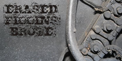
- Mardi Gras Improved by Solotype,
$19.95 - Eva Antiqua SG by Spiece Graphics,
$39.00
- HT Fera Text by Hype Type,
$34.00
- Talking to the Moon - Personal use only

- Janda Closer To Free - Personal use only

- KR Off To Work! - Unknown license

- Talk to the hand - Unknown license

- An ode to noone - Unknown license

- Balls to the Wall - Unknown license

- KR Coffee To Go - Unknown license

- KR Back To School - Unknown license

- Back to the Futurex - Unknown license

- Tied To A Stick by PizzaDude.dk,
$20.00
- Too Sweet To Eat by Cuda Wianki,
$20.00
- How To Consume Oxygen by Vic Fieger,
$8.99 - RM True To Type by Ray Meadows,
$19.00
- KG Next To Me by Kimberly Geswein,
$5.00
- Music To My Eyes by Comicraft,
$19.00
- Nouveau To Go JNL by Jeff Levine,
$29.00
- Fd Bored To Death by Fortunes Co,
$19.00
- East To West JNL by Jeff Levine,
$29.00
- Janda Closer To Free by Kimberly Geswein,
$5.00
- Back To Teacher Outline by NJ Studio,
$19.00
- Go To Town JNL by Jeff Levine,
$29.00
- KG Ways to Say Goodbye - Unknown license

- KG Something to Believe In - Personal use only

- Set Fire to the Rain - Personal use only

- KR Back To School Dings - Unknown license

- Ms to try a bon? - Unknown license

- KG Something To Believe In by Kimberly Geswein,
$5.00
- CA Hail To The King by Cape Arcona Type Foundry,
$19.00
- Set Fire To The Rain by Kimberly Geswein,
$5.00
- KG Ways To Say Goodbye by Kimberly Geswein,
$5.00
- Sevil alias Esra Lite - Unknown license

- Mini Pics Mardi Gras by NicePrice Font Collection,
$4.99 - Gras Vibert Handtooled Capitals by Intellecta Design,
$34.95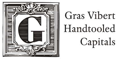
- Crash Waves Lead To Skinny Font - 100% free


