10,000 search results
(0.031 seconds)
- Mesintwa by Ilhamtaro,
$14.00 MESINTWA is a font that is basically a classic serif font then to make it different from other serifs is to give the effect as if it were a letter on a letterpress machine, it will add a vintage impression because remembering that letterpress machines were the beginning of a printing press. To enable the OpenType Stylistic alternates, you need a program that supports OpenType features such as Adobe Illustrator CS, Adobe Indesign & CorelDraw X6-X7. Guides to access all alternates glyphs : http://adobe.ly/1m1fn4Y Cheers!
 - NORWALKE by Unitype Studio,
$19.00 Introducing NORWALK - Modern Serif Font. Our latest digital modern serif font - a sleek and sophisticated typeface perfect for any creative project. With clean lines and elegant curves, this font is sure to make your designs stand out. Get your hands on it today and elevate your designs to the next level! Ready to take your design game to the next level? Whether you're creating a logo, website, or printed materials, this font is the perfect choice for adding a touch of class and sophistication.
 - Adora Bella by PeachCreme,
$20.00 We're excited to unveil our new beautiful script font, "Adora Bella." "Adora Bella" was inspired by clean handwriting with a natural flow and works well for various designs, including wedding stationery, Instagram quotes, modern logos, packaging, websites, and many more. "Adora Bella" features fabulous beginning and ending lowercase swashes as well as lowercase heart swashes. A connecting heart swash may be used to tie two words or letters together; however, it is important to remember that this is intended to be used for joining lowercase words.
 - Loppemarked by PizzaDude.dk,
$17.00 Loppemarked is Flea market in danish, and that’s where I got the inspiration to do these fonts from! Headline - chunky serifs here and there, and some are missing! No attempt to get it right…anywhere! Text - The letters are scribbled quickly, leaving not much attention to accuracy. Sans - With this font, there has been some effort to hit the same width of strokes, but it is still off here and there. All in all, the sweet innocence in these letters…I love it! <3</p>
 - Craftstone by Ronin Design,
$15.00 Introducing Craftstone, a delighfully fun and whimsical font designed to infuse a sense of joy into your projects. Perfect for chidlren's designs, playful themes, and relaxed settings, Craftstone brings a lighthearted touch to your creations. This font's unique personality shines though with its alternates, allowing you to craft a truly distinctive abd charming look. Whether you're creating for kids or seeking a laid-back vibe, Craftsone's playful spirit and versatile alternates make it the ideal choice for adding a tpuch of creative flair to you designs.
 - Toews by Blank Is The New Black,
$10.00 Toews is a continuation of the work started with Versteeg, Huet, and Niemi. It combines the elements of the letterforms found in Huet and Niemi and uses the letterform outlines to create shapes that intersect with themselves. While Huet and Niemi can easily be outlined in most design programs, Toews outlining would not work smoothly in most programs, which is why an outlined version is available. The two styles are carefully designed to be able to transition from one to another smoothly within the same type field.
 - Bad Girl by Scholtz Fonts,
$21.00Bad Girl was designed to appeal to the young consumer and the young-at-heart. While clearly feminine, it manages to combine a charming naïveté with in-your-face rebelliousness. The awkward, rather self-involved character shapes have a definite gauche appeal. Bad Girl has a gamine-like insouciance with a touch of wickedness. In contrast to its naive appearance, Bad Girl has been carefully crafted, letterspaced and kerned and contains a full character set of 237 characters. The font comes in two styles, regular and light. - Trend Rough by Latinotype,
$20.00 Trend , Trend Hand Made & Trend Rough is a font made of layers, taking as a basis a sans and a slab font. It is the result of observation, search and study of the last global trends. Trend tries to capture the aesthetics of fashion or even fashion itself, integrating elements of a very popular and current trend. It is a typeface designed to be used without need to add anything external to it, because it has all components required for this. Trend is trending.
 - Vintage Paradise by Balpirick,
$15.00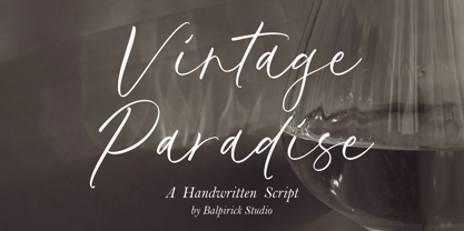 Introducing by Balpirick Studio. Vintage Paradise is a Handwritten Script Font that's perfect for adding a personal touch to your design projects! With its natural, organic feel and unique character. Crafted with care and attention to detail, this font is incredibly versatile and can be used for a range of design projects, including logos, branding, invitations, and more. Its modern, handwritten style gives it a unique character that's sure to make an impact. - also multilingual support Enjoy the font! Feel free to comment or feedback! Thank you!
 - Taurunum by Kostic,
$40.00 The initial idea for this font came when a friend of mine asked me to create a logo for a sports team that he was forming. Since it was a martial arts competitive sport, bold and striking lettering was needed to reflect that. When the logo was finished, I was really pleased whith the letters so I decided to create the entire font. Taurunum is made with intention to be used for display design (logos, posters, etc.), and combining the weights should give best results.
 - Spooky Ghoster by Javatypestd,
$10.00 Introducing Spooky Ghoster Font with a scary horror theme. Masterfully designed to become a true favorite, this font has the potential to bring each of your creative ideas to the highest level Spooky Ghoster best uses for Logotype, heading, cover, poster, logos, quotes, product packaging, header, merchandise, social media & greeting cards and many more. This font is also support multi language. To access the alternate glyphs, you need a program that supports OpenType features such as Adobe Illustrator CS, Adobe Photoshop CC, Adobe Indesign and Corel Draw.
 - Rilke by Pelavin Fonts,
$20.00 Rilke, is the lettering used by Gustav Klimt on the 1st Vienna Secession poster in 1898 and is named for Klimt’s contemporary the poet Rainer Maria Rilke. The Vienna Secession was a group of artists whose motto was "to every age its art and to art its freedom." Their goal was to create a new style not based upon any historical influence. Its subtle curving strokes and the idiosyncratic set of the various characters create an elegant lightness which lends itself well to poetry, inscription
 - Glazed Glory by Balpirick,
$15.00 Glazed Glory is a Bold Handbrushed Font. This display font features bold, handbrushed strokes, giving it a unique and organic feel. Each letter is meticulously designed to convey a sense of craftsmanship and artistic flair. With its expressive strokes and bold character, this font is perfect for adding a charming and distinctive touch to a wide range of design projects, from posters and logos to invitations and social media graphics. - also multilingual support Enjoy the font! Feel free to comment or feedback! Thank you!
 - Royale Kingdom by Balpirick,
$15.00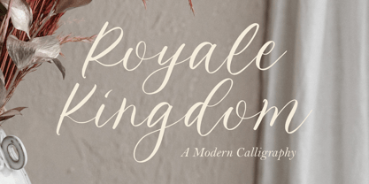 Introducing by Balpirick Studio. Royale Kingdom is a Modern Calligraphy Font that's perfect for adding a touch to your design projects! With its natural, organic feel and unique character. Crafted with care and attention to detail, this font is incredibly versatile and can be used for a range of design projects, including logos, branding, invitations, and more. Its modern, handwritten style gives it a unique character that's sure to make an impact. - also multilingual support Enjoy the font! Feel free to comment or feedback! Thank you!
 - Mix String Cheese by Mix Fonts,
$13.00 Flexi. Bendy. Stringy. Rubbery. Introducing Mix String Cheese – the ultimate handwritten font for adding personality and playfulness to your designs. This font is perfect for logos, titles, and packaging design, and comes with a full range of characters including uppercase letters, punctuation, numbers, and special symbols and accents. Mix String Cheese is a versatile font that is sure to bring fun and creativity to all of your projects. Don’t settle for boring, generic fonts – add some flavor to your designs with Mix String Cheese.
 - Robolt by Typesketchbook,
$39.00 It starts with the idea that different things can be mixed infinitely. Robolt comprises four designs with multiple options to add variety and playfulness. Battery and Machine have a retro touch which reminds one of toy labels from the '80s, while Vintage is rendered a Didot style with different textures to choose. Streamlined Handdrawn style is nicely put in contrast with the solid types. Elements are also available to complement the letters. The set is made up of 29 letters of four families to serve your creativity.
 - Nevolasty by Glukfonts,
$10.00 Nevolasty is a geometric sans serif (uppercase) family. It comes in 9 weights - from Thin to Black. Perfect for graphic design, branding, packaging design but very versatile. With over 1000 alternate glyphs, this font has extensive Latin language support for Western, Central, and Eastern European and gives text a unique, elegant and modern feel. Try magical Stylistic Set01 with more extreme automatic contextual alternates. Technical info: To be able to use Nevolasty fonts you need to have installed program with Opentype features (Contextual Alternates) support.
 - Hoppa by Soar Studio,
$29.00 Hoppa is a clean geometric typeface with a fun twist. It was carefully designed to the modern standards like big x-height and short descenders. With its smooth curves and loop-alike shapes, Hoppa will add a fresh and lively feel to your designs. Although it has been created to be used as a display face, it performs well in longer texts. Thanks to alternate glyphs, font gets more legible, neutral look. Hoppa supports most of Latin and Cyrillic languages and includes range of OT features.
 - Red Hot Mama NF by Nick's Fonts,
$10.00The Zanerian Manual of Alphabets and Engrossing, published in numerous editions since 1895, featured many elegant and elaborate script typefaces. However, it seems that, from time to time, calligraphers just want to have fun, and this little number is definitely fun. Light, lively and just a little loopy, Red Hot Mama is sure to add just the right amount of spice to your special project. Both versions contain the complete Unicode 1252 (Latin) and Unicode 1250 (Central European) character sets, with localization for Romanian and Moldovan. - Angela Sweet by Illushvara,
$12.00 Hello, Happy to share our new font "Angela Sweet" is a beautiful modern font, described by an crafty touch, perfect for your favorite projects. Fall in love with its incredibly distinct and timeless style and use it to create spectacular designs! Angela Sweet is perfect for product packaging, branding project, magazine, social media, wedding, or just used to express words above the background Features : - Uppercase and lowercase - Numbers - Symbols - Multilingual Accent If you have any question, don’t hesitate to contact me. Happy Designing !!! Thank You, Bayu Suwirya
 - Fathoni by Letterfreshstudio,
$14.00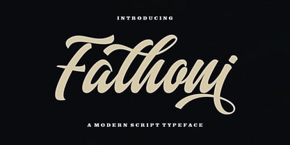 Fathoni is a modern handwritten calligraphy script. It contains the complete set of lowercase, uppercase, alternative, ligature, punctuation, numbers, and multilingual support. Work in harmony with Fathoni to create extraordinary calligraphy creations. You are welcome to use it for various purposes: logos, wedding invitations, titles, signatures, t-shirts, letterheads, nameplates, labels, posters, and more. How to access all alternative characters, using Windows Character Map with Photoshop https://www.youtube.com/watch?v=Go9vacoYmBw How to access all alternative characters using Adobe Illustrator: https://www.youtube.com/watch?v=XzwjMkbB-wQ
 - Salvador History by Balpirick,
$15.00 Introducing by Balpirick Studio. Salvador History is a Handbrushed Script Font that's perfect for adding touch to your design projects! With its natural, organic feel and unique character. Crafted with care and attention to detail, this font is incredibly versatile and can be used for a range of design projects, including logos, branding, invitations, and more. Its modern, handwritten style gives it a unique character that's sure to make an impact. - also multilingual support Enjoy the font! Feel free to comment or feedback! Thank you!
 - Kelly by Kaligra.co,
$29.00 Kelly is Sans serif Version of Mikela Typeface. It is a Bold Minimalist Elegant Modern vintage font with beautiful ligatures, tons of special alternative glyphs, ornament and multilingual support. It's a very versatile font that works great in large and small sizes. Perfect for branding projects, Logo design, Clothing Branding, product packaging, magazine headers, or simply as a stylish text overlay to any background image. HOW TO ACCESS ALTERNATE CHARACTERS Open glyphs panel: In Adobe Photoshop go to Window - glyphs In Adobe Illustrator go to Type - glyphs
 - Jana Thork by Outras Fontes,
$26.90 Jana Thork is a synthesis of stone engraved capital letterforms and uncial and half-uncial calligraphic styles. The idea of the typeface designer Ricardo Esteves was to seek for the limits between our uppercase and lowercase mental concepts. This family can be useful to compose titles, short texts, labels and letterings that need to look attractive to the eye. The family includes Regular and Bold styles, so it can be used in graphic designs that need more complex hierarchic relations or greater visual impact.
 - Ghost Halloween by Ake,
$18.00 Halloween Font is a delightful brush-style display font. With its cute and charming appeal, this typeface is perfect for adding a touch of whimsy to your designs. The authentic brush strokes give it a personal and realistic feel, making it an ideal choice for various creative projects. From Halloween-themed designs to children's books, party invitations, posters, and more, Ghost Halloween Font will bring a playful and engaging vibe to your creations. Get ready to make your designs stand out with this adorable and versatile font!
 - dT Delicatta by dooType,
$40.00 Easy to use, but hard to miss. That’s dT Delicatta. An elegant script face that adds a special touch to any message. Script typefaces usually come packed with endless features and, more often then not, all those possibilities take their toll on the designer or art director. With usability in mind, we kept dT Delicatta simple and straightforward to use while delivering refined shapes that enhance your or your client’s communication. dT Delicatta is a revised, improved and virtually new font of our old classic Delicatta
 - Rockeby SemiSerif by My Creative Land,
$25.00 Rockeby SemiSerif is a font family that joins a well known collection - Rockeby Typography Toolbox. With 14 fonts included, it can be used for any sort of design project including but not limited to branding, websites, brochures, greeting cards etc. Rockeby SemiSerif Rough has a unique feature - the grunge texture that is applied not only to the letters but to the surrounding space as well. You can successfully mix and match all 50 fonts within Rockeby Typography Toolbox to get your design a stylish look.
 - Sessions by Afrojet,
$19.00 Afrojet Type Foundry presents Sessions, a heavyweight modular typeface with a quirky personality. The design is a fresh reimagination of Joseph Albers' classic Kombinationsschrift alphabet. It utilizes modular, repeating stylized forms to bring dimensionality and personality to the page. Sessions takes advantage of OpenType’s Stylistic Alternates feature with: two numeral options (cap-height and x-height), the option to ‘turn off’ the splayed bottoms of certain glyphs, and numerous alternate characters. All together, these options allow you the designer to create unique and custom designs.
 - Alota by Burntilldead,
$14.00 Say hi to “Alota” retro typeface. Inspired by 70’s design styles, a good decade where we saw many calm colors with groovy, bold, 3D and round shape. This font is very easy to use with hundreds of stylistic alternate (ss01-ss12) & powered with opentype feature. The font really bring a good statement for your logo design and can be the image of a design. Alota is very unique and easy to apply to any media; t-shirts, posters, sign boards, and social media needs.
 - Relevance by Chromatype Studio,
$20.00 Every Weight of font can create relevance for any purpose and feel, RELEVANCE is a geometric grotesque sans serif typeface that was created to connect that. done with modern appeal to blend with modern needs. Ranging from extra light to black weights, Relevance offers many possibilities to be applied in many graphic or editorial projects. The lighter weights are suitable for short paragraphs, and the heavier weights are perfect for headlines, perfectly suitable for display purposes such as book covers, web headlines, branding, or editorial.
 - Grindylow by Hanoded,
$15.00 In English folklore (in particular that of Yorkshire and Lancashire), Grindylow is a creature that dwells in rivers and lakes and is said to grab children who come too close to the water’s edge and drown them. It is thought the name Grindylow may be connected to the monster Grendel. Grindylow font does not grab children; it is a rather messy handmade brush font. I used a cheap brush and Chinese ink to create the glyphs. Comes with discretionary double letter ligatures for the lower case.
 - Gill Floriated Capitals by Monotype,
$29.99 Gill Floriated is based on a single character which Eric Gill drew as a decorated initial for use on a specimen setting of his Perpetua type. Although Gill was at first reluctant to produce a full alphabet, Monotype advisor Stanley Morison was able to persuade him to draw a few more characters from which the Type Drawing Office was able to create a full set. Issued in 1937 for display casting, it was revived by Monotype in 1995 for electronic publishing. Best used sparingly as dropped initials.
 - Ranger Script by Letterfreshstudio,
$12.00 Ranger Script is a modern handwriting calligraphy script. Contains a complete set of lowercase, uppercase, alternative, ligature, punctuation, numbers, and multilingual support. Works in harmony with Ranger Script to create awesome calligraphy creations. You are welcome to use it for various purposes: logos, wedding invitations, titles, signatures, t-shirts, letterheads, signboards, labels, posters etc. How to access all alternative characters, using Windows Character Map with Photoshop: https://www.youtube.com/watch?v=Go9vacoYmBw How to access all alternative characters using Adobe Illustrator: https://www.youtube.com/watch?v=XzwjMkbB-wQ
 - Whitehaven by Greater Albion Typefounders,
$8.95 Whitehaven is the spirit of the Art Deco movement made into a very solid and blocky Sans Serif font. The name owes its inspiration to Whitehaven Mansions, a block of flats where that greatest of 1930s detectives, Hercule Poirot lived. Use this to make bold statements, to give posters and designs a taste of thee 30s, and wherever you want to be clear and definitive. Whitehaven is offered in two widths and a range of embossed and engraved styles for flexibility in design work.
 - Crust and Crumbs Brush by Redy Studio,
$10.00 Discover the perfect pairing for your culinary creations with the Crust and Crumbs Foodie Font Duo, featuring a harmonious blend of rounded sans-serif and expressive brush fonts. Whether you're a food blogger, restaurant owner, or a passionate home cook, this font duo is designed to add a delectable touch to your food-related designs. Feel free to give me a message if you have a problem or question. Thank you so much for taking the time to look at one of our products. ~Redy
 - Blank Manuscript by Aah Yes,
$14.95Blank Manuscript allows you to produce sophisticated musical scoresheets even on basic Word Processors - anything from simple plain staves to complex full-page orchestral scores of your own design, to write in the notation yourself. The basic stuff is really easy and straightforward, but there's some quite advanced things you can do as well. So Copy and Save these Instructions. • The main stuff is simple and tends to follow the initial letter. Treble, Bass and Alto clefs are on upper case T B A (there are more clefs, below). The 5 Lines for the clefs are on L or l. • A small v will give a small vertical line (like a bar line) and a Big U will give a Big Upright - these can start or end a line or piece. • Time Signatures - type the following letters: Think of W for Waltz and it's easy to remember that 3/4 time is on W. Then from that they go up or down together like this: V=2/4 W=3/4 X=4/4 Y=5/4 Z=6/4 Compound Times are on H I J K like this: H=3/8 I=6/8 J=9/8 K=12/8 Common Time and Cut Common symbols can be found on semi-colon and colon respectively (all begin with Co- ). 2/2 3/2 are on lower case a and b, 7/4 and 7/8 are on lower case c and d, 5/8 is on small k (think POL-k-A) • Flat signs are on the numbers. Flat signs on LINES 1 to 5 are on numbers 1 to 5. Flat signs on SPACES 1 to 5 are on numbers 6 to 0 (space 1 being above line 1, space 5 being above the top line of the stave). Sharp signs are on the letters BELOW the long-row numbers. Which is q w e r t for the sharp signs on Lines 1 to 5, and y u i o p for sharp signs on spaces 1 to 5. Doing it this way means it works the same for all clefs, whether Treble, Bass, Alto, Tenor or any other. Sharp and Flat Signs always go in this order, depending on how many sharps or flats your key signature requires: Treble Clef Sharps t i p r u o e Flats 3 9 7 4 2 8 6 Bass Clef Sharps r u o e t i w Flats 2 8 6 3 1 7 = Alto Clef Sharps o e t i w r u Flats 7 4 2 8 6 3 1 • Guitar Chord Boxes are on G and g (G for Guitar) Upper Case G has a thick line across the top Lower case g has an open top, for chords up the fretboard TAB symbols are available: Six-string Tablature is on s & S for Six. Four-string Tablature is on f & F for Four. (Lower case has the "TAB" symbol on it, Upper Case has just the lines to continue.) Five-string tablature, is on lower case "j" (as in BAN-j-O) and of course L or l will continue the 5 lines. •RARE CLEF SIGNS including Tenor Clef, are on various punctuation marks, i.e. dollar, percent, circumflex, ampersand & asterisk, above the numbers 4 to 8. NOTE: The important symbols were kept on the letter and number keys, which are fairly standard all over, but some of the less important symbols are on various punctuation keys, which in different countries are not the same as on my keyboard. If it comes out wrong on your system, all I can say is it's right on the systems we've tried, and they'll be in here somewhere, probably on a different key. CLOSING THE ENDS OF THE LINES and BAR-LINES is done with the 3 varieties of brackets - brackets, brace and parentheses - Left/Right for the Left/Right end of the line. Parentheses L/R () which are above 9, 0 give a clef with a small vertical upright (the same as a bar line). Brace L/R and Brackets L/R (both on the 2 keys to the right of P on my keyboard) will close off a staff line with tall upright bars. Brace gives a double upright - one thick, one thin. Brackets give a single tall upright. A Big Upright is on Big U, (Big U for Big Upright) and a small vertical line is on small v (small v for small vertical). The Big Upright is the maximum height, and the small vertical is exactly the same height as a stave. And there's a tall upright Bar, on Bar (which is to the left of z on my keyboard, with Shift,) which is the same height as the bar on upper case U but twice as broad. • There's a staff intended for writing melodies, which is a little bit higher up than an ordinary treble clef giving a space underneath to put lyrics in - on m and M for Melody line. Lower case has the Treble Clef on, Upper case M has just the higher-up staff lines with no clef. (Use mMMMMMMM etc.) However this clef will be in the wrong place to put in sharp and flat signs, key signatures and so on, so if you use this clef you'll have to write the sharps, flats and key signature yourself. There's also a clef that's smaller (less tall) than the ordinary clef, but with the same horizontal spacing so it will align with other standard-sized clefs - on slash (a plain clef) and backslash (with a Treble Clef). • There are some large brackets for enclosing groups of staves, such as you'd use on large orchestral scores, on Upper Case N O P Q R, which can aid clarity. N and O on the left, Q and R on the right. P is a Perpendicular line to be used on both sides to increase the height of the enclosure, in this way but with the staff lines in between: N Q P P P P P P O R OTHERS —————————————— • Repeat marks are on comma (left) and period/full stop (right). • Hyphen is left as a sort of hyphen - it's a thin line like a single staff line, with the same horizontal spacing as ordinary staff lines - in case you want to draw a line across for a Percussion Instrument, or a Title or Lyric Line. • Space is a Space, but with HALF the width or horizontal spacing as ordinary staff lines, so 2 space symbols will be the same width as a clef symbol or line. • Grave (to the left of 1 on the long row, or hold down Alt and type 0096 then let go) gives a staff line that is one eighth the width of an ordinary staff line. • If you want manuscript in a clef and key which requires a flat or sharp sign in the space underneath the 5 lines, they’re on = equals and + plus . SYMBOLS • Many of these symbols will only be useful if you have worked out in advance which bars will need them, but they are here in case you've done that and wish to include them. • Symbols for p and f (piano and forte) are on 'less than' and 'greater than' < > (above comma and full stop) and m for mezzo is on Question, next to them. They can be combined to make mp, mf, ff, pp, etc. These signs -- and other signs and symbols like Pedal Sign, Coda Sign and so on -- can be found on various punctuation mark keys, including above 1, 2, 3 in the long row, and others around the keyboard. There's a sort of logic to their layout, but in different countries the keys are likely to give different results to what is stated here, so it's probably best to just try the punctuation and see if there's any you might want to use. (But on my keyboard a Coda sign is on circumflex - because of the visual similarity. Pedal sign is on underscore. A "Sign" symbol is on exclamation mark.) They were only included in case you really need them to be printed rather than handwritten. • However, a Copyright symbol is deemed necessary, and also included are a "Registered" symbol and a TradeMark symbol. They are found in the conventional places, and can be accessed by holding down ALT and typing 0169, 0174 or 0153 respectively in the numberpad section and letting go. • Staff lines with arco and pizz. above are on capital C and D respectively ---C for ar-C-o. • An empty circle above a staff line (to indicate sections by writing letters A, B, C or 1,2,3 inside for rehearsal marks) is on n. The actual signs for an A, B, C and D in a circle above the staff line can be produced by holding down ALT and typing 0188, 0189, 0190 and 0191 respectively and letting go. • The word "Page", for indicating page numbers, is on the numbersign key. • The two quotes keys, (quote single and quote double) have symbols representing "Tempo is", and "play as triplets", respectively. • INSTRUMENT NAMES There's a whole lot of Instrument Names built in (over a hundred) which can be printed out above the clef, and you do it like this. Hold down Alt and type in the given number in the numberpad section, then let go. For Piccolo it's 0130, for Flute it's 0131, Cornet is on 0154, Violin is on 0193, and the numbers go up to over 0250, it's a fairly complete set. There's also a blank which is used to align un-named clefs on 0096. Put them at the very beginning of the line for the best results. Here they are: WOODWIND Piccolo 0130 Flute 0131 Oboe 0132 Clarinet 0133 Eng Horn 0134 Bassoon 0135 Soprano Sax 0137 Alto Sax 0138 Tenor Sax 0139 Baritone Sax 0140 Saxophone 0142 Contrabassoon 0145 Recorder 0146 Alto Flute 0147 Bass Flute 0148 Oboe d'Amore 0149 Cor anglais 0152 Pipes 0241 Whistle 0242 BRASS Cornet 0154 Trumpet 0155 Flugelhorn 0156 Trombone 0158 Euphonium 0159 Tuba 0161 French Horn 0162 Horn 0163 Tenor Trombone 0164 Bass Trombone 0165 Alto Trombone 0166 Piccolo Cornet 0167 Piccolo Trumpet 0168 Bass Trumpet 0170 Bass Tuba 0171 Brass 0172 VOICES Vocal 0175 Melody 0176 Solo 0177 Harmony 0178 Soprano 0179 Alto 0180 Tenor 0181 Baritone 0182 Treble 0183 Bass 0197 (see also PLUCKED STRINGS) Descant 0184 Mezzo Soprano 0185 Contralto 0186 Counter Tenor 0187 Lead 0206 BOWED STRINGS Strings 0192 Violin 0193 Viola 0194 Cello 0195 Contrabass 0196 Bass 0197 Double Bass 0198 Violoncello 0199 Violin 1 0200 Violin 2 0201 Fiddle 0252 PLUCKED STRINGS Harp 0202 Guitar 0203 Ac. Gtr 0204 El. Gtr 0205 Lead 0206 Bass 0197 Ac. Bass 0207 El. Bass 0208 Slide Gtr 0209 Mandolin 0210 Banjo 0211 Ukelele 0212 Zither 0213 Sitar 0214 Lute 0215 Pedal Steel 0216 Nylon Gtr. 0238 Koto 0239 Fretless 0244 KEYBOARDS + ORGAN Piano 0217 El. Piano 0218 Organ 0219 El. Organ 0220 Harpsichord 0221 Celesta 0222 Accordion 0223 Clavinet 0224 Harmonium 0225 Synth 0226 Synth Bass 0227 Keyboards 0228 Sampler 0249 PERCUSSION and TUNED PERCUSSION Percussion 0229 Drums 0230 Vibes 0231 Marimba 0232 Glockenspiel 0233 Xylophone 0234 Bass marimba 0235 Tubular Bells 0236 Steel Drums 0237 Kalimba 0240 OTHERS Harmonica 0246 Mouth Organ 0247 FX 0251 Intro 0243 Verse 0245 Refrain 0248 Chorus 0250 un-named 0096 (this is a small spacer stave for aligning clefs without a name) ALSO copyright 0169 registered 0174 TradeMark 0153 Rehearsal marks 0188-0191 (giving A, B, C, D in a circle, an empty circle is on n ) Clef signs for Treble Bass Alto without any staff lines 0253-0255 An Alphabetic List of all signs: a 2/2 time b 3/2 time c 7/4 time d 7/8 time e sharp sign, centre line f Tab sign for 4-string tab g Guitar Chord Box, no nut h half-width stave I sharp sign, third space up j Tab sign for 5-string tab k 5/8 time l Lines - 5 horizontal lines for a stave m Melody Clef - a standard clef but placed higher up, with Treble sign n Stave with an empty circle above o sharp sign, fourth space up p sharp sign, space above stave q sharp sign, bottom line r sharp sign, fourth line up s Tab sign for 6-string tab t sharp sign, top line (fifth line up) u sharp sign, second space up v vertical line (bar-line) w sharp sign, second line up x Fretboard, four strings y sharp sign, first space up z Fretboard, five strings A Alto Clef B Bass Clef C “arco” above stave D “pizz.” above stave E Double Vertical Lines F Four Horizontal lines (for 4-string tab) G Guitar Chord Box with nut H 3/8 time I 6/8 time J 9/8 time K 12/8 time L Lines - 5 horizontal lines for a stave M Melody Clef - a standard clef but placed higher up, plain N Bounding Line for grouping clefs - top left O Bounding Line for grouping clefs - bottom left P Bounding Line for grouping clefs - Perpendicular Q Bounding Line for grouping clefs - top right R Bounding Line for grouping clefs - bottom right S Six Horizontal lines (for 6-string tab) T Treble Clef U tall, thin Upright line V 2/4 time W 3 / 4 time X 4/4 time Y 5/4 time Z 6/4 time 1 flat sign, first line up (the lowest line) 2 flat sign, second line up 3 flat sign, third line up 4 flat sign, fourth line up 5 flat sign, fifth line up (the top line) 6 flat sign, first space up (the lowest space) 7 flat sign, second space up 8 flat sign, third space up 9 flat sign, fourth space up 0 flat sign, space above stave - New Lincoln Gothic BT by Bitstream,
$50.99New Lincoln Gothic is an elegant sanserif, generous in width and x-height. There are twelve weights ranging from Hairline to UltraBold and an italic for each weight. At the stroke ends are gentle flares, and some of the round characters possess an interesting and distinctive asymmetry. The character set supports Central Europe, and there are three figure sets, extended fractions, superior and inferior numbers, and a few alternates, all accessible via OpenType features. Back in 1965, Thomas Lincoln had an idea for a new sanserif typeface, a homage of sorts, to ancient Roman artisans. The Trajan Column in Rome, erected in 113 AD, has an inscription that is considered to be the basis for western European lettering. Lincoln admired these beautiful letterforms and so, being inspired, he set out to design a new sanserif typeface based on the proportions and subtleties of the letters found in the Trajan Inscription. Lincoln accomplished what he set out to do by creating Lincoln Gothic. The typeface consisted only of capital letters. Lincoln intentionally omitted a lowercase to keep true his reference to the Trajan Inscription, which contains only magiscule specimens. The design won him the first Visual Graphics Corporation (VGC) National Typeface Competition in 1965. The legendary Herb Lubalin even used it to design a promotional poster! All this was back in the day when typositor film strips and photo type were all the rage in setting headlines. Fast forward now to the next millennium. Thomas Lincoln has had a long, illustrious career as a graphic designer. Still, he has one project that feels incomplete; Lincoln Gothic does not have a lowercase. It is the need to finish the design that drives Lincoln to resurrect his prize winning design and create its digital incarnation. Thus, New Lincoln Gothic was born. Lacking the original drawings, Lincoln had to locate some old typositor strips in order to get started. He had them scanned and imported the data into Freehand where he refined the shapes and sketched out a lowercase. He then imported that data into Fontographer, where he worked the glyphs again and refined the spacing, and started generating additional weights and italics. His enthusiasm went unchecked and he created 14 weights! It was about that time that Lincoln contacted Bitstream about publishing the family. Lincoln worked with Bitstream to narrow down the family (only to twelve weights), interpolate the various weights using three masters, and extend the character set to support CE and some alternate figure sets. Bitstream handled the hinting and all production details and built the final CFF OpenType fonts using FontLab Studio 5. - Winter Glows by Fargun Studio,
$14.00 Thanks for checking out Winter Glows! A fabulously fun yet elegant script font with tons of energy, allowing you to create beautiful hand-made typography in an instant. With extra bouncy curves & loops, Winter Glows is guaranteed to make your text stand out - perfect for logos, printed quotes, invitations, cards, product packaging, headers and whatever your imagination holds. What's really awesome is that Winter Glows comes with a complete set of lowercase alternates, which allows you to create even more authentic custom-feel text. Another great feature is the bonus ornaments font, which allows you to add some really unique and elegant finishing touches to your script text. Winter Glows Family includes 5 font files; Winter Glows • A handwritten script font containing upper & lowercase characters, numerals and a large range of punctuation. Winter Glows Alt 1 • This is a second version Winter Glows, with a completely new set of both lower and uppercase characters. this versions do not contain as many glyphs as the Regular style. If you wanted to avoid letters looking the same each time to recreate a custom-made style, or try a different word shape, simply switch to this font for an additional layout option. Winter Glows Alt 2 • This is a second version Winter Glows, with a completely new set of both lower and uppercase characters. this versions do not contain as many glyphs as the Regular style. If you wanted to avoid letters looking the same each time to recreate a custom-made style, or try a different word shape, simply switch to this font for an additional layout option. Winter Glows Alt 3 • This is a second version Winter Glows, with a completely new set of both lower and uppercase characters. this versions do not contain as many glyphs as the Regular style. If you wanted to avoid letters looking the same each time to recreate a custom-made style, or try a different word shape, simply switch to this font for an additional layout option. Winter Glows Extras • A set of hand-drawn swashes & doodles, the perfect finishing touch to underline your Winter Glows text & doodles for perfect lettering logos. Simply install this as a separate font, select it from your font menu and type any A-Z, a-z & 0-9 character to create a swash & Doodles. Standard Ligatures • Are also available for several lowercase characters (double-letters which flow more naturally). Ligatures will automatically replace the standard letter pairs whenever available, when using any OpenType capable software.
 - BD Gitalona Variable by Balibilly Design,
$139.00 We introduce our Variable Font from the high-complex BD Gitalona font family. Consisting of 3 axes; weight, optical size, and serif, that will give you a different experience extending the family of BD Gitalona. We don't want to mention how many families can be generated from this variable font. During the development process, we got up to more than 50 families and stopped to allow you to continue to play with the slide buttons. And again, BD Gitalona is filled with an explorative and experimental decorative version that we present separately. Figure out the decorative version BD Gitalona Moxa to make the aesthetic appeal of this whole typeface here! Inspiration The world of entertainment moves non-stop. One by one, figures appeared and left. We expect to create something to entertain previous trends with packaging more relevant to the present. More specifically, we admire and are inspired by some of the world's leading and top singers with a segmented nature. We imagine so many figures that can affect every viewer. However, each artist or singer has a segment because almost all of them have characteristics. The Design The basic design of this typeface begins with a transitional serif shape with sharp, shapeless corners. Then in the middle of the invention, there was an opportunity to explore it further from the readability side by adding an optical variable that can adjust the serif thickness when used together between large, medium to paragraph text sizes for editorials. The shift from serif to sans-serif with the contrast initiated by the shift of the serif family form as a different variable also makes this font richer in terms of the features it contains. Parts are expected to add to the user satisfaction with the complexity of this font. The Features BD Gitalona consists of one sub-family intended for body text with nine weights from Thin(100) to Black(900) and four other display sub-families such as Display serif, Flick, Harmony Sans and Contrast Sans. Each consists of four weights Thin(100), Regular Weight(400), Bold(700), and Black(900). And again, there are also retailed separately; the BD Gitalona Variable font, which is designed to accommodate all Subfamily in 1 font file, and BD Gitalona Moxa, an experimental typeface. A total of 700+ glyphs in each style. Advanced OpenType features functionally and aesthetically, such as Case-sensitive forms, small caps, standard and discretionary ligatures, stylistic alternates, ordinals, fractions, numerator, denominator, superscript, subscript, circled number, slashed zero, old-style figure, tabular and lining figure. Supports multi-languages including Western Europe, Central Europe, Southeast Europe, South America, and Oceania.
 - Air Superfamily by Positype,
$29.00 In B-movie awesomeness, Air began as Grotesk vs. Grotesque. I was trying to unify the prevailing traits of German and English Grotes(que/k)s in order to make something different but familiar. I am NOT trying to reinvent Helvetica (snore), so get that out of your system. From the onset, I intended this typeface to be a true workhorse that offers infinite options and flexibility for the user. At its core, it is the maturation of the Aaux Next skeleton I developed years ago. I worked out Aaux Next to settle my issues and love for Akzidenz. With Aaux Next, I strove to be mechanical, cold and unforgiving with it. I was single, young, cocky and it fit. Now I'm married, kids, dog and have found that I've turned into a big softy. When I look at Aaux Next (and have for the past few years) I see another typeface trying to eek out. I wanted it to avoid the trappings of robotic sans, quick tricks and compromises. The typeface’s DNA needed to be drawn and not just generated on a screen — so I set aside a year. I love type. I love working with type. I hate when my options for a slanted complement is only oblique or italic. I set out to produce both to balance usage — there are more than enough reasons to prepare both and I want the user to feel free to consciously choose (and have the option to choose) the appropriate typeface for print, web, etc. That flexibility was central to my decision-making process. The Oblique is immediate and aggressive. The Italic was redrawn at a less severe angle with far more movement and, as a result, is far more congenial when paired with the Uprights. Condensed and Compressed. Yep, why not? I know I would use them. There are nine weights currently available. The logical progression of weights and the intended flexibility demanded I explore a number of light weights and their potential uses — this has produced a number of ‘light without being too light’ options that really work based on the size. The result is a robust 81-font superfamily that is functional, professional, and highly legible without compromising its personality. Pair that with over 900 characters per font that includes ligatures, discretionary ligatures, stylistic alternates, fractions, proportional/tabular lining and proportional/tabular oldstyle figures, numerators, denominators, ordinals, superiors, inferiors, small caps, case-sensitive functionality and extensive language support and you have a versatile superfamily well-suited for any project.