10,000 search results
(0.055 seconds)
- Binerka by Letterhend,
$19.00 Binerka is a stylish modern serif font. This typeface has can be used for modern theme or vintage looks with ligatures & alternates. Very suitable for logo, headline, tittle, and the other various formal forms such as invitations, labels, logos, magazines, books, greeting / wedding cards, packaging, fashion, make up, stationery, novels, labels or any type of advertising purpose. Features : uppercase and lowercase numbers and punctuation multilingual ligatures alternates PUA encoded We highly recommend using a program that supports OpenType features and Glyphs panels like many of Adobe apps and Corel Draw, so you can see and access all Glyph variations. How to access opentype feature : letterhend.com/tutorials/using-opentype-feature-in-any-software/
 - Dreams Note PS by pentagonistudio,
$14.00 Dreams Note Is A Modern Family Font Serif Including 8 Font Style. Font Features : Dreams Note Thin Dreams Note Extra Light Dreams Note Light Dreams Note Regular Dreams Note Medium Dreams Note Semi Bold Dreams Note Bold Dreams Note Black SOFTWARE REQUIREMENTS : Fonts and alternate: No special software is required they may be used in any basic program /website app that allows standard fonts That's it, folks! You can go ahead and get cracking :) Follow My Shop For Upcoming Updates Including Additional Glyphs And Language Support. And Please Message Me If You Want Your Language Included or If There Are Any Features or Glyph Requests, Feel Free to Send me A Message. Have a Good Day!
 - Heart Affairs by Letterhend,
$14.00 Ladies and gentlemen, please welcome our new font duo - Heart Affairs, where the elegance of a serif font intertwines flawlessly with the beauty of a handwritten script. This font duo is carefully crafted to bring together the classic charm of serifs with the contemporary edge of modern scripts. Whether you're designing wedding invitations, branding materials, or editorial layouts, Heart Affairs effortlessly elevates your projects with its timeless appeal and stylish versatility. Features : Uppercase & lowercase Numbers and punctuation Alternates & Ligatures Multilingual PUA encoded We highly recommend using a program that supports OpenType features and Glyphs panels like many of Adobe apps and Corel Draw, so you can see and access all Glyph variations.
 - Skaremoosh by Studio 85 Design,
$19.99 Skaremoosh is display typeface that is wild and weird. It plays by its own rules, and so will you when you use this font. Included in Skaremoosh are standard ligatures, currencies, ampersands and footnotes consistent with the design. Skaremoosh is complete with alternates for each letter, and alternate ligatures for variation and stylistic choices. Skaremoosh is well suited for an informal look and feel for apps, games, fashion, posters, menus, graphic novels, and anything eye catching. This font was created after months of working on some very rule driven font projects. The need to just let loose was intoxicating - and the exact opposite of what I was doing. I really hope this font inspires some spirited designs!
 - Aenos by Product Type,
$17.00 Aenos is a retro condensed display font, ideal for creating eye-catching titles and headlines that appear strong, unique, and clean. Its bold, sturdy appearance works well with medium or large font sizes while maintaining legibility. The Aenos font is also enriched with optional ligatures and Alternate. So use this font right away to make your project stand out. What’s Included : - File font - All glyphs Iso Latin 1 - Ligature, Alternate - We highly recommend using a program that supports OpenType features and Glyphs panels like many Adobe apps and Corel Draw, so you can see and access all Glyph variations. - PUA Encoded Characters – Fully accessible without additional design software. - Fonts include Multilingual support Thank you for your purchase!
 - Madrigalle by Scholtz Fonts,
$36.00 Madrigalle was seven months in the making and may be described as a contemporary copperplate. When designers look for a font that is both elaborate and strong, they generally have to go back to styles of a previous period, possibly produced recently but not contemporary in their look and feel. In Madrigalle, I believe that I've produced a font that is contemporary but has the boldness and delicacy that mark the fonts of previous generations. I feel that most fonts that derive their style from the complexity of their characters place too much emphasis on upper case characters, and that lower case characters are very conservatively treated. I have tried, with Madrigalle, to redress this imbalance and to introduce informality and vigor to the genre. Madrigalle comes in three options: Two simpler options, Madrigalle Nocturne - slightly less elaborate, and Madrigalle Minuet - slightly more elaborate. Each of these options may be easily used in packages that don't support the Character Map OpenType feature. The Professional Option, Madrigalle Expert, combines all the features of Nocturne and Minuet and has a large number of additional opentype character alternatives. It takes full advantage of Opentype features to provide the designer with a wide range of options, enabling him to give an individual stamp to his work. I recommend that packages such as InDesign and Illustrator, which support Character maps, be used with Madrigalle Expert in order to make full use of this font’s OpenType features. (Just select GLYPHS from the TYPE palette, and set your creativity free!) All Madrigalle styles contain the accented characters used in the major European languages. Try Madrigalle, use it for invitations, advertising media, fashion media, music media, contemporary cosmetics, anything romantic... the list is endless!
 - Winter Flowers by Great Studio,
$14.00 Winter Flowers, a font duo, is a unique and modern hand script that provides a large selection of alternative characters to choose from as well as ligatures that look natural and add to the authenticity of the letters. Winter Flowers is a modern handwritten font, loaded with awesome OpenType features, and a set of alternative characters for uppercase and lowercase letters. Make all the extra decorative and unique choices you wish with the included swashes, endings, and alternative letters. Designed to work harmoniously, Winter Flowers is also equipped with a sans font, to perfect your design. This font is perfect for branding, logos, web and editorial design, branding, prints, invitations, handicrafts, quotes, and more. Winter Flowers features OpenType stylistic alternates, ligatures and International support for most Western Languages is included. To enable the OpenType Stylistic alternates, you need a program that supports OpenType features such as Adobe Illustrator CS, Adobe Indesign & CorelDraw X6-X7, Microsoft Word 2010 or later versions. Winter Flowers is coded with PUA Unicode, which allows full access to all the extra characters without having special designing software. Mac users can use Font Book , and Windows users can use Character Map to view and copy any of the extra characters to paste into your favourite text editor/app. Need help? If you need help or advice, please contact me by e-mail Greatstudio92@gmail.com Thank you, Great Studio
 - ITC Johnston by ITC,
$29.00ITC Johnston is the result of the combined talents of Dave Farey and Richard Dawson, based on the work of Edward Johnston. In developing ITC Johnston, says London type designer Dave Farey, he did “lots of research on not only the face but the man.” Edward Johnston was something of an eccentric, “famous for sitting in a deck chair and carrying toast in his pockets.” (The deck chair was his preferred furniture in his own living room; the toast was so that he’d always have sustenance near at hand.) Johnston was also almost single-handedly responsible, early in this century, for the revival in Britain of the Renaissance calligraphic tradition of the chancery italic. His book Writing & Illuminating, & Lettering (with its peculiar extraneous comma in the title) is a classic on its subject, and his influence on his contemporaries was tremendous. He is perhaps best remembered, however, for the alphabet that he designed in 1916 for the London Underground Railway (now London Transport), which was based on his original “block letter” model. Johnston’s letters were constructed very carefully, based on his study of historical writing techniques at the British Museum. His capital letters took their form from the best classical Roman inscriptions. “He had serious rules for his sans serif style,” says Farey, “particularly the height-to-weight ratio of 1:7 for the construction of line weight, and therefore horizontals and verticals were to be the same thickness. Johnston’s O’s and C’s and G’s and even his S’s were constructions of perfect circles. This was a bit of a problem as far as text sizes were concerned, or in reality sizes smaller than half an inch. It also precluded any other weight but medium ‘ any weight lighter or heavier than his 1:7 relationship.” Johnston was famously slow at any project he undertook, says Farey. “He did eventually, under protest, create a bolder weight, in capitals only ‘ which took twenty years to complete.” Farey and his colleague Richard Dawson have based ITC Johnston on Edward Johnston’s original block letters, expanding them into a three-weight type family. Johnston himself never called his Underground lettering a typeface, according to Farey. It was an alphabet meant for signage and other display purposes, designed to be legible at a glance rather than readable in passages of text. Farey and Dawson’s adaptation retains the sparkling starkness of Johnston’s letters while combining comfortably into text. Johnston’s block letter bears an obvious resemblance to Gill Sans, the highly successful type family developed by Monotype in the 1920s. The young Eric Gill had studied under Johnston at the London College of Printing, worked on the Underground project with him, and followed many of the same principles in developing his own sans serif typeface. The Johnston letters gave a characteristic look to London’s transport system after the First World War, but it was Gill Sans that became the emblematic letter form of British graphic design for decades. (Johnston’s sans serif continued in use in the Underground until the early ‘80s, when a revised and modernized version, with a tighter fit and a larger x-height, was designed by the London design firm Banks and Miles.) Farey and Dawson, working from their studio in London’s Clerkenwell, wanted to create a type family that was neither a museum piece nor a bastardization, and that would “provide an alternative of the same school” to the omnipresent Gill Sans. “These alphabets,” says Farey, referring to the Johnston letters, “have never been developed as contemporary styles.” He and Dawson not only devised three weights of ITC Johnston but gave it a full set of small capitals in each weight ‘ something that neither the original Johnston face nor the Gill faces have ‘ as well as old-style figures and several alternate characters. - ITC Bolthole by ITC,
$29.99I fell in love at the age of twelve in Wales, recalls Bernard Philpot. "My father brought me to a small graveyard in the Welsh hills to show me two headstones carved by the great Eric Gill. I instantly fell in love with the beauty of the carving and the perfection of the letterforms. I still go back to marvel at these works of art." However, the ITC Bolthole™ design, Philpot's first commercial typographic endeavor, is quite unlike the works of Eric Gill that first captured his heart. Bolthole is a craggy sans serif with a definite grumpy attitude. It's not terribly legible, and, if more than a few words are set in the design, it's not very readable. To round out its cranky personality, Bolthole does not like to be set in small sizes. Like Cheez Whiz® and bullfights, you either love or hate this typeface. But whichever emotion dominates, there is no denying that Bolthole has a personality to be reckoned with - one with ample magnetism to ensure reader attraction. If used to set brief blocks of display copy, the typeface makes a powerful statement. Bolthole was originally designed to complement a whimsical ad for the Royal Society for the Prevention of Cruelty to Animals. As Philpot recalls, "although the ad didn't win any awards, the type attracted some very positive comments for its original look and feel." Philpot studied graphic design and typography at the London School of Printing, and soon after graduation found himself working in a large advertising agency in London. According to Philpot, "After designing type for everything from packaging to ads, I thought it time to convert one of my designs into a complete font - and Bolthole was born." ITC Bolthole could very well be the Shrek™ of typeface design - which might not be such a bad thing." - Encercle Draft by Typodermic,
$11.95 With Encercle Draft, you can create circles and other shapes containing numbers up to 999999. Here's how it works: hold shift and type the number of digits, followed by a number. If you want the number 25, hold shift, type 2 followed by 25. If you want the number 250, hold shift, type 3 followed by 250. You can also type letters, periods, slashes, hyphens, question marks and exclamation points. Create an inverse white-on-black effect using your application's Bold feature. Easily change shapes by selecting a different font style from your application's font menu. Encercle Draft is available in the following shapes. Circle Square Box (wide rectangle) Box with rounded ends (tab) Diamond Circle inside a diamond Hexagon Hexagon rotated Octagon Triangle up Triangle down Triangle right Triangle left Quote bubble with left tail Quote bubble with right tail Quote bubble with no no tail Cloud (thought bubble) Encercle Draft uses OpenType technology. Most current graphic design applications support basic OpenType features but there are a few exceptions including AutoCAD, SketchUp, Solidworks and Canva. Encercle Draft will work in Affinity, Inkscape, GIMP, Adobe apps (not Photoshop Elements), Microsoft apps (not Powerpoint), Sibelius and more. Encercle Draft includes a PDF manual with examples. There's also an advanced feature which allows you to create solid-colored backgrounds. For a thicker, sans-serif style, check out Encercle Sans. For more complex layered effects with a different selection of typefaces and shapes, check out Numbers with Rings. Encercle PDF user manual.
 - Encercle Sans by Typodermic,
$11.95 With Encercle Sans, you can create circles and other shapes containing numbers up to 999999. Here's how it works: hold shift and type the number of digits, followed by a number. If you want the number 25, hold shift, type 2 followed by 25. If you want the number 250, hold shift, type 3 followed by 250. You can also type letters, periods, slashes, hyphens, question marks and exclamation points. Create an inverse white-on-black effect using your application's Bold feature. Easily change shapes by selecting a different font style from your application's font menu. Encercle Sans is available in the following shapes. Circle Square Box (wide rectangle) Box with rounded ends (tab) Diamond Circle inside a diamond Hexagon Hexagon rotated Octagon Triangle up Triangle down Triangle right Triangle left Quote bubble with left tail Quote bubble with right tail Quote bubble with no no tail Cloud (thought bubble) Encercle Sans uses OpenType technology. Most current graphic design applications support basic OpenType features but there are a few exceptions including AutoCAD, SketchUp, Solidworks and Canva. Encercle Sans will work in Affinity, Inkscape, GIMP, Adobe apps (not Photoshop Elements), Microsoft apps (not PowerPoint), Sibelius and more. Encercle Sans includes a PDF manual with examples. There's also an advanced feature which allows you to create solid-colored backgrounds. For a thinner, classic architecture/drafting style, check out Encercle Draft. For more complex layered effects with a different selection of typefaces and shapes, check out Numbers with Rings. Encercle PDF user manual.
 - Preto Sans OT Std by DizajnDesign,
$50.00 Preto is an extensive type family, which explores the function of serifs on readability and legibility. Preto consist of three subfamilies: Sans, Semi and Serif. Preto is designed for multilingual typesetting. All of the subfamilies have equal gray value but different texture which can be use to differentiate languages. Preto subfamilies have two text weights and two bold styles (Regular --> Bold, Medium --> Black). Every weight has a companion Italic style as well. Preto Sans OT Std The Sans version of Preto forms the basic skeleton of the family, it is decidedly simpler than the other styles (Semi and Serif). Although you can find many distinctive and unique elements in the details. The most visible elements are the tapered upper part of the letters. The capital letters have uniform widths achieving very different texture than traditional roman proportions. There are two different options for ligatures and alternative characters (J, Q, g, &) gives more variability for different languages.
 - Preto Sans by DizajnDesign,
$24.00 Preto is an extensive type family, which explores the function of serifs on readability and legibility. Preto consist of three subfamilies: Sans, Semi and Serif. Preto is designed for multilingual typesetting. All of the subfamilies have equal gray value but different texture which can be use to differentiate languages. Preto subfamilies have two text weights and two bold styles (Regular --> Bold, Medium --> Black). Every weight has a companion Italic style as well. Preto Sans The Sans version of Preto forms the basic skeleton of the family, it is decidedly simpler than the other styles (Semi and Serif). Although you can find many distinctive and unique elements in the details. The most visible elements are the tapered upper part of the letters. The capital letters have uniform widths achieving very different texture than traditional roman proportions. There are two different options for ligatures and alternative characters (J, Q, g, &) gives more variability for different languages.
 - Selectric Melt by Indian Summer Studio,
$45.00 A classical 20-th century's (1900s to 1980s) typewriter font for both text and large display usage, titles, signage... A new thicker version of Selectric (2016), as if typed using not a thin carbon ribbon but a coarse fabric one. Both are available on a different models of Selectrics. Made after rare enough samples of the same style used during 1980s in the USSR. Based on the actual letter proportions of the original typewriter Selectric (2016) (Cyrillic ball). This time not monospaced as before, but proportional. The single known so far previous typewriter vector typeface with this 'ink blotting' effect (similarly expanded serifs) as in Dodo (2008) is ITC American Typewriter (1974; by Joel Kaden and Tony Stan) and all its hand drawn analogs from 1980s (and perhaps before). Which, in turn, is resembling ATF Bulletin Typewriter's (1925, 1933; by Morris Fuller Benton) overall proportions, geometry, and even had some natural ink expands in its paper sample (but not by design, as I see it).
 - Serat by Wahyu and Sani Co.,
$24.00 Serat is a medium contrast flared serif with mixed up styles of classic typefaces which is highly influenced by early stages of Latin based hand writing. The lowercase are modernized versions of Carolingian minuscules, vertical stems which touch the baseline have been modified to have horizontal cut for simpler look and keep the calligraphic style for terminals & stroke ends. Then the uppercase are flared serif which were influenced by Roman inscriptional capitals. The font name was taken from the Javanese word "serat" which means writing (noun). It comes with some unique features, such as: - Carolingian style alternate for some letters (a,e,f,g,t), also comes with separated stylistic set for long 's', and long left leg 'x' and alternative ampersand. - Discretionary ligatures for all caps titling. - Standard Ligatures. - Tabular and Proportional for both Lining and Old-style figure. - Fraction with Nominator and Denominator. - Superscript and Subscript for numbers, etc. Serat would be suitable for "classic" themed work; poster, book cover, branding, videography, etc.
 - Gunec by Twinletter,
$17.00 Introducing Gunec, a cutting-edge and futuristic font ideal for technology- and science-related designs. Gunec is the ideal choice for anyone looking to add a touch of futurism to their work thanks to its distinctive letterforms and svelte lines. The versatile font Gunec can be used for a variety of tasks, such as branding, packaging design, book covers, and more. However, Gunec is more than just a pretty face. This font is ideal for all of your design projects, from print to digital, as it is made to be highly legible and simple to read. Additionally, Gunec has all the elements required to produce a comprehensive and professional design, including a full set of upper- and lowercase letters, punctuation, and numerals. With Gunec font, you’ll be able to create designs that are both stylish and professional, with a futuristic look that’s sure to stand out. This font is perfect for those who want to be ahead of the curve in design, and for those who want to add a touch of innovation to their work. So don’t wait, make Gunec your font of choice today, and take your designs to the next level! What’s Included : - File font OTF, TTF, WOFF, WOFF2, CSS, HTML - All glyphs Iso Latin 1 - Alternate - Simple installations - We highly recommend using a program that supports OpenType features and Glyphs panels like many Adobe apps and Corel Draw so that you can see and access all Glyph variations. - PUA Encoded Characters – Fully accessible without additional design software. - Fonts include Multilingual support
 - As of my last update in April 2023, KonQa isn't a widely recognized font name in the mainstream typography scene. However, let's dive into what makes a font like KonQa intriguing, based on its unique...
- Kuranji by Mevstory Studio,
$20.00 Kuranji, a brand new display font. It’s quirky letterforms make this font perfect for branding, headlines, logotype, stickers, editorial design, and more. Features : Regular Italic We highly recommend using a program that supports OpenType features and Glyphs panels like many of Adobe apps and Corel Draw, so you can see and access all Glyph variations. Contact us if you need something! Happy Designing!
 - Ungaraca by pentagonistudio,
$19.00 Ungaraca Is a modern duo inspired by Serif and Script style. SOFTWARE REQUIREMENTS : Fonts and alternates: No special software is required they may be used in any basic program/website app that allows standard fonts, that's it folks! You can go ahead and get cracking :) Follow my shop for upcoming updates including additional glyphs and language support. Have a Good Day!
 - Namyv by Poloskov,
$14.50 Namyv is the first font I did ... and now it’s improved! I combined all the best of the font. It’s unique and interesting. A great choice for website and app designs. I'm using Namyv Bold for posters and other print designs. It's very strong! And you can combine Namyv font with any Sans Serif font. They will look fantastic. Cyrillic characters included!
 - Fearless Queen by Gassstype,
$25.00 Introduce, New Font in Fearless Queen Inspired from old skool graffiti Sketch and street art, we created this Typeface. Drawn in Procreate app, then vectorized and crafted carefully with passion, love and Prides :). Fearless Queen Typeface Suitable for many design project, branding, packaging, logo, wall art, headline, template, banner, poster, and many more projects. These include all caps, punctuation, and numerals.
 - NorB Scribe by NorFonts,
$28.00 NorB Scribe is a handwritten text font witch can be used with any word processing program for text and display use, print and web projects, apps and ePub, comic books, graphic identities, branding, editorial, advertising, scrapbooking, cards and invitations and any casual lettering purpose… or even just for fun! It comes with 6 weights featuring Light, Normal, Bold with their Italic version.
 - Antipodes by Green Type,
$28.00 Antipodes is a decorative reverse contrast font family. Designed for use in outdoor advertisements, branding, packaging. Antipodes is also perfect for movies and cartoon, video games and mobile apps. Antipodes contains latin, cyrillic and greek gliphs. There is also standard and discretionary ligatures. Any style comes with a wide range of OpenType features: fractions, proportional and tabular figures, contextual alternates, and much more.
 - NorPen Script by NorFonts,
$15.00 NorPen Script is a handwritten Text Font made with an arabic calligraphy pen (my favorite pens) witch can be used with any word processing program for text and display use, print and web projects, apps and ePub, Comic Books, graphic identities, branding, editorial, advertising, scrapbooking, cards and invitations … or even just for fun! It comes with 2 weights: Regular and Italic.
 - Logica Sans by Alexander Sharkov,
$3.00 Let me introduce our cool new sans serif font Logica Sans! It is a versatile font. Great for logo design, mobile apps, online and print use, and a wide variety of projects. We will be constantly updating our font. Add new languages, glyphs, font styles. Follow the updates! We will be glad if our font helps in the development of your project!
 - Arnette by Letterhend,
$19.00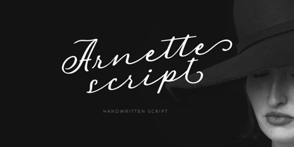 Introducing, Arnette handwritten script. Arnette is a script font that is perfect for quotes, branding, invitation, packaging, headline, logotype, etc. Features : uppercase & lowercase numbers and punctuation multilingual alternates and ligatures PUA encoded We highly recommend using a program that supports OpenType features and Glyphs panels like many of Adobe apps and Corel Draw, so you can see and access all Glyph variations.
 - Margoline by Letterhend,
$19.00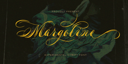 Introducing, Margoline script font. Margoline is a swash handwritten font that is perfect for branding, packaging, wedding invitation, card, etc. Features : uppercase & lowercase numbers and punctuation multilingual alternates and ligatures swash PUA encoded We highly recommend using a program that supports OpenType features and Glyphs panels like many of Adobe apps and Corel Draw, so you can see and access all Glyph variations.
 - Fusione by Paweł Burgiel,
$38.00 Fusione is a handwritten, informal, sketch-like typeface drawn by hand using ink and a sharp nib pen on smooth paper. It is useful for display, poster, books titling, advertising, and magazine work. Best used in Open Type apps, it has automatically exchanging alternates for better simulate true handlettering. Character set support Central and Eastern European as well as Western European languages.
 - Kristolit by Sasha Denisova Type Foundry,
$35.00 Kristolit is a Scotch Roman-inspired typeface with a technological twist. Version 1.0 features regular and italic styles with basic Latin and Cyrillic sets. It’s both elegant and robust: its ample curves contrast with the brutality of its lines, the verticality of its axis and stroke contrast. It is optimized type family for editorial use, branding projects and identities striking a balance between aesthetic experimentation, functionality, and legibility. The italic version adds a calligraphic touch while maintaining its tech-savvy and robust character.
 - Routerline Rough by Viaction Type.Co,
$16.00 Routerline Rough is a script monoline with 4 styles, nice applied in various products. Complete with multilingual characters, ligature and alternate. It is suitable for quote, clothing design, vintage logo, label, poster, packaging design and other designs. File Include (All Styles) : Routerline Rough.otf Routerline Rough.ttf Routerline Rough Slant.otf Routerline Rough Slant.ttf Routerline Rough Bold.otf Routerline Rough Bold.ttf Routerline Rough Bold Slant.otf Routerline Rough Bold Slant.ttf Features (PUA Encoded) : UPPERCASE. LOWERCASE. MULTILINGUAL. PUNCTUATION & SYMBOL. STYLISTIC SET. LIGATURE. I hope you enjoy and thank you.
 - Classist by Sohel Studio,
$10.00 Classist sans serif is a bold font style with a classic and modern touch . There are 4 different styles that you can apply in your design projects. This font is designed with a curved and bold style so it is very perfect for branding projects, logos, business cards, t-shirts, clothing, magazines, product branding, advertisements, posters, quotes etc. Classist Features: · 4 Weights font (Regular,Italic,Bold,Outline) · Uppercase · Numerals & Punctuation · Accented characters · Multilingual Support Thanks and have a wonderful day
 - Peacher by Edignwn Type,
$12.00 The Peacher perfectly represents crafted stuff of vintage script. This project was inspired by beautiful old labels. The product includes 4 styles (regular, rounded, rough and textured). This matches applies in some designs such as the logotype, poster, label, badge, packaging, branding, quotes and more custom design. Peacher includes : 4 style typefaces (regular, rounded, rough and textured) Uppercase, lowercase, numeral, punctuation and symbol 7 sets of alternates and swashes 25 ligatures Multilingual PUA Encoded Thank you for your support and choosing us.
 - Rusthack by Arterfak Project,
$18.00 Rusthack is a friendly brush font, created with the playful feels of freestyle brush-lettering. This font comes from the manual brush stroke which has an informal stroke thickness that makes the font looks more natural. The versatile design, a combination of brush lettering, and handwriting that you can apply in many themes such as urban, apparel, youth, sports, holiday, food, fashion, vintage, you name it! Fonts featured : Uppercase Lowercase Numbers Punctuation Accented characters SS01 - SS02 Ligatures Thank you for watching
 - Rustic Printed by Edignwn Type,
$12.00 The font is called "Rustic Printed", it is sans serif display with vintage themes. The font comes with 2 style typefaces (regular and stamp). This font include different width of alternates glyphs. The Rustic Printed matches applies in some designs such as the logotype, poster, label, badge, packaging, branding, and more custom design. Rustic Printed includes : 2 style typefaces (regular and stamp) Uppercase, lowercase, numeral, symbol and punctuation Alternates Multilingual PUA Encoded Thank you for your support and choosing us.
 - Throrian Formal - 100% free

- Throrian Commonface - 100% free

- Kadupul Flowers by Gatype,
$12.00 Kadupul Flowers is an incredibly unique handwritten,The shape is modern and style is very natural.modern calligraphy font. Masterfully designed to become a true favorite, the name of this font is also inspired by the name of a flower that is popular in the world this font has the potential to bring each of your creative ideas to the highest level! Kadupul Flowers features a varied baseline, gorgeous glyphs, and stunning alternatives. Hand-drawn design elements allow you to create many beautiful typographic designs in an instant like branding, web design and editorial, prints, crafts, quotes, It's great for logotypes, wedding invitations, romantic cards, labels, packaging, spelling of names and others. Kadupul Flowers includes OpenType stylistic alternates, ligatures and International support for most Western Languages. To enable the OpenType Stylistic alternates, you need a program that supports as Adobe Illustrator CS, Adobe Indesign & CorelDraw X6-X7, Microsoft Word 2010 or later versions. How to access all alternative characters using Adobe Illustrator: https://www.youtube.com/watch?v=XzwjMkbB-wQ Kadupul Flowers is coded with PUA Unicode, which allows full access to all the extra characters without having special designing software. Mac users can use Font Book , and Windows users can use Character Map to view and copy any of the extra characters to paste into your favorite text editor/app. How to access all alternative characters, using Windows Character Map with Photoshop: https://www.youtube.com/watch?v=Go9vacoYmBw
 - Sedona by Jeff Kahn,
$29.00 Sedona is a quirky, all capitals, display font that evokes the American West, Native Americana, vacations, travel, campgrounds, rustic lodges, needle point, Christmas, holidays, Arts and Crafts movement, quilts, tiles, and alpine resorts. It is based on an isometric grid and individual shapes that conform to the grid's structure. Each letter or glyph is made up of numerous triangular shapes. The letters have gaps of space that create a dynamic texture. Our mind connects the triangles to complete the letter and recognize the familiar letterform. Sedona will create a unique identity for book cover titles, editorial headings, packaging, logotypes and signs. Create multicolored letters by selecting individual shapes within each letter and apply various colors. Simply convert type in Adobe Illustrator or InDesign with these two steps: 1. "Creating Outlines", 2. "Release Compound Path". You may also want to "Ungroup" the letters. Great care was taken to align the shapes perfectly. There are no overlapping or misaligned shapes. Sedona includes punctuation, numerals, and basic math glyphs.You will find some additional and alternate glyphs in the "Glyph Palette". Sedona does not include a lowercase or diacritics for foreign languages. You may type in lowercase but the letters will appear as uppercase.
 - Plate Gothic by Monotype,
$29.00Around the turn of the twentieth-century, Steel and copper plate engraving was the most sophisticated and expensive method for producing business cards, stationery, and formal announcements. In engraved printing, the image is incised, or engraved into a hard, flat plate. Ink is applied to the plate, and then wiped off; leaving only the ink that is trapped below the surface in the incised areas. When the paper is pressed against the flat plate, the ink is drawn out of these areas and transferred to the paper. The results are twofold: printing which sits above the surface of the paper, and the reproduction very delicate lines and shapes. For business and formal printing, engraved printing was, and is, considered the best. The problem is that not everybody can afford the best. Type foundries, in the early 1900s, figured that if they could produce a typeface for traditional printing, which had appearance of engraving, they would be able to satisfy the needs of those forced to live with modest printing budgets. Engravers faces were born. Fredric Goudy’s Copperplate Gothic was one of the most popular. Plate Gothic is a version of this style updated for digital technology. It has all the charm and charisma as the metal type and yet is perfect for today's needs. - Rough Hearts by Nathatype,
$29.00 Do you want a handwriting style font in consistent, professional displays? Well, finding such fonts can be tough and time-consuming work. Therefore, Rough Hearts is here for your perfect choice. Rough Hearts is a font in a handwriting style with different, more natural shapes looking like spontaneously written letters. Each letter detail is made in swinging styles and this font also has high letter contrast, which means the thickness and thinness differences of the lines on each letter can be clearly seen. This font produces personal and creative impressions resulting in its legibility and attractiveness to apply for simply interesting design projects. You can use this font for big text sizes to be greatly legible and also enjoy the available features here. Features: Alternates Ligatures Stylistic Sets Multilingual Supports PUA Encoded Numerals and Punctuations Rough Hearts fits best for various design projects, such as brandings, headings, magazine covers, quotes, printed products, invitations, greeting cards, name cards, merchandise, social media, etc. Find out more ways to use this font by taking a look at the font preview. Thanks for purchasing our fonts. Hopefully, you have a great time using our font. Feel free to contact us anytime for further information or when you have trouble with the font. Thanks a lot and happy designing.

