10,000 search results
(0.075 seconds)
- Chianti BT WGL by Bitstream,
$49.00Chianti was designed at Bitstream by senior designer Dennis Pasternak in 1991 and initially released in 1995. The intent behind the design was to provide a humanist sanserif of high readability at a wide range of sizes and weights. Humanist sanserifs (others that fall into this category are Linotype’s Frutiger and Optima, and Monotype’s Gill Sans) are an attempt to improve the readability of sanserifs by applying classical roman structure to the letterforms. To enhance its versatility, Mr. Pasternak designed a wide variety of alternate characters, rare ligatures, ornaments and swashes. Chianti is a friendly sanserif useful for a broad range of typographic needs. - Rosehot by Alit Design,
$12.00 Introducing Rosehot Serif Elegant typeface The Rosehot Serif typeface is an elegantly themed font that has a dynamic serif style. The details of the shape of the "Rosehot Serif Elegant typeface" are very smooth and flow to create unique and beautiful curves. Elegant Serif typefaces such as “Rosehot Serif Elegant typeface” are very easy to apply to any design, especially those with an elegant and smooth concept, besides that this font is very easy to use both in design and non-design programs because everything changes and glyphs are supported by Unicode (PUA). The Rosehot Serif Elegant typeface contains 559 glyphs with many unique and interesting alternative options.
 - Tierra Script by Corradine Fonts,
$15.00 Tierra Script is a connected script typeface with a simple structure and organic contour. Its naivety and fluency makes it easy to read and close to everyone. The system has two main styles, one more formal than the other, then could be used in a wide diversity of designs applying the appropriate look. Also has other features, like swashes, alternative characters and contextual replacements. All that features are supported by a careful Open Type programmation, then is just needed to play a little with the font to obtain lovely words and phrases. Some features are present in all the fonts but the "Plus" version contains all of them.
 - Mahony Browns by Alit Design,
$19.00 🍃Introducing Mahony Browns typeface🍃 The Mahony Browns Serif typeface is an elegantly themed font that has a dynamic serif style. The details of the shape of the "Mahony Browns Serif Elegant typeface" are very smooth and flow to create unique and beautiful curves. Elegant Serif typefaces such as “Mahony Browns” are very easy to apply to any design, especially those with an elegant and smooth concept, besides that this font is very easy to use both in design and non-design programs because everything changes and glyphs are supported by Unicode (PUA). The Mahony Browns typeface contains 717 glyphs with many unique and interesting alternative options.
 - Spidro Marley by Alit Design,
$18.00 🍃Introducing Spidro Marley typeface🍃 The Spidro Marley Serif typeface is an elegantly themed font that has a dynamic serif style. The details of the shape of the "Spidro Marley Serif Elegant typeface" are very smooth and flow to create unique and beautiful curves. Elegant Serif typefaces such as “Spidro Marley typeface” are very easy to apply to any design, especially those with an elegant and smooth concept, besides that this font is very easy to use both in design and non-design programs because everything changes and glyphs are supported by Unicode (PUA). The Spidro Marley typeface contains 608 glyphs with many unique and interesting alternative options.
 - Bulone by Alit Design,
$18.00 🌻Introducing Bulone Serif Elegant typeface🌻 The Bulone Serif typeface is an elegantly themed font that has a dynamic serif style. The details of the shape of the "Bulone Serif Elegant typeface" are very smooth and flow to create unique and beautiful curves. Elegant Serif typefaces such as “Bulone Serif Elegant typeface” are very easy to apply to any design, especially those with an elegant and smooth concept, besides that this font is very easy to use both in design and non-design programs because everything changes and glyphs are supported by Unicode (PUA). The Bulone Serif Elegant typeface contains 613 glyphs with many unique and interesting alternative options.
 - Geller Sans by Ludka Biniek,
$29.00 Geller Sans typeface have been developed based on his serif predecessor’s proportions. He’s quite handsome, quite organised. Looking at thin–extraheavy styles he has enough of charm to stand out in advertisement. In text styles you can relay on him. He’s able to meet demand of complex design tasks. Geller Sans has been fitted with wide range of OpenType features. As Geller Serif, he has bullets & dingbats, for easier entry-point making. Entire font family comes in 4 width (Regular, Narrow, Condensed, Compressed). Each width finds its best application in different typographic fractions what makes Geller Sans easy to apply in editorial graphic design. Who’d like to challenge him?
 - Quilliver by Ilhamtaro,
$19.00 QUILLIVER is a script display font with a texture brush, a font that is basically made from digital calligraphy, so it feels very thick with the calligraphy style using a brush on this font. Fonts that are suitable for modern designs such as youth fashion, skateboard brands, quotes, etc. This script font with a texture brush makes this font flexible because it doesn't look feminine, making it easy to apply to non-feminine designs. To enable the OpenType Stylistic alternates, you need a program that supports OpenType features such as Adobe Illustrator CS, Adobe Indesign & CorelDraw X6-X7. Guides to access all alternates glyphs : http://adobe.ly/1m1fn4Y Cheers!
 - Chianti BT by Bitstream,
$29.99 Chianti was designed at Bitstream by senior designer Dennis Pasternak in 1991 and initially released in 1995. The intent behind the design was to provide a humanist sanserif of high readability at a wide range of sizes and weights. Humanist sanserifs (others that fall into this category are Linotype’s Frutiger and Optima, and Monotype’s Gill Sans) are an attempt to improve the readability of sanserifs by applying classical roman structure to the letterforms. To enhance its versatility, Mr. Pasternak designed a wide variety of alternate characters, rare ligatures, ornaments and swashes. Chianti is a friendly sanserif useful for a broad range of typographic needs.
 - Agakê by Sea Types,
$19.00 Agakê is a typography for comics with 03 weights, variations in italics and shadow. It has 432 glyphs with support for multiple languages and was designed to adapt to a variety of styles and narrative genres, whether adventure, fiction, graphic novel or even superhero. Traditionally, the typeface in the comics are applied in capital letters, seeking the optimization of the space without losing the readability. But Agakê was designed to work also in lowercase, allowing a greater number of combinations and an incredible reading experience. Valuing the foundations of the graphic narrative, Agakê obtains total harmony next to the most diverse styles of illustration of the comic books.
 - Vangba by Alit Design,
$12.00 Introducing Vangba Typeface The Vangba font is designed with a serif font concept that has a elegant stencil style. Irregular dynamic shapes but impressively regular and unique make the font "Vangba" different and steal attention. Serif typefaces such as "Vangba" are very easy to apply to any design, especially those with an retro, elegant and classic, besides that this font is very easy to use both in design and non-design programs because everything changes and glyphs are supported by Unicode (PUA). The "Vangba"contains 656 glyphs with many unique and interesting alternative options. In addition to the regular font, there is also an italic version of the Vangba font.
 - Slurm by Nikola Klimova,
$15.00 Slurm is a hand-drawn fun font that is ideal for use in headlines, descriptions and logotypes used in product design and similar applications. In longer texts it works well as a complementary font for comics and illustrations. Various sizes and weights for individual characters are derived from the hand-drawn font. Each glyph is an original; no shapes are repeated. Ligatures have been created for double letters and the typeface includes diacritics for languages that use Latin letters. The typeface features two basic styles, Regular and Bold, which can be used separately just as well as combined. Each style also includes pictures that can be used for various occasions.
 - Trigot by Volcano Type,
$19.00 Trigot is a modular typeface. Every form and every character is constructed from the basic geometric form of the triangle. The simple construction trigot resembles strongly is a gothic blackletter font. The letters are inspired by the ductus and forms of medieval typefaces and have a similar complex expression. The main singularity of Trigot lies in the strong contrast between clear geometry and the complex expression of a blackletter typeface. The name, "Trigot", hints the gothic influence and the triangular modules. Trigot is a modern display font -- it can be used for posters, striking visuals and titles but also for longer phrases and quotes.
 - TF Teenage Riot by Teenage Foundry,
$19.00 Teenage Riot is a Display Font. Inspired by the awesome Chicano lettering style. Look simpler with 2 styles (Regular & Outline) in today’s modern era. Suitable for poster designs, logos, merchandise and others. Features: Uppercase, Lowercase, Numeral, Punctuation & Multilingual. For any questions please contact me 🙂 Thanks!
 - NAKED - Personal use only

- Ionic No 5 by Monotype,
$51.99 Ionic No5 is a refresh of a classic Linotype Clarendon-style serif, another restored classic from the Monotype library, much like the recent updates to Walbaum and Helvetica Now. The original typeface was designed to be printed and read at small sizes, popular with newspapers in the 20th Century at its birth. The restoration and refinement of this typeface has bestowed a greater sense of clarity and directness, smartly stylish, and an utterly captivating appeal. Because these styles were so popular for books and newspapers for so long we associate them with being editorial or bookish, not dull, but thoughtful. Designers today can use that association to their advantage as a visual shortcut to convey similar meaning and tone. More attention was given on modernising the typeface with precious use and the introduction of sharp edges & finishes. The thinnest weights can give a dancing typewriter aesthetic, being low stroke contrast. The heavy weights have an unquestionable presence on the page. Overall, the typeface has a richness and almost illustrative quality about it. The true depth of Ionic No.5 could enable each weight to be a poster by itself. Ionic N°5™ font field guide including best practices, font pairings and alternatives.
 - Rational TW by René Bieder,
$39.00 Rational TW is the typewriter addition to the Rational family. It is a monospaced font building on the same principles as its proportional, neogrotesque brother, such as maximum legibility and flexibility while combining Swiss and American gothic elements with a modern aesthetic. Due to the monospaced environment, some of its letter shapes like “r”, “m”,“f”, “i” and “w” have been slightly adapted but kept the same in appearance. Rational TW comes in two version: Rational TW Display and Rational TW Text. As indicated by its name, Rational TW Text is not limited to, but works best in small font sizes because it features distinctive letter shapes like a double storey “a” or “g” in order to help differentiate similar glyphs in small sizes. Rational TW Display, on the other hand, creates a geometric uniformity by implementing round shapes in “a” and “g”, giving it a subtle friendly and open character. Unlike many other monospaced fonts, Rational TW has a large amount of opentype features like small caps, alternative glyphs, case sensitive shapes, and many more making it the perfect choice for countless scenarios. With more than 700 glpyhs per font, it performs excellently in any project from print to digital.
 - Bengala by Andinistas,
$59.95 Bengala is a font based on Calligraphy & Geometry designed by Carlos Fabián Camargo. Its purpose is to be an innovative typographic system combining Script letters with geometric and hard Caps letters. The contradictory styles are ideal for designing covers, posters, branding and packaging. Its smooth calligraphic look meticulously incorporates characters to design logos and phrases that communicate dynamism and strategy. Bengala Script was inspired by Mistral by R. Excoffon. Bengala Script provides violent and unstable lines with generous spacing between the letters and tight horizontal proportions, producing showy upper and lower case italics inspired by French Gothic calligraphy late fifteenth century. For this reason, Bengala Script retains some uninterrupted calligraphic logic, up and down sometimes higher or shorter than the height of the lowercase, creating dynamism through a variable amount of contrast between thick and thin strokes. Bengala Dingbats has 62 drawings designed to accompany the designs. Script and Caps Bengala have different gender and the similar X height produces more visual appeal. This way Bengala Caps - inspired by the Porshe logo, due to its geometric uppercase Roman construction, extended horizontal proportions, light caliber, rounded strokes terminations and generous spacing between letters. Special thanks to John Moore and Manuel Corradine for their help with Open Type.
 - Bambusa Pro by Fontforecast,
$29.00 Bambusa Pro is a sturdy expressive modern calligraphy family of 4 fonts: Regular, Bold, Basic and Ornaments. It owes its name to the bamboo pen that was used to draw all of the characters and swashes. The typical ink-strokes of the bamboo pen give Bambusa Pro a distinctively different appearance than dip pen calligraphy fonts like Salt & Spices Pro. Similarities between the two are a wide variety of long swashes that connect to the first and last letter of a sentence or name. But with Bambusa Pro this even goes for accented characters, and all upper and lower case letters. Together with five different connecting spaces you can create phrases that look as if the pen was never lifted from the paper. Like Stylist Pro all characters of Bambusa Pro connect to each other, both lower case and upper case letters and vice versa. Bambusa Pro Basic also is hand-lettered with a bamboo pen, but is a lot more straight forward. It combines beautifully with the connected styles Regular and Bold. On top of that Bambusa Pro Ornaments offers 100+ glyphs for additional designs possibilities. Enjoy! You will need an opentype savvy application to get the most out of Bambusa Pro.
 - Schorel by insigne,
$29.00 Schorel commands the room and sets the audience at ease. This new Scotch Roman typeface from insigne is a confident personality with a tasteful amount of contrast. Cool, sharp, balanced, and contemporary, Schorel not only delivers well in longer texts, but can use its mass to meet the needs of subheadlines, callouts, and other similar projects. Scotch typefaces initially come from Scottish foundries, popular in the United States in the late 18th century. This beautiful genre of type grew in popularity through the Victorian era and most of the 20th century to make regular appearance in books, magazines, newspapers, and advertisements. Schorel itself, with its moderate contrast and organic design, features short ascenders and descenders and calligraphic italics. The design features a few ball terminals, but mostly touts its bracket serifs, which come to a sharp point. The typeface, ideal for medium to large sizes, is useful for both headlines and text, carefully created for both print and screen. This OpenType font supports most Latin-based languages. Schorel has nine weights and a true italic, and many special features such as small caps, fractions, old-style figures, and numerous extras complete each font. It’s every bit a delight to your reader’s eye.
 - Condell Bio Poster by Letritas,
$5.00 Condell Bio Poster is part of the bigger Condell family: a project that involves series of typographies that started to be conceived and developed since 2006. It also includes a bigger legibility version and a sans serif. Condell Bio is very versatile and can be used in the agroindustrial production. Thanks to its strongness and its charm, it can be used in different projects where a short and powerful message is required. For instance in a brand marketing campaign. The Condell project follows in terms of time the design of Comalle (a font also designed by Juan Pablo de Gregorio in 2006), but if we compare them, Condell seems to look for a major range of uses rather than a mere stylistic inspiration. And even if it keeps in its shape some organic forms, Condell seems to be much more similar to a sans serif traditional typography. Condell's fat and soft forms and its nice endings, inspired through spontaneous brush strokes, give it a very peculiar pleasant connotation. Its Italic (10 degrees inclination) have been produced singularly, not automatically calculated by the software. Condell Bio Poster is composed of 2 styles: the regular and the italic. Each one of them have 599 characters and is composed of 206 languages.
 - Nautilus Text by Linotype,
$29.99Hellmut G. Bomm first released his Linotype Nautilus typeface in 1999. Ten years later, he updated and expanded the design. Now users have two additional families at their disposal: Nautilus Text and Nautilus Monoline. Nautilus Text bears more similarities to the original Linotype Nautilus. The letters shows a high degree of contrast in their stroke modulation. Bomm's intention was to create a clear, highly legible face. While the even strokes of most sans serif types eventually tire the eyes in long texts, the marked stroke contrast of Nautilus Text lends the face its legibility. The characters were drawn with a broad tipped pen. Like serif typefaces, the forms of Nautilus Text display a variety of elements. Its characters are narrow, with relatively large spaces between them. This helps create an overall open appearance, and allows a large quantity of text to fit into a small space. Nautilus Monoline's letters share the same overall proportions as Nautilus Text's. But as their name implies, they are monolinear. Their strokes do not have the calligraphic modulation that Nautilus Text features. This allows them to set another sort of headline, making Nautilus Monoline a refreshing display type choice to pair with body text set in Nautilus Text. - Nautilus Monoline by Linotype,
$29.99Hellmut G. Bomm first released his Linotype Nautilus typeface in 1999. Ten years later, he updated and expanded the design. Now users have two additional families at their disposal: Nautilus Text and Nautilus Monoline. Nautilus Text bears more similarities to the original Linotype Nautilus. The letters shows a high degree of contrast in their stroke modulation. Bomm's intention was to create a clear, highly legible face. While the even strokes of most sans serif types eventually tire the eyes in long texts, the marked stroke contrast of Nautilus Text lends the face its legibility. The characters were drawn with a broad tipped pen. Like serif typefaces, the forms of Nautilus Text display a variety of elements. Its characters are narrow, with relatively large spaces between them. This helps create an overall open appearance, and allows a large quantity of text to fit into a small space. Nautilus Monoline's letters share the same overall proportions as Nautilus Text's. But as their name implies, they are monolinear. Their strokes do not have the calligraphic modulation that Nautilus Text features. This allows them to set another sort of headline, making Nautilus Monoline a refreshing display type choice to pair with body text set in Nautilus Text. - Breakiss by Dumadi,
$20.00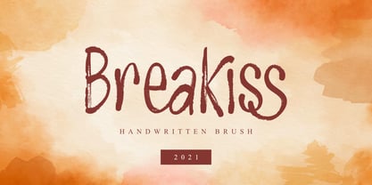 Breakiss – Handwritten Brush is a crafted font created with the app using the brush tool in a relaxed and freestyle. Breakiss is perfect for those of you who like to make craft designs, you will feel amazing when used for social media design, branding, advertising, product design, handwritten quotes, product packaging, posters, merchandise, and other designs.
 - Alifut MF by Masterfont,
$59.00 A practical font family with 4 weights for all your day to day design needs: headlines, body text, signage etc. High legibility at small sizes. An extended sans serif typeface with rounded endings that provides a unique softness appearance without losing legibility. The Pro version is an excellent support for Niqqud (Vowels). All marks are programmed to fit each glyph's shape and width. Best used with apps that support right to left Hebrew text, like Adobe InDesign CC or MS Word.
 - Bertone by Akifatype,
$14.00 Bertone is a Natural smooth brush font, organic, dynamic and energetic sytle.Can used for various purposes. such as the title, signature, logo, correspondence, wedding invitations, letterhead, signage, labels, newsletters, posters, badges, etc. Bertone is coded with PUA Unicode, which allows full access to all the extra characters without having special designing software. Mac users can use Font Book , and Windows users can use Character Map to view and copy any of the extra characters to paste into your favourite text editor/app
 - Rumbia by Akifatype,
$10.00 Rumbia is a modern smooth display font, organic, dynamic and energetic sytle.Can used for various purposes. such as the title, signature, logo, correspondence, wedding invitations, letterhead, signage, labels, newsletters, posters, badges, etc. Rumbia is coded with PUA Unicode, which allows full access to all the extra characters without having special designing software. Mac users can use Font Book , and Windows users can use Character Map to view and copy any of the extra characters to paste into your favourite text editor/app
 - Catalog JNL by Jeff Levine,
$29.00 Catalog JNL is based on a set of vintage wood type. Its uniform, block-style appearance is perfect for projects where bold, readable titling will apply. Available in regular and oblique styles.
 - XLeefMeAlone by Ingrimayne Type,
$14.95 XLeafMeAlone is a collection of leaf silhouettes from common Indiana trees based on actual leaves. Various leaves, selected for their good looks not their intelligence, were scanned and hand-traced. Some species, such as some oaks, are over-represented because they are more picturesque than others, such as apple or peach. LeafMeAlone was featured in the “Type Drawer” column of Personal Publishing (later renamed Business Publishing--I do not know if it still exists) in November of 1990.
 - Baby Megista by IM Studio,
$15.00 Baby Megista is a calligraphic script font that comes with beautiful alternate characters. copper calligraphy mix in handlettering style. Designed to convey an elegant style. Baby Megista is attractive because it is subtle, clean, feminine, sensual, glamorous, simple and very easy to read. Its classic style is perfect to apply to all kinds of formal items such as invitations, labels, menus, logos, fashion, make up, stationery, letterpress, romantic novels, magazines, books, greeting/wedding cards, packaging, labels. Baby Megista has 304+ glyphs and 150 alternate characters. including multiple language support. It features OpenType with alternative styles, binders and character swashes, which allows you to mix and match letter pairs to suit your design, as well as a touch of ornamentation to make this font look elegant.
 - Authentic Romantic by SilverStag,
$14.00 A brand new year is here and a brand new font is here as well. I have to say I had so much fun working on this funky slab serif typeface. I have created some quirky letters and over 100 ligatures + the font comes in four weights - light, regular, medium & italic. The font also includes full language support, punctuation, numerals and detailed instructions how to use ligatures in most of the apps on your computer, as well as in Canva. I invite you to check out the preview images, and I hope you will be immersed in my vision for this creative typeface that, I am sure, will work for all kinds of interesting projects you might be working on this year. If you end up publishing your designs on Instagram, tag me - @silverstagco and I will make sure to showcase your design and work to my audience as well! Authentic Romantic - Slab Serif Font Includes: 100+ Ligatures Numerals & Punctuation Language Support Detailed instructions on how to use alternates in most of the apps on your computer as well for Canva Happy creating everyone!
 - Novel Mono Pro by Atlas Font Foundry,
$50.00 Novel Mono Pro is the monospaced typeface family within the largely extended award winning Novel Collection, also containing Novel Pro, Novel Sans Pro, Novel Sans Condensed Pro, Novel Sans Rounded Pro and Novel Sans Office Pro. Novel Mono Pro has a carefully attuned character design and a well balanced weight contrast. It combines the feeling of a modern humanist with the technical appearance of a typewriter. Many similarities with the other typeface families within the Novel Collection enable designers to combine the families and reach highest quality in typography. Novel Mono Pro [948 glyphs] comes in 12 styles and contains small caps for the uprights and the italics, ligatures, lining figures, hanging figures, small caps figures, positive and negative circled figures for upper and lower case, superior and inferior figures, fractions, extensive language support, arrows for uppercase and lowercase and many more OpenType™ features.
 - ITC Motter Corpus by ITC,
$40.99ITC Motter Corpus was designed by the Austrian type designer Othmar Motter in 1993 to combine the display advantages of a sans serif extra bold design with the legibility of a roman weight. The Motter Corpus is available in the weights regular and condensed regular. The capitals with their strong strokes display slight irregularities and natural looking outlines. When used in very large point sizes the tiny serifs become noticeable. Distinguishing characteristics of this typeface are the unusual design of the g with its upward reaching ear and that of the capital C, whose curve ends in an angular stroke in its upper third. Almost, but not quite, a sans serif, the typeface has diminutive serifs which, along with its modulated weight contrasts, make ITC Motter Corpus remarkable legible in display applications and will give text a nostalgic feel. A similar typeface is Linotype Bariton. - Griston by Rhd Studio,
$20.00 Introducing the newest product, Griston font, this font is perfect for creating signature logos and watermarks for photography studios or photography logos, best for initial logos or brand signatures. Made with elegant, professional and unique taste, You can try it first by typing what you want below made simple but has a very luxurious feel, this font has a lowercase alternative that is very similar to handwriting using a pen so it is suitable for signatures, logos, watermarks and more. again. can create custom personalized signatures, create custom logos, so this awesome signature is for all. maybe next time I will make an italic or slant version if this font is in great demand and can help with many things you want for signatures, logo branding, or watermarks. If you have any questions about the latest fonts, please send a short message thank you
 - Garuda by Campotype,
$49.00 Garuda typeface, featuring the shape and style based on "Garuda Pancasila", the state symbol of the Republic of Indonesia. Garuda is a mythical bird in the Javanese puppet stories, is very similar to the eagle. At the typeface we can find more ligatures beside than the standard. Within Garuda at least encoded 792 glyphs per weight onto major codepage: win 1252, 1250, 1254, 1257 including Mac OS Roman. It is containing more OpenType features such as swash, contextual alternate, stylistic, figures/number, and a few bit ornaments. The typeface has a pretty good readability and legibility even in small sizes. So it is useful for short texts (text length? Whom fear) for print and screen material. Usage on headlines, posters, titles, or something like that, can utilize ornament lines as a sweetener. Please find more information about the OpenType Manual of this typeface on the gallery page (pdf).
 - Patent Reclame by HiH,
$10.00 Patent Reclame manages to be light-hearted, while clearly showing its blackletter roots both in the shape of the individual letters and the rhythm of text on a page. The designer is unknown. Schriftgeisserei Flinsch of Frankfurt a.M. cast the face around 1895. Nicolete Gray shows a quite similar face called “Graphic,” from Stephenson Blake in 1896. Personally, I don't think that Patent Reclame looks like an English design, but I do not have any proof one way or the other. The numbers are proportional, intended for posters, not spreadsheets. Two ornaments are included, an art nouveau rose at #172 and a lilypad with long tendril at #177. Great for invitations, posters and flyers announcing fun events. Do not use for obituaries. Quite readable in smaller sizes for short blocks of text. I really like the buoyant quality -- a nice combination of discipline and enthusiasm.
 - Plinc Buffalo by House Industries,
$33.00 Just as its eponymous ancestors graced vast Western vistas, Buffalo fills broad horizontal typographic topography with distinctive dignity. Buffalo’s migration across a visual landscape that straddles two millennia saw it survive the threat of extinction similar to its mammalian ancestors and emerge with rotund relevance. Now fortified with modern character sets and digital flexibility, nothing espouses an artisanal post-western industrial craft renaissance quite like Buffalo. Legendary lettering artist and type designer Ed Benguiat created the original film version of Buffalo for Photo-Lettering Inc. Working under the direction of the current Photo-Lettering partners, Dutch type designer Donald Roos digitized and expanded Buffalo while expertly maintaining the organic nuances found in the original version. Like all good subversives, House Industries hides in plain sight while amplifying the look, feel and style of the world’s most interesting brands, products and people. Based in Delaware, visually influencing the world.
 - Volta by Linotype,
$29.99Volta is a robust typeface from the 1950s. A revisit to styles that were en vogue at the turn of the century, Bauer type foundry designers Walter Baum and Konrad Bauer designed this type family in1955. The form of Volta's letters are similar to those in New Transitional Serif typefaces, like Cheltenham and Century. Developed after the Didone (i.e., Bodoni) style types, New Transitional Serifs speak more to the zeitgeist of the late 19th Cntury, and were typographic adaptations to it's newer technologies. Already in the period of mass production, typographers and printers at the dawn of the 20th Century had to cope with larger print runs on cheaper materials. The robust letterforms of New Transitional Serifs were designed to compensate for this, but they were also ingenious little inventions in their own right. Form the beginning, the new, peculiar forms of New Transitional Serif letters were adopted for use by advertisers. Their robustness also allowed them to be used in virtually all sizes. Volta was designed especially with advertising display usage in mind. The x-height of Volta's letters is higher than average for serif faces. It is recommended that Volta be used exclusively for shorter tracks of text, above 12 point. Headlines look dashing set in Volta. Four different font styles are available for the Volta typeface: Regular, Medium, Medium Italic, and Bold." - FS Benjamin by Fontsmith,
$80.00 Stone and steel FS Benjamin is a flared serif typeface designed by Stuart de Rozario. Consisting of 12 styles ranging from Light, Book, Regular, Medium, SemiBold and Bold with Italics it has clear, delicate letterforms, punctuated with brutal chiselled angles. With a pure and crafted feel to the forms the typeface has traditional roots but has been designed to work in a contemporary setting. Archetypal proportions in terms of x-height to cap height and ascender to descender ratio, allow the typeface to feel familiar and be legible in all platforms. Delicate brutalism Inspired by the contrasts of London and named after Big Ben, FS Benjamin was designed by Stuart de Rozario and founder, Jason Smith. Walking around London Jason was inspired by the juxtaposition of the old and the new. Glass and steel architecture can often be found amongst traditional signage and coats of arms seen around the City. These surroundings sparked an idea to create a modern design based on an alphabet that would traditionally be carved from stone. “Much of the typography we see today is so similar. I thought what if we created a typeface with traditional roots but modernised it to sit amongst the punk and noise of the streets of London? Old with new. Business with busyness. This is what London is all about.” Jason Smith
 - Bilya Layered by Cerri Antonio,
$30.00 Since 2010 I started my research and experimentation in layered fonts, and I immediately understood that the future of creative graphic fonts is precisely the exploration of it. Over the years I have tried different expressions on the use of the layered system ... but I realized that my propensity to use colors in the font led me to the creation of BILYA. The real creative cue of BILYA is the wonderful childhood memories where nostalgia for them generated the creation of it, which I dedicate to all lovers of glass marbles classic game and beyond. BILYA Base, Outline, Color One, Two, Three, Four, Five and Color Six is a 8 font system that can be layered in different ways to create infinite title effects used commonly in poster and logo design, in flat gradient color style for spectacular 3D emboss styles or realistic 3D logos design projects. BILYA’s layer combinations give you complete control in producing styles like, modern, 3D, beveled. It can be used alone and/or in layered and allows you adjust leading and kerning. Each font contains the similar metrics, so when your title is set, copy and paste in same position to create different layers styles combinations to build out your desired effect. BILYA works great in any graphics application that allows you to utilize layers or 3D graphics effects.
