10,000 search results
(0.048 seconds)
- RT Dyans by Veteran Type,
$14.00 Dyans Font Family is a type of font that is inspired by vintage handwriting art that is often used in signwood, signpainting and others, usually this font is very suitable for manual hand lettering or hand painting art. This font uses the open type feature so you can explore alternative types in certain letters. Enjoyed This font conssist of: Stylistic Set Alternate Character Multilingual Support Math Symbol Numeral & Punctuation Hope your enjoy using this font Thank You.
 - Iquory by PizzaDude.dk,
$20.00 Iquory is a charming, slightly rugged hand-drawn font. With bouncing letters and unpredictable curves, it could very easily give your text that feeling of randomness you are looking for! While the uppercase is very steady - the lowercase just screams for a party - so what are you waiting for? Oh, I almost forgot - the font comes with some nice ligatures for a handful of double letters! You will need to use OpenType supporting applications to use the autoligatures.
 - Professor by Three Islands Press,
$39.00 My father is retired from teaching after a distinguished career as a professor at the University of Texas (and other colleges). He's also retired from writing in longhand, ever since I digitized his script several years ago. Professor is a slightly modified version of my ol' dad's cursive hand -- a good, strong, helpful, friendly, personable hand, much like the man. Use Professor for all your casual handwriting needs: my father doesn't mind. Comes in a single, medium-weight style.
 - Areplos by Storm Type Foundry,
$53.00To design a text typeface "at the top with, at the bottom without" serifs was an idea which crossed my mind at the end of the sixties. I started from the fact that what one reads in the Latin alphabet is mainly the upper half of the letters, where good distinguishableness of the individual signs, and therefore, also good legibility, is aided by serifs. The first tests of the design, by which I checked up whether the basic principle could be used also for the then current technology of setting - for double-sign matrices -, were carried out in 1970. During the first half of the seventies I created first the basic design, then also the slanted Roman and the medium types. These drawings were not very successful. My greatest concern during this initial phase was the upper case A. I had to design it in such a way that the basic principle should be adhered to and the new alphabet, at the same time, should not look too complicated. The necessary prerequisite for a design of a new alphabet for double-sign matrices, i.e. to draw each letter of all the three fonts to the same width, did not agree with this typeface. What came to the greatest harm were the two styles used for emphasis: the italics even more than the medium type. That is why I fundamentally remodelled the basic design in 1980. In the course of this work I tried to forget about the previous technological limitations and to respect only the requirements then placed on typefaces intended for photosetting. As a matter of fact, this was not very difficult; this typeface was from the very beginning conceived in such a way as to have a large x-height of lower-case letters and upper serifs that could be joined without any problems in condensed setting. I gave much more thought to the proportional relations of the individual letters, the continuity of their outer and inner silhouettes, than to the requirements of their production. The greatest number of problems arose in the colour balancing of the individual signs, as it was necessary to achieve that the upper half of each letter should have a visual counterbalance in its lower, simpler half. Specifically, this meant to find the correct shape and degree of thickening of the lower parts of the letters. These had to counterbalance the upper parts of the letters emphasized by serifs, yet they should not look too romantic or decorative, for otherwise the typeface might lose its sober character. Also the shape, length and thickness of the upper serifs had to be resolved differently than in the previous design. In the seventies and at the beginning of the eighties a typeface conceived in this way, let alone one intended for setting of common texts in magazines and books, was to all intents and purposes an experiment with an uncertain end. At this time, before typographic postmodernism, it was not the custom to abandon in such typefaces the clear-cut formal categories, let alone to attempt to combine the serif and sans serif principles in a single design. I had already designed the basic, starting, alphabets of lower case and upper case letters with the intention to derive further styles from them, differing in colour and proportions. These fonts were not to serve merely for emphasis in the context of the basic design, but were to function, especially the bold versions, also as independent display alphabets. At this stage of my work it was, for a change, the upper case L that presented the greatest problem. Its lower left part had to counterbalance the symmetrical two-sided serif in the upper half of the letter. The ITC Company submitted this design to text tests, which, in their view, were successful. The director of this company Aaron Burns then invited me to add further styles, in order to create an entire, extensive typeface family. At that time, without the possibility to use a computer and given my other considerable workload, this was a task I could not manage. I tried to come back to this, by then already very large project, several times, but every time some other, at the moment very urgent, work diverted me from it. At the beginning of the nineties several alphabets appeared which were based on the same principle. It seemed to me that to continue working on my semi-finished designs was pointless. They were, therefore, abandoned until the spring of 2005, when František Štorm digitalized the basic design. František gave the typeface the working title Areplos and this name stuck. Then he made me add small capitals and the entire bold type, inducing me at the same time to consider what to do with the italics in order that they might be at least a little italic in character, and not merely slanted Roman alphabets, as was my original intention. In the course of the subsequent summer holidays, when the weather was bad, we met in his little cottage in South Bohemia, between two ponds, and resuscitated this more than twenty-five-years-old typeface. It was like this: We were drinking good tea, František worked on the computer, added accents and some remaining signs, inclined and interpolated, while I was looking over his shoulder. There is hardly any typeface that originated in a more harmonious setting. Solpera, summer 2005 I first encountered this typeface at the exhibition of Contemporary Czech Type Design in 1982. It was there, in the Portheim Summer Palace in Prague, that I, at the age of sixteen, decided to become a typographer. Having no knowledge about the technologies, the rules of construction of an alphabet or about cultural connections, I perceived Jan Solpera's typeface as the acme of excellence. Now, many years after, replete with experience of revitalization of typefaces of both living and deceased Czech type designers, I am able to compare their differing approaches. Jan Solpera put up a fight against the digital technology and exerted creative pressure to counteract my rather loose approach. Jan prepared dozens of fresh pencil drawings on thin sketching paper in which he elaborated in detail all the style-creating elements of the alphabet. I can say with full responsibility that I have never worked on anything as meticulous as the design of the Areplos typeface. I did not invent this name; it is the name of Jan Solpera's miniature publishing house, in which he issued for example an enchanting series of memoirs of a certain shopkeeper of Jindrichuv Hradec. The idea that the publishing house and the typeface might have the same name crossed my mind instinctively as a symbol of the original designation of Areplos - to serve for text setting. What you can see here originated in Trebon and in a cottage outside the village of Domanín - I even wanted to rename my firm to The Trebon Type Foundry. When mists enfold the pond and gloom pervades one's soul, the so-called typographic weather sets in - the time to sit, peer at the monitor and click the mouse, as also our students who were present would attest. Areplos is reminiscent of the essential inspirational period of a whole generation of Czech type designers - of the seventies and eighties, which were, however, at the same time the incubation period of my generation. I believe that this typeface will be received favourably, for it represents the better aspect of the eighties. Today, at the time when the infection by ITC typefaces has not been quite cured yet, it does absolutely no harm to remind ourselves of the high quality and timeless typefaces designed then in this country.In technical terms, this family consists of two times four OpenType designs, with five types of figures, ligatures and small capitals as well as an extensive assortment of both eastern and western diacritics. I can see as a basic text typeface of smaller periodicals and informative job-prints, a typeface usable for posters and programmes of various events, but also for corporate identity. Štorm, summer 2005 - Antique Spenserian by Dharma Type,
$24.99 This antique script is based on Spencerian script released from MacKellar, Smiths, & Jordan in the 19th century. This family comes in two varieties, Standard and ornamented capitals. The Standard has orthodox style for formal text and display. This makes it possible you to use this style for any projects. The unique Ornamented is suitable for eye-catching part of your project: headlines, wedding invitations and logo. Every glyphs were added antique and distressed effect by hand work with great care to be looked like natural. Use your ideas to enjoy this exclusive script.
 - The Begundals by HansCo,
$12.00 The Begundals is a modern brush script font in hand lettering style. This font looks cool in any design and is very recommended for craft, posters, books, branding, quotes, print templates, packaging, invitations or anything else that needs a unique and fun touch. The Begundals comes in uppercase and lowercase, with punctuation, symbols, numerals, stylistic alternate sets, ligatures, and also has multi-lingual support. You can access all alternates from your OpenType panel in your design software. Tutorial how to Install & use Alternate / Special Character : https://hanscostudio.com/tutorial/ Enjoy!
 - Arcaro JNL by Jeff Levine,
$29.00 There are times when a typeface is used so consistently that it becomes somewhat synonymous with the subject it's used in. The opening and end titles for the ABC-TV series "Naked City" (1958-1963) were set in a bold version of a popular font emulating the look of calligraphic hand lettering. Arcaro JNL is a somewhat lighter and slightly modified version of this typeface and is offered in both regular and oblique versions. The name Arcaro comes from one of the regular characters in this superbly-written police drama, Detective Frank Arcaro.
 - Breksit Brush by Keristyper Studio,
$14.00 Introducing Breksit font made from natural brush hand-drawn look, with adventure concept and bold character. This Font is perfect for traveling and adventure design, badges, logos, posters, branding, packaging, signage, book cover. Multilingual support: Afrikaans, Albanian, Catalan, Danish, Dutch, English, Estonian, French, Finnish, German, Icelandic, Indonesian, Italian, Malay, Norwegian, Portuguese, Spanish, Swedish, Zulu, and many more. What’s Included : Web Fonts Standard & Multilingual glyphs Ligature Works on PC & Mac Simple installations Accessible in Adobe Illustrator, Adobe Photoshop, Adobe InDesign, and even work on Microsoft Word. Hope you enjoy our font!
 - Karmella by Mantype Studio,
$20.00 Karmella a classy serif font with a handful of curvy ligatures. Think Wild Mango with a twist! This font is both bold and elegant.. modern yet vintage.. either way, it is sure to bring attention to your brand and designs! Karmella includes alternate letters (letters with the curvy swashes). These letters are embedded into the font file and easily accessible in programs such as photoshop and illustrator. You can access these in more basic design programs but you will need to use your character map or font book
 - Dunk City by Epiclinez,
$18.00 Bring the street to your design projects with this cool brush typeface. Dunk City is a hand brush font that's perfect for poster, branding, and packaging. With a graffiti-style calligraphy feel, its letters feature a unique style to your designs. The subtle imperfections are designed to make the typeface more lively: it's the key to opening a whole new world of brushwork. So what’s included : Basic Latin Uppercase and Lowercase Numbers, symbols, and punctuations Multilingual Support. PUA Encoded and fully accessible without additional design software Simple Installations works on PC & Mac Thank You!
 - The Enchanted Garden by PeachCreme,
$21.00 "The Enchanted Garden" is a dark, vintage-style font designed with simplicity and readability in mind, ensuring effortless legibility for all your creative ventures. From wedding stationery and Instagram quotes to contemporary logos, packaging, and websites, this versatile font complements a wide range of projects. "The Enchanted Garden" font is a valuable asset for those who cherish the art of handwritten expression. Its meticulously hand-drawn characters exude a timeless charm, infusing your headlines and titles with vibrant life. Moreover, it offers three alternative lowercase glyphs, expanding the horizons of your design possibilities.
 - Ball Game JNL by Jeff Levine,
$29.00 What has become a rite of passage at baseball games got its start in 1908 when lyricist Jack Norworth and music composer Albert Von Tilzer wrote "Take Me Out to the Ball-Game" (which was published by Von Tilzer's York Music Company). The Art Nouveau hand lettered title on the cover of the sheet music was eccentric and attractive enough to warrant being turned into a digital type face, and in honor of its namesake song is called Ball Game JNL; available in both regular and oblique versions.
 - Dx Grove by Dirtyline Studio,
$20.00 introducing Dx Grove, a vintage-inspired font that seamlessly blends nostalgia with elegance, making it the perfect choice for your design projects. This timeless serif font comes in 4 Style regular and Condensed including the italic too. offering you versatility and style for your graphic design, branding, and packaging projects. Capture the essence of the past with Dx Grove free-spirited vintage charm, bringing a touch of yesteryear to your creations. Ideal for wedding invitations, branding, or projects that need nostalgic 90’s font aesthetics, this hand-drawn typeface is bold and versatile.
 - Selomita by Thanoestd,
$15.00 Selomita is a magical handwritten font carefully created with a touch of elegance. This is a beautiful combination of timeless elegance and authentic calligraphy. It features an incredibly classic style, while still keeping a friendly feel. This font is the perfect font for making original and outstanding designs. To keep maximum real hand lettered effect, there were created 65 ligatures. Selomita also includes full set of uppercase and lowercase letters, full uppercase alternate and some lowercase alternate letters, swash, numerals, punctuation. I hope you like with this font. Thanks.
 - LiebeChristmas by LiebeFonts,
$19.90 LiebeChristmas is a hand-crafted collection of Santas, Rudolphs, gifts, treats and more Christmas items in countless variations and sizes. Create pretty Christmas greetings with a personal touch. Surprise your family and friends by printing individual cards for everyone. Decorate your blog or website for the holiday season. More than 100 carefully crafted drawings are included in this single font and can be used in any text or graphics application. How about creating your own wrapping paper with LiebeChristmas patterns? Or how about making Christmas cards in combination with our popular typeface LiebeErika?
 - Old Time Nouveau JNL by Jeff Levine,
$29.00 The 1914 sign lettering instruction book “Art Alphabets and Lettering” by J. M. Bergling showcased many hand lettered alphabets as an inspiration to both up-and-coming and established sign painters. One page in particular featured a classic free-form Art Nouveau style with rounded shapes. This style of lettering was emulated in the 1960s by designers of rock concert posters, so the style is reminiscent of the Art Nouveau period as well as the 1960s. Old Time Nouveau JNL is available in both regular and oblique versions.
 - Libelle by Linotype,
$29.99 Libelle is a 21st century English Copperplate Script typeface. Created by Jovica Veljović, a designer with decades of experience as a calligrapher, typeface designer, and professor, Libelle differentiates itself from other Copperplates Scripts because its letterforms are less mechanical. The hand of the calligrapher shows through the forms, breathing new life into this historic genre. Libelle includes approximately 400 extra glyphs, including alternate forms of many letters and special forms for the beginnings and ends of words. The font includes several stylistic sets, as well as ligatures and ornaments.
 - Decalcomania JNL by Jeff Levine,
$29.00 Decalcomania JNL is based on examples of gold and black water-applied initial decals made by the Transfer Monogram Company of Chicago circa the 1940s. It is presumed the patterns for the letters were hand cut, possibly explaining the variations in line widths and character shapes. These eccentricities were left intact and followed through to the other characters in order to represent a more "authentic" digital version of these vintage decals. Decalcomania JNL is available in both the regular (outline) version, and a solid black version, as well as obliques of both styles.
 - Wellytonia Package by Letterhend,
$17.00 Wellytonia package is a package consist of script font, sans serif font, illustration, ready-made logos and dingbats! All made by manual hand drawing to make sure the natural looks and feel. This type of font perfectly made to be applied especially in logo, and the other various formal forms such as invitations, labels, logos, magazines, books, greeting / wedding cards, packaging, fashion, make up, stationery, novels, labels or any type of advertising purpose. Features : Wellytonia Script, Sans & Dingbats uppercase & lowercase numbers and punctuation multilingual alternates & ligatures PUA encoded
 - Wisely by Mili + Wise,
$12.00 Perfect for writing out uplifting quotes for instagram posts, wall art or greeting cards. It will also be there for you if you need to design some charming packaging or branding. Suitable for short and sweet quotes, as well as longer meaningful paragraphs. Designed and kerned with care and love to make using it a breeze. Wisely is packed with lovely features: contextual alternates to give the text this hand-written look you need many stylistic alternates for uppercase and lowercase ligatures multilingual support with accented characters for international designers
 - Sanitation JNL by Jeff Levine,
$29.00 Sanitation JNL is a bold Art Deco sans design inspired by some stylized hand lettering on a 1930s-era WPA (Works Progress Administration) poster and is available in both regular and oblique versions. The topic of the poster was "Your home is not complete without a sanitary unit" and that was recommended by the State Department of Public Health. A "sanitary unit" is the formal name for what rural folks called an "outhouse", and it's presumed the target group were homeowners not hooked up to major sewer lines such as in those rural areas.
 - Cosmopolite by Ivan Rosenberg,
$16.00 Cosmopolite is hand brushed font with multilingual support. Is ideal for t-shirts, magazines, phone covers, social media, restaurant menus, greeting cards, invitations, weddings, headers and many more. This brush font comes with a complete set of lowercase and uppercase characters, a contextual alternates, numerals and multilingual support. --- For access to Stylistic Alternates is required software with glyphs panel like Photoshop, illustrator, Inkscape etc. Ligatures shows up automatically. Cosmopolite Font include multilingual support for western and central Europe. If you have any questions or suggestions don't hesitate to contact me.
 - Kosumi by Thinkdust,
$10.00 Kosumi is an experimental display typeface. Its juxtaposition of thick and thin catches that gleam in your eye, and leads you by the hand out of your comfort zone with such ease that you'll never look back. Kosumi is comfortable in any of a thousand different places, looking brilliant on posters, and reigning supreme within magazine spreads. All you need to do is let is whisk you away. The eye-catching differences between thick and thin lines serve to capitalise your attention, ensuring your nicely laid out headline is truly the star of the show!
 - Tangelo by Laura Worthington,
$25.00 Tangelo is a fun, casual display script that could be more accurately termed a unicase – it borrows characters liberally from the lower case, but scales them up to cap-size. Tangelo is ideal for kid-friendly products like candy packaging, game boards or apps, and clothing labels. It includes 115 alternates and swash characters for a convincingly hand-lettered look. See what’s included! http://bit.ly/2lW33tt These fonts have been specially coded for access of all the swashes, alternates and ornaments without the need for professional design software! Info and instructions here: http://lauraworthingtontype.com/faqs/
 - Fuuld by That That Creative,
$20.00 Fuuld is a brutalist condensed modern display font that mixes organic and geometric, hand made, and digital production. it has a contemporary look perfect for logos, posters, branding, magazines, and avant garde social media accounts be it instagram, TikTok, or whatever. The cool thing about this font besides how cool it looks is that it uses less ink than a regular font in its weight. this makes it perfect for any environmentally conscious print projects. Try the font with no fill and a stroke for a whole new style.
 - Reforma Grotesk by ParaType,
$30.00 PT Reforma Grotesk was designed for ParaType in 1999 by Albert Kapitonov based on the letterforms of Russian pre-revolutionary hand composition typefaces: Uzky Tonky Grotesk («Condensed Thin Sans»), Poluzhirny Knizhny Grotesk («Semibold Book Sans») and Reforma, of H. Berthold and O. Lehmann foundries (St.- Petersburg). This extra compressed sans serif with distinctive letter shapes is typical for display fonts of the late 19th and early 20th centuries. For use in advertising and display typography. The face got 'Galina' prize at Kirillitsa'99 International Type Design Competition in Moscow.
 - Stipa Willington by Alcode,
$20.00 Stipa willington is a classic font I built it with my relaxed hands with the design of a classic font but having a modern element in it. It makes it particularly suitable for wedding media, book covers, greeting cards, logos, branding, business cards and certificates, in fact for any design work that requires a clasik, formal or luxury. Try Stipa willington, enjoy the richness of OpenType features and let her fun and elegant excitement make you happy and enhance your creativity! You can use this font very easily.
 - Dearest John by Outside the Line,
$19.00 Dearest John is the first font in the Love Letters series from Outside the Line. It is a bouncy hand lettered font. If you type caps and lower case you get one look. If you type all caps you get another look. Kind of 2 fonts for the price of one. I prefer to type caps and lower case and then go back in and tweak the headline a little to get the look I want. Dearest John was seen in the 2011 Typodarium Page-A-Day Calendar on 12-9-2011.
 - Overland Stage JNL by Jeff Levine,
$29.00 There are very few Western-style stencil digital fonts available, hence Overland Stage JNL. In the days when stage coaches, wagon trains, the Pony Express and the first transcontinental railroad crossed the landscape of this country, merchants shipped their goods any way possible to the growing territories and states. Picture wooden cases filled with dry goods, hardware or foodstuffs marked in hand-cut stencil lettering and nailed shut for their cross-country journey. Companion fonts to complement this design are Frontiersman JNL (Western lettering with an inline engraving) and Frontiersman Black JNL.
 - Intertitle Nouveau JNL by Jeff Levine,
$29.00 Samuel Welo’s “Studio Handbook for Artists and Advertisers” contained dozens of hand-lettered alphabets used as inspiration for both the sign trade and for graphic designers. Intertitle Nouveau JNL – available in both regular and oblique versions – was originally an alphabet produced by a round lettering nib, and was first shown in the 1927 edition (later reprinted in the 1960 edition). It is reminiscent of the lettering used on intertitle cards of the silent film era. This font marks an amazing milestone - the 2000th release by Jeff Levine Fonts since its inception in January of 2006.
 - Compania by Letterhend,
$19.00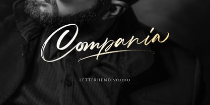 Compania is a luxury signature script. The natural hand writing feel make this font stand out. This font is perfect for logos, magazines, books, greeting / wedding cards, packaging, fashion, make up, stationery, novels, labels or any type of advertising purpose. Features : uppercase & lowercase numbers and punctuation multilingual support ligatures alternates PUA encoded We highly recommend using a program that supports OpenType features and Glyphs panels like many of Adobe apps and Corel Draw, so you can see and access all Glyph variations. Email us to letterhend@gmail.com if you need something! Happy Designing!
 - ITC Mister Chuckles by ITC,
$29.99Round, firm, and bursting at the seams with good humor, ITC Mister Chuckles is based on the premise that barrel shapes have pleasant associations. Think: beer-barrel polkas, a barrel of fun, or a barrel of laughs, and you'll get the idea. Designer Nick Curtis has combined sans serif sturdiness, a hint of 1930s deco and a handful of giggles in this remarkably versatile all-cap face. If the typographic occasion calls for mirth and merriment, invite Mister Chuckles to the party. You'll have more fun than a barrel of monkeys! - Ask For Mercy by Comicraft,
$49.00 She’s tall and thin with elegant, long legs and striking features. She can be seen in Comicraft’s COMIXOLOGY ORIGINALS series, ASK FOR MERCY. No, not Mercy herself — we’re talking about the ASK FOR MERCY font! Yes, you asked for Mercy -- begged for it even -- and now we are granting it to you! Mercy Mercy Me. ASK FOR MERCY contains alternate uppercase alphabets, auto-ligatures for a more random, hand-drawn appearance, and Comicraft's revolutionary Crossbar I Technology™, which puts that tricky character in exactly the right places.
 - Bocahe by IbraCreative,
$13.00 Bocahe, a delightful and whimsical doodle kids font, captures the essence of youthful imagination and playful charm. Each letter in Bocahe is carefully crafted with endearing doodles, resembling the spontaneous drawings of children at play. The font exudes a carefree spirit, making it perfect for projects geared toward a younger audience. Bocahe’s adorable characters bring a sense of innocence to any design, from playful invitations to colorful educational materials. The font’s hand-drawn aesthetic and vibrant personality make it an enchanting choice for conveying joy, creativity, and the boundless wonder of childhood in typographic form.
 - Cookery by Los Andes,
$29.00 Cookery is a contemporary, friendly and authentic hand-drawn brush pen typeface with irregular baseline. It is well-suited to display use for book covers, logotypes, packaging, restaurant menus, invitation cards and advertising, among other uses. Get the most out of Cookery's 613-character set by activating OpenType features including letters having the capability to automatically adjust between connected and disconnected forms, alternates, swashes, initial/terminal forms, old style figures, etc. All these alternatives provide a wide range of possibilities to give your compositions a natural, playful and unique look.
 - Dutch Deco JNL by Jeff Levine,
$29.00 Although the Art Deco movement is generally attributed to the 1930s and 1940s, a number of design influences were showing up during the late 1920s in what is referred to as the Art Nouveau period. The Dutch illustrator Anton Kurvers’ hand lettering on the front cover of the (1927) magazine “Het Vlaamsche Volstooneel” clearly shows the clean lines and Avant Garde geometrics that foreshadow Art Deco. This attractive pre-Deco lettering has been recreated digitally as Dutch Deco JNL, and is available in both regular and oblique versions.
 - Broadcast JNL by Jeff Levine,
$29.00 The vast resource of hand lettered vintage sheet music titles offers many interesting and unique variations on even the simplest styles of lettering. A simple thick-and-thin serif design circa the 1920s-1930s evokes a reminiscence of the Art Nouveau period combined with a touch of what was to come during the Art Deco era. Most charming is the fact this lettering is free of the formal rules and constraints of metal type, where designers are generally forced into conformity with uniform stroke widths, serif placements and character shapes.
 - Zigzag by Volcano Type,
$60.00 ZIGZAG is a funny font family whose letters have four varieties each in order to multiply expressions and attract the eye by breaking the rhythm of reading. There are two styles available Rounded and Not Rounded. The variations oscillate between a hand-drawn design and a geometric or imaginative drawing. Opentype’s function lets you choose between different variations of each glyph and contextual variables allow to mix the styles. Benoît Bodhuin designed ZIGZAG Rounded in 2011/12 for the theatre Vivat. In 2013 ZIGZAG Rounded was supplemented by ZIGZAG Not Rounded.
 - Noah Letter by Aminmario Studio,
$20.00 Noah Letter is a natural signature font, that is readable and stylish. This font was created to look as close to a natural handwritten script, as possible by including alternates lowercase, swash lowercase, ligature and underlines. Built in Opentype features, this script comes to life as if you were writing it yourself. Perfect for any awesome projects that need hand writing taste. Comes with regular and italic. Also support multilingual. This is suitable for branding, quotes, invitations, stationery, wedding design, logos, watermarks on photography, signatures, advertisement, album covers, business cards, clothing, magazines, posters, and more!
 - Azalleia by Intellecta Design,
$26.90 Azalleia is a new exaggerated flourished caps typeface. Well elaborated and unusual design, inspired by old cross-stitch and craft books. Works great when used for display artworks. Entirely designed by hand, without use of auto-tracing and available in two different designs. Buying the two fonts pack you get free the exclusive collection of Azalleia native colored eps vectors, zipped with the font and ready to use. Take a look at the banners in the gallery section to see samples of this nice collection of eps free vectors.