10,000 search results
(0.056 seconds)
- Hvala by Etewut,
$35.00 Hvala is a display typeface based on slab serif. All european languages are included. 'Hvala' means praise. Remember it when you design your graphics using my font. It's a pure magic to express your respects or/and expect them back.
 - Kondo by Surplus Type Co,
$18.00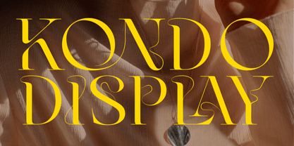 Kondo is a highly stylized serif font that features elegant looping details in the uppercase characters. This makes it a perfect choice for creating branding and logo designs with it's huge selection of custom ligatures. Add Kondo to your collection today!
 - Bush Market by Paramajan,
$12.00 Bush Market is a handwriting script typeface designed to give off a bouncing, fast writing vibe, and informal. It can be used as a handwritten header display or as a stylish text for magazine, blog, branding, packaging, wedding invitation project, etc.
 - Dialog Anila by Prioritype,
$12.00 Simple and eye-catching display fonts for your design touch. You can apply it to packaging designs, posters, logos, quotes, merchandise etc. See some of the previews above for reference. Features: -Uppercase -Lowercase -Numeral -Punctuation -Multilingual -PUA Encoded -Opentype Features
 - St Friska by Stereotypes,
$34.00 St Friska, based on old movie title lettering, is made just for headlines. It comes with a slight touch and feeling of art deco but it’s designed to be contemporary in 2010 and beyond. Friska comes with a big bunch of OpenType features, so a designer can play with it like Lego, using it alongside old or new typefaces. It has stylistic sets and lots of ligatures.
 - Largest by 50Fox,
$29.00 Are you looking to make your headlines more eye-catching? If so, then this Largest Display Typeface is perfect for you! This typeface style stands out from the crowd, making it ideal for grabbing attention. Whether you're looking to make a statement on a poster, logo, card, website, social media or even just overlay text, this Largest Fonts is a great choice. With its bold and heavy look, it will give your headlines the added pop they need. https://youtu.be/5x84ygKnLjg7 You can easily customize the typeface with ligature and alternative characters. And if you're worried about legibility, don't be - the large typeface is designed to be easy to read from a distance. It's the perfect way to make your headlines stand out and show off your creativity. So don't be afraid to go big and make your headlines more attention-grabbing with our Largest Fonts! Thank you for looking.
 - Hometown by Balpirick,
$15.00 Hometown is a Modern Handbrushed Font. Hometown is a bold and fun handwritten font. It’s playfulness make it great for creative projects, be it inspirational wall posters or for communicating your brand. Hometown also multilingual support. Enjoy the font, feel free to comment or feedback, send me PM or email. Thank you!
 - Courtney by Latinotype,
$29.00 Courtney is a display font, unicase, with thick and irregular strokes. It contains a varied set of ligatures that makes Courtney a very dynamic font, ideal for short texts, magazines, logos, etc. It also possesses a large amount of connectors like for example: and, the, by, among other, designed to complement the font.
 - Candywrap by Outerend,
$10.00 The design of the font, "Candywrap," was inspired by the various shapes of candies It gives soft and gentle, but optimistic and fun feel to your design. It offers round-shaped glyphs which can be uniquely used for your shop signs, logos, posters, menus, billboards, and many others! It's a caps only font.
 - Bastrid Script by Attract Studio,
$14.00 Bastrid Script is a feminine modern handwritten font, carefully handcrafted to become a true favorite. Its casual charm makes it appear wonderfully down-to-earth, readable and, ultimately, incredibly versatile. Bastrid Script will look outstanding in any context, whether it’s being used on busy backgrounds or as a standalone headline. Equipped with alternative letters for beginning and ending. and also "stylistic alternates" which makes this letter very beautiful and attractive. Thank you for your purchase! Happy creating!
 - Sahitya by Sulthan Studio,
$19.00 Sahitya Script is a stylish calligraphy font that features a varying baseline, smooth line, classic and elegant touch. It can be used for various purposes such as headings, signature, logos, wedding invitation, t-shirt, letterhead, signage, labels, news, posters, badges etc. Sahitya Script is built with OpenType features and includes start and end. It comes with OpenType Stylistice set, Initial, swashes, ligatures and everything to add a touch to your design and also supports other languages :)
 - Chopped Black by Tipo Pèpel,
$24.00 This typeface was inspired by the font Pabst Heavy, designed by Chauncey Hawley Griffith in 1928 for Linotype. Because of its formal characteristics, recalls the popular Cooper Black and probably was the reaction of Linotype to counter the popularity of this font distributed by the "American Type Founders" was acquired. It's a heavy typeface, ideal for headlines or for use in creating logos, rounded shapes and gestures evoke dynamism and make it perfect to highlight specific words or phrases.
 - Moula by 38-lineart,
$16.00 Moula is a modern sans serif with a geometric touch. Containing of 18 font, 9 uprights and its matching italics. It's shown a clean, minimalist, elegant, warmth, quirky, yet still purposed to be versatile and easy to read. Fit for various design or creative project. Support extended language (+ Cyrillic), fractions, tabular figures, ligatures and more. Perfectly suited for graphic design and any display use. It could easily work for web, signage, corporate as well as for editorial design.
 - Fancy Pants by Comicraft,
$19.00 We call this font Fancy Pants and if you give it a glance, it WILL just dance, dance, dance! In tall high heels and pretty toes, this slick chick font is ready to pose for invitations, party plans or high society soirées and forays into the boom boom rooms and pubs and clubs where fancy meets schmancy, and your pants will make YOU get up and dance and your face want to grin. It's all win-win!
 - Lectori Salutem by HoboArt,
$10.00Is it royal, or is it dandyish? Either way it's sure to catch the eye. Prepare for titling figures any movie executive would be jealous of using. Do you write sci-fi, fantasy, costume, or cult; or is your announcement for an off-beat wedding? Lectori Salutem offers salutations to the reader, and a kick. Lectori Salutem is the serif counterpart of the Lectori Salutem Sans font. A postmodern font with slightly romantic features, and playful ligatures. - Opposition by Rita Bernardo,
$15.00 Opposition is a serif typeface that contain reverse contrast and has a decorative character. Taking into account its specific design, which gives rise to its unique personality. Contain ligatures and is a multi-lingual typeface which is adapt to different Latin alphabet languages. This font contain two weights: regular and bold. It's an ideal typeface for many types of applications in graphic design and beyond, such as websites, packaging, editorial design, titles, small texts and much more.
 - Sekato by Suamzu Art,
$10.00 The Sekato Monoline font is a monoline script font inspired by retro scripts. The Sekato Monoline font comes with the Variable Font format available so it is easy to use to select the desired weight for the design. And supported opentype features that make it more natural and attractive for the needs of designers. Made with care and this font is suitable for digital letters, logos, t-shirts, prints, business cards, branding materials, quotes, nature photography, etc.
 - Magallanes Essential by Los Andes,
$18.00 Magallanes Essential a contemporary neo-humanist sans serif font designed by Daniel Hernández. Its strokes and terminals are related to the calligraphic strokes from humanist typefaces. Every weight comes with alternative glyphs for a more dynamic use. Magallanes is the perfect titling font to complement text faces in magazines, logotypes, etc. It is a essential family of 8 fonts, 4 weights and italics. This typeface no contains alternate glyphs and add only Windows 1252 Character set (219 Glyphs).
 - Gunar by The Northern Block,
$39.00 A geometric sans serif with a square chiseled appearance. Precise curves are met with straight lines and tapered angles to produce a fresh, technical typeface. It’s large x-height and neutral width give it good legibility at small point sizes. These refined rectangular features make it ideally suited to a wide range of modern applications. Details include 550 characters with alternative lowercase a, e, g and y. 5 variations of numerals, manually edited kerning and Opentype features.
 - Metcon by Comicraft,
$19.00 Enough talk. Metcon is not here to talk. It's simply here to PUMP... YOU UP.
 - Compita by Studio Buchanan,
$12.00 Compita is a Neo-Grotesk(ish) typeface that started life as a love-letter to Berthold's classic. But for every rigid, Neue-Haasism, there exists an equal and opposite amount of humanist attributes – along with a deliberate dose of creative license. It has some over-emphasised features and terminal endings which help to create its friendly personality, but sits them on a slightly condensed overall width. Together they help balance each other out, creating a face that feels both affable and professional. Aff-essional perhaps? The character set contains everything the modern day designer needs, including diacritic support for over 30 languages. And It’s packed full of the usual opentype features (that most will probably ignore) – Small caps, multiple number sets, and discretionary ligatures, to name just a few. Whether it’s deployed as a display face, or as the dependable choice for text, Compita is useable across multiple disciplines. Set in online, on screen or in print – it’s proof that not everything has to be Montserrat or Raleway...
 - Ageo by Eko Bimantara,
$22.00 Ageo is a soft geometric sans serif font family. Contain 8 weights from Thin to Heavy with matching Italics. It's a compromise of bauhaus and modern styles with a soft, minimalist, elegant, warmth, quirky, yet still purposed to be versatile and easy to read. Ageo was created to satisfy reading experience, it's compatible for text and also display, fit for headers, titles, posters, websites, brands, apps and other various design or creative projects. It contains several OpenType features: Standard ligature, figures variation (old style, fraction, numerator, denominator), and also broad latin language support. Ageo has been trusted by large enterprises and is still one of our best selling works. This latest update version 2.0 provides some fixes to the letterforms, spacing, and additional 2 variable font files, also new fonts format to support broad reading experiences.
 - Higery by Craft Supply Co,
$20.00 Higery – Serif Typeface: Uniquely Engaging Distinctive Tapered Details: Higery – Serif Typeface stands out with its unique tapered serifs. These details add a sophisticated charm. This font is ideal for captivating visual displays. Perfect for Visual Displays: Higery’s elegant tapering makes it perfect for eye-catching displays. It excels in adding an artistic touch to posters, ads, and more. Its uniqueness ensures your design stands out. Versatility in Design: Though unique, Higery remains versatile for various design needs. It seamlessly fits into digital and print media. This adaptability makes it a valuable tool for designers. Ease of Use for All: Higery is designed with user-friendliness in mind. It’s easy to use for designers of all skill levels. This approachability makes it a popular choice in the design community. Elevating Aesthetic Appeal: Incorporating Higery into your projects can significantly enhance their aesthetic appeal. Its distinctive serifs and elegant design elevate any content. Higery isn’t just a typeface; it’s a visual experience.
 - Landsick by Tour De Force,
$25.00 Landsick is single weight script family. It's charming, it's characteristic, it's lively and playful. Ready to be used everywhere.
 - Aillek by Twinletter,
$18.00 Introducing Aillek, a retro-condensed font with multilingual support and a distinctive look that will enhance any project. Aillek lends a touch of retro charm to any design with its lofty letterforms and alternate characters. Your design becomes more dynamic and interesting thanks to its ligatures options. Aillek is ideal for producing vintage flyers, logos in retro style, nostalgic social media graphics, and more. It is perfect for branding initiatives, packaging design, book covers, and more due to its condensed letterforms. It is adaptable for any project that needs to reach a large audience thanks to its multilingual support. Aillek is a must-have for any designer, marketer, or anyone looking to add a dash of nostalgia to their work because of its distinctive design and features. It’s ideal for those who want to add a touch of nostalgia to their designs as well as for those who want to create designs that evoke nostalgia and vintage aesthetics. Make Aillek your go-to font for all your retro-condensed design needs by taking advantage of this opportunity. Don’t wait, get this special font right away, and start making designs that will be remembered. What’s Included : - File font - All glyphs Iso Latin 1 - Alternate, Ligature - Simple installations - We highly recommend using a program that supports OpenType features and Glyphs panels like many Adobe apps and Corel Draw so that you can see and access all Glyph variations. - PUA Encoded Characters – Fully accessible without additional design software. - Fonts include Multilingual support
 - Friendly by Positype,
$29.00 Friendly is an homage to Morris Fuller Benton's adorable Announcement typeface. It is not a strict interpretation, digital revival or reverent reproduction of the original letterforms… but I would be remiss and shady to not acknowledge the letterforms that inspired this typeface. If you are looking for a more accurate 'scanned revival' I would recommend searching "Announcement" on MyFonts. As stated earlier, it is an homage to the original letterforms of the typeface but takes a great bit of freedom tightening the construction up in order to loosen up the movement of the variant letterforms to allow a great deal of usable personality. I enjoy stating this dichotomy… "loosen up to tighten up the forms" and vice versa. It seems counterintuitive or silly but by allowing the letterforms to normalize, I felt more comfortable going back and adding rather indulgent personality. Infused with stylistic alternates, swashes, titling, many many contextual alternates, 9 stylistic sets and 2 stylistic sets with wordmarks, the typeface became far more 'friendly' for me… how could it not? With so many loops, swashes and typographic indulgences, it was bound to be fun. The more elaborate and 'overdone' Friendly got, the more I wanted to slant it. Here's where my thinking differs from MFB's original. I like slanted romans… especially ones with long ascenders, but I do not like much of a slant. It has to be the lettering person in me. It's hard for me to do a completely upright serif and not pair it with an angle, but I did not feel Announcement's 'Italic' offered much and the actual slant needed to be far less. If it's not an italic, I prefer the letters to slant with an angle equivalent to the thickness of the vertical stroke. The Slanted version of Friendly is set at 3.6 degrees, is quite subtle, and very fitting for me. You will find that most characters have a contextual, stylistic, swash and titling alternate assigned to them and some have an echoed alternate to the swash and titling options if the stylistic alt has been selected in tandem. Additionally, all of these are accessible in the glyph palette directly from the base glyph typed or through selecting options through the Stylistic Sets 1–9. Stylistic Sets 10 & 11 are a little different. They are actually configured as complex majuscule ligatures… a result of me getting carried away. Other features like a default old style numeral set and coordinating glyphs have been produced along with case support, ordinals, and more have been added to make it more relevant for contemporary use.
 - Valeson by insigne,
$34.00 Feel the funk with the retro-inspired Valeson. This groovy mix of the ‘70s and ‘80s has an upbeat rhythm of its own that will make your project boogie. It’s loads of fun with its swashy, calligraphic twist. Push it to the max with plenty of weights. Denser weights are brawny and robust, fantastic for headlines, while medium weights are swell for short bits of text. With all its options, this fun, throwback personality is still streamlined and plenty useful for today’s jobs. It’s loads of fun with its swashy, calligraphic twist. Production assistance by Lucas Azevedo and ikern.
 - Metron by Storm Type Foundry,
$52.00 Metron is so far the most ambitious typeface made to order in the Czech Republic. Despite the fact that for a number of years it has not been used for the purpose for which it was designed, every inhabitant of Prague is still well aware of its typical features. Metron Pro was commissioned by the Transport Company of the Capital City of Prague in 1970 to be used in the information system of the Prague Metro. It was first published in the manual of the Metroprojekt company in 1973 and then used to the full, under the author’s supervision, for lines “A” and “C”. Since 1985 Rathouský's system has been disappearing from the Prague Metro; it survives only in the form of metal letters at its stations and at some stations of the Czechoslovak Railways. In 2014 we're mentioning the 90th birthday of Jiří Rathouský. It’s a good opportunity for updating and re-introducing his Metron. Extended was the choice of figures and fractions, new currency signs added, diacritics revised, etc., but above all the newly designed Cyrillics including true SmallCaps. Now we have six weights plus italics, where the tone of the basic style is even closer to the original. Ten years back we've had the feeling that this typeface should again take a part of Prague’s traffic system and today, when revisiting of all the fonts, the feeling turned to certainty. The main feature of this typeface is namely a noticeability a property above all welcomed in rush of platforms.
 - Clarenwood Stencil JNL by Jeff Levine,
$29.00 It's a wood type! It's a stencil font! It's BOTH! Clarenwood Stencil JNL was originally designed as a solid alphabet (Clarenwood JNL) modeled from vintage wood type. The stencil treatment was applied to add a fresh look to a classic lettering design.
 - AT Move Decoupe by André Toet Design,
$39.95 Découpé Based on a French children’s play from 1906. In a car boot sale André Toet found a funny looking box containing a lot of cut out cardboard figures, in fact it looked a bit like a geometric puzzle! He played around a bit and succeeded to create a workable typeface with it ! The interesting thing about this particular font is, that in fact it’s organized chaos. The 26 letters of the alphabet are a mix between caps and lowercases, so within one word caps and lowercases will be used next to each other. It’s a very useful font for different projects. Concept/Art Direction/Design: André Toet © 2017
 - Dixplay by Emtype Foundry,
$69.00 Dixplay, a typeface based on a pixel grid, is available in two weights: regular and black. Inspired by video game aesthetics of the 80s, was originally intended for display applications, but it works fine on paper as well. The font has been conceived in 20 px size allowing more freedom to manipulate it and making a big difference with other fonts of its kind, this difference it’s more evident in Dixplay Black. As a result, it’s optimized for screen use at 20 px and its multiples. Spacing is one of the most outstanding aspects of Dixplay. While pixel fonts doesn't have kerning pairs, Dixplay offers more than 300 manually done that fit perfectly to the grid. It is available in Open Type format and supports Western European Languages that uses the Latin alphabet. For more details see the PDF.
 - Monas by TypeClassHeroes,
$14.00 Introducing Monas is a Modern Modern Display Font, access your OpenType features to access the large selection of alternate letters and ligatures. Use this font for any branding, product packaging, invitation, quotes, t-shirt, label, poster, logo etc. Feature Uppercase & Lowercase Number & Symbol International Glyphs Multilingual support Alternative Ligature Feel free to drop us a message any time Hope you enjoy it.
 - Amorphic by Ali Güzel,
$11.00 Chrome Balance is an experimental bitmap font created by photographing hand-modeled play dough and adding a chrome effect. It has a unique and dynamic look and is designed to accompany bold and simple designs such as album covers, posters etc.. The vector version of the same form has also been converted to the vector format, font named Amorphic. IG: algzl
 - Winter Swash by Illushvara,
$14.00 Hello, Introducing a new font Winter Swash inspired by graffiti style. It's bold, dramatic, urban styled display font. Add this font to your favorite creative ideas and notice how it makes them come alive like a poster, kids flyer, merchandise, quotes, branding, cartoon, comic and more. If you have any question, don’t hesitate to contact me. Happy Designing !!! Thank You, Bayu Suwirya
 - Charta by Studio K,
$45.00 The Charta family of fonts draws its inspiration from the letter styles used in early manuscripts and printed books. Charta is also remarkably versatile: it’s equally at home in a traditional or modern context and can be used for a wide range of applications from an automobile badge to a newspaper masthead and from a fashion label to a candy bar wrapper.
 - Practish by Gleb Guralnyk,
$10.00 Hello! Introducing a Slab Serif font family named Practish. It's a typefaces set that includes 7 weight variations from Bold to Thin. This font has a strict classic shape and diverce characters thickness makes it useful in lots of cases at any sizes, from visit card to billboard. Practish font family has also a multilingual support of west european languages and 13 ligatures.
 - Sol Supremo by Prestige Artsy Studio,
$19.00 Introducing "Sol Supremo," a stunning all caps serif font that combines elegance and modernity with a touch of nostalgia. With its clean lines and confident curves, this aesthetic typeface brings a fresh perspective to any design project. Whether it's for a sleek logo, striking headlines, or stylish print materials, Elevate adds a touch of sophistication, elevating your visuals to the next level.
 - Tango Mango by TypeClassHeroes,
$14.00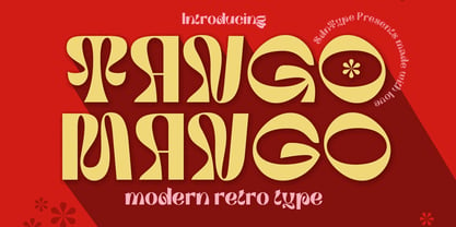 Introducing Tango Mango Modern Retro Font, access your OpenType features to access the large selection of alternate letters and ligatures. Use this font for any branding, product packaging, invitation, quotes, t-shirt, label, poster, logo etc. Feature Uppercase & Lowercase Number & Symbol International Glyphs Multilingual support Alternative Ligature Feel free to drop us a message any time Hope you enjoy it.
 - F line by alphabeet.at,
$30.00 f-line is a special handwriting monoline font face, with one constant line from glyph to glyph and variable width. It was drawn for the designer’s thesis in 2010 and expanded until 2021 with a lot of open type features. It’s built up with three glyph sets to let the glyphs rotate automatically, and amongst other type features initial forms are available.
 - Christmas Sundaylab by ahweproject,
$14.00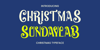 Christmas Sundaylab is a festive and very classy display font. It’s ideal for any of your winter vacation creations, so add it to your designs and bring them to life! Christmas Sundaylab is perfect for branding projects, logo, wedding designs, social media posts, advertisements, product packaging, product designs, label, photography, watermark, invitation, stationery and any projects that need handwriting taste.