10,000 search results
(0.028 seconds)
- M Qing Hua PRC by Monotype HK,
$523.99 Among the world of Chinese commercial fonts, M Qing Hua has a relatively high flexibility to be used in different areas, for instance, media of advertising. Its design concept is to combine the neatness of Hei typeface with the roundedness of Yuen typeface. The typeface tries to revitalize the boring traditional design by adding energy, simplicity and modernness to it, which could be shown in the small features in strokes like delicate and curvy finishings. More is the appropriate mix of masculinity and femininity, so as to enable a more effective communication, stronger visual attractiveness and higher affections.
 - ITC True Grit by ITC,
$29.99ITC True Grit is the work of American designer Michael Stacey, a bold distinctive typeface. An enthusiastic collector of vintage graphic design, Stacey says that he is especially intrigued by lettering styles from the days when most display typography was done by hand. The style for ITC True Grit was taken from the 1930s and updated for digital imagine. Stacey say his goal was to retain the casual feel of handlettering yet impart the crisp finish of current precision typography." ITC True Grit is a hybrid design, a cross between German Blackletter and brush script with a hint of Jugendstil thrown in." - Linotype Syntax Serif by Linotype,
$29.00Linotype Syntax™ Serif is the serif typeface that complements Linotype Syntax™, both created by Swiss type designer Hans Eduard Meier in 2000. With this new design, Meier has at last given shape and structure to the invisible muse that inspired him in the 1950s when he conceived his monoline sans serif based on humanist or Oldstyle letterforms. The calm legibility of this workhorse text family is accented by Meier’s signature of subtle dynamic movement, making it ideal for longer texts in books and magazines. It combines harmoniously with the other Syntax typefaces, Linotype Syntax™ and Linotype Syntax™ Letter. - Gutknecht by Proportional Lime,
$9.99 Jobst Gutknecht was a highly successful printer in the city of Nuremburg from 1514 to 1542. He published the "Achtliederbuch" (the first Lutheran hymnal, with a whole 4 tunes) and many works by Martin Luther. This font is an accurate "recutting" of the font face Gutknecht used for the body text in his printed works. It has been extended to over 900 glyphs adding hundreds for modern use. It also presents many ancient things like old ligatures such as "tz", a hedera, and alternate style pilcrow for visual interest. And for those conservative types the modern lower case "k" is also available.
 - Schoeffer by Proportional Lime,
$14.95 Peter Schoeffer was a printer who was apprenticed to Gutenburg and after leaving Gutenburg in 1455 he set up shop with Facob Fust. His son, Peter the Younger, moved to Mainz and carried on the trade. This particular font is based on a typeface of Peter the Younger that was cut circa 1509-1520. This font has over 900 characters. While there are only about 80 in the historical exemplar the rest have been developed for modern usage. This font is based on Typ.7:146/148G also known as Gesellschaft für Typenkunde plate no. 258.
 - Take The Money by Kitchen Table Type Foundry,
$15.00 Take The Money is a wonky all caps font, made with a Sharpie pen. The name was inspired by something I read in the newspaper: apparently a Danish artist received €72.000 from a museum to create two works of art. The works of art should depict the average income of someone from Austria and someone from Denmark - in real money. The museum then loaned him the €72.000 and told him he'd receive €3.300 for his work. The artist decided that €3.300 would merely cover the costs, so he delivered two empty canvases and called the work: Take The Money And Run.
 - Mirage by Chris Costello,
$22.75 I designed Mirage using ink and a calligraphy brush to evoke the writing styles of ancient and exotic civilizations. After completing the project, it was filed and forgotten. About 15 years later, I was sifting through some of my old art files and found a "photostat" of the entire character set... a truly a magnificent archeological discovery. Then I thought, hey, maybe it's day has come. Why not share it with the world?... a completely digitized version for the new millennium. This unique font is a versatile, calligraphic option for travel, history, and greeting card themes. What other uses can you imagine?
 - Prangs by Sudtipos,
$59.00 The late-19th-century Prussian-American printer and publisher Louis Prang, the “father of the American Christmas card”, was well-known for his efforts to improve art education in the United States. He published many instructional books and even founded a training school for art teachers. One of the books he published included a series of alphabets for sign painters, lithographers, illuminators, architects and civil engineers. There was nothing truly original there — in the book’s preface, Prang says that the alphabets were “based on foreign forms and adapted for American taste”. The one alphabet that caught my attention in that book was one simply called “Italic”. It’s a high- contrast modern, a Didone really, but with an interesting little twist: the lowercase is almost entirely connected, which makes for an interesting mix of modern typography and classic calligraphy. That stuff is right up my alley now. Whenever my eyes happen on a modern, it’s easy, even almost impulsive for me to envision swashes coming out of serifs and terminals. The caps melt and the minuscules dance with them. And so I brought my vision to life. Prangs is an italic set of three weights, each containing more than 1400 glyphs with plenty of OpenType features and Latin language support. This set celebrates the convergence of three centuries of fancy display alphabets. These fonts should work wherever moderns are used to elevate and scripts are used to appeal — namely today’s branding, packaging and glossy publications.
 - ITC Stone Humanist by ITC,
$40.99 Type designers have been integrating the design of sans serifs with serifed forms since the 1920s. Early examples are Edward Johnston's design for the London Underground, and Eric Gill's Gill Sans. These were followed by Jan van Krimpen's Romulus Sans, Frederic Goudy's ITC Goudy Sans, Hermann Zapf's Optima, Hans Meier's Syntax and Adrian Frutiger's Frutiger. Now, ITC Stone Humanist joins this tradition. It is a careful blend of traditional sans serif shapes and classical serifed letterforms. ITC Stone Humanist grew out an experiment with the medium weight of ITC Stone Sans, a design that already showed a relationship to these sans serif-serif hybrids. ITC Stone Sans has proportions based on those of ITC Stone Serif, and its thick-and-thin stroke contrast suggests the bloodline of humanistic sans serif typefaces. But other aspects of ITC Stone Sans are more closely aligned to the gothics and grotesques, a tradition that accounts for the largest portion of sans serif designs. Enter ITC Stone Humanist. During his experiments with the earlier design, Sumner Stone recalls, I was actually quite surprised at how seemingly subtle changes transformed the face," moving the design firmly into the humanist tradition. "The form of the 'g,' 'l,' 'M,' 'W,' and more subtly the 'a' and 'e' are part of the restructuring of the family," he explains. The top endings of vertical lower case strokes have been cropped on an angle, as have the ascender and descender stroke endings. ITC Stone Humanist is a full-fledged member of the ITC Stone family. It has been produced with the same complement of weights, and the x-heights, proportions, and underlying character shapes are completely compatible with the three original designs. The original ITC Stone Sans is a popular typeface, in part because of its notable versatility. ITC Stone Humanist shares this virtue, and can be used successfully at very small sizes, in long passages of text copy, and even as billboard-sized display type."
 - Flourishes A by Wiescher Design,
$39.50 FlorishesA are a set of flourishes, that serves well for frames and other elegant embellishments, they are beginning of last century American. Your I-found-them-somewhere type-designer, Gert Wiescher
 - Bluegrass by Scrowleyfonts,
$14.00 Bluegrass is a smart, fresh font loosely influenced by brush stroke writing. The font includes complementary borders and ornaments accessible as alternates to the standard character keys in Opentype aware applications.
 - National Champion Line Series by Kyle Wayne Benson,
$4.00 National Champion is the overly confident geometric slab that comes in four weights and twelve line styles. He's got a 3/4 cap lowercase, lots of language options, and opentype fractions!
 - Christy Marie by Elemeno,
$25.00Christy Marie likes fun fonts. This was the first font to meet with her approval. It's bouncy, teenage girl sort of font and would do well at parties or the mall. - FG Callie by YOFF,
$13.95 FG Callie is a Calligraphy font, but it shouldn't be taken too seriously :) With curly ends on the descenders and her not so straight lines it's more of a fun font.
 - Islander BT by Bitstream,
$50.99The hand-hewn Islander looks like it could have been liberated from granite blocks.These demonstrative letter forms leave no doubt when it comes to conveying your message, yet they remain playful. - FS Lola by Fontsmith,
$80.00 L-O-L-A Like the subject of the Kinks’ song, FS Lola is a little bit of both – a font with a rare combination of masculine and feminine. The font was inspired by the song, which itself was inspired by the night the Kinks’ manager spent dancing drunkenly in a Soho club with a beautiful woman... Or so he’d thought, until her stubble started to show halfway through the evening. Masculine/feminin Phil Garnham’s experience in designing FS Lola was similar to the one related by Ray Davies. Setting out to create a sans serif font, he realised along the way that he was actually dealing with a semi-serif. He went with it, though, and produced a font with the best masculine and feminine qualities: hard edges and corners tempered by shapes of softness and generosity, the outcome of what Phil calls an “organic” design process. “Initially, my designs were very graphic and hard but not very distinctive. By printing and redrawing the letters in pencil I achieved a softer and friendlier alphabet with a strong personality.” Broad Lola, as you’d expect, is very broad-minded. Available in five weights with italics – and fluent in central European languages – FS Lola offers a confident combination of feminine softness and male steeliness to any kind of design. As the song says, “It’s a mixed-up, muddled-up, shook-up world... except for Lola.
 - Punkstoric - Personal use only

- Spoonge Punk - Personal use only

- Cute Letters by Harald Geisler,
$68.34 Cute Letters is a hand drawn font family in two styles with extensive character sets. Cute Letters - Hearted is a vibrant happily singing script, all capital as well as some lowercase letters are decorated with heart shapes. Second: Cute Letters - Heartless is still as vivid as it’s sister Hearted but a little less briskly, some straightened forms and without the decorative hearts. Both styles are readable and suitable for longer texts in medium point sizes. Cute Letters Hearted & Heartless is a part of the Light Hearted Font Collection that is inspired by a recording of Jean Baudrillard with the title, "Die Macht der Verführung" (The Power of Seduction) from 2006. Further inspiration came from the article, "The shape of the heart: I'm all yours". The heart represents sacred and secular love: a bloodless sacrifice. by British writer Louisa Young printed in EYE magazine (#43) London, 2002.
 - Prince And Princess Charming by Harald Geisler,
$68.34 Prince and Princess Charming are very extravagant and extroverted about their feelings. Prince Charming puts a heart on everything. If you're convinced that you love you've got to go with Prince Charming. Compared to the Prince, Princess Charming puts more hearts on every letter. Convince that you have to be loved: follow Princess Charming. As you would expect from Aristocrats the family members are fluent in many languages and have a surprising extensive character set that even covers Cyrillic. Prince and Princess Charming are a part of the Light Hearted Font Collection that is inspired by a recording of Jean Baudrillard with the title, "Die Macht der Verführung" (The Power of Seduction) from 2006. Further inspiration came from the article, "The shape of the heart: I'm all yours". The heart represents sacred and secular love: a bloodless sacrifice. by British writer Louisa Young printed in EYE magazine (#43) London, 2002.
 - Swank by ITC,
$29.99Jill Bell's typefaces are energetic, highly decorative, and refreshingly unpredictable. Some are friendly and childlike, while others are rough and nervous. Her latest creation is ITC Swank, a connected script whose shabby-chic" sophistication communicates a worn elegance. Bell begins the design process "with black stuff on white paper," she explains, preferring to draw letters before she digitizes them. Often the inspiration for her typefaces comes from a piece of hand-lettering. "Bruno began as a reminder to buy cat food," she says, "and ITC Swank started out as a small bit of lettering for Wurlitzer Pianos." Bell finds that working with blocks of lettering is a good start for script typefaces. "If I'm drawing a script typeface, I have to write out sentences in the letters first," she explains. "Drawing each letter separately doesn't establish the flow and spontaneity that scripts deserve." Bell's newest design is ITC Swank. It's a somewhat tattered formal script with definite links to early copperplate scripts. Though probably not for wedding invitations, Swank's elegant underpinnings are evident, with its slightly narrow proportions and a baseline that can best be called "bouncy." Graphic designers will appreciate the abundance of swash letters, making it easy to create distinctive headlines and short blocks of copy. Bell has a fondness for the "open, genuine" quality of Chinese and Japanese calligraphy. "Eastern styles incorporate the natural flow of the hand," she says. "Natural, human qualities shine through. Mistakes are accepted, not scorned as in the 'white-out' Western culture." This philosophy is evident in Bell's own designs. Whether it's ITC Clover 's carefree spirit, the slightly spooky Hollyweird, Caribbean 's< rustic charm or the weathered elegance of ITC Swank, there is a natural honesty in her work." - Castorgate - Distort - Unknown license

- Castorgate - Messed - Unknown license

- Castorgate - Upright - Unknown license

- Luciferius Infernitus - Unknown license

- Castorgate - Rough - Unknown license

- Erinal Narrow - Unknown license

- Endor Alt - Unknown license

- Neudoerffer Fraktur by Linotype,
$29.99Johann Neudörffer the Elder's 1538 writing manual fascinated the German designer Helmut Bomm for years. Together with Albrecht Dürer and Hieronymus Andreä, Neudörffer helped create Fraktur, perhaps the most Germanic of all the blackletter styles. As a tribute to this master, and bringing its letterforms to a 21st century public, Boom released the Neudoerffer Fraktur family through Linotype in 2009. Neudoerffer Fraktur's appearance is based very much in handwriting, and Bomm had already begun using letters from prototype versions of this typeface as early as the 1990s. For years, Neudoerffer Fraktur'sletters would appear secretly and seductively in design projects like historical sign restorations or heraldry pieces. The sources that Bomm used while drawing the typeface were images from Jan Tschichold's Treasures of Calligraphy" and Albert Kapr's "Schriftkunst." The Neudoerffer Fraktur family has four separate fonts. Any user of Adobe CS applications should consider licensing Neudoerffer Fraktur Regular (the font without any numeral suffixes). This font contains three different OpenType stylistic sets. Users can pick and choose which versions of the letters that they would like to set. Anyone using Quark XPress, Microsoft Word, or other applications without support for Stylistic Sets should license Neudoeffer Fraktur Regular 1, Neudoeffer Fraktur Regular 2, and Neudoeffer Fraktur Regular 3. Each of these three fonts has letters with slightly different style of flourish, and all three may be combined with each other. Neudoerffer Fraktur Regular 1 is optimal for longer texts; Neudoerffer Fraktur Regular 2 contains alternate letters, and well as more ornamented capitals; Neudoerffer Fraktur Regular 3's letters have a stronger calligraphic accent." - Gilgongo Kaps - Unknown license

- Gilgongo Tiki - Unknown license

- Gilgongo Ombre - Unknown license

- Gilgongo Mutombo - Unknown license

- Wazoo Outline - Unknown license

- Gilgongo Doro - Unknown license

- Rostalina Signature by madjack.font,
$18.00 Rostalina Signature is a unique, elegant and modern handwritten font. which looks like a signature, this font is intentionally made with unique and alternating ligatures. This handcrafted style makes it perfect for use in all your design projects be it logos, labels, packaging designs, blog titles, posters, wedding designs, social media posts, Instagram designs, etc. What's included? Multiple Language Support: ŠÀÁÂÃÄÅÆÇÈÉÊËÌÍÎÏŸŽÐÑÒÓÔÕÖØÙÚÛÜÝßàáâãäåæçèéêëìíîïñòóôõöøùúûêýÿŒœšž I hope you enjoy this font. If you have any questions, feel free to give me a message :)
 - DF Pommes by Dutchfonts,
$16.00 The Pommes font originates from my mid seventies potato punchcuttings at artschool. Since I’m living in a potato republic (NE of the province of Groningen) I got inspired to continue. I prepared this culinary alphabet as a tribute to this wonderful allround vegetable. Belgian and French recipies helped me in selecting and cutting/cooking the 6 styles. The Pommes-Dauphine Ultra Heavy (too much eggs added) can be used as a layer behind the Pommes-Dauphine.
 - De Floras by Dikas Studio,
$15.00 Hello, let me introduce my font called de Floras - 5 Fonts Family. de Floras is a lovely and beautiful script typeface that designs manually by hand and love. de Floras comes with 5 weight, light, regular, semi bold, bold and extra bold. de Floras comes with a beautiful start and end swash that made who look for the first time is falling in love. Very suitable for designing wedding cards, birthday cards, invitation, greeting, and many more.
 - Sometimes by Almarkha Type,
$30.00 Sometimes is a fancy signature font with 2 styles: regular and slant. It is inspired by luxury and branded items. It is perfect for logos, branding, photography, invitations, watermarks, advertisements, product designs, stationery, wedding designs, labels, product packaging, special events or anything that need hand-writting taste. Thanks for checking it out, and feel free to drop me a message if you had any queries! Oh, and come and say hello over at email : almarkhatype@gmail.com ~ Almarkha Type
 - Plumrose Signature by Typetemp Studio,
$20.00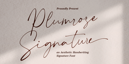 Plumrose Signature Script Font is an adorable, chic, and visual elegance signature script font. Comes with alternatives, ligatures, multilingual suport. Perfect for editorial projects, branding, weddings, social media, product design, stationery, advertising other romantic projects or simply as a stylish text overlay to any background image. Features : Uppercase and Lowercase Stylistic Alternates & Ligatures Numerals & Punctuation Multilanguange PUA Encoded Web Font Included Contact me with an inbox message If you have any question. Thank you! Happy Creating.


