10,000 search results
(0.031 seconds)
- Alana by Laura Worthington,
$49.00 Alana is a connected script that glows with casual elegance. Its inviting letterforms work well in settings such as letter-writing and menu details; even at small sizes. Set at display sizes, Alana’s strokes reveal rough edges evocative of ink on textured paper. Alana includes over 300 alternates, including swash capitals and ornamented forms to customize titles, headlines, packaging, and wordmarks. Alana includes 62 matching ornaments: botanical fleurons, birds, and cute lil’ bugs. See what’s included! http://bit.ly/2bXTLvP *NOTE* Basic versions DO NOT include swashes, alternates or ornaments These fonts have been specially coded for access of all the swashes, alternates and ornaments without the need for professional design software! Info and instructions here: http://lauraworthingtontype.com/faqs/
 - Karmaline by Mysterylab,
$9.00 Karmaline is a six-weight sans serif font family with a unique and expressive design. This font has some intriguing special features such as subtly tapered topheavy vertical strokes and selected wedge-shaped horizontal strokes. It is evocative of designs from Switzerland, Germany, and the Netherlands in the period spanning 1900 – 1930, but with thoroughly modern features like high legibility at small sizes, even inter-character weight and flow, and a high x-height. You'll find Karmaline's semi-condensed width to be useful for both strong headlines and for comfortable copyfitting in narrow column widths. This font also works very well when adding layered shadow and highlight effects, and is a great choice for logos.
 - Silverland by FontMesa,
$49.00 Silverland is a revival of an old type font from the Bruce Type Foundry of New York, the original font from 1874 included uppercase only plus 22 end caps. This 21st. century version has been expanded to include many more decorative end caps plus new lowercase, small caps, italic, italic small caps, swash, swash small caps and gothic version. Approximately six months of painstaking work has gone into making this font family over the last 22 months. The OpenType versions of Silverland include between 230 and 370 kerning pairs each setup as auto ligature replacements, you will need an application such Adobe CS products in order to take advantage of this OpenType feature.
 - Tri-Font by Greiner grafik,
$54.24 By the arrangement of single triangles Tri-Font gets a folded, handmade, geometric and modern effect. Tri-Font is perfectly suitable for use in anything from guidance systems to signage and was made for optimal readability both on screen and in print. The font family consists of a total of 350 glyphs and contains the font styles Triangle // Outline // Body. In Deutsch Die Tri-Font bekommt durch die Anordnung einzelner Dreiecke eine gefaltete, handwerkliche, geometrische und moderne Wirkung. Tri-Font eignet sich wunderbar für den Einsatz in Leit- und Orientierungssystemen. In der Displayanwendung wie auch im Printbereich ist sie angenehm zu lesen. Die Schriftfamilie besteht insgesamt aus 350 Glyphs und beinhaltet die Schriftschnitte Triangle // Outline // Body.
 - Varese Soft by Tarallo Design,
$18.99 Varese is a geometric and modular typeface inspired by early 1900s European posters. It is heavy and excellent for display or large body text. The design of this font explores the boundaries between unity and variety in a playful rhythmic dance. Varese will give your content a warm, nostalgic, robust, and friendly tone. The lowercase is similar in form to the uppercase, yet many of the lowercase letters have interior spaces and several have some variations on the form. The lowercase also has two alternate glyph sets that are half size and align with cap height. One of the alternate glyph sets has an underline and the other set does not. Varese Soft has a sibling, Varese.
 - Silverland Gothic by FontMesa,
$49.00 Silverland is a revival of an old type font from the Bruce Type Foundry of New York, the original font from 1874 included uppercase only plus 22 end caps. This 21st. century version has been expanded to include many more decorative end caps plus new lowercase, small caps, italic, italic small caps, swash, swash small caps and gothic version. Approximately six months of painstaking work has gone into making this font family over the last twenty two months. The OpenType versions of Silverland include between 230 and 370 kerning pairs each setup as auto ligature replacements, you will need an application such Adobe CS products in order to take advantage of this OpenType feature.
 - Neue June by Matt Chansky,
$21.00 Four years of development imbue Neue June with its uniquely crafted high x-height, enabling designers to literally and figuratively elevate layout designs. In today’s highly competitive brand marketplace, readability across communication platforms and memorability go hand in hand towards target audience retention. Neue June comes in six weights, from elegant thin to full-bodied emphatic bold, plus italics. You’ll find a robust selection of highly refined multilingual glyphs. In addition to a suite of ligatures, there are a number of extra characters, such as the estimated symbol, the number sign, and directional arrows. When the creative direction calls for sophisticated and memorable tactics—leverage the versatile 385 glyph count for big messages and easily consumable body copy.
 - Sideroad by Melvastype,
$22.00 Sideroad is an intensive hand-drawn brush script font. It comes in two versions, Textured and Smooth. Textured version has this rough effect that comes when letters are drawn with pointed-brush on rugged surface. The Smooth version is, like the name says, smooth as silk with polished edges and properly drawn forms. Sideroad includes two sets of lower case letters to give variation and more imperfect hand-drawn effect. You can cycle these two sets by enabling Contextual Alternates OpenType feature. It also has set of lower cases without connector strokes. And a set of lower cases with end swashes. On top of these there are also a few underlines to give that final punch to your design.
 - Oksana Sans Compressed by AndrijType,
$33.00 Oksana Sans Compressed is the most skinny part of Oksana Sans font family, but still it retains most features of this humanist sans serif. The Compressed version is designed to get most of your page and fill a minimum space with maximum information. It can be useful in multiple columns typesetting — like magazines, newspapers or business documentation. Oksana Sans Compressed could be a good minor companion for other Oksana fonts as well. It has six weights from Thin to Heavy plus free and funny Fat Compressed Italic face, supports Western, Central European, Baltic Latin and Slavic Cyrillic codepages. Old-style digits, some ligatures, alternative characters and modern currency signs are also included.
 - Mermer by Jana Orsolic,
$35.00 Mermer font family is a contemporary take on Roman capitals in six weights. The font name is the Serbian word for marble, and the inspiration for its creation comes from chiseled street signs in Istria. With lowercase and Cyrillic added, it gets a broader range of usages. Mermer is bold and versatile, can be both sporty and high fashion, looking sharp in more than 40 languages. Thin is thorny and Heavy feels like a block of concrete. Make it LOUD by setting it in large sizes and choosing Mermer Heavy for posters, magazine headings or logos, or you can make it cosy and friendly setting it smaller in Mermer Regular for menus, book covers, invitations or business cards.
 - Okoye by XO Type Co,
$40.00 Okoye occupies a liminal space between the bonkers curviness of 19th-century grotesques and the sandblasted neutrality of 20th-century models. Both extremes are nice, but there’s something to be said for some neutrality with character left in place, yes? Okoye comes in 9 weights, Thin to Black. If you’re using it for interfaces, each weight lines up from 100-900 in the CSS specification you already know, with Regular sitting at 400 and Bold at 700. You’ll see what you expect to see without extra font-weight specification. There’s extensive Latin language support, a set of small caps which mirrors full-size caps (good for control labels), and arrows. Okoye will be your quirkhorse: hardworking, with personality.
 - Chevron by Altered Ego,
$45.00For that tight fit, STF Chevron is perfect. An ultra-condensed display font, with a complete character set. The name? It's named after an oil company, but the shapes of the serifs reflect that as well. With some art deco overtones, try Chevron in places that you might want a simple art deco typeface. How should you use it? It's perfect for posters, packaging and advertising, CD covers and publications. Fully hinted and exquisitely kerned, Chevron will be one of your favorite faces for tall copy that need to get noticed. It's really ideal for calendars, when you want big numbers without losing space for writing in the date fields. License it today! - Sica Expanded by dooType,
$30.00The Sica Family was designed in order to address issues related to technology, while maintaining humanistic forms. Thus, a font with square shapes emerged, but with smooth curves and slightly rounded terminals making it friendly. The family has three widths – condensed, normal and expanded – each of them with six weights and their respective italics, resulting in 36 fonts. With particular details and open shapes that increase legibility, it can be used for both text compositions as well for display sizes. It has 774 glyphs, covering more than 50 languages, as well as ligatures, lining, oldstyle, tabular and proportional figures, fractions, superiors, inferiors, and small caps, all of them accessible through OpenType features. - Posterman by Mans Greback,
$59.00 Posterman is a cool sans-serif typeface. With tall letterforms in a grotesque appearance, this legible typography is a lettering for neo-classic headline or clean logotype. The Posterman font family consists of Regular, Bold and Black, and each weight as Italic, totalling in six styles. The font is built with advanced OpenType functionality and has a guaranteed top-notch quality, containing stylistic and contextual alternates, ligatures and more features; all to give you full control and customizability. It has extensive lingual support, covering all Latin-based languages, from Northern Europe to South Africa, from America to South-East Asia. It contains all characters and symbols you'll ever need, including all punctuation and numbers.
 - TG Frekuent Mono by Tegami Type,
$30.00 TG Frekuent Mono a new modern geometric sans serif with monospaced style. This typeface is made with precise calculations so that it displays a beautiful and modern appearance. Besides this new typeface is also equipped with six different styles, ranging from ultra light to extra bold plus variable font. This typeface also has various alternative characters that can be used according to the needs in the design. Alternative characters that exist in this type of font have a touch of script typeface so that it makes the alternative character of this type of letter a little quirky and different but still fits well with the combination of modern main characters. And supports approximately 100 languages.
 - Mancunium by K-Type,
$20.00 Mancunium is a sans serif family with a contemporary monolinear character, though designed with the iconic proportions of Roman capitals in mind. In addition to reliable romans, the typeface includes proper, optically corrected italics. Also, uniquely, a set of ‘vertalics’ that contain the more script-like glyphs of the italics with angled stem terminals, but which are unslanted and upright in aspect, and without the slight narrowing of the italics. Each font includes a full complement of Latin Extended-A characters and additional oldstyle numerals. Mancunium is sold in two collections – a Regular/Bold package and a Light/Medium package. Each package contains six fonts - two romans, two italics, and two vertalics.
 - Nouveau Theme JNL by Jeff Levine,
$29.00 As long as there’s been movie theaters, those establishments became the perfect hideaway for couples who wanted to kiss, hug and snuggle without the watchful eyes of disapproving parents or the pesky attention of younger siblings. Such was evident in the [13 word] title of the 1919 composition “Take Your Girlie to the Movies (If You Can’t Make Love at Home)”. On the sheet music for this song, it is hand lettered in the Art Nouveau fashion of the time by a round nib pen, and made a perfect candidate to be redrawn as a digital typeface. The end result is Nouveau Theme JNL, which is available in both regular and oblique versions.
 - Sica by dooType,
$30.00The Sica Family was designed in order to address issues related to technology, while maintaining humanistic forms. Thus, a font with square shapes emerged, but with smooth curves and slightly rounded terminals making it friendly. The family has three widths – condensed, normal and expanded – each of them with six weights and their respective italics, resulting in 36 fonts. With particular details and open shapes that increase legibility, it can be used for both text compositions as well for display sizes. It has 774 glyphs, covering more than 50 languages, as well as ligatures, lining, oldstyle, tabular and proportional figures, fractions, superiors, inferiors, and small caps, all of them accessible through OpenType features. - TyfoonSans by Fontforecast,
$18.00 TyfoonSans is a clear, modern, versatile font family of six weights plus matching italics, excellently suited for both display and text. It is designed by Fontforecast in 2013. A very complete character set supports a wide range of languages. OpenType features such as five numeral styles, fractions and both standard and discretionary ligatures, make TyfoonSans well equipped for professional typography. In addition to the design possibilities of TyfoonSans, there is TyfoonScript, a handwritten family of three weights built on the same metrics. When combining TyfoonSans and TyfoonScript, design possibilities become endless. Two font families that blend perfectly and are always found in successive order in your font list thanks to their family name.
 - Giureska by URW Type Foundry,
$39.99 I always admired the beauty of Gothic letters, but lamented their low readability. The revivals of Gothic faces are beautiful, but they revive everything, including the traits that prevent readability. Blackletters are fine in ads and titles, but can’t be used in long texts (like books on Middle Ages, Medieval romances etc) where they would be the perfect historical choice. And I wanted to change this scenario. With Giureska, instead of taking one particular face to revive, I chose the best traits from many Gothic faces, i.e. the forms that were pleasant to look and easy to read. For the ‘small caps’, I studied uncial scripts and made a similar selection, adapting everything to make a unified font. With three weights, true italics and the uncials, Giureska can endure a variety of projects, bringing the appeal of Middle Ages much beyond the cover.
 - Vtg Stencil Italy No. 2 by astype,
$29.00 The Vtg Stencil fonts from astype are based on real world stencils from several countries. The Italian stencils that I chose as a model for this font are roughly based on classic French stencil letters. Please compare the figures (numbers) with their French counterparts. However, the Italian stencils are made with a different production technique. The design of the letters is clearly not punch-cut into the plates, maybe they are drilled, milled or etched. Details such as the serifs look bold and clumsy, and when using the stencils as they are meant, with viscous sign paint, smaller details easily fade away. So I took my freedom to design a font close to the original design but adding several typographic tweaks to let it shine, hoping to get closer to the intended design idea of these Italian stencils. Enjoy the vintage!
 - Rummage Sale by Ingrimayne Type,
$11.95 Several years ago I was asked to do a sign for a rummage sale. To print the words RUMMAGE SALE, I took letters from some of the ornate fonts I was working on at the time. I liked the results, so made them into a font. Fonts from which the letters come include HippityDippity, Tuskcandy, Letunical, OakPark, WyomingStrudel, NeuAltisch, WyomingMacroni, WyomingPastad, and Rundigsburg. The original typeface had two variants of each letter, one on the upper-case keys and the other on the lower-case keys. The name of the original font, RummageSaleOne, acknowledged that a greater selection of letters was desirable but it was only with the upgrade of 2020 that the greater selection was added. The additional variants were added in two ways: as a separate typeface (RummageSale-Two) and also as OpenType stylistic alternatives.
 - Wiesbaden Swing by Linotype,
$29.99 German designer Rosemarie Kloos-Rau created Wiesbaden Swing in 1992 for Linotype. This light, informal typeface is based on her own handwriting, and the strokes have a feeling of spontaneity and energetic flair. Characters like the D, O, W, g, n and y really do swing with unbridled confidence and joy. Kloos-Rau says about her typeface: “From the experience with my design company I recognized the need for fonts with personality. Wiesbaden Swing is my contemporary contribution to the field of calligraphy, a headline font which offers a fresh and unconventional approach to typography.” This family has both regular and bold weights, and a set of Dingbats. The Dingbats are light-hearted and zippy symbols for holidays, children’s products, menus, and more. Wiesbaden Swing will add zest to packaging, catalogs, menus, websites, greeting cards, and magazine layouts.
 - TessieXtraBirds by Ingrimayne Type,
$13.95 A tessellation is a shape that can be used to completely fill the plane—simple examples are isosceles triangles, squares, and hexagons. Tessellation patterns are eye-catching and visually appealing, which is the reason that they have long been popular in a variety of decorative situations. These Tessie fonts have two family members, a solid style that must have different colors when used and an outline style. They can be used separately or they can be used in layers with the outline style on top of the solid style. For rows to align properly, leading must be the same as point size. To see how patterns can be constructed, see the “Samples” file here. Shapes that tessellate and also resemble real-world objects are often called Escher-like tessellations. TessieMoreStuff contains mostly Escher-like tessellations with no clear organizing principle. Most or all of these shapes were discovered/created by the font designer during the past twenty years in the process of designing maze books, colorings books, and a book about tessellations. (Earlier tessellation fonts from IngrimayneType, the TessieDingies fonts, lack a black or filled version so cannot do colored patterns. The addition of a solid style that must be colored makes these new fonts a bit more difficult to use but offers far greater possibilities in getting visually interesting results.)
 - Kate Greenaway's Alphabet by Wiescher Design,
$49.50 Some time ago I bought my smallest book ever: Kate Greenaway’s Alphabet* 57 x 72 mm. I thought it was the sweetest little book I had ever seen. Not knowing about the fame of the designer Kate Greenaway (1846-1901), I put it in some dark drawer and looked at it from time to time. Kate’s books were all outstanding successes in English publishing history; she was an icon of the Victorian era. Some of those books are still being reprinted today. This little gem I had accidentally acquired has become very rare and I have not found any reprints yet. So I thought maybe I could adapt her drawings for use on today’s computers. I ventured to redraw her delicate illustrations, blowing them up 300 percent, being forced to simplify them without losing her touch. It took quite some time! While redrawing them, I discovered that she most certainly drew them in at least three different sessions as well. Then I scanned my drawings and put them in a font. To make the font more usable, I added the ten numerals in Kate’s style; the original does not have those. I hope she would have liked my adaptations. Yours in a very preserving mood, Gert Wiescher. * Kate Greenaway’s Alphabet, edited by George Rutledge & Sons, London and New York, ca. 1885.
 - TessieMoreStuff by Ingrimayne Type,
$11.95 A tessellation is a shape that can be used to completely fill the plane—simple examples are isosceles triangles, squares, and hexagons. Tessellation patterns are eye-catching and visually appealing, which is the reason that they have long been popular in a variety of decorative situations. These Tessie fonts have two family members, a solid style that must have different colors when used and an outline style. They can be used separately or they can be used in layers with the outline style on top of the solid style. For rows to align properly, leading must be the same as point size. To see how patterns can be constructed, see the “Samples” file here. Shapes that tessellate and also resemble real-world objects are often called Escher-like tessellations. TessieMoreStuff contains mostly Escher-like tessellations with no clear organizing principle. Most or all of these shapes were discovered/created by the font designer during the past twenty years in the process of designing maze books, colorings books, and a book about tessellations. (Earlier tessellation fonts from IngrimayneType, the TessieDingies fonts, lack a black or filled version so cannot do colored patterns. The addition of a solid style that must be colored makes these new fonts a bit more difficult to use but offers far greater possibilities in getting visually interesting results.)
 - ITC Weber Hand by ITC,
$40.99LisaBeth Weber's eponymous typeface ITC Weber Hand is deceptively simple-looking. It's a handwriting face in a light, monolineal style with a slightly formal, almost angular appearance. Weber, who is an accomplished singer/songwriter as well as an artist and lettering artist, says she has always had an inherent sensibility with lettering." Her favorite subject in the first grade was penmanship, and when, as an adult, she got her first checkbook, "I thought it was very unfair that the signature always had to be consistently the same." She describes Weber Hand as "a natural progression of my handwriting style, a friendly and versatile font." Its letterfit is naturally loose, and it shows its character best when set with ample leading. In 1999, when LisaBeth Weber's ITC Weber Hand™ typeface was released, it soon became one of ITC's most popular handwriting fonts. A decade later she decided that is was time to update her single-weight design. A light weight would benefit from a bold companion, in addition to condensed variations for much greater versatility. This warm, friendly, and charming design is just as at home in Restaurant menus as it is in brochures, for advertising, and on packaging. With the new weights ITC Weber Hand will surely continue to be a popular handwriting type with broad appeal." - Berenjena by PampaType,
$40.00 Berenjena is a captivating font family designed by type designer Javier Quintana Godoy in Santiago de Chile. Berenjena has the right combination of comfort in reading and a lyric spirit. This helps keep readers in the delicate atmosphere in which novels and tales can display all their charm. Most typefaces created for books cannot reach this. Either they are too expressive so they tire the eyes of the reader, or they are dull and reading becomes a tedious task. Berenjena was designed for text use bearing in mind this concept of subtle balance. Berenjena (Spanish for aubergine or eggplant) gives your text that spicy environment in which words shapes are easy to read while letterforms maintain their capricious feeling. It comes in roman and cursive declined in four weights: Blanca, Fina, Gris, Negra. All Berenjena character sets include extensive diacritics coverage for more than 200 languages plus the usual contextual features. The Berenjena Pro fonts (available at PampaType.com) include smalls caps, elegant ligatures, cute swashes, every kind of figures, and all contextual sorts. Berenjena will give your design a very individual character. It wears captivating details of calligraphic poetry which link subtlety to vernacular sign painting from Santiago de Chile. See a pdf of Berenjena here http://origin.myfonts.net/s/aw/original/306/0/156716.pdf or visit PampaType.com for more information.
 - TessieMiscellaneous by Ingrimayne Type,
$13.95 A tessellation is a shape that can be used to completely fill the plane—simple examples are isosceles triangles, squares, and hexagons. Tessellation patterns are eye-catching and visually appealing, which is the reason that they have long been popular in a variety of decorative situations. These Tessie fonts have two family members, a solid style that must have different colors when used and an outline style. They can be used separately or they can be used in layers with the outline style on top of the solid style. For rows to align properly, leading must be the same as point size. To see how patterns can be constructed, see the “Samples” file here. Shapes that tessellate and also resemble real-world objects are often called Escher-like tessellations. Most of the shapes contained in TessieMiscellaneous are Escher-like tessellations. Most or all of these shapes were discovered/created by the font designer during the past twenty years in the process of designing maze books, colorings books, and a book about tessellations. (Earlier tessellation fonts from IngrimayneType, the TessieDingies fonts, lack a black or filled version so cannot do colored patterns. The addition of a solid style that must be colored makes these new fonts a bit more difficult to use but offers far greater possibilities in getting visually interesting results.)
 - Schotis Text by Huy!Fonts,
$35.00 Schotis Text is a workhorse typeface designed for perfect reading on running texts. Its design is based in Scotch Roman 19th-century style but designed from scratch, with a more contemporary and not nostalgic look. It has seven weights plus matching italics, with 1100 glyphs per font, with a very extended character set for Latin based languages as well as Vietnamese, and shows all its potential with OpenType-savvy applications. Every font includes small caps, ligatures, old-style, lining, proportional and tabular figures, superscript, subscript, numerators, denominators, and fractions. The Scotch Romans were one of the most used letters during the 19th and early 20th century, but they don’t have their own place in the main typographical classifications. They appeared at the beginning of the 19th century with Pica No. 2 in the catalog of William Miller (1813) and assumed the British route towards high contrast and vertical axis modern Romans. In fact, they were called just Modern. In opposition to the continental route of Fournier, Didot, and Bodoni, the English way opted for a wider, more legible letter also resistant to bad printing conditions. The name Schotis comes from the misspelling of Scottish that gave the name to a popular dance in Madrid in the 19th-century. It first was called Schotis and today is knows as Chotis.
 - Testament by Canada Type,
$24.95 From the standpoint of calligraphy, a font family of capitals and uncials makes perfect sense. The Roman square capitals, the quadrata, are matched by round capitals of older Greek origin; the word "uncus" means hook-shaped like a beak or talon. Interrelated and often interchangeable, these capital letters served as book hands for both the Latin West and the Greek-speaking East before they evolved into minuscule alphabets. The Testament family is based on the few formal capital manuscripts of the Bible, Virgil and Homer that have survived from the ancient world. Throughout the Middle Ages both uncials and square capitals were used, often together, for headings and initial characters. By their nature the Roman capitals are the voice of Caesar and hold the place of authority, while the uncials speak for the Church in a balanced relationship. In ancient times church and state were not as separate as they are now, and the alphabets were not as different as typographic tradition has made them. In this calligraphic rendering it is clear that they are of the same substance and can be written in the same style, conveying even to the modern eye the eternal and classical quality of epic and scripture. Testament comes in all popular font formats, and includes support for a vaster-than-usual range of Latin-based languages.
 - TessieAnimals by Ingrimayne Type,
$18.95 A tessellation is a shape that can be used to completely fill the plane. Simple examples are isosceles triangles, squares, and hexagons. Tessellation patterns are eye-catching and visually appealing, which is the reason that they have long been popular in a variety of decorative situations. These Tessie fonts have two family members, a solid style that must have different colors when used and an outline style. They can be used separately or they can be used in layers with the outline style on top of the solid style. For rows to align properly, leading must be the same as point size. To see how patterns can be constructed, see the “Samples” file here. Shapes that tessellate and also resemble real-world objects are often called Escher-like tessellations. This typeface contains many Escher-like tessellations that resemble animals including horses, goats, rabbits, fish, frogs, and other vertebrates. Most or all of these shapes were discovered/created by the font designer during the past twenty years in the process of designing maze books, coloring books, and a book about tessellations. (Earlier tessellation fonts from IngrimayneType, the TessieDingies fonts, lack a black or filled version so cannot do colored patterns. The addition of a solid style that must be colored makes these new fonts a bit more difficult to use but offers far greater possibilities in getting visually interesting results.)
 - TessieFlyingBirds by Ingrimayne Type,
$19.95 A tessellation is a shape that can be used to completely fill the plane—simple examples are isosceles triangles, squares, and hexagons. Tessellation patterns are eye-catching and visually appealing, which is the reason that they have long been popular in a variety of decorative situations. These Tessie fonts have two family members, a solid style that must have different colors when used and an outline style. They can be used separately or they can be used in layers with the outline style on top of the solid style. For rows to align properly, leading must be the same as point size. To see how patterns can be constructed, see the “Samples” file here. Shapes that tessellate and also resemble real-world objects are often called Escher-like tessellations. This typeface contains many Escher-like tessellations that resemble flying birds. Most or all of these shapes were discovered/created by the font designer during the past twenty years in the process of designing maze books, colorings books, and a book about tessellations. (Earlier tessellation fonts from IngrimayneType, the TessieDingies fonts, lack a black or filled version so cannot do colored patterns. The addition of a solid style that must be colored makes these new fonts a bit more difficult to use but offers far greater possibilities in getting visually interesting results.)
 - Fluire by Lián Types,
$37.00 MAS AMOR POR FAVOR (1) (more love, please) Fluire means -to flow- in Italian and that’s what this font is all about. The story began when a friend of mine asked for a tattoo with the word -Fluir- (to flow in Spanish). She didn't want a tattoo full of swashes and swirls, like I'm used to doing, but something more fluent, soft and minimal. My very first attempts were more related to copperplate calligraphy but I wasn't even close: I discovered that I needed to forget a little bit about the classic contrast and speed of the engrosser's nib and started playing with a tiny flat metal nib. Letters started to flow, and I immediately thought of turning them into a font. Inspired by the tattoo I created and by other tattoos I saw, I started the journey of what would be a very fun process. The result is a very cute, almost monoline font with a wide range of uses. USES If not used for a tattoo (my first ‘target’), the font delivers amazing results in combination with Fluire Caps: These two need each other, they go together, they talk. I designed Fluire Caps Down and Fluire Caps Up so it’s easier to manage their colors. Also there’s Fluire Caps Down Lines, which has a decorative thin line to add yet another dimension. Use the fonts in magazines, book covers, posters, greeting cards, weddings, lettered walls, storefronts! TIPS Since the font is Open-Type programmed, I strongly recommend using it in applications that support that feature. Also, the font looks way better when -contextual alternates- are activated, but it’s your choice :) Try Fluire, and keep flowing. NOTES (1) The phrase alludes to maybe the most tattooed phrase in Latin America.
 - Hadley - Unknown license

- Campbell by VzType,
$15.00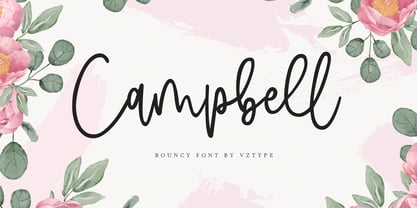 Campbell is a stylish modern calligraphy font with casual chic flair. It is perfect for branding, wedding invites and cards.
 - Lathinolo by Midtype,
$24.00 Lathinolo is a handwritten font. Perfect for greeting cards, wedding stationery, photographer watermarks logos, modern websites, apparel design and more.
 - Generica Condensed by Monotype,
$29.99Generica Condensed is based on mid-20th century geometric sans designs, but is less formal, with a touch of playfullness. - Hope Sans by Monotype,
$50.99 Hope Sans™ takes the jaunty style of 1950s and 60s lettering and melds it with the jubilant 1970s swashes of Bookman. The result is a sans serif family that is lively, inviting and deeply customizable. Its basic sans serif forms create engaging text, while a roaring collection of swash designs, alternate characters and ligatures make it a natural for attention-grabbing display typography. Hope Sans has been selected by the judges of the 22nd Annual TDC Typeface Design Competition to receive the Certificate of Typographic Excellence. The middle weights of the family are easy on the eyes and shine at smaller sizes and in blocks of text copy. Their friendly vibe also translates well to web and interactive design projects. Spacing is open, counters are large and Hope Sans’ range of six weights can provide just the right design for virtually any need. Headlines, subheads, banners and navigational links are naturals for its lightest and boldest weights – either with, or without, the swash letters. “Hope Sans is a paint box,” says its designer, Charles Nix. “In its basic form, it’s a sturdy grotesque, capable of setting text in a cool and relaxed way. But a bit of accenting with the alternate forms easily creates an entirely different mood and meaning. And for those that are willing to really mix with it, the variety of alternate characters can build truly unique typographic statements.”
 - PF Stamps Pro by Parachute,
$79.00 PF Stamps covers a wide range of applications which require the stamp effect. This is a form of lettering which was very popular in the mid-twentieth century for product labeling. Special machinery was developed by mainly two companies, one in the United States and the other in Germany. This machinery produced paper die cuts which were later used as a base for the marking with a paintbrush. PF Stamps Paint was developed to simulate this type of lettering. Two other styles, Metal and Flex, have been very popular since its original release. The first one was developed from a metallic stamp imprint, whereas the second one with its slight 3-D look simulates letters stamped on plastic. To insure realistic results, uppercase letters are different from lowercase. This is very useful when two similar letters sit next to each other. There 3 more styles: Solid (the stencil in its regular clean form), Rough and the very interesting Blur. The all new “Pro” version comes to complete this series with what was missing: 93 matching frames and frames parts which will satisfy the most demanding designer. This is a bonus font which is available only with the purchase of the whole family. Use these frames “as is” at any size, or connect the frame parts to each other to create longer frames. Finally, this series supports more than hundred languages which are based on the Latin, Greek or Cyrillic scripts.
