10,000 search results
(0.028 seconds)
- Auliya Rahmah by Nandatype Studio,
$12.00 Auliya Rahmah is a bold serif font, and is trendy, contemporary in style. This font is PUA coded which means you can access all the glyphs and swashes easily! Fall in love with her incredibly versatile style and use it to create spectacular designs!
 - Gitchgitch by Weknow,
$5.00 Give a simple rounded fun groovy, fancy, to any text project. Also good for a logotype or brand name. This is a gift to my graphic designer friend Gita from Indonesia, I call her gitch gitch, so I made it the name on this font.
 - BD Kickrom Mono by Typedifferent,
$25.00 BD Kickrom Mono is a retro futuristic monospaced, uppercase font with the main characters set on the small keys and variants on the capital characters. It is great for the use as headlines in magazines, logotypes on posters, game titles, movies or music packaging.
 - Liong by Dikas Studio,
$15.00 Liong is a bold & retro slab serif typeface inspired by western typography signane, they have a contrast weight bar and slab with fun and fancy character. Liong comes with 4 style regular, italic, slab & slabitalic, perfect for logos, badges, typography and any retro design needs.
 - Cross Stitch Elaborate by Gerald Gallo,
$20.00 Cross Stitch Elaborate is based on upper case characters 25 stitches tall. It is not intended for text use. It was designed specifically for use as fancy monograms or initials. Cross Stitch Majestic has an uppercase alphabet located under the shift+character set keys.
 - Halloween Park by AEN Creative Studio,
$15.00 Halloween Park is a dripping fun and thick display font. Use it for each of your October designs and notice how they instantly come to life. Halloween Park is PUA encoded, which means you can access all of the glyphs and swashes with ease!
 - Digby by Atlantic Fonts,
$26.00 Digby is friendly, honest and active. Digby family includes twelve hand-drawn fonts. They work well together, in fact Digby Line Thin fits nicely over Digby Regular. All have a generous set of double letter ligatures and are designed to work great as all-caps.
 - P22 Rakugaki by IHOF,
$24.95 Rakugaki means "scribble" in Japanese. This font expresses casual handwriting with warmth and simplicity. The bold weight of Rakugaki is harmoniously integrated in all three writing systems, Katakana, Hiragana and Latin. The enclosed key charts give instructions for character placement in Katakana and Hiragana.
 - Jack Lady Script by Bosstypestudio,
$14.00 Jack Lady Script is a cool and scary decorative font. Use it for each of your October designs and notice how they instantly come to life. Jack Lady Script is PUA encoded which means you can access all of the glyphs and swashes with ease!
 - Push Ups by Gustav & Brun,
$10.00 Is it ironic? Maybe. Is it a propaganda font? Nope. Is it witty? Yes. Is it suitable for selling ice cream? Very much so. Push Ups is a handwritten 3D-font. It’s available in three different styles, combined they will give you almost endless possibilities.
 - Andrea Handwriting by StuArt,
$9.00 Born out of an insatiable addiction to handwriting fonts, Andrea's Handwriting fonts are simple, readable and easy on the eyes. Each font is cool, casual and fun all at the same time. Perfect for printing your personal thoughts be they silly, pensive or absolutely nonsense!
 - Hooky by Comicraft,
$29.00 Originally created for Sound Effects in Marvel's GHOST RIDER 2099, our spraycan stylish HOOKY font has just the right Scrawl of the Wild for graph-iti enthusiasts everywhere -- and they wash right off with just a little splash of 'delete'. Spray it, don't Say it!
 - Cheeky Tommy by Alexander Sharkov,
$3.00 Our new stylish and cheeky font is perfect for a variety of youth brands and projects. The letters are intentionally sloppy, but they look great in the context of any size text blocks! We hope our cheeky font will help you develop your cheeky project!
 - Flashie by Gerald Gallo,
$20.00 Flashie is an all caps, very bold contemporary sans serif font. Under the lowercase keys are alternate characters for A, C, E, F, K, L, M, N, R, S, U, W, X, Y. It is ideal for headlines, titles, branding and small blocks of text.
 - Gretchen by Solotype,
$19.95Apparently original with the Lindsay brothers type foundry in New York shortly before they were merged into the American Type Founders Company. A few characters of the original font have been modified slightly to make them more harmonious with the rest of the alphabet. - Meep by Dawnland,
$13.00 What to do today? Meep? Meep! Meep! Meep! They all agreed. Meet the Meep sisters - Lala, Lili, Lolo & Lulu - a handwritten narrow font in 4 weights - regular & slanted with common- and many double letter ligatures for a natural & varied hand drawn look! Go create! Meep!
 - Bugheds by Letterhend,
$19.00 Introducing Bugheds. A blackletter font that i've made with a personality touch. They works perfect for you who needs for headline, logotype, apparel, branding, packaging, advertising etc. This font is comes in uppercase, lowercase, punctuation, symbols, numerals, stylistic set alternate, ligatures, etc also support multilingual.
 - Baskerville Caps by Three Islands Press,
$15.00Baskerville Caps is a single font with two sets of large initial caps, the uppercase keys displaying a classical outline and the lowercase a floriate style. Both sets include the characters Å, Ä, Æ, É, Ö, Ø, Ü, Ç, Ñ and the OE ligature. - XTextures by Ingrimayne Type,
$9.95 The XTextures package contains two typefaces that can be used to create borders or backgrounds. The elements are simple stripes, spots, and cracks. Some of them are flipped and rotated so that they can be combined to create endless patterns that connect and repeat.
 - Country Charm by Okaycat,
$28.50 Country Charm is a picture font. A cute collection of vectored sketches brought to life by designer Natsuko Hayashida. More than 50 unique illustrations. Her depictions of fruits, vegetables & herbs are beautiful organic shapes, perfect for you to use on signs, posters, invitations, and more.
 - ITC Panache by ITC,
$29.99Typefaces, like most other works of art, provide a small window into the personalities and sensibilities of the artists who create them. ITC Panache not only provides this window, it is also aptly named. Mr. Edward Benguiat the dreator of ITC Panache, has all the dash, verve (and panache) hinted at in the design, Creative, capable and prolific, Ed Benguiat has drawn hundreds of exciting and popular typeface designs. Benguiat's design goal was to create a sans serif typestyle that is versatile, utilitarian - and distinctive. We think he has succeeded admirably. ITC Panache's three weights mix exceptionally well to complement each other or provide emphasis where necessary. Extensive testing at text sizes and design fine-tuning has produced a typeface family which is remarkably homogenous and consistent in color. Text set in ITC Panache is inviting without dissapointment. It is exceptionally easy to read, even in long text blocks of copy or small point sizes. When set in larger sizes or used for headlines, ITC Panache's character traits becomes more apparent and pronounced to the reader. They help to create graphics with distinction and style. Big or small. a little or a lot. it's hard not to use ITC Panache well. If you could pigeonhole ITC Panache, it would probably be classified as a stressed sans", but this would not completely describe, or do justiceto, the design. There is a slight contrast in stroke weight, which becomes more pronounced as the familiy weight increases; but there is a more to distinguish ITC Panache from ather sans serifs. Perhaps most obvious is its high waist and correspondingly slight condensation of the top half of the "round" capitals. Both of these traits link ITC Panache with the sensuous forms of art nouveau creations. In contrast are the typicall old style "e" found in designs like Cloister and ITC Berkeley Old Style, and the two storied "g" common to the early 20th century sans serif designs. The capital "A" even has the cupped top found in Caslon designs. Part of the beauty of ITC Panache is that all of these seemingly unrelated desig traits are melded into a design of exceptional continuity." - Sathya Script by Gian Studio,
$14.00 Introduce Sathya Script in beautiful handwritten style. Equipped with 600 glyphs. Sathya Script is perfect for branding projects, home appliance design, product packaging, use in business cards, invitation cards, etc. Just as a stylish text overlay onto a background image or anything else that needs a touch of elegance. Available in the Satya. To enable the OpenType Stylistic alternative, you need a program that supports OpenType features such as Adobe Illustrator CS, Adobe Indesign & CorelDraw X6-X7, Microsoft Word 2010 or a later version. There are additional ways to alternate/swash, using the Character Map (Windows), Nexus Font (Windows), Font Book (Mac) or a software program such as PopChar (for Windows and Mac). How to access all alternative characters, using Windows Character Map with Photoshop: https://www.youtube.com/watch?v=Go9vacoYmBw How to access all alternative characters using Adobe Illustrator: http://youtu.be/iptSFA7feQ0 How to use the font style set in Microsoft Word 2010 or later versions: https://youtu.be/x1A_ilsBsGs Thanks for checking! I really hope you enjoy it. Regards Designers: Afri Giani Publisher: Gian Studio
 - Stevens Titling by Linotype,
$29.99 Stevens Titling refers to the classic Roman alphabet as it appears on the Trajan column and numerous other monuments. With its realistic brush strokes, it shows the letterforms as they might have been sketched on the marble before the stonecutter reached for his hammer and chisel. The four fonts that constitute the Stevens Titling suite are named after animals — badger, boar, sable and wolf –, each known for the specific character of its hairs when used to make painting brushes. Sable Brush is the most formal and elegant, with solid forms which show no obvious trace of the handdrawn brush stroke; it comes with a set of small capitals for those classical titles preferred by Hollywood. In fact, each of these fonts would do a great job as a film title and poster font. The Badger Brush variant is compact and firm; Boar Brush is dramatic, and in Wolf Brush each part of the letter is made up of realistic, dry strokes.
 - Eloise by Wiescher Design,
$39.50 Ever since I first designed Ellida in 2005, that elaborate script in the tradition of the 18th-century English calligrapher George Bickham and the 19th-century American calligrapher Platt Rogers Spencer, I wanted to add a very high contrast cut to the family. I finally did so. But the result looks so much different to Ellida that I had to give it another name, hence "Eloise". Eloise should actually be written with a 'i' that has double dots, but that would be difficult for international use. Eloise is a beautiful first name not only for French girls. Pronounce: Ay-low-eese. If I would have had a daughter, I would have called her "Eloise" (with double dots!). But instead I have two phantastic sons, so I never got the chance to use it. Actually one of my sons discovered it on his little boys sand shovel, it was called Eloise. Your decorative designer with a heart for sand shovels Gert Wiescher
 - Aleesya Rose by Brenners Template,
$19.00 Aleesya Rose is a Stylish Font Family to bring a touch of elegance to any design. The clear contrast blends into all styles - even thin styles - and the strong individuality by weight delights the designer's imagination. 14 styles including 7 weights and italics are essential for designers to complete more detailed and sophisticated typography. This style has 426 glyphs each, check the glyph window in your app. The upright standing of the vertical stems stably supports the center of gravity of the entire font. And the thin strokes used as finishing touches will convey an elegant personality to the layout. The ligatures are designed to appeal to the reader with their beautiful tenderness, and they are: Ba, Be, Ha, He, LO, Le, Lo, Re, Ro, ck, de, do, ee, ff, fi, oo, rr, th. In particular, we recommend that you choose this font family to achieve the following purposes: Editorial design, Personal branding, Branding business, logo design, portfolio, and any special design.
 - VLNL Boulangerie by VetteLetters,
$35.00 VLNL Boulangerie was originally an incomplete set of early 20th century wood type letters, that Donald Roos found in a dust covered carton box stashed away somewhere at the Royal Academy in The Hague. Charmed by the letter forms Donald decided to print them on paper with a printing press. Next he digitised the prints as they came out, including small imperfections and damages. The missing characters were composed and added digitally to complete the alphabet. (See if you can spot those!?) We think VLNL Boulangerie is a little French in appearance (hence the name), it's joyful, warm, a little crunchy and round-ish. It defenitely has that ‘je-ne-sais-quoi’ that seperates it from most wood type grotesques. It can be perfect for lettering on a storefront window of – let's say a bread shop or a lunchroom. Or a logo for a downtown hipster café. VLNL Boulangerie hardly has any limitations actually.
 - Chicago Brush by Colllab Studio,
$19.00 "Hi there, thank you for passing by. Colllab Studio is here. We crafted best collection of typefaces in a variety of styles to keep you covered for any project that comes your way! If you're looking for a hand-drawn font to help craft a unique statement piece, you've probably been spending hours looking for the perfect brush font. The problem with most brush fonts is that they're not actually made from real brushes - they look like they've been artificially drawn by a machine. There's now a high-quality alternative available. We are proud to introduce our new, very high resolution Chicago Brush font - the result of our meticulous process of digitizing hand-drawn typefaces and then optimizing them through our exclusive, innovative technology. That’s why we created Chicago Brush, a font made from a real brush. Use it to create logos, names and signage. It will look hand lettered, like you really worked on those letters manually. A Million Thanks Colllab Studio www.colllabstudio.com
 - Bostonbay by Balpirick,
$15.00 Bostonbay is a Modern Handwritten Font. Bostonbay is a unique and elegant handwritten font. It looks beautiful on a variety of designs requiring a personalized style, such as wedding invitations, thank you cards, weddings, greeting cards, logos and so on. Bostonbay also multilingual support.
 - Fatimah by Goodigital13,
$20.00 feel and use it to create gorgeous wedding invitations, beautiful stationary art, eye-catching social media posts, and cute greeting cards perfectly macth for desgign with valentine theme, any product like book cover, t-shirt, branding, promotion, social media post, quotes, wedding, photography and more.
 - Ayulinda by Patria Ari,
$17.00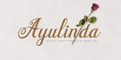 Ayulinda is a luxurious wedding script typeface with its own beautiful alternate glyphs that you can experiment with. Ayulinda is perfect for branding projects, wedding invitation, branding, logo, social media posts, advertisements, product packaging, product designs, label,poster, and any projects that you work on.
 - Al Veshion by Aluyeah Studio,
$90.00 Al Veshion is a floral luxury font. It's a fashionable, elegant, decorative font. Floral ornament letters are ideal for your wedding monograms and logos, fashion product, herb, back to nature vibe, organic vibe, and many more. Use this font for wedding invitations, branding, packaging, magazines, florist shops, social media, restaurant menus, greeting cards, headers and many more. This typeface features 190+ characters with some language adaption that is guaranteed to give your project a competitive edge. Al Veshion features: OpenType support, Multilingual support (15 languages) and is PUA Encoded. Easy to use alternates. It's OpenType support but you can easily call alternates character using special combination like A.2 B.2 a.2 v.2 so you don't need special software. Thanks for checking out Al Veshion. I really hope you enjoy using it! If you have any questions I'd be more than happy to answer them, just send me a message!
 - Cirkus Fantastiko by PizzaDude.dk,
$17.00 The other day I was at a market with my kids and they had this really retro kind of circus thing. The signs and posters there, were designed in a really sloppy and poor manner - but they all had a lot of naive charm! I was really fascinated by all these uneven letters and I was immediately inspired to do a font like that! And out of the magic hat comes...ta-da-da-da...Cirkus Fantastiko! Planning on throwing a party with a circus theme? Then Cirkus Fantastiko is ready to play the juggling clown while riding the elephant! Play around with the 3 different layers to create that low budget hand painted cirkus posters! :)
 - P22 CoDependent by IHOF,
$24.95 P22 CoDependent is a revival of the Independant typeface from 1930 created by Dutch designer Johannes Nicolaas Coenraad Collette along with Jos Dufour from Belgium. Independant was released in metal by the Belgian division of the Amsterdam Type Foundry in commemoration of the 100th anniversary of the independence of Belgium from the Netherlands. Despite the name, the two fonts contained in the set, Regular and Shadow, are not codependent upon each other. They can be used alone, but together they can create a dynamic two-color option. There have been other fonts inspired by and revived directly from Independant, but this version adheres the original design with the added consideration of how the shadow version will overlap.
 - Old Sport JNL by Jeff Levine,
$29.00 The 1930s era French textbook on lettering "100 Alphabets Publicitaires déssinés par M. Moullet" featured a hand lettered chamfered alphabet with slab serifs reminiscent of sports lettering. Although intended for advertising and signage inspiration, only a partial lower case was illustrated along with the capitals and no numbers or other characters existed. These had to be created from scratch. The finished result is not only a bit of classic lettering from the past, but the font also doubles as a typeface with a sports look and feel. A traditional (rather than stylized) M and N are located on the solid bar key and the broken bar key respectively. Old Sport JNL is available in both regular and oblique versions.
 - Beletrio by Storm Type Foundry,
$29.00 Beletrio was made as companion to Beletria, it has many shapes in common. We already have plenty of sans-serif fonts with classical proportions in the Stormtype library, such as John Sans, Sebastian or Andulka, but Beletrio is certainly the most peaceful of the bunch – it shares not only the feel of its serif originator, but its soft curves provide lovely visual caress as well. The smooth endings are not visible at first, they are balanced for easy reading as they solve some critical relations such as "rv, ry, rt", but in larger sizes you'll fully enjoy the picturesque details. It handles the smallest point sizes as well as large billboards, fashion magazines and philosophic tractates.
 - Copperplate New by Caron twice,
$39.00 Imagine America in the 1930s. A gangster flick with Al Capone, a crime novel featuring Philip Marlowe. Our hero in a fedora sits in a classy bar, orders a double bourbon, lights a cigar and eyes the evening paper. He turns the pages, reading about a bank heist over on Third Avenue, a scandal involving a baseball player, a small ad for a general practitioner and a large spread about a famous law firm. What do the bottle of booze and the majestic facade of the bank have in common? The elegant baseball uniform and trustworthy attorneys? - Copperplate Gothic - When Frederick William Goudy created his legendary typeface in 1901, it went on to literally become the symbol of early 20th century America. Tiny serifs, characteristically broad letterforms, and particularly bold titles decorated calling cards at 6-point size, enormous bronze-cast logos, newspaper headlines, restaurant menus and more. This was the golden age of Copperplate, lasting up until the arrival of die neue Typografie and monospaced grotesques in the 1960s. Then the typeface almost completely disappeared. It made a partial comeback with the advent of the personal computer; digitizations of varying quality appeared, and one version even became a standard font in Adobe programs. This may have played a role in Copperplate later being used in DIY projects and amateur designs, which harmed its reputation. Copperplate New has been created to revive the faded glory of the original design. Formally, the new typeface expands the existing weight and proportional extremes. The slight serifs are reduced even further, making the typeface sans-like at smaller point sizes and improving readability. In contrast, at large point sizes it retains all of its original character. Decorative inline & shadow styles have been added and both have been created in all five proportions, making it easy to adapt the typesetting to the format you need. Despite these changes and innovations, Copperplate New remains true to Goudy’s original design and represents a snazzy way to evoke a golden era in American culture. Specimen: http://carontwice.com/files/specimen_Copperplate_New.pdf
 - Chopard by Larin Type Co,
$16.00 Chopard is an elegant and modern sans-serif font family. It includes upright and Italic style, each of them has six weights from light to bold. This is a multi-purpose font that is perfect for any project, it is contrasted, modern and easy to read. With it, you can create logos, use in advertising, packaging, book covers and magazines, headings, descriptions and much more. Todes includes stylistic alternates for uppercase and lowercase, with them you can add dynamics to the font and make your project more individual and stylized. This font is easy to use has OpenType features.
 - Integral CF by Connary Fagen,
$35.00 Integral CF is designed for maximum visual and emotional impact with its stunning, superbold letterforms. An all-caps titling font family, Integral's six weights excel in posters, social media, headlines, video, and print. Hidden behind the linear, confident construction is a hint of roguish charm. Designed to be bold and large, Integral pairs nicely with lighter typefaces that provide contrast, such as a sans serif like Greycliff CF, Criteria CF, or Work Sans. Text-friendly serifs like Artifex CF are also pair well with Integral. All typefaces from Connary Fagen include free updates, including new features, and free technical support.
 - Linotype Rowena by Linotype,
$29.99Linotype Rowena is part of the Take Type Library, selected from the contestants of Linotype’s International Digital Type Design Contests of 1994 and 1997. This text font was designed by the Latvian artist Gustavs A. Grinbergs and is available in six weights, from light to black. The font has a light stroke contrast and its basic forms are the circle, rectangle and triangle, making it a constructed face. The impression of the font on the reader is elegant and cool, very like poster fonts of the 1930s. Linotype Rowena is suitable for headlines and shorter texts with point sizes 12 and larger. - Linotype Brewery by Linotype,
$29.99Linotype Brewery is part of the Take Type Library, chosen from the contestants in the International Digital Type Design Contests of 1994 and 1997. This text font is available in six weights from light to black and was designed by Gustav A. Grinberg. An outstanding characteristic of the font is its light stroke contrast and its constructed forms. Its tiny, triangular serifs first become noticeable in very large typesizes, much like the Dutch fonts of the 17th century, Copperplate, for example. Linotype Brewery is cool and elegant and well-suited to middle-length texts and headlines.