10,000 search results
(0.048 seconds)
- Qurve Wide - Unknown license

- Qurve Hollow Thin - Unknown license

- Sanity - Unknown license

- Sanity - Unknown license

- Qurve Thin - Unknown license

- Shabella by Tlatous Type,
$19.00 Introducing Shabella by Tlatous Type. Shabella is a Modern Handwritten Font. Shabella is perfect for product packaging, branding project, megazine, social media, wedding, or just used to express words above the background.
 - Recruitment JNL by Jeff Levine,
$29.00 A 1916 recruitment poster from World War I seeking men to join the Army’s Signal Corps provided the lettering inspiration for Recruitment JNL, which is available in both regular and oblique versions.
 - Mythical Prince by Sign Studio,
$15.00 Mythical Prince is a beautiful and smooth sans serif font created by a romantic and lovely look. It is perfect for greeting cards, wedding invitations, posters, logotypes, product branding, and much more.
 - Aimchestar by FHFont,
$18.00 Aimchestar is script with a hand-lettered brush style, and includes OpenType features. It is suitable for designs, weddings, events, t-shirts, logos, badges, sticker, and more to make your work awesome.
 - Mono Flower by Letterafandi Studio,
$12.00 MONO FLOWER is a modern sans serif font. This font is perfect for logos, greeting cards, package design, brand identity, craft designs, any DIY projects, book titles, wedding invitations, packaging, and more.
 - Angelist Heart Font by IbeyDesign,
$18.00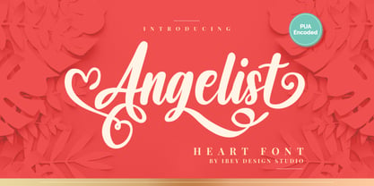 Angelist Heart Font that inspires friendliness and elegance. It is perfect to use for any of your wonderful creations such as branding projects, logos, brochures, business cards, wedding invitations, and many others.
 - Robertina by Letterafandi Studio,
$14.00 Robertina is a Modern handwritten font. That font is perfect for ; logos, greeting cards, a package design, a brand identity, craft design, any DIY project, book title, wedding invitation, packaging and more.
 - Fife Gallery by Lemonthe,
$14.00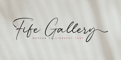 Fife Gallery is a stylish and incredibly elegant modern calligraphy font. It looks stunning on wedding invitations, quotes, greeting cards, logos, business cards and every other design which needs a handwritten touch.
 - Standgrow by FHFont,
$19.00 Standgrow is script font with authentic clean brush style, this font basically script calligraphy with vintage style. Suitable for design, element design, wedding, event, t-shirt, logo, badges, sticker, and awesome work.
 - New Molly Script by Rifa Studio,
$12.00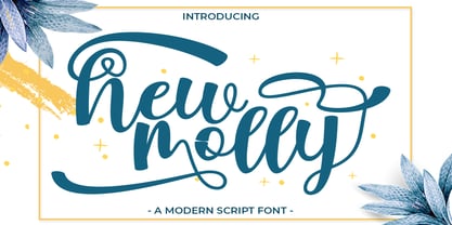 New Molly is a modern script.This font looks fresh, stylish, elegant and natural. This font is great for logo branding & invitations, wedding design, photography, quotes, posters, watermark, special events and much more.
 - Heart Mother by Yoga Letter,
$14.00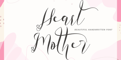 "Heart Mother" is a unique and beautiful handwritten font. This font is equipped with lowercase, uppercase, ligatures, numerals, punctuation, and multilingual support. Suitable for weddings, engagements, stickers, posters, prints, invitations, and others.
 - Brobane by Letterniz,
$27.00 Brobane is a clean and lining brush script. It looks stunning on wedding invitations, thank you cards, quotes, greeting cards, logos, business cards and every other design which needs a handwritten touch.
 - Dockyard by Lemonthe,
$15.00 Dockyard is a relaxed handwritten font, has a gentle and beautiful flow. This font is perfect for logo, wedding invitations, stationery, photography, social media posts, product packaging, greeting cards, and much more!
 - Hakigai Heart Font by IbeyDesign,
$17.00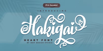 Hakigai Heart Font that inspires friendliness and elegance. It is perfect to use for any of your wonderful creations such as branding projects, logos, brochures, business cards, wedding invitations, and many others.
 - Antikan Rayo by Yoga Letter,
$20.00 "Antikan Rayo" is a beautiful handwritten font. This font is equipped with uppercase, lowercase, numerals, punctuation, and multilingual support. very suitable for Christmas, winter, weddings, engagements, valentines, invitations, photography, birthdays, and others.
 - The Soulty by Forberas Club,
$16.00 The Soulty made for something interesting and excited, or you can make your wedding invitation with this beautiful font and you can use this font for your party or cute moment. Cheers
 - Christmas Break by Yoga Letter,
$16.00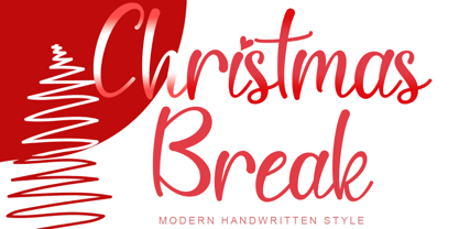 "Christmas Break" is a beautiful handwritten font. This font is perfect for weddings, Christmas, stickers, banners, posters, photography, engagements, and more. Equipped with uppercase, lowercase, numerals, punctuation, swash, titling, and multilingual support
 - Simplemind by Balpirick,
$15.00 Simplemind is a modern handwritten font. Simplemind is perfect for product packaging, branding project, magazines, social media, weddings, or just used to express words above the background. It includes multi-lingual support.
 - Molga by Creativemedialab,
$18.00 Molga is a modern and elegant sans serif font. It has a lot of stylistic alternates to create unique and beautiful words for Logos, headlines, Invitation cards, Wedding logo, and many more.
 - Almerita by Sakha Design,
$12.00 Almerita is a sweet and delicate handwritten font. Dainty and joyful, this font will be ideal for writing wedding invitations, cards, or any other design that may need a romantic, personalized touch!
 - Cutie Biscuit by Balpirick,
$15.00 Cutie Biscuit is perfect for product packaging, branding project, magazine, social media, wedding, or just used to express words above the background. This font includes TTF, Cutie Biscuit also has multilingual support.
 - Beatlove by Sakha Design,
$14.00 Beatlove is a sweet and delicate handwritten font. Dainty and joyful, this font will be ideal for writing wedding invitations, cards or any other design that may need a romantic, personalized touch!
 - Nathaly by Aestherica Studio,
$12.00 Nathaly is a sweet and delicate handwritten font. Dainty and joyful, this font will be ideal for writing wedding invitations, cards, or any other design that may need a romantic, personalized touch!
 - Tropical Nature by Skinny Type,
$15.00 Tropical Nature is a smoothie handwritten font perfect for your boho and farmhouse designs! This font is perfect for signs, shirts, wedding, home decor, branding, blogs, logos, invitations and more! Thank you!
 - Majora Pro by Latinotype,
$29.00 Majora Pro is a slab serif typeface which derives its name from a Portuguese historical toy manufacturer. The font comes in 8 styles, ranging from a delicate Thin to a robust Black, with matching italics and an upright version of stencil fonts, resulting in a total of 24 weights. Majora Pro is well-suited to a wide range of design projects which include packaging, editorial design, screen use, etc. Its humanistic features and moderate contrast between thick and thin strokes make it also suitable for long block of texts while having a high degree of legibility. The font includes a set of alternate glyphs which help give your compositions a different and unique look. The Stencil version was specially designed for use in signage, packaging, titles and headings. Majora Pro contains an extensive set of 750 characters (including small caps, different figure styles, etc.) that support over 200 Latin-based languages. Majora is the previous version of Majora Pro.
 - Serat by Wahyu and Sani Co.,
$24.00 Serat is a medium contrast flared serif with mixed up styles of classic typefaces which is highly influenced by early stages of Latin based hand writing. The lowercase are modernized versions of Carolingian minuscules, vertical stems which touch the baseline have been modified to have horizontal cut for simpler look and keep the calligraphic style for terminals & stroke ends. Then the uppercase are flared serif which were influenced by Roman inscriptional capitals. The font name was taken from the Javanese word "serat" which means writing (noun). It comes with some unique features, such as: - Carolingian style alternate for some letters (a,e,f,g,t), also comes with separated stylistic set for long 's', and long left leg 'x' and alternative ampersand. - Discretionary ligatures for all caps titling. - Standard Ligatures. - Tabular and Proportional for both Lining and Old-style figure. - Fraction with Nominator and Denominator. - Superscript and Subscript for numbers, etc. Serat would be suitable for "classic" themed work; poster, book cover, branding, videography, etc.
 - Swollen - Unknown license

- Arabetic Sans Serif by Arabetics,
$32.00 The Arabetic Sans Serif type family follows the guidelines of the Mutamathil type style but also illustrates the effects of adding and removing Latin-like serifs on Arabetic scripts legibility. It has only one glyph for every basic Arabic Unicode character or letter as defined in Unicode Standards version 5.1. Arabetic Sans Serif employs variable x-height values. It includes all required Lam-Alif ligatures and uses ligature substitutions and selected marks positioning but it does not use any other glyph substitutions or forming. Text strings composed using types of this family are non-cursive with stand-alone isolated glyphs. Tatweel (or Kashida) glyph is a zero width space. Keying it before any glyph will display that glyph’s isolated form. Keying it before Alif Lam Lam Ha will display the Allah ligature. Arabetic Sans Serif family includes both Arabic and Arabic-Indic numerals; all required diacritic marks, Allah ligature, in addition to all standard English keyboard punctuations and major currency symbols. Fonts are available in regular, italic, bold, and bold italic styles.
 - Sebastian Pro by Storm Type Foundry,
$32.00Sans-serif typefaces compensate for their basic handicap – an absence of serifs – with a softening modulation typical of roman typefaces. Grotesques often inherit a hypertrophy of the x-height, which is very efficient, but not very beautiful. They are like dogs with fat bodies and short legs. Why do we love old Garamonds? Beside beautifully modeled details, they possess aspect-ratios of parts within characters that timelessly and beauteously parallel the anatomy of the human body. Proportions of thighs, arms or legs have their universal rules, but cannot be measured by pixels and millimeters. These sometimes produce almost unnoticeable inner tensions, perceptible only very slowly, after a period of living with the type. Serifed typefaces are open to many possibilities in this regard; when a character is mounted on its edges with serifs, what is happening in between is more freely up to the designer. In the case of grotesques, everything is visible; the shape of the letter must exist in absolute nakedness and total simplicity, and must somehow also be spirited and original. - Someri by Arabetics,
$39.00 Someri (English: Sumerian) is an Arabetic type design with a Cuneiform spirit. The Someri family follows the guidelines of the Mutamathil Taqlidi type style. It has one glyph for every basic Arabic Unicode character or letter, as defined in Unicode Standards version 5.1, and one additional, final-position, glyph for each Arabic letter that is normally connected with other letters from both sides in traditional cursive Arabic strings. Someri employs variable x-height values. It includes all required Lam-Alif ligatures and uses ligature substitutions and selected marks positioning but it does not use any other glyph substitutions or forming. Text strings composed using types of this family are non-cursive with stand-alone isolated glyphs. Tatweel (or Kashida) glyph is a zero width space. Keying it before any glyph will display that glyph isolated form. Keying it before Alif Lam Lam Ha will display the Allah ligature. Someri family includes both Arabic and Arabic-Indic numerals; all required diacritic marks, Allah ligature, in addition to all standard English keyboard punctuations and major currency symbols. Fonts are available in regular and italic styles.
 - Dynamic Duo by Comicraft,
$19.00 Batman & Robin! Thelma & Louise! Butch Cassidy & The Sundance Kid! Hip Flask & Farrell! Frodo & Sam! Sonny & Cher! Calvin & Hobbes! Bert & Ernie! Dynamic Duos exist in all forms of literature & entertainment, and now Comicraft is proud to introduce its latest alliterative offering, DYNAMIC DUO! A buddy movie in font form, Dynamic Duo is a team-up of Solid and Open weights who can’t decide who is the lead and who is the sidekick! In the fine tradition of all two-in-ones and company-wide comic crossovers, first they fight and then they team up — to take your design on the biggest, loudest, most intense adventure of All Time. Dynamic Duo features comic-book style hook caps and alternate uppercase letters which automatically cycle for a more natural, hand-drawn appearance. Solid and Open weights can be layered to create chromatic effects, and matching variable fonts allow near-infinite control of weight and slant. Each weight contains 478 glyphs and supports 220 languages. Comicraft fonts are created BY comic book letterers FOR lettering comic books. Accept no substitutes! Artwork by Axel Medellin from Elephantmen #73
 - Omnipop by Fenotype,
$20.00 Omnipop is a potent display pack with three styles. All the fonts have firm yet clean and velvety character. Omnipop Brush is a forward leaning brush script with a somewhat heavy complexion. It has a large x-height and it makes nice smooth and even texts. Omnipop Brush is equipped with Standard Ligatures and Contextual Alternates that are automatically on as they should be kept. In addition it has Swash, Stylistic and Titling Alternates for extra show-off. Omnipop Script is a monoline connected script simulating a smooth felt-tip pen. Script is equipped with Standard Ligatures and Contextual Alternates to keep the connections smooth. In addition Omnipop Script has Swash, Stylistic and Titling Alternates and even more extra characters can be found in the glyphs window. Omnipop Sans is a sturdy rounded all caps sans with a sort of geometric vibe to it. Anything you type with Omnipop Sans will look cheery and approachable. Omnipop fonts rock on their own but they also play great together in any order.
 - Silsilah by Arabetics,
$39.00 The Silsilah family follows the guidelines of the Mutamathil Taqlidi type style. It has one glyph for every basic Arabic Unicode character or letter, as defined in Unicode Standards version 5.1, and one additional, final-position, glyph for each Arabic letter that is normally connected with other letters from both sides in traditional cursive Arabic strings. Silsilah employs variable x-height values. It includes all required Lam-Alif ligatures and uses ligature substitutions and selected marks positioning but it does not use any other glyph substitutions or forming. Text strings composed using types of this family are non-cursive with stand-alone isolated glyphs. Tatweel (or Kashida) glyph is a zero width space. Keying it before any glyph will display that glyph isolated form. Keying it before Alif Lam Lam Ha will display the Allah ligature. Silsilah family includes both Arabic and Arabic-Indic numerals; all required diacritic marks, Allah ligature, in addition to all standard English keyboard punctuations and major currency symbols. Fonts are available in regular and italic styles.
 - Eggad by Ingrimayne Type,
$9.00 Eggad features letters on eggs. It can be a fun font to use at Easter or for any egg-related message. Some of the eggs - those on the upper-case keys - have their large end on the bottom and others - those on the lower-case keys - have their large end on the top. The font uses the contextual alternatives feature of OpenType to alternate the big-bottom and big-top eggs. If you only want eggs with big tops or with big bottoms, turn this feature off. Eggad comes in two styles, a regular style in which the eggs are outlined and a bold style in which the eggs are solid. Both are monospaced. The two styles can be layered to color the eggs. Alternatively, background color can be added (dot accent and ring characters) or the outline color can be changed (sterling and yen characters) using layers in the regular style. If you are typing numbers and you want the start to be big-bottom number, switch on OpenType style set 1.
 - Sabre by Alias,
$60.00 I generally refer to our typefaces as ‘graphic’ rather than typographic. By that I mean their starting points are usually ways of constructing shapes and systems of shapes. As with other Alias typefaces, Sabre has stone and wood cut letterforms as a starting point. What is interesting about lettercutting is the connection between shape and material. These beautifully crafted letterforms have a particular sharpness which reflects, of course, how they were made. The idea of constructing letters from a kit of parts we first explored in early fonts Elephant and Factory. These are different in that they were very much grid-based, with a geometric structure. For Sabre I also had Fred Smeijers’ stencil construction drawings in mind. These show how a set of components can be the basis for a crafted, elegant typeface. Sabre is quite a loose interpretation of this idea. Sabre’s graphic shape means it works well at large sizes, with a dramatic, angular impact. Its aim is to be typographic enough to function for blocks of small-size text too.


