10,000 search results
(0.367 seconds)
- Filia by Up Up Creative,
$16.00 Introducing Filia, a vintage-inspired display font with smooth curves and plenty of OpenType features. Filia is perfect for your next editorial, advertising, branding, book, or invitation project. OpenType Features Filia includes 900+ glyphs. Specific OpenType features include stylistic alternates, several stylistic sets with features like swashes, initial forms, multilingual support (including multiple currency symbols - for kicks I even included a Bitcoin symbol in there), and three ampersand styles. It also includes 120+ standard and discretionary ligatures that add character and interest to your typography. The OpenType features can be very easily accessed by using OpenType-savvy programs such as Adobe Illustrator and Adobe InDesign. (To access most of these awesome features in Microsoft Word, you'll need to get comfortable with the advanced tab of Word's font menu. If you have questions about this, ask me!) Please note: there is only one file this font. That's the magic of OpenType - all of the alternates, ligatures, etc. are built right into the main .otf file! Mail support : julie@upupcreative.com Find inspiration (and sneak peeks at my next font-in-progress) on Instagram: http://instagram.com/julieatupupcreative Facebook : https://www.facebook.com/upupcreative Pinterest: https://www.pinterest.com/upupcreative My website: http://upupcreative.com PLEASE ENJOY! I can't wait to see what you make with Filia! Feel free to use the #upupcreative and #filiafont tags to show me what you've been up to!
 - Mixolydian by Typodermic,
$11.95 Introducing Mixolydian, the scientific sans-serif typeface that’s anything but pretty. But don’t let its lack of aesthetics fool you; it packs a punch with its industrial and analytical tone. Unlike those fancy, European technical fonts, Mixolydian was made with an American flair in mind. Some of its graphic elements were even derived from the Federal Highway Administration Standard alphabet and architectural drafting templates. And let’s talk about those letters. Mixolydian’s intentionally off-kilter rhythm gives it a utilitarian, scientific vibe that’s perfect for any data-driven project. No need for frills or fuss here; Mixolydian is all about getting the job done. But that’s not all—the Mixolydian family comes in six weights and six highly inclined obliques, making it versatile enough for any design project you can dream up. So if you’re looking for a typeface that’s deliberately unattractive but highly effective, Mixolydian is your answer. Most Latin-based European writing systems are supported, including the following languages. Afaan Oromo, Afar, Afrikaans, Albanian, Alsatian, Aromanian, Aymara, Bashkir (Latin), Basque, Belarusian (Latin), Bemba, Bikol, Bosnian, Breton, Cape Verdean, Creole, Catalan, Cebuano, Chamorro, Chavacano, Chichewa, Crimean Tatar (Latin), Croatian, Czech, Danish, Dawan, Dholuo, Dutch, English, Estonian, Faroese, Fijian, Filipino, Finnish, French, Frisian, Friulian, Gagauz (Latin), Galician, Ganda, Genoese, German, Greenlandic, Guadeloupean Creole, Haitian Creole, Hawaiian, Hiligaynon, Hungarian, Icelandic, Ilocano, Indonesian, Irish, Italian, Jamaican, Kaqchikel, Karakalpak (Latin), Kashubian, Kikongo, Kinyarwanda, Kirundi, Kurdish (Latin), Latvian, Lithuanian, Lombard, Low Saxon, Luxembourgish, Maasai, Makhuwa, Malay, Maltese, Māori, Moldovan, Montenegrin, Ndebele, Neapolitan, Norwegian, Novial, Occitan, Ossetian (Latin), Papiamento, Piedmontese, Polish, Portuguese, Quechua, Rarotongan, Romanian, Romansh, Sami, Sango, Saramaccan, Sardinian, Scottish Gaelic, Serbian (Latin), Shona, Sicilian, Silesian, Slovak, Slovenian, Somali, Sorbian, Sotho, Spanish, Swahili, Swazi, Swedish, Tagalog, Tahitian, Tetum, Tongan, Tshiluba, Tsonga, Tswana, Tumbuka, Turkish, Turkmen (Latin), Tuvaluan, Uzbek (Latin), Venetian, Vepsian, Võro, Walloon, Waray-Waray, Wayuu, Welsh, Wolof, Xhosa, Yapese, Zapotec Zulu and Zuni.
 - Tattoo Sailor, crafted by the talented font designer Juan Casco, is a font that seamlessly embodies the spirit and aesthetic of traditional sailor tattoos, which have captivated people's imaginations...
- The font Artesanias, designed by Juan Casco, is a unique and captivating typeface that encapsulates an artistic flair and the essence of craftsmanship. It effortlessly bridges the gap between traditi...
- Sure thing! Prope, a font designed by Juan Acosta Inc., is a visual treat that blends traditional typography principles with a contemporary flair. Its character set is meticulously crafted, offering ...
- Romance Fatal Sans, a creation by the talented Juan Casco, is a font that masterfully blends elegance with modernity, striking a perfect balance between form and function. At first glance, it captiva...
- Imagine if fonts could dance. Well, if any font were to throw on a pair of dancing shoes and hit the dance floor, Unity Dances by S. John Ross would be busting moves that would make even the most res...
- ITC Chivalry by ITC,
$29.99ITC Chivalry is a calligraphic hybrid that honors the tradition of combining Roman capitals with italic lowercase letters. Drawn by Missouri lettering artist Rob Leuschke, who used a flat-nib pen on textured watercolor stock and then converted the drawings into a digital font, the design combines an old world" feel with "new world" legibility. A companion set of black letter caps completes the suite of characters. "I've loved drawing letters for as long as I can remember," says Leuschke. "Even in kindergarten, I tried to draw letters like my teacher." After graduating from college, Leuschke worked for a short time at a sign company in St. Louis, and in the early 1980s began working at Hallmark Cards in Kansas City. His talent as a calligrapher and lettering artist eventually brought him back to St. Louis to begin a freelance career. Since then Leuschke has created over 250 fonts, primarily for the greeting card industry, that are now being used on work for his clients all over the world. Leuschke first conceived of the face as just the black letter caps; he later added the Roman letters to give the design more versatility. The Roman caps of ITC Chivalry combined with the lowercase are well suited to blocks of copy, while the more decorative black letter caps are ideal for showcasing short text of just a few words. Both sets of capitals also make great initial letters." - The LEGO BRIX font, meticulously crafted by the talented designer known as SpideRaY, is a fascinating typeface that pays homage to the iconic LEGO brand, celebrated for its colorful interlocking plas...
- Barokah by Alifinart Studio,
$14.00 Do you want to create a design with a luxurious and casual style? Barokah Serif Font is the best choice. This is a modern display font has a lot of ligature for uppercase and lowercase. This serif font are perfect for luxury projects and will keep your creativity flowing. Typeface Story In 2021, we released Barokah Script and at that time a lot of people loved it. However, we feel that Barokah Script should be combined with a serif font with a luxurious and casual style, so that it will become a popular for everyone. That's why, today—after 1 year—we are releasing Barokah Serif, as the best match for Barokah Script. Why Barokah Serif Font? Barokah Serif is a font with a myriad of ligatures, both uppercase and lowercase. In this font, there are Stylistic Alternates for each capital letter with an authentic and elegant design. In the lowercase letters you will find an amazing variety of ligatures and in a luxurious style. This will make each of your designs look elegant and classy. For ease of use, we divide it into two; Standard and Discretionary Ligatures. Features: - Uppercase and lowercase letters - Numbers and punctuation - Lots of ligatures for uppercase and lowercase - Stylistic Alternates for each capital letter - True type hinting - Multilingual Standard and Discretionary Ligatures Standard and Discretionary Ligatures are available for the following letter combinations: LA LI LU LE LO LL RA RI RU RE RO KA KI KU KE KO XA XI XU XE XO ZA ZI ZU ZE ZO RS AS MS KS HS EV EW DO OC OG DG OO OQ TT NN WWW SS Th fi ff ffi fj ffj ft fl ffl fb ffb fh ffh fk ffk ſi ſſ ſſi ſl ſſl ſt ct st tt an ah am ap ar ab en eh em ep er eb cn ch cm cp cr cb un uh um up u rub gi gj ti tti tj ss ri rj www Language Supports Afrikaans, Albanian, Asu, Basque, Bemba, Bena, Breton, Catalan, Chiga, Colognian, Cornish, Croatian, Czech, Danish, Dutch, Embu, English, Esperanto, Estonian, Faroese, Filipino, Finnish, French, Friulian, Galician, German, Gusii, Hungarian, Indonesian, Irish, Italian, Kabuverdianu, Kalaallisut, Kalenjin, Kamba, Kikuyu, Kinyarwanda, Latvian, Lithuanian, Lower Sorbian, Luo, Luxembourgish, Luyia, Machame, Makhuwa-Meetto, Makonde, Malagasy, Maltese, Manx, Meru, Morisyen, North Ndebele, Norwegian Bokmål, Norwegian Nynorsk, Nyankole, Oromo, Polish, Portuguese, Quechua, Romanian, Romansh, Rombo, Rundi, Rwa, Samburu, Sango, Sangu, Scottish Gaelic, Sena, Serbian, Shambala, Shona, Slovak, Soga, Somali, Spanish, Swahili, Swedish, Swiss German, Taita, Teso, Turkish, Upper Sorbian, Uzbek (Latin), Volapük, Vunjo, Walser, Zulu Suggested Uses Perfect for branding projects, logo or logotype, promotion, book cover, invitation, letterhead, website, and more. Conclusion Barokah Serif is a luxurious authentic font and a must-have in your font collection. Get the Barokah Serif Font now… ----------------------------------- Alifinart Studio alifinart@gmail.com Instagram | Behance
 - Teimer Std by Suitcase Type Foundry,
$75.00Typographer and graphic designer Pavel Teimer (1935-1970) designed a modern serif roman with italics in 1967. For the drawing of Teimer he found inspiration in the types of Walbaum and Didot, rather than Bodoni. He re-evaluated these archetypes in an individual way, adjusting both height and width proportions and modifying details in the strokes, thus effectively breaking away from the historical models he used as a starting point. Teimer's antiqua has less contrast; the overall construction of the characters is softer and more lively. The proportions of the italics are rather wide, making them stand out by their calm and measured rhythm. This was defined by the purpose of the typeface, as it was to be utilised for two-character matrices. The long serifs are a typical feature noticeable throughout the complete family of fonts. In 1967, a full set of basic glyphs, numerals and diacritics of Teimer's antiqua was submitted to the Czechoslovak Grafotechna type foundry. However, the face was never cast. At the beginning of 2005 we decided to rehabilitate this hidden gem of Czech typography. We used the booklet "Teimer's antiqua - a design of modern type roman and italics", written by Jan Solpera and Kl‡ra Kv’zov‡ in 1992, as a template for digitisation. The specimen contains an elementary set of roman and italics, including numerals and ampersands. After studying the specimen, we decided to make certain adjustments to the construction of the character shapes. We slightly corrected the proportions of the typeface, cut and broadened the serifs, and slightly strengthened the hair strokes. In the upper case we made some significant changes in the end serifs of round strokes in C, G and S, and the J was redrawn from the scratch. The top diagonal arm of the K was made to connect with the vertical stem, while the tail of Q has received a more expressive tail. The stronger hairlines are yet more apparent in the lower case, which is why we needed to further intervene in the construction of the actual character shapes. The drawing of the f is new, with more tension at the top of the character, and the overall shape of the g is better balanced. We also added an ear to the j, and curves in the r have become more fluent. To emphasise the compact character of the family, the lining numerals were thoroughly redrawn, with the finials being replaced by vertical serifs. The original character of the numerals was preserved in the new set of old-style figures. To make the uppercase italics as compact as possible, they were based on the roman cut rather than on the original design. The slope of lowercase italics needed to be harmonised. The actual letter forms are still broader than the characters in the original design, and the changes in construction are more noticeable. The lower case b gained a bottom serif, the f has a more traditional shape as it is no longer constricted by the demands of two-matrice casting, the g was redrawn and is a single storey design now. The serifs on one side of the descenders of the p and q were removed, the r is broader and more open. The construction of s, v, w, x, y, and z is now more compact and better balanced. Because Teimer was designed to make optimal use of the OpenType format, it was deemed necessary to add a significant amount of new glyphs. The present character set of one font comprisess over 780 glyphs, including accented characters for typesetting of common Latin script languages, small caps and a set of ligatures, tabular, proportional, old style and lining, superscript and fraction numerals. It also contains a number of special characters, such as arrows, circles, squares, boxed numerals, and ornaments. Because of its fine and light construction, the original digitised design remained the lightest of the family. Several heavier weights were added, with the family now comprising Light, Light Italic, Medium, Medium Italic, Semibold, Semibold Italic, Bold, and Bold Italic. - Gasa Script Reg by Gasarian,
$19.00 Gasa Script est une police "faite main", d'après ma propre écriture manuscrite. Elle permet d'ajouter une touche manuscrite à n'importe quel projet. On peut associer la police avec des Dingbats, pour créer des rébus par exemple. N'hésitez pas à vectoriser les 89 dingbats (très imagés) pour jouer avec, et un conseil, gardez toujours la palette "glyphes" ouverte. Et si vous ne trouvez pas votre bonheur parmi ces Dingbats, je peux en dessiner sur commande !
 - ArTarumianIshkhanuhi by Tarumian,
$40.00 As well as ArTarumianIshkhan font ArTarumianIshkhanuhi (Ishkhanuhi from Arm. “Princess” was created as a modern stylization of Armenian medieval lapidary letters. As his feminine, more delicate form.
 - Jimbo by Adobe,
$29.00First used by the designer on his personal letterhead, Jimbo has an informal modern style. Use the Jimbo font family on posters, in advertisements and on packaging. - Inside The BOX by Gleb Guralnyk,
$12.00 Hi! Introducing this conceptual modern typeface "Inside the BOX". It's a two-in-one font - big letters are made bold and fat :) and small letters are thin.
 - Ah, Stasmic, the font that seems to have chugged three espresso shots before sitting down to the business of being a font. Crafted by the ever-innovative Ray Larabie, a name synonymous with fonts tha...
- Blue Mutant - Unknown license

- Ammer Handwriting by Schriftlabor,
$18.99 Austrian Cartoonist Wolfgang Ammer lent his handwriting to this font, which was produced by Miriam Surányi. Wolfgang already uses the font in his daily routine: It facilitates corrections and translations of his cartoons for international newspapers. Rich in contextual alternates, Ammer contains about 1800 glyphs. Each character has multiple alternates. And a complex OpenType substitution feature makes sure that the same variant does not appear twice in a line. As a special gimmick, the font contains a Tic Tac Toe game: To activate it, type a # and turn on stylistic set 20. Then use digits 1–9 for setting the naughts and crosses on their places. The enclosed TT variant has a reduced glyph set and therefore a smaller file size, hence it is better suited for use on the web.
 - Pilgrim by Linotype,
$29.99 Pilgrim is a re-cut of a Linotype face that Eric Gill originally designed for a book published by the Limited Edition Club of New York. Admired for its tranquil dignity, the Pilgrim type is both firm and elegant. Its general appearance resembles that of Gill’s Joanna font family. The contrast of the font is not very strong. The serifs are bracketed. Eric Gill, who designed the type on which Pilgrim is closely based, observed one sort of model for his lettering - the incised monumental letter of Roman origin. This is clearly seen in his capitals, but is also true of his lowercase letters, which have little of the calligraphic or engraved qualities of most other type designs. Gill’s types are Roman in the classic sense, yet also particular to Gill himself.
 - The Sculptor by Comicraft,
$39.00 In much the same way that the leading character in Scott McCloud's first full-length graphic novel has given his life to art, Comicraft's John 'JG' Roshell has given HIS life to sculpt a unique font to suit it. Well, not his LIFE, but at least a couple of days. However, unlike the eponymous hero of THE SCULPTOR, you don't have to make a deal with Death to get your own copy of The Sculptor font! You too can letter anything with your bare hands! And a keyboard. And a computer. And some operating programs and software, obvs. Because creating anything is always going to be harder than you think, especially when you have only 200 days to live. Not you, The Sculptor. In all good bookstores now!
 - ITC Styleboy by ITC,
$29.99 Although ITC Styleboy has a retro feel, it isn't based on any earlier typeface. As far as inspiration goes," says designer Chester Wajda, "I'd have to say comic strips of the '20s and '30s, and silent-film marquee lettering from the '20s - with a hint of a Chinese brush?" He originally created the typeface for a children's book he was working on. "I wanted it to be fun, but still somewhat formal in its underlying structure," he says. "It's largely based on right and 45-degree angles, with slight tucks inward on the stems and bowls, and a few flourishes here and there." Styleboy's top-heavy look is most noticeable in the caps, but it's exaggerated too in the "8" and the lowercase "g." Styleboy is Wajda's first typeface design."
 - Mantika Sans Paneuropean by Linotype,
$67.99With its well-defined characters that are readily legible even in the small font sizes, Mantika Sans by Jürgen Weltin is ideal for typesetting. The elaborately designed and highly individual set of italics enhances the attractiveness of the font.Jürgen Weltin developed the Mantika™ Sans sans serif font using older designs for an serif font as his inspiration. Nothing more than the merest suggestion of the original serifs has survived. Bevelled line endings and the slight variation in thickness of verticals, in particular, provide Mantika Sans with a very dynamic character that evokes manuscript. Short ascenders and descenders give the font a compact appearance that is also underscored by its condensed proportions. Weltin has achieved his aim of producing a typeface with excellent legibility even in small sizes not just by means of the x-height, which is tall in comparison with the capital letters, but also by using clearly defined and well differentiated designs for critical letters, such as i", "I" and "l". Lower case "i", for example, has a serif while the "l" has a curved base.In addition to uppercase numerals, Mantika Sans also has lowercase or old style numerals that have been designed so that they can be used in both tabular and proportional settings. The uppercase numerals are slightly shorter than the uppercase letters, ensuring that the latter can be sympathetically incorporated within continuous text.The Mantika Sans italics are very unusual. They are inclined at only 4.5° (the usual angle for italics is 10 - 12°) and so appear to be almost upright. In addition, they also have quite distinctive forms. The overall effect calls attention to their curvilinear, manuscript character, enhances contrasts and further emphasizes the terminals. Weltin explains: "Within the variety of forms of the italics there are many contrasting terminal elements that create dynamism. The result is a diversity of interaction between the rounded and angular forms". Mantika Sans Italic thus has all the features of a display typeface, but can also be happily used on its own to set longer text passages. Mantika Sans is available in two weights; Regular and Bold, both of which have corresponding italics sets. Mantika Sans has been designed so that the widths of the four related cuts are identical, meaning that a change of font within a single layout will have no effect on justification. In addition, the members of the Mantika Informal font family, designed by Jürgen Weltin in 2010, also have the same thickness. Other font families having weights with equal thickness can be found in the "Linotype Office Alliance series".The Mantika Sans character sets are paneuropean. There are characters for setting texts in Eastern European languages, Greek and Cyrillic. There is also a range of special symbols, including right-angled brackets, subscript and superscript lower case letters, together with numerals, arrows and many different bullet points.As a vibrant and highly legible text font, Mantika Sans has a broad spectrum of potential applications. Its unusual italics are not just perfect for use in display text. The fact that it has only four cuts means that Mantika Sans is particularly suitable for office use or for the setting of business reports. Its excellent legibility even in the small font sizes also makes it ideal as a text for electronic reading devices; this also applies to Mantika Informal.At the 3rd International Eastern Type Design Competition Granshan 2010, Mantika Sans was awarded in the category Greek text typefaces." - Mantika Sans by Linotype,
$50.99 With its well-defined characters that are readily legible even in the small font sizes, Mantika Sans by Jürgen Weltin is ideal for typesetting. The elaborately designed and highly individual set of italics enhances the attractiveness of the font.Jürgen Weltin developed the Mantika™ Sans sans serif font using older designs for an serif font as his inspiration. Nothing more than the merest suggestion of the original serifs has survived. Bevelled line endings and the slight variation in thickness of verticals, in particular, provide Mantika Sans with a very dynamic character that evokes manuscript. Short ascenders and descenders give the font a compact appearance that is also underscored by its condensed proportions. Weltin has achieved his aim of producing a typeface with excellent legibility even in small sizes not just by means of the x-height, which is tall in comparison with the capital letters, but also by using clearly defined and well differentiated designs for critical letters, such as i", "I" and "l". Lower case "i", for example, has a serif while the "l" has a curved base.In addition to uppercase numerals, Mantika Sans also has lowercase or old style numerals that have been designed so that they can be used in both tabular and proportional settings. The uppercase numerals are slightly shorter than the uppercase letters, ensuring that the latter can be sympathetically incorporated within continuous text.The Mantika Sans italics are very unusual. They are inclined at only 4.5° (the usual angle for italics is 10 - 12°) and so appear to be almost upright. In addition, they also have quite distinctive forms. The overall effect calls attention to their curvilinear, manuscript character, enhances contrasts and further emphasizes the terminals. Weltin explains: "Within the variety of forms of the italics there are many contrasting terminal elements that create dynamism. The result is a diversity of interaction between the rounded and angular forms". Mantika Sans Italic thus has all the features of a display typeface, but can also be happily used on its own to set longer text passages. Mantika Sans is available in two weights; Regular and Bold, both of which have corresponding italics sets. Mantika Sans has been designed so that the widths of the four related cuts are identical, meaning that a change of font within a single layout will have no effect on justification. In addition, the members of the Mantika Informal font family, designed by Jürgen Weltin in 2010, also have the same thickness. Other font families having weights with equal thickness can be found in the "Linotype Office Alliance series".The Mantika Sans character sets are paneuropean. There are characters for setting texts in Eastern European languages, Greek and Cyrillic. There is also a range of special symbols, including right-angled brackets, subscript and superscript lower case letters, together with numerals, arrows and many different bullet points.As a vibrant and highly legible text font, Mantika Sans has a broad spectrum of potential applications. Its unusual italics are not just perfect for use in display text. The fact that it has only four cuts means that Mantika Sans is particularly suitable for office use or for the setting of business reports. Its excellent legibility even in the small font sizes also makes it ideal as a text for electronic reading devices; this also applies to Mantika Informal.At the 3rd International Eastern Type Design Competition Granshan 2010, Mantika Sans was awarded in the category Greek text typefaces."
 - Pep O Mint Normal - Unknown license

- GlOrY - Unknown license

- AidaSerif - Unknown license

- Sanity - Unknown license

- QUBE - Personal use only

- Stefano by Signs of Gold,
$25.00 Stefano is a meld of traditional Roman typeface design and calligraphic hand lettering. It is bold yet refined; elegant yet forceful. Stefano will enhance the urbane and elevate the prosaic.
 - Hello Rogest by Runsell Type,
$16.00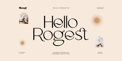 Hello Rogest font is perfect for many of your projects like logos & branding, photography, invitations, watermarks, advertisements, product designs, stationery, wedding designs, labels, product packaging, special events and much more.
 - Pogba by Mr. Typeman,
$14.00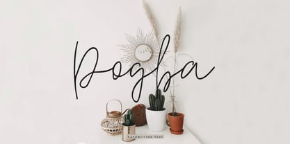 Pogba is a stylish calligraphy font with an amazing and natural style. Pogba is perfect for branding & logo projects, also suitable for packaging, wedding invites and cards and so on.
 - Rose Boutique by Supfonts,
$15.00 Rose Boutique it is cute handwritten chick font with exquisite accents. This font is perfect for branding, cricut projects, wedding invitations, logos, vinyl, svg files, stickers, cards, signs and more!
 - England Co by Runsell Type,
$16.00 England Co font is perfect for many of your projects like logos & branding, photography, invitations, watermarks, advertisements, product designs, stationery, wedding designs, labels, product packaging, special events and much more.
 - Ristabella by Coredeon,
$9.00 inspired by my beloved wife's handwriting, starting with a scribble, consists of thick and thin lines These fonts are suitable for letter writing, decoration, display, birthday, wedding and for logos
 - Wild Rhytm by Forberas Club,
$16.00 This new script font is written by our team, and ready to pop up your project by using this font for your party, event, invitation or at your wedding decor.
 - Lets Sparkle by Lucky Type,
$12.00 Let’s Sparkle is a brand-new handwritten font that will be perfect for books, wedding invitations, greeting cards, logos, posters, or anything else that needs a fun and happy look!
 - Salways by Forberas Club,
$16.00 Salways is our new product , the handwritten font with playful and bouncy theme to match up your personal project like wedding invitation, your party or the cute moment you have.
 - Withered Leaves by Rvandtype,
$12.00 Withered Leaves is Handwritten font. It has a elegant, and modern look which can be used for logos, branding, invitations, stationary, wedding designs, social media posts, and every other design.
 - Berdina by TM Type,
$12.00 Berdina feels equally charming and elegant. It looks stunning on wedding invitations, thank you cards, quotes, greeting cards, logos, business cards, and every other design which needs a handwritten touch.
 - Ridvena by Rvandtype,
$10.00 Ridvena is a handwritten font. It has an elegant and playful look that can be used for logos, branding, invitations, stationery, wedding designs, social media posts, and so much more.


