10,000 search results
(0.036 seconds)
- IA Airship Captain by Invisible Art Studio,
$14.99 IA Airship Captain is a good readable comic book dialogue font made with a marker with wavy lines, giving it uniqueness and recognition. The family includes Regular, Italic, Bold, and Bold Italic. And contains a large number of kerning pairs. Added extended Latin, extended Cyrillic and contextual autoreplacing crossbar "I" in words like I, I'm, etc.
 - Mountty by Meutuwah,
$20.00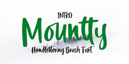 INTRODUCING Mountty is handwritten font with a modern Brush feel. Mountty is perfect for modern projects, headings, blogs, logos, brandings, web design, card, coffee shop, t-shirt, invitations and more! Programs that support in this font is a Microsoft Office Adobe Photo Shop, Adobe Illustrator, Adobe Indesign, and Corel Draw, badges etc. Thank You Font Lovers....!
 - Bakson Marinel by TypeClassHeroes,
$15.00 Bakson Marinel is a modern display sans, simplistic, high-contrast sans that is at home in high-end fashion and cultural environments that you can explore and combine. use this font for any branding, product packaging, invitation, fashion, label, poster, logo etc. Feature Uppercase & Lowercase Number & Symbol International Glyphs Multilingual support Alternative Ligature Hope you enjoy it.
 - Delighter Script by Uncurve,
$20.00 Delighter Script is simply perfect blended fonts with 3 style. Including 10 font and extras. Delighter is inspired from many lettering, poster, quotes, logos and brands. It's perfect for advertising, magazines, editorial, poster, branding, logo type, header, titles, packaging, display etc. A good combination for helping your design, just mix and match and you'll be very authentic.
 - Gilton by Jolicia Type,
$19.00 Gilton by Jolicia Type is a display font inspired by retro playful style writing.This font comes with a unique shape where every corner and There are 16 font family for the choice of the desired letter design, Support for 93 languages This font suitable with your projects such as poster, user interface, magazine, logo, apparel design, etc.
 - Hipsterious by Letterhend,
$15.00 Hipsterious is casual and fun script that stands out from the crowd. Consist of two types, a regular and rough. Perfect to be used especially for logo type, signature, photography, quotes, apparel design, and any design needs. As usual, the font comes with many opentype features such as ligatures, stylistic set alternate, etc and also support multilingual.
 - The Boldstyle by Almeera Studio,
$15.00 Introducing The Boldstyle a retro bold script which will bring yo back to 70s feel.comes with Extrude versions. So you don't need extra effort to create extrude effects. Its features include: Stylistic Alternate, Swash, Ligatures, Stylistic set and multilingual support. You can choose alternatives for substitution with various variants Glyphs. Very suitable for logos, tshirts, posters, branding, etc.
 - Mane by BaronWNM,
$14.00 Mane is a display font with a slant block shape. thick on the vertical line and thin on the horizontal line. have a firm and solid impression. Suitable for writing titles, posters, games, ad taglines, sports, space, etc. has an alternate start and end on each capital letter and several ligatures in order to add variations to each usage.
 - Love Squall by Meutuwah,
$16.00 INTRODUCING Love Squall is handwritten font with a modern Brush feel. Love Squall is perfect for modern projects, headings, blogs, logos, brandings, web design, card, coffee shop, t-shirt, invitations and more! Programs that support in this font is a Microsoft Office Adobe Photo Shop, Adobe Illustrator, Adobe Indesign, and Corel Draw, badges etc. Thank You Font Lovers....!
 - Supremely Luxurious by TypeClassHeroes,
$15.00 Introducing Supremely Luxurious, Access your OpenType features to access the large selection of alternate letters and ligatures. Use this font for any branding, product packaging, invitation, quotes, t-shirt, label, poster, logo etc. Feature Uppercase & Lowercase Number & Symbol International Glyphs Multilingual support Alternative Ligature Feel free to drop us a message any time Hope you enjoy it.
 - Gexo Sans by Java Pep,
$19.00 Proudly present newest elegant sans serif font, Gexo Sans font is the family font that has 5 weights and 5 italics. Gexo Sans designed for elegant and outstanding purposes for your project. This font is perfect for logotype, advertising poster, title, headline, publishing, text font, and etc. Gexo Sans is supporting multilingual more than 30 languages.
 - Cielo by Wilton Foundry,
$29.00 Cielo font family consists of Cielo Light, Cielo Light Italic, Cielo Regular, Cielo Italic, Cielo Bold, Cielo Bold Italic, and Cielo Stencil (Regular weight) Cielo is a versatile contemporary typeface family that will serve you well in many design situations like advertising, corporate communications, etc. Buying all seven weights make it an excellent value for money!
 - Bulgary Reagans by Letterhend,
$12.00 Bulgary Reagans is a pair of font that brings the playful looks with casual feel. The handwritten sans serif combined with the natural hand writing script are the perfect match for you who needs a typeface for headline, logotype, apparel, invitation, branding, packaging, advertising etc. Features : Uppercase & lowercase Numbers and punctuation Alternates & Ligatures Multilingual PUA encoded
 - Black Cycle 2 by Vozzy,
$10.00 Introducing vintage label font duo named Black Cycle. These two fonts has an additional characters and multilungual support (check out all available characters on previews). Both of font familes has four styles: Clean, Clean Shadow, Aged and Aged Shadow. This font will look good on any vintage styled designs like a poster, T-shirt, label, logo, etc.
 - Retro Pica by Creativemedialab,
$18.00 Introducing Retro Pica, a bold and fun display font. Retro Pica features a bold retro style with many alternate characters ideal for design, such as posters, t-shirts, branding, logos, etc. Retro Pica Lite, with this style, we replaced the uppercase character with the alternate version for those who use applications that do not support open-type features.
 - Astronoma by Milan Pleva,
$7.00 Astronoma is a clean modern and geometric sans serif typeface inspired by industrial design and technical fonts. Includes OpenType features & supports many languages. Astronoma is ideal for headlines, headers, logos, labels, packaging, presentations, magazines, invitations, etc. Features: Basic latin alphabet A-Z 11 Ligatures & Alternates 56 Accented characters Numbers, Punctuation, Currency, Symbols, Math symbols & Diacritics Enjoy Astronoma!
 - The KR Floral Color Me font by Kat Rakos is a delightful and artistically inspired typeface that stands out for its unique integration of floral motifs and playful aesthetics. This typeface is not ju...
- Sevigne ST by Reserves,
$39.99 Sevigne [sey-vee-nyey] is a highly refined, contemporary geometric stencil, inspired by the ambience of high-end fashion and luxury combined with the raw, utilitarian nature of the stencil. The inclusion of over 130 unique ligatures expand it’s sensibility of alluring, well-balanced letterforms and distinctive style. The stencil marks are atypically placed and vary throughout, giving it a purposely forward presence. Stylistically, as an all-caps typeface, Sevigne exudes a greater sense of harmony and polish due to it’s unicase form where the interplay of a limited amount of characters is the focus. Subtle, considered details are found within individual letters, contrasted by the complex, intersecting forms that make up the various ligatures. With multiple stylistic sets added to the expanded ligatures, individual letters and ligature pairs can be carefully exchanged to fine-tune text settings for a unique custom type solution. Features include: Precision kerning- Expanded set of over 130 Ligatures, including alternates (ae, oe, fi, fl, ffi, ffl, ffj, ff, fh, fj, ft, tt, th, ct, st, oo, og, go, ogo, gog, la, ea, ev, ew, fy, ez, et, oc, ga, do, uv, vu, yu, uy, nn, mm, xy, yx, ao, oa, ac, da, aq, nt, aa, ll, ss, ut, tu, ka, ca, ag, of, off, co, ne, nr, nl, nd, nk, hn, mn, me, mp, al, an, af, ar, ak, ah, ad, ab, and, gg, all, co, ço, he, the, tl, tn, tf, tr, tk, td, tb, te, am, ame, amb, tm, ap, tp, wu, uw, kt, tz, ra, za, mk, xx, yy, vv, ww, ky, fu, oq, cc, cq) Alternate characters (A, G, R, Q, _, $, ®, •, ¶) Slashed zero Full set of numerators/denominators Automatic fraction feature (supports any fraction combination) Extended language support (Latin-1 and Latin Extended-A) *Requires an application with OpenType and/or Unicode support.
 - Sevigne by Reserves,
$39.99 Sevigne [sey-vee-nyey] is a highly refined, contemporary geometric sans, inspired by the ambience of high-end fashion and luxury. The inclusion of over 130 unique ligatures expand its sensibility of alluring, well-balanced letterforms and distinctive style. Stylistically, as an all-caps typeface, Sevigne exudes a greater sense of harmony and polish due to its unicase form where the interplay of a limited amount of characters is the focus. Subtle, considered details are found within individual letters, contrasted by the complex, intersecting forms that make up the various ligatures. With multiple stylistic sets added to the expanded ligatures, individual letters and ligature pairs can be carefully exchanged to fine-tune text settings for a unique custom type solution. Features include: Precision kerning- Expanded set of over 130 Ligatures, including alternates (ae, oe, fi, fl, ffi, ffl, ffj, ff, fh, fj, ft, tt, th, ct, st, oo, og, go, ogo, gog, la, ea, ev, ew, fy, ez, et, oc, ga, do, uv, vu, yu, uy, nn, mm, xy, yx, ao, oa, ac, da, aq, nt, aa, ll, ss, ut, tu, ka, ca, ag, of, off, co, ne, nr, nl, nd, nk, hn, mn, me, mp, al, an, af, ar, ak, ah, ad, ab, and, gg, all, co, ço, he, the, tl, tn, tf, tr, tk, td, tb, te, am, ame, amb, tm, ap, tp, wu, uw, kt, tz, ra, za, mk, xx, yy, vv, ww, ky, fu, oq, cc, cq) Alternate characters (A, G, R, Q, Z, _, $, ®, •, ¶) Slashed zero Full set of numerators/denominators Automatic fraction feature (supports any fraction combination) Extended language support (Latin-1 and Latin Extended-A) *Requires an application with OpenType and/or Unicode support.
 - Norwich Aldine ML by HiH,
$12.00 Norwich Aldine ML is a all-cap typeface with enlarged serifs, designed and produced in wood by William Hamilton Page of Norwich, Connecticut in 1872. Norwich Aldine ML is a fine example of the strength of decorative wood types: large, simple type forms that provide the visual boldness sought by advertisers of the Victorian period. While our marketing has gotten so very sophisticated, there is always a place for a simple, visually strong typeface. Although about 14 miles inland, Norwich, Connecticut lies at the head of the Thames River. The river is both wide and deep, and therefore was not bridged in the early 20th century. Until then, if you wanted to get from Groton on the west bank to the whaling port of New London on the east bank by land, you had to go by way of Norwich. Because of its size, the Thames is navigable all the way from Norwich to New London. Docks were built in Norwich around 1685 and the city became Connecticut’s 2nd largest port by 1800. With the construction of the Norwich & Worcester Railroad in 1835, Page could easily ship his wood type north by rail or south by coastal schooner. Included with our font, Norwich Aldine ML, are two 19th century printer’s ornaments of sailing ships similar to those that sailed up the Thames to Norwich. Reference: Moon’s Handbooks, Connecticut 2nd Edition (Emeryville CA 2004) The family has expanded from one to four fonts: 1. Norwich Aldine ML: the concept font, computer-sharp corners and smooth curves, as we imagine it was designed. 336 Glyphs including some reduced-width alternatives for better letter spacing. 2. Norwich Aldine Worn ML: the way actual wooden type would look after have been used for a while. 332 Glyphs 3. Norwich Aldine Distressed ML: the way the wooden type would look after it had really been used, perhaps abused. Alternatives to the more popular letters reflect the damage that typically occurs on a well-wormn font, with nicks, cuts and scratches and the overall wear that reduces the overall height and leads to uneven inking due to varying heights in the chase. A couple of bullets look like bullet holes. 345 glyphs. 4. Norwich Aldine Cyrillic: Cyrillic includes alll English and Cyrillic letters for MS Windows Code Page 1251, ISO 8859-5 and MacOS Cyrillic. 235 glyphs. We did Cyrillic because is was fun and we felt the basic design cried out for Cyrillic. While obviously subjective, we hope you will agree.
 - Klothilde by Fontroll,
$20.00 Klothilde is a handwriting font which came to life in one of my doodling sessions (I must admit I still doodle with pen and paper). The idea was to create a font which resembles writing with a quill on paper with exaggerated ball terminals. Sometimes there is too much ink which makes the letters fat and the strokes uneven. The paper soaks the ink resulting in blurred line crossings. The form gets blurry. On the other hand, when the quill runs out of ink the stroke gets thinner looking like the light version of Klothilde. In order to emulate the different looks, I created six fonts with a common skeleton but different appearance which can be altered seamlessly by using the Variable Fonts technology (e.g. in latest Adobe apps or CorelDRAW Graphics Suite) along the Weight and Blurred sliders. But even without, Klothilde can be used even in longer copy. Use it from 18 pt upwards, flush left with tight leading and intersecting ascenders and descenders. Due to extensive manual kerning, it gives your text an even colour. To my knowledge, Klothilde is one of the first script Variable fonts in different weights. No, Klothilde’s letters are not connecting. But I added a whole bunch of connecting ligatures which are simply activated by the ligature feature of your app. Even Microsoft Word can do that. Thus Klothilde comes to life, as it should be expected from a handwriting font. In order to add to variety there are additional glyphs for some critical initial and standalone letters. Repeating letter combinations like nn, mm or rr are avoided by replacing the second letter by an alternative form. All features are activated by the standard ligature feature. Ligatures are available for most European languages, some even in Cyrillic (some special Serbo-Croat letters included and accessible through localization or Style Set 08 features). Romanian comma-accent characters and ligatures are accessible through the OpenType locl feature. For the topping on the cake, I added an alternate ampersand (stylistic set 1) and asterisk (ss04), an alternate Cyrillic b (ss02) and t (ss03), a few fleurons, arrows and a skull (OpenType feature ornm), fractions (frac feature), circled numbers (ss06) and an interrobang (ss07) which result in exactly 900 glyphs in each of the six fonts. There should be enough to play with. Should you be missing a special character, do give me a hint.
 - Buddy Parts by PizzaDude.dk,
$15.0052 cool Buddy Parts, each one with it's own goofy looks on his face. Can you tell which one reminds of you? *g* - Echophonic by Rocket Type,
$14.00 Try new Echophonic today! It's hi-fidelity sound you can actually see! Another miracle of modern science in several weights by Rocket Type.
 - NorB Felt Tip by NorFonts,
$32.00 NorB Felt Tip was inspired from the lettering of my grand-brother Med Bahha who taught several kinds of letterings. It is a handwritten text font mimicking a felt pen and can be used with any word processing program for text and display use, print and web projects, apps and ePub, comic books, graphic identities, branding, editorial, advertising, scrapbooking, cards and invitations and any casual lettering purpose… or even just for fun! NorB Felt Tip comes with 6 weights each with their matching italics and in a Light, Normal, Bold and Heavy version.
 - Akagi by Positype,
$25.00 Akagi started as a rough sketch while on a really long plane ride to Tokyo in 2007. I wanted to develop a sans that was a complete departure from my successful Aaux Pro (now Aaux Next) sans serif family. Whereas Aaux and its siblings are rather unforgiving and stark in their presentation, I wanted this new sans serif to "smile" at you when it's on the page. When the plane landed and I realized I did not sleep through the 15 hour trip, my brain shut off, the laptop closed and I hopped in the car to the hotel—forgetting the "new sans" folder on my desktop. Fast forward a few months and I found myself seeing a lot of crisp, rigid, robot-like sans serif typefaces everywhere... I enjoy these new crop of faces but wanted to see something "friendlier" and remembered my earlier sketch work. The groundwork was there screaming at me to complete and Akagi arose from the ashes. To be truly satisfied with it personally, a great deal of time was spent trying to create a harmony between line and curve in an attempt to show that you can be crisp, clean and legible and still keep some personality. The Light and Fat weights (regular and italic) are my favorites and I hope to see them as the workhorses of the typeface.
 - Automoto by Device,
$39.00 Automoto is built from a limited number of curved and straight segments that have been flipped and rotated. It has an extensive set of two- and three-letter ligatures that form a triple ribbon resembling a model car racetrack. For clarity, some character combinations were excluded as they proved to be ambiguous in context. The upper- and lowercase characters can be freely intermixed according to taste.
 - Quasaria by Linotype,
$29.99Linotype Quasaria is part of the Take Type Library, selected from contestants of Linotype’s International Digital Type Design Contests of 1994 and 1997. The font was designed by German artist Armin Retzko and the characters are composed of disjointed pieces. The eye tries to complete the symbols into the forms they are used to. Linotype Quasaria with its unique forms is intended exclusively for headlines and displays. - Viktorie by Three Islands Press,
$39.00 Viktorie might easily be mistaken for the handwriting of a note-taker in a hurry: it looks swiftly jotted down. These energetic characters pay little heed to such arbitrary contraints as baseline or x-height -- taken together, they give the effect of casual penmanship that's both curiously legible and inspiringly unleashed. Viktorie has a single, medium-light weight and comes, of course, with a full character set.
 - MVB Aunt Mildred by MVB,
$39.00 MVB Aunt Mildred has a vintage charm that evokes hand-lettered postcards or advertising. Akemi Aoki drew the letterforms with a fine-tip felt pen and named it after her great aunt. Since its release in 1995, Aunt Mildred has been a popular choice for children’s books. Italics and bold weights have been added, making it even more useful for publications, packaging, and greetings of all sorts.
 - Seaside Resort NF by Nick's Fonts,
$10.00Lettering on a 1933 booklet about certain facilities in Italy -- can you guess what they might be? -- by the Bertarelli Design Studio of Milan inspired this decidedly different and engaging monocase face. If you're looking for something that says "casual elegance," this is it. This font contains the complete Latin language character set (Unicode 1252) plus support for Central European (Unicode 1250) languages as well. - Gimbo by Halbfett,
$30.00 Gimbo is bold. This heavy sans-serif design features thin counters. The interior spaces inside letterforms have been reduced as much as possible. Often, they seem abstract. There are three fonts in the Gimbo family: Black, Ultra, and Ultra Shadow. What do those terms mean? Well, Ultra is wider than Black. It takes up more pixels on-screen or brings more ink to the page.
 - Ring Eyes by Ochakov,
$11.00 Now you can see... the new direction of the big family called Ring - Ring Eyes! That's a very unique Ring & truly devoted. There are only four styles, but they are all very important. Ring Eyes font like our eyes held a million stories. Ring Eyes font like other of the Ring Family is the perfect choice for headlines, logos, branding, packaging, publications, and much more.
 - Calendar Blocks JNL by Jeff Levine,
$29.00Calendar Blocks JNL was inspired by old-fashioned wood type used to assemble calendar pages in the days of letterpress printing. The A-Z keystrokes contain the dates 1-26. The lower case a-z keystrokes have the remaining dates 27-31, along with the split dates 23/30 and 24/31 and blank boxes. The days of the week are located on the 1-7 keys. - Hilton Serif by Juraj Chrastina,
$39.00 There is something special about thin fonts. On one side there is the sensitive, charming and warm touch, on other side they are uncompromising, thoroughgoing. Here the contrast can't hide the clear shapes. Hilton Serif and Hilton Sans are a pair of highly legible, subtle and elegant sans-serif and semi-serif display faces. The quality of spacing and kerning are ensured by Igino Marini.
 - Linotype Cerny by Linotype,
$29.99Linotype Cerny is part of the Take Type Library, selected from the contestants of Linotype’s International Digital Type Design Contests of 1994 and 1997. Dutch artist Mark van Wageningen designed an alphabet consisting exclusively of capital letters. The font’s most distinguishing characteristic is its irregular outer contour, almost as though they were ripped out of paper. Linotype Cerny is intended exclusively for headlines in larger point sizes. - Cover Charge JNL by Jeff Levine,
$29.00 Although less prevalent today, a cover charge was added to better class night clubs of the 1930s and 1940s to discourage patronage by people of questionable social graces. The general idea was that the lower strata of society (meaning the "average Joe" or "hoi polloi") would balk at paying an extra fee just for entrance to a place of good entertainment and fine dining.
 - Inkster by Typadelic,
$19.00Inkster breaks all the rules. The serifs vary from letter to letter, if they have any serifs at all. The upper and lower case letters intermingle and the contrasting characters bounce all over the baseline. Loosely based on the character shapes of Frisco, I developed a tightly spaced calligraphic version and called it Inkster. Use this artistic font when youre looking for a distinctive style! - Kolkata Hotelroom by Hanoded,
$10.00 Hotel rooms in Kolkata don't top the list of 'luxurious habitations'. They are dingy, fly-ridden, dirty and noisy. But if you look really hard, you will find traces of long gone grandeur. This font is all of the above and more: it is sloppy and messy, it spikes and sags, but it does give your designs that extra oomph you are looking for.
 - Vivala Black by Johannes Hoffmann,
$9.99 The idea was to create a typeface with a high black ratio that would work well in a compact style. The five styles of Vivala Black share similar metrics, so they can be easily substituted for each other in a body of text. OpenType features include ligatures, fractions, ordinals, numerators, denominators and stylistic alternates. Fields of application are posters, magazines, packaging, books, and corporate design.
 - Kuzimy by Twinletter,
$15.00 Introducing kuzimy Arabic style font. With this, Font lets you create designer-quality designs with ease. You will get a variety of styles for your project. They come in upper and lower case and alternate with different shapes. You will be able to easily create professional designs with an Arabic Style theme. This font gives you the best results when used in your projects.