10,000 search results
(0.037 seconds)
- Couturier Poster by Latinotype,
$29.00 Elegance flows through Couturier Poster soul. The new cousin of early launched Couturier, brings higher contrast and an extended family, perfect for big sizes. Inspired by the didones from the 18th century, its design its heavily influenced by contemporary ideas makes it suitable to use for almost anything you can think of. Equipped with swashes, ligatures, small caps and alternates, this typography is very versatile and allows you to set a big range of compositions with discretion or personality. Couturier Poster comes in six weights and matching true italics, from thin to black. It's a good choice to pair with Couturier for smaller sizes and Couturier Poster for the big titles. It has a set of 1248 characters that cover more than 200 languages derived from latin.
 - Xmas Knitted by Beast Designer,
$15.99 Imagine a font that embodies the cozy warmth of a holiday sweater. The Xmas Knitted Font is a whimsical creation that brings to life the spirit of the season with each letter. Crafted meticulously, it mimics the intricate weave of yarn, evoking the charm of hand-knitted patterns. Each character is adorned with festive elements like snowflakes, holly leaves, or reindeer motifs, creating a delightful tapestry of holiday cheer. The font exudes a nostalgic, homemade feel, reminiscent of cherished moments by the fireplace, sipping cocoa, and sharing stories during the festive season. Its playful yet comforting design makes it perfect for adding a touch of seasonal magic to invitations, greeting cards, or any project seeking a dash of Christmas spirit.
 - Marceaux by Hexagon Foundry,
$17.00 Marceaux is a sophisticated font with a touch of elegance and modernity. The letterforms are sleek and slender, with clean lines that give this font a refined and graceful appearance. Whether you're creating a logo, a book cover, or a website, Marceaux will bring a touch of class to your project. Marceaux features a complete set of small caps, uppercase, and lowercase letters. The font has been developed in six weights, from light to black, with corresponding true italics and oblique letters, and two styles (serif and sans-serif) for a total of 24 styles, making it versatile enough to use in a variety of design applications. Marceaux includes an expanded character set that supports over a hundred latin-based languages.
 - Comicblast by Kustomtype,
$25.00 Comicblast is a comic and hand-drawn font family with a universal and timeless design. The font is inspired by the work of acclaimed Belgian comic artists. The font is unique and helps you to complete your designs with a custom and handmade look. This typeface has six styles, available in regular, medium and bold weights, with italic counterparts, all-in-one style-linked. In short: a complete and affordable package for each designer. Comicblast has smooth and round shapes. It looks friendly and casual, is completely handmade and suitable for comics, logos, titles, package design or wherever you need a fun and warmhearted comic font, for all your fantastic designs! Comicblast is designed by Coert De Decker in 2018 and published by Kustomtype Font Foundry.
 - Artifex CF by Connary Fagen,
$35.00 Designed for easy reading of long passages, Artifex CF's smoothed-off serifs help the flow of text without unnecessary visual noise. Artifex's even rhythm and mellow tone make it an excellent option for books, magazines, articles, blogs, captions, and longform texts. A near-upright italic adds emphasis and urgency with elegance. Artifex also doubles as a handsome display typeface, scaling gracefully with charming details revealing themselves at large sizes. Artifex CF pairs nicely with bold, clean sans-serifs, such as Greycliff CF and Visby CF. Artifex also has a sibling typeface, Artifex Hand CF, cut from the same cloth, but with subtle flares in place of the serifs. All typefaces from Connary Fagen include free updates, including new features, and free technical support.
 - Rooney by Jan Fromm,
$45.00 Rooney is based mainly on old-style serif construction principles, such as the angle of stress, the open letterforms and the medium contrast, which lends the typeface a serious feel. Nonetheless Rooney is equipped with rounded shapes and soft curves that add a warm and smooth overall impression. Rooney combines these two different approaches: It has distinctive, original letterforms, but remains very readable and versatile. It includes six weights from Light to Black and Italics. The Rooney family comes with a Pro version, which is intended for professional designers. It contains lots of OpenType features such as small caps, ligatures, different figure sets and alternate glyphs. With around 840 glyphs, Rooney Pro is a powerful tool for any kind of typographical task.
 - Renata by Laura Worthington,
$25.00 Both casual and upscale, Renata features inviting. languorous letterforms, stroked by the hand of an experienced calligrapher with a small brush-tipped pen. Renata is quite readable thanks to its high x-height and spacious connecting strokes. It also looks exceptionally natural – every lowercase letter includes an alternate of each letter and a beginning, ending, and an “isolated” form (useful for settings like “mar y sol,” “o sole mio”; lettered lists; and creative uses like wordmarks). Renata features 119 swashes for a custom look and feel. See what’s included! http://bit.ly/2fQYX6B This font has been specially coded for access of all the swashes, alternates and ornaments without the need for professional design software! Info and instructions here: http://lauraworthingtontype.com/faqs/
 - Kiro by Dharma Type,
$24.99 Kiro is a minimal, simple condensed sans-serif family designed by Ryoichi Tsunekawa and the whole family consists of 12 style: six weights from Thin to ExtraBold and their matching Italics. The range of styles provides flexibility for title, headline and body text. And the large x-heights gives them legibility and readability. The basic skeleton was designed semi-modularly and the letterform was minimalized by removing their unnecessary stems. Their corners were finished with subtle rounded effect. The minimalized semi-modular design gives this family contemporary urbane taste and rounded corners make this family warm and friendly. Kiro supports almost all European languages: Western, Central, South Eastern Europeans and afrikaans. And superior figures, inferior figures, denominators, numerators and fraction can be accessed by using OpenType features.
 - Antry Sans by Mans Greback,
$59.00 Antry Sans is a cool uppercase typeface. With heavy letterforms in a sturdy appearance, this poster font gets attention while keeping clean. It is legible and clean, optimized for a non-complex design or headline. The Antry Sans font family consists of Thin, Regular and Bold, and each weight as Italic, totalling in six styles. The font is built with advanced OpenType functionality and has a guaranteed top-notch quality, containing stylistic and contextual alternates, ligatures and more features; all to give you full control and customizability. It has extensive lingual support, covering all Latin-based languages, from Northern Europe to South Africa, from America to South-East Asia. It contains all characters and symbols you'll ever need, including all punctuation and numbers.
 - Deliscript by Alphabet Soup,
$29.00 Although initially inspired by the neon sign in front of Canter’s Delicatessen in Los Angeles, the design of Deliscript Upright and Deliscript Slant soon took on a life of its own–and its own distinctive look. Like its sibling Metroscript, Deliscript has many features that expand its usability such as the the variable length tails which can be accessed in 6 different styles, and the never before seen crossbars which can be extended outward in either direction from the lower case “t”. Throw in the special “WordLogos”, tons of ligatures and foreign accented characters, and you have a recipe for typesetting that approaches the look of hand-lettering. For a better understanding of its unique features please download The Deliscript User Manual—available in the Gallery section.
 - Cottorway by FoxType,
$10.00 Cotterway Display is a Brand New Elegant Typeface with a powerful font family. It has a dependable and uncompromising style, with controlled letterforms and modern touches. It looks amazing in logos, magazines, and movies. Cotterway Font would be perfect for branding, headlines, Captions, paragraphs, and posters. The various weights allow you to experiment with a wide range of applications. It's created to make an impression without sacrificing its beauty and readability. It's shown a clean, minimalist, warmth, quirky, yet still purposed to be versatile The Typeface includes Six Weights - Light, Regular, Medium, SemiBold, Bold and ExtraBold. Numerals and extended punctuation (200+ Glyphs). Expert kerning and quality crafting. TTF, OTF and WebFonts Included. Thank you for taking the time to look into the font.
 - Linotype Syntax Letter by Linotype,
$29.00Linotype Syntax™ Letter is reminiscent of the style of the Roman Rustic capitals and is an earthy, almost snappy companion to the other Linotype Syntax™ typefaces. Instead of subtly expressing the rhythmic dynamism of handwritten letters, this face is more overt about its connections to writing movements, such as the lead-in and exiting terminals, and the organic branching of round strokes from main stems. Linotype Syntax Letter was designed especially for office communications, and it does add a warmer, more personal touch to such documents — while still combining nicely with the more formal Syntax relatives. With six weights, their matching italics, as well as small caps and old style figures, this typeface family has a total of 24 weights. - Supria Sans Condensed by HVD Fonts,
$50.00 Beside Supria Sans™ , the condensed version is the second component of the Supria type system. Encompassing the same six weights and three styles as Supria Sans, and characterised by the same approach to the modernist source material, this condensed set of fonts is 20% narrower than the normal version, allowing for significant space saving economies. Used together, Supria Sans and Supria Sans Condensed become much more than just a versatile and functional workhorse – ideal for resolving complex design issues with elegance and sophistication. Supria Sans Condensed™ is equipped for complex, professional typography. As an exclusively OpenType release, these fonts feature small caps, five variations of numerals, arrows and an extended character set to support Central and Eastern European as well as Western European languages.
 - Grungy Old Typewriter by FontFuel,
$14.00 Grungy Old Typewriter is based on two typed letters, each on two pages and dated 1901. The results are eroded, rough, irregular and grungy. The final results are a vintage look. As a designer, I wanted as much flexibility as possible, so there are six versions that are designed to work together. Additionally, I decided to keep the grunge and irregularities within the shape and not include surrounding typewriter or paper marks. I leave it to the design to add those elements as desired. One note, the letter spacing is much tighter than an old typewriter. I felt that readability for modern readers suffered from the added space. Of course, you can get that same look by increasing the letter spacing in your favorite design program.
 - Pericano Display by FoxType,
$12.00 Pericano Display is a Brand New Elegant Slab Serif Typeface with a powerful font family. It has a dependable and uncompromising style, with controlled letterforms and modern touches. It looks amazing in logos, magazines, and movies. Pericano Font would be perfect for branding, headlines, Captions, paragraphs, and posters. The various weights allow you to experiment with a wide range of applications. It's created to make an impression without sacrificing its beauty and readability. It's shown a clean, minimalist, warmth, quirky, yet still purposed to be versatile. The Typeface includes Six Weights - Thin, ExtraLight, Light, Regular, Medium, and SemiBold. Numerals and extended punctuation (200+ Glyphs). Expert kerning and quality crafting. Thank you for taking the time to look into the font.
 - Vodka by Fenotype,
$19.00 Vodka - a display pack with an edge. Vodka is a display combo pack of four styles and six fonts. Vodka fonts are clean but soft. Vodka's core is two weights of a Brush Script and a Monoline Script with similar characters. Vodka Sans is a bold sans with very soft features. Vodka Sans lowercase letters are a bit condensed version of uppercase. Vodka Slab is a rounded bold display type. Vodka Brush and Pen are equipped with automatic Contextual Alternates and Standard Ligatures that help to keep the flow smooth. For more expressive letters there’s Swash Alternates for every standard letter. Vodka fonts are designed to play together but can easily be used as themselves too. For the best price purchase the whole pack!
 - Ever West by Andrew Tomson,
$10.00 Meet the new font family! This font came to my mind while I was sitting in line at the dentist. There are often different magazines at the front desk to read and pass the time while waiting. One of those magazines turned out to be about fashion. When I opened it on a random page, I saw beautiful pictures. But you know what the first thing that catches my eye? The font! The font in which the headline or quote is written. After you read it, you look at everything else. And I wondered what my font would be in this case. I present to you my version of a font for fashion lettering. Good luck and love to you, friends!
 - Diagram Display by Makes Type,
$50.00 The distinctive design of the "Diagram Display" comes from the Venn diagram. It is a common statement and it is a spatial illusion. The delicately differentiated curves balance the technical, geometrically constructed shaping. The graceful character comes with All caps or Small caps typesetting in lighter weights when the font takes on a classicist character due to its proportions. It appears best in headlines and larger sizes, in all applications and themes where its elemental design resonates. Each of the six weights contains an extensive character set, including small caps, uppercase, lowercase and tabular numbers, mathematical symbols, standard and discretionary ligatures, or arrows and other special characters. The stylistic set SS01 contains alternations (a, g, t, u, y) that support its geometrically constructed appearance.
 - Montoro Display by FoxType,
$12.00 Montoro Display is a Brand New Luxury Typeface with a powerful font family. It has a dependable and uncompromising style, with controlled letterforms and modern touches. It looks amazing in logos, magazines, and movies . Montoro Font would be perfect for branding, headlines, Captions, paragraph, and posters . The various weights allow you to experiment with a wide range of applications. It's created to make an impression without sacrificing its beauty and readability. It's shown a clean, minimalist, warmth, quirky, yet still purposed to be versatile The Typeface includes Six Weights - Regular, Medium, SemiBold, Bold, ExtraBold, and Black. All offer wide language support, upper and lower cases, numerals and extended punctuation. Thank you for taking the time to look into the font.
 - Hatsch Sans by Mans Greback,
$59.00 Hatsch Sans is a modern uppercase typeface. With balanced letterforms in a fresh appearance, this grotesque font is a new take on classic sans-serif design. It is legible and clean, optimized for a non-complex design or headline. The Hatsch Sans font family consists of Thin, Regular and Bold, and each weight as Italic, totalling in six styles. The font is built with advanced OpenType functionality and has a guaranteed top-notch quality, containing stylistic and contextual alternates, ligatures and more features; all to give you full control and customizability. It has extensive lingual support, covering all Latin-based languages, from Northern Europe to South Africa, from America to South-East Asia. It contains all characters and symbols you'll ever need, including all punctuation and numbers.
 - Graphite Club by Comicraft,
$19.00 The eight rules of Graphite Club: You do not talk about Graphite Club… You do NOT talk about Graphite Club. If someone types "Stop" taps out “Limp,” the Graphite is over. Only two -- Waitasecond! EVERYBODY wants to talk about Graphite Club! It's the font for rough and tough typesetting that looks as etchy and sketchy, sleek and sexy as Brad Pitt on an off day. It's Light as a featherweight, it's as Regular as wetwork and as Bold as Brass Knuckles. And don't let anyone tell you this font is not special. It's as beautiful and unique as a snowflake. And so are you. Features six weights with alternate uppercase alphabets, language support for Western & Central Europe, Automatic alternates, Stylistic Alternates & Crossbar I Technology™
 - Mangrove by Set Sail Studios,
$18.00 Bring your letters to life with the Mangrove Font Duo! A delightfully playful pairing of Sans and Script fonts. These perfectly balanced typefaces have been carefully designed to work not only as standalone fonts, but also to pair together effortlessly—delivering undeniably eye-catching typography bursting with character. Throw a script letter in the middle of the sans font, try the swooping sans ligatures or it’s uplifting small-caps, the possibilities are numerous. It’ll work in lowercase or uppercase, and with a choice of 3 weights per font, that’s six fonts in total for you to experiment with! Language Support • English, French, Italian, Spanish, Portuguese, German, Swedish, Norwegian, Danish, Dutch, Finnish, Indonesian, Malay, Hungarian, Polish, Croatian, Turkish, Romanian, Czech, Latvian, Lithuanian, Slovak, Slovenian.
 - MartiniThai Neue Slab V2 by Deltatype,
$39.00 Award winning 2017 font from Demark (Thailand) and G-Mark (Japan) in Graphic Design, MartiniThai Neue Slab is now available with better taste. Deltatype created a better version of MartiniThai Neue Slab V2: refined for better outline, we fine-tuned all outlines for better letterforms. Proportion were adjusted for better consistent. Metrics got new values for increased readability. Kerning, fine-tuned kerning pair for better spacing between the letters. MartiniThai Neue Slab V2 comes in six weights: Thin, Light, Regular, Bold, Extra Bold, Black. Thai Language is included in this package. MartiniThai Neue Slab is a unique slab serif in Thai Script that creates a sense of timeless and contemporary feel and is used by a media provider and nationwide in Thailand.
 - Gabriel Sans by Fontfabric,
$45.00 Gabriel Sans is a font family inspired by the original Sans Serif fonts of the Transitional age like Futura and Grotesk, but with a modern twist. It is clean, elegant and straight-to-the-point. It has features similar to the classic Helvetica - like the endings of the capital C - but goes one step further. It also has a quadratic look, which makes it easily distinguishable and easy to use - the height is nearly as long as the width. It is professional and equally suited to your business or your personal lifestyle; it can be used in logotypes as well as in typeset text. It’s an all-purpose font offering the best of both worlds! Gabriel Sans comes in six weights, italic and normal.
 - Bembo MT by Monotype,
$45.99 The origins of Bembo go back to one of the most famous printers of the Italian Renaissance, Aldus Manutius. In 1496, he used a new roman typeface to print the book de Aetna, a travelogue by the popular writer Pietro Bembo. This type was designed by Francesco Griffo, a prolific punchcutter who was one of the first to depart from the heavier pen-drawn look of humanist calligraphy to develop the more stylized look we associate with roman types today. In 1929, Stanley Morison and the design staff at the Monotype Corporation used Griffo's roman as the model for a revival type design named Bembo. They made a number of changes to the fifteenth-century letters to make the font more adaptable to machine composition. The italic is based on letters cut by the Renaissance scribe Giovanni Tagliente. Because of their quiet presence and graceful stability, the lighter weights of Bembo are popular for book typography. The heavier weights impart a look of conservative dependability to advertising and packaging projects. With 31 weights, including small caps, Old style figures, expert characters, and an alternate cap R, Bembo makes an excellent all-purpose font family.
 - Sunetta by Linotype,
$29.99An inkstone, a brush, ink, and paper. In China, one speaks of “wenfang sibao” — the four treasures of the scholar’s study. With these centuries-old hand tools, Werner Schneider created a calligraphic type trilogy of the highest aesthetic order; he named this typeface family after Buddha’s stepbrother, Sunetta. Sunetta is an outstanding choice for contemporary display type purposes. Its combination of lively forms overcome sterile text passages, lending them a more personal note and feeling. But Sunetta is not only recommended for documents bestowing distinction and accolades; the fonts are superb for shorter text passages as well. Sunetta’s spirited flow raises it above the fray that so many generic letterforms find themselves mired in, creating an unforgettable impression. Sunetta’s three complementary styles, Sunetta Flair, Sunetta Charme, and Sunetta Magic, offer three varying degrees of calligraphic verve. The family’s base font, Sunetta Flair, harkens back to the showcard lettering styles of the 1950s, while remaining distinctly European in taste. Sunetta Charme has a more swash-type appearance, while Sunetta Magic is joyfully decorative — its brush-written strokes dance across the line. Together, they may help you reach typographic nirvana. - Bembo Infant by Monotype,
$45.99The origins of Bembo go back to one of the most famous printers of the Italian Renaissance, Aldus Manutius. In 1496, he used a new roman typeface to print the book de Aetna, a travelogue by the popular writer Pietro Bembo. This type was designed by Francesco Griffo, a prolific punchcutter who was one of the first to depart from the heavier pen-drawn look of humanist calligraphy to develop the more stylized look we associate with roman types today. In 1929, Stanley Morison and the design staff at the Monotype Corporation used Griffo's roman as the model for a revival type design named Bembo. They made a number of changes to the fifteenth-century letters to make the font more adaptable to machine composition. The italic is based on letters cut by the Renaissance scribe Giovanni Tagliente. Because of their quiet presence and graceful stability, the lighter weights of Bembo are popular for book typography. The heavier weights impart a look of conservative dependability to advertising and packaging projects. With 31 weights, including small caps, Old style figures, expert characters, and an alternate cap R, Bembo makes an excellent all-purpose font family. - Cheval by Solotype,
$19.95Formalized from some hand lettering by the multifaceted Jugendstil designer Bruno Mauder, perhaps better known for his work in glass and ceramics. - Dunhill Script by Lipton Letter Design,
$29.00 A bit of happenstance and accident are always full of possibility — Richard Lipton’s Dunhill Script is based on observations of the work of his left-handed calligraphy students and then from a small detail generated by his own freehand sketching. Like his other script typefaces, Dunhill was born from the desire to achieve a certain visual drama. Many details show the pen at work, like the terminal shapes and the caps and ascenders. Dunhill also has a range of alternate stylistic glyphs and contextual features that can transform it into a connected script. It’s a great choice for editorial display or advertising and branding settings on its own or paired with a Roman sans or serif.
 - Futurex Slab - Unknown license

- Birani by Attype Studio,
$16.00 Birani is lovely script font with swash on beginning & ending word. This font perfect for valentine & wedding theme design. Combine it with Birani beginning, ending swash & ligatures to make perfect design for yor projects. Birani perfect for valentine promotion, wedding invitation, branding, logo, invitation, stationery, social media post, product packaging, merchandise, blog design, game titles, cute style design, Book/Cover Title and more. What's Included : - Birani Family Font - Ligature - Multilingual Support - Beginning & Ending Swash
 - Brethen by Typebae,
$15.00 Brethen is a stylish and elegant serif font. It looks beautiful on a variety of designs requiring a personalized style, such as wedding invitations, thank you cards, weddings, greeting cards, logos and so on. Bring your projects to the highest levels! To use stylistic alternates and ligatures, you don't need to use software that supports opentype, because we have made it separately so it's very easy to use. Features: Multilingual Ligatures Stylistic Alternates PUA encoded
 - Overlander by Oakstone Creative,
$6.50 Overland is a strong Art Deco typeface, inspired by the train 'The Overland' that runs in Australia, the font is perfect for headlines, display, branding and much more... even wedding stationary!. It is a bold and dense with an obvious deco inspired background, great for any projects or brands that wear the roaring 20's to 40's on their sleeve. Great for Signage, Wedding stationary, logos, branding materials, business cards, quotes, posters, and more!
 - Yuanita by Putracetol,
$12.00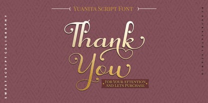 Yuanita is a beautiful modern calligraphy font. A modern script with a handmade calligraphy style. This font is feminime, elegant, messy and modern. Yuanita perfect for wedding event, anniversary, birthday, greeting cards, logotype, branding, wedding invite and card, elegant logo, poster, packaging, stationery, website, and any other projects requiring a handwritten and luxurious touch. Includes OpenType feature with a lot of alternates to help you to make great lettering. This font also supports multiple languages.
 - Knighthood by Letterara,
$12.00 Knighthood is a elegant and masculin font Brush. with extra attention to quick strokes and sharp details, Knighthood contains uppercase, lowercase and ligature. This font can also be used to show elegance in a wedding and christmas. Grotters is ideal for logos, apparel, wedding, book, t-shirts, hoodies, quotes, youtube, quotte, product packaging, website or anything that needs a typographic turbo-boost and you’ll get a unique swash to accompany the font.
 - Diamond Bridge by Sarid Ezra,
$15.00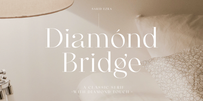 Introducing, Diamond Bridge - a classy serif with diamond touch! Diamond Bridge is an elegant and classy serif with a beautiful details that will make your presentation, logo or your wedding invitations more stunning and classy! You can use this font for several purposes such as a wedding invitations or even your own branding! This fonts support Multi Language and already PUA Encoded! Features Uppercase & Lowercase Number & Symbol Multi language PUA Encoded Thank You!
 - Buttershine Serif by Typestory,
$25.00 Buttershine is a bold, beautiful and versatile duo font (serif and script). It looks beautiful on a variety of designs requiring a personalized style, such as wedding invitations, thank you cards, weddings, greeting cards, logos and so on. What’s Included : Ligature, Alternate & Swashes Works on PC & Mac Simple installations Accessible in the Adobe Illustrator, Adobe Photoshop, Adobe InDesign, even work on Microsoft Word. PUA Encoded Characters – Fully accessible without additional design software.
 - Kanaya by Putracetol,
$14.00 Kanaya is a beautiful modern script font. Kanaya has a very beautiful alternate character, and has modern, elegant and luxurious swashes in each lowercase character. Kanaya is perfect for wedding events, anniversaries, birthday, greeting cards, logotype, branding, wedding invites and cards, elegant logos, posters, packaging, stationery, websites, and many more. Includes OpenType features with a lot of alternates, to help you to make great lettering. This font is also support multi-language.
 - Spring Butter by Sipanji21,
$18.00 Spring Butter is a modern script with leaves looks in the open type feature. This font is elegant, messy and modern. Spring Butter perfect for wedding event, anniversary, birthday, greeting cards, logotype, branding, wedding invite and card, elegant logo, poster, packaging, stationery, website, and any other projects requiring a handwritten and luxurious touch. Come with open type feature with a lot of alternates and some ligatures also its help you to make great lettering.
 - Magrit by Creativemedialab,
$20.00 Magrit is a bold serif display font, It has many alternates character with nice curve that you can arrange to create a nice logo lettering, or use it as a display face on a poster and add a few alterations to it to make a beautiful eye catching words. Magrit font is best for branding, logo lettering, headlines, product packaging, tshirt design, wedding theme, poster, book cover, wedding invitation, Christmas and many more
