10,000 search results
(0.052 seconds)
- Eutaw Stencil JNL by Jeff Levine,
$29.00 A hand lettered emulation of a Roman stencil type face on the cover of the folio for the Stenso School Set was the basis for Eutaw Stencil JNL, which is available in both regular and oblique versions. The Stenso School Set (circa 1940-41) was comprised of three stencils – two lettering guides and a map of the [then] 48 United States. Developed and patented by Baltimore school teacher Ruth Libauer Hormats, her stencils were the first to offer a system for accurate letter spacing and ease of use. “Eutaw” (as part of the font’s name) is taken from Eutaw Place, the street where Ruth and her husband lived at the time of Stenso’s inception. To the Cherokee, the name means “Creek Indian”.
 - Vallassina by Wilton Foundry,
$29.00 Vallassina is named after Vallassina, a village in the valley of the upper tract of the river Lambro in northern Italy. The most important settlement in the area is the town of Asso, from which the valley takes its name. Spasell is a slang of Insubric language, spoken until 19th century by inhabitants of Vallassina, when they used to go out from the valley for business and they didn't want to be understood by the people. What makes this valley unique is that the locals use a unique whistle language to communicate to each other. Vallasina is confidently irreverent yet curiously attractive. How many ways can you use Vallassina to whistle to your neighbors? Vallasina is available in OpenType format.
 - Wanted by ITC,
$29.99 One look at the font Wanted brings to mind swinging saloon doors, double shots of whiskey and sheriff's badges. It belongs to the so-called Italienne typefaces which began to appear at the beginning of the 19th century. The distinguishing characteristic of such typefaces is the robustness of its serifs, which exceeds that of the base strokes. Wanted looks almost as though it were stamped on paper. Small white flecks appear in some of the strongest black strokes just as they would in a stamp which did not get quite enough ink...or are they perhaps the work of a sharp shooter? Wanted is best for short headlines and perfect for anything which should have the look and feel of the Wild West.
 - Chlorine Sans by Victory Type,
$12.50The Chlorines are two unique fonts, for they look as if they have been corroded with some sort of caustic material. Could it have been chlorine? Who knows? Both fonts have a modern appeal to them and fancy up any document. And when you can pick both of 'em up for only $45 how can you resist that corrosive, yet clean appeal? Chlorine Sans is a unique font, for it looks as if it has been cleanly corroded with some sort of caustic material. Could it have been chlorine? Who knows? This font has a modern appeal to them and fancy up any document. And when you can pick it up for only $25 how can you resist that corrosive, yet clean appeal? - Aarde by Scholtz Fonts,
$19.00This is the definitive standard African font. It combines wonderful readability with tremendous panache. The fact that it has a full character set (UPPER and lower case), all punctuation and all special characters, means that it can be used in just about any African design context. If you had only one African font in your arsenal, it would have to be Aarde Black. The name "Aarde" means "earth" and refers to the gutsy, earthy character of the letterforms. It includes a full character set: characters for English, French, Italian, German, and Portuguese. The numerals are mono-spaced, and are very readable so that they will line up correctly in columns of figures. The letters of the alphabet are correctly kerned so that they appear correctly in text. - Greenleaf by Oddsorts,
$39.00 Meet Greenleaf, a display family that blends elegant art deco details, extensive linguistic support, and technically innovative features to create a bold impression that’s ideal for branding, signage, packaging, invitations, and so much more. Greenleaf’s “Pro” fonts support over three hundred sixty languages to reach the broadest possible audience. Meanwhile, its decorative companions expand the family’s expressive potential. They effortlessly create banners, chains, frames, and patterns — and include chromatic fonts which can be set in two colors without layers or special design software. Download the user guide to see Greenleaf’s many features and discover how the fonts actively help you take advantage of all they have to offer. Enjoy! Greenleaf is a trademark of Charles Gibbons / Oddsorts and may be registered in certain jurisdictions.
 - Lirio by Eurotypo,
$48.00 Lirio is a decorative and expressive typeface, it’s elegant yet eccentrically handwritten font. Lirio is presented in two versions: Regular and Slanted. They have many advantages of the OpenType futures to choose from: stylistic alternates, swashes, contextual alternates, and a full set of standard and discretional ligatures. Lirio supports all diacritics for CE languages; they come also with a huge variety of ornaments, underlines, beginnings and word endings that will allow you to work in a creative way. Lirio can fit into many clients’ design brief. They've been specially thought to use in packaging design, children books, advertising, logotypes, greeting cards, restaurants, web sites and much more. These fonts may enlarge your graphic capabilities and your work can be more competitive.
 - Makalu by Juraj Chrastina,
$29.00 Makalu is a funny flower font inspired by the lovely drawings of the famous illustrator Zdeněk Miler (best known for his small mole). His flowers are at the same time cartoony and realistic. Enjoy this choice of 27 original and distinctive illustrations while creating your designs.
 - Architect by Australian Type Foundry,
$30.00Based on the text on architect's plans. The designer asked friends and relatives for the plans for their house extensions, and he studied plans in the public library, then blended the best features of all the characters he could find. Architect was designed originally in 1999. - Persia BT by Bitstream,
$50.99Masoud Nejabati has drawn upon his capable calligraphic skills to create this typeface. Persia represents his first latin-based design. This gentle and finely rendered script reveals Nejabati's extensive background in Islamic calligraphic art. The slight back slant further enhances the appearance of hand-scribed pen calligraphy. - Runa Serif by Monotype,
$29.99Swedish designer Lennart Hansson began designing letterforms at the age of 20, and since then his exceptional calligraphic artwork has been on exhibit throughout the world. Hansson won the Nordic Typeface Competition in Copenhagen for his typeface Runa Serif, inspired by the forms of ancient Viking runes. - Vendetta by Emigre,
$69.00 The famous roman type cut in Venice by Nicolas Jenson, and used in 1470 for his printing of the tract, De Evangelica Praeparatione, Eusebius, has usually been declared the seminal and definitive representative of a class of types known as Venetian Old Style. The Jenson type is thought to have been the primary model for types that immediately followed. Subsequent 15th-century Venetian Old Style types, cut by other punchcutters in Venice and elsewhere in Italy, are also worthy of study, but have been largely neglected by 20th-century type designers. There were many versions of Venetian Old Style types produced in the final quarter of the quattrocento. The exact number is unknown, but numerous printed examples survive, though the actual types, matrices, and punches are long gone. All these types are not, however, conspicuously Jensonian in character. Each shows a liberal amount of individuality, inconsistency, and eccentricity. My fascination with these historical types began in the 1970s and eventually led to the production of my first text typeface, Iowan Old Style (Bitstream, 1991). Sometime in the early 1990s, I started doodling letters for another Venetian typeface. The letters were pieced together from sections of circles and squares. The n, a standard lowercase control character in a text typeface, came first. Its most unusual feature was its head serif, a bisected quadrant of a circle. My aim was to see if its sharp beak would work with blunt, rectangular, foot serifs. Next, I wanted to see if I could construct a set of capital letters by following a similar design system. Rectangular serifs, or what we today call "slab serifs," were common in early roman printing types, particularly text types cut in Italy before 1500. Slab serifs are evident on both lowercase and uppercase characters in roman types of the Incunabula period, but they are seen mainly at the feet of the lowercase letters. The head serifs on lowercase letters of early roman types were usually angled. They were not arched, like mine. Oddly, there seems to be no actual historical precedent for my approach. Another characteristic of my arched serif is that the side opposite the arch is flat, not concave. Arched, concave serifs were used extensively in early italic types, a genre which first appeared more than a quarter century after roman types. Their forms followed humanistic cursive writing, common in Italy since before movable type was used there. Initially, italic characters were all lowercase, set with upright capitals (a practice I much admire and would like to see revived). Sloped italic capitals were not introduced until the middle of the sixteenth century, and they have very little to do with the evolution of humanist scripts. In contrast to the cursive writing on which italic types were based, formal book hands used by humanist scholars to transcribe classical texts served as a source of inspiration for the lowercase letters of the first roman types cut in Italy. While book hands were not as informal as cursive scripts, they still had features which could be said to be more calligraphic than geometric in detail. Over time, though, the copied vestiges of calligraphy virtually disappeared from roman fonts, and type became more rational. This profound change in the way type developed was also due in part to popular interest in the classical inscriptions of Roman antiquity. Imperial Roman letters, or majuscules, became models for the capital letters in nearly all early roman printing types. So it was, that the first letters in my typeface arose from pondering how shapes of lowercase letters and capital letters relate to one another in terms of classical ideals and geometric proportions, two pinnacles in a range of artistic notions which emerged during the Italian Renaissance. Indeed, such ideas are interesting to explore, but in the field of type design they often lead to dead ends. It is generally acknowledged, for instance, that pure geometry, as a strict approach to type design, has limitations. No roman alphabet, based solely on the circle and square, has ever been ideal for continuous reading. This much, I knew from the start. In the course of developing my typeface for text, innumerable compromises were made. Even though the finished letterforms retain a measure of geometric structure, they were modified again and again to improve their performance en masse. Each modification caused further deviation from my original scheme, and gave every font a slightly different direction. In the lower case letters especially, I made countless variations, and diverged significantly from my original plan. For example, not all the arcs remained radial, and they were designed to vary from font to font. Such variety added to the individuality of each style. The counters of many letters are described by intersecting arcs or angled facets, and the bowls are not round. In the capitals, angular bracketing was used practically everywhere stems and serifs meet, accentuating the terseness of the characters. As a result of all my tinkering, the entire family took on a kind of rich, familiar, coarseness - akin to roman types of the late 1400s. In his book, Printing Types D. B. Updike wrote: "Almost all Italian roman fonts in the last half of the fifteenth century had an air of "security" and generous ease extremely agreeable to the eye. Indeed, there is nothing better than fine Italian roman type in the whole history of typography." It does seem a shame that only in the 20th century have revivals of these beautiful types found acceptance in the English language. For four centuries (circa 1500 - circa 1900) Venetian Old Style faces were definitely not in favor in any living language. Recently, though, reinterpretations of early Italian printing types have been returning with a vengeance. The name Vendetta, which as an Italian sound I like, struck me as being a word that could be taken to signifiy a comeback of types designed in the Venetian style. In closing, I should add that a large measure of Vendetta's overall character comes from a synthesis of ideas, old and new. Hallmarks of roman type design from the Incunabula period are blended with contemporary concerns for the optimal display of letterforms on computer screens. Vendetta is thus not a historical revival. It is instead an indirect but personal digital homage to the roman types of punchcutters whose work was influenced by the example Jenson set in 1470. John Downer.
 - Reina Neue by Lián Types,
$29.00 Hey! See Reina Neue in action here! INTRODUCTION When I designed the first Reina¹ circa 2010, I was at the dawn of my career as a type designer. The S{o}TA, short for the Society of Typographic Aficionados, described it as complex display typeface incorporating hairline flourishes to a nicely heavy romantic letterform². And it was like that; that’s what I was pursuing at that time since I was very passionate about ornaments and accolades of Calligraphy. Why? I felt that Typography, in general, needed more of them. These subtle flourishes could breathe life into letters. Maybe, I thought it was the only way I could propose something new into the field of type. However, after some years, I came across a very interesting quote: –Beautiful things don’t ask for attention– Wow! What did this mean? How could something be attractive if it’s not actually showing it. Could this be applied to my work? Sure. I think every type-designer goes through this process (aka crisis) regarding his or her career. At the beginning we love everything. We are kind of blind, we only see the big picture of a project. And that’s not because we are lazy. We actually can’t see the small mistakes nor the subtleties that make something simpler beautiful. We are not able. But, the small subtleties… They are actually everything: With experience, one puts more attention into the details and learns that every single decision in type has to be first meticulously planned. Here I am now, introducing a new Reina, because I felt there was a lot of it that could be improved, also the novelty of Variable Fonts caught my attention and I had to take that to my type library. THE FONT A thing of beauty is a joy forever Now, a decade later, I’m presenting Reina Neue. This font is not just an update of its predecessor: –A thing of beauty is a joy forever– is the first line of the poem ‘Endymion’ by John Keats, and despite the meaning of “beauty” may vary from person to person, and even from time to time (as read in the last paragraph), with Reina I always wanted to bring joy to the eye. In 2010, and now, in 2020. I believe the font is today much better in every aspect. It was entirely re-designed: Its shapes and morphology in general are much more clean and pure. The range of uses for it is now wider: While the old Reina consisted in just one weight, Reina Neue was converted into a big family of many weights, even with italics, smallcaps and layered styles. The idea behind the font, this kind of enveloping atmosphere made out of flourishes, is still here in the new Reina. This time easier to get amazing results due to the big amount of available alternates per glyph and also more loyal from a systemic point of view. However, and as read in the introduction -Beautiful things don’t ask for attention-, if none of the flourishes are activated the font will look very attractive anyway. Reina Neue is ready to be used in book covers, magazines, wedding cards, dazzling posters, storefronts, clothing, perfumes, wine labels and logos of all kind. Like it happened with the previous Reina, I hope this new font satisfies every design project around the world if used, and can be a joy forever. SOME INSTRUCTIONS Before choosing the right style for your project, hear my advice: -Reina Neue Display was meant to be used at big sizes. If you plan to print the font smaller than 72pt, I suggest using Reina Neue, not Display. Otherwise, if the font will be BIG or used on a digital platform, Reina Neue Display should be your choice. For even smaller sizes, use Reina Neue Small. This style was tested and printed in 12pt with nice results. (Note for variable fonts: Print them in outlines) -Reina Italic is not a slanted version of the roman, and this means some flourishes are different between each other. The Italic version has other kind of swirls. More conservative, in general. -All the styles of Reina Capitals have Small Capitals inside. -Reina Capitals Shine should be used/paired ONLY with Reina Capitals Black. The engraved feeling can be achieved if Reina Capitals Black and Reina Capitals Shine are used as layers, with the same word. Variable fonts instructions: -For more playful versions, choose Reina Neue VF, Reina Neue Italic VF or Reina Neue Capitals VF: With them you can adjust between 3 axes: Weight (will change the weight of the font) – Optic Size (will thicken/lighten the thin strokes and open/close the tracking) – Accolades (will modify the weight of the active flourishes). SOME VIDEOS OF REINA NEUE VF https://youtu.be/8cImmT5bpQM https://youtu.be/1icWfPmKAkg https://youtu.be/YC9GkJDL1a8 NOTES 1. The original Reina, from a decade ago: https://www.myfonts.com/fonts/argentina-lian-types/reina/ 2. In 2011, Reina received an honourable mention by S{o}TA. “Great skill is shown in the detailing, and an excellent feel for the correct flow of curves and displacement of stroke weight.” https://www.typesociety.org/catalyst/2011/ Reina was featured in the “Most Popular Fonts of the year” in MyFonts in 2011 https://www.myfonts.com/newsletters/sp/201201.html In 2012, the font was also selected in Tipos Latinos, the most prestigious competition of type in Latinoamerica. https://www.tiposlatinos.com/bienales/quinta-bienal-tl2012/resultados Also, chose as a “Favorite font of the year” in Typographica. https://typographica.org/typeface-reviews/reina/
 - Envelove by Sudtipos,
$39.00 «Envelove» is the brand new typographic challenge handwritten by Yani Arabena and designed along with Guille Vizzari and Ale Paul, for Sudtipos. It all started as a game for Yani. A carefree and spontaneous calligraphy, making use of the pointed nib with black ink, exploring its expressive possibilities pressing against paper. With time that nib turned into her dearest tool to flow through her writing, breeding this particular style of hers that let her trespass the barrier that kept personal and professional passions apart. All that inspiration is present in «Envelove», a play on words that reflects the love of letters. An expressive free-and-easy typeface that follows no formal calligraphic model and lets itself go with the meaning of words, rhythm and sensations. «Envelove» successfully joins three different fonts, «Envelove Script»—free, spontaneous and unique of its kind—going together with «Envelove Caps»—an uppercase style that builds controlled but dynamic words thanks to its alternates and ligatures, and to its own true Small Caps set as well—and «Envelove Icons», ideal to decorate and bring to life any written message. «Envelove» encourages you to write as if you have a nib, ink and an envelope. It invites you to take part in other worlds like a magic cocktail, a summer night, a long-awaited reunion, a first dance, a dish cooked with your own hands. The fashion world, gourmet, stationery, scrapbooking and everyone where a Handmade or Handcrafted feel is craved for, save a special place for «Envelove». (The illustration series that are shown with «Envelove» were made by the incredible Argentine illustrator Eugenia Mello.)
 - Classica Pro by URW Type Foundry,
$35.99 Classica Pro by Bernd Möllenstädt A real alternative for letterpress printing A masterpiece It was only after many years, shortly before the end of his life, Bernd Möllenstädt brought out these early drafts of his Classica Light and Light Italic from his drawer, and asked me to produce for him on the computer a Bold and Bold Italic, from which we later wanted to interpolate further cuts like Regular and so on. The boldening of letters with an oblique axis and with hairlines which should not grow to the same extent as the general line widths, is hard to cope with perfectly, even for the smartest computer program, and even more so, when it concerns an as complicated set of data as those conceived by Bernd. The automatically generated result could therefore only be a first step that had to be improved manually later. This was about the stage that we had reached when Bernd died in March 2013, leaving me behind with comprehensive corrections on proofs of this automatically generated Bold. Although I was aware that it would mean a lot of work to complete the project, I did not want to leave it unfinished and decided to finalize and publish the Classica, also in Bernd‘s honor. In the course of the two years that I worked on this font family it somewhat naturally became also my own. New details were added and some of the existing changed. A book typeface requires the supreme and forgives rarely, it represents a true masterpiece. My intention and my ambition were to create a real alternative for letterpress printing, with a font family that contains all the typographic options for an excellent typesetting, and is better readable and has a better appearance than other existing typefaces. Whether this was achieved, the reader may decide. Volker Schnebel, Hamburg, december 2014
 - Zephyrine by Muksal Creatives,
$10.00 Zephyrine is modern family of Display fonts. Zephyrine has 6 families font, starting from the small Regular and Regular Italic to the largest black and Black Italic. This typeface is versatile and can be used successfully in magazines, posters, branding, websites, etc.*
 - Big Heroes by Typefactory,
$14.00 Big Heroes is playful font which puts a smile on your projects and will inspire you to create something fun and memorable. It is perfect for headings, flyer, greeting cards, product packaging, book cover, printed quotes, logotype, apparel design, album covers, etc
 - Nakara by Kreuk Type Foundry,
$12.00 Nakara Serif is All-Caps Modern Serif Typeface with solid heavy impressions. Available in 3 styles: Regular Outline Rough Nakara Serif ideally suited for headline title, badges lockup, logo, branding, posters etc. Supports Multi-language, Stylistic Ligatures & PUA encoded for alternates styles.
 - Alright by K-Type,
$20.00 Alright is a cursive font is based on the handwriting alphabets used in education, but with modern short ascenders and descenders. Most of the lowercase letters and half of the capitals join up smartly. A useful teaching alphabet and surprisingly stylish too.
 - Tattoo Master by Vozzy,
$10.00 Introducing a vintage look label font named "Tattoo Master". This family includes five styles - Regular, Texture, Shadow, Full and Aged. You can see samples on the posters. This font will be great on any retro design on poster, t-shirt, label, logo etc.
 - Berlion by Blankids,
$23.00 Introducing of our new product the name is Berlion a Handwritting Script Font, Berlion inspired by Bouncy Calligraphy style with a fun theme very good for Logotype, kids poster, flyer, childrenbook, cartoon, comic etc FEATURES : Uppercase Lowercase Number Punctuation Multilingual PUA Encode Opentype
 - Renaissance Initial by Kaer,
$19.00 This is a new classic Renaissance Initial font. Renaissance Initial font is perfect for premium design labels, medieval print, antique posters, etc. The fonts are presented in usual and color versions. Only uppercase letters from A to Z and numbers set (36 characters)
 - Drogheda by Fontdation,
$20.00 Introducing our latest font release: Drogheda. A reversed-contrast slab serif with a strong but flexible personality. Crafted with high attention to the details, gives you the best designing experience. Suits best for poster designs, headlines, quote writings, etc. THANKS AND ENJOY!
 - Moon Phases by Fascination Workshop,
$10.00 Moon Phases documents the phases of the moon over time. Great for animation, signs, greeting cards, posters, etc. The phases of the moon follow the alphabetical order. Upper and lower case characters are the same. For a character map, see the gallery.
 - Millik by Zealab Fonts Division,
$12.00 Millik is multipurpose and unique display font, you can use it in modern and vintage design. This font will suitable for any project, like branding, print template, logo and etc. Millik include uppercase and lowercase, ligature and alternate style,and also multilingual support.
 - Dobi Hand by Tugrul Peker,
$5.00 Dobi Hand is a fat, bold, fun, cartoon like and has variable contrast handmade typeface. Dobi Hand that can be used for graphic design like food packaging, children books, birthday invitations, greeting cards etc. Dobi means in Turkish "fat, fatty" (in street language)
 - Panopticum by Vladislav Ivanov,
$20.00 Panopticum is a Vladislav Ivanov font family with 3 styles- Panopticum,Panopticum Re and Panopticum Broken. Panopticum is a custom font which is applicable for any type of graphic design - web, print, motion graphics, etc. and perfect for t-shirts and logos.
 - Erdo Davina by Ably Creative,
$15.00 Erdo Davina This font is very suitable to be applied in various aspects of design, and your branding. Also, it’s perfect for logos, branding, title, social media posts, advertisements, product packaging, product designs, label, photography, watermark, special event, magazine, web designs, etc.
 - KG Flavor And Frames Four by Kimberly Geswein,
$5.00 Fun frames and borders in a variety of styles. Note that the pennants can be typed in 2 lengths-- typing abab gives you a continuous pennant border. This works for all of the pennant and bunting styles-- abab, cdcd, efef, ghgh, ijij, etc... :)
 - Pottery by Nurf Designs,
$16.00 Pottery is a beatiful script font. This font is great for your next creative project such as logos, printed quotes, invitations, cards, product packaging, headers, Logotype, Letterhead, Poster, Apparel Design, Label, and etc. Pottery comes with uppercase, lowercase, numerals, punctuations, multilingual support .
 - Signs and Symbols by URW Type Foundry,
$39.99 Signs and Symbols is a collection of general purpose images for a variety of applications like climate and weather, nature, leisure, sports etc. Handy when you need some signs and symbols for your layout. Signs and Symbols was designed for the URW++ FontForum.
 - TheSerif by LucasFonts,
$49.00 TheSerif is part of the Thesis superfamily. Although it was conceived to be the perfect secondary font within the Thesis system – for use in headlines, subheads, pull quotes, etc. – TheSerif has also been used successfully as a text font in its own right.
 - Fried Cassava by Gassstype,
$22.00 Fried Cassava - Natural Handwritten Font with a natural style and dramatic movement. Crafted manually with love and passion, This font is great for your next creative project such as logos, printed quotes, invitations, cards, product packaging, headers, Logotype, Letterhead, Poster, Label, and etc.
 - Rigeko by Zealab Fonts Division,
$10.00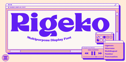 Rigeko is multipurpose and unique display font, you can use it in modern and vintage design. This font will suitable for any project, like branding, print template, logo and etc. Rigeko include uppercase and lowercase, ligature and alternate style, and also multilingual support.
 - Boochild by Gassstype,
$28.00 Boochild - Natural Handwritten Brush Font with a natural style and dramatic movement. Crafted manually with love and passion, This font is great for your next creative project such as logos, printed quotes, invitations, cards, product packaging, headers, Logotype, Letterhead, Poster, Label, and etc.
 - Wolf Fangs Graffiti by Sipanji21,
$15.00 Wolf Fangs is an incredibly unique and chunky lettered display font with graffiti basic feel, its suitable for logotype, design grafics, e-sport, apparel, wall art, etc. Add this font to your favorite creative ideas and notice how it makes them come alive!
 - Stenciling Cards JNL by Jeff Levine,
$29.00Stenciling Cards JNL is the digital equivalent of the individual letter and number stencils used to paint markings on walls, crates, boxes, etc. Use this type design when you want a reversed stencil look. Kern it super tight for a continous word stencil. - Yxlofon by Cercurius,
$19.95 Yxlofon is a 21st century display typeface with a flavor of 20th century modernism. It should be used in large sizes on posters, leaflets, book covers, disk covers, etc. It suits anything modern, experimental or futuristic in art, architecture, literature or music.
 - Melvens by Ronny Studio,
$21.00 Melvens is an experimental combination font. includes 2 fonts that have very different styles and appearances, but make this font look unique. This font is perfect for your design needs such as poster design, logo design, branding, social media design, books, magazines, etc.
 - Good Looking Karma by Gassstype,
$25.00 Good Looking Karma is a Handwritten Brush font made with Procreate app with Rough style and dramatic movement this font is great for your next creative project such as logos, printed quotes, invitations, cards, product packaging, headers, Logotype, Letterhead, Poster, Label, and etc.