10,000 search results
(0.062 seconds)
- LT Sonoma - 100% free

- LT Wave - 100% free

- LT Superior - 100% free

- LT Superior Serif - 100% free

- LT Makeup - 100% free

- LT Beverage - 100% free

- LT Renovate - 100% free

- Toppo Giggio, crafted by the talented Juan Casco, is a font that captures the essence of playfulness and creativity in its design. This typeface stands out for its unique blend of whimsical details a...
- Neuliner by CozyFonts,
$20.00 The Neuliner Family is sleek, condensed, extremely legible & flexible available in 7 styles. The inspiration stems from the classic, slender Art Deco era. Designed with a repeated vertical theme Neuliner is consistent from style to style with variations in weight and character. With over 350 glyphs and applying in over 80 languages with Numerals, Dingbats & Euro accents this family is complete. At the time of its first release Neuliner is available in Medium, Bold, Italic, Outline, Drop, Rough, & Rounded. Other styles are in the works. As displayed in the posters, Neuliner works well, in any style, for headlines, by-lines, logos, titles, posters, signage, billboards, ads, main & end titles, monograms, numbering systems, wedding invites and stationary, etc. The Bold style works congruously with the Outline & Drop styles, for either 'trapped' or 'offset' effects. This family also has its roots and influence in Mid Century influenced architecture and design yet lends its style to contemporary and modern design in the 2020s. The Drop & Rough versions are unique styles that render well in Adobe Illustrator & Adobe Photoshop for use in a myriad of colors and effects. The rough-edged style resembles a stitched and weathered effect, while the drop version plays prominently as headlines in either bright or muted color combinations. The versatile, ever-classic outline style gives any image or photographs an impression of elegance and transparency without sacrificing legibility. Neuliner Rounded embosses and engraves either blindly or foil added with a lasting impression. Neuliner Family from Cozyfonts Foundry.
 - Futurex Transmaat - Unknown license

- Shakila by Alifinart Studio,
$17.00 Shakila Script is a handwritten font created at the end of March 2021. It is a unique bold font with a pretty and charming casual style with many variants of beautiful swashes, as well as an alternative to capital letters. Shakila is a lovely and delicate font duo (script and sans serif), that exudes elegance and class. This font was particularly crafted for those who need a beautiful and refreshing look to their designs. Also, this font is perfect for branding projects, logo, product designs, invitation cards, wedding cards, stationery designs, advertisements, label, photography, blogging, social media or watermark. Key Features: - Multilingual Accents - Alternative capital letters - Stylistic Alternates up to 20 choices - Has a heart connected feature for a-z and A-Z letters - Available shortcut for Stylistic Alternate by simply adding "period" (.) and “number” (1-20) to each letter. - Has lots of ligatures so the letters connect well together - Has OpenType and PUA Encodes features. This font has a total of 885 glyphs, including capital letters, uppercase alternates, lowercase, numeral and punctuation, multilingual accents, beginning and ending swashes for lowercase, and includes a large number of stylistic alternates and heart swashes (for lowercase-lowercase and uppercase-uppercase). The advantage of the Shakila Script font compared to other fonts is that the alternative capital characters are in 1 font file, so it will make it easier for you to work. Therefore, you are free to choose it as you like, especially this font has the OpenType and PUA Encodes features which means you can access all of the glyphs and swashes with ease. As I mentioned earlier, Shakila Script has a large number of Stylistic Alternates features, up to 14 options for letter a-z and up to 20 options for letter b d h k l. In fact, there is also a swash feature in the form of a connected for the combination of each lowercase-lowercase and uppercase-uppercase letters. Interestingly, you can activate all Stylistic Alternates that are owned by each letter, just by typing; letter + period + number. For example: a.1 a.2 a.3 or b.1 b.2 b.3 and so on. As for activating the heart connected for each letter a-z or A-Z is quite easy. Namely by simply typing; letter + underscore + underscore + letter. For example: a__a or A__A and so on. Shakila Script is a Font Duo pack that pairs with Shakila Sans. The two were created at about the same time, but made in separate file packages. The reason I created this font duo is to make your projects more harmonious and unique. At the end of the sentence, Shakila Font Duo is a very authentic and amazing. If there are things you want to ask, don't hesitate to contact my email. For complete details, please visit my Behance profile. Alifinart Studio alifinart@gmail.com Thank you.
 - dearJoe 7 by JOEBOB graphics,
$39.00 The dearJoe series of fonts came to life around the year 1999, when I created dearJoe 1, which was a first (and half-assed) attempt to convert my own handwriting into a working font. Being able to type in my own hand had always been a childhood fantasy, and even though I only partly understood the software, a working font was generated and I decided to put it on the internet for people to use in their own personal projects. Which they did: at this moment the dearJoe 1 font has been downloaded millions of times and can be found on Vietnamese riksjas, Tasmanian gyms and chocolate stores on 5th Avenue for instance. The font is not something I am particularly proud of, but it started me of in building what's now the JOEBOB graphics foundry. Inbetween creating other fonts, the dearJoe series has become a theme I revisit every once in a while, trying to create an update on how my handwriting has evolved, along with my abilities in creating fonts that mimic actual handwriting. In the last decade or so I started implementing ligatures and alternate characters, which helped a lot in coming to a result that can almost pass for actual handwriting. The 2019 dearJoe 7 font is the latest addition to this font family. All characters were scanned from handwritten notes, cherrypicking the characters and letter-combinations I liked best. They were written with a Lamy M66 B pen and only minor adjustments were made to the original scans, leaving most little flaws and rough edges as they were for a convincing ball-point on paper result. The font comes with over 150 ligatures, making sure the font has a variated and credible overall look and feel.
 - Dans Le Jardin by Latinotype,
$29.00 Dans Le Jardin is a continuation of Dan Le Cuisine dingbat. Their wild and crazy curves give a very special vintage language. Can be used to create patterns or compositions for posters,websites, etc..
 - Neue Echo by RMU,
$30.00 Inspired by the former Schriftguss, Dresden, font Echo, this fresh-drawn und designed Neue Echo can be filled in many different ways, and makes it a great display font for labels, posters, headlines etc.
 - Brestonk by Dhan Studio,
$18.00 Brestonk is a new font with textured stroke detail, also provided some ligatures and extra swashes. Perfect for projects posters, logos, product packaging, invitations, greeting cards, brands, news, blogs, everything including personal charm etc.
 - Hexadot Thin by Konst.ru,
$6.00Font with hexagonal dots for texts, names, logotypes, titles, headers, topics etc. Big sizes of this font can be used for posters, t-shirts and other surfaces. Also good for the three-dimensional inscriptions. - Ruly by Enrich Design,
$24.95 Ruly is my newest font creation. My roommate in college always had the coolest writing. I thought that it deserved to be a font. The font is a great choice for newsletters, cards, etc.
 - Hyperizo by AbtoCreative,
$15.00 Hyperizo is a futuristic style font in three weights. It's the perfect font for logo, game, packaging, poster, web use, etc. The family contains a set of 231 characters, supporting multilingual and OpenType features.
 - Hexadot Light by Konst.ru,
$6.00Font with hexagonal dots for texts, names, logotypes, titles, headers, topics etc. Big sizes of this font can be used for posters, t-shirts and other surfaces. Also good for the three-dimensional inscriptions. - Hexadot by Konst.ru,
$-Font with hexagonal dots for texts, names, logotypes, titles, headers, topics etc. Big sizes of this font can be used for posters, t-shirts and other surfaces. Also good for the three-dimensional inscriptions. - Black Wednesday by Lemon Studio Type,
$20.00 Black Wednesday is a bold serif typeface in modern and classy style. OpenType features include more Alternative character sets. Black Wednesday is ideal for headlines, headers, logos, labels, packaging, postcards, presentations, magazines, invitations, etc.
 - Ketamine One MF by Masterfont,
$59.00 A practical font family with 3 weights for all your day by day design needs: headlines, signage etc. An extended sans serif typeface with rounded endings that provides unique industrial appearance without losing legibility.
 - Batish MF by Masterfont,
$59.00 A practical font family with 4 weights for all your day by day design needs: headlines, signage etc. An extended sans serif typeface with rounded endings that provides unique softness appearance without losing legibility.
 - Orange Melon by Motokiwo,
$15.00 Orange Melon, a bold script font that is suitable for headline, logotype, apparel, invitation, branding, packaging, advertising etc. This typeface is comes in uppercase, lowercase, large range of punctuation, symbols & numerals, also support multilingual.
 - Boldatin by Patria Ari,
$10.00 Boldatin font family, a slab display typeface with different styles (regular, slanted, condensed, condensed slanted) with total of 24 fonts and 6 weight that suit for your project like signage, poster, banner, flyer, etc.
 - Challah Display by Typophobia,
$25.00 Challah is a display font containing 295 glyphs. Letters are very diverse, but because they contain several shapes characteristic for each other - they retain a certain coherence. When creating the font, the main inspiration was to take from the Brazilian graffiti trend - Pichação and Korean typography. Most of the letters are the same size and width, however, when designing, we also tried to include at certain moments small "surprises" that will surely interest and surprise the user of the above-mentioned typeface. The font fits very well into the urban structure, therefore it perfectly matches the art on the walls with the art on the billboards, creating a kind of dialogue.
 - Songlines by Fine Fonts,
$29.00 Songlines is based upon a pen-drawn script drawn by Michael Harvey to illustrate a poem by Johannes Thurman. The expressive and rough-edged letterforms of Songlines do not have any lowercase characters. Instead, alternative uppercase characters occupy their positions. By using a mixture of upper-case and lowercase characters, text can be given a very lively and vigorous character. For example, the two versions of L are designed to overlap and interact whichever way round they are used. The augmented Songlines Plus version, has many alternative characters and ligatures added together with Opentype features to enable their automatic substitution where the application in which they are used permits.
 - Rosa by Pelavin Fonts,
$25.00 Inspired by Art Deco packaging, Rosa fits comfortably into that classic genre. It’s namesake in the collection of La Sociéte Parisienne de Savons is described thusly: In mythological legend, Chloris, the goddess of Spring flowers transformed the body of a nymph into the first Rose. Aphrodite gave her beauty. Dionysus, the god of wine gave her a sweet fragrance and the Three Graces, charm, joy and radiance. Equally compatible with Machine Age, Streamline, Moderne and even Memphis design motifs, it presents the unique option of serving as both the typographic and decorative components of a design. Use Rosa to evoke a sense of elegance, high style and historical context.
 - Rumpled by Ingrimayne Type,
$9.00 TapedUp, Tinkerer, and Rumpled are based on the template I used for several letterbat fonts—fonts made of wrenches and bolts, hammers, or paper clips. TapedUp can be thought of as a font made from masking tape, and Rumpled is the same design but the tape pieces are wavy. Tinkerer is the same design but with elements that resemble what might happen if one constructed letters from Tinker Toys. All are caps only, but some of the shapes on the lower-case keys differ from the corresponding shapes on the upper-case keys. The Rumpled family has four members, the regular, an oblique, a shadowed, and an oblique shadowed.
 - Mr Black by Hipopotam Studio,
$20.00 To design Mr Black, we used old ('70-'80) dry transfer lettering sheets that were used by my grandfather who was a military cartographer. We had only two almost used-up sheets. The letters didn't transfer so well but we liked the way they were damaged. All of the characters have a very high resolution so they can be used in a large scale. Mr Black doesn't have lowercases but has up to three alternate uppercase for each letter. Checkout Mr Tiger if your looking for lowercase letters with the same distortion effect. We designed it for our book for children, “Who eats Whom”
 - Mailbox Letters JNL by Jeff Levine,
$29.00Many items we use in our day-to-day lives offer wonderful source material for font designs. Mailbox Letters JNL was inspired by a set of self-stick adhesive letters used on mailboxes, doors and other areas of identification at home or in business. Each letter, number and punctuation mark is centered on a black rectangle - just as the actual model for this font. Use it as spaced, or hand set it tighter to form a ribbon with white-on-black text. To provide continuity for the ribbon effect, a blank rectangle is provided on the vertical bar key (the shift position of the backslash key). Limited character set. - Santa Fe by ITC,
$29.99Santa Fe was created by British designer David Quay in 1983. Distinguishing are its script characters and the lower case e, which has the form of a capital E. The letters of this font emphasize the base line. Rounded corners pair with elegant forms to give Santa Fe a flowing, cheerful look. The figures are reminiscent of American advertisements of the 1960s with their light, carefree images. Like with most script fonts, the letters of Santa Fe should be set close enough together that they touch. An added bonus are the various alternative forms with which Quay provided Santa Fe and the many design possibilities which they offer. - Pre Code Movies JNL by Jeff Levine,
$29.00 The hand lettered credits from the 1931 melodrama “Safe in Hell” inspired the typeface Pre Code Movies JNL, which is available in both regular and oblique versions. The design is strongly influenced by the popular Art Deco style of thick-and-thin characters and also features rounded corners. The font’s name comes from the early era of talking pictures and the short period before the establishment of the Hays Office in 1934 when Hollywood did not self-censor itself. Many then-taboo topics were exploited on film until Will Hays cracked down on such productions. To read more about Pre-Code Hollywood, visit the Wikipedia link: https://en.wikipedia.org/wiki/Pre-Code_Hollywood
 - Knedle by Sudetype,
$50.00 A tasteful sans-serif with a delicate italics, ideal for branding and packaging design. Knedle [dumplings] are characterized by carefully balanced proportions and soft stroke endings, which gives the typeface credible yet friendly expression. Italics are not just slanted versions of roman styles, but with their delicate letter shapes and narrower proportions they form a taste-balanced counterpoint. With 14 styles (Latin & Cyrillic) more than 1460 glyphs per font and rich OpenType features (including many stylistic sets) Knedle are perfectly suited for the needs of branding or packaging design. Thanks to their excellent legibility and smart contextual alternates, they can also work surprisingly well as a signage font. Bon appetite!
 - Butter Tropical by Allouse Studio,
$14.00 Proudly Presenting, Butter Tropical a Handwritten Font Duo Original and Script. Both Fonts come with Multi-Lingual Support to fulfill your need. We highly recommend using a program that supports OpenType features and Glyphs panels like many of Adobe apps and Corel Draw, so you can see and access all Glyph variations. Butter Tropical is perfect for any tittle, logo, product packaging, branding project, megazine, social media, wedding, or just used to express words above the background. Enjoy the font, feel free to comment or feedback, send me PM or email. Thank You!
 - Galih Ratna by Allouse Studio,
$16.00 Galih Ratna A Lovely Calligraphy Font Galih Ratna is perfect for any titles, logo, product packaging, branding project, megazine, social media, wedding, or just used to express words above the background. Galih Ratna also come with beginning and ending swash, stylistic set and Multi-Lingual Support. We highly recommend using a program that supports OpenType features and Glyphs panels like many of Adobe apps and Corel Draw, so you can see and access all Glyph variations. Enjoy the font, feel free to comment or feedback, send me PM or email. Thank You!
 - Happiness Machine by Allouse Studio,
$16.00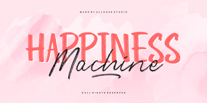 Proudly Presenting, Happiness Machine a cool Font Duo. Happiness Machine is perfect for any titles, logo, product packaging, branding project, megazine, social media, wedding, or just used to express words above the background. Happiness Machine come with alternates, underline style and also Multi-Lingual Support. We highly recommend using a program that supports OpenType features and Glyphs panels like many of Adobe apps and Corel Draw, so you can see and access all Glyph variations. Enjoy the font, feel free to comment or feedback, send me PM or email. Thank You!
 - Tokyosign by Allouse Studio,
$16.00 Tokyosign come with Multi-Lingual Support. Enjoy the font and feel the natural impression like the handwritten style itself! We highly recommend using a program that supports OpenType features and Glyphs panels like many of Adobe apps and Corel Draw, so you can see and access all Glyph variations. Tokyosign is perfect for any tittle, logo, stationery, product packaging, branding project, megazine, social media, wedding, or just used to express words above the background. Enjoy the font, feel free to comment or feedback, send me PM or email. Thank You!
 - Bramz by Ergibi Studio,
$19.00 BRAMS Display Serif Font. This font has unique and sleek letterform, make it great to be used for modern and minimalistic design theme. The unique ligatures on serif makes this typeface cool and stands out rather than the regular serif font, perfectly for headlines, logos, posters, packaging, T-shirts,coffee shops, restaurants, magazine’s headers, signs or gift/post cards,cafe’s and weddings or any type of advertising purpose. BRAMS only comes with an uppercase, Numeral, Punctuation, Ligature, and also Support Multi Language. if you have any Question please Message Me. Thank you ERGIBI STUDIO
 - Grindline by Allouse Studio,
$16.00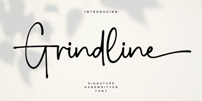 Proudly Present, Grindline a Signature Handwritten Font. Grindline is perfect for any titles, logo, product packaging, branding project, megazine, social media, wedding, or just used to express words above the background. Grindline come with ligatures, stylistic alternates, beginning and ending swash, also Multi-Lingual Support. We highly recommend using a program that supports OpenType features and Glyphs panels like many of Adobe apps and Corel Draw, so you can see and access all Glyph variations. Enjoy the font, feel free to comment or feedback, send me PM or email. Thank You!


