3,061 search results
(0.01 seconds)
- Silk Serif by SilkType,
$47.50 Silk Serif is a high-contrast typeface with thin, pointy, heavily bracketed serifs, and ball terminals in the appropriate places, as well as bracketed junctions in various letterforms. The main feature of the typeface is the disconnection between the bowls and the stems. However, the bowl is very close to the stem, creating the illusion of connection. Silk is delicate and legible — but above all, it is sophisticated.
 - Fleurons Six by Wiescher Design,
$39.50 Fleurons are embellishments and this is my sixth and so far most beautiful round. I again found some nice old ones and made them completely new. These go well with many Copperplate scripts and especially with my scripts Nadine and Ellida. Your very elaborate, Gert Wiescher
 - Sails Next by East end,
$16.30 This font was created from scratch in a simple, strong, and unique style. No other fonts were used as references. Its name was inspired by the shape of the first letter, A, that flashed into being. Sails next is perfect as a display font for posters, flyers, and magazine headings. The font family consists of the regular font only.
 - Sir Spicious by PizzaDude.dk,
$20.00 Handtraced comic font. Supersteady and perfect for massive text or just headlines. You will need to use OpenType supporting applications to use the autoligatures.
 - SIAS Gramma by SIAS,
$29.90 The Gramma font family provides about 240 very basic graphic structures. Compilation of of this set has been inspired not by symblic but by graphical-morphological concerns. Therefore the three fonts (A, B, C) represent the entirety of all possible and simple graphic forms. Glyphs of this kind are likely to be found anywhere: in scripts, in signage, in branding marks – and so on. So, the Gramma font package is applicable to a great variety of usage. Whenever a free choice of elemental graphic motifs is desired – be it ideographical, pictographical or for brand design, this package provides you with nearly any graphic shape imaginable.
 - Phantom Isles by Wing's Art Studio,
$26.00 The Phantom Isles: Retro Tiki Font A Textured Retro Font Inspired by Tropical Tiki Style and South Sea Adventures! The Phantom Isles is a hand-drawn font inspired by 1950s Tiki culture, tales of exotic locations and south sea adventures. It features the textured look of weathered wood and is the perfect choice for book covers, movie titles, theme parks or vintage themed events. The font includes a complete set of uppercase and lowercase characters, along with numbers, punctuation, symbols and language support. You’ll also find a set of specially illustrated underlines, shapes and icons including flora and fauna, old rope, skulls and more. A Brief History of Tiki Culture Originating from Māori mythology, a tiki is a wooden or stone carving that represents deified ancestors found in most Polynesian cultures. The mainstream and commercialised Tiki Culture that became popular across America from the 1930s to 50s was inspired by the sentimental appeal of an idealised South Pacific, particularly Hawaii, as viewed through the experiences of those who had visited such areas during World War II and cinematic depictions of beautiful scenery, forbidden love and the potential for danger. Over time it selectively incorporated more cultural elements of other regions that affected Polynesia, such as Southeast Asia. The Americanised form of Tiki Culture maintains a dedicated following today, particularly among those interested in 1950s graphic and interior design, history and the escapist lounge aesthetic it inspires. Learn more about the history of Tiki and Polynesian culture.
 - Eurotypo SII by Eurotypo,
$18.00 Eurotypo SII is a sibling of our Eurotypo Sans family and is composed of two Expanded weights and six Condensed styles. Each font of Eurotypo SII contain 359 glyphs and advanced typographical support with OpenType features such as ligatures, discretional ligatures and case-sensitive forms. It also contain diacritics for Central European languages. All aspect of readability and accurate kerning were carefully controlled.
 - Retro Sailing by Prioritype,
$21.00 Retro Sailing - Weird Display Font. A whimsical style display font with a retro touch that clearly visualizes your designs. It is suitable for the design of merchandise, posters, covers and social media posts. Features: Uppercase, Lowercase, Numeral, Punctuation & Multilingual. Multilingual contained: Afrikaans, Albanian, Asu, Basque, Bemba, Bena, Breton, Catalan, Chiga, Cornish, Danish, Dutch, English, Estonian, Filipino, Finnish, French, Friulian, Galician, German, Gusii, Indonesian, Irish, Italian, Kabuverdianu, Kalenjin, Kinyarwanda, Luo, Luxembourgish, Luyia, Machame, Makhuwa-Meetto, Makonde, Malagasy, Manx, Morisyen, North Ndebele, Norwegian Bokmål, Norwegian Nynorsk, Nyankole, Oromo, Portuguese, Quechua, Romansh, Rombo, Rundi, Rwa, Samburu, Sango, Sangu, Scottish Gaelic, Sena, Shambala, Shona, Soga, Somali, Spanish, Swahili, Swedish, Swiss German, Taita, Teso, Uzbek (Latin), Volapük, Vunjo, Zulu. Thanks!
 - Six Hands by ParaType,
$10.00 Six Hands is a set of handwritten fonts based on various writing tools, such as pencil, felt-tip pen, ball-point pen, and brush. The character set of each of these fonts supports the Cyrillic alphabet, as well as the extended Latin script for all European languages. Most of the styles also contain additional alternatives that have the capability of automatically interchanging in the setting, which significantly variegates and humanizes the text. Six Hands is quite a rare combination of diverse display fonts that work well together. It is made for talented designers who can use it creatively in packaging, advertising, displays, posters, menus, invitations and so on. The design of Six Hands was a result of collaboration between Alexandra Korolkova, Alexander Lubovenko and all those who assist them in this work. This set of fonts was released by Paratype in 2018.
 - Final Six by Type-Ø-Tones,
$64.00 FinalSix is the typographic adaptation of a lettering. Working on the graphic image for a sports event (the European Waterpolo Final in 2014) we had the idea of creating a character set that reflected the idea of the undulating movement of water in a pool. In practice, we draw characters with rounded tops, bottoms and diagonals and using the word WATERPOLO as a visual reference for a wavy feeling, in a process that we could define as “form follows meaning.” To preserve its personality as much as possible, the most idiosyncratic characters are found in the Default set, while we can find more standardized variations for editorial use in a Stylistic set.
 - Silk Goned by Imoodev,
$20.00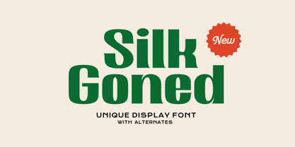 Silk Goned is cool modern fonts with visual elegance, smooth curves, and beautiful ligatures clear, making your work look true and attractive. A versatile font that works in both large and small sizes. This font is suitable for a wide variety of projects such as invitations, logos, branding, magazine, photography, card, product packaging, mugs, quotes, poster, labels, signatures, and more. A font which is perfect for all business sectors including personal projects, studio, corporate, creative agency, industrial, company, etc.
 - Lil' Idgits by Patricia Lillie,
$25.00Walking talking bouncing rolling whatchamacallits. - Sin Original by FontHaus,
$14.95 Loosely inspired by the designs of Rudolf Koch and his Koch Antiqua, Sin Original Dark by Mondrey Sin is a curious monoline display face with small x-heights, and large caps. The design almost looks 1920s vintage. Interesting for book Jackets, editorial, and as drop caps.
 - ExperiTypo Six by Intellecta Design,
$14.95 - Oil Change by Albatross,
$19.95
- Lil Johnny by Mans Greback,
$59.00 Lil Johnny is a beautiful calligraphic script typeface. Drawn and created between 2020 to 2022, this logotype lettering has a vivid style and a strong personality. It has an optimistic look, a wild movement and big expressive capital letters. Use underscore _ anywhere in a word to make an underline. Example: Love_letter Use multiple underscores to make different swashes. Example: Base_____ball Use numbersign # after any letter to make a swash. Example: Welcome# Summer# (Download required.) The Lil Johnny typeface family consist of Regular and Italic. The font is built with advanced OpenType functionality and has a guaranteed top-notch quality, containing stylistic and contextual alternates, ligatures and more features; all to give you full control and customizability. It has extensive lingual support, covering all Latin-based languages, from Northern Europe to South Africa, from America to South-East Asia. It contains all characters and symbols you'll ever need, including all punctuation and numbers.
 - Isle Headline by Mans Greback,
$19.00 Isle Headline is a high-quality serif typeface family, drawn by Måns Grebäck during 2018 and 2019. It is a sharp font with a clear and attentive look, adapted for headlines, titles and large type settings. It comes in four weights, each one as italic, totaling in eight styles: Light and Light Italic, Medium and Medium Italic, Bold and Bold Italic, Black and Black Italic. The font family can be used in a combination with a font of a different style, or together with its sister font Isle Body, also a serif font, which has the same basic structure but with a softer look and adapted for body text and smaller type. Each style contains ligatures and support for a wide range of languages.
 - LT Sip - 100% free

- Swing Era JNL by Jeff Levine,
$29.00 Hand lettered Art Deco lettering for the title on the cover of the 1930s-era song "And I Still Do" provided the inspiration for Swing Era JNL. A bold, casual and friendly typeface, it features an intersecting inline through some of the characters. One could almost picture the hottest big band of the day promoted on a lobby card with this alphabet, beckoning all to come on in and "cut a rug".
 - New Clear Era by fontBoy,
$35.00 New Clear Era is part of a large ongoing project investigating classicism and legibility. The regular version is the base font. Numerous permutations will be performed on this underlying skeleton. Also investigated are the ideas of an extended type family, and trying to understand what makes a contemporary legible, serif typeface. The Mix versions combine characters from the Roman and Display to make quirky fonts that can be comfortably used for setting text. Mix One is the most quirky; Mix Three is the least.
 - Nouveau Era JNL by Jeff Levine,
$29.00 Nouveau Era JNL was adapted from the title of a hand-lettered advertisement found on the back of a 1920s-1930s piece of vintage sheet music.
 - Delightful Lil Dragons - 100% free

- Cinquenta Mil Meticais - Unknown license

- Look sir, droids! - Unknown license

- KR Lil Note - Unknown license

- Oil Crisis A - Unknown license

- Oil Age Heiroglyphs - Unknown license

- KR Lil Angel - Unknown license

- Pica Hole - SIM - Unknown license

- FS Silas Sans by Fontsmith,
$80.00 The great enigma There are hidden depths to FS Silas Sans. First impressions are of a functional, multi-purpose typeface with a cool, edgy, angular character. Gaze into its eyes a little longer, though, and you'll detect a more nuanced, colourful personality, with full, open, satisfyingly squarish forms balancing the abruptness of the sharply-angled terminals and ascenders. Authoritative, official and stern on the outside; amiable and welcoming on the inside. You’re so Dane The designers, led by Phil Garnham, were trying to capture something straight-talking, authentic, and a little... Scandinavian. ‘We were thinking about some of the characters in Danish dramas that were on in the early stages of the font’s development, like The Killing and The Bridge,’ says Phil. ‘The police officers, that is, not the psychopathic killers. Smart and a bit cool, but with a warm heart.’ For a good Danish name, we settled on Silas. It was that or Hans-Christian. The finer points Silas Sans rewards close inspection. Study, if you will, its amply squarish forms, the roomy ‘o’ and ‘e’, in particular. Observe the angular ascenders and terminals of, for example, the ‘L’, ‘I’, ‘d’ and ‘i’, inferring the movement and lift of a pen. Consider the cuts to the ‘A’ and ‘v’ that create harmony with adjacent letters. And scrutinise the subtle ink traps set within the ‘A’ and ‘Y’ for reproduction at small sizes. A fine subject, we think you’ll agree, and available in a versatile range of weights to make (with FS Silas Slab) a typographic system with a comprehensive hierarchy.
 - Six Feet Over by Brad Mead,
$10.00 Six Feet Over is tall, cool and near impossible to read - what's not to love? This super condensed and trippy typeface was designed to be elusive and is perfect for those that love condensed, compressed - or any other word for squished - fonts.
 - FS Silas Slab by Fontsmith,
$80.00 Slab-like sibling Why stop at sans? Rather than leave FS Silas Sans as an only child, the team wanted to extend the family, and create a complete system for brands and editorial. Unsure what the result would be, the team started experimenting with a slab serif version. ‘We didn’t know how it would turn out, but we really liked it and wanted to take it further. A fresh angle ‘We stuck with the angular theme of the sans by drawing angled slab serifs,’ says Phil Garnham, ‘as opposed to the square serifs that slab fonts usually have. That created an inner dynamism in words and sentences on the page, and a very distinctive, crafted character, like a Victorian soul in a contemporary body.’ These crafted touches include details such as the angled ascenders on the ‘i’ and ‘l’, while characters such as the ‘y’, with its abruptly-ending descender, add a mark of distinction. A perfect pair Silas Slab, like its sibling, offers a clear-cut range of five weights, from the elegant Thin to the monumental ExtraBold. Put it together with Silas Sans and you have the full complement, capable of performing the full range of tasks, above the line and below, in headlines, body copy and logotypes, B2B and B2C. Keep them together; they don’t like it when they’re apart.
 - Lil Milton AEF by Altered Ego,
$45.00Lil Milton is full of energy and excitement, like the blues legend that inspired its name. Irregular counters (and irregular outlines!) creates a dissonant harmony of form and function. Stretch it, but don't condense it for a righteous look. Lil Milton is the perfect companion to Adobe Myriad Tilt. - Oil Barrel JNL by Jeff Levine,
$29.00Oil Barrel JNL is roughly based on lettering spotted in an online auction of custom brass stencils made for marking different petroleum grades on oil company barrels. - Display Digits Six by Gerald Gallo,
$20.00 Display Digits Six is a display number font with eight sets of variations of the same digits. The digits 0 through 9, with period and comma in appropriate variations, are prepared as (1) solid, (2) outline, (3) solid with contour outline, (4) outline with 3-D shadow, (5) 3-D shadow only, (6) outline with drop shadow, (7) positive in circle, (8) negative in circle.
 - Dusk Til Dawn by Scholtz Fonts,
$19.95 As with Nocturne, Dusk til Dawn recalls the romantic, sophisticated Zeitgeist of the early 20th century, that nostalgic time "between the wars". It as a number of attractive ligatures and upper-case alternates. I have used Nocturne as a basis for Dusk til Dawn, given the font really bold down-strokes, reduced the width of some upper case characters and changed the shape of many lower case characters. Dusk til Dawn comes in two styles: Dusk til Dawn Regular, which uses the Art Deco convention of small x height, and long ascenders. This Display style is perfect for headers, posters, labels etc. Dusk til Dawn Book, which, with its higher x-height and slightly wider characters, is extremely legible and suitable for longer passages of smaller size text.
 - Smooth Sailing JNL by Jeff Levine,
$29.00 Songs of the early 1900s were anything but the status quo in topic or style. Excessively long titles, novelty tunes and "foreign themes" permeated the piles of sheet music in the local music shops. 1916's "Oh How She Could Yacki Hacki Wicki Wacki Woo (That's Love in Honolu)" covered a number of these quirks within one publication. This Hawaiian-tinged song evoked the mysterious ways of the South Seas islands, despite the abridging of Honolulu to "Honolu". Nonetheless, the hand lettered title of this particular piece of sheet music featured an Art Nouveau-influenced bold block letter with rounded corners. It's now available digitally as Smooth Sailing JNL, in both regular and oblique versions.
 - Normandy Isle JNL by Jeff Levine,
$29.00 Normandy Isle JNL is a condensed sanserif typeface built off of the basic design of an old wood type, but augmented with thick and thin lines to create a whole different look. The font itself is named after a community in the North end of Miami Beach.
 - Silk Sans Display by SilkType,
$47.50 Silk Sans Display is the sans version of the high-contrast typeface Silk Serif. The main feature of the font family is the disconnection between the bowls and the stems. However, the bowl is very close to the stem, creating the illusion of connection. Silk is delicate and legible — but above all, it is sophisticated. Silk Sans Display is available in 7 weights, from Extra Light to Black, and supports Western, Central and South-Eastern European languages.
 - FF Dirty Six by FontFont,
$41.99 British type designer Neville Brody created this display FontFont in 1994. The font is ideally suited for music and nightlife and poster and billboards. FF Dirty Six provides advanced typographical support with features such as ligatures. It comes with proportional lining figures. This FontFont is a member of the FF Dirty super family, which also includes FF Dirty Four, FF Dirty One, FF Dirty Seven, and FF Dirty Three.


