8,987 search results
(0.179 seconds)
- Mollie Glaston by Great Studio,
$18.00 Mollie Glaston is a modern serif font with a unique ligature style, a high contrast and light font perfect for feminine logo signs, fashion heads & editorial designs, branding projects, Clothing Branding, packaging, magazine headings, advertising, T-shirts, postcards and much more. Mollie Glaston is also included full set of: Uppercase and lowercase letters Automatic ligatures Multilingual characters Numerals Punctuation
 - The Macksen by Kotak Kuning Studio,
$17.00 The Macksen is a new, bold script font which has two styles: Clean and Textured. With those kind of styles, The Macksen will give your designs a vintage and classic look. The Macksen is great for logotype, branding design, logo design, digital lettering arts, t-shirts/apparel, posters, magazines, signs, advertising design, and any vintage design needs.
 - Retro Blanche by Pista Mova,
$9.00 Blanche is a hand-drawn, retro script font. This font is perfect for all your fun designs! Use Blanche to create logos, branding, stickers, shirts, signs, posters, quotes, instagram posts, procreation designs and more! Includes shadow/extrude versions that are perfectly sized to fit Blanche Regular - so you can layer both fonts easily! Blanche Regular Blanche Extrude Thank You!
 - Staufer Gotisch by RMU,
$35.00 Thannhaeuser’s mid-1930s display blacklettr font as a fresh and extended redesign called Staufer Gotisch. This font contains a bunch of useful ligatures, and it is recommended to activate both Standard and Discretionary Ligatures. To reach the numero sign, type the combination N-o-period und activate the OT feature Ordinals. The # key is occupied by the round s.
 - Boldblaster by Sign Studio,
$12.00 Boldblaster brings vintage themes into the modern era. Neatly arranged lowercase characters are needed for writing a brand or logo. With regular and italic styles, the Boldblaster family can be used together in one display and can support each other in your designs. Supporting font on preview : HEXI ( https://www.myfonts.com/fonts/sign-studio/hexi/ ) Thank You
 - Celluloid JNL by Jeff Levine,
$29.00Celluloid JNL was modeled from a few samples shown in a 1947 sales catalog for changeable letter directory boards and the various styles available for these signs. Prior to modern plastics, celluloid was the material used for these molded letters. Aside from the Regular and Oblique versions, there is also Celluloid Highlight JNL and Celluloid Highlight Oblique JNL. - Roundlane by Zealab Fonts Division,
$10.00 Roundlane is a font inspired by retro badges antique labels, and includes all-caps, multilingual support, alternates signs, numbers & punctuation. It works well for album covers, video tittles, stickers, clothing brand names, t-shirt designs, badges designs, banner, flyer and more. I can’t wait to see what you guys will come up with with using this font!
 - Thigles by Abbasy Studio,
$15.00 Thigles, is a font inspired by Signs Painting, these pretty hand painted letters that you can see on buildings, billboards and signboards. Thigles font comes with some alternates and ligature as well to create your design more unique. With additional shadow font you will be able to create the beautiful combination and bring retro touch to your artworks!
 - Fathing by Multype Studio,
$17.00 Introducing, Fathing Script. This is a modern script font. It maintains its classy calligraphic influences while feeling contemporary and fresh. Fathing is perfect to use in logotype / wordmark, badge, sign board, poster, headline text, apparel, wedding invitation, etc. This font has many opentype features like ligature, stylistic alternate, contextual alternate, swash, etc and support multi language
 - Roadster Script by Fontop,
$9.00 Welcome my new vintage style ROADSTER font family. With so many extras the font gives additional opportunities for logo creation, branding designs, blogs. Also looks cool when used in headers in signs, layouts, ad materials. OpenType features include swashes and dividers. To use swashes and dividers you need to press dot (.) followed by a number from 1-9 range.
 - Buchfraktur by RMU,
$25.00 The late-19th and early-20th century standard blackletter family in Germany, in three weights. To get access to all ligatures, it is recommended to activate both Standard and Discretionary Ligatures. You find the round s on the # key, and by typing the combination N-o-period and activating the OT feature Ordinals you get the numero sign.
 - Goldenlife by Putracetol,
$22.00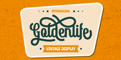 Goldenlife is a vintage display typeface. This font was inspired by classic vintage signs. It come with uppercase, lowercase, various alternates, numbers, punctuation and multi-lingual support. Goldenlife is great for any kind of display purpose from logos, t shirts, apparel, handwritten quotes, product packaging, tittle headers, posters, merchandise, social media, labels, branding and greeting cards.
 - Parler Fraktur by RMU,
$25.00 Friedrich Poppl’s blackletter font, carefully redrawn and redesigned for modern use, named after the Parler master builder family who built the Schwaebisch Gmuend cathedral. This font contains the letter ‚long s‘ which can be reached in two ways. Either you use the OpenType feature ‚historical forms‘, or you type the integral sign + the option key on your keyboard.
 - Halliday JNL by Jeff Levine,
$29.00 Halliday JNL was redrawn from impressions made by a rubber stamp sign printing set, thus providing the slight imperfection of line widths that gives a hand-made approach to the typeface. The lettering style is based on Beton Open Condensed, a clean and popular slab serif used for decades in print display titling and rubber stamp manufacture.
 - Subletter by Type Colony,
$25.00 Subletter Script is a casual script typeface with stylish style, clean, and great movement this typeface and allow you to make lettering and logotype quickly and easily. This typeface is inspired by brush lettering and sign painting that has strong styles and classy for using on project such as Logotype, Letterhead, Poster, Apparel Design, Label and etc.
 - Spaghetti Joint JNL by Jeff Levine,
$29.00 An image from the Library of Congress showing a New York City Italian Kitchen storefront window and its various neon signs inspired Spaghetti Joint JNL, which is available in both regular and oblique versions. The term “Spaghetti Joint” is old-fashioned slang for any restaurant serving Italian cuisine, especially those featuring spaghetti or other pasta dishes.
 - System Overload by Hanoded,
$15.00 I sometimes think that we live in strange times: a lot of good (and bad) things seems to happen all at once. System Overload font is based on the protest posters from the seventies. You can use it for your own protest posters, your restaurant signs or whatever you fancy. Comes with several interesting discretionary ligatures as well!
 - Western Trail JNL by Jeff Levine,
$29.00 For decades, Samuel Welo’s “Studio Handbook for Artists and Advertisers” was a source of inspiration for sign painters, graphic artists and designers. In later years, many digital revivals of Welo’s hand lettered typography have been made available. Western Trail JNL is the latest member of such digital fonts, and is available in both regular and oblique versions.
 - Favorite Hangout JNL by Jeff Levine,
$29.00A "thick and thin" line weight treatment is given to Jeff Levine's Hash and Beans JNL, providing a whole new take on the design - first inspired by a sign in an old photograph of a diner. Favorite Hangout JNL conjures up memories of summer nights, drive-ins, your best guy or gal and sharing some tasty burgers and fries. - Raglen by IM Studio,
$23.00 Raglen is an elegant serif font with a unique binding style, high contrast and light weight font, perfect for feminine logo signs, fashion & editorial design heads, branding projects, Apparel Branding, packaging, magazine titles, advertisements, T-shirts, cards. post, and more. many. Raglen also includes a full set: Uppercase and lowercase Auto fastener Multilingual characters Number punctuation
 - ITC Freddo by ITC,
$29.99ITC Freddo is the work of New York designer James Montalbano and was inspired by a sign lettering manual from the 1930s. Montalbano liked the character shapes illustrated in this manual but found many of the proportions odd. So he reinterpreted them to produce capitals and lower case letters which, according to today's standards, better complement one another. - Helsinki by Ludwig Type,
$45.00 Helsinki 2.0 is a completely updated version of our popular Helsinki typeface. We expanded the character set, changed the weight structure, and also added italics. Helsinki is inspired by the Finnish traffic sign typeface. It is based on geometric shapes, with technical and masculine forms. Helsinki is rather narrow, which makes it well suited to headlines and short text.
 - Hotel District JNL by Jeff Levine,
$29.00 The sans serif type style for the specialty font Nameplate JNL was given a serif treatment and is now Hotel District JNL complete with a full character set. Originally inspired by two Art Deco-era metal door signs saying "Men" and "Ladies", the thin lettering lends itself well to period pieces as well as contemporary design work.
 - Drunk Vision by Gleb Guralnyk,
$13.00 Hello! Introducing a creative font named Drunk Vision. It's an abstract shape smooth typeface with trendy distorted shape. This font includes lots of multilingual characters (check out a screenshot with available letters and signs). Thirty fancy ligatures will make your lettering more organic and natural (You can access these ligatures by activating a "Standard Ligatures" on your OpenType panel).
 - UT Sugar Cane by Uniontype,
$15.00 Sugar Cane by Uniontype is a fresh and light multilingual script inspired by vintage monoline fonts. It provides advanced typographical support with contextual alternates, ligatures and swashes. That way, you’ll have automatic access to the dozens of extra glyphs in each of the fonts. This font is good for menu, signs, packaging, posters, letterings and logos.
 - Midtown Tessie NF by Nick's Fonts,
$10.00A sign at the 81st Street (Museum of Natural History) New York subway stop provided the pattern for this mosaic tile face. The font features a full-tile background at the bar position (shift-backslash) and left-and-right pointing fists at the brace positions as well as complete Latin 1252 and Central European 1250 character sets. - Smart Frocks NF by Nick's Fonts,
$10.00 A sign in a London storefront, ca. 1930, pitching—surprise!—Smart Frocks provided the visual cues for designing this typeface. Singularly stylish, hip and haughty and decidedly Deco, this is the smart font to use! This font contains the complete Latin language character set (Unicode 1252) plus support for Central European (Unicode 1250) languages as well.
 - Junebug Stomp NF by Nick's Fonts,
$10.00A circa-1925 poster for the chanteuse Arlette Montal, signed simply "Bouchard," provided the inspiration for this roly-poly romp through the alphabet. It takes its name from a popular East Texas summertime porch dance...or not. This font contains the complete Latin language character set (Unicode 1252) plus support for Central European (Unicode 1250) languages as well. - Cyber Rock by WAP Type,
$15.00 Cyber rock Brush Script bold, cool, cursive, design, editorial, grunge, handpaint, handwritten, ink, letter, logo, logotype, magazine, marker, modern, paint, ragged, ROUGH BRUSH, script, sign, style, stylish, swash, tag tagging, textured, trend, trendy, urban, vintage, written handwritten brush script dry brush cursive font with rough and dynamic look. Ideal for quotes, posters, branding, packaging, illustration, social media.
 - Dark Blades by Tadiar,
$19.00 Dark Blades is an authentic gothic vintage font family of 4 fonts created for headers and text. Multilingual support (Latin Extended). Designed for: - Vintage branding (Clothes, Alcohol, Bikes, Games) - Horror - Music branding - Myth: Vampires, Zombie, Halloween, Werevolves, Magic, Fantasy - Medieval style Well use in vintage labels, headers & titles, Posters, Street Signs and other Outdoor, Package Design.
 - Hoelderlin by RMU,
$25.00 In 1938 the Frankfurt-based foundry Ludwig & Mayer released Eugen Weiss’ beautiful fraktur ‚Hoelderlin‘. Carefully redrawn and redesigned, this digitized version is intended to add another gem to the enthusiasts’ treasure drove of blackletter types. The font contains the historical long s which can be reached by the OpenType feature historical forms or by typing the integral sign [ ∫ ].
 - Haenel Antiqua by RMU,
$30.00 This narrow neoclassical revival is based upon a font released by the Haenel Foundry, Berlin, in the 19th century. By typing [alt] + p respectively [alt] + b you have access to a framing element as it can be seen on the posters. By using the OT feature stylistic alternative you can change the normal numbersign into an oldstyle numero sign.
 - On The Ground by Fascination Workshop,
$10.00 On the Ground is a picture font made from drawings of found objects. These object were found on the ground while walking around different cities in the United States. The font uses varying drawing styles (from detailed to pictographic) but they all have a similar irregularity, unifying the characters. Perfect for animations, signs, greeting cards, posters, etc.
 - Tarquin AT by Akufadhl,
$15.00 Tarquin is a All-Caps sanserif typeface, inspired by the beautiful hand-painted sign. It has a strong personality, high contrast stem, and widely opened counter to improve the readibility as it designed for display purposes. It's available in 3 different style, REGULAR, STENCIL, and SHADOW designed for display purpose design Crafted beautifully and carefully with hand.
 - But by Nicole Fally,
$40.00 Bold, black and square. But was first drawn as a logotype for the magazine "BUT – Bilder und Texte" (pictures and texts) which was published by an experimentally-oriented non-commercial initiative. In consideration of the unusual dimensions of the magazine (6 x 14 cm / 2,4 x 5,5 inch), I decided to fill as much space as possible with the body of type. This formal idea refers to the meaning of the title by blurring the border between legible letters and abstract shapes. Because of its origin, But is ideal for short messages in headline point size. Despite its blocky shapes, But creates a friendly atmosphere. The details are as playful as the restrictions that are given by the concept allow them to be. Punctuation marks and other special characters contrast the boldness of the design since they are matching the thin parts of upper- and lowercase letters. This also avoids gaps when longer texts are set. But is available in open type format and has an extended character set (Latin extended A). Two sets of numerals, one matching the x-height and another one matching the cap-height, are provided.
 - Alaturka by Bülent Yüksel,
$19.00 ABOUT FAMILY: What makes "Alaturka" elegant, friendly and contemporary is its very rounded curves with very open terminals. "Alaturka" has been designed with a higher "x-height" than other fonts in its class to make tiny readability more obvious in any use situation. It will be ideal for use in small sizes such as business cards or mobile applications. This typeface is also equipped with powerful OpenType features to satisfy the most demanding professionals. It has solid features like case sensitivity, small, true capitals, full ligatures, tabular figures for tables, old-style figures to elegantly insert numbers into your sentences, and more alternative characters to give personality to your projects. FEATURE SUMMARY: - 2 style: 1From 1923 To 2023 - 8 weights: Thin, Extra Light, Light, Regular, Medium, Bold, Extra Bold, and Black. - 3widths: Normal, Narrow, and Condensed. - Matching italics (12º) for all weights and widths. - Matching small caps for all weights and widths. - Lining and old-style figures (proportional and tabular). - Some alternate characters - Unlimited fractions. - Automatic ordinals (1st, 2nd, 3rd, etc.). - Extended language support: Most Latin-based scripts - Extended currency support. You can enjoy using it.
 - Eponymous by Monotype,
$25.99 Eponymous is an Egyptian-style typeface with chunky, scalloped serifs. It is available in five weights in both roman and italic. I have always loved slab serif type and have created Eponymous to fulfil a yearning for a versatile, stylish and contemporary slab face. A key design characteristic is the implementation of scalloped serifs which, to me, imbues the typeface with a distinctive personality. Make use of the Open Type features that are part of Eponymous. For a start, you can implement some stylistic alternates, so, if the main characters don’t quite suit your concept, try activating Stylistic Set 1. There’s also a full set of small caps included. You can mix and match these characters with regular lowercase to create some interesting unicase typography. Of course, all characters have complementing diacritics, enabling multi-language support. Key features: Eponymous is is an Egyptian-style typeface with chunky, scalloped serifs 5 weights in roman and italic: Light | Regular | Medium | Bold | Black Full set of small caps with diacritics and figures 30+ alternate characters Full European character set 650+ glyphs per font Eponymous was redrawn and re-spaced to a higher standard in April 2021 (v2.0).
 - Guanabara Sans by Plau,
$20.00 Guanabara is the third release of Plau Type Foundry. It started from the need of a wayfinding typeface that had personality enough to be the brand typeface for a city. The city of Rio de Janeiro, with its never-ending curves and all year long summer weather provided the constraints and requirements of this typeface. From there, it evolved to be a workhorse, with 8 weights from Thin to Black and matching true italics. It just had to have the features that all us designers have grown to love, such as alternate letters (a, g and r for the romans), tabular and proportional figures in lining and oldstyle set-ups as well as small caps, fractions and all that jazz (I mean, samba). And it needed to be recognizable and distinct. For that, design features like tapered R legs, capitals with classic proportions and calligraphic finishes on the terminals proved crucial. And last, but not least, like Rio, it had to welcome many cultures. We came to think of it as the “Typeface from Ipanema”, with a classic, timeless look, swinging elegance and joyful attitude.
 - Angulosa M.8 by Ingo,
$38.00 At first glance, »Angulosa M.8« is one of those fonts that a technician or engineer would probably draw. And yet it differs fundamentally from typefaces constructed in this way. The right angle forms the basic element of the »Angulosa M.8«, but that's about it with the pure mathematics. Serif-like upstrokes and downstrokes on some letters improve readability, and carefully used slants makes the appearance a little friendlier. The proportions are not based on any mathematical principle, but are derived from freehand writing of the letterforms with a broad quill. In terms of style, »Angulosa M.8« belongs most closely to the modernist, constructivist typeface attempts, such as those undertaken at the Bauhaus in the 1930s. The styles of »Angulosa M.8« range from "Condensed" to "Expanded", from "Light" to "Black", plus the respective oblique form, which in this font is slanted to the left. All variants can be adjusted continuously in the variable font: the font width ranges from 50 to 150, font weight from 300 to 900, upright [0] and italic [1]. The »Angulosa M.8« supports all European languages including Eastern and Central European, Turkish, Greek and Cyrillic.
 - Corsa Grotesk by Typedepot,
$39.00 Corsa Grotesk is our very own tribute to two typographic giants: the Futura and Avenir typefaces. It is Designed with geometric simplicity in mind with well balanced strokes and modern touch. Generous proportions and x-height with more contemporary details - the single story ‘a’ and the horizontally barred ‘k’ being just two of many examples makes it shine in every jobs it takes. Corsa Grotesk blends the classic geometric aesthetics into a well-balanced font with generous proportions and minimal contrast. It features 10 weights ranging from Hairline to Black plus matching italics, as well as Cyrillic support for Bulgarian and Russian localizations. Filled with all the essential OpenType features like tabular figures, fractions, ligatures etc, it is a great choice for branding, advertising, user interfaces or any text that needs a bit of polish and a slick, present-day look that still feels familiar. With its 2.0 version we managed to polish the font even more. We revisited every path and fixed all the inaccuracies throughout. Corsa Grotesk now comes with way better and consistent spacing and kerning, just the right amount of contrast and balance. Live Tester | Download Demo Fonts | Subscribe