10,000 search results
(0.046 seconds)
- Cumhuriyet by Fontuma,
$24.00 About the font family Cumhuriyet is an Arabic concept that means "the form of government in which the nation holds the sovereignty and uses it through the deputies elected for certain periods". The reason why I gave this name to the font is that 2023 is the centennial anniversary of the Republic of Turkey, which was founded by Atatürk. This typeface, which is sans serif, consists of three families: ▪ Cumhuriyet: Font family with Latin letters ▪ Cumhuriyet Pro: Font family including Latin, Arabic and Hebrew alphabets ▪ Cumhuriyet World: Font family including Latin, Cyrillic, Greek, Arabic and Hebrew alphabets Cumhuriyet is a family of multi-purpose typefaces designed in a geometric style. This font is an extremely useful font for media and digital media as well as for printed products. In this respect, the Cumhuriyet font can be used as a text and title font in publishing and printing areas, magazines, newspapers, books, banner and poster designs, and websites.
 - Azbuka by Monotype,
$29.99 The Azbuka™ typeface family has its roots in a fairly pedestrian source. “The idea came in part from an old sign in London that read ‘SPRINKLER STOP VALVE’,” says Dave Farey, designer of the typeface. Like all good sign spotters, Farey took a photograph of the sign and filed it away for possible use in a lettering or typeface design project. In Prague a number of years later, the street signs reminded Farey of the London signage - and his camera came out again. Comparing the two back in his studio, he realized that the signs from London and Prague were not as similar as he initially thought. However, they were enough alike to serve as the foundation for a no-frills, 21st century sans serif typeface family. “I wanted to draw a wide range of weights, italic and condensed designs all in one go,” recalls Farey, “rather than add on to the family later.” His goal was to create a family that could be used for text and display copy, with sufficient weights to provide a broad typographic palette. Indeed, the completed design, created in collaboration with fellow type designer Richard Dawson, consists of twenty typefaces in eight weights ranging from extra light to extra black. The five mid-range designs have complementary italics. Seven condensed designs round out the family. Azbuka’s lighter weights perform remarkably well in blocks of text composition. “They’re clean and legible - and perhaps a little boring,” says Farey, “but they are perfect for copy with a down-to-earth, yet contemporary flavor.” The heavier weights are equally well suited for a variety of display uses. The designs are authoritative but not overbearing and will readily make a strong statement without calling attention to themselves. The condensed weights of Azbuka are ideal for those instances where you have a lot to say - and not much room to say it. The name Azbuka? It’s Russian for “alphabet.” And what more appropriate name could there be for this utilitarian, industrial-strength type family than alphabet? The Azbuka family is available as a suite of OpenType Pro fonts. Graphic communicators can now work with this versatile design while taking advantage of OpenType’s capabilities. The Azbuka Pro fonts also offer an extended character set that supports most Central European and many Eastern European languages
 - Metro Nova by Linotype,
$57.99 Metro Nova comprises seven weights, from ultra thin to extra black in regular proportions, and six weights as condensed designs. Each has an italic counterpart for a total of 26 fonts. The family is available as OpenType® Pro fonts, which provide for the ability to easily insert typographic features such as ligatures, fractions and alternate characters. Pro fonts also offer an extended character set to support most Central European and many Eastern European languages.
 - Arethusa Pro by AVP,
$35.99 Arethusa Pro is a versatile font after the 'transitional' style – a style that has been evolving for 250 years. The balanced design of familiar letter forms blends form with function to create highly readable text. Twelve fonts organised in three sub-families provide a range of weights and styles. Language support includes Greek and Cyrillic and each font contains small capitals, superscript, fractions, ligatures, old-style numerals, case-sensitive forms and other opentype alternatives.
 - 1470 Jenson Latin by GLC,
$38.00 This family was inspired by the pure Jenson set of fonts used in Venice to print De preparatio evangelica in the year 1470. The present font contains all of the specific latin abbreviations and ligatures used in the original. Added are the accented characters and a few others not in use in this early period of printing, also small caps, these, contained in a separate file in the Mac TT version. This font supports strong enlargements as easily than small size remaining very smart, elegant and fine. Decorated letters like 1512 Initials, 1550 Arabesques, 1565 Venetian 1584 Rinceau or other fonts from GLC Foundry, can be used with this family without anachronism. If Italic style is required, we recommend the use of 1557 Italique.
 - Metroland by takoliko,
$15.00 Metroland inspired by urban and modern life on a metropolis city. Metroland have a Subway vibe and a transportation theme that relate to our routine. Metroland is simple and modern sans serif display family font. it has a monoline geometric, and simple atmosphere. Metroland came with 9 weight and 9 italic fonts. It can easily be matched to an incredibly large set of projects, and good for communicating your brands.
 - Samant by OldStudioo,
$14.00 Samant Signature is a signature font that you can use to make a design for logo branding, poster headline, magazines, book titles, business cards, beautiful fashion designs, advertisements, product designs, wedding invitation, signature or handwritten quote. Samant Signature font including alternates, 100+ ligatures and includes 52 textured swashes. Enable the OpenType Stylistic alternates, you need a program that supports OpenType features such as Adobe Illustrator CS/CC, Adobe Indesign CS/CC, Adobe Photoshop CS/CC, CorelDraw X6-X7 & Microsoft Office. a font that made the hand by having the character up and down like a dancer. Freestyle has a very unique style of signature, it is very suitable for use in the work of modern design. Features: Basic Latin A -Z and a – z Number International Symbol International glyphs Alternatif Ligature Swashs Thanks!
 - Startup by Serebryakov,
$30.00Startup is a nine style type famaly. It combines the aesthetics of gothic sans and Neo-grotesques. Created specifically for the creation of startup identity. When you need something that doesn't scream, but has personality. This type family can be used in the design of the logo, as well as apply it to headlines and secondary texts. - Riipale by Morganismi,
$15.00 Riipale is a font family with two sets of hand-drawn characters. Quality picture fonts are also included in the family of Riipale. Riipale Lined and Riipale Black support most European languages.
 - Venis by Chank,
$99.00 On first impression, Venis is a traditional text typeface: clean, simple and elegant with nice contrast. On closer inspection, you'll notice nuances that add charm and wonder, much like its name (rhymes with "tennis"). Is this font a serif or sans serif? Hmmmm, it never really commits. Further design liberties were taken to create unique qualities in its characters, which are best exemplified by the signature lowercase y. This font family is optimized for print, and has worked beautifully for letterpress projects including wedding invitations and birth announcements. Venis will also work well in newsletters, brochures, proposals, magazines, books, and other text-heavy paper products, bringing creative elegance to your designs.
 - Betterman by Scratch Design,
$10.00 Betterman is a realistic signature font, that is perfect for you to create a realistic signature logo, so easy to use and you can combine it with the swashes and 20 ligatures to make your signature more natural. Betterman font is also perfect for different projects such as invitations, quote text, stationery, wedding invitation designs, social media posts, advertisements, website & landing pages, product packaging, product designs, label, photography, watermark, and more like special events. How to use this font: Just open your Opentype features ( Minimum Compatible with Adobe Photoshop CS 6 and Adobe Illustrator CS 6 ) in Adobe Photoshop go to Window - Glyphs and all the alternates will appear while using the script font to use the ligatures and swashes. As you type, your text will look like a natural signature or handwriting. What are you waiting for? Download now Betterman font and make your own Signature logo!
 - Wolverton by Greater Albion Typefounders,
$10.00 The extensive Wolverton family was inspired by a turn of the 20th century luggage label designed by the London and North Western railway. The Wolverton family combines period flair and charm with respect for the modern need for legibility and purposefulness. The family has at its heart four Body text faces (regular, italic, bold and bold italic). These are complimented by three display text faces, offering upper and lower case letter forms, all offered in regular, oblique, bold and bold oblique forms. Four all-capital based display design are also included if offered in the same four style, making an extensive and flexible family suitable for a wide range of uses; everything from setting large amounts of text to large scale signage and poster work. Wolverton offers a unique blend of charm an modern flexibility, why not give it a try today? All faces include lining and old style numerals and are extensively kerned. Individual faces are all economically priced and substantial discounts offered for the purchase of larger sets of typefaces.
 - Firelli by Typejockeys,
$60.00 Firelli is an original family of 14 styles including 7 weights and Italics. Delighting from thin to black, Italic swash caps, ligatures, and neat alternate characters. Big headlines will love Firelli’s incorruptible details. Longer texts will benefit from a wide-ranging family with its solid posture. Go, use everything Firelli has to offer, to design your contentful magazines, powerful annual reports, or even bedtime stories and fairy tales.
 - Goodfood by MaGo Fonts,
$9.00 Introducing our stunning Goodfood Font Family, a versatile and delicious sans serif display typeface that is perfect for your most tasteful design projects. With a total of five different weights, this font family offers you ultimate flexibility in creating captivating and impactful designs. Whether you're working on a logo, branding materials, product packaging, or editorial projects, this font family will enhance the overall aesthetic and make your designs stand out. To further enhance creativity, Goodfood Font Family includes alternates and ligatures. These additional characters provide you with ample possibilities to customize and stylize your typography, creating unique and eye-catching designs. By utilizing alternates and ligatures, you can bring a distinctive touch to your headers, titles, headlines, and other important elements of your design. Here's what you can expect from this font family: Five Weights: The font family offers five weights, ranging from Light to Bold. This wide range allows you to experiment with different typographic hierarchies and create visually appealing compositions. Alternates: The inclusion of alternates expands the versatility of this font family. By simply swapping characters, you can create different stylistic variations, giving your designs a fresh and creative look. Ligatures: The font family also includes ligatures, which are special characters that combine two or more letters into a single unique glyph. Ligatures ensure smooth and visually pleasing connections between characters, resulting in a harmonious and cohesive typography. Superior Legibility: While the Goodfood Font Family features elegant and decorative serifs, it doesn't compromise on legibility. The carefully crafted characters and balanced letterforms ensure readability across various sizes and mediums. Extensive Language Support: This font family supports a wide range of languages, allowing you to create designs for global audiences with ease. Whether you're a professional designer looking to elevate your creative projects or an individual seeking a unique font for personal use, the Display Serif Font Family offers an impressive array of options. Add sophistication, versatility, and a touch of uniqueness to your designs with this remarkable font family.
 - GHEA Granshan by Edik Ghabuzyan,
$40.00 GHEA Granshan is a super font family. It has 9 upright weights and their Italics. It supports Latin Pro, Armenian, Greek, Cyrillic, Bulgarian & Ukrainian alternatives alphabet systems. The weights from Regular to Bold and their Italics can be used as text fonts. The weights thinner than Regular and thicker than Bold can be used as Display fonts. It is an easily readable fond and the eyes don't get tired while reading. GHEA Granshan has a slight contrast style and at the same time is quite bright and clear.
 - Above the Beyond by My Creative Land,
$27.00 Above the Beyond is a font family that contains a high contrast Contemporary Garamond Serif and a Casual Signature Brush script. The serif comes in two styles - Regular and Italic - the italic angle is similar to the one used in the Script font. The main difference between traditional Garamond and Above the Beyond Garamond is that the ascenders are significantly shorter which makes the serif fonts more suitable for branding design and helps to reduce the distance between lines without scarifying the legibility. The Italic style has many stardard ligatures as well as calligraphic ones. Above the Beyond Script is full of OpenType enhancements such as ligatures and alternates - everything that is needed to create an organic handwritten look. It is fully unicode mapped and can be used in any software - either using OpenType panel of the application in use or your OS default Font management software - Character Map or FontBook - by copy-pasting the glyphs you need. The font family is perfect for all kind of designs: quotes, t-shirt, branding, social media, magazines, cards, packaging etc.
 - Black Bone Script by Skinny Type,
$15.00 Black Bone Signature font is a classy, stylish, simple and elegant signature font. Specially designed with the concept of script fonts with natural pen strokes. The impression of soft line will be visible. I keep this font looks stylish, elegant, classy, modern, easy to use, and lots of combination options. This font easy to use and friendly for designer and it is PUA encoded which means you can access all of the glyphs and swashes with ease!. Black Bone Signature font is perfect for use as signature, branding, logos, quotes, card, wedding, social media, watermark, name tag, and many other project. Features: -Upper and Lowercase -Numerals & Symbols -Multilingual Support -Ligatures -Swash Please send a message if you have questions. Thank you !
 - Amtyara Script by Gatype,
$12.00 Amtyara Script is a modern calligraphy design. This font is elegant and beautiful with a stroke. Can be used for various purposes. such as logos, product packaging, wedding invitations, branding, headlines, signage, labels, signatures, book covers, posters, quotes and others. Amtyara Script is encoded with PUA Unicode, which allows full access to all additional characters without having to design special software. Mac users can use Font Book , and Windows users can use Character Map to view and copy any additional characters to paste into your favorite text editor/app. If you need help or have any questions, let me know. I'm happy to help: Thanks & Happy Designing.
 - Nostalgic Script by Dhan Studio,
$17.00 Nostalgic Script is a modern brush font, organic, dynamic and energetic sytle. It can used for various purposes. such as the title, signature, letterhead, signage, labels, newsletters, posters, logo, correspondence, wedding invitations, badges, etc. Nostalgic Script features 315 Glyphs, 143 alternate characters, including initial and terminal letters, alternates, ligatures and International support for most Western Languages is included. Nostalgic Script is coded with PUA Unicode, which allows full access to all the extra characters without having special designing software. Mac users can use Font Book , and Windows users can use Character Map to view and copy any of the extra characters to paste into your favourite text editor/app.
 - Earth Tone by Sarid Ezra,
$15.00 Introducing, Earth Tone - Organic Sans Family Earth Tone is a handmade font family with natural and organic feels! Contain three weight. Including Light - Regular - Bold. You can use this font for every project. Suitable for branding logo, hand lettering, or apparel design. When you want a handmade touch in your design, this font will never disappoint. This font family also support multilingual, number and symbol.
 - Randu Sans by Yukita Creative,
$14.00 Randu Sans Serif Display Font Family is a sleek, modern font family with an elegant typography style. Created with clarity and boldness in mind, this font offers a variety of bold and italic styles, providing flexibility in its use. Whether used for titles, headings, or poster designs, the Candied Sans Serif Display Font Family provides the clarity and appeal needed to hold an audience's attention.
 - Authenticity by Doehantz Studio,
$20.00 Authenticity is an authentic signature font. It made with a neat touch making it easy to read. This font is suitable for use as web logos, signatures, invitation, prints, headers, magazines, book covers, t-shirt prints, craft, product brand, business card, logo, and gift card
 - The Dear by Almarkha Type,
$29.00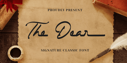 The Dear - Signature Classic Font, this font is great for your creative projects such as watermark on photography, and perfect for Classic logos & branding, photography, invitation, watermark, advertisements, product designs, stationery, wedding designs,label, product packaging, special events or anything that need Signature taste.
 - Mimic by Dmitri Moruz,
$19.00 Mimic is a font family of several typefaces, that are based upon the physical structure of the mouth, depicted while speaking of corresponding letters occurred. It is primarily created as an accidental font family, and thus contains the very basic glyph set, which includes: punctuation, numbers, and letters. Mimic font family is made up of: Mimic Regular, Mimic Medium, and Mimic Bold.
 - Nura by Sabrcreative,
$12.00 Introducing the Nura Font Family is the modern Display sans serif family. The Nura Font family comes in various sizes from Thin to Black, giving you the freedom to get creative with this font. With strong characters in the size of Black, it is very suitable for use for sign displays. and other sizes you can use as needed for your project
 - Mesopotamia by Teweka,
$15.00 Introducing New Mesopotamia Modern Signature, created with signature letters in mind. This font also has Swash, Ligature in it. You can use it as a logo, packaging, headline, poster, t-shirt, greeting card, wedding invitation, etc.
 - Kompress Pro by RMU,
$35.00 Kompress Pro - a font family of two highly compressed sans serif fonts, regular and shadowed. Both fonts contain West and East European character sets, as well as Cyrillic glyphs. This multilingual font family is well suited for decorative purposes.
 - Joe DiMaggio - Unknown license

- FWD Egyptian Tower by Fontwright Design,
$39.99 FWD Egyptian Tower is a designers stack-able Display family best purchased as one package. The four versions can be manipulated in your favorite graphics or sign making application to achieve the different effects as shown in the font family ad designs. All fonts are tightly spaced and are very often intentionally overlapped creating a balance for each very unique wider bottomed character. Being stack-able, the designer can duplicate the original text layer and by changing the font on the lower of the two layers to another of the family can then add another available effect. This can be repeated to add other of the available effects. Then by converting the text of the lower text layers to curves or outlines and welding the characters of the words together, the overlaps can be eliminated. This process is fairly common practice for a graphic designer and quite easy once done a few times.
 - Bremenoff by Designova,
$15.00 Bremenoff is a timeless sans-serif typeface family of 14 fonts, made with simplicity in every aspect of design. Created with a special focus on readability and the finest visual capabilities, this typeface can turn your design projects into something extraordinary. Handcrafted and designed with powerful OpenType features in mind, each weight includes extended language support including Western European & Central European sets. A total of 289 glyphs are included. Bremenoff is a perfect choice for graphic design, text presentation, web design, print and display use. The typeface can be an amazing option for beautiful branding, logo / logotype design projects, marketing graphics, banners, posters, signage, corporate identities as well as editorial design. Adding extra letter-spacing for the Caps will make this font perfect for minimal headlines and logotypes as shown in promo images here. Bremenoff typeface family comes with a total of 14 fonts having 7 weights (Thin / Light / Book / Regular / SemiBold / Bold / Heavy) as well as Italic versions of all weights.
 - Hadhelia Script by Picatype,
$14.00 Hadhelia Script is modern calligraphy design. This font is casual and pretty with swashes. Can be used for various purposes. such as logo, product packaging, wedding invitations, branding, headlines, signage, labels, signature, book covers, posters, quotes and more. Hadhelia Script features OpenType stylistic alternates, ligatures and International support for most Western Languages. To enable the OpenType Stylistic alternates, you need a program that supports OpenType features such as Adobe Illustrator CS, Adobe Indesign & CorelDraw X6-X7, Microsoft Word 2010 or later versions. If you need help or have any questions, please let me know. I'm happy to help. Thanks & Happy Designing!
 - Safrina by Cocodesign,
$12.00 Safrina Script is a modern calligraphy design, including Regular. This font is casual and beautiful with swash. Can be used for various purposes. such as logos, product packaging, wedding invitations, branding, headlines, signage, labels, signatures, book covers, posters, quotes, and more. Safrinal Script includes a change of the OpenType language style, binding and international support for most Western languages. To activate the OpenType Stylistic alternative, you need a program that supports OpenType features such as Adobe Illustrator CS, Adobe Indesign & CorelDraw X6-X7, Microsoft Word 2010 or newer versions. How to access all alternative characters using Adobe Illustrator:
 - Baltimore Typewriter by Intellecta Design,
$20.90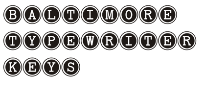 a comprehensive family of fonts
 - Annuario by Resistenza,
$39.00 Annuario is a sans serif multi-weight font family initially designed for a calendar. 48 fonts with 2 axes, a flexible family for many purposes. More About Opentype Features: https://bit.ly/opentype-rsz
 - Interbellum by Punch,
$22.00 Interbellum is an Art Deco inspired font family which contains 3 display fonts, 2 modern-looking text fonts and 4 AllCaps fonts. In combination, you can easily give your designs a bold, yet elegant look. And by using the many different style sets, it is able to stand tall in all sorts of designs. Although it was inspired by the roaring 20s, we still think of Interbellum as an everlasting time traveller that will definitely impress your clients.
 - DIN Next Arabic by Monotype,
$155.99 DIN Next is a typeface family inspired by the classic industrial German engineering designs, DIN 1451 Engschrift and Mittelschrift. Akira Kobayashi began by revising these two faces-who names just mean ""condensed"" and ""regular"" before expanding them into a new family with seven weights (Light to Black). Each weight ships in three varieties: Regular, Italic, and Condensed, bringing the total number of fonts in the DIN Next family to 21. DIN Next is part of Linotype's Platinum Collection. Linotype has been supplying its customers with the two DIN 1451 fonts since 1980. Recently, they have become more popular than ever, with designers regularly asking for additional weights. The abbreviation ""DIN"" stands for ""Deutsches Institut für Normung e.V."", which is the German Institute for Industrial Standardization. In 1936 the German Standard Committee settled upon DIN 1451 as the standard font for the areas of technology, traffic, administration and business. The design was to be used on German street signs and house numbers. The committee wanted a sans serif, thinking it would be more legible, straightforward, and easy to reproduce. They did not intend for the design to be used for advertisements and other artistically oriented purposes. Nevertheless, because DIN 1451 was seen all over Germany on signs for town names and traffic directions, it became familiar enough to make its way onto the palettes of graphic designers and advertising art directors. The digital version of DIN 1451 would go on to be adopted and used by designers in other countries as well, solidifying its worldwide design reputation. There are many subtle differences in DIN Next's letters when compared with DIN 1451 original. These were added by Kobayashi to make the new family even more versatile in 21st-century media. For instance, although DIN 1451's corners are all pointed angles, DIN Next has rounded them all slightly. Even this softening is a nod to part of DIN 1451's past, however. Many of the signs that use DIN 1451 are cut with routers, which cannot make perfect corners; their rounded heads cut rounded corners best. Linotype's DIN 1451 Engschrift and Mittelschrift are certified by the German DIN Institute for use on official signage projects. Since DIN Next is a new design, these applications within Germany are not possible with it. However, DIN Next may be used for any other project, and it may be used for industrial signage in any other country! DIN Next has been tailored especially for graphic designers, but its industrial heritage makes it surprisingly functional in just about any application. The DIN Next family has been extended with seven Arabic weights and five Devanagari weights. The display of the Devanagari fonts on the website does not show all features of the font and therefore not all language features may be displayed correctly.
 - DIN Next Devanagari by Monotype,
$103.99DIN Next is a typeface family inspired by the classic industrial German engineering designs, DIN 1451 Engschrift and Mittelschrift. Akira Kobayashi began by revising these two faces-who names just mean ""condensed"" and ""regular"" before expanding them into a new family with seven weights (Light to Black). Each weight ships in three varieties: Regular, Italic, and Condensed, bringing the total number of fonts in the DIN Next family to 21. DIN Next is part of Linotype's Platinum Collection. Linotype has been supplying its customers with the two DIN 1451 fonts since 1980. Recently, they have become more popular than ever, with designers regularly asking for additional weights. The abbreviation ""DIN"" stands for ""Deutsches Institut für Normung e.V."", which is the German Institute for Industrial Standardization. In 1936 the German Standard Committee settled upon DIN 1451 as the standard font for the areas of technology, traffic, administration and business. The design was to be used on German street signs and house numbers. The committee wanted a sans serif, thinking it would be more legible, straightforward, and easy to reproduce. They did not intend for the design to be used for advertisements and other artistically oriented purposes. Nevertheless, because DIN 1451 was seen all over Germany on signs for town names and traffic directions, it became familiar enough to make its way onto the palettes of graphic designers and advertising art directors. The digital version of DIN 1451 would go on to be adopted and used by designers in other countries as well, solidifying its worldwide design reputation. There are many subtle differences in DIN Next's letters when compared with DIN 1451 original. These were added by Kobayashi to make the new family even more versatile in 21st-century media. For instance, although DIN 1451's corners are all pointed angles, DIN Next has rounded them all slightly. Even this softening is a nod to part of DIN 1451's past, however. Many of the signs that use DIN 1451 are cut with routers, which cannot make perfect corners; their rounded heads cut rounded corners best. Linotype's DIN 1451 Engschrift and Mittelschrift are certified by the German DIN Institute for use on official signage projects. Since DIN Next is a new design, these applications within Germany are not possible with it. However, DIN Next may be used for any other project, and it may be used for industrial signage in any other country! DIN Next has been tailored especially for graphic designers, but its industrial heritage makes it surprisingly functional in just about any application. The DIN Next family has been extended with seven Arabic weights and five Devanagari weights. The display of the Devanagari fonts on the website does not show all features of the font and therefore not all language features may be displayed correctly. - DIN Next Cyrillic by Monotype,
$65.00DIN Next is a typeface family inspired by the classic industrial German engineering designs, DIN 1451 Engschrift and Mittelschrift. Akira Kobayashi began by revising these two faces-who names just mean ""condensed"" and ""regular"" before expanding them into a new family with seven weights (Light to Black). Each weight ships in three varieties: Regular, Italic, and Condensed, bringing the total number of fonts in the DIN Next family to 21. DIN Next is part of Linotype's Platinum Collection. Linotype has been supplying its customers with the two DIN 1451 fonts since 1980. Recently, they have become more popular than ever, with designers regularly asking for additional weights. The abbreviation ""DIN"" stands for ""Deutsches Institut für Normung e.V."", which is the German Institute for Industrial Standardization. In 1936 the German Standard Committee settled upon DIN 1451 as the standard font for the areas of technology, traffic, administration and business. The design was to be used on German street signs and house numbers. The committee wanted a sans serif, thinking it would be more legible, straightforward, and easy to reproduce. They did not intend for the design to be used for advertisements and other artistically oriented purposes. Nevertheless, because DIN 1451 was seen all over Germany on signs for town names and traffic directions, it became familiar enough to make its way onto the palettes of graphic designers and advertising art directors. The digital version of DIN 1451 would go on to be adopted and used by designers in other countries as well, solidifying its worldwide design reputation. There are many subtle differences in DIN Next's letters when compared with DIN 1451 original. These were added by Kobayashi to make the new family even more versatile in 21st-century media. For instance, although DIN 1451's corners are all pointed angles, DIN Next has rounded them all slightly. Even this softening is a nod to part of DIN 1451's past, however. Many of the signs that use DIN 1451 are cut with routers, which cannot make perfect corners; their rounded heads cut rounded corners best. Linotype's DIN 1451 Engschrift and Mittelschrift are certified by the German DIN Institute for use on official signage projects. Since DIN Next is a new design, these applications within Germany are not possible with it. However, DIN Next may be used for any other project, and it may be used for industrial signage in any other country! DIN Next has been tailored especially for graphic designers, but its industrial heritage makes it surprisingly functional in just about any application. The DIN Next family has been extended with seven Arabic weights and five Devanagari weights. The display of the Devanagari fonts on the website does not show all features of the font and therefore not all language features may be displayed correctly. - DIN Next Paneuropean by Monotype,
$92.99DIN Next is a typeface family inspired by the classic industrial German engineering designs, DIN 1451 Engschrift and Mittelschrift. Akira Kobayashi began by revising these two faces-who names just mean ""condensed"" and ""regular"" before expanding them into a new family with seven weights (Light to Black). Each weight ships in three varieties: Regular, Italic, and Condensed, bringing the total number of fonts in the DIN Next family to 21. DIN Next is part of Linotype's Platinum Collection. Linotype has been supplying its customers with the two DIN 1451 fonts since 1980. Recently, they have become more popular than ever, with designers regularly asking for additional weights. The abbreviation ""DIN"" stands for ""Deutsches Institut für Normung e.V."", which is the German Institute for Industrial Standardization. In 1936 the German Standard Committee settled upon DIN 1451 as the standard font for the areas of technology, traffic, administration and business. The design was to be used on German street signs and house numbers. The committee wanted a sans serif, thinking it would be more legible, straightforward, and easy to reproduce. They did not intend for the design to be used for advertisements and other artistically oriented purposes. Nevertheless, because DIN 1451 was seen all over Germany on signs for town names and traffic directions, it became familiar enough to make its way onto the palettes of graphic designers and advertising art directors. The digital version of DIN 1451 would go on to be adopted and used by designers in other countries as well, solidifying its worldwide design reputation. There are many subtle differences in DIN Next's letters when compared with DIN 1451 original. These were added by Kobayashi to make the new family even more versatile in 21st-century media. For instance, although DIN 1451's corners are all pointed angles, DIN Next has rounded them all slightly. Even this softening is a nod to part of DIN 1451's past, however. Many of the signs that use DIN 1451 are cut with routers, which cannot make perfect corners; their rounded heads cut rounded corners best. Linotype's DIN 1451 Engschrift and Mittelschrift are certified by the German DIN Institute for use on official signage projects. Since DIN Next is a new design, these applications within Germany are not possible with it. However, DIN Next may be used for any other project, and it may be used for industrial signage in any other country! DIN Next has been tailored especially for graphic designers, but its industrial heritage makes it surprisingly functional in just about any application. The DIN Next family has been extended with seven Arabic weights and five Devanagari weights. The display of the Devanagari fonts on the website does not show all features of the font and therefore not all language features may be displayed correctly. - Talonica by Nantia.co,
$24.00 Greek Signature Font Talonica The Greek Signature Font Talonica is a signature decorative font with which you can achieve a hand-lettering style. Talonica is a multilingual lettering font with Greek (of course), Latin characters, and diacritics. Supports all European languages. This signature style is perfect if you want to achieve a modern-looking graphic design project. In addition, this font has a really nice flow so you can also use it in a larger body of text. It can also be used on social media content, for branding or packaging applications. Also, this is the ideal typeface for organic product wine branding and packaging. You can use it to create logotypes with character and natural flow. Additionally, you can use its romantic vibes for wedding invitation designs. Especially if you are looking for a handwritten font for Instagram quote posts or any other social media content, this signature typeface is for you!
