10,000 search results
(0.179 seconds)
- Shintia Script by Seniors Studio,
$17.00 Shintia Script is highly legible script typeface. It is a bold, classic and fun Vintage Script font with almost 247 glyphs and opentype features with stylistic alternates. It can be used for various purposes such as posters, t-shirts, signage, logos, news, badges etc. To enable the OpenType Stylistic alternates, you need a program that supports OpenType features such as Adobe Illustrator CS, Adobe Indesign & CorelDraw X6-X7, Microsoft Word 2010 or later versions.
 - Koziupack by Sudtipos,
$45.00 Wild and free as usual, but now with a touch of sharp focus presented in curled ascenders and descenders, swashy care-free caps, and very unique figures. Koziupack is the ideal choice of font for food and drink product labels, signage, magazine advertisements. It looks particularly great when accenting any work of modern illustration, or by itself brightly knocked out of a dark background. Designed by Koziupa and digitized by Ale Paul.
 - Fabitha Script by stiplinestudios,
$11.00 Proudly Present .. Fabitha Script Fabitha Script goes with Modern and Natural Calligraphy, ready to give your design project with Fresh and Fabulous Style. This font have an 177 Standard Glyph + 109 Glyph Alternate in Open Type Standard Format. Suitable for various purpose such as digital lettering, headings, logos, wedding invitation, t-shirt, letterhead, signage, lable, news, posters, badges, branding materials, t-shirt, print, business cards, quotes, logo, poster, and suitable for any graphic design project.
 - Conifer by Ryan Keightley,
$15.00 Conifer is a blocky geometric sans serif font that adheres to strict grid rules in order to define its corner angles. Its seemingly rigid form is tempered by the soft, rounded corners, and fine notched details present at acute angles in the glyphs. Available in a clean solid and a varied, textured rough. The result is a rugged, retro, typeface that is at home in fashion lookbooks and wood-carved park signage alike.
 - American Christmas by Mans Greback,
$79.00 American Christmas is a funky and decorative season's typeface. As a cozy winter script, it brings a festive touch to every word, with letters that seem to dance joyously across the page. Its bold flow is reminiscent of retro holiday signage, evoking a sense of nostalgia and warmth. This typeface is adorned with stars that twinkle like lights on a tree, adding a sparkle to your seasonal greetings. This typeface family is provided in three starry versions and one clean, and also comes with an extra symbol font for beautiful Xmas icons. Use parenthesis symbols () [] {} to make stars around any word. Example: {Xmas}[Songs] Use underscore _ after any word to make a swash. Example: Santa_ Multiple underscores make longer tails. Example: Yuletide____ The font is built with advanced OpenType functionality and guaranteed top-notch quality, containing stylistic and contextual alternates, ligatures and more automatic and manual features; all to give you full control and customizability. It has extensive lingual support, covering all Latin-based languages, from North Europa to South Africa, from America to South-East Asia. It contains all characters and symbols you'll ever need, including all punctuation and numbers. With American Christmas, Mans Greback has crafted a typeface that captures the essence of the holiday spirit. Each character is designed to convey the excitement and heartfelt connection of the season, making it an ideal choice for those moments when you want your message to be wrapped in the warmth of the holidays.
 - Ice Creamery by FontMesa,
$29.00Ice Creamery is a new variation of our Saloon Girl font family complete with italics and fill fonts which may be used to layer different colors into the open parts of each glyph. We don’t recommend using the fill fonts for Ice Creamery as stand alone solid fonts, Ice Creamery Chocolate was designed as a the stand alone solid font for this font family. Fill fonts go back to the 1850's where they would design matched sets of printing blocks and the layering of colors took place on the printing press, they would print a page in black then on a second printing they would print a solid letter in red or blue over the letters with open spaces to fill them in. Most of the time the second printing didn't line up exactly to the open faced font and it created a misprinted look. With the fill fonts in Ice Creamery and other FontMesa fonts you have the option to perfectly align the fill fonts with the open faced fonts or shift it a little to create a misprinted look which looks pretty cool in some projects such as t-shirt designs. I have some ice cream making history in my family, my Grandfather Fred Hagemann was the manager of the ice cream plant for thirty years at Cock Robin Ice Cream and Burgers in Naperville IL. In the images above I've included an old 1960's photo of the Cock Robin Naperville location, the ice cream plant was behind the restaurant as seen by the chimney stack which was part of the plant. If you were to travel 2000 feet directly behind the Cock Robin sign in the photo, that's where I started the FontMesa type foundry at my home in Naperville. My favorite ice cream flavor was their green pistachio ice cream with black cherries, they called it Spumoni even though it wasn't a true Spumoni recipe. Their butter pecan ice cream was also incredibly good, the pecans were super fresh, their Tin Roof Sundae ice cream was chocolate fudge, caramel and peanuts swirled into vanilla ice cream. One unique thing about Cock Robin and Prince Castle was they used a square ice cream scoop for their sundaes. - Siseriff by Linotype,
$29.99 The Siseriff family of types contains nine different styles, which were developed by the master Swedish typographer Bo Berndal in 2002. Siseriff is a contemporary slab serif face. Except for the Siseriff Black weight, all of the letters display a slightly condensed appearance that is coupled with a relatively uniform width throughout the alphabet. Siseriff's nine styles are distributed across five weights (Light, Regular, Semi Bold, Bold and Black). The Italic companions for these styles (Siseriff Black does not have an italic companion) are true italics. These redrawn italics add a higher degree of differentiation from the Roman weights than could be achieved with obliques alone. Many common Slab Serif families (e.g., Serifa) do not offer this degree of differentiation. This variety makes Siseriff the perfect choice for journalistic and editorial work, where a good hierarchy may be achieved solely by relying on the various weights available, and their italics. All nine styles of the Siseriff family are part of the Take Type 5 collection from Linotype GmbH."
 - Novel Sans Pro by Atlas Font Foundry,
$50.00 Novel Sans Pro is the humanist grotesque typeface family within the largely extended award winning Novel Collection, containing Novel Pro, Novel Sans Pro, Novel Sans Hair Pro, Novel Sans Condensed Pro, Novel Mono Pro, Novel Sans Rounded Pro and Novel Sans Office Pro. Novel Sans Pro has a carefully attuned character design and a well balanced weight contrast. Classic proportions and the almost upright italic makes Novel Sans Pro being a modern humanist with the calligraphic warmth of a real italic. Many similarities with the other typeface families within the Novel Collection enable designers to combine the families and reach highest quality in typography. Novel Sans Pro [1020 glyphs] comes in 6 weights and contains small caps, an extra set of alternate glyphs, many ligatures, lining figures [proportionally spaced and monospaced], hanging figures [proportionally spaced and monospaced], small caps figures [proportionally spaced and monospaced], positive and negative circled figures for upper and lower case, superior and inferior figures, fractions, extensive language support, arrows for uppercase and lowercase and many more OpenType™ features.
 - Glade by Dear Alison,
$24.00 My latest typeface is a formal, copperplate script named Glade. Beginning as a project for a client who wanted several widths of a formal script style, the project never saw fruition. However, it did get me excited about the idea of a width family of steel nib scripts, ranging from extra narrow to extra wide, and the result is the Glade family. To give Glade a minor modern makeover from the original intent, the lowercase has been scaled up, and the Capitals scaled down for a more friendly personality. The character set has been expanded, and OpenType support has been added for unlimited fractions, ordinals, superiors and inferiors. So if you have the need for a formal connecting script, but are short on space, try Glade Narrow or Glade Extra Narrow. If space is not an issue, then the Regular, Wide or the generously gracious Extra Wide should do nicely. And if you get the whole family, well then you are set for anything that comes your way.
 - Novel Sans Rounded Pro by Atlas Font Foundry,
$50.00 Novel Sans Rounded Pro is the humanist grotesque typeface family within the largely extended award winning Novel Collection], also containing Novel Pro, Novel Sans Pro, Novel Sans Hair Pro, Novel Sans Condensed Pro, Novel Mono Pro, Novel Sans Rounded Pro and Novel Sans Office Pro. Novel Sans Rounded Pro has a carefully attuned character design and a well balanced weight contrast. Classic proportions and the almost upright italic makes Novel Sans Pro being a modern humanist. Many similarities with the other typeface families within the Novel Collection enable designers to combine the families and reach highest quality in typography. Novel Sans Rounded Pro [1020 glyphs] comes in 6 styles and contains small caps, an extra set of alternate glyphs, many ligatures, lining figures [proportionally spaced and monospaced], hanging figures [proportionally spaced and monospaced], small caps figures [proportionally spaced and monospaced], positive and negative circled figures for upper and lower case, superior and inferior figures, fractions, extensive language support, arrows for uppercase and lowercase and many more OpenType™ features.
 - Stajn Pro by Anže Veršnik,
$45.00 stajn-type.com — Stajn Pro Type Family Website where you can get DEMO version of Stajn Pro Book Stajn Pro was designed upon a main goal of using this typeface to set larger amount of text. The slightly condensed proportion allows for more content per page while large x height with its larger counters improves legibility and readability while used on smaller sizes. Despite the fact that Stajn Pro was designed as a body text Type Family, it works as well as a display too. Wide variety of weights as well as interesting, strong and at the same time beautiful character along with some stylistic alternate makes Stajn Pro a useful typeface in a field of editorial, magazine and promotional materials design. The Stajn Pro character includes some humanistic typeface characteristics, which add some softness and elegance in its strong and stable presence. More information about development, usage and characteristics of a Stajn Pro Type Family at stajn-type.com If you have any other questions please do not hesitate to write me at info@stajn-type.com
 - Novel Sans Condensed Pro by Atlas Font Foundry,
$50.00 Novel Sans Condensed Pro is the humanist grotesque typeface family within the largely extended award winning Novel Collection, containing Novel Pro, Novel Sans Pro, Novel Sans Hair Pro, Novel Sans Condensed Pro, Novel Mono Pro, Novel Sans Rounded Pro and Novel Sans Office Pro. Novel Sans Condensed Pro has a carefully attuned character design and a well balanced weight contrast. Classic proportions and the almost upright italic makes Novel Sans Condensed Pro being a space saving, modern humanist with the calligraphic warmth of a real italic. Many similarities with the other typeface families within the Novel Collection enable designers to combine the families and reach highest quality in typography. Novel Sans Condensed Pro [1020 glyphs] comes in 6 weights and contains small caps, an extra set of alternate glyphs, many ligatures, lining figures [proportionally spaced and monospaced], hanging figures [proportionally spaced and monospaced], small caps figures [proportionally spaced and monospaced], positive and negative circled figures for upper and lower case, superior and inferior figures, fractions, extensive language support, arrows for uppercase and lowercase and many more OpenType™ features.
 - Novel Sans Office Pro by Atlas Font Foundry,
$50.00 Novel Sans Office Pro is the humanist grotesque typeface family optimized for office environments within the largely extended award winning Novel Collection, also containing Novel Pro, Novel Sans Pro, Novel Sans Condensed Pro, Novel Mono Pro and Novel Sans Rounded Pro. Novel Sans Office Pro has a carefully attuned character design and a well balanced weight contrast. Classic proportions and the almost upright italic makes Novel Sans Office Pro being a modern humanist with the calligraphic warmth of a real italic. Many similarities with the other typeface families within the Novel Collection enable designers to combine the families and reach highest quality in typography. Novel Sans Office Pro [1020 glyphs] comes in 6 weights and contains small caps, an extra set of alternate glyphs, many ligatures, lining figures [proportionally spaced and monospaced], hanging figures [proportionally spaced and monospaced], small caps figures [proportionally spaced and monospaced], positive and negative circled figures for upper and lower case, superior and inferior figures, fractions, extensive language support, arrows for uppercase and lowercase and many more OpenType™ features.
 - Preto Semi OT Std by DizajnDesign,
$- Preto Semi is an experiment. It is an attempt to create a readable type for text point sizes (other than sans-serif and serif). Preto Semi is not a Sans with added serifs or Serif with serifs removed. The use of the serifs is redefined and used for other purpose(s). The serifs became the extension of the stroke, they help to solve the spacing problem of sans-serif types and they use the primary function of serifs – keeping the eye on the baseline and emphasize the horizontal rhythm of the lines of text. Preto Semi is intended for magazines and editorial design, as other members of Preto family. Preto is an extensive type family, which explores the function of serifs on readability and legibility. Preto consist of three subfamilies: Sans, Semi and Serif. Preto is designed for multilingual typesetting. All of the subfamilies have equal gray value but different texture which can be use to differentiate languages. Preto sub-families have two text weights and two bold styles (Regular -> Bold, Medium -> Black). Every weight has a companion Italic style as well.
 - Gorgonzola Gothic by The Ampersand Forest,
$20.00 Gorgonzola Gothic is a geometrically-inspired gothic sans serif family that's robust and versatile. Inspired by the geometric quirkiness of IxD (also by The Ampersand Forest), Gorgonzola Gothic expands into a thirty-style family that works for everything from branding to text. It further mitigates IxD's quirkiness by offering two options in the round and shouldered lowercase glyphs. The standard letterforms, like IxD, have notched joins, giving them an assertive, almost futuristic look. The alternates of those letterforms (housed in Stylistic Set 01, and available as immediate hoverable glyph options in the Adobe Suite) are more conventional (as are the SS01 ampersand, Q, S, a, and s). In this way, Gorgonzola Gothic offers the best of both worlds: a flavorful, slightly futuristic family (in the same world as geometric classics like Eurostile) and a workhorse gothic sans (like the Benton classics Franklin Gothic, News Gothic, etc.). Its three widths: Skinny, Slim, and Standard, give it a wide range of applications, from display to body. Gorgonzola Gothic makes a statement with strength and sureness.
 - Preto Semi by DizajnDesign,
$24.00 Preto Semi is an experiment. It is an attempt to create a readable type for text point sizes (other than sans-serif and serif). Preto Semi is not a Sans with added serifs or Serif with serifs removed. The use of the serifs is redefined and used for other purpose(s). The serifs became the extension of the stroke, they help to solve the spacing problem of sans-serif types and they use the primary function of serifs – keeping the eye on the baseline and emphasize the horizontal rhythm of the lines of text. Preto Semi is intended for magazines and editorial design, as other members of Preto family. Preto is an extensive type family, which explores the function of serifs on readability and legibility. Preto consist of three subfamilies: Sans, Semi and Serif. Preto is designed for multilingual typesetting. All of the subfamilies have equal gray value but different texture which can be use to differentiate languages. Preto sub-families have two text weights and two bold styles (Regular -> Bold, Medium -> Black). Every weight has a companion Italic style as well.
 - Sunetta by Linotype,
$29.99An inkstone, a brush, ink, and paper. In China, one speaks of “wenfang sibao” — the four treasures of the scholar’s study. With these centuries-old hand tools, Werner Schneider created a calligraphic type trilogy of the highest aesthetic order; he named this typeface family after Buddha’s stepbrother, Sunetta. Sunetta is an outstanding choice for contemporary display type purposes. Its combination of lively forms overcome sterile text passages, lending them a more personal note and feeling. But Sunetta is not only recommended for documents bestowing distinction and accolades; the fonts are superb for shorter text passages as well. Sunetta’s spirited flow raises it above the fray that so many generic letterforms find themselves mired in, creating an unforgettable impression. Sunetta’s three complementary styles, Sunetta Flair, Sunetta Charme, and Sunetta Magic, offer three varying degrees of calligraphic verve. The family’s base font, Sunetta Flair, harkens back to the showcard lettering styles of the 1950s, while remaining distinctly European in taste. Sunetta Charme has a more swash-type appearance, while Sunetta Magic is joyfully decorative — its brush-written strokes dance across the line. Together, they may help you reach typographic nirvana. - Sweet Gothic by Sweet,
$39.00 Sweet Gothic is a 2009 addition to the Sweet Collection of engraved lettering styles from the 20th Century. Sweet Gothic Light is closely based on lettering from an engravers pattern from the early 1900s that was used for tracing letterforms with the engraving machine (pantograph) to make steel engraving plates. The design is related to many similar engravers gothics developed in the early 1900s, but as each engraving house created by hand their own patterns for popular styles of the time, there is variation among the models. Sweet Gothic offers contrast in stroke weight and its unique personality. The bolder weights are new designs, based on the characteristics of the Light. A serif variant (Sweet Gothic Serif) has also been developed to expand the usefulness of the family, offering an alternative to Copperplate Gothic. As such, most of the fonts are new designs, yet may seem familiar and ubiquitous given their model. The fonts offer two sizes of figures and monetary symbols: one set is intended for use with upper- and lowercase settings; the second set is the same height as the small caps.
 - Avenir Next Thai by Linotype,
$79.00 Avenir Next Pro is a new take on a classic face—it’s the result of a project whose goal was to take a beautifully designed sans and update it so that its technical standards surpass the status quo, leaving us with a truly superior sans family. This family is not only an update though; in fact it is the expansion of the original concept that takes the Avenir Next design to the next level. In addition to the standard styles ranging from ultralight to heavy, this 32-font collection offers condensed faces that rival any other sans on the market in on and off—screen readability at any size alongside heavy weights that would make excellent display faces in their own right and have the ability to pair well with so many contemporary serif body types. Overall, the family’s design is clean, straightforward and works brilliantly for blocks of copy and headlines alike. Akira Kobayashi worked alongside Avenir’s esteemed creator Adrian Frutiger to bring Avenir Next Pro to life. It was Akira’s ability to bring his own finesse and ideas for expansion into the project while remaining true to Frutiger’s original intent, that makes this not just a modern typeface, but one ahead of its time. Avenir Next Variables are font files which are featuring two axis, weight and width. They have a preset instance from UltraLight to Heavy and Condensed to Roman width. The preset instances are: Condensed UltraLight, Condensed UltraLight Italic, Condensed Thin, Condensed Thin Italic, Condensed Light, Condensed Light Italic, Condensed, Condensed Italic, Condensed Demi, Condensed Demi Italic, Condensed Medium, Condensed Medium Italic, Condensed Bold, Condensed Bold Italic, Condensed Heavy, Condensed Heavy Italic, UltraLight, UltraLight Italic, Thin, Thin Italic, Light, Light Italic, Regular, Italic, Demi, Demi Italic, Medium, Medium Italic, Bold, Bold Italic, Heavy, Heavy Italic.
 - Avenir Next Rounded by Linotype,
$42.99Avenir Next Pro is a new take on a classic face—it’s the result of a project whose goal was to take a beautifully designed sans and update it so that its technical standards surpass the status quo, leaving us with a truly superior sans family. This family is not only an update though; in fact it is the expansion of the original concept that takes the Avenir Next design to the next level. In addition to the standard styles ranging from ultralight to heavy, this 32-font collection offers condensed faces that rival any other sans on the market in on and off—screen readability at any size alongside heavy weights that would make excellent display faces in their own right and have the ability to pair well with so many contemporary serif body types. Overall, the family’s design is clean, straightforward and works brilliantly for blocks of copy and headlines alike. Akira Kobayashi worked alongside Avenir’s esteemed creator Adrian Frutiger to bring Avenir Next Pro to life. It was Akira’s ability to bring his own finesse and ideas for expansion into the project while remaining true to Frutiger’s original intent, that makes this not just a modern typeface, but one ahead of its time. Avenir Next Variables are font files which are featuring two axis, weight and width. They have a preset instance from UltraLight to Heavy and Condensed to Roman width. The preset instances are: Condensed UltraLight, Condensed UltraLight Italic, Condensed Thin, Condensed Thin Italic, Condensed Light, Condensed Light Italic, Condensed, Condensed Italic, Condensed Demi, Condensed Demi Italic, Condensed Medium, Condensed Medium Italic, Condensed Bold, Condensed Bold Italic, Condensed Heavy, Condensed Heavy Italic, UltraLight, UltraLight Italic, Thin, Thin Italic, Light, Light Italic, Regular, Italic, Demi, Demi Italic, Medium, Medium Italic, Bold, Bold Italic, Heavy, Heavy Italic. - Ardena by Julien Fincker,
$34.99 About the design: Ardena is a modern sans-serif typeface family. While neutral and clear at first glance, it can be characterized as both pleasant and confident due to its open, rounded forms and vertical terminals. It can be used in both a restrained and expressive way. The thinner and thicker weights are particularly suitable for strong headlines, while the middle weights can be used for typographic challenges and body text. Completed with an extensive character collection, it becomes a real workhorse. A versatile allrounder that is up to all challenges – for Corporate Identity, Editorial, Branding, Orientation and Guidance systems and much more. Features: The Ardena family has a total of 20 styles, from thin to heavy with matching italics. With over 1064 characters, it covers over 200 Latin-based languages. It has an extended set of currency symbols and a whole range of Open Type Features. There are alternative characters as stylistic sets, small caps, automatic fractions – just to name a few. Arrows and numbers: In particular, the extensive range of arrows and numbers should be highlighted, which are perfectly suited for use in orientation and guidance systems. Thanks to Open Type Features and an easy system, the various designs of arrows and numbers can also be simply "written" without first having to select them in a glyph palette. The principle is easily explained: If a number is placed in round or square brackets, it will automatically be displayed in an outlined circle or square. If you add a period to the number, it is displayed in a full circle or square. The same principle also applies to the arrows. The arrows themselves are combinations of greater/less symbols with the various slashes or hyphens. Get the Variable Font here: https://www.myfonts.com/fonts/julien-fincker/ardena-variable/
 - Blushed by Supfonts,
$17.00 Hello, friends. I keep experimenting with handwritten fonts, shapes and lines. I want the font to set the tone, the atmosphere, and look like an inscription made in a hurry, but it is well read. Blushed combines all these qualities. Simple and clear, looks at ease. It is perfect for signatures or design, where you do not need a strict style. Test it out below to see how it could look for your next project! Includes: Uppercase and lowercase Numbers and punctuation Foreign language support Ligatures Check out my blog: https://www.instagram.com/zloillev pinterest.com/dmitriychirkov7 Enjoy
 - Connecticut by Cititype,
$19.00 The 'Connecticuts' font is a versatile handwritten typeface that is perfect for various applications, including logos, signatures, photography watermarks, quotes, book titles, and more. Its unique charm lies in the combination of monoline characters with a firm and fabulous handwriting style. The font exudes a sense of elegance and professionalism while maintaining a human touch, making it an excellent choice for both formal and creative projects. Whether you need to add a personal flair to your branding or elevate the visual appeal of your designs, 'Connecticuts' delivers a sophisticated and engaging look that is sure to leave a lasting impression.
 - Anastasya by Create Big Supply,
$15.00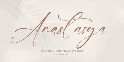 Introducing Anastasya, an elegant script handwritten signature font that exudes beauty and femininity. With its captivating style, Anastasya is perfect for a wide range of projects. Whether you're designing wedding invitations, crafting sophisticated logos, or adding a touch of elegance to your branding, this font is sure to impress. It features both uppercase and lowercase letters, numbers, and punctuations, allowing for versatile design options. Anastasya is also multilingual, enabling you to communicate your message globally. With ligatures and PUA encoding, accessing unique glyphs and special characters is effortless. Explore the full character set of Anastasya and elevate your designs with its graceful charm.
 - Adinda Melia by Subectype,
$17.00 Adinda Melia is a lovely modern calligraphy font with with a touch of handwriting style. This font is perfect for creating signature logos and watermarks for photography studio or wedding invitation. Adinda Melia includes full set of beautiful hand lettered uppercase and lowercase letters, numerals, a large range of punctuation and ligatures. All lowercase letters include beginning and ending swashes, giving realistic hand-lettered style. In order to use the beautiful swashes, you need a program that supports OpenType features such as Adobe Illustrator CS, Adobe Photoshop CC, Adobe Indesign and Corel Draw. Thank You Subectype studio
 - Bedontes by Aminmario Studio,
$20.00 Bedontes is an unique handwritten brush font. Created with brush pen to give a great contrast between thick and thin curves. Drawn, Scanned & Vectorized from paper to screen. I wanted to create an authentic brush typeface leaving the texture and imperfections the way they are, but perfect for any awesome project that need hand writing taste. Comes with regular and italic, also support multilingual. This is suitable for branding, header, quotes, invitations, stationery, wedding design, logos, watermarks on photography, signatures, advertisement, album covers, business cards, clothing, magazines, posters, and more! Thanks for checking out this font. I hope you enjoy it!
 - Penthagon by Gie Studio,
$9.00 Hello Everybody,. Are you going to make your business changes more widely known? Find the solution by giving a small touch to the design of your product promo using a natural and contemporary font style ! Penthagon is Script Font Duo with elegant and signature style, that are very beautiful,luxurious,and high class for creating handwritten-style logos, wedding stationery, photographer watermarks logos, modern websites, fashion branding, name card, wedding invitation, and all the identity of your business products. Features: -Multilingual Support for 83 Country -Ligature collection -PUA Encoded -Numerals and Punctuation What you get : -Penthagon Regular -Penthagon Tail Happy design !
 - Cadina by Sulthan Studio,
$12.00 Introducing Cadina, an elegant new font! This font is especially created for those of you who need a touch of elegance to design your projects next with perfect results and amazing. Cadina is a very beautiful and interesting script and comes with a perfect line for use for various purposes. Like titles, signatures, logos, correspondence, wedding invitations, letterheads, nameplate, labels, bulletins, posters, badges, Branding, Greeting Cards, etc. Cadina is built with OpenType features and includes start and end. It comes with OpenType Stylistic set, Initial, swashes, ligatures and everything to add a touch to your design and also supports other languages :)
 - Consistance by Haksen,
$15.00 Consistance is a stylish modern and natural handwritten script font with casual bold signature script type. It is perfect for branding, wedding invites and cards, and maybe for red wine label. Consistance includes full set of gorgeous uppercase and lowercase letters, numerals, a large range of punctuation and ligatures. In order to use the beautiful ligatures, you need a program that supports OpenType features such as Adobe Illustrator CS, Adobe Photoshop CC, Adobe Indesign and Corel Draw. but if your software doesn't have Glyphs panel, you can install additional swashes font files. Thanks and have a great day, Haksen Studio
 - Amber Lemon by Supfonts,
$18.00 Amber Lemon is a cute handwritten signature font with heart and regular swashes. Perfect for greeting cards, wedding stationery, photographer watermarks logos, modern websites, apparel design and more. Amber Lemon features handwritten ligatures, beginning and end swashes for lowercase letters and heart connections Thanks so much for checking out my shop, and please get in touch if you have any questions! Amber Lemon Font Features: Full Set of standard alphabet and punctuation Extra set of beginning and ending swashed lowercase Extra set of heart connections handwritten ligatures PUA Encoded - no special software needed to access extra characters Multilingual Characters AÁĂÂÄÀĀĄÅÃÆBCĆČÇĊDÐĎĐEÉĚÊËĖÈĒĘẼFGĞĢĠḠHĦIIJÍÎÏİÌĪĮĨJKĶLĹĽĻŁMNŃŇŅÑ OÓÔÖÒŐŌØÕŒPÞQRŔŘŖSŚŠŞȘẞTŤŢȚUÚÛÜÙŰŪŲŮŨVWẂŴẄẀXYÝŶŸỲỸZŹŽŻ aáăâäàāąåãæbcćčçċdðďđeéěêëėèēęẽfgğģġḡhħiıíîïìijīįĩjȷkķlĺľļłmnńňņñoóôöòőōøõœpþ qrŕřŗsśšşșßtťţțuúûüùűūųůũvwẃŵẅẁxyýŷÿỳỹzźžż
 - Mallona by MC Creative,
$10.00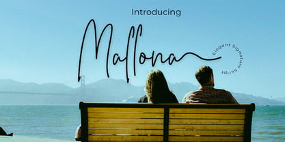 Mallona is monoline script font which natural movement and elegant for signature style. is perfect for branding projects, logo, wedding designs, social media posts, advertisements, product packaging, product designs, label, photography, watermark, invitation, stationery and any projects that need handwriting taste. What’s Included : Standard glyphs Ligature Works on PC & Mac Simple installations Accessible in the Adobe Illustrator, Adobe Photoshop, Adobe InDesign, even work on Microsoft Word. PUA Encoded Characters – Fully accessible without additional design software. Fonts include multilingual support for; ä ö ü Ä Ö Ü ß ¿ ¡ for questions and usage license please contact us Mohamadcandirah@gmail.com
 - Women Frame by Wildan Type,
$11.00 Women Frame is a modern calligraphy font with sweet pressure. i hope this font perfect for creating signature logos and watermarks for photography studio or wedding invitation. I made it with love and magic!! Women Frame includes full set of beautifull hand lettered uppercase and lowercase letters, numerals, a large range of punctuation and ligatures. All lowercase letters include beginning and ending swashes. In order to use the beautiful swashes, you need a program that supports OpenType features such as Adobe Illustrator CS, Adobe Photoshop CC, Adobe Indesign and Corel Draw. if you have questions, please provide a short message to us
 - Graceful Farmhouse by moriztype,
$16.00 Graceful Farmhouse Script is a stunning, attentive and classy script font, comes in a modern and classic, wavy style, built to meet the needs of your next design project. Graceful farmhouse Script can be used for various purposes. such as title, signature, logo, correspondence, wedding invitation, letterhead, nameplate, label, newsletter, poster, badge, etc. Graceful Farmhouse Script contains a full set of lowercase and uppercase letters, a wide variety of punctuation marks, numbers, and multilingual support. This font also has several ligatures, Swash, and Stylistic Sets, for those of you who have opentype software (eg Photoshop/Illustrator, Corel Draw).
 - Olivine by URW Type Foundry,
$35.00 In an era of typographic neutrality, Pria Ravichandran adds spirit and flavour to the humanist sans, a genre that is known for legibility. Introducing Olivine. Olivine is a versatile type family that performs admirably across sizes. It is designed with maximum care ensuring legibility across various sizes, angles and distances. The sturdy shapes and the exaggerated ink traps fade to produce an even typographic colour and a lively texture in smaller text sizes. In larger display settings, the details become self-conscious and highlight the spectacular quality of the design. Olivine is neither experimental nor minimal, striking a balance between formality and friendliness. Olivine is clean as well as organic at the same time. Consisting of seven weights in roman and italics, the type-family address typographic hierarchy for texts of all kinds and sizes. Distinctive, yet neutral letterforms add personality to the type family. The counter-forms are large and open giving the design plenty of internal space which is balanced against the generous spacing of the characters. These features of Olivine make the reading process enjoyable in digital as well as the print medium. No squinting to read this type-family! If you are looking to add some flavour into your design, try Olivine. It is a trend-setting typeface that we predict is going that extra mile. Try before you buy, Olivine Medium and Medium Italic are available free for unlimited commercial usage.
 - Code Next by Fontfabric,
$39.00 10 years later, one of the first geometric typefaces in our portfolio and a popular favorite of yours is rising to a whole new level! We’re revealing the stand-alone type family Code Next—a staggering evolution from Code Pro in functionality, versatility, and application. The transformation includes 6 new weights, 10 new Italics, full support of Extended Cyrillic and Greek, full redesign and glyphs refinement, 2 variable fonts, to name but a few. Going back to 2011, the grotesque-inspired Code Pro was designed to complement memorable pieces that make a statement. Balancing between stylization and simplification, it was encoded with the distinct voice of basic organic shapes to stand the test of time. Little did we know, it would expand and live up to the potential of a “font from the future” as the new Code Next. Today, a type family of 22 styles, this geometric sans solidifies its relevance and carries a strong constructive aesthetic through simplified forms with a twist. These fit any modern design in print, web, and display visualization. Developed to go above and beyond, Code Next comes prepared for multi-script projects with Extended Latin, Extended Cyrillic, and Greek. Explore Code Next’s versatility and switch things up with the help of 2 variable fonts, more than 1280 glyphs, and an extensive OpenType features set including small caps, standard and discretionary ligatures, contextual and stylistic alternates, stylistic sets, case sensitive forms, and much more. Overview: • Font family of 22 fonts • 10 weights • Languages - Full support of Extended Latin; Extended Cyrillic; Greek • Entirely refined design and metrics • Glyph count - 1288 • Variable fonts - 2 fonts OpenType features: • Small Caps • Standard Ligatures • Discretionary Ligatures • Contextual Alternates • Stylistic Alternates • Stylistic Sets • Case-Sensitive Forms • Ordinals • Localized Forms • Lining Figures • Proportional Figures • Tabular Figures • Oldstyle Figures • Subscripts • Scientific Inferiors • Superscripts • Numerators and Denominators • Fractions • Roman figures • Extensive mathematical support • Navigation symbols
 - Linkpen Primary by Linkpen Handwriting Fonts,
$10.00 Linkpen Primary is a font family for teaching handwriting. It is designed to be used by teachers and parents to help children or adult learners practice their handwriting, at home or at school. Linkpen Primary gives you endless possibilities for creating your own educational resources - worksheets, signs, labels, etc. - to appeal to your learners and get them interested and passionate about learning to write. This versatile font family contains 24 styles, each with special features that support learning to write. For ultimate flexibility, styles are available with and without guide lines, and in regular and italic versions. The styles can each be purchased separately or as a complete family value pack. The letter shapes have been designed to be clear, simple and easy to read. There are 12 print styles designed for beginners or younger children, to allow them to practice writing the letter shapes. The print fonts all come in Regular, Guide, Dotted, Dotted Guide, Outline, and Arrow styles, to give learners different ways to build their confidence creating the letter shapes. There are 12 Join fonts, for when your learners are ready to progress onto joined up handwriting. The Join fonts automatically join up as you type on your computer, tablet, or interactive whiteboard, producing beautiful, neat, clear joined up text for your classroom or home resources. The Join fonts come in Regular and Dotted styles, as well as a special Connect style which highlights the join between letters, to help your learners make the transition from printed writing to joined up. The Join fonts are created with OpenType Contextual Alternate rules, which ensure that the joins are always formed correctly, depending on the context of each letter within a word. Compatible with Microsoft Word and Publisher 2010 onwards (desktop version), SMART Notebook 18 onwards, Pages and Keynote for iOS, TextEdit for macOS, LibreOffice 6, Notepad for Windows, and Promethean ActivInspire Version 2.21 onwards.
 - Lucky Organics by IbraCreative,
$12.00 Lucky Organic is an endearing and charming handwritten bubble font that radiates pure cuteness and playfulness. With its whimsical and rounded letterforms, Lucky Organic captures the essence of joyful innocence. Each letter is nestled within a delightful bubble, creating a captivating and cheerful visual effect. The font's organic curves and friendly design make it an ideal choice for projects that crave a touch of adorable charm, such as children's books, playful logos, and vibrant signage. Lucky Organic effortlessly transforms any text into a lively display of creativity, bringing a smile to faces and a sense of light-hearted wonder to designs.
 - Appetite Pro Rounded by Serebryakov,
$39.00 Appetite Pro Rounded is an extension of the world wide popular display fonts Appetite Pro (2016) and Appetite Rounded (2011). Appetite Pro Rounded consists of 10 weights — 5 regular and 5 italic — from Light to Heavy. It’s a multilingual and international rounded font, with a full western latin, cyrilyc (russian, belarusian, ukrainian) and basic Greek support. Appetite Pro Rounded font family special designed made in addition for Appetite Pro. Due to the 10 weights rounded font and 10 weights normal weights palette you can solve a wide variety of professional problems without spending money on extra fonts for titles, sub-titles and main text.
 - P22 Constructivist by P22 Type Foundry,
$24.95 Font mavens of the world unite! Constructivist recreates the bold graphic design of early Soviet Era Russian Artists such as Rodchenko and Popova. The Constructivist family contains 5 fonts plus a set of decorative extras. Constructivist Pro is an Opentype adaptation of the P22 Constructivist Set font system which combines the 5 font styles and adds Opentype features such as alternate Latin and Cyrillic letterforms, full Central European Language support and changes in line spacing and optical sizing of some characters for improved harmony. In all over 1200 Glyphs for maximum flexibility and design choices. Seize control of the means of desktop production with this revolutionary font collective!
 - Benua by Jehoo Creative,
$19.00 Benua font family, a sleek and modern sans serif font designed with unique curved details at the letters a, d, l, m, n, p, and r. These details give the font a distinctive look and feel, creating a cohesive and harmonious design. Closed apertures and generous spacing of the font provide excellent legibility, making it an ideal choice for both print and digital media. Benua also features small caps, which add a touch of elegance and sophistication to any design project. The font comes in 9 weights, from "Thin" to "Black," each equipped with its own italic version, allowing for a range of emphasis and flexibility in design.