10,000 search results
(0.033 seconds)
- TE Poster by Tharwat Emara,
$35.00 This font may be conservative and classic, but also may be more playful and modern. It is good for theater or art posters and for modern music, web-pictures or vinyl covers. Of course it also will be good for coffee shops, cafe's, restaurants, magazine's headers, signs or gift/post cards and weddings. Try to use it in your beauty or travel blogs, you will see how many options you will have with stylish POSTER
 - FE Gigant by Egor Stremousov,
$50.00 The font has a pronounced decorative effect and is suitable for the gaming, publishing and film industry. The Cyrillic alphabet conveys the spirit and atmosphere of Soviet constructivism. It is well suited for names of Soviet (or pseudo-Soviet) trademarks, large headings, signs, giant letter structures, etc. The Latin part is not tied to the Soviet period and can be applied in a wider range. Sharp angles and unnatural proportions create dynamics, strength and heaviness.
 - TE Fantasy by Tharwat Emara,
$49.00 This font may be conservative and classic, but also may be more playful and modern. It is good for theater or art posters and for modern music, web-pictures or vinyl covers. Of course it also will be good for coffee shops, cafe's, restaurants, magazine's headers, signs or gift/post cards and weddings. Try to use it in your beauty or travel blogs, you will see how many options you will have with stylish FANTASY
 - Stovepipe Stencil JNL by Jeff Levine,
$29.00 Stovepipe Stencil JNL was not directly designed from a vintage source, but it does draw its influences from classic sans serif lettering of the past. Even its name borrows (somewhat gratuitously) from the "stovepipe" lettering so popular with sign painters. True stovepipe letters tend to be squarer with rounded corners, but the name has also been loosely associated with some tall, condensed type styles. The typeface is available in both regular and oblique versions.
 - Sweetie Summer by Attype Studio,
$12.00 Sweetie Summer inspired by summer ice cream. perfect display font for summer business, summer flyer, summer sign & summer decor. Comes with display font, this layered font make a shiny effect for typography that you creates. Sweetie Summer is perfect for branding, logo, invitation, stationery, social media post, product packaging, merchandise, blog design, game titles, cute style design, Book/Cover Title and more. Features : - Multilingual Support --- Hope you enjoy with our font! Attype Studio
 - Hoeflers by Maulana Creative,
$12.00 Hoeflers is a Hand-lettered font inspired by the vintage 70's sign board, music, shop and movies, it has a rough stroke outline and then we fill it. Hoeflers includes opentype features Ligatures. It support multilingual more than 100+ language. This font is good for logo design, Movie Titles, Books Titles and any awesome project you create. Make a stunning work with Hoeflers Rough sans font. Its a caps only fonts. Cheers, MaulanaCreative
 - Hollywood 69 by Fonts of Chaos,
$10.00 This is not Hollywood. You may be surprised but I am not inspired by the famous Hollywood sign for this type but a grid on a roof of Barcelona. I walked down the street observing the architecture of buildings in the area of the Marina when I saw a grid on a roof. One of the workers put a board on them and the magic happen. Hollywood 69 is now free with 99 !
 - Grifa Slab by deFharo,
$14.00 Grifa Slab is a chunky typeface with thick rounded slab serifs in 4 styles with true italics, ideal for very legible titles and with a hard and smooth aspect at the same time. You can use this font in editorial design for headlines, also for advertising and the design of posters, signs or posters, in all cases readability is guaranteed. The typography has a set of 525 characters (Latin Extended-A) and OpenType functions.
 - Wave Path by Attype Studio,
$16.00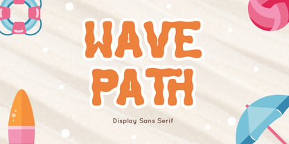 Wave Path inspired by Ocean Wave on summer. perfect Sans serif display font for summer business, summer flyer, summer sign & summer decor. Comes with Ligatures character, Perfect combination effect for typography that you creates. Wave Path is perfect for branding, logo, invitation, stationery, social media post, product packaging, merchandise, blog design, game titles, cute style design, Book/Cover Title and more. Features : - Wave Path.otf - Ligatures - Multilingual Support --- Hope you enjoy with our font! Attype Studio
 - TE Cathrine 2 by Tharwat Emara,
$49.00 This font may be conservative and classic, but also may be more playful and modern. It is good for theater or art posters and for modern music, web-pictures or vinyl covers. Of course it also will be good for coffee shops, cafe's, restaurants, magazine's headers, signs or gift/post cards and weddings. Try to use it in your beauty or travel blogs, you will see how many options you will have with stylish CATHRINE2
 - TE Rekaah 2 by Tharwat Emara,
$49.00 This font may be conservative and classic, but also may be more playful and modern. It is good for theater or art posters and for modern music, web-pictures or vinyl covers. Of course it also will be good for coffee shops, cafe's, restaurants, magazine's headers, signs or gift/post cards and weddings. Try to use it in your beauty or travel blogs, you will see how many options you will have with stylish REKAAH2
 - Vestigia by Rodrigo Navarro Bolado,
$32.00 Vestigio m. Ing. & Fr. vestige: a trace, mark or visible sign left by something as an ancient city in a condition or practice vanished or lost. Vestigia is born by lost pieces of other typography, being then, Garbancera's descendant. It evolved to be seen in big point sizes and compete with other fierce competitors, while retaining some features of it ancient predecessor, navigates a gothic fraktur experimental style, existing between legible and illegible reading.
 - Gloria Beauty by Lettersams,
$18.00 Gloria Beauty is a script with a new idea that has letter characters connected to each other, so it looks unique and romantic with others. This font has beautiful, well-balanced characters, making it suitable for a variety of purposes. such as posters, wedding invitations, logos, branding, titles, signs, labels, mugs, quotes, and others. Gloria Beauty features 620+ glyphs covering characters, alternatives, and binders, including start and end letters, alternates, binders, and multiple language support.
 - Fabuleuse Slab by Nuno Dias,
$18.00 Fabuleuse Slab is a one-style font that features a thin, condensed and high cap height and x-height. This gives the font a distinct retro look & bohemian feeling that is great for logos & branding, packaging, titles, magazines, posters, signs, shirts, scrap-booking, … This display font comes in Capital letters as well as Lowercase. It also comes equipped with Ligatures, Numbers, Punctuation Marks, Diacritic Marks and a well stocked supply of special characters.
 - TE Focus by Tharwat Emara,
$39.00 This font may be conservative and classic, but also may be more playful and modern. It is good for theater or art posters and for modern music, web-pictures or vinyl covers. Of course it also will be good for coffee shops, cafe's, restaurants, magazine's headers, signs or gift/post cards and weddings. Try to use it in your beauty or travel blogs, you will see how many options you will have with stylish FOCUS
 - Horror Vibes by Gassstype,
$25.00 Introducing of our new product the name is Horror Vibes - Handmade horror Font and Multilanguage support.Introducing of designs look modern, unique and fun. It’s perfect for labels, quotes, posters, DIY projects, branding, packaging, greeting cards, websites, photos, photography overlays, signs, window art, scrapbooking, tags and so much more!our new product that inspired by Street Tagging, graffiti style with a fun theme very good for graffity poster, flyer, childrenbook, cartoon, comic etc
 - Hollywood Hills by Studio K,
$45.00 Inspired by that iconic sign in the Hollywood Hills, this font is a must for film buffs, movie lovers and designers who want to bring a bit of big screen glamour to their projects. It’s a caps only face, but by using the upper and lower case keys type can be set above or below the base line, thus creating the signature stagger effect. See also Jazz Age and Tea Dance by Studio K
 - Laythis by Gatype,
$14.00 Laythis - Modern Signature Font. It comes with an elegant and modern style that is perfect for making any design stand out! This font is perfect for branding, wedding invitations, magazines, mugs, business cards, quotes, posters and more. Here's what's included: Laythis. OTF Help Files Laythis Type Features: Uppercase - Lowercase Numbers & Punctuation Encoded PUAs Perfect for Headlines, Logotypes, Signs, Posters, Letterheads, T-Shirts and more. Hope you enjoy with our Fonts Thank you
 - TE Cathrine by Tharwat Emara,
$49.00 This font may be conservative and classic, but also may be more playful and modern. It is good for theater or art posters and for modern music, web-pictures or vinyl covers. Of course it also will be good for coffee shops, cafe's, restaurants, magazine's headers, signs or gift/post cards and weddings. Try to use it in your beauty or travel blogs, you will see how many options you will have with stylish CATHRINE
 - Shadow Brush by Juncreative,
$17.00 Shadow Brush is a strikingly versatile and charming brush script font, hand-brushed with care. With organically flowing letters and a real brush pen texture, Shadow Brush provides a perfect balance of casual yet captivating lettering for your design projects. It will be great for Logotypes, Posters, Digital Lettering Arts, Clean Design, Branding Design, Sign, Merchandise and Social Media Posts.This font contain of Uppercase, Lowercase, Number, Symbol, Punctuation, also already PUA encoded.
 - Aerioz by Letrasupply Typefoundry,
$18.00 Aerioz is a monoline all caps font, comes with over 600 characters including 324 alternate letters. Smooth with rounded lines, simple, elegant, and perfect in any layout project such a headline magazines, custom name, neon sign and more typography work. Aerioz is packed with ornaments and OpenType alternates, you can combine the regular font with the ornament to make it more perfect. How to get access alternate glyphs from open type fonts : http://adobe.ly/1m1fn4Y
 - RePublic by Suitcase Type Foundry,
$75.00In 1955 the Czech State Department of Culture, which was then in charge of all the publishing houses, organised a competition amongst printing houses and generally all book businesses for the design of a newspaper typeface. The motivation for this contest was obvious: the situation in the printing presses was appalling, with very little quality fonts existing and financial resources being too scarce to permit the purchase of type abroad. The conditions to be met by the typeface were strictly defined, and far more constrained than the ones applied to regular typefaces designed for books. A number of parameters needed to be considered, including the pressure of the printing presses and the quality of the thin newspaper ink that would have smothered any delicate strokes. Rough drafts of type designs for the competition were submitted by Vratislav Hejzl, Stanislav Marso, Frantisek Novak, Frantisek Panek, Jiri Petr, Jindrich Posekany, and the team of Stanislav Duda, Karel Misek and Josef Tyfa. The committee published its comments and corrections of the designs, and asked the designers to draw the final drafts. The winner was unambiguous — the members of the committee unanimously agreed to award Stanislav Marso’s design the first prize. His typeface was cast by Grafotechna (a state-owned enterprise) for setting with line-composing machines and also in larger sizes for hand-setting. Regular, bold, and bold condensed cuts were produced, and the face was named Public. In 2003 we decided to digitise the typeface. Drawings of the regular and italic cuts at the size of approximatively 3,5 cicero (43 pt) were used as templates for scanning. Those originals covered the complete set of caps except for the U, the lowercase, numerals, and sloped ampersand. The bold and condensed bold cuts were found in an original specimen book of the Rude Pravo newspaper printing press. These specimens included a dot, acute, colon, semicolon, hyphens, exclamation and question marks, asterisk, parentheses, square brackets, cross, section sign, and ampersand. After the regular cut was drafted, we began to modify it. All the uppercase letters were fine-tuned, the crossbar of the A was raised, E, F, and H were narrowed, L and R were significantly broadened, and the angle of the leg and arm of the K were adjusted. The vertex of the M now rests on the baseline, making the glyph broader. The apex of the N is narrower, resulting in a more regular glyph. The tail of Q was made more decorative; the uppercase S lost its implied serifs. The lowercase ascenders and descenders were slightly extended. Corrections on the lower case a were more significant, its waist being lowered in order to improve its colour and light. The top of the f was redrawn, the loop of lowercase g now has a squarer character. The diagonals of the lowercase k were harmonised with the uppercase K. The t has a more open and longer terminal, and the tail of the y matches its overall construction. Numerals are generally better proportioned. Italics have been thoroughly redrawn, and in general their slope is lessened by approximatively 2–3 degrees. The italic upper case is more consistent with the regular cut. Unlike the original, the tail of the K is not curved, and the Z is not calligraphic. The italic lower case is even further removed from the original. This concerns specifically the bottom finials of the c and e, the top of the f, the descender of the j, the serif of the k, a heavier ear on the r, a more open t, a broader v and w, a different x, and, again, a non-calligraphic z. Originally the bold cut conformed even more to the superellipse shape than the regular one, since all the glyphs had to be fitted to the same width. We have redrawn the bold cut to provide a better match with the regular. This means its shapes have become generally broader, also noticeably darker. Medium and Semibold weights were also interpolated, with a colour similar to the original bold cut. The condensed variants’ width is 85 percent of the original. The design of the Bold Condensed weights was optimised for the setting of headlines, while the lighter ones are suited for normal condensed settings. All the OpenType fonts include small caps, numerals, fractions, ligatures, and expert glyphs, conforming to the Suitcase Standard set. Over half a century of consistent quality ensures perfect legibility even in adverse printing conditions and on poor quality paper. RePublic is an exquisite newspaper and magazine type, which is equally well suited as a contemporary book face. - Fried Chicken by FontMesa,
$25.00 The name of this font brings back memories of an old fried chicken restaurant in Willow Springs Illinois circa 1960’s and 1970’s, my family would all get in the car and take a long drive down to an old country road Illionis Rt 171 through a forest preserve where we’d come upon the old Willowbrook motel with a bar and restaurant next door. The restaurant was called Kegal’s, when you entered the building you had to walk through the smoky bar first to get to the restaurant, I can still see the hard wood floors with all the finish worn off from decades of foot traffic. Up until the mid 1960’s Kegal’s used to raise their own chickens behind the restaurant, back then fried chicken in the Midwest was either coated in flour or bread crumbs, Kegal’s was covered in a beautiful layer of golden bread crumbs. Before your meal arrived they’d bring a basket of dinner rolls along with crackers, bread sticks and country butter, on the side they’d serve coleslaw with a vinegar sauce, which is very common in the Midwest, the first time you try it your face puckers up like you just sucked on a lemon but you get used it over time. After waiting for what seemed like forever to a child the waitress comes out of the kitchen with a huge tray of that golden deliciousness and your mouth begins to water, in her other hand was another tray filled to overflowing with crinkle cut french fries all made by hand, I’d eat a hole handful of those french fries first then take a bite of that tender juicy farm raised chicken. Today a fine Italian restaurant occupies the old Kegal’s building and the motel is long gone, only my fond memories remain. Fast forward to 2020 and FontMesa has just made some Fried Chicken as an eight weight type font family with alternates. With the Fried Chicken slab serif font family we’ve broken some rules by removing a few of the slabs on certain letters for a unique homemade look. Fried Chicken is perfect for your next product label, t-shirt design, logo, headline or cookbook cover. Treat yourself to some good ol’ Fried Chicken today.
 - Rum Soft Serif by Trine Rask,
$30.00 Rum Soft Serif is a soft version of Rum Serif with softly rounded outer corners. Rum Soft Serif is a text & display family suitable for any purpose, any media, any size. A humanistic modular Serif in five weights containing small caps, italic, swashes, alternative characters, old style, lining, tabular & proportional figures. Design date: 2011-2023 The complete family consists of Sans Serif & Serif in both sharp and soft version + the display fonts Rum Plakat & Rum Silhouette.
 - Osnova Pro by AndrijType,
$55.00 The common Slavic word Osnova means basis in English and βάση in Greek. This universal but still distinctive typeface can make a good ground for any design project. Osnova has six weights from Thin to Heavy with Italic, Small Caps, Old Style & Tabular Figures, some ligatures, alternatives and letter variations. It supports Central European, Greek and Cyrillic codepages, and will be suited for both display and text use. Look how people use it: http://use.type.org.ua/tagged/osnova
 - Rum Soft Sans by Trine Rask,
$30.00 Rum Soft Sans is a soft version of Rum Sans with softly rounded outer corners. Rum Soft Sans is a text & display family suitable for any purpose, any media, any size. A humanistic modular sans serif in five weights containing small caps, italic, swashes, alternative characters, old style, lining, tabular & proportional figures. Design date: 2001-2021 The complete family consists of Sans Serif & Serif in both sharp and soft version + the display fonts Rum Plakat & Rum Silhouette.
 - Orchard Trees by Supfonts,
$15.00 Hello dears! I fulfilled my old dream and drew (wrote it to whom as you like :) a font in the Modern Calligraphy style. Also I added Ligatures and Swashes, have fun :) Orchard Trees will look beautiful on holiday invitations, wedding invites and stationery, logos, and more. Test it out below to see how it could look for your next project! Includes: Uppercase and lowercase Numbers and punctuation Foreign language support Check out my blog: https://www.instagram.com/zloillev pinterest.com/dmitriychirkov7
 - Grassroots Typewriter by BeckMcCormick,
$16.00This font was inspired by a 1950’s Royal Quiet De Luxe Typewriter, and features textured letters & symbols, creating a realistic look & feel without needing to source your own antique machine! Each keystroke on an old typewriter shows variations based on the ink ribbon & how hard or soft the typebars strike the ribbon & paper. This font was designed to provide multiple options for each letter so that you can further customize the look & feel of your text. - Ongunkan Rhaetian Script by Runic World Tamgacı,
$60.00 Rhaetic or Raetic (/ˈriːtɪk/), also known as Rhaetian, was a Tyrsenian language spoken in the ancient region of Rhaetia in the eastern Alps in pre-Roman and Roman times. It is documented by around 280 texts dated from the 5th up until the 1st century BC, which were found through northern Italy, southern Germany, eastern Switzerland, Slovenia and western Austria, in two variants of the Old Italic scripts. Rhaetic is largely accepted as being closely related to Etruscan.
 - ND Raster West by NeueDeutsche,
$9.00 A Pixel Font with Wild West Spirit inspired by the daring cowboys and classic MS DOS games. Immerse in the rustic landscapes of Deadwood saloons and tumbleweeds as you evoke the nostalgia of retro gaming graphics. ND Raster West delivers crisp and sharp letterforms, reminiscent of arcade games and early computer screens. Its authentic Western flair and rugged edges capture the essence of the Old West, perfect for titles, headings, or body text in various creative projects.
 - Artigua by Picador,
$29.00 High contrast, sharp endings and geometrical shapes – these are the main features of Artigua. The relation of vertical and horizontal lines reduces with weight – this makes regular weight appropriate for longer texts and black ideal weight for headings. Whole family contains small caps, subscript, superscript, italics, fractions old style and tabular figures. Over 1100 glyphs and 18 fonts makes a perfect match for clean and minimal projects. With Artigua it’s super easy to prepare adverts, books or web headings.
 - Rossanova by Eko Bimantara,
$21.00 Rossanova is a complete semi-serif font family. Its consist of 36 fonts; 2 optical sizes, 8 weight from thin to black with each matching italics. Rossanova is enriched with beautiful personality, it's shaped in high contrast strokes for the normal optical style and moderate contrast strokes for the text styles which fit for reading. Contains more than 470 glyphs with some OpenType features e.g, stylistic alternates, ligature, discretionary ligature, old number, variation of figures etc.
 - Bogart by Zetafonts,
$39.00 All the nine weights of Bogart, as well the matching true italics forms, feature an extended charset of over 1600 glyphs, covering 219 languages using latin, cyrillic and greek alphabets, and sporting a complete set of Open type features. To add flexibility for editorial usage, a text-oriented Bogart Alternate set of nine weights was added to the family keeping the design more similar to its modern old style model and allowing for a heavy readable mid-weight range.
 - Level by District,
$15.00 Level is a spurless sans serif family that takes a more calligraphic approach to the popular square sans. The subtle swelling and shrinking in the strokes of the curves and terminals contrast with the slight squared corners for a sans family that straddles the line between machine-made and human-crafted. Generous spacing and simple, narrow construction make for airy text that still conserves real estate on the page. Three weights include italics and small-caps + old-style numbers.
 - Haggard Nova by TipografiaRamis,
$39.00 Haggard Nova is the new edition of Haggard fonts (designed in 2011). The new typeface is an upgraded version of an old wedge serif font, with careful refinements to glyph shapes, and the extension of glyph amounts which enabled support of more Latin languages. Haggard Nova is released in eight styles with small caps, and true italics, and contains OpenType features. This typeface can be used for editorials and print designs, as well as text and headlines.
 - Night Wind Sent by Ana's Fonts,
$12.00 Night Wind Sent is an elegant handwritten script font family inspired by old-fashioned handwritten postcards and letters. It includes ligatures (for a true handwritten feel), stylistic alternates, handwritten small caps, and swashes (for an extra bit of drama). Plus! Extra versions of the font: underline and strikethrough, and an ornaments font, to help decorate your text. Night Wind Sent is perfect for any design that needs a handwritten look, such as signatures, notes and quotes, logos and branding.
 - Romantico by Kustomtype,
$25.00 Kustomtype's "Romantico" font is a sans serif font family with a regular & oblique version. It contains all upper & lower cases. The "Romantico" family is coordinated into letterforms, metrics, and weights to work better together. Why still looking for old school types for your posters, advertising, text, design, artwork, headtext, editoral design, magazines, etc.? "The true genius shudders at incompleteness - imperfection - and usually prefers silence to saying the something which is not everything that should be said." Edgar Allan Poe
 - Salda Soft by Hurufatfont,
$19.00 Salda Soft; It is a modern sans serif family that blends old and new generation sans serif fonts in the same body. It has a wide usage area with its light narrow structure, soft and clean lines, humanist touches. It provides clean and smooth visuals in vertical screens, mobile applications and block texts. It consists of a total of 20 styles. Ideal for all kinds of editorial design, packaging, corporate identity, brand, application, web and desktop.
 - Areplos by Storm Type Foundry,
$53.00To design a text typeface "at the top with, at the bottom without" serifs was an idea which crossed my mind at the end of the sixties. I started from the fact that what one reads in the Latin alphabet is mainly the upper half of the letters, where good distinguishableness of the individual signs, and therefore, also good legibility, is aided by serifs. The first tests of the design, by which I checked up whether the basic principle could be used also for the then current technology of setting - for double-sign matrices -, were carried out in 1970. During the first half of the seventies I created first the basic design, then also the slanted Roman and the medium types. These drawings were not very successful. My greatest concern during this initial phase was the upper case A. I had to design it in such a way that the basic principle should be adhered to and the new alphabet, at the same time, should not look too complicated. The necessary prerequisite for a design of a new alphabet for double-sign matrices, i.e. to draw each letter of all the three fonts to the same width, did not agree with this typeface. What came to the greatest harm were the two styles used for emphasis: the italics even more than the medium type. That is why I fundamentally remodelled the basic design in 1980. In the course of this work I tried to forget about the previous technological limitations and to respect only the requirements then placed on typefaces intended for photosetting. As a matter of fact, this was not very difficult; this typeface was from the very beginning conceived in such a way as to have a large x-height of lower-case letters and upper serifs that could be joined without any problems in condensed setting. I gave much more thought to the proportional relations of the individual letters, the continuity of their outer and inner silhouettes, than to the requirements of their production. The greatest number of problems arose in the colour balancing of the individual signs, as it was necessary to achieve that the upper half of each letter should have a visual counterbalance in its lower, simpler half. Specifically, this meant to find the correct shape and degree of thickening of the lower parts of the letters. These had to counterbalance the upper parts of the letters emphasized by serifs, yet they should not look too romantic or decorative, for otherwise the typeface might lose its sober character. Also the shape, length and thickness of the upper serifs had to be resolved differently than in the previous design. In the seventies and at the beginning of the eighties a typeface conceived in this way, let alone one intended for setting of common texts in magazines and books, was to all intents and purposes an experiment with an uncertain end. At this time, before typographic postmodernism, it was not the custom to abandon in such typefaces the clear-cut formal categories, let alone to attempt to combine the serif and sans serif principles in a single design. I had already designed the basic, starting, alphabets of lower case and upper case letters with the intention to derive further styles from them, differing in colour and proportions. These fonts were not to serve merely for emphasis in the context of the basic design, but were to function, especially the bold versions, also as independent display alphabets. At this stage of my work it was, for a change, the upper case L that presented the greatest problem. Its lower left part had to counterbalance the symmetrical two-sided serif in the upper half of the letter. The ITC Company submitted this design to text tests, which, in their view, were successful. The director of this company Aaron Burns then invited me to add further styles, in order to create an entire, extensive typeface family. At that time, without the possibility to use a computer and given my other considerable workload, this was a task I could not manage. I tried to come back to this, by then already very large project, several times, but every time some other, at the moment very urgent, work diverted me from it. At the beginning of the nineties several alphabets appeared which were based on the same principle. It seemed to me that to continue working on my semi-finished designs was pointless. They were, therefore, abandoned until the spring of 2005, when František Štorm digitalized the basic design. František gave the typeface the working title Areplos and this name stuck. Then he made me add small capitals and the entire bold type, inducing me at the same time to consider what to do with the italics in order that they might be at least a little italic in character, and not merely slanted Roman alphabets, as was my original intention. In the course of the subsequent summer holidays, when the weather was bad, we met in his little cottage in South Bohemia, between two ponds, and resuscitated this more than twenty-five-years-old typeface. It was like this: We were drinking good tea, František worked on the computer, added accents and some remaining signs, inclined and interpolated, while I was looking over his shoulder. There is hardly any typeface that originated in a more harmonious setting. Solpera, summer 2005 I first encountered this typeface at the exhibition of Contemporary Czech Type Design in 1982. It was there, in the Portheim Summer Palace in Prague, that I, at the age of sixteen, decided to become a typographer. Having no knowledge about the technologies, the rules of construction of an alphabet or about cultural connections, I perceived Jan Solpera's typeface as the acme of excellence. Now, many years after, replete with experience of revitalization of typefaces of both living and deceased Czech type designers, I am able to compare their differing approaches. Jan Solpera put up a fight against the digital technology and exerted creative pressure to counteract my rather loose approach. Jan prepared dozens of fresh pencil drawings on thin sketching paper in which he elaborated in detail all the style-creating elements of the alphabet. I can say with full responsibility that I have never worked on anything as meticulous as the design of the Areplos typeface. I did not invent this name; it is the name of Jan Solpera's miniature publishing house, in which he issued for example an enchanting series of memoirs of a certain shopkeeper of Jindrichuv Hradec. The idea that the publishing house and the typeface might have the same name crossed my mind instinctively as a symbol of the original designation of Areplos - to serve for text setting. What you can see here originated in Trebon and in a cottage outside the village of Domanín - I even wanted to rename my firm to The Trebon Type Foundry. When mists enfold the pond and gloom pervades one's soul, the so-called typographic weather sets in - the time to sit, peer at the monitor and click the mouse, as also our students who were present would attest. Areplos is reminiscent of the essential inspirational period of a whole generation of Czech type designers - of the seventies and eighties, which were, however, at the same time the incubation period of my generation. I believe that this typeface will be received favourably, for it represents the better aspect of the eighties. Today, at the time when the infection by ITC typefaces has not been quite cured yet, it does absolutely no harm to remind ourselves of the high quality and timeless typefaces designed then in this country.In technical terms, this family consists of two times four OpenType designs, with five types of figures, ligatures and small capitals as well as an extensive assortment of both eastern and western diacritics. I can see as a basic text typeface of smaller periodicals and informative job-prints, a typeface usable for posters and programmes of various events, but also for corporate identity. Štorm, summer 2005 - Habana Deco ML by HiH,
$12.00 Habana Deco ML was inspired by a hand-lettered sign on the stucco exterior of a small pharmacy in modern-day city of Havana, Cuba. It, in turn, was based on the fat-faced Art Deco lettering of the late 20s and early 30s, especially the Futurismo posters out of Italy, as well as alphabets designed in The Netherlands, France, USA and even the Soviet Union. There are 24 stylistic alternate glyphs (SALT), many inspired by a variety of these sources, including a couple from the sign in the front of the Congress Hotel in South Beach, Miami. The others features of the Habana Deco include 363 glyphs, 184 kerning pairs (KERN), 14 ornaments and shapes (ORNM) and 15 discretionary ligatures (DLIG). This is a font with which you can have fun. The zip package includes two versions of the font at no extra charge. There is an OTF version which is in Open PS (Post Script Type 1) format and a TTF version which is in Open TT (True Type)format. Use whichever works best for your applications.