8,661 search results
(0.025 seconds)
- Equalis Stencil by Eurotypo,
$28.00 Equalis Stencil is a slab-serif typeface. This OpenType font comes in three weights, alternates and symbols, with support for CE languages. Equalis Stencil can be used as display type, headlines, packaging, signs routing and a wide range of projects.
 - Therestone by Almarkha Type,
$23.00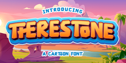 Therestone is a Cartoon Display Font that will make your designs look modern, unique and fun. It’s perfect for labels, quotes, posters, DIY projects, branding, packaging, greeting cards, websites, photos, photography overlays, signs, window art, scrapbooking, tags and so much more!
 - Retroid by Gleb Guralnyk,
$15.00 Hello! Introducing a vintage style font — Retroid. It's a pixelated old-school typeface that imitates 8-bit console graphics. Retroid font has multilingual support (check out a screenshot with available letters and signs). Thank you and wish you a peaceful sky!
 - Banzai Bros by Fenotype,
$20.00 Banzai Bros is a deadly efficient multidisciplinary all-caps assault font. It's highly recommended for posters, signs, flags & banners. Banzai Bros comes with a small set of ornaments. Available as a single font or in packs with other Fenotype fonts.
 - Romeline by Almarkha Type,
$22.00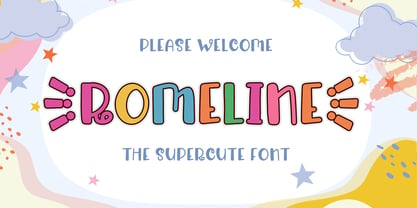 Rameline is a Supercute Display font that will make your designs look modern, unique and fun. It’s perfect for labels, quotes, posters, DIY projects, branding, packaging, greeting cards, websites, photos, photography overlays, signs, window art, scrapbooking, tags and so much more!
 - Chick Chack by Almarkha Type,
$23.00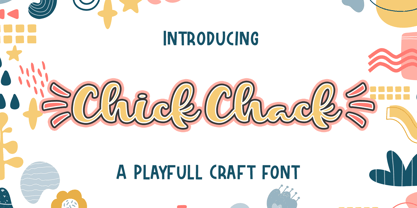 Chick Chack is a Playful Craft font that will make your designs look unique and fun. It’s perfect for labels, quotes, posters, DIY projects, branding, packaging, greeting cards, websites, photos, photography overlays, signs, window art, scrapbooking, tags and so much more!
 - Husky by Trim Studio,
$12.00 Husky is a sweet and playful handwritten font, clean and a little bit quirky, this font is the perfect fit for crafter and graphic artist to complete their design such as invitation, advertisement, poster, logo, birthday, product sign, and many more!
 - Splinter2 - Personal use only

- Zanky by Product Type,
$18.00 Introducing Zanky, the perfect solution for any project that requires a touch of retro, vintage, and classic display. With its unique condensed shape and stylistic set alternate, this font is the perfect addition to any design project. Zanky’s unique condensed shape ensures that it stands out in any design project, making it the perfect choice for anything from logos to posters. Additionally, its stylistic set alternate feature provides even more design flexibility, allowing you to create unique and eye-catching designs with ease. Whether you’re working on a vintage-inspired project or simply looking to add a touch of classic display to your design, Zanky is the perfect font for the job. Try it out today and see the difference it can make in your designs. What’s Included : - File font WOFF, WOFF2, CSS, HTML - All glyphs Iso Latin 1 - We highly recommend using a program that supports OpenType features and Glyphs panels like many Adobe apps and Corel Draw, so you can see and access all Glyph variations. - PUA Encoded Characters – Fully accessible without additional design software. - Fonts include Multilingual support
 - Baltra by Galapagos,
$39.00After researching the type styles contemporary graphic designers have been using over the past few years, I noticed a consistent use of Copperplate Gothic, and its derivative designs, for various corporate advertising campaigns. That level of usage gave me the inspiration to design a display font possessing subtle characteristics of Copperplate Gothic, and various Latin Condensed designs. The font I ended up designing was semi-condensed, with more contrast between thicks and thins than in Copperplate. Baltra also has a subtle flair in its otherwise traditional lowercase, while possessing a larger than average lowercase x-height. Copperplate Gothic, on the other hand, has minimal contrast and uses small capitals for its lowercase. After examining extensive type specimens from wood type, metal type, phototype and digital type, I was not able to find a single design possessing a majority of Baltra's characteristics. Consequently, I consider Baltra to be a truly unique design, sharing with Copperplate Gothic only its flairs on stems, and having only subtle characteristics in common with traditional Latin designs. - Gilam by Fontfabric,
$39.00 Gilam is a sans serif font with semi-condensed proportions. The typeface was based on the famous DIN but combines its popular neo-grotesque look with characteristics, such as the pointed edges in the “W” and “M” as well as the outward cut terminals, which gives a distinctive look to the modern geometric typeface. The complete set of 9 weights plus italics gives to designers the absolute freedom to create anything. Perfect layouts with blocks of text, headlines, motion graphics, logos, apps, and websites are just part of the intended usage of this versatile typeface. Features: • 765 glyphs in 18 styles; • Extended Latin, Cyrillic and Greek; • Geometric forms and low contrast; • Prominent x-height which makes it legible in a text; • Perfect for headlines and logos; • Suitable for web, print, motion graphics etc. • Semi-condensed proportion; • Advanced typographical support and OpenType features including case-sensitive forms, fractions, superscript and subscript characters, and stylistic alternates; • Complete set of figures - old style and lining figures, which come with proportional and tabular variation; Gilam means “joy of people” so that you can enjoy it!
 - Always by Scholtz Fonts,
$19.00 Always is an elegant script font in six styles. Always makes full use of extravagant ascenders and descenders, giving the font a generous, opulent appearance. To use the font to its best advantage, we suggest that the user allows a generous line spacing. (For example: use multiple line spacing of no less than 1.3 when using the MS Word application). Always comes in six styles, condensed light, light, condensed regular, regular, black and fat, giving the user enough variety for all possible uses. Use a combination of styles for product branding, book covers, greeting cards, wedding media, women’s advertising media. The Always combination will enable you to use different styles of the same font for headings, sub-headings and body text. Always makes use of OpenType features and includes a number of automatic and discretionary ligatures, giving the font a varied, handwritten effect. Always contains over 283 characters - (upper and lower case characters, punctuation, numerals, symbols and accented characters are present) as well as characters for ligatures and alternate characters. It has all the accented characters used in the major European languages.
 - FF Meta Hebrew by FontFont,
$79.99German type designer Erik Spiekermann, created this sans FontFont between 1991 and 2010. The family has 28 weights, ranging from Hairline to Black in Condensed and Normal (including italics) and is ideally suited for advertising and packaging, book text, editorial and publishing, logo, branding and creative industries, small text as well as web and screen design. FF Meta provides advanced typographical support with features such as ligatures, small capitals, alternate characters, case-sensitive forms, fractions, and super- and subscript characters. It comes with a complete range of figure set options—oldstyle and lining figures, each in tabular and proportional widths. As well as Latin-based languages, the typeface family also supports the Cyrillic, Greek, and Hebrew writing systems. FF Meta Variable are font files which are featuring two axis and have a preset instance from Hairline to Black and Condensed to Roman In 2011, FF Meta was added to the MoMA Architecture and Design Collection in New York. This FontFont is a member of the FF Meta super family, which also includes FF Meta Correspondence , FF Meta Headline , and FF Meta Serif . - Beatnik by Type Innovations,
$39.00 I was working at Bozell Worldwide, an advertising agency, on their yearly promotional pitch. An art director was looking for a condensed informal headline treatment to be used on one of the new ad campaigns. I took several different font designs and started to condense and scale the proportions in the hopes of finding several good solutions. They finally settled on a version of Times Roman, scaled horizontally to about 50 percent proportions. I liked the look so much that I later went back to the drawing board and refined the concept by adding slanted serifs and a varying alignment on all the letter forms giving the typeface a very casual and informal appearance. At about that time, I was reading a book by Jack Kerouac, and was so inspired by his writings on the ‘beat generation’ that I decided to name the font ‘Beatnik’. Afterwards, I added a set of true small capitals and old style figures. I'm currently working on additional weights and variations to expand this ‘hip’ new font series. Groovin' baby.
 - ITC Avant Garde Gothic by ITC,
$42.99 ITC Avant Garde Gothic is a font family based on the logo font used in the Avant Garde magazine. Herb Lubalin devised the logo concept and its companion headline typeface, then he and Tom Carnase, a partner in Lubalin’s design firm, worked together to transform the idea into a full-fledged typeface. The condensed fonts were drawn by Ed Benguiat in 1974, and the obliques were designed by André Gürtler, Erich Gschwind and Christian Mengelt in 1977. The original designs include one version for setting headlines and one for text copy. However, in the initial digitization, only the text design was chosen, and the ligatures and alternate characters were not included. The font family consists of 5 weights (4 for condensed), with complementary obliques for widest width fonts. When ITC released the OpenType version of the font, the original 33 alternate characters and ligatures, plus extra characters were included. ITC Avant Garde Gothic® font field guide including best practices, font pairings and alternatives. Featured in: Best Fonts for Logos, Best Fonts for Websites, Best Fonts for PowerPoints
 - Ateknov by Twinletter,
$17.00 Introducing Ateknov, a retro condensed font that embodies classic elegance. This font is perfect for designers looking for a touch of nostalgia in their work. Ateknov features a clean and polished design with sharp edges and a condensed appearance that makes it a great choice for headlines, logos, and branding. Ateknov comes equipped with alternate characters and ligatures, each with a unique and beautiful design that adds depth and character to your projects. The font also supports multilingual characters, making it accessible to a global audience. Whether you’re creating a vintage-inspired design or a modern twist on a classic aesthetic, Ateknov is a versatile font that will elevate your work to the next level. Download it today and start exploring the possibilities. What’s Included : - File font - All glyphs Iso Latin 1 - Alternate, Ligature - Simple installations - We highly recommend using a program that supports OpenType features and Glyphs panels like many Adobe apps and Corel Draw so that you can see and access all Glyph variations. - PUA Encoded Characters – Fully accessible without additional design software. - Fonts include Multilingual support
 - Corporative by Latinotype,
$26.00 The first typeface developed by Latinotype Team. Corporative is a semi serif font that has a marked personality and distinctive traits, what makes it suitable to be used at large text sizes.Since it is a condensed font, it can also be used in smaller sizes. Corporative and Corporative Sans come with the Latinotype’s standard set of 350 characters, making it possible to use the font in 128 different languages. Corporative provides users with a wide range of characters, weights and widths for every project. By combining different variants,designers can achieve the best results. The family consists of 64 fonts: a basic family that includes 8 weights plus italics, an alternative family of 8 weights with matching italics and 2 condensed families, one regular and one alternative, both with italics. Latinotype has added new faces to its team. Latinotype Team nowcomprises: Javier Quintana, César Araya, Bruno Jara, Luciano Vergara and DanielHernández. Corporative was created by Latinotype Team and developed by Javier Quintana and César Araya, under the supervision of Luciano Vergara, Miguel Hernández and Daniel Hernández.
 - Corporative Sans by Latinotype,
$26.00 Corporative Sans typeface is developed by Latinotype Team. Corporative Sans is the new version of Corporative. This font has a marked personality and distinctive traits, what makes it suitable to be used at large text sizes. Since it is a condensed font, it can also be used in smaller sizes. Corporative comes with the Latinotype’s standard set of 350 characters, making it possible to use the font in 128 different languages. Corporative provides users with a wide range of characters, weights and widths for every project. By combining different variants, designers can achieve the best results. The family consists of 64 fonts: a basic family that includes 8 weights plus italics, an alternative family of 8 weights with matching italics and 2 condensed families, one regular and one alternative, both with italics. Latinotype has added new faces to its team. Latinotype Team now comprises: Rodrigo Fuenzalida, César Araya, Bruno Jara, Luciano Vergara and Daniel Hernández. Corporative was created by Latinotype Team and developed by Javier Quintana, Rodrigo Fuenzalida and César Araya, under the supervision of Luciano Vergara and Daniel Hernández.
 - Mi Casa by FontMesa,
$25.00 Mi Casa is a new condensed version of our Home Style font which is a revival of an old 1800's classic ornate French font. This new 2021 condensed version takes this old classic to an all new level by adding small caps, italics and a new black version. Mi Casa is perfect for headlines and logos from advertising to product labels, t-shirt lettering and restaurant menus. Fill fonts are also part of this family, new to this font style is the half fill font for creating a two color effect on the letters, you'll need an application that works in layers to use the fill fonts in Mi Casa. The regular fill font for Mi Casa isn't meant to be used as a stand alone font so we've created a solid black version with thicker serifs on top and adjusted outlines throughout for a better appearance as a solo font. We hope you enjoy Mi Casa as much as we did making it. Mi Casa is a trademark of FontMesa LLC
 - Albireo Soft by Cory Maylett Design,
$25.00 Albireo Soft in a softer version of Albireo, released by Cory Maylett Design in 2019. The svelte sans-serif letterforms and rounded terminals give Albireo Soft a highly legible and informal look that's perfect for packaging, headlines, logos, brochures, digital use and anywhere else that needs a friendly condensed typeface. With a combination of seven weights in each of the three condensed widths, Albireo Soft will do the job when you need to squeeze many words into a limited amount of space. The fonts include the entire set of glyphs needed for all Western and Central European Latin-based alphabets. Meticulously crafted to ensure each glyph conforms to the highest possible quality standards, Albireo Rounded won't let you down. You may buy one font at a time or save money by purchasing packages consisting of the seven fonts in each width. Save even more by purchasing the entire Albireo Soft collection and, in addition to the 21 separate fonts, you'll receive a variable font that covers all the weights, widths and everything in between.
 - Verbatim by Monotype,
$25.99 This extensive 60-font type family was inspired by the best (and worst) of 1970s science fiction TV shows and movies. Verbatim aims to extract the essence of futuristic type from that era, add a dash of modern style and conjure a cinematic typeface for the 21st century. From the extremes of the thin condensed, all the way through to the black extended, Verbatim has the scope to add drama to your titles and headings, and finesse to your logo and branding projects. Distinguishing features include a large x-height and open counters that aid legibility. This typeface crosses a few boundaries of type specification in that it is both rounded and square, it is part geometric in construction with a touch of humanistic flair and stroke contrast – giving Verbatim a distinctive and confident air. Key features: • 6 weights in Roman and Oblique • 5 Styles – Condensed, Narrow, Regular, Wide, Extended • Small Caps and 7 Alternates • European Language Support (Latin) • 600 glyphs per font. See more detailed examples at the Verbatim microsite.
 - Anisette Std Petite by Typofonderie,
$59.00 Geometric font inspired by shop signs in 4 styles Anisette has sprouted as a way to test some ideas of designs. It has started with a simple line construction (not outlines as usual) that can be easily expanded and condensed in its width in Illustrator. Subsequently, this principle of multiple widths and extreme weights permitted to Jean François Porchez to have a better understanding with the limitations associated with the use of MultipleMaster to create intermediate font weights. Anisette built around the idea of two widths capitals can be described as a geometric sanserif typeface influenced by the 30s and the Art Deco movement. Its design relies on multiple sources, from Banjo through Cassandre posters, but especially lettering of Paul Iribe. In France, at that time, the Art Deco spirit is mainly capitals. Gérard Blanchard has pointed to Jean Francois that Art Nouveau typefaces designed by Bellery-Desfontaines was featured before the Banjo with this principle of two widths capitals. The complementarity between the two typefaces are these wide capitals mixed with narrow capitals for the Anisette while the Anisette Petite – in its latest version proposes capitals on a square proportions, intermediate between the two others sets. Of course, the Anisette Petite fonts also includes lowercases too. Anisette Petite, a geometric font inspired by shop signs in 4 styles So, when Jean François Porchez has decided to create lowercases the story became more complicated. His stylistic references couldn’t be restricted anymore to the French Art-déco period but to the shop signs present in our cities throughout the twentieth century. These signs, lettering pieces aren’t the typical foundry typefaces. Simply because the influences of these painted letters are different, not directly connected to foundry roots which generally follow typography history. The outcome is a palette of slightly strange shapes, without strictly not following geometrical, mechanical and historical principles such as those that typically appear in typefaces marketed by foundries. As an example, the Anisette Petite r starts with a small and visible sort of apex that no other similar glyphs such as n or m feature, but present at the end of the l and y. The famous g loop is actually inspired by Chancery scripts, which has nothing to do with the lettering. The goal is of course to mix forms without direct reports, in order to properly celebrate this lettering spirit. This is why the e almost finishes horizontally as the Rotis – and the top a which must logically follow this principle and is drawn more round-curly. This weird choice seemed so odd to its designer that he shared his doubts and asked for advise to Jeremy Tankard who immediately was reassuring: “Oddly, your new top a is fine, it brings roundness to the typeface, when the previous pushes towards Anisette Petite to unwanted austerity.” The Anisette Petite, since its early days, is a mixture of non-consistent but charming shapes. Anisette, an Art Déco typeface Anisette Petite Club des directeurs artistiques, 46e palmarès Bukva:raz 2001
 - Puma by Canada Type,
$24.95Based on Herbert Thannhaeuser's 1954 Kurier design, Puma is the digital version of what is possibly the friendliest yet least used heavy brush design. Aside from its utilitarian functionality as a poster and sign font, Puma includes some original and artistic shapes, such as the very gorgeous single-stroke take on the letter P, the humorous knot-and-dash Q, the happy fish-eye e, the casual single-looped f, and the welcoming g. Perfect for shop signs, posters, menu heads, children book covers, fun flyers, and loud but friendly messages altogether. The complete character set is complemented with a second font containing various letter alternates and ligatures. - Photo Developer JNL by Jeff Levine,
$29.00 An image found online of a vintage storefront sign for the Kraus Photo Shop was the inspiration for Photo Developer JNL, which is available in both regular and oblique versions. The sign featured a thick and thin Art Deco style lettering with an inline cutting through the thicker strokes. Before the advent of digital photography, and way before chain stores offered in-house processing, neighborhood photo labs were the only place for getting prints from your roll film (unless you wanted to send the film into Kodak for developing and printing). Customers of these stores could also purchase additional film, cameras and photographic accessories from the same location.
 - Retrolight by Almarkha Type,
$29.00 Introducing Neon Font called Retrolight A unique Fonts with Retro Style can make your logotype become more interesting. inspired by real world neon light signs, it features minimal letter forms with smooth rounded corners and, true to real neon tubes, strictly uses lines with open start and end points. This font is perfect for adding your own glowing light effects or can be used to actually design real world neon signs. Retrolight fonts is perfect for your project and allows you to create designs, headlines, posters, logos, badges, t-shirts and many more that are beautiful. It is also best used for posts, logos, posters, certificates, labels and more.
 - Tylaco by Alcode,
$20.00 Tylaco is a display typeface. Tylaco come with Regular style, it will make this typeface can be used in all design projects and works perfectly for pairing with script typeface or handmade fonts, Headlines, Posters, Packaging, T-shirts, Postcards, Invitation, Wedding Sign, Sign Painting, Signboard, and much more. Try Tylaco, enjoy the richness of OpenType features and let her fun and elegant excitement make you happy and enhance your creativity! You can use this font very easily. • Multilingual Support If you do not have programs that support OpenType features like Adobe Illustrator and CorelDraw X Versions, you can access all alternative flying machines using Font Book (Mac) or Character Map (Windows)
 - Millbrae JNL by Jeff Levine,
$29.00 In the city of Millbrae (just South of San Francisco in San Mateo County, California) stands an office building which formerly housed the Millbrae Theater. California has the distinction of preserving artifacts of its past, unlike many other portions of the US, and the perpendicular "Millbrae" sign with its neon tubes and Art Deco lettering is still attached to the renovated structure. Gene Gable (a friend of type designer Jeff Levine) took a photo of the sign and sent it along as simply an image of great lettering of the past to enjoy, but it triggered the inspiration to create the namesake font Millbrae JNL.
 - Avaneonz by Almarkha Type,
$29.00 Introducing Neon Font called Avaneonz A unique Fonts with Retro Style can make your logotype become more interesting. inspired by real world neon light signs, it features minimal letter forms with smooth rounded corners and, true to real neon tubes, strictly uses lines with open start and end points. This font is perfect for adding your own glowing light effects or can be used to actually design real world neon signs. Avaneonz fonts is perfect for your project and allows you to create designs, headlines, posters, logos, badges, t-shirts and many more that are beautiful. It is also best used for posts, logos, posters, certificates, labels and more.
 - Neonblitz by Almarkha Type,
$33.00 Introducing Neon Font called Neonblitz A unique Fonts with Retro Style can make your logotype become more interesting. inspired by real world neon light signs, it features minimal letter forms with smooth rounded corners and, true to real neon tubes, strictly uses lines with open start and end points. This font is perfect for adding your own glowing light effects or can be used to actually design real world neon signs. Neonblitz fonts is perfect for your project and allows you to create designs, headlines, posters, logos, badges, t-shirts and many more that are beautiful. It is also best used for posts, logos, posters, certificates, labels and more.
 - Kursivfraktur by RMU,
$25.00 Inspired by Rudolf Engelhardt's Journal-Kursiv, released by Ludwig Wagner, Leipzig, in 1913, Kursivfraktur was freshly drawn and redesigned, and comes as one of those rare beautiful italic blackletter fonts. This font contains the letter long s which can be reached in two ways. Either you use the OT feature historical forms, or you type the integral sign [ ∫ ] on your keyboard. There are two graphic elements implemented, a corner element and a straight element for framing. The corner element lies on the Product sign [ ∏ ], the straight element you will find on the pi-key [ π ]. Furthermore it is recommended to activate the discretionary ligatures OT feature.
 - Staincool by Viaction Type.Co,
$12.00 Staincool is a layered Font, with a retro style, and is inspired by the artist's sign painter style. There are 6 layers that are easy to use. Staincool developed from the Stengkol 04 font (https://www.myfonts.com/font/viaction-type/stengkol/) that is added to 3D fonts. This font is perfect for various design purposes such as labels, merchandise, packaging, logotype, sign and more. The Staincool font is perfect for modern & vintage themes by adjusting the desired color on the 3D layer. This font can be used in Adobe Illustrator & Adobe Photoshop. If you have questions & need help please contact us via message or email.
 - Acre by Jonathan Ball,
$24.00 Acre is a geometric sans-serif type family of eight weights that's both inspired by and named after my great grandfather, Tex Acre. Tex was an artist and sign maker whose handcrafted signs illuminated the roadsides of the American Midwest and typified mid-century Americana. Acre is a tribute to him, his work, and many of my favorite early 20th century geometric typefaces. With eight weights ranging from Thin to Black, Acre is an extremely versatile family that can be used for display, text, or anything in between. Acre offers full European language support plus many OpenType features such as tabular and oldstyle figures.
 - Zidler by MKGD,
$13.00 One of my all time favourite movies is Baz Luhrmann’s Moulin Rouge. In it, there’s a brief scene where the proprietor of the Moulin Rouge (Harold Zidler) signs away the deeds to the establishment. The actual signing of his signature is what motivated me to create this script font. Although it’s not an exact replica of the character’s hand, I like to think that it has the same crisp immediacy of the original. With its consistent oblique slant, narrow and long ascenders and descenders, and the occasional blobbing of letters, the overall effect, gives the appearance of a correspondence penned by lamplight while a storm rages outside.
 - Stacker by Almarkha Type,
$29.00 Introducing Neon Sci-fi Futuristic Font called Stacker A unique Fonts with Futuristic Style can make your logotype become more interesting. inspired by real world neon light signs, it features minimal letter forms with smooth rounded corners and, true to real neon tubes, strictly uses lines with open start and end points. This font is perfect for adding your own glowing light effects or can be used to actually design real world neon signs. Stacker fonts is perfect for your project and allows you to create designs, headlines, posters, logos, badges, and many more that are beautiful. It is also best used for posts, logos, posters, labels and more.
 - Neonlife by Popskraft,
$19.00 This font comes from the romance of 20th century tube signs that will likely disappear forever. But let's not be upset — the Neonlife font embodies not only the warmth and comfort of neon signs, but also the energy of a modern style. And welcome to New Neon Life! The font family contains 6 sizes to help you choose the best size for different occasions. Neonlife is a unique solution for cool typography, branding, headings, in short, everything that makes our world unique and special. Although this font is not designed for large amounts of text, all characters are perfectly balanced and can be used like any regular font.
 - Blacker Pro by Zetafonts,
$39.00 Blacker Pro is the revised and extended version of the original wedge serif type family designed by Cosimo Lorenzo Pancini and Andrea Tartarelli in 2017. Blacker was developed as a take on the style that Jeremiah Shoaf has defined as the "evil serif" genre: typefaces with high contrast, oldstyle or modern serif proportions and sharp, blade-like triangular serifs. Due to the high contrast in the design - slightly reminescent of didone typefaces - Blacker has been developed in two optical subfamilies. The display version offers tighter tracking, higher contrast and sharper corners for maximum effect at big sizes, while the text variant offers better readability and screen rendering at smaller sizes, with lower contrast and looser spacing. In the pro version, two additional condensed variant families have been added (condensed display and condensed text) allowing for more freedom and versatility in typesetting where space constraints are present. Also, three titling uppercase-only variants have been added, with a slightly extended feel, and two decorative subfamilies (inline and diamond). Each of these seven variants has been developed in six weights from light to heavy, with matching italics, for a total of 69 styles covering a wide range of editorial and advertising uses. All Blacker Pro feature a revised and extended character set covering over two hundred languages using the latin, cyrillic and greek alphabets. Open type features include small caps, positional numerals, fractions, superior & inferior figures, alternate forms, and an extended set of standard and discretionary ligatures. With its bold personality, Blacker aims to be a modern classic used for bold statements and self-conscious brands, making your text look great both on paper and on the screens.
 - Camy by Scholtz Fonts,
$9.50 I wanted to create a "handwriting" font which could be used professionally. I have often needed such a font with a variety of weights and styles for a particular project and have had to resort to mixing fonts, creating a rather messy, amateur job. Camy is named for a little village in South West France where I did much of the initial work on this font. Camy is ideal for contemporary display work, comes in ten styles, and has a contemporary appeal with its casual, easy to read letters. Camy was designed as a total professional package for designers looking for a handwritten font suitable for all kinds of contemporary display work: the idea being that once you have the Camy Professional Pack you don't have to waste time searching for other handwritten fonts. The Family: LIGHT -- NARROW - light weight, condensed width, delicate line -- MEDIUM - light weight, delicate line -- WIDE - light weight, expanded width, delicate line NORMAL WEIGHT -- NARROW - of medium weight and condensed width - perfect for limited space -- MEDIUM - of medium weight -- WIDE - of medium weight and expanded width BLACK - for best readability -- NARROW - condensed width for bolder statements in small areas without losing legibility -- MEDIUM - for bolder statements -- WIDE - expanded width for bolder statements FAT -- WIDE - for maximum impact Use a combination of styles for product branding, book covers, invitations, greeting cards. The Camy combination works well for both headings and body text. Camy contains over 250 characters - (upper and lower case characters, punctuation, numerals, symbols and accented characters are present). It has all the accented characters used in the major European languages.
 - Eastman by Zetafonts,
$39.00 Discover the complete Eastman type family: Eastman Grotesque and Eastman Condensed! Designed in 2020 for Zetafonts by Francesco Canovaro and Andrea Tartarelli with help from Solenn Bordeau and Cosimo Lorenzo Pancini, the original Eastman typeface family was conceived as a geometric sans workhorse family developed for maximum versatility both in display and text use. The original wide weight range has been complemented with three more additional widths, to give you maximum control over the appearance of text in your page. While Eastman Compressed and Eastman Condensed behave as space-saving condensed families, Eastman Grotesque adapts the family design style to humanist proportions. All share a solid monolinear design and a tall x-height that makes body text set in Eastman extremely readable on paper and on the screen. Influenced by Bauhaus ideals and contemporary minimalism, but with a nod to the pragmatic nature 19th century grotesques, Eastman has been developed as a highly reliable tool for design problem solving, and given all the features a graphic designer needs - from a wide language coverage (thanks to over one thousand and two hundred latin, cyrillic and greek characters) to a complete set of open type features (including small capitals, positional numbers, case sensitive forms). The most impressive feature of all Eastman fonts remains the huge choice of alternate characters and stylistic sets that allows you to fine-tune your editorial and branding design by choosing unique, logo-ready variant letter shapes. Don’t want to lose too much time with the glyphs palette? Use the Eastman Alternate weights, thought for display use and presenting a selection of some of the more eye catching & unusual letter shapes available for the family.
 - Bulluck by Patria Ari,
$12.00 Bulluck is a serif display typeface with strong characters to support your brand/project. Perfect for projects with subjects related to automobiles or outdoor activities. Bulluck can also be used for logos and branding, headlines, posters, signage, advertisements, printed quotes, product packaging, product designs, labels, photography, watermark, special events and more.
 - Kolesom by Frantic Disorder,
$12.00 Kolesom is bold display font that inspired from classic rusty stuff like old signage and poster. This typeface has various styles of font that includes Clean, Alt, Texture, and Western. I found it perfect for poster design, t-shirt design, and other display design needs. Works best in 100pt and above.
