8,661 search results
(0.028 seconds)
- Andron 1 Monetary by SIAS,
$79.00 Andron 1 Monetary is a special supplement font containing 120 monetarian and weight measurement characters, both historical and modern. It provides a most comprehensive repertoir of even older currency unit signs as testified in manuscripts and printed sources. Among the most recently launched national currency signs, the Rubel, Manat and Turkish Lira characters are present with their new Unicode values. – All glyphs are drawn in the classical Andron style and blend perfectly with all other Andron fonts. – This font is a valuable addition to your Andron library.
 - Kanona JNL by Jeff Levine,
$29.00Kanona JNL is modeled from one of the numerous alphabets created by the late Alf R. Becker for Signs of the Times magazine from the 1930s through the 1950s. Thanks to a wealth of source material provided by Tod Swormstedt of ST Media (and who is also the curator of the American Sign Museum in Cincinnati, Ohio), Jeff Levine has been redrawing many of these alphabets and presenting them in digital form. The original variations in letter widths from Becker’s hand-painted alphabet have been left intact. - VLNL Irish Stew by VetteLetters,
$35.00 Obviously the Irish Stew font finds its origin in Ireland. During a vacation in West Ireland Donald® fell in love with the famous local dish. In fact, he loved Irish stew so much he couldn't wait to create a font dedicated to the stew from Ballymaloe. He found the inspiration for this font on an old shop front sign somewhere in Dublin. The sign only contained a few characters, but the stew had given him more than enough energy and inspiration to complete the whole alphabet!
 - Beriot by Boyanurd,
$19.00 Beriot is a sans serif whose basics are condensed in Regular (Normal) weight, getting a lot of form inspiration from the topic also known as Steile Futura which is a letterform that Paul Renner himself explored in the mid-1950s, where shapes are constructed with little stress on modular squares but there are changes in certain parts so they become less modular. The Beriot family is available in 42 weights with matching slanted cuts, divided into 3 subfamilies: Condensed, Normal and Expanded. Each has been designed for a range of text sizes each, and already variable, allowing you to choose and make your own type of weight you like. OpenType Features are available in each of these font styles, including alternative characters, different numbers set and case-sensitive and there are additional symbols that make it the perfect choice for professional types of branding, digital design and editorial.
 - Velino Compressed Headline by DSType,
$50.00 Velino is one of our most complete type families. The serif version comes in two packages with three widths: Velino, Velino Condensed, and Velino Compressed. The display package contains high-contrast typefaces, with a modern flair—very feminine but with plenty of character, specially designed for fine print in big text sizes. The text package was designed for any running text. Its proportions and colors make it ideal for text, even in very difficult conditions such as newspaper printing. We also designed the perfect companion to this enormous type system: Velino Poster, a slab serif typeface with only one weight and its respective italic, but with plenty of muscle, for every time some extra strength is needed, such as setting very big text, magazine covers or newspapers’ special sections. Finally, we designed Velino Sans and Velino Sans Condensed to perfectly match the weight and proportions of Velino, all with matching italics.
 - Loventica by Second Son Radiance,
$19.00 Loventica - Beauty Fashion Serif - Chic and Elegant Font Loventica is a beauty fashion serif font with a touch of elegance and charm. With same height for uppercase and lowercase, you can mix and match as you wish. Comes with condensed alternates and symbols It is perfect for your upcoming projects such as luxury logo and branding, classy editorial designs, woman’s magazines, cosmetic brands, art gallery branding, boutique branding, stationery design, blog design, modern advertising designs, card invitations, art quotes, home decor, book/cover titles, special events, and more. Loventica also support multilingual! Features : Basic Latin A-Z and a-z Numbers Punctuation Symbols Opentype Features Condensed Alternates PUA Encode Multilanguage Support I really hope you'll get pleasure using Loventica font and it will be perfect for your daily design! Contact me with an inbox message If you have any issue or question. Thank you! Second Son Radiance Std
 - Fenomen Slab by Signature Type Foundry,
$35.00 The geometrical drawing of Fenomen Slab follows the guidelines set by our other font family Fenomen Sans. It is a perfect companion of Fenomen Sans, as well as being a standalone font family capable of delivering its own expression and aesthetics. The set contains four width proportions – Normal, SemiCondensed, Condensed and ExtraCondensed in eight weights ranging from Hairline to Black. Every font of the family contains four types of numerals, small caps, ligatures and contextual alternates. The typeface was developed between the years 2014–2017 and was subjected to a series of tests for the fluent legibility of all fonts even in extreme conditions. Narrow fonts provide this set with the maximum use including newspaper typesetting. The typeface has an elegant, delicate design in thin fonts and sufficient legibility in bold. Mutual contrast produces great creative tension. Font name acronyms described: SCN = SemiCondensed CN = Condensed XCN = ExtraCondensed
 - Velino Ultra by DSType,
$50.00 Velino is one of our most complete type families. The serif version comes in two packages with three widths: Velino, Velino Condensed, and Velino Compressed. The display package contains high-contrast typefaces, with a modern flair—very feminine but with plenty of character, specially designed for fine print in big text sizes. The text package was designed for any running text. Its proportions and colors make it ideal for text, even in very difficult conditions such as newspaper printing. We also designed the perfect companion to this enormous type system: Velino Poster, a slab serif typeface with only one weight and its respective italic, but with plenty of muscle, for every time some extra strength is needed, such as setting very big text, magazine covers or newspapers’ special sections. Finally, we designed Velino Sans and Velino Sans Condensed to perfectly match the weight and proportions of Velino, all with matching italics.
 - Ganges Slab by ROHH,
$40.00 Ganges Slab is a condensed slab serif typeface inspired by Central European advertising typography from late XIX century. It is a perfect match for Ganges Sans. The font has condensed proportions and original letter shapes. Ganges is designed mainly for editorial design, especially for display use, as well as short paragraphs of text. Its narrow proportion makes it very practical to use for posters and magazine covers. Characteristic letter forms fit great for branding, logo and packaging design. It is also a very interesting choice for websites and e-book headlines. Ganges Slab family consist of 27 fonts - 9 weight, 9 italics and 9 obliques. It supports extended set of latin languages, as well as broad number of OpenType features, such as case sensitive forms, standard and dicretionary ligatures, stylistic alternates, contextual alternates, lining, oldstyle and tabular figures, slashed zero, fractions, superscript and subscript, ordinals, currencies and symbols.
 - Keiss Title by DSType,
$50.00 The Keiss type family is our interpretation of the popular nineteen century Scotch Roman typefaces. We intended to keep a very classic approach while introducing a couple of new elements that differentiate this type family from it’s ancestors. This design, with short descenders and ascenders, along with three very distinct optical sizes makes this type family well suited for contemporary newspapers. The Title and Big versions range from Thin to Heavy, with matching italics, in order to be used in big sizes and stand out in the design. The Text ranges from Thin to ExtraBold and is a standalone type family for text usage, with narrow proportions and wider and open italics for improved text setting. The Condensed versions, ranging from Thin to Bold, don’t have italics, although they can be matched with the italics of the Title and Big versions, due to the fact they are very condensed.
 - Branding SF by Latinotype,
$29.00 Branding Super Family is an extension of the Branding project , including new variables that cater to a wide array of requirements, still maintaining its essence. It is a super family for modern needs! Additional to its particular design, different widths are included: now Branding Ultra Condensed is a reality. The project also considers a variety of alternate characters, making Branding Super Family a great tool for graphic designers and art directors. It is ideal for use in logotypes, isotypes, short texts, and others. Branding Super Family is a Sans Serif spurless font with medium-large x-height, straight curves and convex terminals. It has 7 weights and 4 widths that vary from thin to black, and from ultra condensed to medium, each with their matching italics. It also includes a set of 544 characters supporting 128 languages. OpenType characteristics include European accents, old style numbers and 4 sets of alternates.
 - Keiss Big by DSType,
$50.00 The Keiss type family is our interpretation of the popular nineteen century Scotch Roman typefaces. We intended to keep a very classic approach while introducing a couple of new elements that differentiate this type family from it’s ancestors. This design, with short descenders and ascenders, along with three very distinct optical sizes makes this type family well suited for contemporary newspapers. The Title and Big versions range from Thin to Heavy, with matching italics, in order to be used in big sizes and stand out in the design. The Text ranges from Thin to ExtraBold and is a standalone type family for text usage, with narrow proportions and wider and open italics for improved text setting. The Condensed versions, ranging from Thin to Bold, don’t have italics, although they can be matched with the italics of the Title and Big versions, due to the fact they are very condensed.
 - Velino Sans by DSType,
$55.00 Velino is the most recent of our Premium Typefaces. The serif version comes in two packages with three widths: Velino, Velino Condensed and Velino Compressed. The Display package contains high contrast typefaces, with a modern flair, very feminine but with plenty of character, specially designed for fine print in big text sizes. The Text package was designed for any running text. Its proportions and colors make it the ideal for text, even in very difficult conditions such as newspaper printing. We also designed the perfect companion to this enormous type system: Velino Poster, a Slab Serif typeface with only one weight and its respective italic, but with plenty of muscle, for every time some extra strength is needed, like setting very big text, magazine covers or newspapers’ special sections. Finally we designed Velino Sans and Velino Sans Condensed to perfectly match the weight and proportions of Velino, all with matching italics.
 - Atto Serif by Wilton Foundry,
$29.00I set out to design a contemporary font that is condensed with thick and thin strokes. The highly structured forms of this condensed font was made more interesting and softer by giving it a slightly calligraphic tone and by adding round corners. Atto's express purpose is to be both utilitarian, compact and technical but with a friendly face. The name "atto" was adopted since it refers to the measurement of "smallness" or detail. You will no doubt discover all the many pleasant nuances within Atto. Adopted in 1964, "atto" comes from the Danish "atten", meaning eighteen. Atto - (symbol a) a SI prefix to an unit and means that it is 10 to the power- 18 times this unit. Examples are one attosecond or one attometer/attometre. Atto is available in for Mac and Windows in Postscript, Truetype and Opentype. See also the companion font Atto Sans. - Velino Display by DSType,
$55.00 Velino is the most recent of our Premium Typefaces. The serif version comes in two packages with three widths: Velino, Velino Condensed and Velino Compressed. The Display package contains high contrast typefaces, with a modern flair, very feminine but with plenty of character, specially designed for fine print in big text sizes. The Text package was designed for any running text. It’s proportions and colors make it the ideal for text, even in very difficult conditions such as newspaper printing. We also designed the perfect companion to this enormous type system: Velino Poster, a Slab Serif typeface with only one weight and it’s respective italic, but with plenty of muscle, for every time some extra strength is needed, like setting very big text, magazine covers or newspaper’s special sections. Finally we designed Velino Sans and Velino Sans Condensed to perfectly match the weight and proportions of Velino, all with matching italics.
 - Velino Compressed Display by DSType,
$55.00 Velino is the most recent of our Premium Typefaces. The serif version comes in two packages with three widths: Velino, Velino Condensed and Velino Compressed. The Display package contains high contrast typefaces, with a modern flair, very feminine but with plenty of character, specially designed for fine print in big text sizes. The Text package was designed for any running text. It’s proportions and colors make it the ideal for text, even in very difficult conditions such as newspaper printing. We also designed the perfect companion to this enormous type system: Velino Poster, a Slab Serif typeface with only one weight and it’s respective italic, but with plenty of muscle, for every time some extra strength is needed, like setting very big text, magazine covers or newspaper’s special sections. Finally we designed Velino Sans and Velino Sans Condensed to perfectly match the weight and proportions of Velino, all with matching italics.
 - Golden Youth Font Duo by Set Sail Studios,
$14.00 Introducing the Golden Youth Font Duo; A stylish & modern harmony of sans & script typefaces. With a tall condensed sans-serif font and a free-flowing script companion, Golden Youth offers beautiful contrasting typography for a diversity of design projects, including; logos & branding, packaging design, social media posts, advertisements & product designs. Golden Youth contains 2 font files, designed to work as a perfect companions or simply as strong standalone typefaces; Golden Youth Script • A clean, free-flowing, monoline script font containing upper & lowercase characters, numerals and a large range of punctuation. Also includes a full set of alternate characters and a large range of ligatures, accessible by turning on 'Stylistic Alternates' and 'Discretionary Ligatures' using OpenType software. Golden Youth Caps • A tall condensed sans-serif font containing uppercase only characters, numerals and a large range of punctuation. Creates a perfect pairing contrast with the Golden Youth Script fonts.
 - Velino Headline by DSType,
$50.00 Velino is one of our most complete type families. The serif version comes in two packages with three widths: Velino, Velino Condensed, and Velino Compressed. The display package contains high-contrast typefaces, with a modern flair—very feminine but with plenty of character, specially designed for fine print in big text sizes. The text package was designed for any running text. Its proportions and colors make it ideal for text, even in very difficult conditions such as newspaper printing. We also designed the perfect companion to this enormous type system: Velino Poster, a slab serif typeface with only one weight and its respective italic, but with plenty of muscle, for every time some extra strength is needed, such as setting very big text, magazine covers or newspapers’ special sections. Finally, we designed Velino Sans and Velino Sans Condensed to perfectly match the weight and proportions of Velino, all with matching italics.
 - Velino Compressed Text by DSType,
$55.00 Velino is the most recent of our Premium Typefaces. The serif version comes in two packages with three widths: Velino, Velino Condensed and Velino Compressed. The Display package contains high contrast typefaces, with a modern flair, very feminine but with plenty of character, specially designed for fine print in big text sizes. The Text package was designed for any running text. It’s proportions and colors make it the ideal for text, even in very difficult conditions such as newspaper printing. We also designed the perfect companion to this enormous type system: Velino Poster, a Slab Serif typeface with only one weight and it’s respective italic, but with plenty of muscle, for every time some extra strength is needed, like setting very big text, magazine covers or newspaper’s special sections. Finally we designed Velino Sans and Velino Sans Condensed to perfectly match the weight and proportions of Velino, all with matching italics.
 - Velino Poster by DSType,
$55.00 Velino is the most recent of our Premium Typefaces. The serif version comes in two packages with three widths: Velino, Velino Condensed and Velino Compressed. The Display package contains high contrast typefaces, with a modern flair, very feminine but with plenty of character, specially designed for fine print in big text sizes. The Text package was designed for any running text. It’s proportions and colors make it the ideal for text, even in very difficult conditions such as newspaper printing. We also designed the perfect companion to this enormous type system: Velino Poster, a Slab Serif typeface with only one weight and it’s respective italic, but with plenty of muscle, for every time some extra strength is needed, like setting very big text, magazine covers or newspaper’s special sections. Finally we designed Velino Sans and Velino Sans Condensed to perfectly match the weight and proportions of Velino, all with matching italics.
 - Velino Compressed Ultra by DSType,
$50.00 Velino is one of our most complete type families. The serif version comes in two packages with three widths: Velino, Velino Condensed, and Velino Compressed. The display package contains high-contrast typefaces, with a modern flair—very feminine but with plenty of character, specially designed for fine print in big text sizes. The text package was designed for any running text. Its proportions and colors make it ideal for text, even in very difficult conditions such as newspaper printing. We also designed the perfect companion to this enormous type system: Velino Poster, a slab serif typeface with only one weight and its respective italic, but with plenty of muscle, for every time some extra strength is needed, such as setting very big text, magazine covers or newspapers’ special sections. Finally, we designed Velino Sans and Velino Sans Condensed to perfectly match the weight and proportions of Velino, all with matching italics.
 - Keiss Text by DSType,
$50.00 The Keiss type family is our interpretation of the popular nineteen century Scotch Roman typefaces. We intended to keep a very classic approach while introducing a couple of new elements that differentiate this type family from it’s ancestors. This design, with short descenders and ascenders, along with three very distinct optical sizes makes this type family well suited for contemporary newspapers. The Title and Big versions range from Thin to Heavy, with matching italics, in order to be used in big sizes and stand out in the design. The Text ranges from Thin to ExtraBold and is a standalone type family for text usage, with narrow proportions and wider and open italics for improved text setting. The Condensed versions, ranging from Thin to Bold, don’t have italics, although they can be matched with the italics of the Title and Big versions, due to the fact they are very condensed.
 - Circulo by MMD Fonts,
$6.29 Bound to rules, unbound in the usage. Hyper geometric, and minimal contrast. Circulo V1 is based on a font project I originally started because of a client I had. I wanted to create a display and text font for their product design brand, which is all about reducing the amount of necessary materials and production steps. Before I started the course at tipo-g it was called -“REDUCE“ and was more or less finished. The concept was based on the name. How far can letter shapes be reduced to their core geometric concepts and still be identified as letters? But in a way, it lacked a unique approach and was just a generic geometric Sans Serif with a lack of finesse. There was already a glimpse of characteristics visible which would later define Circulo V1. The high focus on geometric shapes was not of the same severity, and the angle on the stems was less intense. Those, as I call them, fake serifs turned out to be a significant factor in legibility and the characteristic of the font. Besides those changes and improvements, I decided to implicate a new feature to the concept, a condensed style. I quickly realised that it is impossible to keep my perfect circles and half-circles in this style without breaking my rules for the font. This „problem“ turned out to be the most crucial feature of the condensed set. Circular-based Letters will ignore the rules and boundaries of the condensed style and stay as they are. This feature allows the user to create a unique rhythm in their texts, and if you use the variable font, you can decide how intense this rhythm will be. In this situation, the user can choose which letters are allowed to keep their shapes and which will be put in their condensed corset. All, some or none of them, you decide.
 - Optima Nova by Linotype,
$57.99 With the clear, simple elegance of its sans serif forms and the warmly human touches of its tapering stems, the Optima family has proved popular around the world. In 2002, when it was finally possible to produce digital alphabets without technical limitations and compromises, and more than fifty years after the first sketches, an expansion and redesign of the Optima family was completed and released as Optima nova. Hermann Zapf and Japanese type designer, Akira Kobayashi, collaborated on the project, which included re-working of the existing weights and the addition of several new weights: small caps, old style figures, light, heavy, and condensed. The original Optima was never manufactured with a real italic, only an oblique version of the roman. Optima nova has a complete range of beautifully designed real italics; the new italic forms, of the e, f and g are especially notable. The titling face includes capital letters with special and unusual letter combinations and ligatures, making it an excellent choice for headlines, logos and advertising purposes. Optima continues to be an all-purpose typeface; and Optima nova works for just about anything from book text to signage. Optima Nova® font field guide including best practices, font pairings and alternatives.
 - Aukim by AukimVisuel,
$20.00 Aukim is an exceptional, unique and ligature-rich font that gives a new look to your texts. It is a more text-oriented font and thanks to its OpenType features, it becomes versatile. It is available in 3 sub-families (condensed, normal and extended) for a total of 54 fonts. There are 9 weights with their real italics. It has 886 glyphs, 107 uppercase and 65 lowercase ligatures per font. It also offers a wide range of languages, from Latin to Cyrillic, as well as powerful OpenType features such as meticulously and professionally maintained kerning, stylistic variations, swashes, highly distinctive ligatures, old-fashioned tabular figures, fractions, denominators, superscripts, unlimited subscripts, arrows and much more to satisfy the most demanding professionals. On the one hand, it has rounded curves with very open endings that make this font family noble, friendly and contemporary and on the other hand very useful for writing titles on any medium. Perfectly suitable for graphic design and any display use. It could easily work for web, signage, corporate design as well as editorial design. Aukim is a cool, wonderful, elegant, bold and fun display font. It can easily be paired with an incredibly wide range of projects, so add it to your creative ideas and notice how it makes them stand out!
 - FF Sizmo by FontFont,
$50.99 FF Sizmo™ is available in two flavors. One is an honest, industrial strength, somewhat condensed, sans serif family. The other builds on the first, and is a display design with horizontally connecting baseline strokes. The five weights of basic the FF Sizmo typefaces are ideal for print and digital projects. Character spacing is generous, counters are open and apertures are wide and clear. Banners, navigational links, sub heads, and short blocks of contextual copy are natural on-screen uses for the design. Print projects from branding to way-finding also fall easily into FF Sizmo’s range of applications. The “line” versions of FF Sizmo can be arresting stand-alone typefaces – or distinctive complements to the basic roman and italic designs. In either instance, the line designs make powerful statements in headlines, subheads, posters and cover art. OpenType® fonts automatically insert beginning, middle or ending line element characters into the copy. Drawn by Verena Gerlach, both designs were inspired by the same source, a commercial signage system that enabled quick and easy copy changes. “The idea for the typeface,” explains Gerlach, “is a housing complex index board, on which movable white plastic capital letters were fixed by a thick line to the wooden board. This line is an important part of the font’s appearance.”
 - Pitkin JNL by Jeff Levine,
$29.00Borrowing from the 1940s, and inspired by printed text found in an old catalog, the slightly imperfect letterforms of Pitkin JNL emulate the hand-lettered look of signs and show cards. - Tant Gertrud by Cercurius,
$19.95 A cross-stitch font based on a classical pattern, including capital and lower-case letters. It is suitable for posters, signs, ads and greeting cards in the Thanksgiving and Christmas season.
 - FloriGlyphos by Sea Types,
$15.00 Built from the petroglyphs found on the island of Santa Catarina - Brazil. With elemental geometric signs and figurative human representations. It is a printer with a decorative characteristics of Art Deco.
 - Clarence Alt by RodrigoTypo,
$25.00 It is a new version of Clarence, with very noticeable changes, very funny and informal signs. It also contains different variants like Shine, Extrude and you can combine them enjoy it! :)
 - Moving Van JNL by Jeff Levine,
$29.00Moving Van JNL is a classic sign painter's block Roman with angled [instead of rounded] corners and slab serifs. This style of lettering was most popular in the 1920s and 1930s. - Crispy Blue by Bogstav,
$14.00 Crispy Blue is handmade, using a blobby brush. Inspired by a clumsy sign I saw the other day: full of blobby lines and uneven strokes - but full of life and personality!
 - Quiroga Serif Pro by TipoType,
$29.00 Quiroga Serif began in 2007 with the name Quadratta Serif. This typography was designed for continuous text, legible at medium and small sizes, with great saving of space, optimized for 6, 8, 10 and 12 points. The morphology is a mix between tradition and innovation; it has a vertical axis, thick serifs, tall x-height, light modulation and a lot of internal space between letters: key to improve legibility at small sizes. Formally, my idea was to make a serif type that had a unique color, this is visible due to the light modulation. This is also complemented with the incorporation of not common, alternative signs. Some parts of the letters that are usually curb or diagonal where made horizontal (for example: a, q, p, etc.), this makes the eye of each character to be wide and unique. The serifs (wedge type) suffered diverse variations during the process. At the begining they where thicker and ended vertically, but this caused a great deal of printing errors. And so we decided to modify them by giving them an angle to avoid visible errors in medium and small sizes. The ch, and ll ligatures where rescued because they are a part of our current spanish alphabet. The historic ligatures and stylistic alternates give different options to users who want different alternatives within a text. The accentuation signs were composed in a middle line above all signs to avoid visual shock. We also gave plenty of importance to small caps numbers, mathematical signs and currency signs so that the could interact well.
 - Shpinoza MF by Masterfont,
$59.00 A practical font family with 5 weights for all your day by day design needs: headlines, body text, signage etc. High legibility at small sizes. An extended sans serif typeface with rounded endings that provides unique softness appearance without losing legibility.
 - Quintton by TypoBureau Studio,
$15.00 Quintton script is a casual clean brush stroke font, perfect for logo design, branding, invitations, t-shirts print, mock up, magazines, signage and so much more. With its handmade feel, Quintton is perfect for your upcoming projects so don't miss out.
 - Unholy by Natural Ink,
$12.00 Unholy Script is a modern calligraphy design, including Regular. This font is casual and beautiful with swash. Can be used for various purposes. such as logos, product packaging, wedding invitations, branding, headlines, signage, labels, signatures, book covers, posters, quotes, and more.
 - Ginko by Monotype,
$29.99Ginko is a capitals only display font with an obvious Asian influence. The characters are formed with short tapered strokes, reminiscent of those produced by a broad pen. An ideal face for signage, menus, advertising, wherever an Asian feel is required. - Twilight by Natural Ink,
$12.00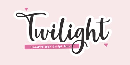 Twilight Script is a modern calligraphy design, including Regular. This font is casual and beautiful with swash. Can be used for various purposes. such as logos, product packaging, wedding invitations, branding, headlines, signage, labels, signatures, book covers, posters, quotes, and more.
 - Darbuka MF by Masterfont,
$59.00 A practical font family with 4 weights for all your day by day design needs: headlines, body text, signage etc. High legibility at small sizes. An extended sans serif typeface with rounded endings that provides unique softness appearance without losing legibility.
 - Manila by Sulthan Studio,
$9.00 Sans serif font family with a minimalist style has 6 thickness styles, I hope this will please you in preparing your work with this elegant font. which can be used in various projects, wedding invitations, magazine headlines, social networks, signage, etc.