3,822 search results
(0.034 seconds)
- The font "Barber Shop" by Last Soundtrack is a distinctive display typeface that encapsulates the nostalgic essence of traditional barber shops with a modern twist. Its design is reminiscent of the c...
- MVB Celestia Antiqua by MVB,
$39.00Mark van Bronkhorst designed MVB Celestia Antiqua at a time when font choice was limited. Design was characterized by overuse of the few fonts that came with laser printers. A rustic typeface, recalling the roughness and irregularity of pre-digital printing, was a response to the cold crispness of DTP. MVB Celestia Antiqua holds its own among a large group of other “weathered” serif fonts, in part due to the size of the family: three weights, small caps, italics, and two titling styles. But it's also successful because it's simply drawn well, the contours only as rough as they need to be, enabling text at any size, large or small. - 1902 Loïe Fuller by GLC,
$45.00 This script font was inspired by the 1900s Art Nouveau style, in tribute to the well known American dancer Loïe Fuller. This font is specially developed for the OpenType possibilities. The TTF and OTF versions contain, besides all accented Western European Latin characters and ligatures, small caps, contextual alternates, more than seventy titling alternates, and others... It is used as variously as web-site titles, posters and fliers design or greeting cards, all various sorts of presentations, menus, certificates, letters. This font supports very strong enlargements as well as small sizes. When printed, it remain perfectly legible and elegant from 7 pts even if using an ordinary inkjet printer .
 - 1790 Royal Printing by GLC,
$38.00 From 1702 to 1811 the French "Royal", then "Imperial", Printers, neglected Garamond and Fournier's designs and used only the font called "Romain du Roy", carved (1693 to 1723) by Philippe Grandjean by order of the king Louis XIV. 1790 Royal Printing was inspired by various variants of Romain du Roy that were in use during this period. Our sources were mainly official and legal documents printed in the late royal period, and in the beginning of the French revolution. There was no bold style. The 1790 Royal Printing Caps fonts contain small caps, plus titling caps for headlines as 1790 Royal Printing capitals are intended to be used preferably for text.
 - Anele Pro by Ole Sondergaard,
$14.28 Anele is a classic grotesque in the bedt sense of the word in 5 weights and Italic that communicates in 140 languages. The font is created by the danish designer Ole Sondergaard who is also behind the award-winning FF Signa super family.
 - Tambau by Tipogra Fio,
$30.00 Tambau is a display typeface crafted by Matheus “Fio” Gonçalves, a Brazilian design student, still in college, inspired by Brazilian concert urban posters and wood type that I saw at the Oficina Tipográfica São Paulo. The font was first made for a magazine project in design school, making it beautiful on giant pages headlines, billboards, signs, etc. There’s no lowercase, the character set is dramatic and objective. The uppercase is actually expanded letterforms causing some eyes and breathing paths to the very condensed and very modular glyphs, which creates a quite interesting striped texture between form, counterform and spacing. The lots of ligatures come to give it more closure between the letters, when they try to form blank spaces. So do the diacritics, fitting in the space given to them by the dynamic letterforms, making dense rectangular blocks. You may use Tambau as big as you can or do a high tracking to it and still it will be pretty. The titles can be dynamic, just condensed or just large. It’s on your own. Don’t be afraid to play with Tambau, it’s an alive typography. Curiosity: For the magazine in design school, the pilot project of Tambau was cut in a MDF board, to print it with texture and paint. Later was added more characters, languages and special glyphs to it. Set: Tambau is a singular font typeface, with extended and condensed characters, numbers, ligatures, punctuation and symbols for Basic, Western, Central and South Eastern Latin languages.
 - Ambroise Std by Typofonderie,
$59.00 An exquisite Didot font in 18 series Ambroise is a contemporary interpretation of various typefaces belonging to Didot’s late style, conceived circa 1830, including the original forms of g, y, &; and to a lesser extent, k. These unique glyphs are found in Gras Vibert, cut by Michel Vibert. Vibert was the appointed punchcutter of the Didot family during this period. It is the Heavy, whom sources were surest that Jean François Porchez has been used as the basis for the design of the typeface family. In the second half of the 19th century, it was usual to find fat Didots in several widths in the catalogs of French type foundries. These same typefaces continued to be offered until the demise of the big French foundries in the 1960s. Ambroise attempts to reproduce more of what we see printed on paper in the 19th century; a more accurate representation of Didot punches. So, the unbracketed serifs are not truly square straight-line forms but use tiny transitional curves instead. The result on the page appears softer and less straight, particularly in larger sizes. The illustrious Didot family of type founders and printers Every variation of the typeface carries a name in homage to a member of the illustrious Didot family of type founders and printers. The condensed variant is called Ambroise Firmin. The extra-condensed is called Ambroise François. Ambroise Pro brought back to life: fifteen years in the making! Club des directeurs artistiques, 48e palmarès Bukva:raz 2001
 - 1510 Nancy by GLC,
$20.00 This set of decorated initial letters was inspired by those used in 1510 in Nancy (France, Lorraine) for printing of "Recueil ou croniques des hystoires des royaulmes d'Austrasie ou France orientale[...]" Author Symphorien Champion, unknown printer. There were three sorts of initials family, but only one complete and clear, except a very few characters. The printer used some letters to represent others, as V, turned over to make a A, D to make a Q, M for E, So, the reconstruction was a little less difficult. Thorn, Eth, L slash and O slash were also added. The original font's letters was only drawn in white on a black background only, but it was tempting to propose a negative version in black on white. A few letters have multiple appearance, but only the A was clear enough to be reproduced. It can be used as variously as web-site titles, posters and flyer design, publishing texts looking like ancient ones, or greeting cards, all various sorts of presentations, as a very decorative, elegant and luxurious additional font... This font supports strong enlargements revealing its fine details and remaining very smart. Its original medieval height is about one inch equivalent to about three to four lines of characters. This font may be used with all our blackletter fonts, but as well with "1543 Humane Jenson", "1557 Italic" and "1742 Civilite", without any fear about anachronism.
 - Alpha Flight Solid - Unknown license

- Alpha Flight Small Caps - Personal use only

- Food Doodles by Outside the Line,
$19.00 A playful dingbat/picture font of what else but food. Each tiny illustration is offered as a line drawing and a reverse. Great for menus or to add a little fun to inter office communications. Use the pickle as a header for 911 memos.
 - Crimson Skyline by Hanoded,
$15.00 Crimson Skyline is a thin brush font. I used a pencil and Chinese ink to paint the letters. Crimson Skyline comes with double letter ligatures for the lower case letters. And the name? Well, it just has a nice ring to it. That’s all!
 - Kind Type by Letters&Numbers,
$28.00 Kind Type is based on watercolor painted letters. Open, bold strokes with rounded terminals make it a very legible typeface even at small size. Kind Type has a soft, friendly character with a distressed edge. It is suitable for short paragraphs, captions or headings.
 - Cocobella by Cultivated Mind,
$29.00 Cocobella is a beautiful chic and elegant hand painted font. The characters are uneven which gives Cocobella an edgy unique look. Cocobella will work best for clothing brands, fashion magazines, advertising, books, greeting cards, invitations, weddings and any time you feel sophisticated and chic.
 - Kertayasa by Akufadhl,
$25.00 Kertayasa is a layered typeface inspired by an old signage and vintage letter painting. It consists of 10 layers, a wide support of latin languages, and some alternates. You will imbue beautifully vintage display typography in anything – including editorial and packaging – which you might create.
 - Delabasto by Seniors Studio,
$15.00 Delabasto is contemporary brush font, with the look of a stylish face. were painted on paper and carefully made into a font. can be used for stationery, fashion, logo, merchandise, books, clothing, magazines, cover artwork etc. Delabasto includes several ligatures, alternates and international support.
 - Posterizer KG Sketch by Posterizer KG,
$30.00 Posterizer KG Sketch is basically a drawn version of Egyptian Slab Serif font Posterizer KG. Posterizer KG Sketch, is useful for some themes like music, painting, party, food, nature, kids... and many other funny and creative things. Contains all the Latin and Cyrillic glyphs.
 - Rase Nicolous by Graffiti Fonts,
$24.99 Rase Nicolous is a tall, handwritten graffiti font built to emulate a particular category of modern American, west coast graffiti styles. The varied stroke width & rough edges can produce the look of a number of different writing implements, paint brush, pencil, marker, chalk etc.
 - Snowy Wonderland by Mvmet,
$15.00 Snowy Wonderland is perfect choice display font for winter and Christmas themed designs. You can use it for anything ranging from t-shirts, book designs, and greeting cards to stickers and posters, or anything that needs a casual touch, it will be your perfect font to pick. Fall in love with its incredibly versatile style, and use it to create lovely designs!
 - Icing by Great Lakes Lettering,
$24.95 Icing is a font based on a naive, illustrated handwriting that can be used on a daily basis. It is a delicate, handwritten front with a somewhat masculine feel which mimics the natural stroke of pointed pen calligraphy. Icing embodies a folksy feel that brings true character to any design. Purchase it together with its extended family Frosted in our Winter Mix Package!
 - Christolas Gift by Ake,
$12.00 Christolas Gift is a delightful display font that uses the magic of the winter holidays to bring joy to the ones who use it. Its playful style makes it a perfect choice for a variety of products. You can use it with confidence on greeting and holiday cards, quotes. children’s books and activities, logos, mugs, gift bags, and many more.
 - Christmas Sundaylab by ahweproject,
$14.00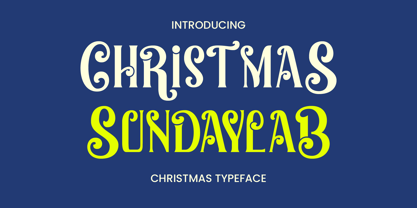 Christmas Sundaylab is a festive and very classy display font. It’s ideal for any of your winter vacation creations, so add it to your designs and bring them to life! Christmas Sundaylab is perfect for branding projects, logo, wedding designs, social media posts, advertisements, product packaging, product designs, label, photography, watermark, invitation, stationery and any projects that need handwriting taste.
 - Your Everything by Yoga Letter,
$15.00 "Your Everything" is a very beautiful and unique calligraphy font. This font is decorated with a unique and attractive butterfly. This font is perfect for valentine, christmas, winter, wedding, photography, promotion, and others. The decoration on this font is very easy to use, because it has been specially designed and there are instructions for its use in the preview. Thank you:)
 - Murisa Alexenia by Murisa Studio,
$10.00 Have you ever wanted a pattern in your font?, so it will look unique and attractive?. We present to you the Alexenia font. Murisa Alexenia is a font inspired by fallen leaves in winter. A font full of aesthetics in it. A font that will take you into a calming atmosphere. Use this font in your best design, and feel the sensation..
 - Salzburger Plakat NF by Nick's Fonts,
$10.00A poster by Otto Baumberger for an Austrian winter sports festival in 1907 inspired this charming confluence of medieval and Art Nouveau influences. As such, its appeal is timeless, and well suited for storybook romances of all stripes. Both versions of the font include complete Latin 1252, Central European 1250 and Turkish 1524 character sets, with localization for Moldovan, Romanian and Turkish. - Viva Beautiful by Cultivated Mind,
$19.00 Viva Beautiful is a lovely hand painted brush script. Viva Beautiful includes two script styles (Regular or B) and an all caps font. Both scripts come in a basic or pro version. Viva Beautiful Pro and Viva Beautiful Pro B include opentype alternates and common ligatures. Try the alternates and ligatures to give your designs a realistic hand painted look. Viva Beautiful and Viva Beautiful B include opentype ligatures. The all caps font is a basic version and pairs beautifully with any Viva script. This brush script family works best for fashion, beauty products, food, apparel and magazines. Viva Beautiful could also be used for film, television, marketing, advertising and websites. Bring beauty to your designs with Viva Beautiful!
 - TF Hustler Blood by Teenage Foundry,
$19.00 TF Hustler Blood Graffiti Font - a unique and exciting design that is sure to add a splash of creativity to your projects! Our font features a monoline style that is complemented by a vibrant splash of paint, giving your designs a unique and eye-catching look. we've also included several alternative that are perfect for supporting the graffiti style. These alternative give you even more flexibility and allow you to create designs that are truly unique and individual. The monoline style gives the font a clean and modern look, while the splash of paint adds a touch of creativity and spontaneity. Features: Uppercase, Lowercase, Numeral, Punctuation & Multilingual. For any questions please contact me 🙂 Thanks!
 - Material by Rocket Type,
$20.00 Who made this mess! Material is quintessential paint brush font fun. A little bit grunge, little bit 80s chic. Material is rated R for adult content and violence, violence to the american alphabet. This font soars just like KITT in Knight Rider. Part virtuoso part New Kid On The Block. Feels like you’re painting those letters on yr’ own self! Anytime you need to make a little mess and really express yourself choose Material. This font will really give your designs some distressed authenticity. Material is great for billboards, t shirts or video productions. It’s full of smudgy love, it’s loud and is likely to offend but what better way to give your designs that highly sought after ‘edge’.
 - Quitle by Slide Shoot,
$10.00 Quitle Sans Serif is a an elegant and smooth combine typeface regular and italic sans serif font. He has a beautiful character. It fits perfectly with invitation card designs, company logos, movie titles, movie names, business cards, book titles, brand names and various other designs. Quitle Sans Serif is a subtle sans serif font that exudes sophistication and elegance. Its stylish alternations and ligatures make this font the perfect partner for any project.
 - DT Hand Draft by Dragon Tongue Foundry,
$9.00 Hand Draft is hand crafted to emulate both the early printer’s serif font and/or a hand-drawn version of an early Serif font, using either a felt or round nibbed pen. Carefully designed to recreate a sturdy Sans Serif font with just the right amount of artistic imperfection, in three styles: outlined, hatched, and solid. A little funky and slightly grungy, this hand-drawn font is intentionally not quite perfectly rendered.
 - Prosaic Std by Typofonderie,
$59.00 A Postmodern vernacular sanserif in 8 fonts Prosaic designed by Aurélien Vret is a Postmodern typographic tribute to the french vernacular signs created by local producers in order to directly market their products visible along the roads. These signs drawn with a brush on artisanal billboards do not respect any typographic rules. The construction of these letterforms is hybrid and does not respect any ductus. Nevertheless the use of certain tools provokes a certain mechanism in the development of letter shapes. It’s after many experiments with a flat brush, that’s these letterforms have been reconstructed and perfected by Aurélien Vret. This is the starting point for the development of an easily reproducible sanserif with different contemporary writing tools. From non-typographical references of Prosaic towards readability innovation The influence of the tool is revealed in the letterforms: angular counterforms contrasting to the smoothed external shapes. This formal contrast gives to Prosaic a good legibility in small sizes. These internal angles indirectly influenced by the tool, open the counterforms. In the past, to deal with phototype limitations in typeface production, some foundries modified the final design by adding ink traps. In our high resolution digital world, these ink traps — now fashionable among some designers — have little or no effect when literally added to any design. Should one see in it a tribute to the previous limitations? Difficult to say. Meanwhile, there are typeface designers such as Ladislas Mandel, Roger Excoffon, and Gerard Unger who have long tried to push the limits of readability by opening the counters of their typefaces. Whatever the technology, such design research for a large counters have a positive impact on visual perception of typefaces in a small body text. The innovative design of counter-forms of the Prosaic appears in this second approach. Itself reinforced by an exaggerated x-height as if attempting to go beyond the formal limits of the Latin typography. It is interesting to note how the analysis of a non-typographical letters process has led to the development of a new typographic concept by improving legibility in small sizes. Disconnected to typical typographic roots in its elaboration, Prosaic is somewhat unclassifiable. The formal result could easily be described as a sturdy Postmodern humanistic sanserif! Humanistic sanserif because of its open endings. Sturdy because of its monumental x-height, featuring a “finish” mixing structured endings details. The visual interplay of angles and roundness produces a design without concessions. Finally, Prosaic is Postmodern in the sense it is a skeptical interpretation of vernacular sign paintings. Starting from a reconstruction of them in order to re-structure new forms with the objective of designing a new typeface. Referring to typographic analogy, the Prosaic Black is comparable to the Antique Olive Nord, while the thinner versions can refer to Frutiger or some versions of the Ladislas Mandel typefaces intended for telephone directories. Prosaic, a Postmodern vernacular sanserif Prosaic is radical, because it comes from a long artistic reflection of its designer, Aurélien Vret, as well a multidisciplinary artist. The Prosaic is also a dual tone typeface because it helps to serve the readability in very small sizes and brings a sturdy typographic power to large sizes. Prosaic, a Postmodern vernacular sanserif
 - Arlette by TypeTogether,
$49.00 Pilar and Ferran based Arlette on the fast stroke of one letter from a Roger Excoffon family, but along the way they abandoned that starting point in favour of experimentation. Many sans serifs are like a svelte black dress: functional, beautiful, and the unfussy outfit for a nice evening get together. The Arlette family isn’t like this. It’s a stunner — an incandescent reimagining of what defines a sans and how it can look. Arlette explores the boundaries of the sans serif landscape and returns with forms developed from gestural vigour. Thinking of it as “painterly” may at first seem to fit, but it underestimates Arlette’s ability to master an unseen world of countless emotions and physical applications: magazines, branding, editorial, teen and young adult works, book covers, and a host of products and packaging whose content will be amplified with Arlette’s voice. Not only does Arlette use its eight weights plus italics to speak in Latin-based scripts, it is also fluent in Thai and has six weights (hairline through bold) with which it meets that challenge, whether in text or display. Arlette Thai’s modern nature is seen in two features for the script. One is the decorative Thai characters that are based on original palm leaf manuscripts. Another is a version of the Latin numerals adapted to the height of the script due to their wide use in Thailand. Arlette Thai has been meticulously developed, including contextual kerning to avoid mark clashes. Arlette’s OpenType capabilities include mathematic and scientific figures, positional forms, pointers, arrows, and oldstyle, lining, and tabular lining numerals. In addition to all this, it’s packed with swashes and swash ligatures in both scripts for enthusiastic typesetting. Because it pushes experimentation without compromising readability, both Arlette Thai and Latin are surprisingly legible in small sizes and arrestingly beautiful when their details can be seen.
 - The WetPaint font, conceived by Richard William Mueller, is a dynamic and lively typeface that emulates the appearance and energy of hand-painted brush strokes. Its distinctive character is derived f...
- Cuckoo Fat by Very Good Fonts,
$19.00Cuckoo Fat was first seen in 1988 when I painted it on a record shop's window. Since then this hand lettered font has been there and done that. Cuckoo Fat is a loud and proud, classic and informal display font designed to work well on any job. - Visual Fantasy by Kitchen Table Type Foundry,
$15.00 Visual Fantasy is a great, all caps display font. It was based on an old font of mine called Plakkaat, which was made using a flat brush and acrylic paint. Visual Fantasy is great for poster work, book covers and product packaging. Comes with extensive language support.
 - HT Motel by Dharma Type,
$19.99 A handsome font, perhaps a little classical. Regularly-connected script, so it’s legible but also memorable font. Holiday Type Project offers retro hand drawing scripts. Inspired by retro script on shopfront lettering, wall paint advertisements in Italy around 1950s. Check out the script fonts from Holiday Type!
 - Summertime Breeze JNL by Jeff Levine,
$29.00 The opening title sequence for the 1958 film “The Long, Hot Summer” was hand lettered in a free-form style as if painted with loose paintbrush strokes. This served as the model and inspiration for Summertime Breeze JNL, which is available in both regular and oblique versions.
 - Picture this: the font Chow Fun comes sauntering into the room, a masterpiece cooked up by the ingenious Harold Lohner. It's like that one friend who's been around the world, dabbles in everything co...
- Lettre by Latinotype,
$19.00 Lettre is a geometric serif font designed by Pablo Sinn. Thanks to its imperfections, this font looks like it is hand-lettered. Lettre brings back nostalgic feelings of mechanical typewriter characters and recovers the essence of the rustic and natural, what makes it a very modern typeface.
 - Art Museum JNL by Jeff Levine,
$29.00 Art Museum JNL is yet another take on the classic Art Deco "solid letter" fonts that emulate the style of Futura Black. This version comes to you through the courtesy of a vintage WPA (Works Progress Administration) poster promoting national parks and Winter sports. Take note of the unusual inverted middle crossbar on the 'E' and 'F' as inspired by the poster's hand lettering.

