9,716 search results
(0.013 seconds)
- Skammefy by Andreas Søren Johansen,
$69.00 Skammefy holds a detailed set of letters, that are intended to be both readable when small - and charismatic when large. Strong details of letters like e, a, g, f, y draws attention to headlines, signs or wherever it might be used.
 - Bella Ciao by Almarkha Type,
$23.00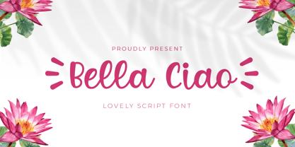 Bella Ciao is a Lovely Script font that will make your designs look unique and fun. It’s perfect for labels, quotes, posters, DIY projects, branding, packaging, greeting cards, websites, photos, photography overlays, signs, window art, scrapbooking, tags and so much more!
 - Sweet Purple by Almarkha Type,
$29.00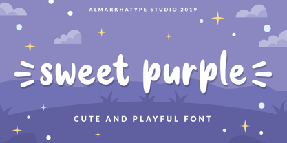 Sweet Purple – fun font that will make your design looks modern, unique and fun. Perfect for labels, quotes, posters, DIY projects, branding, packaging, greeting cards, websites, photos, photography, signs, window art, scrap booking, tags and so much more! Thank You
 - Flared by Graphicfresh,
$25.00 A groovy, bold typeface that transports you back to the 70s and 80s. Its sleek curves and sharp angles evoke the spirit of neon signs and vintage design. Get ready to captivate with this striking font that exudes nostalgic coolness.
 - Celtic Astrologer Symbols by Deniart Systems,
$15.00 Containing over 130 symbols. Unlike traditional western zodiacs, the Celtic zodiac contains 13 signs instead of 12. This series contains the zodiacs, the planets as well as the Ogham numbers. NOTE: this font comes with an interpretation guide in pdf format.
 - Healthiest by Gassstype,
$25.00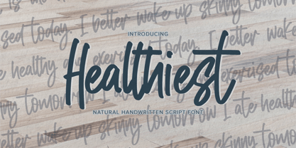 Healthiest - Natural Handwritten Script Font that will make your designs look modern, unique and fun. It’s perfect for labels, quotes, posters, DIY projects, branding, packaging, greeting cards, websites, photos, photography overlays, signs, window art, scrapbooking, tags and so much more!
 - Coffee Bar JNL by Jeff Levine,
$29.00 An image of the wide, Art Deco influenced lettering of a sign over a coffee bar inside a Jacksonville, Florida Lovett’s Supermarket (a predecessor to Winn-Dixie) inspired the namesake font Coffee Bar JNL – available in both regular and oblique versions.
 - TC Broadway by Monotype,
$29.99 Modeled after a 1928-1928 design by M.F. Benton -- Broadway --, TC Broadway is ideal for show posters and signs for restaurants and boutiques. The TC Broadway font has strong contrasting strokes, and as such is only suitable for short lines.
 - Tekanan by San Studio,
$10.00 Tekanan Typeface is an experiment and designed by Zainul Faozi. Tekanan Typeface looks futuristic and it's a great choice to use on your designs, such as a shop sign, poster, cover, headline, and more. Designer: Zainul Faozi Publisher: San Studio
 - Oksana Sans Condensed by AndrijType,
$33.00 Oksana Sans Condensed is designed for tight-fitting text. It has six weights from Thin to Heavy. Supports Western, Central, Baltic Latin and European Cyrillic codepages. Old-style digits, some ligatures, alternative characters and Ukrainian hryvnia sign are also included.
 - Equalis Stencil by Eurotypo,
$28.00 Equalis Stencil is a slab-serif typeface. This OpenType font comes in three weights, alternates and symbols, with support for CE languages. Equalis Stencil can be used as display type, headlines, packaging, signs routing and a wide range of projects.
 - Therestone by Almarkha Type,
$23.00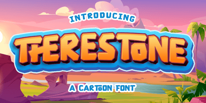 Therestone is a Cartoon Display Font that will make your designs look modern, unique and fun. It’s perfect for labels, quotes, posters, DIY projects, branding, packaging, greeting cards, websites, photos, photography overlays, signs, window art, scrapbooking, tags and so much more!
 - Retroid by Gleb Guralnyk,
$15.00 Hello! Introducing a vintage style font — Retroid. It's a pixelated old-school typeface that imitates 8-bit console graphics. Retroid font has multilingual support (check out a screenshot with available letters and signs). Thank you and wish you a peaceful sky!
 - Banzai Bros by Fenotype,
$20.00 Banzai Bros is a deadly efficient multidisciplinary all-caps assault font. It's highly recommended for posters, signs, flags & banners. Banzai Bros comes with a small set of ornaments. Available as a single font or in packs with other Fenotype fonts.
 - Romeline by Almarkha Type,
$22.00 Rameline is a Supercute Display font that will make your designs look modern, unique and fun. It’s perfect for labels, quotes, posters, DIY projects, branding, packaging, greeting cards, websites, photos, photography overlays, signs, window art, scrapbooking, tags and so much more!
 - Altwien by XTOPH,
$32.00 Altwien is a blackletter display font. Inspired by the old street-signs of Vienna and Salzburg. It’s a clear and simplistic looking condensed typeface. Put Altwien into a contemporary, fresh or modern context and get a completely new and unique style.
 - Chick Chack by Almarkha Type,
$23.00 Chick Chack is a Playful Craft font that will make your designs look unique and fun. It’s perfect for labels, quotes, posters, DIY projects, branding, packaging, greeting cards, websites, photos, photography overlays, signs, window art, scrapbooking, tags and so much more!
 - Husky by Trim Studio,
$12.00 Husky is a sweet and playful handwritten font, clean and a little bit quirky, this font is the perfect fit for crafter and graphic artist to complete their design such as invitation, advertisement, poster, logo, birthday, product sign, and many more!
 - Nimbus Sans by URW Type Foundry,
$35.00 The first versions of Nimbus Sans have been designed and digitized in the 1980s for the URW SIGNUS sign-making system. Highest precision of all characters (1/100 mm accuracy) as well as spacing and kerning were required because the fonts should be cut in any size in vinyl or other material used for sign-making. During this period three size ranges were created for text (T), the display (D) and poster (P) for small, medium and very large font sizes. In addition, we produced a so-called L-version that was compatible to Adobe’s PostScript version of Helvetica. Nimbus was also the product name of a URW-proprietary renderer for high quality and fast rasterization of outline fonts, a software provided to the developers of PostScript clone RIPs (Hyphen, Harlequin, etc.) back then. Also in the 80s, a new, improved version of the Nimbus Sans, namely Nimbus Sans Novus was designed. Nimbus Sans Novus was conceptually developed entirely with URW’s IKARUS system, i.e. all styles harmonize perfectly with each other in terms of line width, weight, proportions, etc. On top of that, Nimbus Sans Novus contains more styles than Nimbus Sans. Now, Nimbus Sans is also available as Round (like the popular URW fonts Futura Round and Eurostile Round). The Round versions are intended to facilitate the work of designers and typographers. The fonts can be used directly, without further preparatory work in graphic programs as finished, high-quality Rounds.
 - Nimbus Sans Round by URW Type Foundry,
$35.99 The first versions of Nimbus Sans have been designed and digitized in the 1980s for the URW SIGNUS sign-making system. Highest precision of all characters (1/100 mm accuracy) as well as spacing and kerning were required because the fonts should be cut in any size in vinyl or other material used for sign-making. During this period three size ranges were created for text (T), the display (D) and poster (P) for small, medium and very large font sizes. In addition, we produced a so-called L-version that was compatible to Adobe’s PostScript version of Helvetica. Nimbus was also the product name of a URW-proprietary renderer for high quality and fast rasterization of outline fonts, a software provided to the developers of PostScript clone RIPs (Hyphen, Harlequin, etc.) back then. Also in the 80s, a new, improved version of the Nimbus Sans, namely Nimbus Sans Novus was designed. Nimbus Sans Novus was conceptually developed entirely with URW’s IKARUS system, i.e. all styles harmonize perfectly with each other in terms of line width, weight, proportions, etc. On top of that, Nimbus Sans Novus contains more styles than Nimbus Sans. Now, Nimbus Sans is also available as Round (like the popular URW fonts Futura Round and Eurostile Round). The Round versions are intended to facilitate the work of designers and typographers. The fonts can be used directly, without further preparatory work in graphic programs as finished, high-quality Rounds.
 - Quietism High by Michael Rafailyk,
$20.00 Quietism High is an experimental subfamily that received a high contrast from Quietism Display and a high x-height from Quietism Text. It's still a Display typeface, albeit more graceful, wide and open. Other subfamilies: https://www.myfonts.com/collections/quietism-font-michael-rafailyk Scripts: Latin, Greek, Cyrillic. Languages: 480+ The promo images used “Sleeping Venus” painting by Giorgione, “The Creation of Adam” painting by Michelangelo, and “The Piazza and Church of Santa Maria Maggiore” painting by Giovanni Paolo Pannini.
 - Series A Signage JNL by Jeff Levine,
$29.00 The basis for Series A Signage JNL is Highway Gothic; a type style design formally known as the FHWA Series. The font was developed by the United States Federal Highway Administration, and originally consisted of only capital letters and figures. Each Letter designation represented a character width from "A" (condensed) to "F" (wide). Due to poor visibility at high speeds, Series "A" was discontinued. At one point lower case characters were added to the various widths of the design, but this typeface revival is based on the original guidelines specified in the 1948 (reprinted 1952) book "Standard Alphabets for Highway Signs" [this was the original name for the FHWA series fonts preceding the eventual name change to Highway Gothic]. Unlike the original, Series A Signage JNL is available in both regular and oblique versions.
 - NS Philapost by Novi Souldado,
$35.00 Philapost was inspired by the Blackletters era of typeface, specifically Textura. Existed in Western Europe, from approximately 1150 until the 17th century. Reminiscing about the domination of Blackletter styles in every visual hierarchy from multiple industries. We talk about the newspaper, books, headlines, signs, architectures, cemetery, manufacture, and many more. As the life goes on, the historical aspect is still inevitable. Nowadays, the blackletter style of typeface got modernized a lot in the form of a print and digital media. Magazines, journals, movie titles, album artwork, signage, merchandise, events, branding, logo, and massive possibilities in graphic-design-based industry and business. Armored with a well-designer Opentype Features such as various of Stylistic Alternates and Ligatures that makes your visual statement historical, yet remarkable. And the majestic touch is a bonus, of course.
 - Linotype Tiger by Linotype,
$29.00Linotype Tiger is part of the Take Type Library, chosen from the entries of the Linotype-sponsored International Digital Type Design Contests of 1994 and 1997. This fun font was created by German designers G. Jakob and J. Meißner. Like the font Linotype Sunburst, Linotype Tiger is also a typeface without curves, rather, angular and almost aggressive. The forms are reminiscent of splinters of wood arranged to form letters, numerals and punctuation signs. The font contains five weights which can be combined experimentally with each other, even over each other, or combined with more neutral typefaces. With its energetic character, Linotype Tiger is genearlly suitable exclusively for headlines with point sizes of 18 or larger, although the weight Linotype Tiger Tame can also be used for shorter texts. - Odense by Linotype,
$40.99Franko Luin, Odense's designer, on this typeface: With Odense I entered the field where Optima reigns in royal majesty. The first question I received was, in fact, why I designed another Optima. Look closely: Odense has as much in common with Optima as Garamond with Baskerville. Am I right? Odense Neon is a special variant that can be used for logos or single words. I had the idea for it when I noticed that the neon tubes in a sign over a store only partially followed the characters. The name comes from the Danish town Odense, the town of the famous storyteller Hans Christian Andersen, author of, e.g., 'The Little Mermaid.' Odense is also the place where the first book in the Nordic countries was printed, the 'Breviarium Ottoniense', in 1482. - TT Trailers by TypeType,
$39.00 Meet the new TT Trailers! The first version of TT Trailers was conceived as a font suitable for the film industry. The font harmoniously looks in posters, it is ideally suited for setting titles. However, the font has gained wide popularity among designers, and now you can find TT Trailers on the covers of magazines, on restaurant signs and on the main pages of websites. TT Trailers useful links: Specimen | Graphic presentation | Customization options Since 2019 when we released the first version, the TypeType studio team has released dozens of fonts, constantly improving our skills. In 2022, we decided to look at TT Trailers again, improving and expanding the font. In the new TT Trailers, we expanded the character set, corrected the contours, and improved the technical content. We have added extended Latin and Cyrillic characters, new symbols, and additional sets of numbers. The number of glyphs in one style has increased from 1081 to 1242. The inclined styles were long-awaited. The italics in TT Trailers are as eccentric as the upright fonts. The 15-degree tilt looks absolutely harmonious, complementing the character of the font family. We added italics to the variable font, so the new font changes along two axes at once, weight and slant. From the technical point of view, TT Trailers has become more modern and correct, and the number of OpenType features has increased from 29 to 42. We have added new alternative versions of glyphs and created a large number of localized features. The font retained all the qualities thanks to which designers fell in love with it, but became even more convenient. TT Trailers in the new version is suitable for titles and posters, for websites and printed materials. The font will embellish in restaurant and cafe signs and look beautiful in posters. There are 19 styles in TT Trailers: 9 upright, 9 italic and 1 variable font.
 - Puma by Canada Type,
$24.95Based on Herbert Thannhaeuser's 1954 Kurier design, Puma is the digital version of what is possibly the friendliest yet least used heavy brush design. Aside from its utilitarian functionality as a poster and sign font, Puma includes some original and artistic shapes, such as the very gorgeous single-stroke take on the letter P, the humorous knot-and-dash Q, the happy fish-eye e, the casual single-looped f, and the welcoming g. Perfect for shop signs, posters, menu heads, children book covers, fun flyers, and loud but friendly messages altogether. The complete character set is complemented with a second font containing various letter alternates and ligatures. - Millbrae JNL by Jeff Levine,
$29.00 In the city of Millbrae (just South of San Francisco in San Mateo County, California) stands an office building which formerly housed the Millbrae Theater. California has the distinction of preserving artifacts of its past, unlike many other portions of the US, and the perpendicular "Millbrae" sign with its neon tubes and Art Deco lettering is still attached to the renovated structure. Gene Gable (a friend of type designer Jeff Levine) took a photo of the sign and sent it along as simply an image of great lettering of the past to enjoy, but it triggered the inspiration to create the namesake font Millbrae JNL.
 - Kursivfraktur by RMU,
$25.00 Inspired by Rudolf Engelhardt's Journal-Kursiv, released by Ludwig Wagner, Leipzig, in 1913, Kursivfraktur was freshly drawn and redesigned, and comes as one of those rare beautiful italic blackletter fonts. This font contains the letter long s which can be reached in two ways. Either you use the OT feature historical forms, or you type the integral sign [ ∫ ] on your keyboard. There are two graphic elements implemented, a corner element and a straight element for framing. The corner element lies on the Product sign [ ∏ ], the straight element you will find on the pi-key [ π ]. Furthermore it is recommended to activate the discretionary ligatures OT feature.
 - Staincool by Viaction Type.Co,
$12.00 Staincool is a layered Font, with a retro style, and is inspired by the artist's sign painter style. There are 6 layers that are easy to use. Staincool developed from the Stengkol 04 font (https://www.myfonts.com/font/viaction-type/stengkol/) that is added to 3D fonts. This font is perfect for various design purposes such as labels, merchandise, packaging, logotype, sign and more. The Staincool font is perfect for modern & vintage themes by adjusting the desired color on the 3D layer. This font can be used in Adobe Illustrator & Adobe Photoshop. If you have questions & need help please contact us via message or email.
 - Acre by Jonathan Ball,
$24.00 Acre is a geometric sans-serif type family of eight weights that's both inspired by and named after my great grandfather, Tex Acre. Tex was an artist and sign maker whose handcrafted signs illuminated the roadsides of the American Midwest and typified mid-century Americana. Acre is a tribute to him, his work, and many of my favorite early 20th century geometric typefaces. With eight weights ranging from Thin to Black, Acre is an extremely versatile family that can be used for display, text, or anything in between. Acre offers full European language support plus many OpenType features such as tabular and oldstyle figures.
 - Zidler by MKGD,
$13.00 One of my all time favourite movies is Baz Luhrmann’s Moulin Rouge. In it, there’s a brief scene where the proprietor of the Moulin Rouge (Harold Zidler) signs away the deeds to the establishment. The actual signing of his signature is what motivated me to create this script font. Although it’s not an exact replica of the character’s hand, I like to think that it has the same crisp immediacy of the original. With its consistent oblique slant, narrow and long ascenders and descenders, and the occasional blobbing of letters, the overall effect, gives the appearance of a correspondence penned by lamplight while a storm rages outside.
 - Neonlife by Popskraft,
$19.00 This font comes from the romance of 20th century tube signs that will likely disappear forever. But let's not be upset — the Neonlife font embodies not only the warmth and comfort of neon signs, but also the energy of a modern style. And welcome to New Neon Life! The font family contains 6 sizes to help you choose the best size for different occasions. Neonlife is a unique solution for cool typography, branding, headings, in short, everything that makes our world unique and special. Although this font is not designed for large amounts of text, all characters are perfectly balanced and can be used like any regular font.
 - Storefront Pro by Sudtipos,
$79.00 Storefront is what the prolific and talented American sign painters of the 1920s and 1930s would have created if they had access to the advanced lettering and type technologies we have today. Rooted in an incomplete Alf Becker alphabet sample, Storefront is my usual overdose on alternates and swashes, my eternal attempt at giving typesetting that ever-elusive handmade impression. Though the main shapes, especially the majuscules, are almost a standard recitation of the natural evolution of nineteenth century scripts, the additional variants available within the font provide a leap in time to what sign makers and packagers are doing today. I can honestly say that Storefront’s influences are probably less historic and more in line with my recent travels and frequent supermarket visits. It’s difficult to avoid current visual culture when you're constantly bombarded with it. Not that I try. I certainly welcome the overflow. I'm probably addicted to it by now. With a very cool aesthetic, plenty of alternates and swashes, extended Latin language support, Storefront is over a thousand glyphs for your branding, packaging, and sign making pleasure.
 - Enamela by K-Type,
$20.00 Enamela (rhymes with Pamela) is a monoline square sans that is available in normal width and condensed versions. Although rooted in the early years of sans serif type, the Enamela fonts have a timeless quality that is practical and unpretentious. The letterforms derive from vitreous enamel signage dating from the Victorian era and widely used in Britain for street nameplates, Post Office signs, the plates on James Ludlow wall postboxes, railway signs and direction signs, as well as for circular Automobile Association wayfinding plaques throughout the first half of the twentieth century. The quirky terminals, stemming from the compression of geometric type, invite comparison with the Charles Wright fonts used for UK vehicle registration plates. Enamela and Enamela Condensed are both available in three weights – regular, medium and bold – and as italics (optically corrected obliques). A commonly used alternative M with a vertex that touches the baseline is provided at the Alt-M (µ) keystroke on a Mac, or Alt-0181 on Windows. A commonly used G with a plain vertical throat, no crosspiece, is assigned Unicode FF27 (full width capital G).
 - 1968 GLC Graffiti by GLC,
$38.00 This font was inspired by the paint brushed letters in use in the 60 - 70s for protest slogans tagged on the cities walls. In those days, we didn't commonly use aerosols like today, so we used paint brushes, with paint or tar cans, drew the letters, and ran away quickly ! Capitals and lower case have the same size, and a lot of alternates characters or ligatures allows the user to vary each letter (until tree alternates for single letters) in each word of a text . Likewise, the words may be easily underscored or intersected by a few stains looking like paint spots, substituted to the following standards characters: [greater], [less], [dagger], [backslash], [bullet], and [underscore].
 - Lost and Foundry by Fontsmith,
$15.00 Breaking the cycle of homelessness We are partnered with The House of St. Barnabas, a private members club in Soho Square, whose work as a not for profit charity aims to break the cycle of homelessness in London. Each purchase (of the family pack) comes with a one month membership to The House and 100% of the proceeds from sales of fonts go directly to the charity to help their essential work. This unique collection of 7 typefaces is based on the disappearing signs of Soho, at risk of being lost forever due to the ever changing landscape of the area. By re-imaging the signage as complete fonts, we have rescued this rich visual history from the streets and present the typefaces into a contemporary context for a bright optimistic future. FS Berwick Thanks to its humble tiled origins, this Egyptian serif type maintains a uniform character width, creating the irregular letter proportions found in the final alphabet. Broad-shouldered, the bracketed serifs firmly ground the font, whilst its extreme hairlines become a necessity due to the uniform width. Of note is the upside down ‘S’, to be found on the original sign on Berwick Street. Perhaps due to its ceramic origins, there is a surprising ‘slippiness’ to its final appearance. FS Cattle Cattle & Son is best described as a wide, but not overly extended, grotesque-style sans serif, showing a uniform width and carrying a robust strength to its form. Whilst lightly functional overall, the purposeful diagonal legs of the ‘K’, ‘R’ and the tail of the ‘Q’ add an urgency to its appearance. The reduced size of the ampersand gives away Cattle & Son’s hand-painted origins, and the oblique compacted ‘LTD’ found on the original sign is also included in the final set. This beautiful sign is tucked away under an arch in Portland Mews, sheltering from the weather. Perhaps this is why it has lasted so long. FS Century This somewhat elongated set of Roman capitals was originally rendered in paint circa 1940, but its roots trace back to the Trajan Column in Rome. Witness the slightly unbalanced ‘W’ and the painter’s hand is revealed. Century’s flared serif style is extremely short, sharp and bracketed. The ‘M’ is splayed and has no top serifs. Century has a uniform appearance of width, probably due to its sign-written origins. Yet is elegant, classic and exudes sophistication. FS Charity A true Tuscan letterform, the original is located on The House of St. Barnabas in ceramic tiles and was revealed in all its broken glory in 2014. FS Charity retains the option of using these incorrect characters (try typing lowercase in the test drive above and compare with the more uniform uppercase characters). FS Charity features fishtailed terminals on its strokes, a curious branched ‘T’ and the ‘S’ displays tear-drop ends to its serifs. Almost uniform in width, the ‘A’, ‘M’ and ‘W’ are the widest characters in this set. FS Marlborough The elongated Marlborough features diagonal terminals to some characters and numerals. Also retained is the space-saving contracted ‘T’ glyph from the original sign, while the ‘R’ features a distinctive wedge-shaped leg. Highly individual in this form, similar signage appears around Soho, but featuring a variety of widths in their design. FS Portland The sister type to Cattle & Son, Portland is oblique rather than italic. The serifs are not overly long, yet still enhance its rather rigid cap height and baseline appearance. Its ‘A’ has a top serif, the ‘M’ is square and the ‘G’ foregoes any spur. Particularly delightful is the open ampersand. Numerals align to encourage the horizontal flavour of the oblique style. Overall, Portland is both confident and graceful. FS St James A lineal Continental style, St James also displays a true sense of ‘Londoness’ in its titling form, perhaps influenced by early Underground signage. Irregular letterforms display a continental flavour, particularly evident in its Deco style ‘W’, ampersand and numerals. The rather high cross bar in the ‘A’ is also reflected in the raised middle strokes of the ‘M’. Noteworthy are the distinctive unions found on all of the characters and the additional small caps. The original lettering is still located on Greek St.
 - 1538 Schwabacher by GLC,
$38.00 This 1538 Schwabacher was based on a font used by Georg Rhau in Wittemberg (Germany) to print Des Babsts Hercules [...], a German pamphlet against roman catholicism written by Johannes Kymeus. The original font has a relatively complete set of characters including “long s”, but also the special german types like k, fl or ‰, ˆ, ¸.... A few omissions were remedied, and accented letters were added. A render sheet, enclosed with font files, help to identify them on keyboard. It can be used as web-site titles, posters and fliers, editing ancient texts, menus or greeting cards as a very decorative font... Although this font remains clear and easy to read from 8 or 9 points on screen, it is clearly designed for print works.
 - 1776 Independence by GLC,
$38.00 1776 Independence was designed inspired mainly from the Caslon typeface used by John Dunlap in the night of 1776 July 4th in Philadelphia to print the first 200 sheets of the Congress' Declaration of Independence establishing the United States of America. I just added accented letters and a few others, with respect for the original design. A render sheet,enclosed with font file, help to identify them on keyboard. It can be used as web-site titles, posters and fliers, editing ancient texts, menus or greeting cards as a very decorative font... This font supports as easily enlargement or small size, remaining clear and easy to read from 8 or 9 points to 72 and over. It gives a smart look especially to prints.
 - Black Seashore by Great Studio,
$17.00 Black Seashore is a script typeface with noble and vintage looks. Created in response to current graphic design trends. Inspired by classic labels, vintage packaging, and old sign paintings. This Black Seashore will add a touch of worldly knowledge to your artwork, Classic nuance is perfect for those of you who need fonts for especially the types of logos, clothing, signage, branding, packaging, advertising, and more. I have designed a number of examples, so you can see how it can be used. Black Seashore also has many alternatives for ascender, descenders, swash, and ligature. It also has several options for tail and underline. To provide a number of good possibilities to play and make some unique designs. Black Seashore is equipped with: • Uppercase, lowercase letters, numbers, punctuation & symbols • Multilingual support • Alternative style • Stylistic Set 01 - Stylistic Set 014 • Swash • Ligature If there are problems, questions, or anything about my font, please send an email to greatstudi92@gmail.com