10,000 search results
(0.046 seconds)
- Ortodoxa Do Oriente by Intellecta Design,
$14.90inspired in Orthodox Cyrillic scripts - Falcon Casual by TypeArt Foundry,
$45.00 An even more casual script.
 - KG Only Human by Kimberly Geswein,
$5.00 A connected, delicate script font.
 - Willynta by Patria Ari,
$15.00 Introducing, Willynta, a beauty handwritten script with a twist of fun! The natural hand writing script is suitable for you who needs a typeface for headline, logotype, apparel, invitation, branding, packaging, advertising etc.
 - Brownstone Sans by Sudtipos,
$59.00 One design sparks another. As Alejandro Paul experimented with the strokes and curves of the monoline script Business Penmanship, he discovered interesting new forms and shapes that didn't fit the Spencerian theme of that typeface. These forms simmered in Ale’s subconscious over the next three years, during which time he visited New York City, pored over rare type specimen books in the New York Public Library, and explored Brooklyn’s neighborhoods. Brownstone, the face born from these explorations, is an original 21st-century design, yet one subtly infused with historical and cultural references -- keen observers might spot influences from decorative typefaces of 19th-century foundries. And just as faces from that era were influenced by contemporary architecture, the frames included with Brownstone echo the ornate iron railings of Park Slope’s row houses. (There’s also a slight 1960s vibe to Brownstone, of novelty swash-sans photocompositing faces, that can be played up at your discretion.) Influences aside, Brownstone has broad appeal to modern audiences. A soft, monoline sans-serif, with elements of Swiss geometry (see the ‘k’ and ‘x’), its marriage of highly legible, draftsman-like letterforms with decorative swashes and ornaments reflects the old-meets-new aesthetic of the DIY craft culture seen in Brooklyn and other urban centers. It’s ornamental but unfussy, romantic but understated. Brownstone includes character sets for Latin-based languages, including Western and Eastern European, Baltic, Turkish, Maltese, Celtic and Welsh. Over 1500 glyphs, including small capitals, swash characters, alternates, and ligatures, in both Light and Thin weights. Ornamental frames are also included in both weights. The Brownstone Frames fonts are available as separate fonts in the new Brownstone Slab family.
 - Caslon Black by ITC,
$29.99The Englishman William Caslon punchcut many roman, italic, and non-Latin typefaces from 1720 until his death in 1766. At that time most types were being imported to England from Dutch sources, so Caslon was influenced by the characteristics of Dutch types. He did, however, achieve a level of craft that enabled his recognition as the first great English punchcutter. Caslon's roman became so popular that it was known as the script of kings, although on the other side of the political spectrum (and the ocean), the Americans used it for their Declaration of Independence in 1776. The original Caslon specimen sheets and punches have long provided a fertile source for the range of types bearing his name. Identifying characteristics of most Caslons include a cap A with a scooped-out apex; a cap C with two full serifs; and in the italic, a swashed lowercase v and w. Caslon's types have achieved legendary status among printers and typographers, and are considered safe, solid, and dependable. A few of the many interpretations from the early twentieth century were true to the source, as well as strong enough to last into the digital era. Caslon Black was designed by Dave Farey in the ITC library. - Woodyland by Illushvara,
$16.00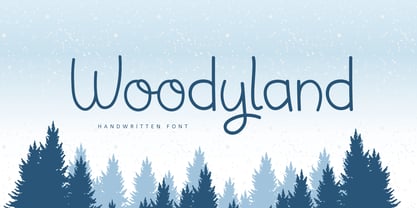 Hello, Woodyland is a cute and friendly handwriting font that is perfect for winter design or crafty projects. Use it for branding, crafts for decor, invitations, and more! Features : Uppercase and lowercase Numbers Symbols Ligature Multilingual Accent If you have any question, don’t hesitate to contact me. Happy Designing !!! Thank You, Bayu Suwirya
 - Penabico by Intellecta Design,
$23.90 After 13 months of hard work, Iza W and Intellecta Design are proud to announce Penabico. This is a free interpretation of the copperplate script styles to be found in the Universal Penman . London, 1741 , the monumental publication of engraved work by George Bickham (along with collaborators Joseph Champion, Wellington Clark, Nathaniel Dove, Gabriel Brooks, William Leckey and many others). This enhanced OpenType version is a complete solution for producing documents and artworks which need this kind of calligraphic script: 100s of stylistic alternates for each letter (upper- and lowercase), accessed with the glyph palette; 250 ornaments and fleurons (mostly in the copperplate roundhand renaissance style) encoded in the dingbats range and accessed with the glyph palette (plus a special set with over 50 of these ornaments accessed with the ornaments feature); an extensive set of ligatures (100s of stylistic and contextual alternates plus discretionary ligatures) providing letterform variations that make your designs really special, resembling real handwriting on the page; complete, intricate, ready-made calligraphic words; abbreviations (in many languages). The principal font contains the complete Latin alphabet, including Central European, Vietnamese, Baltic and Turkish with all diacritic signs, punctuation marks (including interrobang ). The German ‘ß’ (germandbls, eszett, sharp s) even has over six different alternate forms. And we don't forget to add the unconventional germandbls uppercase. In non-OpenType-savvy applications it works well as an English commercial script style font. Because of its high number of alternate letters and combinations (over 1500 glyphs), we suggest the use of the glyph palette to find ideal solutions to specific designs. The sample illustrations will give you an idea of the possibilities. You have full access to this amazing stuff using InDesign, Illustrator, QuarkXpress and similar software. However, we still recommend exploring what this font has to offer using the glyphs palette. Two last things — we have placed some of the ornaments, catch-words and other material in supplementary fonts, for easier access in non-OpenType-savvy programs. They are: Penabico Words (see the pdf user guide in “Gallery”), Penabico Abbreviations (free font), and Penabico Extras (free font). And, when buying Penabico you get the 'Penabico EPS Bonus Set", a gift pack containing various highly intrincated frames in EPS format, easy and ready to work with your preferred vector design software like Corel or Illustrator (see the pdf in the Gallery). Know too our other superscript font : Van den Velde Script at http://new.myfonts.com/fonts/intellecta/van-den-velde-script/
 - MISQOT by !Exclamachine,
$9.99 MISQOT, with beefy proportions and fine details is a titling font with lots of extras: lowercase, international accents and special characters. The 1.1 release features improved inter-weight metrics, additional characters and 9 newly added essential symbols.
 - Roadside Diner JNL by Jeff Levine,
$29.00 The hand painted signage from a 1950s era photo of the Miami Diner Restaurant in Miami, Florida inspired the digital version of its 1940s-influenced lettering. Roadside Diner JNL is available in both regular and oblique versions.
 - Celtiberica by Celtibérica,
$24.00 What was the inspiration for designing the font? Ancient script from Celtiberian culture. What are its main characteristics and features? Very ancient scripts in lead or bronze. Usage recommendations: As you like, Archeological designs.
 - Amberlight by Get Studio,
$25.00 Introducing Amberlight Script - a new fresh & modern script with a sweet calligraphy style, decorative characters, and a dancing baseline! So beautiful on invitations like greeting cards, branding materials, business cards, quotes, posters, and more!
 - Luedickital by URW Type Foundry,
$39.99 Lüdickital is a handwriting script design. Lüdicke wasn´t satisfied with existing scripts which he though of too stylish and uneven. He simply digitized his own handwriting and developed a regular and a bold.
 - Young Gallant by Doyald Young,
$50.00 My intent in designing Young Gallant was to create as simple and elegant a formal script as possible. It was developed to illustrate my new book Learning Curves discussing the essence of formal script.
 - Black Jacky by IbeyDesign,
$19.00 Black Jacky Bold Script Font is versatile script font that has a wide spectrum of applications ranging from greeting cards to headlines and is guaranteed to add a romantic feel to your next project.
 - Alright, imagine it's a cozy night, and you decide to dive into a world where every letter tells a story of mystery and magic. That's where Midnight Hour, crafted by the talented David Kerkhoff, come...
- Plantain by CastleType,
$49.00 Plantain Stencil is based on Plantain which in turn is my interpretation of Plantin Adweight, which was one of my first commissioned projects (by Smarter Image, long before they went bankrupt). Plantin Adweight is one of the most beautiful designs of the Plantin family, which is a modern revival typeface, cut under the direction of F. H. Pierpont in 1913, who based the design on that of a famous 16th century printer, Christophe Plantin, for whom Pierpont’s font was named. The stencil cut of Plantain adds a bit of sparkle to the design. Supports most European languages that use the Latin alphabet.
 - 1786 GLC Fournier by GLC,
$38.00This family was inspired by numerous documents and books printed in Paris during the end of the 1700s. Mainly, documents printed by P.G. Simon & N.H. Nyon, “Printers of the parliament” were used for the Normal and italic styles and “Caps”. “Titling” characters were coming from a collection of hymns printed by Nicolas Chapart. In France these Fournier characters, as Baskerville in Great Britain, were the most often in use in the late 1700s, just before the Didot designs. This font supports strong enlargements, specially the capitals of “Caps” file and “Titling”, remaining very smart, elegant and fine. - Pieches by PintassilgoPrints,
$29.00 This typeface is inspired by the powerful political and social posters by Paul Peter Piech, a tireless artist and printer. Questioned about his endless energy and focus on work, he said "I don't want to sit around and be silent". Pieches is a linocut-looking font heavily loaded with interlocks, including vertical pairs of letters. There are alternates also, and not quite a few: four glyphs for each letter so countless expressive possibilities are open. Graphical elements are also included, for added wilderness. This is a loud-speaking font for those who don't want to be silent. Come on, let’s shout!
 - Amasis by Monotype,
$40.99 Amasis is a slab serif design which has been drawn with a humanist approach, rather than the traditional geometric construction associated with this style of letter. The result is a typeface that has an affinity with the Ionics, although in character it belongs to the latter decades of the twentieth century. The Amasis italic fonts, rather than being sloped roman or cursive in nature, are related more to the Old Style italics. Amasis works particularly well in small sizes where readability is important. Amasis has proved excellent for use on low resolution printers and for facsimile transmissions.
 - Colmcille by Monotype,
$29.99Colmcille was designed by a Gaelic scholar, typographer and printer, and first released by Monotype for composition casting in 1936. The design intention was to provide a Gaelic looking type which worked well as a roman text face. The digital version of the Colmcille font family has been made in collaboration with the designer's son, Dara O Lochlainn. A number of changes have been made, including a new set of figures and the addition of a bold weight. Although originally designed as a text face, Colmcille can be used for advertisements, flyers, in fact wherever a touch of Gaelic charm is required. - 1883 Fraktur by GLC,
$38.00 This family was inspired by the set of fonts used in the end of 1800s by the famous J. H. Geiger, printer in Lahr (Germany), especially these used to print an almanac for the year 1883. It is a Fraktur pattern, with two styles, as a few others incomplete fonts also used for this work were Blackletters from other patterns. Both were used in two size, for titles, subtitles, main text and notes. This font contains standard ligatures and German historical ligatures (German double s, long s, tz, ch, ck...) and diacritics. 1543 German Deluxe Initials may be used in complement this family.
 - Miklos by George Tulloch,
$21.00 The gifted Hungarian punch-cutter and printer Miklós Kis was active in Amsterdam in the 1680s. Among the many fonts that he cut during those years were a ‘mediaen’ (pica-sized) roman and italic, and the digital Miklós fonts are an interpretation of these ‘mediaen’ types. The character set has been extended to cover all the European languages that use the Latin alphabet, and the fonts offer OpenType features such as small capitals; old-style and lining figures, both proportional and tabular; fractions; superior and inferior numbers; superior alphabet; contextual and stylistic alternates; and intelligent application of long ‘s’.
 - Gutknecht by Proportional Lime,
$9.99 Jobst Gutknecht was a highly successful printer in the city of Nuremburg from 1514 to 1542. He published the "Achtliederbuch" (the first Lutheran hymnal, with a whole 4 tunes) and many works by Martin Luther. This font is an accurate "recutting" of the font face Gutknecht used for the body text in his printed works. It has been extended to over 900 glyphs adding hundreds for modern use. It also presents many ancient things like old ligatures such as "tz", a hedera, and alternate style pilcrow for visual interest. And for those conservative types the modern lower case "k" is also available.
 - Schoeffer by Proportional Lime,
$14.95 Peter Schoeffer was a printer who was apprenticed to Gutenburg and after leaving Gutenburg in 1455 he set up shop with Facob Fust. His son, Peter the Younger, moved to Mainz and carried on the trade. This particular font is based on a typeface of Peter the Younger that was cut circa 1509-1520. This font has over 900 characters. While there are only about 80 in the historical exemplar the rest have been developed for modern usage. This font is based on Typ.7:146/148G also known as Gesellschaft für Typenkunde plate no. 258.
 - Bloxen by Schaub Design,
$12.00 Hand-hewn along the banks of the mighty River Raisin in Southeast Michigan, this heavy block typeface is the perfect addition to any design project in need of a stout, yet fun typographical treatment. Before this font made its journey into the outside world, it began its life as a 4B pencil sketch on cheap inkjet printer paper, as many of my projects do. This typeface, not unlike me, doesn't waste its time with finesse, or convention, and truly doesn't mind being a little bit on the thick side. There is a time for refinement and propriety, but this ain't it.
 - Scroll by Canada Type,
$24.95Earlier this year, my eyes fell upon a discarded wedding invitation on the sidewalk. A closer look at it revealed that it had at one point been victimized by rain. Some of the fancy script letters were not quite broken, but sort of melted and run-down, while the rest were still somewhat intact. That's how Scroll was conceived, as an idea for a script where thicks and thins blend to produce a wet appearance. Unlike most available broken scripts, the Scroll script was originally drawn in its own juiced context, and not based on any existing script. This font is great for atmospheric antiquity, deep natural poetry, still life captioning, gothic music posters and collateral, or horror literature and poetry covers. - Big Fish by Fenotype,
$30.00 Big Fish is a low contrast Script and Slanted Casuals with bold characters. Big Fish has three weights of Script and a set of Extras that can be used as themselves or combined with script charters for custom swashes. Big Fish is packed with OpenType features: Keep on Contextual Alternates and Standard Ligatures for better flow and try Swashes to spice up your words. Big Fish Casuals is a sturdy casual lettering font with same stroke shapes as the script. Casuals works great with the script but is also a strong font by itself. All Big Fish fonts have wide language support and cover even Cyrillic alphabets. Big Fish is a tremendous pack for any display use from branding to packaging and online to print.
 - "A Theme for Murder" is a font that evokes a sense of eerie suspense and chilling mystery, reminiscent of classic horror films and novels. Designed by Chris Hansen, this distinctive typeface encapsul...
- Dynascript by Alphabet Soup,
$60.00 Typography enters the Space Age! Dynascript brings the ease of “Pushbutton Automatic” to your typesetting experience. Dynascript is actually Two fonts in One–without switching fonts you can instantly change from Dynascript’s connecting font to the non-connecting italic with the simple push of a button. For more details download “The Dynascript Manual” from the Gallery Section. What is Dynascript? Dynascript is the slanted script cousin of Dynatype. It shares many of the characteristics of it’s sibling, but is drawn entirely from scratch and has it’s own unique character. To some it may be reminiscent of various mid-century neon signage, and of sign writing, Speedball alphabets and even baseball scripts. The design of Dynascript also takes some cues from a historical typographic curiosity that began in Germany in the ‘20s and which lasted into the ‘60s—when Photo-Lettering gave it the name "Zip-Top". Basically it was believed to be the wave of the future—that by weighting an alphabet heavier in its top half, one could increase legibility and reading speed. The jury’s still out on whether or not there’s any validity to this claim, but I think you’ll agree that in the context of this design, the heavier weighting at the top of the letters helps to create some uniquely pleasing forms, and a script unlike any other. Typesetters across the planet will also be able to set copy in their language of choice. Dynascript’s 694 glyphs can be used to set copy in: Albanian, Basque, Catalan, Cornish, Croatian, Czech, Danish, Dutch, Esperanto, Estonian, Faroese, Finnish, French, Galician, German, Hungarian, Icelandic, Indonesian, Irish, Italian, Kalaallisut, Latvian, Lithuanian, Malay, Maltese, Manx, Norwegian Bokmål, Norwegian Nynorsk, Oromo, Polish, Portuguese, Slovak, Slovenian, Somali, Spanish, Swahili, Swedish, Turkish, and Welsh—and of course English. Sorry! Off-world languages not yet supported. PLEASE NOTE: When setting Dynascript one should ALWAYS select the “Standard Ligatures" and “Contextual Alternates” buttons in your OpenType palette. See the “Read Me First!” file in the Gallery section.
 - Gillebra by CBRTEXT Studio,
$15.00 Gillebra is a modern calligraphic monoline script font with soft, clean curves. It contains a complete set of uppercase & lowercase letters, a wide variety of punctuation marks, numbers, and multilingual support. Perfect for adding a touch of elegance to your projects and branding. Also with their help, you can make beautiful wedding inscriptions or frames for your home. This font is also suitable to be used to help your business, such as book covers, stationery, marketing, magazines, and more.
 - Like A Cat by PizzaDude.dk,
$20.00 As a kid I used to write my favourite football teams name with 3D letters over and over again. I spent hours doing this - often to find out I had the colors wrong, or I had made a spelling error or two - but now, several years after, I have created the "Like a cat" font - so that you can make "handmade" headlines or funny quotes or even your favourite football teams name in a swoosh! If you get the colors wrong, or you make a spelling error, it's fast and easy to correct! :) Like a cat comes with substitution characters for double letters!
 - Peppy Pegasus by Putracetol,
$22.00 Peppy Pegasus - Quirky Unicorn Theme Font is a charming typeface designed to transport you to the whimsical world of unicorns, pegasus, and rainbows. This font showcases playful, rounded, and soft letterforms that add an element of delight to your designs. It's versatile and can be used on its own or paired with any of its nine enchanting variations. With nine distinct variations inspired by pegasus, horses, horns, wings, rainbows, and magic, Peppy Pegasus is the perfect choice for children's themes, crafting projects, and imaginative designs. It brings a sense of fun, playfulness, and a vibrant, colorful aesthetic to your creations.
 - Flintstock by Hustle Supply Co,
$18.00 Introducing Flintstock A Vintage Industrial Display Font Family Flintstock is a strong, bold industrial display typeface that includes 8 Files. I created Flintstock as a work horse typeface that will work on a variety of different projects. Flintstock is a font that you can trust to continually use over and over throughout your Creative Career. It delivers a powerful simplicity, yet conveys the Vintage Industrial vibe without losing the versatility. Hustle Supply Co. has been delivering unique Design Products since 2013. Serving a community of Creatives, Designers, Marketers, Content Creators & Brands that appreciate Handcrafted & Vintage Typefaces.
 - Soothsayer by Comicraft,
$39.00 A soft spoken sorceress whispers sweet somethings in your shell-like ear. Her words excite and enthrall, tantalize and tease, they soothe and seduce, stimulate and sustain you, they awaken and arouse you, they entice and engorge you, they -- oh, I'm sorry, what was I supposed to be saying? Oh yeah, from the pages of DC Comics' Vertigo title, THE WITCHING HOUR, and Joe Kelly and Chris Bachalo's STEAMPUNK, Comicraft is happy to make available one of our most requested fonts... Hey, what happened to that cute girl with the white hair? And, Hey, Where's my wallet?!?
 - Dancing Marathon JNL by Jeff Levine,
$29.00 The hand lettered title found on the cover of the 1932 sheet music for “Dancing Marathon” inspired the digital revival of this unusual lettering as well as the font’s name. This eccentric Art Deco design (with a slight bit of Art Nouveau mixed in) is a thin, monoline typeface. Dancing Marathon JNL is available in both regular and oblique versions. Dance marathons got their start during the Great Depression as people desperate to earn a few dollars would enter into contests that went on for hours until the last couple remained standing on the dance floor.
 - Lupio by Tour De Force,
$25.00 Lupio comes as 102nd family in our catalogue. It is geometric sans serif family with humanistic elements. Lupio family contains variable and classic versions, so you can pick which one suits better for you and your project. Classic version is additionally fine tunned to get overall character look more equalised and uniform. When it comes to distinction – in sea of dozen other sans serif famlies, we made Lupio decently recognizable. You won't mistaken him with others. Lupio is designed as working horse family, to be used in all possible situations – from websites to packages, editorial design and applications.
 - XPawnShop by Ingrimayne Type,
$5.00 XPawnShop is a typographical chess font; the pieces are letters. The Pawn is an awkward letter P, the knight is a horse in the shape of an h, the bishop is a decorative letter B, the rook is an elephant with an R shape, the queen is a Q, and the king is an ornate K. Two other XPawnShop fonts are made of very simple pieces, but as a bonus, both have the set of dominoes from the unicode block 1F030 to 1F093. The key layout is a bit complicated; see the key guide for detailed information on how to position pieces correctly.
 - Hello Valentine by Yoga Letter,
$12.00 This pretty font is called hello Valentine. This font is very easy to use, and to bring out a pretty tail is not difficult because there are guides included. This font is perfect for expressing your happiness with your partner. This font is very beautiful and elegant that can be used for Valentine's Day, weddings, capturing romantic stories, quotes, branding, logos, banners, and more.
 - Rekord Antiqua by RMU,
$30.00 Rekord Antiqua, regular and semibold, released 1911 by Wagner & Schmidt, is a perfect body text partner for Art Nouveau display fonts. Both styles come with a long s, which can be reached by the OT feature of historical forms or by typing [alt] + b. In addition, you find two framing elements on [alt] + P and [alt] + p, and an oblique style was added too.