4,521 search results
(0.02 seconds)
- Calcis by Eurotypo,
$24.00 “Chalkís” or “Chalkida” was the capital of the Euboea island in old Greece. The name derived from the Greek and it means copper - bronze. Colonist from this area founded several important cities in the Magna Graecia, such as Cumae (coastal area of Southern Italy), where our alphabet come from. At the beginning, first scribes draw the signs in mono-line, but later on, the influence of materials, tools and the skill of calligraphers, developed the refinement of the lettering. “Calcis” is a family of sans serif fonts, characterized by its austere, functional and clear style, emerged from straight lines and primary shapes; but enriched by the contribution of countless anonymous calligraphers who have polished and embellished their forms over the years. “Calcis” is presented in five weights and italic style. It has good legibility in small sizes, elegance and strong visual impact in headlines as well. Each font of the family contain 377 glyphs with accurate kerning pairs careful controlled, and advanced typographical support with OpenType features such as: old style numerals, ligatures, discretional ligatures and case-sensitive forms. It also contain diacritics for Central European languages.
 - Gradl Max by Fresh Air Fonts,
$14.00 Max J. Gradl was a German jewelry designer. A Web search today turns up several examples of his work from the turn of the 20th century. He seemed to favor green stones in silver metalwork. Gradl also did advertising work and co-authored a book on architectural design. Most important for our purposes, though, are the incredible hand lettered alphabets and monograms the man left behind. I’ve digitized one of those delightful alphabets and tried to keep it true to the original. Beyond the base character set of letters, numerals and basic punctuation, I had to extrapolate forms that, I hope, hold true to Gradl’s design. Enjoy!
 - Pucky by Just My Type,
$25.00 When teaching font-making at the Art Institute of Tucson, I give my students plenty of lab time to come up with design ideas. I designed Pucky while one class created their fonts. It came about through an idea for a capital A: sort of a triangle with two round sides and a crossbar formed by a circle falling out. (You can see it here.) In drawing that, I hit upon the idea of making the tops of the alphabet sharp and square and the bottoms rounded. (See the whole alphabet here.) Pucky suggests both circus and psychedelia. Hmmmm, does anybody have an “in” at Cirque du Soleil?
 - BMX Radical by Eclectotype,
$15.00 BMX Radical is inspired by the titles of the cult 1980s BMX movie "Rad". The characters R, A and D were designed after this, with the rest of the character set being completely made up. The font is uppercase only, but with two different alphabets. In OpenType-capable applications, engaging contextual alternates will make the alphabets automatically switch between each other, meaning double letter combinations always contain two different glyphs to give the text a much more handmade feel. It is a very versatile brush font. It can look cheesy and retro in bright colors with outlines or gritty and modern in more muted palettes.
 - Banco by ITC,
$29.00Banco was the first typeface work of French designer Roger Excoffon and was released in 1952. The strong forms look as though they were rolled out of sheet metal and feature upright, tapering strokes. The slight slant, the varying heights of stroke ends, and the relationships between line and curve give Banco font its sense of liveliness and dynamism. Excoffon did not design a matching lower case alphabet for his capitals, but this was accomplished later by Phill Grimshaw, who also designed the light weight. He deliberately 'underdesigned' the lower case forms, producing a more reserved alphabet based on the design ideas of the original. - Severe by Gerald Gallo,
$20.00 Severe is a clean, contemporary, condensed, geometric font family. There are 2 fonts in the Severe family, Severe Lower Case and Severe Small Caps. The small caps versions has small caps in place of the lower case alphabet. The lower case and small caps versions have the same uppercase alphabet, numbers, punctuation, symbols and miscellaneous characters. In addition to the cap height numbers there are small cap height numbers in each. The Severe fonts are ideal for headlines, titles, branding, small blocks of text or wherever a fresh, contemporary, condensed font is desirable. Severe Lower Case and Severe Small Caps are sold only as a set priced at $20.
 - Cord by Roland Hüse Design,
$20.00 Cord (Zsinór in Hungarian) was originally a commissioned work for a tablecloth pattern with a thread like frame decoration that is actually consist of letters. The lettershapes were being created based on Rovas characters, which were reinterpreted without decreasing legibility. Therefore, the Rovas alphabet was designed in the first place followed by its matching Latin company. The full character set contains: Western, Central and South Eastern European Latin characters basic symbols and punctuation Rovas alphabet Rovas number symbols and punctuation Display font, best fit in larger sizes for souvenirs, folk art theme, embroidery, ribbon like decorative texts and signages. Good luck and Happy Creating! Roland
 - SK Femme Fatale by Shriftovik,
$48.00 SK Femme Fatale is a decorative typeface inspired by strong women and their contributions to culture and design. The typeface is built with great attention to detail, its curves are thought out to the smallest detail, which gives the symbols a unique sophisticated character. The symbolic composition is rich not only visually, but also in typesetting: the typeface supports many languages, including extended Cyrillic alphabet and Latin alphabet. For better visual communication, ligatures have been added to the typeface. They enhance the interaction of the character form. A wide range of additional characters, numbers, arrows, etc., expand the possibilities of using the typeface in various areas of design.
 - TT Commons™️ Pro by TypeType,
$39.00 Introducing TT Commons™️ Pro, version 3.300! We’ve extended our bestseller and made it even better by adding the Greek alphabet and updating the OpenType features. The TT Commons™️ Pro typeface currently includes: 5 different subfamilies: Standard, Condensed, Compact, Expanded, and Mono; 102 font styles + 2 variable fonts: TT Commons™️ Pro Variable and TT Commons™️ Pro Mono; 1546+ characters in each Mono font style set and 1656+ characters in each Standard, Condensed, Expanded, and Compact font style; 275+ languages support, along with the Vietnamese and Greek alphabets (in all subfamilies but Mono); flawless kerning and manual TrueType hinting; 32+ OpenType features.
 - Nouveau Rose by Jeff Levine,
$29.00 In the July 24, 1915 issue of “Dry Goods Reporter” is a demonstration of hand lettering rendered with the use of a “speed pen”. Two suggested examples cited in the accompanying article were the Payzant pen and the then-new Speedball pen. An ornate Art Nouveau serif alphabet is displayed, with some examples having delicate floral elements entwining the letters. The initial alphabet was auto-traced, then cleaned-up and modified to recreate the core design of the basic (unadorned) letters. The numerals, punctuation and all additional characters were then made from scratch. Nouveau Rose JNL is the finished result, and is available in both regular and oblique versions.
 - Ongunkan Northern Arabian Scrip by Runic World Tamgacı,
$49.99 The Ancient North Arabian scripts Ancient North Arabian is the name given to a group of scripts belonging to the South Semitic script family, which also includes the Ancient South Arabian alphabets (musnad and zabūr) and the vocalized alphabets used in Ethiopia for Geʿez, Amharic, etc. The Ancient North Arabian scripts were used both in the oases (Dadanitic, Dumaitic, Taymanitic,) and by the nomads (Hismaic, Safaitic, Thamudic B, C, D, and possibly Southern Thamudic). There are tens of thousands of inscriptions and graffiti in these scripts which were used in the period roughly between the sixth century BC and the fourth century AD. See the descriptions of the individual scripts below
 - Morocco by Linotype,
$29.99Morocco is a round, curvaceous font from Swiss designer Michael Parson. Many of the letterforms in Morocco are inspired by the Modern Greek alphabet. Five of the lowercase letters have additional ascenders/descenders that are not typical in the Roman alphabet (h, n, s, u, x). This experimentation continues into the uppercase as well; many capital letters in this font have been bequeathed with ascender or descender-like elements, and some capital letters, like the Q", only come up to the x-height of the lowercase letters. This experiment in type design is one of ten from Parson that has been included in the Take Type 5 collection from Linotype GmbH." - Museum Initials by Wundes,
$12.00Museum is the Wundes foundry's first font revival. These letter forms are scanned from the engravings of Freeman Delamotte who in 1879 published a spectacular set of ancient and mediaeval ornamental alphabets. The original forms for this font were created in 1490, a few years before Columbus discovered America. There was not much information on the origin of this font, save that it came from a British museum, hence the name. The original character set was missing the letters J,P,V and W so I've constructed these letters in the same style to complete the alphabet. Other than those 4 additions, the engravings are true to their original forms. - TA Fabricans by Tural Alisoy,
$25.00 TA Fabricans graphic presentation at Behance TA Fabricans font is based on Film Fiction Semi Expanded font. The font also supports the Hebrew alphabet. The Display version comes only in the Latin alphabet. I tried to prepare the font carefully. I specifically searched for the Hebrew alphabet. I benefited from my Israeli colleagues. I believe that my font will be successful. Please check and if you have any additional requests or complaints, please write to me. t@taft.work TA Fabricans works great for branding, magazines, headers, logos, TV, UI, web, badge, packaging, headlines, posters, t-shirt/apparel etc. TA Fabricans offers you options to explore a whole host of applications and gives a real modern feel to any project. Family overview: 36 fonts, 9 weights (from Thin to ExtraBlack) + Condensed, Expanded, Display Latin, Hebrew Display font without Hebrew Multilingual 4 free font Localized Forms with NLD, PLK OpenType Features: Localized Forms Contextual Alternates Tabular Figures Subscript Scientific inferiors Superscript (Superiors) Numerators Case Sensitive Forms Standard and Discretionary Ligatures Stylistic Alternates Kern Ordinals
 - Fenomen Sans by Signature Type Foundry,
$38.00 Geometrical drawing of Fenomen Sans typeface goes back to the roots of the Bauhaus aesthetics and the entire architectural and design avant-garde of the 20th century. It is still a symbol of functional rationality, clean aesthetics in relation to shape, and of progressive thinking. Its popularity is timeless and permanent. The set contains eight basic alphabets of a square pattern, eight semicondensed, eight condensed and eight extremely condensed alphabets, all in Latin and Cyrillic alphabets. Every font of the family has four types of numerals, small caps and variant letters. The typesetting can fluently use all fonts simultaneously. The typeface originated between the years 2011–2014 and was subjected to a series of tests for the fluent legibility of narrow fonts even in extreme conditions. Narrow fonts provide this set with the maximum use also for newspaper typesetting. The typeface has an elegant, delicate design in thin fonts and sufficient legibility in bold. Mutual contrast produces creative tension. Font name acronyms described: SCN = SemiCondensed CN = Condensed XCN = ExtraCondensed
 - Rival by Mostardesign,
$25.00 Rival – A serif font family with contemporary distinctive signs Rival is a modern serif font family inspired by characters drawn with a round nib, it has many distinctive signs such as broken curves, slightly curved downstrokes, curved diagonals, and curved, slanted axes. All these typographic tokens gives Rival a modern and contemporary aspect for all kinds of graphic projects. It comes in 7 weights with corresponding italics and it’s suited for multiple purposes including display and editorial use, especially for advertising, long text, packaging and branding. Rival provides advanced typographical support with OpenType features such as small caps, ligatures, discretionary ligatures, old style figures, case-sensitive forms, slashed zero, fractions, and pro kerning.
 - Chet by East end,
$22.00 Chet was inspired by the lettering on the signs of American diners and gas stations in the 1950s and 60s. It is not a mere reprint of nostalgic signage letters, however. This typeface retains the boldness, uniqueness, and strength of this era, while adding a modern touch that makes it feel comfortable to use today. It is highly readable even from a distance, making it perfect for signs, posters, and website headers. Chet can also be used as a base for creating logotypes because of the unique forms of the a, n, and r. The typeface is named after Chet Baker, the jazz trumpeter who was active between the 1950s and 1970s.
 - Arestons by Uncurve,
$25.00 Arestons is an aesthetic vintage typography font, inspired from the past, elegant signage, gold leaf , sign painting and old label product. Arestons comes with tons of alternates characters to make more eye cacthy . It is suitable for authentic logos, headings, sign painting, posters,letterhead, branding, magazines, album covers, book covers, movies, apparel design, flyers, greeting cards, product packaging, and more. To make everyone enjoyed Arestons give you one extras font including ornament , catch word and some traditional badge. If you use Areston with you imagination, you just cobine with the another font like script , serif or san serif font and adding some effect finally.. BOOM..!! you get a great design for your project.
 - Musty Scoot by Bogstav,
$15.00 Got a pair of jeans that goes well with both party and casual living? A shirt that would fit well to a Hollywood movie premiere and would be suitable to pick up the kids from the kindergarten? If so, you know exactly what I mean, when I say that the Musty Scoot font is suitable for anything! Well, almost anything...maybe not that highway sign, or that security sign at the airport!!! But suitable for anything for children, toys, adventures, handcraft, invitation, restaurants, playgrounds, libraries...etc etc Each letter has 7 slightly different versions, which automatically cycles as you type. There is even a version of right/left sided arrow to choose from!
 - Orion MD by Alphabet Soup,
$45.00 A font where "each word that's set approaches becoming its own logo" is how some have described this unique typeface. Originally inspired by an enamel sign he picked up at a Paris flea market, Michael Doret says that the seven letters contained in the sign were enough to suggest to him that here were letterforms put together in a way that he had never seen in a contemporary digital font. Always eager to create something a little out of the ordinary, he took up the challenge to flesh out the forms into a complete font. Orion can be defined as a geometric, connecting script that is at once contemporary, yet classic and timeless.
 - Eixample Villa by Type-Ø-Tones,
$55.00 The Eixample project is inspired by modernist signage of various examples found in the Eixample neighbourhood in Barcelona. The name of each subfamily is related to its location or to specific elements of the original sign. Villa is the abbreviation for Carrer Villarroel (Villarroel Street), where the Villarroel Pharmacy has been displaying this sign since the first quarter of the twentieth century. The Eixample Villa typeface system consists of sturdy letters free of ornaments with an industrial aspect. Only the treatment of the curves borrows modernist features. Like the rest of the families in the Eixample series, Villa shows its origin as a display font, but it has been engineered to give good results at small sizes as well.
 - Merengue Script by Sudtipos,
$59.00 Merengue Script is the second typeface designed by Panco, once again together with Ale Paul, who supervised the whole development. In this opportunity, the process of shape research and the systematization of signs led him to dive into new waters. The objective was to generate a system of signs in which the construction of such was not directly bound to traditional calligraphy, nor to texts typography. Instead, the point was to create signs inspired in “Brush pen” calligraphy but with their main features drawn or literally illustrated. The result was a font with personality, authenticity and uncommon formal aspects that make Merengue Script an interesting, highly attractive and rather unusual font. From the very beginning, the search was based on creating a font with weight and good presence in big formats, but, at the same time, efficient for brief texts of small formats. The aim was to make it usable mainly in candy, sweets and chocolate packaging. The predominance of round shapes, harmonious modulations and funny and friendly-looking visual rhythms spark a special effect in the usage of Merengue Script. Texts are enhanced with an interesting visual charm, capable of transforming a very simple text into a virtual illustration that semantically reinforces the messages in a simple way, without putting legibility at risk. With a basic set of stylistic alternatives full of frills and flounces for initials, ornamental and final letters, plus a set of disconnected signs, Merengue Script offers a wide and versatile range of options for graphic designers in the process of packaging design.
 - Franzi by Wannatype,
$26.00 The new sans-serif Franzi typeface family – as neutral as can be, but at the same time individual and striking. Its unmistakable character lies in the detail, with no effect pushing itself to the fore. As a wide-running typeface with a relatively large x-height, the typeface family is perfectly suited to small text sizes but, with its elegant details, it leaves nothing to be desired in display applications either. Originally designed with constructed, often rectangular elements, Franzi has gradually been rounded during the development process and is now less hard in order to guarantee optimal legibility. A total of 20 well-developed fonts are available: 10 line thicknesses from hairline to black, each of which can be upright and italic. The italics are softly and elegantly drawn, while the upright characters appear much more severe. The design appeal reveals itself in the two-storey ‘a’ – a tribute to legibility in body copy; however, for those who prefer the geometric in applications, an alternative single-storey ‘a’ is also available. All styles have small caps, superscript and subscript lowercase letters, lining, non-lining and small caps figures, fractions as well as several ligatures, alternative fonts, symbols and arrows. The Latin uppercase letters are also available as discreet swash variants. In addition to the extended Latin alphabet, the typeface family also includes the complete Greek, Cyrillic and International Phonetic Alphabet IPA. Franzi was created as a further development of an order to produce a sign for a therapy practice in Vienna’s Franz-Hochedlinger-Gasse – hence the name, which is more common as an abbreviation for Franziska than as a diminutive for the male name Franz: Franzi is therefore a hybrid typeface name which has female tendencies.
 - se7en - Unknown license

- Parisian Ornamentals by Celebrity Fontz,
$24.99Beautiful, richly ornamented shadowed letters in the Empire fashion, similar to the fonts of the Parisian type founder J. Gille', cut around 1810. Includes one set of A-Z ornamental initials conveniently assigned to both the upper and lower case alphabet characters. - Chamfer Serif JNL by Jeff Levine,
$29.00 A set of vintage wood type printing blocks yielded the alphabet which was to become Chamfer Serif JNL. With its heavy vertical serifs and interesting character shapes, the design is unique when compared to the more familiar wood type offerings of the past.
 - ITC Gamma by ITC,
$29.99ITC Gamma font is the work of designer Jovica Veljović. Named after the third letter of the Greek alphabet, ITC Gamma has almost no sharp corners. Its serifs, stroke endings and terminals are all rounded, a feature best seen in larger point sizes. - Evening Dress JNL by Jeff Levine,
$29.00 Thin, elegant and thoroughly Art Deco is the thick-and-thin (slightly flared) alphabet found on page 31 of Samuel Welo’s 1930 instructional book “Lettering Practical and Foreign”. Redrawn digitally as Evening Dress JNL, it is available in both regular and oblique versions.
 - French Geometric JNL by Jeff Levine,
$29.00 An Art Deco geometric alphabet found within the pages of the 1939 French lettering book "Modèles de lettres modernes par Georges Léculier" ("Models of Modern Letters by Georges Léculier") is the basis for French Geometric JNL; available in both regular and oblique versions.
 - Blandford Woodland NF by Nick's Fonts,
$10.00The chapbook Pen & Brush Lettering and Practical Alphabets, published by Blandford Press, Ltd., London, in 1929 averred that these letterforms suggested a lightface version of Neuland. And so they do, with the added bonus that this typeface, unlike its inspiration, includes lowercase characters. - Festa by Green Type,
$37.00 Festa is a multilingual handwritten type family. Includes Latin, Cyrillic and base Greek alphabets. Also Festa supports the following OpenType features: ligatures, swashes and stylistic alternates (These features are available only for the Festa fonts. Festa Brush fonts don't support these features).
 - Ongunkan Atlantis Hollow by Runic World Tamgacı,
$40.00 Atlantis: The Lost Empire is a 2001 I made the alphabet prepared for Atlantis Lost Empire, the first feature-length animated movie of Walt Disney in 2000 years, in 2 versions in accordance with the original. It is suitable for today's use.
 - SK Reykjavik by Salih Kizilkaya,
$12.99 SK Reykjavik is a modern geometric font family with sans serif and slab serif characters. Supports all typographic elements you will need in Latin, Cyrillic, Greek, Turkish and Baltic alphabets. It contains 32 fonts and 26,208 glyphs and offers full support for ligatures.
 - Cut by Turtle Arts,
$20.00Cut is a font made from rubber stamps that were specially hand carved by Kerrie. Cut is a single case alphabet, but the font includes Cut Regular and Cut Reversed (the upper and lower case letters) with numbers and extra image symbols. - Uptown JNL by Jeff Levine,
$29.00 Uptown JNL was found amidst the pages of a 1944 edition of the vintage lettering design book entitled "Sixty Alphabets". This lovely Art Deco typeface has slight curvature to the straight lines of the letter forms and a wonderful hand-lettered look.
 - Hello Wishes by Good Java Studio,
$22.00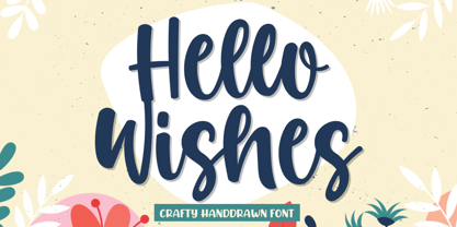 Produly Present Hello Wishes a Crafty Font Hello Wishes a Crafty Font make from handlettering ideas in typeface. This font includes full of Alphabetical glyphs, Numerals, and punctuation. This is so perfect for invitations, monograms, wedding, fashion, branding, label, handlettering or logotype.
 - Top Kick NF by Nick's Fonts,
$10.00Schriftatlas: Alphabete von A bis Z strikes again with this dazzling display of geometry at play, originally named Concentra. Best used at larger sizes for maximum impact. Both versions contain the complete Latin 1252, Central European 1250 and Turkish 1254 character sets. - Modern Times by Tural Alisoy,
$20.00 Modern Times font has been updated. To use the new version, go here. Modern Times font. 996 glyph, 100+ Languages Set. Multilingual support: Latin basic, Latin Extended, Cyrillic, Greek, Georgian, Central Europe, Turkish, Baltic, Romanian, Euro, West European diacritics Please test your alphabet
 - Almost Heaven NF by Nick's Fonts,
$10.00This charming little number is based on a rubber-stamp alphabet set, sold in the early 1900s under the name "Perfection", which suits it well. Both versions of this font include the complete Unicode 1252 Latin and Unicode 1250 Central European character sets. - Hello Mono One by Good Java Studio,
$18.00 Introducing Hello Mono with Layered Inline Hello Mono is a playfully display font make from handdrawn ideas in typeface. This font includes full of Alphabetical glyphs, Numerals, and punctuation. This is so perfect for invitations, monograms, wedding, fashion, branding, label, handdrawn or logotype.
