10,000 search results
(0.04 seconds)
- Egyptienne F by Linotype,
$29.99Adrian Frutiger designed Egyptienne F for the Deberny & Peignot Foundry in 1956. This was the first of several Egyptians designed by Frutiger, see also Glypha and Serifa. “Egyptian” or “Egyptienne” is a typographic designation for roman typefaces with slab (or square or rectangular) shaped serifs; and those that have bracketing between main stroke and serifs (like this one) are known as “Clarendon-style Egyptians”. Egyptienne F has a medium x-height and excellent character spacing for setting text in small point sizes. Legible, flexible, and neutral in appearance, Egyptienne F is a good choice for books, magazines, and on-screen presentations. - PiS Malefiz by PiS,
$24.00 PiS Malefiz is inspired by the hand-drawn type on the package of the german 60's version boardgame „Malefiz“, also known as Barricade or Barricata. Extended to five hand-drawn weights PiS Malefiz turned out to be the weird lovechild of Saul Bass and Ralph Steadman, fun and childish plus angry and strange. Just as playing the boardgame, PiS Malefiz is a wild and superfast rollercoaster ride of emotions! Combine the five interchangeable weights for total whackyness or use the clean and legible thin and regular versions for sleek and slender slanting. Have fun! Keep the dice rolling!
 - Gringo Dingbats by Volcano Type,
$19.00Gringo is a type family that contains 27 different varieties. It is divided into three groups: Sans, Slab, and Tuscan = Europe - Texas. Due to its consistant structure, the single groups can be mixed as you wish. Furthermore every variety comes in Light, Medium, and Bold. There are three widths, from Narrow to Wide. Additionally, there is also a Dingbats font. The concept of Gringo is a fusion and a merging of type cultures to cross borders and create something new. Gringo won 3rd place in the "tdc2 2006 award" by the Type Directors Club New York. - Marconi by Linotype,
$29.99 Marconi was created by Hermann Zapf in 1973. According to Gerard Unger, it was the world's first digital typeface. Zapf’s design was developed as a text face for books and magazines. The round forms of the Marconi follow the principle of the superellipse. The lowercase letters are enlarged as the result of reading tests, while the capital letters are slightly reduced. The 8-point size — normally used for newspapers — looks more like 9 1/2 points. Marconi is a legible typeface with its large and open lowercase letters. It is ideal for long text blocks in newspaper, book, and magazine production.
 - ITC Charter by ITC,
$40.99 Charter was designed in the mid-1980s by Matthew Carter. The typeface was designed with the limitations of low- and middle-resolution output devices in mind; hence the squared off serifs and the economy of diagonals and curves. The design, however, became an instant success on its own merits. It is an excellent everyday typeface for a wide variety of uses including books and technical manuals. Charter offers small cap, extension and alternate typographer sets that help to make it more versatile and functional. ITC bought the Charter designs in 1993, but Bitstream retained the right to sell the original designs.
 - Linotype Vision by Linotype,
$29.99Linotype Vision is part of the Take Type Library, chosen from the entries of the Linotype-sponsored International Digital Type Design Contests of 1994 and 1997. Created by German designer Dan-André Neimeyer, the font contains five weights. The characters look as though they are constructed of fragments fitted only loosely together. Just enough of each character is put onto paper so that the eye of the reader can complete the conventional form. Based loosely on sans serif forms, the font has a futuristic, mathematical feel. Linotype Vision is exclusively for headlines in point sizes of 18 and larger. - Hiroshima Gyoshi by 38-lineart,
$14.00 Hiroshima Gyoshi is a handwritten font inspired by ancient Japanese calligraphy. The thick and random strokes look very prominent and play with negative space. You will feel the rhythm in irregularity. it is a bold handwritten font, carefully handcrafted to become a true favorite. Its casual charm makes it appear wonderfully down-to-earth, readable and, ultimately, incredibly versatile. This fantastic font is best suited for headlines of all sizes, as well as for blocks of text that have both maximum and minimum variations. Whether it’s for web, print, moving images or anything else – Hiroshima Gyoshi will look spectacular
 - High Fidelity by District 62 Studio,
$59.00 High Fidelity is our funky new variable font that was inspired by an incredible vintage poster we saw at the NYPL (sadly, the designer wasn't credited.) First we developed the ultra wide top-heavy style. Then, unable to resist the dynamics of variable type, we added the narrow width and violà our first variable font was born. We then added "drip" and "stretch" axes so you can play around and customize it to your heart's content. We think it works for anything from album covers, posters, social media, apparel - really anywhere you need a fun, expressive look.
 - Archimoto V01 by Owl king project,
$37.00 Archimoto V.01 Responded to the design of working drawing techniques in the world of architecture and letters on old stuff photography lens bodies, archimoto is designed with a more modern form, a little touch of detail in the corner area is so smooth that it aims to provide comfort to the eyes, by bringing 20 sizes including italic archimoto can be used more freely and can be adjusted more extensive exploration of its use. archimoto can be used as headlines and body text, the level of readability that looks comfortable makes the arrangement of letters more beautiful.
 - Gang by Ani Dimitrova,
$39.00 Gang is a 2 - style display font family designed by Ani Dimitrova. Both weights contain a set of extended Latin and Cyrillic, as well as all sorts of open type features: standard ligatures, proportional figures, numerals, arrows, matching currency symbols, and fractions. In both styles, the font is well-suited for large headlines, word emphasis, and different types of advertising. The fonts' wide proportions make them a perfect choice for screen usage. This style palette offers a flexible range for display typography. The Gang type family is ideally suited for magazines, branding, posters, as well as web and screen design, and more.
 - Govia Sans by Marc Lohner,
$25.00 Let’s have some fun! Govia Sans adds plenty of joy to any logo, layout or UI. Geometric shapes and a funny look come together in this font family – thus, Govia Sans might be the perfect choice for toys, books, packaging designs, movieposters and many more. Although the fonts’ comic character shines through in every glyph, it keeps a surprising degree of legibility even in small sizes. Choose between a Medium and a Bold weight. Designed by Marc Lohner, Govia Sans speaks more than 200 languages. Funny ligatures, arrows, oldstyle figures and many more features will fulfill all your typographic needs.
 - Jozef by Underscore,
$35.00 Jozef is a serif typeface family with modern character and a firm voice. It is equally suited to setting text on screen and in print. With eight weights, matching italics, and decorative capitals it offers a plentiful typographic range, and provides language support for extended latin. The sharp serifs equip this typeface with a strong tone and clear legibility, while the italics offer a softer but equally solid appearance. Opentype features, number sets and a wide range of typographic characters make this a resourceful text typeface. Jozef was designed by Johannes Neumeier and published through Underscore in 2018.
 - Jollin Family by Creativemedialab,
$14.00 Jollin Family is a pretty, attractive and fashionable sans serif, has ton of alternates that you can use to create a simple but pretty letters. Jollin has 8 weights and 3 Widths and also available in Variable version Jollin Family Variable contain three configurable axes: weights, width, and slant, you can adjust the font axis setting to get the desire size. Jollin Perfect for Heading, logo creation, Advertisements, Christmas, Label, business card, branding and more! Get inspired by its fashionable appeal! to access alternate Adobe Photoshop go to Window - glyphs Adobe Illustrator go to Type - glyphs
 - Fast Hand by Gerald Gallo,
$20.00 The Fast Hand set was inspired by casual, neat hand lettering. They are casual and informal and ideal for use in conveying these qualities. They are excellent for casual text and at large sizes an effective casual display font. Both fonts have the same uppercase alphabet, numbers, punctuation, accented characters, symbols, and miscellaneous characters. As their names imply Fast Hand Lower Case has a lowercase alphabet while Fast Hand Small Caps has small caps in place of the lowercase alphabet. Fast Hand Lower Case and Fast Hand Small Caps are sold as a set priced at $20.
 - Tsanger Yun Hei SC by Tsanger,
$198.00 Tsanger Yunhei was designed and published by Tsanger. Tsanger Yunhei contains 8 styles and family package options. The designer has made unique treatment on the shape and structure of the pen, based on the Chinese calligraphy style and writing, which makes it easier to identify under the same size of the font and group reading effect better. Tsanger Yunhei is more in line with the aesthetic habits of Chinese characters getting the reading an easy task. This font adopts GB 2312—1980 standard, with a total of 6763 Chinese characters, matching Latin letters, Greek letters, Hiragana, Katakana, Russian Cyrillic letters, etc.
 - ALS Malina by Art. Lebedev Studio,
$63.00 Malina (raspberry) is a plump, sweet-tempered display typeface. It comes in one style that includes small caps, ligatures, and ornaments. The face “speaks” several languages. Malina works wonders in titles and bite-size text nuggets. On top of the regular set of characters, the typeface hosts with ease a duck and fox, owl and crocodile, mammoth and pig. They’re irresistible when used by one or in bunches forming patterns. The typeface is ideal for signs, posters, sweets and kids product packaging; will feel at home in fun & entertainment stuff design and as a part of playful projects.
 - Naraba by Flawlessandco,
$9.00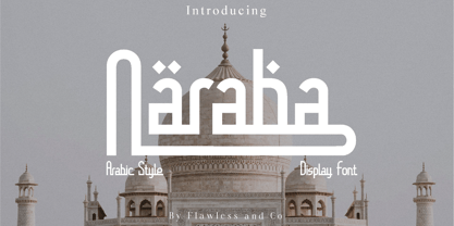 Introducing "Naraba," a stunning Arabic font inspired by the elegant Kufi style. This meticulously crafted typeface seamlessly merges tradition and modernity, making it perfect for a wide range of design applications. There's some connected letters and some alternates that suitable for any graphic designs such as branding materials, t-shirt, print, business cards, logo, poster, t-shirt, photography, quotes .etc This font support for some multilingual. Also contains uppercase A-Z and lowercase a-z, alternate character, numbers 0-9, and some punctuation. If you need help, just write me! Thanks so much for checking out my shop!
 - Penthagon by Gie Studio,
$9.00 Hello Everybody,. Are you going to make your business changes more widely known? Find the solution by giving a small touch to the design of your product promo using a natural and contemporary font style ! Penthagon is Script Font Duo with elegant and signature style, that are very beautiful,luxurious,and high class for creating handwritten-style logos, wedding stationery, photographer watermarks logos, modern websites, fashion branding, name card, wedding invitation, and all the identity of your business products. Features: -Multilingual Support for 83 Country -Ligature collection -PUA Encoded -Numerals and Punctuation What you get : -Penthagon Regular -Penthagon Tail Happy design !
 - Gringo Slab by Volcano Type,
$29.00Gringo is a type family that contains 27 different varieties. It is divided into three groups: Sans, Slab, and Tuscan = Europe - Texas. Due to its consistant structure, the single groups can be mixed as you wish. Furthermore every variety comes in Light, Medium, and Bold. There are three widths, from Narrow to Wide. Additionally, there is also a Dingbats font. The concept of Gringo is a fusion and a merging of type cultures to cross borders and create something new. Gringo won 3rd place in the "tdc2 2006 award" by the Type Directors Club New York. - Dot To Dot by A New Machine,
$9.00 This font is for parents and educators that want to easily be able to print out the alphabet in order to have their child or student then trace them. This eliminates the need for creating the dotted lines by hand and lets the user type out exactly what letters they need instead of relying on pre-made charts. The font is upper and lowercase letters and numbers only - no punctuation. Comes in Regular and Guides (get both for the same price as one) which draws guidelines with the letters. Best when used at a large point size.
 - Highfield by Surplus Type Co,
$9.00 Highfield is a luxury sans serif type family of three weights plus matching italics. It’s influenced by the modern and elegant style sans serif typefaces that are popular in high class editorial design. The fonts are based on geometric forms that have been optically corrected for better legibility. While the bold weight is a great performer in display sizes the light and regular wights are well suited to longer body & supporting text. Highfield is equipped for complex, professional typography. The OpenType fonts have an extended character set to support Central and Eastern European as well as Western European languages.
 - Gamby by Nathatype,
$29.00 Gamby is an attractive, vintage, playful display font for your customers. Its main character is the round, thick letters in thin outlines. Gamby provides two versions, regular and italic to use for bigger-sized texts to be legible. Features: Ligatures Multilingual Supports PUA Encoded Numerals and Punctuations Gamby fits for any design projects, such as posters, logos, book covers, headings, printed products, merchandise, social media, etc. Find out more ways to use this font by taking a look at the font preview. Feel free to contact us for further product information or trouble complaints. Thank you and happy designing.
 - HU Handserif KR by Heummdesign,
$25.00 HU Handserif KR contains KOREAN words and Latin alphabets. HU Handserif KR expresses the heart written down by hand in a font. Since there are no curved serifs, it is a handwritten typeface that is easy for children to follow correctly. It was produced using the order of strokes so that Hangeul can be written in the correct order, and the shape and size of the initial consonants, middle consonants, and final consonants were produced correctly. It also has an honest and correct form based on the basic principles of letters and the structure according to the form.
 - Edgewater by cm5dzyne,
$16.00Initially created for use in a logo and with a limited number of characters, Edgewater evolved into a full typeface suitable for everything from projects requiring a space-age, futuristic feel to logotype for the most refined, conservative corporations. Edgewater was joined in November, 2008, by Edgewater Hairline, which supports more than 30 languages and is especially attractive in larger point sizes. The hairline version also is a nice complement to the other fonts in the Edgewater series, though still striking enough to stand on its own as the dominant visual in a virtually unlimited number of displays. Timeless, unique and flexible. - Noir by Mindburger Studio,
$39.00 Noir is a sans serif font family of 12 fonts with contemporary aesthetics heavily influenced by early 20th century geometric typefaces. While having its geometric structure it carries organic personality with touch of warmth injected to each form. Noir font family ranges from light and elegant weights perfect for small text, to extremely heavy and masculine weights suited for large display sizes. Noir has a rich arsenal of Open Type features for highly professional use and extended Latin, Cyrillic and Greek language support. Noir is delivered as Std and Pro version. Cyrillic and Greek are available in Pro package only.
 - Karsten by Nasir Udin,
$25.00 The first development of Karsten typeface was inspired by signs on some old Dutch-buildings in Java. Then in the making, it blends with modern style. It's a synthesis between two cultures, the East & the West. The typeface was named after the Dutch architect who gave major contributions to architecture and town planning in Indonesia, Herman Thomas Karsten. It comes in nine weights from thin to black with matching italics. Its mixture of weights provide a wide range of styles that will help you find the best vibe for your projects, for headlines or a short paragraph. See the full presentation on Behance
 - Gringo Sans by Volcano Type,
$29.00Gringo is a type family that contains 27 different varieties. It is divided into three groups: Sans, Slab, and Tuscan = Europe - Texas. Due to its consistant structure, the single groups can be mixed as you wish. Furthermore every variety comes in Light, Medium, and Bold. There are three widths, from Narrow to Wide. Additionally, there is also a Dingbats font. The concept of Gringo is a fusion and a merging of type cultures to cross borders and create something new. Gringo won 3rd place in the "tdc2 2006 award" by the Type Directors Club New York. - Monotype Clearface Gothic by Monotype,
$29.99Clearface Gothic first appeared in 1910, designed by Morris Fuller Benton, the world-famously prolific typeface artist. In addition to Clearface Gothic, Benton also designed classics like Franklin Gothic, Century Expanded, and many other types. Clearface Gothic is a sans serif face with light forms displaying the Zeitgeist of the turn of the 20th century. Distinguishing characteristics are the open forms of the a" and "c," the arched "k," and the upward-tilting horizontal stroke of the "e." The relatively narrow typeface, with its open inner white spaces, is extremely legible even in small point sizes. There is no accompanying italic." - Magasin by Type-Ø-Tones,
$50.00 Magasin is a high contrast display typeface inspired by the pointed pen calligraphy, yet with a retro-chic twist. It combines a sense of script with geometric and slightly condensed structure resulting in idiosyncratic curves softly connecting the vertical elegance of its forms, ideally suited to use at large sizes in headlines for magazines, posters or packaging. Magasin boasts a rich set of OpenType features that provide a better flow such as Ligatures, Stylistic Alternates, Contextual Alternates, and Final Forms. It also includes a set of capital Swashes. Please check the ‘Read me’ file located in the gallery for more specifications.
 - Nubian by G-Type,
$39.00 Nubian was one of the first typefaces ever designed by G-Type and is an elegantly proportioned, crisply modern sans serif family. Comprising five weights from Thin to Bold with true matching italics, each font also includes two sets of figures (lining and old-style numerals) and an extended European character set. Nubian has a noticeably open, semi extended appearance providing very even 'colour' and excellent legibility when set as text. The contemporary letterforms work well at all sizes in print and on screen making Nubian a great choice across all media. The family has been updated to OpenType with extended language coverage.
 - Kaarna by LetterMaker,
$28.90 Kaarna is a rough hand drawn sans serif. The underlying shapes and structure are designed in the style of modern sans serifs which are made livelier by the hand drawn look. The condensed proportions make it especially suitable for use in large headlines and to achieve maximum impact. The hand drawn texture becomes clearly visible in big sizes and quiets down when used small. This allows you to use Kaarna for both headlines and short to medium length texts, ensuring visually unified typography. Because of its design and large character set, Kaarna is well suited for branding, advertising, packaging and editorial use.
 - Croog Pro by TipografiaRamis,
$39.00 Croog Pro is an upgraded version of Croog fonts (2009). As its predecessor, the new release is a rounded geometric monoline typeface, but built now in four weights with true italics. One more style has been added - "Black", for display use. Squarish in proportions, monoline letterforms gain more readability by having short rounded serifs and terminals. The typeface is ideal for use in display sizes, though is quite legible in text. Croog Pro is released as OpenType fonts with extended glyph amounts, which enabled support of more Latin languages as well as Cyrillic languages, and includes some OpenType features.
 - P22 Cusp by IHOF,
$24.95 This typeface was originally inspired by Art Deco lettering. During the development of the letterforms a strick DeStijl grid was imposed. The lowercase letterforms were created with the influences of rave/techno design styles. The result is a distinctly contemporary display font. The P22 Cusp Family contains 4 fonts: P22 Cusp Round, P22 Cusp Round Slant, P22 Cusp Square, P22 Cusp Square Slant. This font was designed as a display font and may be a bit taxing on the eye at smaller point sizes. The P22 Cusp family is licensed exclusively to P22 type foundry/International House of Fonts.
 - Ristella by Mans Greback,
$59.00 Ristella - a logotype script font. This high-quality typeface is created by Måns Grebäck. Its style is bold and has large, attention-grabbing uppercase letters. Ristella contains alternate and stylistic alternates, as well as multiple ligatures. With its hundreds of glyphs it also has support for a wide range of languages. How do you make a swash? Combine an ending and a tail to make a swash. Endings are found in the following symbols: [ ] { } Tails are found in the following symbols: < > § _ ¤ Example: Ristella}> With ligatures activated, write multiple tail symbols to make a longer swash. Example: Tailextender]¤¤¤
 - Duran by The Northern Block,
$- Duran is a strong, versatile geometric sans with industrial quality. Inspired by technical style letterforms with simple construction, the typeface is useful in both large format and body text. Its compact lateral shape helps save space across layouts and is good to go across a wide range of modern applications. Details include seven weights with matching italics and over 670 characters per style. Opentype features consist of eight variations of numerals, including inferiors, superiors, fractions, case figures and circled figures. Additional features include case-sensitive forms, stylistic alternates, ligatures, game symbols, arrows and language support covering Western, South and Central Europe.
 - Linotype Cutter by Linotype,
$29.99Linotype Cutter was designed by Georg John in 1997. As the name suggests, the font looks like it was cut out of black cardboard pieces. Each letter has a irregular rectangle black background and they combine to form heavy rows of letter elements. The strong contrasts of the font make it good for short headlines or initials in larger point sizes and combines well with almost any text font. Georg John made a second version of this theme called Linotype Schere (scissors) it is a companion typeface where the conturs of the letters are even rougher in its form. - Gorda by Zeptonn,
$10.00 Oh yeah! Gorda is a huge, bold and all-caps typeface. It's rounded style makes sure it's nice and friendly, even though it can be used in (very) large sizes. With Gorda you can produce a powerful and contemporary style. The smaller stroke width of the symbols and punctuation marks makes sure legibility is not an issue, as is often the case with fat type. Gorda is suitable for all sorts of uses, especially posters, headlines, artwork and logos. Use it to draw attention, in a quirky and distinctive way. Gorda has been designed and developed by Zeptonn.
 - Avantime by Supfonts,
$16.00 Charming 80's retro inspired typeface with wonderful versatility given it includes 30 fonts. This is a perfect for any project Inspired by magazine adverts from the 70's and 80's - this family fit right in with bringing retro back into the 21st century. Super-versatile - have a scroll through all the preview to see the very wide range of variety the Avantime back can manifest the possibilities are really quite endless :) Avantime Font Features: 30 fonts Full Set of standard alphabet and punctuation PUA Encoded - no special software needed to access extra characters Language support: All European languages Multilingual Characters
 - Elongated Roman by Red Rooster Collection,
$45.00 Elongated Roman is a Didone-style serif typeface. It was originally designed in 1950 by typographers at Stephenson Blake. After International TypeFounders, Inc. acquired exclusive licensing rights to the Stephenson Blake Collection, Steve Jackaman (ITF) digitally revived the typeface in 1997 for the Red Rooster Collection. Much like other Didone typefaces, Elongated Roman’s strong contrast between thick and thin strokes and hairline serif design strengthen its elegance as a “modern face.” Unlike other Didone typefaces in the Red Rooster Collection, Elongated Roman was designed with display size in mind thanks to its strong variance in stroke weight.
 - Drumbeat by EdyType,
$60.00 DRUMBEAT, a brand new face from Edy Type, coming to help resolve the necessities of loose scripts in Packaging and Editorial Design. Its' very particular thicks and thins and ups and down, makes it very suitable whenever informalities is required. Used with tiny little characters, enlarged to mammoth sizes or filling a large page with it, would show it’s perfect balance and color, almost as if where hand writen. In fact, a truly different script, a graphologist would declare that is written by a person very sure of what he wants, and besides and best of all, it’s pretty.