10,000 search results
(0.021 seconds)
- Mirror by Robert Petrick,
$25.00 I designed “Mirror Font” with the idea that it could function as standard font but it also can function as a creative tool to create interesting letter form logos and titles. It is readable even at small sizes and would make an interesting addition to your library of “Futurist” font styles. See more graphic examples of Mirror Font in Action! on YouTube .
 - Saddle Tramp JNL by Jeff Levine,
$29.00 The designers of wood type in the 1880s did not lack for inspiration or imagination. From extremely ornate designs to ultra compressed or condensed alphabets, there was no shortage of variety. Saddle Tramp JNL is one such compressed font. Its wide, bold design coupled with its squat appearance allows for multiple words in a headline without overuse of page space.
 - Zanjabeel Arabic by Boharat Cairo,
$20.00 Zanjabeel is an Arabic typeface with a hybrid design between the Naskh and Modern Kufi styles, comes in 9 weights, and some italic letters that give a unique and dynamic feel. the typeface works well with large sizes, headlines, and short text. also, works in printing and digital uses. The typeface is a collaboration with the Egyptian designer Ibrahim Hamdi
 - Chiller by ITC,
$40.99Chiller is the work of British designer Andrew Smith, a chaotic, reckless fun font. Although the ink blots and stray strokes might look undisciplined, the forms of this typeface were carefully planned and it is surprisingly legible even in small point sizes. Chiller is equipped with a number of alternate characters as well as illustrations and almost guarantees eye-catching graphics. - Hundred Ligature by Patria Ari,
$17.00 Introducing - Hundred Ligatture, a modern sans logo font with more than 300 discretionary ligatures ready to be combined. Hundred Ligatture is suitable for headlines of all sizes, editorial design, branding, packaging, web and broadcast use, etc. This font designed with modern forms, so each individual character is quickly and easily recognized. Such distinctness makes it good for signage and display work.
 - Parity Sans by Shinntype,
$19.00 The Parity concept takes the minimalist unicase alphabet and expands it in another dimension, that of the megafamily encompassing a variety of weights, optical sizes and styles (roman/italic, serif/sans, proportional/monowidth)—of benefit whether fine tuning a single, quite specific font for the task at hand, or harmoniously combining several in the hierarchy of a multi-formatted page layout.
 - Sandy Pillow by Nathatype,
$29.00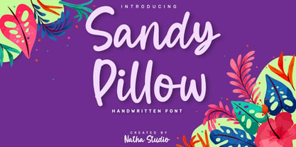 Sandy Pillow is a beautiful handwritten font. It brings an attractive typeface. Made for any professional projects. The font is suitable for any project like logo, t-shirt printing, wedding invitations, and greeting cards to social media quotes, branding, and more! Outstanding in a wide range of contexts. Featured : - Standard Ligatures - Stylistic Sets - Multilingual Support - PUA Encoded - Numerals and Punctuation
 - Khadash by NamelaType,
$19.00 Khadash is a slick Handwriting Brush Latin and Arabic font, made with natural strokes that resemble real handwriting. Khadash Arabic font is a separate with Latin characters as subfamily to reduce font size. There are two sets of Latin character choices in the form of letters, regular and alternate, Khadash is perfect for branding projects, product packaging, merchandise, advertising, quotes and more
 - Nouvelle by Mina Arko,
$45.00Nouvelle is an elegant sans serif family of six fonts (light, regular, semibold and italics). This modular typeface works just as well as display typeface as it does in body text. Because of the high x-hight it stays readable in very small sizes. It has 1884 characters: oldstyle numerals, ligatures and extra characters that support almost all European languages. - Dalton Marine by Sign Studio,
$15.00 Dalton Marine is an absolutely elegant serif font and designed for display. This typeface includes stylistic alternates set that allow you to change multiple characters in one click. It will elevate a wide range of crafting ideas, from cards to branding, labels, and more. This font is PUA encoded, which means you can access all of the glyphs and swashes with ease.
 - Bucanera Soft by Corradine Fonts,
$24.95 Bucanera Soft is a clean modern blackletter designed especially considering its readability. Due to its soft edges, Bucanera Soft leaves the traditional look of aggressive and hard blackletters and allows to find a more friendly appearance in a wide range of applications. Bucanera Soft was selected as a winner in the 3rd Communication Arts Magazine Typography Contest in Typeface Design category, 2013 issue.
 - Rum Plakat by Trine Rask,
$30.00 Rum Plakat is a display type developed as a display face within the type family »Rum« Rum Plakat is an alternative version of Rum Soft Sans Black. It is suitable for posters and editorial design in large sizes & other eye catching matters. The complete family consists of Sans Serif & Serif in both sharp and soft version + the display fonts Rum Plakat & Rum Silhouette.
 - La Belman Pro by Gleb Guralnyk,
$14.00 Presenting a font family La Belman Pro. This capital vintage style typeface is perfect for label design and different headers. It has 5 weights wich makes it more usable in different sizes and usecases. Lots of ligatures can help you to create a unique lettering compositions. West european characters set is available. Thank you for your attention and have a nice day!
 - Informe by Arterfak Project,
$19.00 Informe is a modern monospaced typeface. Built with strong letter shapes, and industrial taste. This typeface was designed to read well in small and large sizes. Informe is suitable for digital interface, simple coding, label, editorial, tickets, and more. Available in 4 styles that you can use for the headline, subheadline, tagline, and body text. Equipped with some alternates and multilingual support.
 - Frames And Borders by Outside the Line,
$19.0032 borders and frames, round ones, square ones, rectangles and an oval. Curly Qs, vines, flowers, dots and swirls in outline and reverse. Plz note that this is not a dingbat font and needs to be used in large sizes of 72 point or more. Don't miss Rae's other frame fonts. Frames & Borders Too and the new Frames and Banners. - Preston Signature by Cititype,
$17.00 Prestons signature is made with a medium-sized marker pen with a casual groove. Feel the sensation of natural handwriting. This font is a great choice for digital signatures, brand names, logos, banners, headlines, wedding invitations, business cards, book titles, movies, podcast texts and craft work. we complement with alternate and ligature to strengthen the natural impression on your design
 - BD Supper by Typedifferent,
$45.00 "BD Supper" is a friendly and humorous geometric-organic sans serif typeface great for use on food packaging and in gastronomy-related topics. It features a wide selection of alternate characters to choose from. Use them as you like. With two weights regular and bold, «BD Supper» fits the needs to structure a body text with a headline and to create logotypes.
 - Makeevka by NREY,
$19.00 Makeevka typeface is sans-serif semi-condenced font family. It has wide multilingual support with cyrillic also. This font was crafted with the intention to present clean, legible, multipurpose characters that are easy to read wether it's on screen or print. Fit for all purposes; text, display, headline, print, corporate identity, logo, branding, product, infographic, photography and other applications and medium.
 - Telka by BumbumType,
$39.00 Ideas are diverse and modern applications are complex. Telka is the typeface to answer this contemporary needs, following our studios approach in creating multi-dimensional tools. Characteristic for this typeface is the character-width variation. From the standard, neutral width collection to the wide collection, with its quirky details and strong personality. Telka is in our shop as variable font available.
 - Display Uncanny by Gerald Gallo,
$20.00 Display Uncanny is a display font not intended for text use. It was designed specifically for display, headline, logotype, branding, and similar applications. The same A to Z characters are located under the shift+character set and character set keys with the ones under the character set keys reduced in size. There are numbers and punctuation located under their respective keys.
 - Augan by Muksal Creatives,
$15.00 Augan Modern sans serif typeface with beautiful alternete, special glyphs, ornament and multilingual support. It's a very versatile font that works great in large and small sizes. Perfect for editorial projects, Logo design, Clothing Branding, product packaging, magazine headers, or simply as a stylish text overlay to any background image. Features: Lowercase and Uppercase alternete Numerals & Punctuation Accented characters Multiple Languages Supported
 - Pictographs by Monotype,
$29.99The Pictographs MT font was contains over 700 emoji icons (emoticons). These symbols, pictures and images cover a range of expressions and uses. Emoji were very popularized in Japan and have become widely adopted and integrated into the Unicode specification. The Pictographs MT font was created to support messaging applications, and to give designers and developers a robust set of emoticons. - ITC Esprit by ITC,
$29.99ITC Esprit is the work of designer Jovica Veljović and blends the classic proportions of a serif typeface with the grace and charm of calligraphy. Highly legible even in small point sizes, the font can also be used as an impressive display face for use with sans serif text. In 2010 Veljovic revised this family and released this as ITC New Esprit. - AwanZaman by TypeTogether,
$93.00 AwanZaman has a three-phase story, beginning with Dr Mamoun Sakkal’s two Arabic styles and culminating with Juliet Shen’s Latin extension. AwanZaman started as simply Awan, a commission for a modern, clean, monoline typeface for writing headlines and story titles in a forward-thinking Kuwaiti newspaper. Awan was based on the geometric forms of Kufic script, while in phase two, a second typeface (Zaman) was designed to add enough calligraphic Naskh details to make it easy to read in demanding newspaper settings. Together these two phases give the typeface a warm, familiar, and progressive look, as well as an explanatory two-part name — AwanZaman. Since most editorials use typical Naskh headline fonts with an exaggerated baseline, Awan’s rational forms immediately distinguish it as a modern and progressive voice in the crowded field of Arabic editorial typefaces. As the companion Arabic typeface, Zaman has the same basic proportions and forms as Awan, but with many cursive, energetic, and playful details. And since modern monoline fonts are increasingly being used to set extended texts, more features were borrowed from Naskh calligraphy to expand the typeface’s use from headlines into text setting. When using the AwanZaman Arabic family, Awan (geometric Kufic forms) is the starting point. To add the sweeping, energetic personality of Zaman (calligraphic Naskh forms), simply activate an alternate character through the option of 20 stylistic sets available in any OpenType-savvy software. The two typefaces function as one file — the AwanZaman Arabic family — allowing users to combine features from both designs to transform the appearance of text from geometric and formal to playful and informal. The third phase of AwanZaman’s development introduced a companion Latin typeface designed by Juliet Shen to fulfil the persistent need in the Arabic fonts market for modern and geometric bilingual type families. Due to the Arabic’s monolinear strokes, AwanZaman Latin was destined to be a sans serif with a tall x-height, larger counters, and corresponding stem thickness to harmonise with the Arabic’s overall text colour and page presence. But it needed much more. One of AwanZaman’s chief assets is making the two languages look on a par when typeset side by side. Arabic and English readers will have a different sense of what that entails, but this type family defers to the Arabic — graceful and artistic with a good mix of straight stems and curved forms. Latin in general doesn’t aesthetically flow the way Arabic does, yet the tone of the Latin needed to mirror both the Arabic’s more squarish curves and formal personality of Awan and the undulating and more playful shapes of Zaman without looking outlandish. That need was met by creating some novel Latin characters, which are accessed through four stylistic sets the same way as AwanZaman Arabic. The alternates are not just clever in the way they look and how they echo the Arabic aesthetic, but also in harmonising the disparate languages and serving designers well when needing a balanced, bilingual text face with a warm and lively voice. AwanZaman is a clever, seven-weight powerhouse that makes extensive use of OpenType’s stylistic sets (20 in the Arabic and four in the Latin) so writers and designers can make the most of everything from a single glyph in display sizes down to dense text in paragraphs. As AwanZaman Arabic has no italic, neither does the Latin; contextual distinction normally handled by italics is achieved by exploiting the family’s seven weights. AwanZaman’s intricate OpenType programming supports Persian and Urdu, with features such as the returning tail of Barri Yeh treated properly. From its inception in geometry to its melding of two worlds with novel forms, AwanZaman is a personal labor by designers Dr Mamoun Sakkal and Juliet Shen, and embodies the TypeTogether ideals of serving the global community with innovative and stylish typeface solutions. The complete AwanZaman Arabic and Latin families, along with our entire catalogue, have been optimised for today’s varied screen uses.
 - ALS Direct by Art. Lebedev Studio,
$63.00 ALS Direct is an open and dynamic typeface with clear-cut letterforms that make it instantly readable. It lends text a neutral, yet agreeable and modern feel. Direct has nine font styles convenient for the purposes of navigation signage. Regular-style letterforms are rather wide, because direction signs are likely to appear before readers at an angle, so the type needs to withstand perspective distortions. And as signs and boards may vary in size, Direct was developed to include several width variations. Condensed fonts can be used where horizontal space is limited, allowing you to keep proper height and readability of the characters. A signage typeface must be easily readable from some distance away and have simple letterfoms with clear-cut features to quickly identify characters. Designing a type for a potentially wide range of purposes calls for a universal approach. If not destined to be used for navigation in a particular building, it shouldn’t incorporate any peculiar elements to agree with certain design or architecture. All of the above determined our choice of a sans serif with large apertures and definite features allowing readers to instantly recognize letters. Descenders are made compact not to interfere with the line below. And the low contrast between thick and thin strokes renders all elements equally perceptible. The x-height is significant, close to the cap height, which inhances readability of the lowercase type. There are two reasons why directions must not be set in all caps. Firstly, lowercase letters are more diverse and include ascenders and descenders identifying some of the letters in the line. And secondly, having learned to read, people recognize word shapes rather than individual letters, which makes lowercase text more readable. With Direct being a signage typeface, first to be developed were its width variations, and different weight styles and italics were added later. Another thing to be kept in mind was that signs often use dark background colors, and black type on a white background appears smaller than white type on a black background. Direct is the first Cyrillic typeface created for navigation purposes. Before that, designers could use the Cyrillic version of Frutiger (Freeset) developed by Adrian Frutiger for the Paris Charles de Gaulle International Airport, and a number of other, mostly body copy, neutral sans serif types. However, signs and boards were dominated by Arial, which Direct would be glad to replace offering elegance and lucidity of form instead of type bluntess. Direct was designed as a signage typeface, but its neutral style and clear-cut letterforms suggest various other ways of application.
 - Joanna Nova by Monotype,
$50.99 The Joanna® Nova design, by Monotype Studio designer Ben Jones, is an extensive update to Eric Gill’s original Joanna typefaces and brings this much admired – but underused – slab serif typeface into the 21st century. Joanna Nova features 18 fonts – more than twice as many as the original Joanna – with a wide range of weights including thin and ultra black, which were not available in the original design. Every glyph has been redrawn using a variety of reference sources, including Gill’s original sketches and the copper patterns used in Joanna’s initial production. When Jones set out to design Joanna Nova, he saw that the ‘real Joanna’ was not immediately evident. “Some of Gill’s original drawings have a sloped ‘M’; there is also a ‘K’ and ‘R’ with a curled leg and a letter ‘d’ without the flat bottom,” he explained. “Is this Joanna? Or is it the version used to print Gill’s Essay on Typography? Or is it the digital version with which most people are surely more familiar than any other version? Ultimately, I think, none of these and all of these were ‘Joanna’ because, as with any typeface, it is more the idea or concept behind the typeface that makes it what it is. My approach was to create a version of Joanna that appears in your mind when you think of Joanna.” Jones noted that one of the most distinguishing aspects of Joanna is the italics; and that, for reasons unknown, many of the characters in the current versions are much more condensed than those in the hand-set fonts of metal type., The newer designs being almost unusable at small sizes. The italics in Joanna Nova have been reworked to be more legible and closer to their original widths. Joanna Nova expands the original Joanna in several ways that open up new typographic possibilities, These additions include several new weights, support for Greek and Cyrillic scripts, small caps for all scripts in both upright and italic styles, several numeral options and a host of context-sensitive ligatures. The Joanna Nova typeface family is part of the new Eric Gill Series, drawing on Monotype's heritage to remaster and expand and revitalize Eric Gill’s body of work, with more weights, more characters and more languages to meet a wide range of design requirements. The series also brings to life new elements inspired by some of Gill’s unreleased work, discovered in Monotype’s archive of original typeface drawings and materials of the last century.
 - Andes Neue by Latinotype,
$29.00 Unlike its predecessor, Andes Neue contains a larger character set of 759 glyphs which support 219 Latin-based languages from 212 countries. The font comes in 4 variants that provide a wide stylistic range. Andes Neue is the most similar to the original Andes design. The Alt1 character set bears some similarity to the old Andes's (yet cleaner); Alt2 uses the alternates in the font as default glyphs; and Alt3 is a mixture of the other three variants that offers a balanced set of characters. Andes Neue also includes new accents and glyphs for a wider language support, and a set of small caps (in each variant). All of these features give the font a strong personality that helps make text look more appealing. Andes Neue varied weights work well with both short and mid-length text sections, providing a wide range of choices for any design project.
 - Black Tie by Scholtz Fonts,
$19.00 Black Tie is an art-deco font with the smooth sophistication of retro design. It is very readable and can be used at all sizes. It functions well as a display font and creates attention-attracting headers and subheaders. Black Tie comes in two styles: 1. Black Tie Regular: in which the caps and lower case have different baselines. Black Tie Regular is better for sub-heads and display. 2. Black Tie Baseline: in which all characters share a common baseline. This style is better for body text and smaller sizes. Fully professional, Black Tie contains a full character set Ñ Upper and Lower case, all numerals, punctuation, symbols and accented characters. It is suitable for layout work in all major European languages Ñ Spanish, Portuguese, German, French, Swedish and Italian (to name a few). The characters are spaced for readability and have been carefully kerned.
 - HGB Unik by HGB fonts,
$23.00 For many years I had repeatedly written names on certificates or designed texts for certificates of honor with a pen. I later digitized a font written with a broad pen from 1988 to make it easier to use. After the technical possibilities for this had developed, I made a PostScript font out of this document font. The "HGB-Unik" is a humanistic antiqua that arose from this written type. In 2009 Unik was chosen as the text font for a book. However, the book designers wanted to have an italic and a bold style as well. The cursive was developed from written texts that I also wrote for various occasions in the 1980s. The resulting font family was thoroughly revised several times until a usable text font with four weights was created. Although the Unik looks very idiosyncratic in display size, it shows a surprisingly balanced, pleasant typeface in read size.
 - Fascinate Pro by Stiggy & Sands,
$29.00 A soft Art Deco inspired typestyle with panache The Fascinate Pro Family, which includes both Regular & Inline styles, began as a nod to Art Deco yesteryear and typefaces like Broadway, yet they have an exaggerated x-height and softness that give them a friendly yet sophisticated vibe. Even with their high contrast weighting, the Fascinate Pro family is cleanly legible at small sizes, while the Inline style is better visible at larger display sizes. See the 5th and 6th graphics for a comprehensive character map preview. OpenType features include: - Full set of Inferiors and Superiors for limitless fractions. - SmallCaps feature. - Oldstyle (default) and Standard Tabular figure sets. - A small collection of Standard Ligatures. - A Stylistic Alternates feature for an alternate lowercase i and j style. Approx. 581 Character Glyph Set: each style of Fascinate Pro comes with a glyph set that includes standard & punctuation, international language support, and additional features.
 - Keiss Title by DSType,
$50.00 The Keiss type family is our interpretation of the popular nineteen century Scotch Roman typefaces. We intended to keep a very classic approach while introducing a couple of new elements that differentiate this type family from it’s ancestors. This design, with short descenders and ascenders, along with three very distinct optical sizes makes this type family well suited for contemporary newspapers. The Title and Big versions range from Thin to Heavy, with matching italics, in order to be used in big sizes and stand out in the design. The Text ranges from Thin to ExtraBold and is a standalone type family for text usage, with narrow proportions and wider and open italics for improved text setting. The Condensed versions, ranging from Thin to Bold, don’t have italics, although they can be matched with the italics of the Title and Big versions, due to the fact they are very condensed.
 - Keiss Big by DSType,
$50.00 The Keiss type family is our interpretation of the popular nineteen century Scotch Roman typefaces. We intended to keep a very classic approach while introducing a couple of new elements that differentiate this type family from it’s ancestors. This design, with short descenders and ascenders, along with three very distinct optical sizes makes this type family well suited for contemporary newspapers. The Title and Big versions range from Thin to Heavy, with matching italics, in order to be used in big sizes and stand out in the design. The Text ranges from Thin to ExtraBold and is a standalone type family for text usage, with narrow proportions and wider and open italics for improved text setting. The Condensed versions, ranging from Thin to Bold, don’t have italics, although they can be matched with the italics of the Title and Big versions, due to the fact they are very condensed.
 - Complements by Ingrimayne Type,
$9.00 In the typeface family "Complements" two sets of characters complement each other, so much so that they work together much better than they work separately. The two sets are designed to alternate and this alternating is done automatically in applications that support the OpenType feature Contextual Alternatives. Complements is purely for show and display; it is a horrible choice for text. The spacing is very tight, which works well for very large point sizes. At smaller point sizes the user may want to increase character spacing. The typeface is monospaced. If the spacing between words is too large, substitute the non-breaking space (or the underscore) for the space character. Complements is geometric, bizarre, and hard to read, all characteristics that catch the reader's attention. Complements comes in two styles, regular and outline. The outline style was designed to be used in a layer over the regular style.
 - Monologue Rounded by Halfmoon Type,
$20.00 INTRODUCING MONOLOGUE ROUNDED! A softer, more humane, and funnier version of MONOLGUE. MONOLOGUE itself is a simple, condensed sans serif font with bold and complex personality. It was purposely crafted to be used in large point sizes, although it doesn't lose it's magic in small point sizes. With this rounded version, you can be even more expressive in your design projects. FEATURES: Basic latin characters, numerals, punctuations and symbols. Extensive language support, including slavic languages with cyrillic alphabet. Stylistic Alternates Stylistic Sets (ss01–ss06) 100+ Discretionary Ligatures Ordinals Preconstructed fractions Fractions Superscript and Superscript Numerals Kerned, spaced, and hinted If you have any questions, please don't hesitate to contact me via email at muhtadi.yusril@gmail.com. Check out my other works, such as font design, lettering, and type exploration on Instagram @yusril.muhtadi (https://www.instagram.com/yusril.muhtadi) Thank you for visiting and have a great, great day! Yusril Muhtadi
 - Megaki by Mega Type,
$19.00 Megaki - Serif Display Font. Megaki is a Serif Display Font with a modern, classy, fun, unique and versatile style. Looks great at display size and easy to read at text size. This font also has many unique alternatives and ligatures (500+ glyphs) that will make for amazing design projects. Megaki Serif Display Font works well for branding projects, logos, television shows, movie titles, wedding designs, social media posts, advertising, product packaging, product design, labels, photography, watermarks, invitations, special events or anything else required to create a theme. Megaki is built with OpenType features and includes initial and final language styles, alternative characters for uppercase and lowercase letters, numbers, punctuation, alternatives, endings, and also supports other languages. Have fun using Megaki!!! Hope you enjoy our fonts and if you have any questions, feel free to message & I'll be happy to help :) Thank you very much for purchasing our fonts!
 - Sebale by Craft Supply Co,
$20.00 Introducing Sebale – Handwritten Script A Playful Handwritten Script Sebale, a font brimming with delightful whimsy, injects a playful touch into your designs. Charming Whimsy Sebale’s design is not only handwritten but also exudes charming whimsy, making it an ideal choice for a variety of creative projects. Versatile for Creative Endeavors Moving beyond its charm, Sebale’s versatility shines through, allowing it to seamlessly enhance a wide range of design projects. From greeting cards to branding, it offers a wide array of possibilities. Engaging and Memorable Sebale ensures that your content is not only engaging but also incredibly memorable, leaving a lasting and delightful impression. In Conclusion To sum it up, Sebale – Handwritten Script is the font that effortlessly infuses a delightful playfulness into your designs. Its versatility makes it suitable for a broad range of creative endeavors, ensuring accessibility to a diverse readership. With Sebale, your projects will undoubtedly stand out.
 - Keiss Condensed by DSType,
$50.00 The Keiss type family is our interpretation of the popular nineteen century Scotch Roman typefaces. We intended to keep a very classic approach while introducing a couple of new elements that differentiate this type family from it’s ancestors. This design, with short descenders and ascenders, along with three very distinct optical sizes makes this type family well suited for contemporary newspapers. The Title and Big versions range from Thin to Heavy, with matching italics, in order to be used in big sizes and stand out in the design. The Text ranges from Thin to ExtraBold and is a standalone type family for text usage, with narrow proportions and wider and open italics for improved text setting. The Condensed versions, ranging from Thin to Bold, don’t have italics, although they can be matched with the italics of the Title and Big versions, due to the fact they are very condensed.
 - Kashi by Naghi Naghachian,
$64.00 Kashi is the Persian word for tile. This font is inspired from building decorations of 16th and 17th centuries in Iran. It is extremely legible even in very small size. Kasha design fulfills the following needs: A Explicitly crafted for use in electronic media fulfills the demands of electronic communication. B Suitability for multiple applications. Gives the widest potential acceptability. C Extreme legibility not only in small sizes, but also when the type is filtered or skewed, e.g., in Photoshop or Illustrator. Nima’s simplified forms may be artificial obliqued in InDesign or Illustrator, without any loss in quality for the effected text. D An attractive typographic image. Kasha was developed for multiple languages and writing conventions. Kashi supports Arabic, Persian and Urdu. It also includes proportional and tabular numerals for the supported languages. E The highest degree of calligraphic grace and the clarity of geometric typography.
 - Keiss Condensed Big by DSType,
$50.00 The Keiss type family is our interpretation of the popular nineteen century Scotch Roman typefaces. We intended to keep a very classic approach while introducing a couple of new elements that differentiate this type family from it’s ancestors. This design, with short descenders and ascenders, along with three very distinct optical sizes makes this type family well suited for contemporary newspapers. The Title and Big versions range from Thin to Heavy, with matching italics, in order to be used in big sizes and stand out in the design. The Text ranges from Thin to ExtraBold and is a standalone type family for text usage, with narrow proportions and wider and open italics for improved text setting. The Condensed versions, ranging from Thin to Bold, don’t have italics, although they can be matched with the italics of the Title and Big versions, due to the fact they are very condensed.
 - Shelley Script Cyrillic by Linotype,
$67.99Matthew Carter designed the Shelley family 1972 for Mergenthaler Linotype to be used as a new script face for the photo typesetting machines. The basic idea was to create one script face that would offer dfferent elegant letterforms. Matthew designed Shelley in three different versions, Allegro which is in the style of Kuenstler Schreibschrift, Andante where the caps are less flowrish and wide and Volante where the letters have its most expressive and wide forms and the lowercase z in this font is in the french anglian double stacked form. All three versions can be easily mixed to give the text a more individual calligraphic look Besides Shelley Linotype Zapfino from Hermann Zapf shows similar basics, but in a totally different letterform. In Linotype Zapfino the individual lowercase letters from the four different versions have different letterforms which gives the text an even more individual touch.