10,000 search results
(0.033 seconds)
- Boister Black Pro by CheapProFonts,
$10.00 I loved the look of this font so much that I couldn't resist reworking it - although it probably had the most basic character set I've ever used as a starting point. But here it is in its complete, professional, multilingual state. I hope this wonderful swashbuckling font now finds many new users and uses. Celebrate! ALL fonts from CheapProFonts have very extensive language support: They contain some unusual diacritic letters (some of which are contained in the Latin Extended-B Unicode block) supporting: Cornish, Filipino (Tagalog), Guarani, Luxembourgian, Malagasy, Romanian, Ulithian and Welsh. They also contain all glyphs in the Latin Extended-A Unicode block (which among others cover the Central European and Baltic areas) supporting: Afrikaans, Belarusian (Lacinka), Bosnian, Catalan, Chichewa, Croatian, Czech, Dutch, Esperanto, Greenlandic, Hungarian, Kashubian, Kurdish (Kurmanji), Latvian, Lithuanian, Maltese, Maori, Polish, Saami (Inari), Saami (North), Serbian (latin), Slovak(ian), Slovene, Sorbian (Lower), Sorbian (Upper), Turkish and Turkmen. And they of course contain all the usual "western" glyphs supporting: Albanian, Basque, Breton, Chamorro, Danish, Estonian, Faroese, Finnish, French, Frisian, Galican, German, Icelandic, Indonesian, Irish (Gaelic), Italian, Northern Sotho, Norwegian, Occitan, Portuguese, Rhaeto-Romance, Sami (Lule), Sami (South), Scots (Gaelic), Spanish, Swedish, Tswana, Walloon and Yapese.
 - Ah, PonsonbyNF by the illustrious Nick Curtis, a font that captures the essence of a bygone era with a modern twist. Picture this: an adventurous soul from the early 20th century, sporting a dapper m...
- Grit Sans by Baseline Fonts,
$39.00 Grit Sans is a font balanced enough to stand strong on the tippy-toes of its pointed "t" ascenders. Even all caps communicates calm. Dashes of whimsy in the proportionately plump X-Heights tell of the accountant drinking too much sherry at the office Christmas party, but thick, consistent strokes never lets you forget his job title. Ascenders and descenders consistently reach the same heights and depths, further attesting to the reliability of this typeface, at even very small sizes. Available in both regular and bold face, Grit Sans is a faithful complement to thin fonts with a pinch of frivolity such as Heirloom Artcraft. It is ideal in use for titles, subheadings, menus, playbills, custom stamps, logos - anywhere a solid font can speak at a volume just above all others.
 - Typoskript AR by ARTypes,
$35.00Typoskript AR is based on a metal type which was produced in 1968 by VEB Typoart, Dresden, from a design of the German calligrapher and lettering artist Hildegard Korger. It bears all the qualities of the artist’s inimitable style which will be immediately recognizable to anyone who’s familiar with her Handbook of Type and Lettering (Lund Humphries, 1992) (Schrift und Schreiben, Leipzig, Fachbuchverlag, 1971). The ARTypes transcription retains the roughness of the artist’s pen on paper as it was featured in the original type, as well as the letterfit, ch, ck and f-ligatures. ARTypes have supplied the font with all the standard accents, monetary signs, etc. The original qu logotype is provided as an alternative letter. A printable .pdf specimen of the type can be downloaded from the gallery. - Borex by Twinletter,
$17.00 Introducing Borex, the ultimate font for all your sport racing needs. With its bold and dynamic letterforms, it captures the excitement and energy of the race track. And with four unique variations, including regular, slant, and taper styles, you can customize your designs to fit the tone and theme of your project. Not to mention, the font also comes equipped with alternate characters and unique ligatures to add an extra touch of creativity. So rev up your designs with Borex and get ready for the finish line! What’s Included : - File font - All glyphs Iso Latin 1 - Alternate, Ligature - Simple installations - We highly recommend using a program that supports OpenType features and Glyphs panels like many Adobe apps and Corel Draw so that you can see and access all Glyph variations. - PUA Encoded Characters – Fully accessible without additional design software. - Fonts include Multilingual support
 - Blue Goblet Serif by insigne,
$6.99 Blue Goblet is a series of fonts and ornaments by Cory Godbey and Jeremy Dooley. This best selling series has now been extended to include a new member, Blue Goblet Serif. Blue Goblet Serif comes with a variety of weights and also an outline version. Blue Goblet is hand-lettered by the artist, Cory Godbey, and is organic, spontaneous and exuberant. Characters bounce and dance above and below the baseline and x-height, making this a whimsical and fun script. Not only is Blue Goblet Serif a excellent choice, it also is a member of a wide family of different fonts. You can use it side by side with the original Blue Goblet, and there are a wide range of ornaments available, totaling over 350 illustrations! These illustrations include frames, florals and other text ornaments that can be inserted into your text and resized at will. This makes the Blue Goblet series a great pick when you want a type system that works very well together for a very unique and consistent look. The Blue Goblet series continues to grow and be expanded, making it a valuable investment. Blue Goblet Serif also includes auto replacing ligatures that make it appear that the script was drawn by the artists own hand, just for you! Blue Goblet Serif also includes a wide variety of alternates that can be accessed in any OpenType enabled application. Blue Goblet includes over 150 OpenType glyphs, and is loaded with features including an even more unique alternate alphabet. Included are swash alternates, style sets, old style figures and small caps. Please see the informative PDF brochure to see these features in action. OpenType enabled applications such as the Adobe suite or Quark can take full advantage of the automatic replacing ligatures and alternates. This family also includes the glyphs to support a wide range of languages. Blue Goblet Serif is great choice for display and short blocks of display text, children's books, packaging, or other unique applications. Fill in the counter spaces with color for a unique look, or alternate the different weights. Use Blue Goblet whenever you want to inject a sense of fun and whimsy to your designs. Give the Blue Goblet series a try today!
 - 112 Hours by Device,
$9.00 Rian Hughes’ 15th collection of fonts, “112 Hours”, is entirely dedicated to numbers. Culled from a myriad of sources – clock faces, tickets, watches house numbers – it is an eclectic and wide-ranging set. Each font contains only numerals and related punctuation – no letters. A new book has been designed by Hughes to show the collection, and includes sample settings, complete character sets, source material and an introduction. This is available print-to-order on Blurb in paperback and hardback: http://www.blurb.com/b/5539073-112-hours-hardback http://www.blurb.com/b/5539045-112-hours-paperback From the introduction: The idea for this, the fifteenth Device Fonts collection, began when I came across an online auction site dedicated to antique clocks. I was mesmerized by the inventive and bizarre numerals on their faces. Shorn of the need to extend the internal logic of a typeface through the entire alphabet, the designers of these treasures were free to explore interesting forms and shapes that would otherwise be denied them. Given this horological starting point, I decided to produce 12 fonts, each featuring just the numbers from 1 to 12 and, where appropriate, a small set of supporting characters — in most cases, the international currency symbols, a colon, full stop, hyphen, slash and the number sign. 10, 11 and 12 I opted to place in the capital A, B and C slots. Each font is shown in its entirety here. I soon passed 12, so the next logical finish line was 24. Like a typographic Jack Bauer, I soon passed that too -— the more I researched, the more I came across interesting and unique examples that insisted on digitization, or that inspired me to explore some new design direction. The sources broadened to include tickets, numbering machines, ecclesiastical brass plates and more. Though not derived from clock faces, I opted to keep the 1-12 conceit for consistency, which allowed me to design what are effectively numerical ligatures. I finally concluded one hundred fonts over my original estimate at 112. Even though it’s not strictly divisible by 12, the number has a certain symmetry, I reasoned, and was as good a place as any to round off the project. An overview reveals a broad range that nonetheless fall into several loose categories. There are fairly faithful revivals, only diverging from their source material to even out inconsistencies and regularize weighting or shape to make them more functional in a modern context; designs taken directly from the source material, preserving all the inky grit and character of the original; designs that are loosely based on a couple of numbers from the source material but diverge dramatically for reasons of improved aesthetics or mere whim; and entirely new designs with no historical precedent. As projects like this evolve (and, to be frank, get out of hand), they can take you in directions and to places you didn’t envisage when you first set out. Along the way, I corresponded with experts in railway livery, and now know about the history of cab side and smokebox plates; I travelled to the Musée de l’imprimerie in Nantes, France, to examine their numbering machines; I photographed house numbers in Paris, Florence, Venice, Amsterdam and here in the UK; I delved into my collection of tickets, passes and printed ephemera; I visited the Science Museum in London, the Royal Signals Museum in Dorset, and the Museum of London to source early adding machines, war-time telegraphs and post-war ration books. I photographed watches at Worthing Museum, weighing scales large enough to stand on in a Brick Lane pub, and digital station clocks at Baker Street tube station. I went to the London Under-ground archive at Acton Depot, where you can see all manner of vintage enamel signs and woodblock type; I photographed grocer’s stalls in East End street markets; I dug out old clocks I recalled from childhood at my parents’ place, examined old manual typewriters and cash tills, and crouched down with a torch to look at my electricity meter. I found out that Jane Fonda kicked a policeman, and unusually for someone with a lifelong aversion to sport, picked up some horse-racing jargon. I share some of that research here. In many cases I have not been slavish about staying close to the source material if I didn’t think it warranted it, so a close comparison will reveal differences. These changes could be made for aesthetic reasons, functional reasons (the originals didn’t need to be set in any combination, for example), or just reasons of personal taste. Where reference for the additional characters were not available — which was always the case with fonts derived from clock faces — I have endeavored to design them in a sympathetic style. I may even extend some of these to the full alphabet in the future. If I do, these number-only fonts could be considered as experimental design exercises: forays into form to probe interesting new graphic possibilities.
 - Domestic Manners - Unknown license

- VakaDi by Tadiar,
$15.00 vakaDi is stylish futuristic tech font designed for such areas as hi-tech, future, sport, space, army, games and many others. In the process of creating the font, we faced the choice of which letters are better - this or that... Each of them was beautiful in its own way and so we decided to include them all!:) Some you will find in upper case, others in lower case. Multilingual support (Latin extended). It is designed for header and text both.
 - Spacerace by Joe Hewitt Design,
$11.99 Spacerace is here to infuse a touch of the future into your projects. It is a modern, clean, multi-weight typeface heavily inspired by Science Fiction. It brings a sleek aesthetic to various design projects and conveys a sense of competition and progress. The geometric elements give the impression of space and exploration. Most glyphs have 'sliced through' alternatives for you to mix and match with the standard style. Available in Light, Regular, Medium, Semibold and Bold weights, all with matching oblique versions.
 - Inky Fingers by Hanoded,
$20.00 Inky Fingers… Well, the name says it all! This rather obese font was made by hand (literally) using my index finger, some sheets of paper and a lot of Chinese ink. As the eco-paper absorbed quite a lot of ink, I had to do a second ink-run! Inky Fingers is a very legible typeface, ideal for headlines, books and posters. It comes with Babylonian language support - including the Schwa/schwa glyphs for the Azeri speaking crowd. Ain't I nice?
 - Mr Palker Dad by Letterhead Studio-YG,
$35.00 Mr Palker Dad — has appeared in a natural evolution of the Palker-Palkerson family. Its closest relative - grotesque Mr Palker Dadson. This generation is more stout than the previous one. One may even be brave enough to use them for composing small texts. Notably Mr Parker Dad has become one of the frequently sold typefaces on the «Peterburg. The city speaks» map as it is highly readable while remaining extremely tight. Mr Parker Dad has all the features of P&P’s family.
 - Bannertype by Wiescher Design,
$10.00 Bannertype is – at least for my feeling – the most German of all fonts. It was used heavily mostly in newsprint and advertising in the early 1900s. I designed a dirty version of the narrow font in 4 stages of dirtiness, plus one free shadow font. Since the font has too many points I cannot generate a OTF-version, I am over the limit for that. But I have tried this TrueType version and it works like a jiffy in MacOS 10.8.2!
 - Clarissa by Letterara,
$12.00 Clarissa is a modern handwritten font with an incredibly friendly feel. It features gorgeous swashes and ligatures that make this script incredibly versatile. Whether you’re looking for fonts for Instagram or calligraphy scripts for DIY projects, Clarissa will turn any creative idea into a true piece of art! This font is PUA encoded which means you can access all of the amazing glyphs and swashes with ease! It also features a wealth of special features including alternate glyphs and ligatures.
 - Exter by Variable Type Foundry,
$22.99 Exter is a geometric Sans-Serif font inspired by the work of Russian artist Alexandra Exter that combines geometric and angled forms. Exter has been designed for advertising, posters, web, branding, packaging or any place where you need a clean and forceful voice. This personal character of its forms is due to the variety of weights it has (Black, Ultra Bold, Bold, Semi Bold, Regular, Light, Ultra Light, Extra Light and Thin). All are fully The character set is robust, covering extended Latin.
 - Princess Kimberli by Letterara,
$14.00 Princess Kimberli is a modern handwritten font with an incredibly friendly feel. It features gorgeous swashes and ligatures that make this script incredibly versatile. Whether you’re looking for fonts for Instagram or calligraphy scripts for DIY projects, Kimberli will turn any creative idea into a true piece of art! This font is PUA encoded which means you can access all of the amazing glyphs and swashes with ease! It also features a wealth of special features including alternate glyphs and ligatures.
 - Foro Sans by Hoftype,
$49.00 Foro Sans is the matching friend of the popular Foro family (Foro and Foro Rounded). It comes with the same number of styles and the form displays the same characteristic features. Foro Sans consists of 16 styles and is well suited for ambitious typography. It comes in OpenType format with extended language support. All weights contain ligatures, superior characters, proportional lining figures, tabular lining figures, proportional old style figures, lining old style figures, matching currency symbols, fraction- and scientific numerals and matching arrows.
 - Andora by Letterara,
$12.00 Introducing Andora, a beautiful, full-featured modern calligraphic font with tons of alternate characters and OpenType features. Andora hand-lettered is particularly well-suited for invitations, branding and editorial design. Perhaps the most fun thing about Andora is that it includes multiple versions of all ascending and descending letters, making it lots of fun to play with layouts and compositions. The OpenType features can be very easily accessed by using OpenType-savvy programs such as Adobe Illustrator and Adobe InDesign.
 - Christmas Lights by Letterara,
$12.00 Christmas lights is a modern handwritten font with an incredibly friendly feel. It features gorgeous swashes and ligatures that make this script incredibly versatile. Whether you’re looking for fonts for Instagram or calligraphy scripts for DIY projects, Christmas lights will turn any creative idea into a true piece of art! This font is PUA encoded which means you can access all of the amazing glyphs and swashes with ease! It also features a wealth of special features including alternate glyphs and ligatures.
 - FS Olivia Paneuropean by Fontsmith,
$90.00Antwerp On a visit to Belgium and the Netherlands while still an MA student at Reading University, Eleni Beveratou made some important discoveries. First, there was the letter ‘g’ from the Didot family seen at Plantin Moretus Museum in Antwerp, which seemed “almost like a mistake”. Then there were strange details such as the serifs on the “l”, “h”, “k”, “b” and “d” in Egmont Cursive and other typefaces by Sjoerk Hendrik de Roos, found in volumes of poetry she picked up from a chaotic bookshop in Amsterdam. These were characters that stood out from the text but seemed to blend harmoniously with the rest of the letters. “And there it was, the spark. I decided to design a typeface that would capture the details of the process of writing.” A guiding hand Eleni shared her initial thoughts with Phil Garnham and Jason Smith. They liked what they saw in her tentative first sketches, and gave her the chance to develop her ideas further. Phil, in particular, provided valuable input as FS Olivia took shape. Eleni’s main influence – the handwritten – would give the font its character. “When creating a typeface,” says Eleni, “it’s fair to say that it reflects some of the designer’s personality. And that’s certainly the case with FS Olivia. “Although technology is part of my everyday life. I am a great admirer of traditional graphic design where you can touch and feel paper and ink.” Irregular “What I particularly like,” says Eleni, “is that a printed item can develop its own personality sometimes as a result of imperfections in the print. “FS Olivia has some of these characteristics as it’s inspired by handwriting, and yet it also includes some very modern features.” Feminine and fascinating, FS Olivia captures the expressive twists and turns of (the poet’s?) pen on paper, with low junctions, deep top serifs and semi-rounded edges. Round outstrokes contrast with the rough corners of the instroke, while strong diagonals and inclined serifs create a richly textured pattern. Polytonic It’s only fitting that there should be a version of this poetic font for one of the birthplaces of poetry and song. Eleni, who hails from Athens, developed an extensive range of glyphs that could be used for the Greek language, in both modern and ancient texts. For the latter, there is a version of Olivia for displaying polytonic Greek (a system that utilises a range of accents and “breathings”), which brings the 21st century technology of OpenType to the presentation of poetic texts from Ancient Greece. Just think what Homer could have done with that. - FS Olivia by Fontsmith,
$70.00 Antwerp On a visit to Belgium and the Netherlands while still an MA student at Reading University, Eleni Beveratou made some important discoveries. First, there was the letter ‘g’ from the Didot family seen at Plantin Moretus Museum in Antwerp, which seemed “almost like a mistake”. Then there were strange details such as the serifs on the “l”, “h”, “k”, “b” and “d” in Egmont Cursive and other typefaces by Sjoerk Hendrik de Roos, found in volumes of poetry she picked up from a chaotic bookshop in Amsterdam. These were characters that stood out from the text but seemed to blend harmoniously with the rest of the letters. “And there it was, the spark. I decided to design a typeface that would capture the details of the process of writing.” A guiding hand Eleni shared her initial thoughts with Phil Garnham and Jason Smith. They liked what they saw in her tentative first sketches, and gave her the chance to develop her ideas further. Phil, in particular, provided valuable input as FS Olivia took shape. Eleni’s main influence – the handwritten – would give the font its character. “When creating a typeface,” says Eleni, “it’s fair to say that it reflects some of the designer’s personality. And that’s certainly the case with FS Olivia. “Although technology is part of my everyday life. I am a great admirer of traditional graphic design where you can touch and feel paper and ink.” Irregular “What I particularly like,” says Eleni, “is that a printed item can develop its own personality sometimes as a result of imperfections in the print. “FS Olivia has some of these characteristics as it’s inspired by handwriting, and yet it also includes some very modern features.” Feminine and fascinating, FS Olivia captures the expressive twists and turns of (the poet’s?) pen on paper, with low junctions, deep top serifs and semi-rounded edges. Round outstrokes contrast with the rough corners of the instroke, while strong diagonals and inclined serifs create a richly textured pattern. Polytonic It’s only fitting that there should be a version of this poetic font for one of the birthplaces of poetry and song. Eleni, who hails from Athens, developed an extensive range of glyphs that could be used for the Greek language, in both modern and ancient texts. For the latter, there is a version of Olivia for displaying polytonic Greek (a system that utilises a range of accents and “breathings”), which brings the 21st century technology of OpenType to the presentation of poetic texts from Ancient Greece. Just think what Homer could have done with that.
 - Announcement Board JNL by Jeff Levine,
$29.00 Many decades back, churches, schools and other buildings with a need to display an outdoor message often chose a sign making system utilizing characters silk screened onto metal pieces in a block chamfer style. Each piece had a crimp in the top of the metal which formed a hook to fit over the existing rails of a message panel. This allowed for a finished sign to be displayed within minutes, and a quick change of information was not very time-consuming. A popular version of these signs provided white letters and numbers on black backgrounds. This was the model for Announcement Board JNL, which is available in both regular and oblique versions. There are two different width blank panels on the broken and solid bars for those who wish to kern the letters tight to form a ribbon, however they were designed to have slight spacing in order to emulate the hand assembly of those vintage sign panels.
 - DGS Art Deco Greek by dgsdesigns,
$10.00 DGS Art Deco Greek is a unique typeface breaking all boundaries available in Latin and Greek scripts. It can be used in a wide range of projects including invitations, theatre and cinematic productions, branding, logos , adverts and much more.
 - Grazia by Autographis,
$39.50 Grazia is a joining script with zero contrast. That means that I designed the line of the letters so, that they look equally thick all the time. The script is almost upright and has this 1930s look to it.
 - Henceforth by Hanoded,
$15.00 Henceforth is a hand-drawn, all caps didone-style typeface. It is a little rough, a little uneven, but lively and elegant as well. Comes with an abundance of diacritics and, lo and behold, some end-ligatures as well.
 - Silent Echo by Hanoded,
$15.00 Silent Echo - the name just popped up! I didn’t hear and echo, nor is it very silent here (with three kids running around). Silent Echo is a handmade all caps font. Quite neat, very legible and full of swashes!
 - Wildwest by Trustha,
$12.00 Wildwest is a dynamic and impactful brush font, giving it credence for usage as a display typeface. With a lot of movement and flow, Wildwest is a wonderful font that will give all your designs the touch they need.
 - Hay Ghost by Letterafandi Studio,
$16.00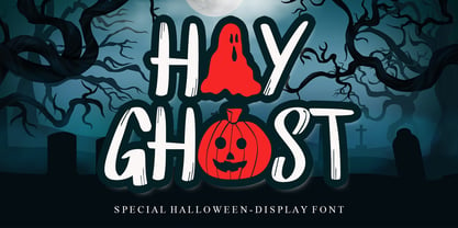 Hay Ghost is a thick-lettered and spooky display font. It is perfectly suitable for any Halloween-related project or crafty idea! This font is PUA encoded, which means that you can access all of the glyphs with ease!
 - Andilay by Rezastudio,
$9.00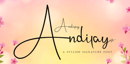 Andilay is a lovely and timeless handwritten font. It is the best choice for creating eye catching logos, branding and quotes. This font is PUA encoded which means you can access all of the glyphs and swashes with ease!
 - Quatrain by Hanoded,
$15.00 Quatrain is a hand-drawn, all caps typeface based on Bodoni. It is a little rough, a little uneven, but lively and elegant as well. Quatrain looks good on packaging, or in headlines. Comes with an abundance of diacritics.
 - Bunnyheart by Letterafandi Studio,
$16.00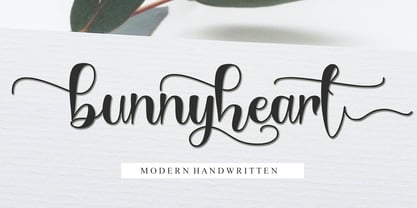 Bunnyheart is a modern handwritten font. Whether you’re using it for crafting, digital designing, presentations, or greeting card making, it’s perfect! This font is PUA encoded which means you can access all of the glyphs and swashes with ease!
 - Danity by Sesa Grafika,
$35.00 Danity is a gorgeous and retro styled display font. Add it confidently to your projects, and you will love the results. This font is PUA encoded which means you can access all of the glyphs and swashes with ease!
 - Vingiloth by Mr. Typeman,
$12.00 Vingiloth is a delicate script which simulates natural handwriting. Vingiloth includes Vingiloth Regular and Vingiloth Caps, designed to contrast and compliment each other with elegant beauty and contemporary style, making it an excellent fit for projects of all types.
 - Semrawut by Andrey Font Design,
$9.00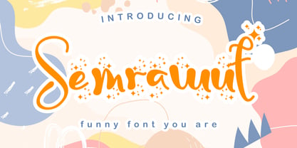 Semrawut is a lovely and timeless handwritten font. It is the best choice for creating eye catching logos, branding and quotes. This font is PUA encoded which means you can access all of the glyphs and swashes with ease!
 - Hello Snow Swash by Stefani Letter,
$14.00 Hello Snow is a sweet and snowy display font with a magical feel. Each of its letters is covered in snow, making it the ideal font for any Winter-project! It embodies playfulness and authenticity and is the perfect choice for any children's activity, Christmas, thanksgiving, poster, logo, packaging, or school project. Fall in love with its incredibly adaptable style and use it to create amazing designs! Add this beautiful display font to each of your creative ideas and notice how it makes them stand out!
 - Moena by RagamKata,
$16.00 Moena | Stylish Modern Serif Font Moena is a unique serif font that showcases distinctive characters in each letter, while maintaining a high level of readability. With its slight thinness, this font remains versatile for all design purposes, especially for logo designs. Moena's uniqueness lies in its meticulously crafted letterforms, where each character carries its own distinct personality. The font exudes an air of creativity and elegance, making it ideal for adding a touch of sophistication to your designs. Whether you're working on logos, branding, or other design projects, Moena's versatility shines through. Its delicate yet readable appearance adds a sense of refinement, allowing your designs to stand out effortlessly. Crafted with precision and a keen eye for detail, Moena ensures that every curve and stroke is thoughtfully designed to maintain legibility while showcasing its individualistic charm. With Moena, you have a powerful tool to create captivating and memorable designs that leave a lasting impression. Unleash your creativity and elevate your designs with the unique character of Moena!
 - Deberny by Typorium,
$15.00 The Deberny typeface is an interpretation–carrying a contemporary imprint–of a typographic style which appeared and spread at the end of the 19th century until the begining of the 20th. These typefaces were named Italian, Venetian, Veronese and were classified in the Hellenic category, a spontaneous typographic movement caracterized by triangular and heavy serifs. They found their inspiration among numerous references, from incised to slab serif typefaces and their extreme expressions in wood type letterforms. The Deberny font family is made of 26 styles in 3 complementary sets of style, offering a wide palette of visual resonance: • Deberny Line is ideally suited for editorial, branding, posters and billboards. It has sharp contrast between thick and thin strokes. Heavy horizontal strokes are not frequent in roman letters, but here they fit naturally with the italic letters. • Deberny Open is a stylish outline declination of Deberny Line Medium and Medium Italic. • Deberny Text is an adaptation of Deberny Line made for broader use. Its shapes are less contrasted, which makes it perfectly legible for print or screen reading in small size text. Old style figures and small caps complete Deberny Text in all its 8 styles. The Deberny typeface family supports Latin-based languages and will be available soon in Cyrillic and Greek. Deberny Narrow will be released this year in all its 26 styles.
 - Sinete by Ndiscover,
$89.00 Sinete, besides being and elegant and charming typeface, is also an extraordinary monogram set. You can create any 2 letter combination with its more than 350 handmade interlocking monograms. There is also the possibility of creating stylish 3 letter combinations. But that is not all, Sinete provides you with 30+ numeral ligatures and a variety of frames to combine with the monograms. This font also gives you the ability to create many text textures with its 4 case design approach (Uppercase, Small Caps, cantered Small Caps and “Opulent” Case). This gives you plenty of versatility. Make sure you play with the 9 Stylistic Sets provided. Sinete is all about creating wonderful words. Perfect for wedding invitations and other events as well as for refined logos and branding. This is also a great typeface for titles due to its delicate design and captivating look.
 - Broadway Poster by GroupType,
$15.00 Originally designed by Morris Fuller Benton in 1925, FontHaus's 1995 revival is based on a design named "Novelty Broadway". Characters were referenced from "Commercial Art of Show Card Lettering" by James Eisenberg, published by D. Van Nostrand Company in 1945. This Broadway is classic Broadway but with some charming differences such as a slanted lower case "f" a remarkable lower case "g" and a high-waisted upper case case "R", as only a few examples. It was named "Novelty" because the alphabet incorporated a concave design feature in the tops and bottoms of each letter. These differences allow this version to possess much more personality than that of all other Broadway designs on the market. It looks almost hand brushed, has soft edges and is no where near as sterile looking as all the other digital versions. It feels very 1925!
 - Dave Gibbons Lower by Comicraft,
$49.00 Other guys may imitate him, but the original is still the greatest! Get in with the In Crowd and check out the font created by Mister Fontastic for Dave Gibbons Original Graphic Novel, The, ah, The Originals. Yes, Dave Gibbons now comes in lower case, it's not just what he does when he gets back from the off license. Be sure and pick up The Originals from Amazon -- now available in paperback, and probably still available as a hard case, much like Dave. After the crack about the case of beer above, I'm guessing you'll find me with a broken spine in the remainder pile. See the family related to Dave Gibbons Lower: Dave Gibbons Journal & Dave Gibbons .
