10,000 search results
(0.04 seconds)
- Tornelsen Curkee by madeDeduk,
$16.00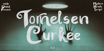 Really excited to introduce Tornelsen Curkee is a realistic brush script! Tornelsen Curkee will be perfect for all your designs project. Tornelsen Curkee Included: Uppercase Lowercase Number & Symbol International Glyphs Ligature Alternative Hope you enjoy it.
 - Omniscript by AVP,
$24.95 Omniscript is a confident hand-lettered script without self-conscious style or idiosyncrasy. Four weights together with monospaced numerals and math symbols make it ideal for architects and engineers. The fonts support all Latin-based languages.
 - Teramo by ROHH,
$29.00 Teramo™ is daring, sharp and dynamic. Its personality is derived from asymmetry and movement. It is a contemporary serif family full of modern design elements playing with proportions of works of XV and XVI century masters such as Francesco Griffo or Claude Garamond. The family features four optical sizes. Display sizes feature extreme stroke contrast and are intended for fashion, lifestyle, cosmetics, magazine, business, hi-tech and advertising use. Text styles are created for all kinds of body copy — long and short paragraphs, books and websites in any modern design context. They are crafted to be elegant and legible, featuring more generous spacing and scrupulous kerning. Display weights are designed as modern, extraordinary variations on didone style. Teramo’s letterforms are merging classical proportions and precise, contemporary details such as asymmetric serifs, sharp edges and unconventional glyph shapes. Another important factor constituating Teramo’s personality is an angled axis, unusual for didone families and giving the typeface much more organic and dynamic feel. Teramo features a lively true italics strongly related to cursive handwriting. The italic styles imply movement, energy and fluency, introducing a new color to paragraph text, as well as being a powerful and interesting standalone display type. The family introduces additional titling letter variations for headlines and display uses, such as sharp and modern lowercase “y” or uppercase alternates for better all caps typography. Teramo consists of 56 fonts in 4 optical sizes - 28 uprights and their corresponding true italics + 2 variable fonts. It has extended language support as well as broad number of OpenType features, such as case sensitive forms, standard and discretionary ligatures, titling alternates, contextual alternates, lining, oldstyle figures, slashed zero, fractions, superscript and subscript, ordinals, currencies and symbols.
 - Masiva by Graviton,
$24.00 Masiva font family has been designed for Graviton Font Foundry by Pablo Balcells in 2018. It is a geometric sans serif typeface with carefully crafted curves that provide a soft and pleasant appearance. Its universal shapes make it suitable for any kind of project, text length and size. It can be used as a powerful display typeface in big sizes. Also, thanks to its legibility, it can be used in long body texts in very small sizes and everything in between. It performs just as well in classic style projects as in contemporary or modern ones. Masiva consists of 12 styles, each containing small caps and glyph coverage for several languages.
 - Rimbomba by Muykyta,
$13.00 Rimbomba is a freehand style font with long ascenders and descenders and a steep slant making it elegant yet casual. It is inspired by writing letters by hand, as it was done before, with strokes that in the normal style imitate the tip of a pen and in the medium and bold styles they imitate a round pen stroke. It is a font with strength in its movements and finesse in its curves, which creates a homogeneous set that is easy to read and which produces a certain reading speed. It is complemented with stylistic alternatives for the beginning and the end of the words.
 - SK Coisa by Shriftovik,
$32.00 SK Coisa is a decorative slanted geometric typeface with a daring character. Its sharp shapes and angles, and indeed the whole structure, scream for its extraordinary nature. It is unusual and stands out, and most importantly, it does not hesitate to be not like everyone else. SK Coisa is built on the contrast of rounded and sharp geometric shapes, and because of it, its appearance is impossible to forget. The typeface has both capital and lowercase characters. It supports the basic and expanded Cyrillic and Latin alphabet, as well as many other languages and character sets. If you want your design to scream, then SK Coisa is exactly what you need!
 - Broadside Text by Device,
$39.00 Broadside Text is a companion to Broadside, and is optimised for use at smaller sizes. More open counters, more generous letter-spacing and additional fractions increase legibility. The original Broadside family is suitable for headlines and larger sizes, and also comes with condensed and extended versions. Broadside is a versatile, authoritative and functional family inspired by the sans serifs seen on ’40s and ’50s patriotic posters and period advertising. It is available in seven weights across condensed, normal and extended widths, each with reweighed italics. The type from this period was very often hand-drawn, and so differs considerably from poster to poster. Many American examples of this period use a Photo-Lettering style called Murray Hill and its derivatives, although their UK counterparts, designed by such luminaries as Abram Games or Tom Eckersley, are more stylistically diverse. Even though no single model is available to base a digitisation on, there are certain recurring stylistic quirks that give the type its unique flavour, and so the most interesting examples from several sources were be combined for the final family. Alternate short descenders, allowing for tighter line spacing, can be toggled on or off in the Opentype panel of Indesign or Illustrator. Tabular and lining numerals and a single-story ‘a’ are also available in all weights and styles.
 - TT Supermolot Neue by TypeType,
$35.00 Useful links: TT Supermolot Neue PDF Type Specimen TT Supermolot Neue graphic presentation at Behance Looking for a custom version of TT Supermolot Neue? TT Supermolot Neue is a redesigned, extended and greatly enhanced reincarnation of the popular TT Supermolot and TT Supermolot Condensed font families. During its existence, the hammers (‘molot’ in Russian) managed to get into the spotlight in a huge number of projects, for example, in popular video games, films, and branding. Despite its popularity, the limited composition of old families put boundaries their development, which prompted us to release a completely redesigned and greatly extended version. And while the old families could offer designers only a limited number of tools, in the new version you can already find 54 fonts, and each individual font now consists of more than 620 glyphs. First, we have added a completely new subfamily, TT Supermolot Neue Extended. But this is only the tip of the iceberg—in order to achieve visual harmony between the three subfamilies, we completely revised the distribution of widths among them. As a result of this work, the width of the TT Supermolot Neue Basic subfamily became a bit narrower, and the width of the TT Supermolot Neue Condensed subfamily became even narrower than it was in the old version. Secondly, we’ve increased the number of weights. While in the old versions there were only 5 weights, in the new ones there are 9 in each of the subfamilies. In addition, we gave a facelift to the lowercase and uppercase letters. In TT Supermolot Neue, the design of all controversial grapheme forms was soothed and now the family can also be used in the text set. We have completely redrawn italics. It took us half a year to compensate for all the circles, to transform italic strokes, to work out the position of the diacritics, to make right the spacing, and to finish kerning. Following a good tradition, in the TT Supermolot Neue extensive support for useful OpenType features was added, and hinting was also improved. If we talk about visual features, we recommend paying closer attention to two stylistic sets: the first set (ss01) is designed to make the typeface more humanist, and when you turn on the second set (ss02), the typeface becomes even more technological. In addition, the typeface has more than 26 items of standard and discretionary ligatures. We also have not forgotten about the figures and we added a set of old-style figures to the standard version. In addition, the typeface has case, ordn, frac, sups, sinf, numr, dnom, onum, tnum, lnum, pnum, calt, liga, dlig, salt, ss01, ss02.
 - Black Pearl by FontMesa,
$30.00 Black Pearl is a revival of an ornate calligraphic font possibly created between 1850 and 1870. I spent two years looking for all the letters of this font; once I found them all, I immediately went to work on recreating this old classic. I was not able to find any numbers for the font, so new to this style are numbers, some punctuation and currency symbols. The Truetype and OpenType formats include an extended character set with Central and Eastern European accented letters. Extra characters in this font are left and right pointing hands in place of the less than and greater than keys; a ship’s wheel, located on the asterisk key; and a boat anchor on the bracket keys.
 - Snatch by Latinotype,
$29.00 Snatch is a dynamic and expressive type system designed for impassioned and unprejudiced creative directors who look to combine the rough with the sexy. The font is well-suited for publishing projects, branding and packaging. Snatch is composed of three sections: a group of sharp-shaped uppercase fonts (small caps and all caps) in 5 weights, a set of script catchwords and eclectic sets of dingbats and flags that communicate the blue-sky thinking and feel of the project. Snatch—a collaborative project between Bercz and Latinotype Team—is the wild, condensed sister of BOWIE and it was developed by Valentina Vega, Rodrigo Fuenzalida and César Araya, under the supervision of Dany Berczeller, Daniel Hernández y Luciano Vergara. The family consists of 5 weights, ranging from Thin to Black, and comes with a 679-character set that supports 206 languages.
 - Tropicano JNL by Jeff Levine,
$29.00 Before 1959, in pre-Castro Havana, Cuba, the preeminent nightclub was the Tropicana. During the regime of Fulgencio Batista, Cuba was resplendent with nightclubs and gambling casinos catering to [mostly] the North American tourists; which brought it the title of the Monte Carlo of the Americas. Although Cuba (and the world as a whole) has changed vastly over the decades, the hand-lettered logo of the Tropicana Night Club has survived, and has been reproduced as a complete digital font called Tropicano JNL (a slight twist to the club's name). At first the font seems to be awkward, crude and amateurish, but in taking a second look, there's a playful charm to it. Additionally, this font can double as a "spooky" font for the Halloween season, monster parties and in other similar themes.
 - MFC Falconer Monogram by Monogram Fonts Co.,
$169.00 The inspiration source for MFC Falconer Monogram is an unusual hand-drawn design from a vintage embroidery publication which relies on rigid geometric letterforms to create an upward stepping framework. This monogram which evokes visions of it embossed or printed on antique baking tins was originally intended to adorn handkerchiefs, but the possibilities of its use are up to your imagination. This is one of many monogram designs from the early 1900’s which fall into a two letter format that is either adorned or interwoven decorative elements. Download and view the MFC Falconer Guidebook if you would like to learn a little more. MFC Falconer Monogram comes complete with Pro format fonts. You will require with programs that can take advantage of OpenType features contained within the Pro fonts.
 - AT Move Billiard by André Toet Design,
$39.95 BILLIARD was born from the numerous sketches André Toet did for the design of a series of postage stamps in 2011. It’s a capital monospaced and ‘fun’ alphabet, based on the classic billiard play with two white and one red ball. Actually snooker and pool were derived from this rather old sport! In Europe it used to be a sport played by elderly people, practiced in traditional bars, including the smell of beer and the at that time prevalent smell of cigarettes and cigars. These days billiard, snooker and pool are quite popular once again with young people. Hopefully our new font will get the same attention the ‘old sport’ deserves and who knows it might even be used in a sportive way. Concept/Art Direction/Design: André Toet © 2017
 - Piedmont by 38-lineart,
$17.00 Hello good people. introducing our new font 'Piedmond' This time we wanted to create a gallant signature font. Inspired by men's hand strokes, with a decisive pattern, each glyph is formed through the pressing of the pen, the orientation of the shape is almost constant with the direction of the pattern that continues to point forward and ends with a strong pressing of the pen. We call it the masculine signature type, reflecting a confident attitude, a definite decision and full confidence. We design this font for modern product branding, not only for men, but women also love this masculine side. This font is equipped with swashes, alternates and additional ligatures for the lowercase. By using this font, it will give your brand more confidence to appear wider. Thanks
 - Go by Canada Type,
$24.95 Five years into the 21st century and the promise of nanotechnology, high-end popular culture design seems to thrive on combining opposites and drawing a fine line between traditionally contradictory ideas. This is seen in modern society's usual cultural frontrunners - like consumer electronics, fashion items, music packaging and publications, where it is evident that traditionally complex marketing statements of fashionability and lifestyle are attempted with simple minimalism. But at the typographic end of this realm, the creative majority still uses old faces that help the modern statement only in passing. Some of the more adventurous creative professionals actively seek new elements to emphasize contemporary impact in their modern design. To those adventurous types (pun intended), Canada Type presents this new face called Go. It is very much a child of the new millennium, inspired by the unmistakable minimalist style of modern 21st century corporate logos, recent design shifts in electronic music and club-marketing collateral, and disc jockeys who have enthusiasm, energy, precision and total control of each and every vibration traveling from mixer to speakers. Go is an original modern techno-lounge face that offers the eyes pleasing collages of friendly minimal forms that give the words an impression of simplicity and depth at once. This is a font that prides itself on its precise grouping of elements and just enough original creativity in combining those elements. The precision builds the sharp edge sought for modern statements, while the creativity keeps the message rejuvenated, clear and interesting. Go's character set consists of a versatile and unexpected, yet mild mix of the uppercase and lowercase forms, with multiple variations on the majority of the letters. The e being a vertical mirror of G is only the first of the pleasant surprises. More than 30 alternates are inside the font. All the accented characters in Go have been meticulously (perhaps obsessively) drawn to be unusual for logos and short statements. Take a look at the character map and be ready for a space-age surprise. To borrow a Star Trek cliché, this font can Go where no font has gone before.
 - TT Frantz by TypeTrends,
$24.00 Useful links: Using the variable font in Illustrator Working with a variable font in Photoshop TT Frantz is an experimental variable font, distinguished by its slimness and lightness. The variation in the font affects the change in the height of the mean line - by moving the axis adjustment slider you can easily raise or lower the mean line of the font. In TT Frantz, you can find small references to the art deco aesthetics, which are expressed in significantly lowered or, conversely, heightened waist of the letters. In addition, depending on the position of the axis adjustment slider, the closedness of the aperture changes for some letters. In order to preserve the main feature of the font—the change in the height of the main line—we made lowercase characters as tall as uppercase ones, but at the same time we kept small kerns. An interesting fact is that in Cyrillic letters з с а е, the variability of the aperture follows a different scenario in comparison with their Latin sisters. When working on TT Frantz, we tried to make it so that when changing the variability, the width of the characters would not change, and the font would remain monospaced. And in order to avoid holes in the set, we made contextual alternates and several ligatures. Frantz consists of 470 glyphs, and in addition to broad language support (Latin and Cyrillic) it can offer standard and old-style figures, including their tubular versions, as well as ligatures. Important clarification regarding variable fonts. At the moment, not all graphic editors, programs and browsers support variable fonts. You can check the status of support for the variability of your software here: v-fonts.com/support/ But do not despair—even if you do not have access to the necessary software, you still have the opportunity to use TT Frantz in your projects. Especially for you, we have prepared three separate non-variable styles (Frantz A, Frantz B, Frantz C), each of which is responsible for a certain location of the mean line of the font and where this line is already fixed in a certain position (high, medium and low).
 - CrEAtOR CamPotype by Campotype,
$15.00 So far the Creator Campotype standard version known in the form of free font (published on several websites by license: free for personal use). The font takes the basic form of modern typography, but some user feedback consider it in the medieval look. Whatever it is, the inspiration of the font was originally set off from the logotype of internal student magazine where the designer had studied in the late 80s. Creator Campotype is a pure display font. This fonts do not have faces lowercase, but all caps. Nevertheless forms of different characters can be accessed by pressing the uppercase and lowercase on the keyboard. Maximum usage can be made by combining them as necessary. Some forms of characters were made more stylistic such as slash and backslash which “out of” the conventional form. In addition, the circle effects on several glyphs were created by default (as found on the free version) so that the glyph was enough to generated with the keyboard access as usual. Information for those who have access to the free version, there are significant changes in this version (2001) as described in the file “creator ct pdf” (gallery)
 - Lemonado by Melvastype,
$29.00 Lemonado is a type family drawn with a dry brush pen. It includes upright and italic scripts and all caps fonts with brush texture or with smooth edges. Lemonado Script is playful and slightly bouncing connecting script. It includes two sets of lower cases to increase the hand writing effect. By enabling Contextual Alternates from OpenType panel you can cycle these two sets and achieve variation. Lemonado Script also includes set of lowercases without connecting stroke, you can use those in the middle of words or automatically add them at the end of words by enabling Stylistic Set 1 at the OpenType panel. There are also set of lower cases with end swashes, you can automatically add these swashes to end of words by enabling Stylistic Set 2 at the OpenType panel. Also other alternate characters and underlines are included to give you even more possibilities to play with. Lemonado Caps has two sets of upper case letters, high and low ones. You can achieve this fun looking bouncing effect by varying them. Just enable Contextual Alternates from OpenType panel and those two sets will cycle.
 - Hortensia by Canada Type,
$24.95 Hortensia, designed around 1900 by Emil Gursch for his own Berlin foundry, is a typeface most expressive of the post-Victorian aesthetic that was all the rage in both Europe and America during the second half of the 19th century and up until the Great War. It is a reduced aesthetic of sharp points and natural curves that almost want to apologize for their own elegance, but clearly embody the simple excitement about the blossoming of industry and crafts during the period. This deco script trend would get a re-run for about a decade on either side of the second World War — especially in the entertainment and financial industries — before giving way to art nouveau and big brush faces. Hortensia was Gursch's most popular typeface, used extensively and prominently in many beautiful type catalogs, and a commonly seen design element in Germany for quite a while after its release. This digital version brings plenty of fixes and additions to the original metal Hortensia design, including many alternates sprinkled throughout the character set, and support for a wide range of Latin-based languages (including Central European, Baltic, Turkish and Welsh).
 - Halcyon by Studio Buchanan,
$12.00 Halcyon is a post-geometric typeface made up of 16 fonts across 8 weights. Each weight contains an upright with a corresponding true italic. Halcyon's design builds on the foundations of classic typefaces such as Futura, Gill Sans and ITC Avant Garde Gothic, by mixing their geometric structure with more modern humanist qualities and attributes. The result is a friendly and approachable personality with a sophisticated and serious edge. Halcyon feels familiar, but unique, playful but not asinine. The versatility of its character makes Halcyon a reliable choice for any design decision. With a large variety of weights, and a whole host of Open Type features, Halcyon can adapt to fit the tone of your communications. The lighter weights present a more refined and formal voice, while the heavier, oversized weights grow more exuberant. It's large x-height and open apertures increase it's legibility, making it perfect for setting large display headlines or small sized, long form text. Halcyon is a multilingual family with hundreds of accented characters, and allows for customisable characters through diacritic combinations. All European languages are already covered, alongside many more within the Latin alphabet.
 - Bridle Path by Cititype,
$19.00 ‘Bridle Path’ is a captivating font that embodies the graceful beauty of natural ink strokes. With its unique blend of thick and light strokes, it exudes a tranquil and soulful writing style that is both relaxed and inviting. The font's distinctive character makes it an excellent choice for various applications, including brands, logos, photography logo watermarks, headers, titles, weddings, cards, and website banners. The fluidity of Bridle Path’s design creates an enchanting visual experience, as if each letter was crafted by an artist's brush. The thick strokes provide a sense of boldness and strength, while the light strokes add delicacy and elegance to the overall appearance. This combination results in a font that captures attention and leaves a lasting impression. Bridle Path’s versatility extends beyond its aesthetic appeal. It has been meticulously crafted to support multilanguage usage, ensuring that it can seamlessly adapt to various linguistic needs. Whether your content is in English, Spanish, French, German, or any other language, Bridle Path will faithfully represent your words with clarity and beauty. Whether you're seeking a font that embodies a serene atmosphere or one that adds a touch of sophistication, Bridle Path is the perfect choice. Its soothing and expressive nature elevates any design, making it a valuable asset for both professional and personal projects. Embrace the allure of ‘Bridle Path’ and bring a sense of natural elegance to your creations.
 - Maiola by TypeTogether,
$49.00 Being inspired by early Czech type design, Maiola is clearly a contemporary typeface, that is mindful of its historical heritage, implementing old-style features and calligraphic reminiscence, more frankly so in the Italic. Nevertheless, through its personality, it attempts to create a welcoming tension on the page, without shouting too loudly at the reader. It handles its expressive tendencies with care and in doing so increases its usability, with legibility being of great importance. Subtle irregularities of the letterforms enhance furthermore the dynamic spirit and liveliness of the typeface. With the advent of Opentype, allowing for bigger character-sets and better language support, as a natural consequence, Maiola Multiscript covers Latin A, Cyrillic and Greek. Although basically independent from each other, they are, however, designed in the same spirit as the Latin, and harmonize well in multilingual text settings. The update to this beautiful font family includes the addition of over 240 glyphs featuring new ornaments, stylistic alternates, ligatures, superior letters, fractions and more. Furthermore, several glyphs were significantly improved and the kerning was fine tuned for better performance. Originally released in 2005, Maiola was an immediate success. It won the renowned TDC competition in 2004 where it was also recognized as a “judge’s choice”, was part of the touring exhibition e-a-t, and was selected in the Creative Review design competition in 2005.
 - Puffball by Open Window,
$- Puffball is a fat face with cartoonish features. It also wouldn't look out of place in an ancient Celtic engraving. What makes Puffball so intriguing to look at is that it seems to walk a thin line of buffoonery and ornamentation.
 - Holland Gateway by Stringlabs Creative Studio,
$25.00 Holland Gateway is a magical handwritten font carefully created with a touch of elegance. It will elevate a wide range of design projects to the highest level, be it branding, headings, wedding designs, invitations, signatures, logos, labels, and much more!
 - Kaaos Pro by The Type Fetish,
$25.00 Kaaos Pro is based on the logo of the Finnish hardcore band of the same name. It was expanded to include extended Latin, extended Cyrillic and Greek alphabets so it will work with most languages in Europe and the Americas.
 - Inked Classic by Adam Ladd,
$25.00 Inked Classic is hand-inked with a mix of strong lines and a classic feel. While it has a personal touch, it also conveys a sense of modernism with the didone influence. Great for display and works in smaller text settings.
 - Anantason Reno by Jipatype,
$17.00 Anantason Reno is a versatile sans-serif typeface that offers a range of 162 styles, spanning from thin to black in weight and ultra-condensed to ultra-expanded in width. Its adaptability makes it well-suited for a variety of purposes.
 - Aventura by Sudtipos,
$59.00 Aventura is burlesquely round, stylishly seductive, eternally sugar-fixed, and loving to a fault. Plenty of stylistic alternates are included to heighten the mood or soften it. Either way you look at it, there's a lot of love in the air.
 - Pandanus by Hanoded,
$15.00 Pandanus is a lovely, handwritten typeface with a lot of flair. It is stylish, elegant and highly legible, making it an ideal font for texts and cards. Comes with a full range of diacritics and alternates for the lower case letters.
 - Cantoria by Monotype,
$29.99Cantoria was designed by Ron Carpenter in 1986. It is a serif font with characteristics of stone cut letters. Distinguished by its open forms and large capitals and available in 10 weights, Cantoria offers a wide range of possible applications. - Dschoyphul by Ingrimayne Type,
$9.95 Dschoyphul is a serifed typeface that was crudely drawn with a pen. It is sloppy and irregular. It was one of several efforts to draw a serifed typeface by pen; see also SarahfSlob, which contains a complete family of styles.
 - Shoal by Graphicfresh,
$18.00 Adaptation to the 1920s design style which is synonymous with luxury and elegance. Its form is rigid, and stratified, and stands out in the height of its character. This font was created to recognize the famous design style of the time.
 - Deco Neue Wilde by Open Window,
$- Deco Neue Wilde is a filter font based on Deco, an original Open Window classic. It sort of speaks for itself but it reminds me of a lava lamp and the countless shapes that you could waste time watching appear.
 - Bricoleur NF by Nick's Fonts,
$10.00 This naïve script was discovered in a French printers' magazine from 1927. Its total lack of pretension makes it warm and inviting. Both versions of this font support the Latin 1252, Central European 1250, Turkish 1254 and Baltic 1257 codepages.
 - Cut Block by Adam Ladd,
$20.00 A hand-drawn typeface that depicts the idea of cutting away pieces of wood. It has a rough, yet modern appearance as it is largely based off the popular Gill Sans (with some modifications). Leaving a graphic and textured look.
 - Seven Moon by Four Lines Std,
$15.00 Introducing Seven Moon: A Retro-Inspired Font with Bold and Cheerful Charm. Seven Moon's cheerful charm shines through every character, evoking a sense of nostalgia and excitement. Its bold strokes and unique shape give it a strong presence, while its playful nature adds a touch of warmth and approachability. This font is designed to command attention and leave a lasting impression. Its distinct style ensures that your message will be conveyed with impact, making it an excellent choice for branding, advertising, social media graphics, and more.
 - Classy Minimalist by Jinan Studio,
$20.00 Classy Minimalist is a stunning handwritten typeface that features 139 ligatures for a natural and sophisticated handwritten look. Its beauty is perfect for weddings design, valentines, invitations, branding, quotes, and more. Plus, it supports multiple languages, making it perfect for a variety of design needs. With its elegant strokes and versatility, this font adds beauty to any project, making it a must-have for content creators. Features A set of uppercase and lowercase glyphs Number, symbol, and punctuation Multilingual Support Alternates, ligatures, and swashes PUA encoded
 - Dandy Script by Hipfonts,
$17.00 Dandy Script is a stunning new typeface that blends classic elegance with contemporary flair. Its graceful, flowing lines and delicate curves make it the perfect choice for high-end designs that require a touch of sophistication. With its modern twist on traditional script fonts, Dandy Script is both timeless and fresh, making it ideal for a range of creative projects. Whether used for invitations, branding, packaging, or other design applications, Dandy Script is sure to elevate any project with its refined and luxurious aesthetic.
 - Submariner by Type Fleet,
$- Submariner waterproof sans serif technology Submariner is a waterproof type family that displays the right amount of power and character on every depth level. Thanks to its strong and humanistic construction, it can endure great information pressure. It is a marvelous typographic experience. The letter construction is more open and endings are slightly wider. It is suitable for longer texts, information graphics, annual reports and signalization. The typeface’s x-height is exactly 70% of its capitals. The italics are designed at a 9° angle.
 - Magazin ST by siquot'types,
$39.99 Magazin ST is powerful but delicate. What fascinated me seeing, a couple of letters, in Bob Roy Kelly's book (American Wood Type:1828-1900) were the little squares in the corners that represent a glow from lighting coming from below and from the right. Such ambiguity excited me and I thought that today with digital resources it wouldn't take long to do it. Seeing it working is excellent. Look In the posters what it is for and the effects it produces, including the sensation of relief.- L.S.