10,000 search results
(0.038 seconds)
- Etelka by Storm Type Foundry,
$49.00 Etelka was designed for purposes of corporate identities, branding, product package design and outside lettering. It works anywhere an extremely legible typeface is needed. Package and label design often requires a wide choice of weights and widths: light and narrowed fonts to fit huge amount of mandatory informations onto a small box, or to squeeze text lines around a bottle, fat and wide styles to emphasize information on a poster or vehicle. The regular styles will serve well for business card, small texts and for your website. Etelka’s design idea is wide, open rounded square. Some details are extremely minimized: lower-case “a, n” or “u” lack their typical spur. The typeface has a distinctive industrial expression with all diagonals slightly softened, and her overall strict mono-linear principle is exceptionally broken only for fine optical adjustments in joints. Cyrillic and Greek scripts are present for international business, as well as rich latin diacritics. Etelka is actually very well suited for all kinds of visual communication, especially orientation systems in modern architecture. The first drawing of the font, which was later named “Etelka”, was submitted in 2004 for the Czech Television identity competition and was rejected by the jury. We later concluded that the design was worth extending to the current superfamily of 42 fonts. It is a reliable typeface for corporate identities and websites.
 - Lady Slippers by Studioways,
$40.00 This is Lady Slippers, a delicate and beautiful typeface resembling one of Eliza Gwendalyn’s popular modern calligraphic styles! She is the full blown version with many OpenType bells and whistles such as, swashes, ligatures, discretionary ligatures and stylistic alternates. Enabling them makes it possible to create beautiful and seemingly hand-written calligraphy designs. Then there’s Lady Slippers Basic, Lady Slippers Loops, and Lady Slippers Align. These fonts are toned down versions of Lady Slippers. Still beautiful and delicate handwritten script typefaces, they are meant for users who don't require all of OpenType goodies. Each of these fonts support some basic OT features, like fractions, superiors, and ordinals. In an interesting twist, we have redrawn the lowercase in Lady Slippers Align to align on the baseline, giving Lady Slippers a more traditional calligraphic appeal. Finally, Lady Slippers Ornament is offered as a companion for any font in the Lady Slippers family. It contains decorative ornaments, crests and other hand drawn elements, as well as a set of figures, minimal punctuation, and some catchwords useful for invitations and bridal pieces. The package includes a key map so finding the ornaments is made easy. All the glyphs are accessible from any standard keyboard. You can purchase the fonts separately, or one of the discounted bundles we've put together, Lady Slippers 4 Pack (includes Basic, Loops, Align and Ornaments) or the Lady Slippers & Ornaments pack.
 - Abdo Rajab by Abdo Fonts,
$29.50 Abdo Rajab is the second version of the font FS Rajab which was designed by the type designer Abdulsamiea Rajab Salem for Future Soft company fonts. It is a leading company in Arabization field and producing the Arabic and Islamic programs beside the children programs. This font appeared between 1998 and 2000. In this version there were a lot of adjustments to keep the font in its spirit and uniformity between the various characters. Also added some new characters, which gave him another beautiful addition to be used in both title and text designs. Three weights (Regular, light and bold) have been created. Then the font was converted to OpenType to support Arabic, Persian and Urdu to be compatible with the various operation systems and modern software. The combination of modern Kufi and Naskh styles and varying between straight and curved parts made it a beautiful typeface appropriate to the titles and text, and able to meet the desire of the user in the design of ads and modern designs of various types of audio and visual.
 - Abdo Salem by Abdo Fonts,
$29.50 Abdo Salem is the second version of the font FS_Salem which was designed by the type designer Abdulsamie Rajab Salem for Future Soft company fonts. It is a leading company in Arabization field and producing the Arabic and Islamic programs beside the children programs. This font appeared between 1998 and 2000. In this version there were a lot of adjustments to keep the font in its spirit and uniformity between the various characters. Also added some new characters, which gave him another beautiful addition to be used in both title and text designs. Three weights (Light, bold and black) have been created. Then the font was converted to OpenType to support Arabic, Persian and Urdu to be compatible with the various operation systems and modern software. The combination of modern Kufi and Naskh styles and varying between straight and curved parts made it a beautiful typeface appropriate to the titles and text, and able to meet the desire of the user in the design of ads and modern designs of various types of audio and visual.
 - Yefimov Sans by ParaType,
$30.00 Yefimov Sans is a sans companion for Yefimov Serif . It is one of the last original faces by Vladimir Yefimov. It has contemporary design, squarish shapes of the round letters and legible proportions. Thanks to open aperture, it works well in small point sizes, and its distinctive letterforms make it good also for display purposes. The typeface was completed by Maria Selezeneva and Alexandra Korolkova. Released by ParaType in 2015.
 - Genial by Scholtz Fonts,
$16.95 Genial is an elegant, contemporary script font in nine styles, specifically designed for maximum versatility. All of the styles, ranging from condensed thin to expanded fat, are clear and legible. The font conveys a feeling of relaxed elegance. The Family: Medium weights - Regular: of medium weight and regular width - Expanded: of medium weight and wide - Condensed: of medium weight and condensed width (narrow characters) - perfect for limited space Black weights (for best readability) - Regular: for bolder statements - Expanded: expanded width for bolder statements Light weights - Regular: regular width, delicate line - Expanded: wide characters and a delicate line - Condensed: condensed width (narrow characters) and a delicate line Fat weight - Expanded: for maximum impact (wide and extra-bold) Use a combination of styles for product branding, book covers, invitations, greeting cards. The Genial combination will enable you to use different styles of the same font for headings, sub-headings and body text. Genial contains over 250 characters - (upper and lower case characters, punctuation, numerals, symbols and accented characters are present). It has all the accented characters used in the major European languages.
 - Savarella by Slex Studio,
$12.00 LOVE angelo is a beautiful Font Duo that's perfect for branding, wedding invitations, and other romantic projects. Font Features: -Lowercase beginning and end swash -lowercase swash up and down -ligature -1 multilingual Serif font. All the features and special characters of this font are included in one file. So that it is easily accessible by using programs or software that support opentype such as Microsoft Word, Excel, Adobe Illustrator, Adobe Photosop, and Adobe Indesign). This font is also very easy to use as it is compatible for all software even for supported non-opentypes. Are you wondering how to find out a special feature or character? Dont worry. You will get a guide with the file if you download this font. Please send a message if you have any questions or concerns, and feel free to say hi on Instagram: https://www.instagram.com/slex_studio/
 - Sutixo by Twinletter,
$17.00 Sutixo is the font for speed enthusiasts. Designed with the sports racing theme in mind, this font is perfect for creating bold and attention-grabbing designs. It comes with four variations, each with its own distinct style, and various alternate characters and ligatures to take your plans to the next level. Whether you’re creating graphics for a motorsport event or simply want to add a touch of excitement to your branding, Sutixo is the font you need. So gear up and get ready to race with Sutixo! What’s Included : - File font - All glyphs Iso Latin 1 - Alternate, Ligature - Simple installations - We highly recommend using a program that supports OpenType features and Glyphs panels like many Adobe apps and Corel Draw so that you can see and access all Glyph variations. - PUA Encoded Characters – Fully accessible without additional design software. - Fonts include Multilingual support
 - Condemned by Grype,
$16.00 Condemned is a light destructive sans typeface created from an old damaged ATF Specimen Book from 1912, and looks reminiscent of poorly transferred rub off type. It contains a complete alternate core character set for a subtly randomized look. Here's what's included with Condemned: 684 glyphs - including Capitals, Lowercase , Numerals, Punctuation and an extensive character set that covers multilingual support of latin based languages. (see the 5th graphic for a preview of the characters included) Contextual Alternates that auto-switches between Capitals & Alternate Capitals, Lowercase and Alternate Lowercase, as well as Numerals and Alternate Numerals for visual randomness. To access the Contextual Alternates feature, you will need to be using software with Opentype compatibility otherwise you can access the alternate glyphs via a Glyphs panel. Stylistic Alternates feature that swaps all standard Capitals, Lowercase, and Numerals with their Alternates Alternate Capitals and Lowercase are complete with all international accented characters Font is provided in TTF & OTF formats. The TTF format is the standard go to for most users, although the OTF and TTF function exactly the same. Here's why Condemned is for you: You're into legible but distressed typestyle that imitates a random distress to it You love condensed gothics, and want to pair them with a distressed condensed gothic You're a fan of old Letraset/Transfertype rub off lettering You're recreating weathered military ephemera and want a typeface with some tooth to it You just like to collect quality fonts to add to your design arsenal
 - Malow by Putracetol,
$28.00 Malow - Display Font Malow is a stunning display font that will bring elegance and sophistication to any project. This font was designed with a contemporary style that still maintains a classic look, making it perfect for a wide range of applications. The idea behind the creation of Malow was to develop a font that combines a modern aesthetic with a touch of timeless elegance. The result is a typeface that looks fantastic on branding projects, logos, packaging designs, posters, and more. Malow is a versatile font that can be used in a variety of design contexts, whether it's for print or digital projects. Its clean lines and bold appearance make it an excellent choice for headlines and titles, while its legibility also makes it ideal for body text. This font comes with a range of features that make it even more appealing. It includes uppercase and lowercase letters, opentype alternates and ligatures, and full multilingual support, ensuring that it can be used for projects in any language. In the font package, you will find three different file formats, including OTF, TTF, and WOFF. This makes it easy to use the font across a range of design software, including Adobe Illustrator, Photoshop, InDesign, and more. If you're looking to add a touch of sophistication to your design project, then Malow is an excellent choice. Its clean lines and elegant style make it a versatile font that will elevate any design. In summary, Malow is an elegant display font that combines modern and timeless styles, making it a great choice for a wide range of design projects. Its features include multilingual support, opentype alternates and ligatures, and three file formats in the package. This font is perfect for anyone looking to add a touch of sophistication to their project.
 - TuNninG OxidE by RodrigoTypo,
$29.00 Tunning Oxide, is an alternative version of Tunning Pro, it contains different styles as alternatives, it also contains Cyrillic and Greek, It is special for stock titles
 - Radish & Garlick by Jehansyah,
$9.00 This font is inspired by clean handwriting that is a bit simple, but still maintains elegance and creates a luxurious feel in the design, Radish and garlick This handcrafted font, so cute and so cute for any design you want to look simple yet aesthetically pleasing, use this design for all your design needs, it will potentially be your best font choice use it for all your design needs, print media, brochures, social media, social media status, letters, invitations, and much more. Thank you very Much
 - SD Quainton by Sawdust,
$35.00 SD Quainton was created in 2016 by Jonathan Quainton the co-founder of graphic design studio Sawdust. With a harmonious blend of Didone and Bauhaus elements Quainton embarks on a fresh and innovative direction. Drawing inspiration from revered typefaces like Bodoni and Didot, SD Quainton evokes the same sense of awe that captivated its creator. Designed with specific contexts in mind, SD Quainton finds its perfect home in the realms of fashion, retail, and premium products, where its captivating charm can truly shine. Although ideally suited for eye-catching headlines and titles due to its delicate strokes, the possibilities of where this remarkable typeface may find its place are as limitless as the designer's imagination.
 - JT Symington by JAM Type Design,
$15.00 JT Symington was inspired by the classic serif typefaces of the 20th century. Its well defined serifs make it well suited to headlines as well as large chunks of body copy.
 - Searches by Redy Studio,
$17.00Searches – Elegant Ligature Fonts Searches is a font that you should give a chance, if you are looking for a different look, Searches is a good place to start! There is always inspiration in fonts! Searches is an elegant, messy and lovely script. But Searches is not your ordinary script font; it has been developed to perfection by its creator, and it is sure to inspire you as well. You will fall in love with the movement of the letters, and you will find yourself using this font for many design projects to come. It comes with 92 ligatures, numbers, and other necessary glyphs. Searches features: A full set of upper & lowercase characters Numbers & punctuation 92 Gorgeous ligatures accents characters PUA Encoded Characters – Fully accessible without additional design software. Feel free to give me a message if you have a problem or question. Thank you so much for taking the time to look at one of our products. - Lady Suettaya by Sulthan Studio,
$12.00 Hi Font Lover! Lady Suettaya is a classic font, I build it with my relaxed hands. designing a classic font but having a modern element in it, which makes it particularly suitable for wedding media, book covers, greeting cards, logos, branding, business cards and certificates, in fact for any design work that requires a clasik, formal or luxury look. Try Lady Suettaya in your hands, enjoy the richness of OpenType features and let her fun and elegant excitement make you happy and enhance your creativity! You can use this font very easily. There are so lovely features in it. Contains the full set of lowercase and capital letters, punctuation, numbers, and multilingual support. This font also includes some ligatures and alternative styles Stylistic Set For those of you who have software that is able to work OpenType (Corel Draw / Photoshop / Illustrator / InDesign). About Multilingual? Don't worry, I Have added the characters in International Language.
 - Kalexa by Yock Mercado,
$9.99 Kalexa, a name inspired by the fusion of kaleidoscope and hexagon, is a modern typeface created from geometric lines based on the hexagon's shape. It draws inspiration from low poly and heavy industrial typefaces, reflecting modernity, simplicity, and power. With its sleek and minimalist design, Kalexa emerges as a disruptive force. Thanks to its 6 font weights, it is highly versatile, making it suitable for a myriad of projects across various themes, ranging from sports designs and industrial brands to technology projects. It adheres to the trend of bold and unconventional shapes while maintaining excellent readability. Available in a variable version for precise control over font weights, Kalexa unlocks endless possibilities for designers to craft captivating visual experiences. Each line becomes a brush of creativity, walking the line to new frontiers of design expression.
 - Estragon Pro by Stabenfonts,
$45.00 Estragon is a vivid sans-serif text face with venetian influences, suitable especially for books. It is remarkable for: its light slant, to the right, for most of the verticals, its small sized uppercase letters making it suitable for languages where they are often used (for example German,) and its just lightly inclined true italics. For a wide language support, Estragon contains a lot of accented characters including the polish kreska. It is generously equipped with ligatures, special and alternate characters as well as various kinds of numbers: besides the standard old-style figures to be set as part of text copy there are small-cap and tabular numbers as well as a set of fraction figures. Estragon comes with two weights, uprights and true italics, each with small-caps.
 - Mundbind NL by Hanoded,
$15.00 I just visited my good friend Jakob Fischer from Pizzadude.dk in Denmark. As always we talked fonts, drank coffee and walked endlessly through Copenhagen, the city where he lives. We thought it would be a fun idea to each create a font from a handmade sign we saw in the city. We only had like 7 glyphs to work with, so the rest was up to our imagination. We also thought it would be nice to give the fonts a similar name. Mundbind means mask in Danish. When you Google translate it, it will give you the wrong translation (it will say 'mouth piece'), so trust me on this one! My font is called Mundbind NL - where the NL stands for Netherlands. Jakob will hopefully call his finished font Mundbind DK - where the DK stands for Denmark. Mundbind NL comes with a monster load of diacritics (including Vietnamese) and two alternate glyphs for the lower case letters that will cycle as you type.
 - Party Noid by PizzaDude.dk,
$20.00Party Noids goes all the way - from cartoonish to romantic, from funny to serious. Write in all caps, all lowercase or mix upper and lowercase to create ounces of fun! - TA Bankslab by Tural Alisoy,
$33.00 The building of the Northern Bank of St. Petersburg's Baku branch was built in 1903-1905. It was the first Art Nouveau-style building in Baku, Azerbaijan. Later the bank was transformed into the Russian-Asian Bank. After the oil boom in Baku in the 19th century, branches of many banks and new banks were opened in the city. The branch of the Northern Bank of St. Petersburg was among the first banks that was opened in Baku. N.Bayev was the architect of the building for the branch of the Northern Bank of St. Petersburg located at Gorchakovskaya 3 in 1903-1905. The building currently houses the Central Branch of the International Bank of Azerbaijan. My purpose in writing this is not to copy and paste the information from Wikipedia. What attracted me to the building was the word "Банкъ" (Bank) written in Cyrillic letters, which was also used in Azerbaijan during the Soviet era. The exact date of the writing is not known. Every time I pass by this building, I always thought of creating a font of this writing someday. I had taken a photo of the building and saved it on my phone. I did a lot of research on the font and asked a lot of people. However, some did not provide information at all and some said they did not have any information. I was interested in the history of this font but I do not know if this font really existed or it was created by the architect out of nowhere. If there was such a history of this font, I wanted to recreate this font and make it available. If not, I had to create it from scratch in the same way, using only existing letters on the building. Finally, I made up my mind and decided to develop the font with all letters I have got. It was difficult to create a font based on the word, Банкъ. Because in the appearance of the letters, the midline of the letters on A, H, K was very distinct, both in the form of inclination and in more precise degrees. The serif part of the letters, the height of the upper and lower sides, differed from each other. I don't know whether it was done this way when the building was constructed or it happened over time. I prepared and kept the initial version of the font. I took a break for a while. I started digging on the story of the font again. Meanwhile, I was researching and got inspired by similar fonts. Unfortunately, my research on the font's history did not yield any results. I decided to continue finishing up the font. After developing the demo, I created the font by keeping certain parts of these differences in the letters. In addition, I had to consider the development of letters in the Cyrillic, as well as the Latin alphabet, over the past period. Thus, I began to look at the appearance of slab-serif or serif fonts of that time. In general, as I gain more experience in developing fonts, I try to focus on the precision of the design for each font. In recent years, I specifically paid attention to this matter. YouTube channel and articles by Alexandra K.'s of ParaType, as well as, information and samples from TypeType and Fontfabric studios on the Cyrillic alphabet were quite useful. I gathered data regarding the Latin alphabet from various credible sources. I do not know if I could accomplish what I aimed at but I know one thing that I could develop the font. Maybe someday I'll have to revise this font. For now, I share it with you. I created the font in 10 styles. 7 weight from Thin to Extra Black, an Outline, Shadow, and Art Nouveau. The Art Nouveau style was inspired by the texture in the background used for the text on the building. The texture I applied to capital letters adds beauty to the font. If you like the font feel free to use it or simply let me know if your current alphabet doesn't support this font.
 - TA Bankslab Art Nouveau by Tural Alisoy,
$40.00 TA Bankslab graphic presentation at Behance The building of the Northern Bank of St. Petersburg's Baku branch was built in 1903-1905. It was the first Art Nouveau-style building in Baku, Azerbaijan. Later the bank was transformed into the Russian-Asian Bank. After the oil boom in Baku in the 19th century, branches of many banks and new banks were opened in the city. The branch of the Northern Bank of St. Petersburg was among the first banks that was opened in Baku. N.Bayev was the architect of the building for the branch of the Northern Bank of St. Petersburg located at Gorchakovskaya 3 in 1903-1905. The building currently houses the Central Branch of the International Bank of Azerbaijan. My purpose in writing this is not to copy and paste the information from Wikipedia. What attracted me to the building was the word "Банкъ" (Bank) written in Cyrillic letters, which was also used in Azerbaijan during the Soviet era. The exact date of the writing is not known. Every time I pass by this building, I always thought of creating a font of this writing someday. I had taken a photo of the building and saved it on my phone. I did a lot of research on the font and asked a lot of people. However, some did not provide information at all and some said they did not have any information. I was interested in the history of this font but I do not know if this font really existed or it was created by the architect out of nowhere. If there was such a history of this font, I wanted to recreate this font and make it available. If not, I had to create it from scratch in the same way, using only existing letters on the building. Finally, I made up my mind and decided to develop the font with all letters I have got. It was difficult to create a font based on the word, Банкъ. Because in the appearance of the letters, the midline of the letters on A, H, K was very distinct, both in the form of inclination and in more precise degrees. The serif part of the letters, the height of the upper and lower sides, differed from each other. I don't know whether it was done this way when the building was constructed or it happened over time. I prepared and kept the initial version of the font. I took a break for a while. I started digging on the story of the font again. Meanwhile, I was researching and got inspired by similar fonts. Unfortunately, my research on the font's history did not yield any results. I decided to continue finishing up the font. After developing the demo, I created the font by keeping certain parts of these differences in the letters. In addition, I had to consider the development of letters in the Cyrillic, as well as the Latin alphabet, over the past period. Thus, I began to look at the appearance of slab-serif or serif fonts of that time. In general, as I gain more experience in developing fonts, I try to focus on the precision of the design for each font. In recent years, I specifically paid attention to this matter. YouTube channel and articles by Alexandra K.'s of ParaType, as well as, information and samples from TypeType and Fontfabric studios on the Cyrillic alphabet were quite useful. I gathered data regarding the Latin alphabet from various credible sources. I do not know if I could accomplish what I aimed at but I know one thing that I could develop the font. Maybe someday I'll have to revise this font. For now, I share it with you. I created the font in 10 styles. 7 weight from Thin to Extra Black, an Outline, Shadow, and Art Nouveau. The Art Nouveau style was inspired by the texture in the background used for the text on the building. The texture I applied to capital letters adds beauty to the font. If you like the font feel free to use it or simply let me know if your current alphabet doesn't support this font.
 - Typha Latifolia by JBFoundry,
$12.00 Typha Latifolia is a plant of the swamps from the Northern Hemisphere. It is characterized by its high rangy leaves. Typha Latifolia is also a font family. It is characterized by the height of the ascenders and the descenders. Numerous ornamental variations complete medium and bold versions.
 - Toronto Gothic by E-phemera,
$12.00Toronto Gothic was developed from a headline in a 1920s issue of the Toronto Star. In a previous life, it was probably Condensed Titling Gothic #11, but in this form its rounded corners and irregular lines are meant to make it look worn from years of use. - Lettre by Latinotype,
$19.00 Lettre is a geometric serif font designed by Pablo Sinn. Thanks to its imperfections, this font looks like it is hand-lettered. Lettre brings back nostalgic feelings of mechanical typewriter characters and recovers the essence of the rustic and natural, what makes it a very modern typeface.
 - Escaut by Eurotypo,
$26.00 Escaut is a modern calligraphic font, with a casual style and a lot of rhythm. It is designed with a pen with its characteristic ink discharges. Escaut includes a huge variety of ligatures and decorative characters in upper and lower case, to give it more handwriting reality
 - Jolgoria in Town - Personal use only

- Garetra by Letterhend,
$17.00 Garetra Serif s a sophisticated serif with many weight you can choose. It has 4 weight styles which you can play around to match your project, whether for a standout headline, or for a tagline, you name it. Perfect to be applied to the other various formal forms such as invitations, labels, logos, magazines, books, greeting / wedding cards, packaging, fashion, make up, stationery, novels, labels or any type of advertising purpose. Features : uppercase & lowercase numbers and punctuation multilingual alternates & ligatures PUA encoded We highly recommend using a program that supports OpenType features and Glyphs panels like many of Adobe apps and Corel Draw, so you can see and access all Glyph variations. How to access opentype feature : letterhend.com/tutorials/using-opentype-feature-in-any-software/
 - Saveur Sans Round by Arkitype,
$10.00 Saveur Sans Round is the softer, friendlier cousin of Saveur Sans, a font family inspired by art deco and French cafes. This display family has clean, simple letterforms that feel modern but at the same time have a retro, art-deco styling. This family can add a sophistication to any layout whether it be print or online. Saveur Sans Round is a great selection for headlines, logotypes and branding. it is an all-caps display family with some neat alternatives including an alternative O and E that instantly give your copy that retro-deco look. The promos have been inspired by French food and design. This family is perfect for use in packaging and branding of food products as well as menus and restaurant or cafe branding.
 - Merciana Script by Akifatype,
$14.00 Merciana Script is highly legible Script typeface, with a touch of a bold, classic and fun Vintage Script font look. It includes OpenType features with stylistic alternates. It can be used for various purposes. such as posters, t-shirt, signage, logos, news, badges etc. To enable the OpenType Stylistic alternates, you need a program that supports OpenType features such as Adobe Illustrator CS, Adobe Indesign & CorelDraw X6-X7, Microsoft Word 2010 or later versions. Merciana Script is coded with PUA Unicode, which allows full access to all the extra characters without having special designing software. Mac users can use Font Book , and Windows users can use Character Map to view and copy any of the extra characters to paste into your favourite text editor/app.
 - OakPark by Ingrimayne Type,
$9.00 OakPark is a decorative or display family with an Art-Deco feel. It has high contrast with very thick stems that invite decoration. Eight members of the family have interior decoration and can be used individually or in layers over the regular style and under hollow style to create colorful text displays. These ten members are all-caps, but about half of the letters on the lower-case keys differ in some way from their counterparts on the upper-case keys. There is also a shadowed style and it can be layered with a shadowinside style. Completing the family are a style that has true lower case characters with an accompanying italics, and a style that has small caps on the lower-case keys.
 - Molianty by Akifatype,
$10.00 Molianty is highly legible script typeface, with a touch of a bold, classic and fun vintage look. It includes OpenType features with stylistic alternates. It can be used for various purposes, such as posters, t-shirt, signage, logos, news, badges etc. To enable the OpenType Stylistic alternates, you need a program that supports OpenType features such as Adobe Illustrator CS, Adobe Indesign & CorelDraw X6-X7, Microsoft Word 2010 or later versions. Molianty is coded with PUA Unicode, which allows full access to all the extra characters without having special designing software. Mac users can use Font Book , and Windows users can use Character Map to view and copy any of the extra characters to paste into your favourite text editor/app.
 - Mirola by Nathatype,
$29.00 Looking make your brand unique and memorable? Maybe you wish to create advertisements that draw attention? If you can say “yes” to any of these then hold on to your seats and get ready for a modern, fun, and delightful experience! Mirola-Serif Font Mirola is a serif that is aimed to be used in modern style. It fits right in with your designs. It’s beautiful without trying too hard, it’s gorgeous without being apologetic, it’s brave in the face of uncertainty, these all represent you. Go ahead and use it on your website, for your social media branding, Pinterest banners, printed invitations, and more! Features: Stylistic Set Alternates Swashes PUA Encoded Numerals and Punctuation Thank you for downloading premium fonts from Nathatype
 - ITC Conduit by ITC,
$45.99 A no-nonsense modern sans serif design, the ITC Conduit type family embodies an earnest vernacular spirit. Its designer, Mark Van Bronkhorst, explains: “It’s the kind of lettering you might find on boilers, assembly diagrams, and desiccant packets,” he explains. “It’s plain, grid-based, visually incompetent, yet legible and direct.” Brilliantly assembled from a typographic kit of parts, ITC Conduit's letterforms project a coolness, without feeling austere or unapproachable. It's an excellent choice for publication, packaging, or even wayfinding design systems. The ITC Conduit collection is available in 14 styles, with weights from extra light to black—all with matching italic designs. An easy, efficient way to bolster your go-to typographic arsenal, add it to your type library today!
 - Chiefland by Letterhend,
$17.00 Garetra Serif s a sophisticated variable serif font with with many weight you can choose. It has 12 weight styles which you can play around to match your project, whether for a standout headline, or for a tagline, you name it. Perfect to be applied to the other various formal forms such as invitations, labels, logos, magazines, books, greeting / wedding cards, packaging, fashion, make up, stationery, novels, labels or any type of advertising purpose. Features : variable font with 6 weight style regular and slant uppercase & lowercase numbers and punctuation multilingual alternates & ligatures PUA encoded We highly recommend using a program that supports OpenType features and Glyphs panels like many of Adobe apps and Corel Draw, so you can see and access all Glyph variations.
 - Narcissus SG by Spiece Graphics,
$39.00 Narcissus Open is a heavy typeface designed by Walter Tiemann in 1921 for the Klingspor Foundry in Germany. It is a shaded wide roman using a very modest amount of white highlighting. Serifs are extremely delicate, almost ornamental. This elegant old typeface gives a feeling of importance and authority and is highly effective when used in large display sizes. Narcissus Solid lacks all highlighting and becomes more useful in smaller sizes. Narcissus Open and Solid are also available in the OpenType Std format. Some new characters have been added to this OpenType version. Advanced features currently work in Adobe Creative Suite InDesign, Creative Suite Illustrator, and Quark XPress 7. Check for OpenType advanced feature support in other applications as it gradually becomes available with upgrades.
 - Mandalli by Supersemarletter,
$10.00 Mandalli is a fun and friendly display font. A little bit quirky, this font looks incredibly adept on a wide variety of contexts! It will look amazing in stationery, logos, social media post and any project that requires a unique look! This font is PUA encoded which means you can access all of the glyphs and swashes with ease! Honestly it works perfectly for headlines, logos, posters, packaging, T-shirts and much more. Font Features : • Regular version • Character set A-Z in uppercase and lowercase • Ligatures in lowercase • Numerals & Punctuation • Accented Characters • Multiple Languages Supported Recommended to use in Adobe Illustrator or Adobe Photoshop with opentype feature. If you have questions, just send me a message and I'm glad to help. Best Regards, Supersemar Letter
 - Hartwell by W Type Foundry,
$25.00 Hartwell is a Neo-humanist sans serif type family. Its strokes and terminal are related to the calligraphic shapes from humanist typefaces in sets with geometric touches. This combination results in a versatile postmodern type family ready to use with many possibilities. Hartwell comes in 18 weights from thin to heavy plus its matching italics. Moreover, this family has OpenType features such as arrows, ligatures, fractions, special numbers, alternate glyphs, extended language support and many more. Hartwell has the ability to blend perfectly in all sort of projects like editorial design, branding, advertising, headlines and short texts. Finally, I would like to thank the entire W team and their collaborators for the months of learning, goodwill and make this project possible.
 - Decoral by Totem,
$30.00 Decoral has developed its character from the Art Deco period typography and is reinterpreting it with a modern approach. This typeface is a friendly and flexible family that is fun to use. It’s consisted of 3 weights with over 650 glyphs each. Decoral also comes with special stylistic sets and swash characters that allows the user to be even more creative and playful with the type. These open up many different possibilities that certainly will spice up your design. Decoral will satisfy all your typographic needs, from book jackets to monograms, from packaging to logos, and even wedding invitations—timelessly elegant, with a distinctive flair that exudes Art Deco typography in a fresh, modern way. The wide selection of titling alternates and ligatures make copyfitting a delight.
 - Fallefi Script by Akifatype,
$10.00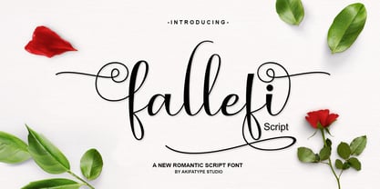 Fallefi Script is highly legible script typeface, with a touch of a bold, classic and fun vintage styling. It includes OpenType features and stylistic alternates. It can be used for various purposes, such as posters, t-shirt, signage, logos, news, badges etc. To enable the OpenType Stylistic alternates, you need a program that supports OpenType features such as Adobe Illustrator CS, Adobe Indesign & CorelDraw X6-X7, Microsoft Word 2010 or later versions. Fallefi Script is coded with PUA Unicode, which allows full access to all the extra characters without having special designing software. Mac users can use Font Book, and Windows users can use Character Map to view and copy any of the extra characters to paste into your favourite text editor/app.
