10,000 search results
(0.148 seconds)
- Rephran by Mirror Types,
$20.00 Rephran is a font completely designed by hand, with brush and black indian ink,all the lines were softly made by hand. Every letter is like a piece of art, including the numbers and signs. Check the PDF in the gallery section to see the details. It includes Capitals, lower case letters, Signs and Numbers.
 - Warilah by Letterafandi Studio,
$16.00 Warilah is a modern handwritten with characters that dance along the baseline. It can be used for various purposes such as logos, wedding invitations, headings, t-shirts, letterhead, signage, labels, news, posters, badges and so much more. This font is PUA encoded which means you can access all of the glyphs and swashes with ease!
 - Suorva by Sign Studio,
$15.00 Suorva from the sans serif family is made for display needs. Each side of his body is well-measured and consistent. Has a Stylistic Alternate Set ( S, Y, a, e, g, k, y) and also Discretionary Ligatures (uppercase). All Glyphs have PUA Encoded which will make it easier to use in general editor software.
 - Brandon Grotesque Office by HVD Fonts,
$40.00 This special Office version of Brandon Grotesque is especially for all Microsoft Office applications (Word, Excel, Powerpoint …). It contains just the 4 basic styles which are stlye-linked and can be easily accessed by the "I" or "B" button in Office. The fonts are manually hinted so their appearance is also optimized for these applications.
 - Kitchen Doodles by Outside the Line,
$19.00 Julia Child said, "I didn't start cooking until I was 32: up until then I just ate". Whether you cook or eat, design menus or place cards or cookbooks this set of 30 fresh Kitchen Doodle illustrations makes the job easier. Baking, cooking, mixing, chopping, grating, this little font has it all. Bon Appétit!
 - Rosereta by Almarkha Type,
$33.00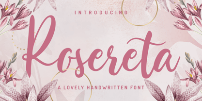 Rosereta - Lovely Script font with a natural handwritten feel. This handmade font will make your design has a beautiful natural touch for each details. It is perfect for any design project as Invitation,logo, book cover, craft or any design purposes. This font is PUA encoded which means you can access all of ligatures.
 - Larsson by GRIN3 (Nowak),
$19.00 Larsson is a hand-drawn, all-caps, ultra-narrow font created by Bartek Nowak. It contains two variations for each letter and a lot of ligatures. Use for invitations, greeting cards, posters, advertising, weddings, books, menus etc. Language support includes Western, Central and Eastern European character sets, as well as Baltic and Turkish languages.
 - Sugar Pie by Sudtipos,
$79.00 When Candy Script was officially released and in the hands of a few designers, I was in the middle of a three-week trip in North America. After returning to Buenos Aires, I found a few reactions to the font in my inbox. Alongside the congratulatory notes, flattering samples of the face in use, and the inevitable three or four “How do I use it?” emails, one interesting note asked me to consider an italic counterpart. I had experimented with a few different angles during the initial brainstorming of the concept but never really thought of Candy Script as an upright italic character set. A few trials confirmed to me that an italic Candy Script would be a bad idea. However, some of these trials showed conceptual promise of their own, so I decided to pursue them and see where they would go. Initially, it seemed a few changes to the Candy Script forms would work well at angles ranging from 18 to 24 degrees, but as the typeface evolved, I realized all the forms had to be modified considerably for a typeface of this style to work as both a digital font and a true emulation of real hand-lettering. Those were the pre-birth contractions of the idea for this font. I called it Sugar Pie because it has a sweet taste similar to Candy Script, mostly due to its round-to-sharp terminal concept. This in turn echoes the concept of the clean brush scripts found in the different film type processes of late 1960s and early 1970s. While Candy Script’s main visual appeal counts on the loops, swashes, and stroke extensions working within a concept of casual form variation, Sugar Pie is artistically a straightforward packaging typeface. Its many ligatures and alternates are just as visually effective as Candy Script’s but in a subtler and less pronounced fashion. The alternates and ligatures in Sugar Pie offer many nice variations on the main character set. Use them to achieve the right degree of softness you desire for your design. Take a look of the How to use PDF file in our gallery section for inspiration.
 - LunchBox by Kimmy Design,
$25.00 LunchBox is a uniquely hand-drawn typeface that gives infinite customizable options and a fully authentic look. Using Lunchbox’s OpenType features gives access to over 1,500 different characters. Contextual alternatives give each letter 4 different character styles, all cycling through each other to ensure that no two letters ever show up together. There is also a custom set of small caps, each with 4 style variations as well. Stylistic alternatives give an extra hand-drawn flourish, loop and slight variation, also with 4 different styles per letter. Discretionary ligatures pertain to both regular all caps Lunchbox as well as stylistic alternatives. It takes special letters and gives a unique interaction with the characters around them, giving your design a unique and personalized look. Swashes also have four style variations to both the regular and stylistic alternatives, as well as lowercase letters with ascenders and descenders. All of these options are available in Light, Regular and Bold and can be purchased with Lunchbox Ornaments for an extra element. If you do not use Opentype but are using a program that includes a full glyph panel, you will be able to access each of the style variations you want. Enjoy!
 - Miedinger by Canada Type,
$24.95 Helvetica’s 50-year anniversary celebrations in 2007 were overwhelming and contagious. We saw the movie. Twice. We bought the shirts and the buttons. We dug out the homage books and re-read the hate articles. We mourned the fading non-color of an old black shirt proudly exclaiming that “HELVETICA IS NOT AN ADOBE FONT”. We took part in long conversations discussing the merits of the Swiss classic, that most sacred of typographic dreamboats, outlasting its builder and tenants to go on alone and saturate the world with the fundamental truth of its perfect logarithm. We swooned again over its subtleties (“Ah, that mermaid of an R!”). We rehashed decades-old debates about “Hakzidenz,” “improvement in mind” and “less is more.” We dutifully cursed every single one of Helvetica’s knockoffs. We breathed deeply and closed our eyes on perfect Shakti Gawain-style visualizations of David Carson hack'n'slashing Arial — using a Swiss Army knife, no less — with all the infernal post-brutality of his creative disturbance and disturbed creativity. We then sailed without hesitation into the absurdities of analyzing Helvetica’s role in globalization and upcoming world blandness (China beware! Helvetica will invade you as silently and transparently as a sheet of rice paper!). And at the end of a perfect celebratory day, we positively affirmed à la Shakti, and solemnly whispered the energy of our affirmation unto the universal mind: “We appreciate Helvetica for getting us this far. We are now ready for release and await the arrival of the next head snatcher.” The great hype of Swisspalooza '07 prompted a look at Max Miedinger, the designer of Neue Haas Grotesk (later renamed to Helvetica). Surprisingly, what little biographical information available about Miedinger indicates that he was a typography consultant and type sales rep for the Haas foundry until 1956, after which time he was a freelance graphic designer — rather than the full-time type designer most Helvetica enthusiasts presume him to have been. It was under that freelance capacity that he was commissioned to design the regular and bold weights of Neue Haas Grotesk typeface. His role in designing Helvetica was never really trumpeted until long after the typeface attained global popularity. And, again surprisingly, Miedinger designed two more typefaces that seem to have been lost to the dust of film type history. One is called Pro Arte (1954), a very condensed Playbill-like slab serif that is similar to many of its genre. The other, made in 1964, is much more interesting. Its original name was Horizontal. Here it is, lest it becomes a Haas-been, presented to you in digital form by Canada Type under the name of its original designer, Miedinger, the Helvetica King. The original film face was a simple set of bold, panoramically wide caps and figures that give off a first impression of being an ultra wide Gothic incarnation of Microgramma. Upon a second look, they are clearly more than that. This face is a quirky, very non-Akzidental take on the vernacular, mostly an exercise in geometric modularity, but also includes some unconventional solutions to typical problems (like thinning the midline strokes across the board to minimize clogging in three-storey forms). This digital version introduces four new weights, ranging from Thin to Medium, alongside the bold original. The Miedinger package comes in all popular font formats, and supports Western, Central and Eastern European languages, as well as Esperanto, Maltese, Turkish and Celtic/Welsh. A few counter-less alternates are included in the fonts.
 - Grabnika Unix by DePlictis Types,
$46.00 Grabnika Unix is a unicase style typeface with a straight and a bit tall look and it has a residual influence of monospaced fonts. One of the major characteristics of this typeface are those sharp cuted ears and joints that appears repeating at some of the letters and gives him a distinctive personality and a minimalist design approach on other group of letters that creates an alternative interesting fill of the spaces. It is suitable for signage purpose and headlines or relatively short body texts and also for logo design and branding. It is a loud and fresh display that could give a certain distinctive and young personality to your designs. As a fun fact, the name of this font comes from the romanian word “grabnic” that means “fast” and I developed this font by chance as a custom lettering for a logo design project, so I saw it proper as an alternative in the actual wide font markets and I decide to finishing it as a multilingual support typeface. Enjoy!
 - Tenez by Plau,
$30.00 Big News! Tenez has been selected for the Tipos Latinos Biennial 2016 and Typographica’s Favorite Typefaces of 2015! Tenez is a Grand Slam display didone typeface from Plau. We designed it for a branding project, further developing the resulting logotype into a typeface we felt could solve many designers’ needs. Its origins are rooted in pointed nib calligraphy which can be seen in contemporary Didot and Bodoni inspired typefaces. But Tenez’s shapes are organic (these modern typefaces were originally cut by hand after all) – in fact that was the challenge we set from the start: to make a typeface as organic in construction as possible. This echoes some of late 19th century typefaces and advertising, yet we thought of it for contemporary uses. One of the several unique features of Tenez is its unusual Thin weight, in which the contrast between thin strokes and the black area left by the serifs makes for a typewriter-like personality. The italics provide a perfect counterpoint to the roman weights. Tenez was unapologetically conceived as a display typeface meant to be used large as in magazine openings, drop caps or everywhere there’s a need for elegant impact. The family includes support for almost all Latin languages available, figure sets for almost every conceivable occasion (tables, text, you name it), alternates for the quirky beautiful R (sometimes simpler is better, but not always!) and Q (with a nice big tail for that article opener). Tenez pairs really well with our no-frills sans-serif Motiva Sans and our cute vertical connected script Primot.
 - Kinryu - Unknown license

- Hemicube by Mans Greback,
$59.00 Hemicube is a geometric logotype font, created by Mans Greback in 2020. Its futuristic lettering follows a mathematical pattern while being minimalistic and clean, which makes in work perfectly in sci-fi or technology context graphics. It is a three-style typeface family; in addition to the regular Hemicube style, it also comes as a basic Type style as well as a monogram Logo style. In the Hemicube Logo font, write any three capital letters to make a cube monogram. Example: ABC Use underscore to create a logo with fewer letters. Examples: A_B _CD _E_ It has a very extensive lingual support, covering all European Latin scripts. The font contains all characters you'll ever need, including all punctuation and numbers.
 - Poultry Sign by Ingrimayne Type,
$5.95 While searching through microfilm of an old, 1932 newspaper, I stumbled on the word "Poultry" written with trapezoidal letters. I did not recall seeing lettering like this and it inspired me to design a typeface that could produce a similar result. Poultry Sign has two widths each with three weights giving the family six styles. It is monoline, monospaced, and all caps. The letters on the lower-case keys reverse the trapezoid of those on the upper-case keys. The designer's expectation is that the most common use for this typeface will alternate upper-case and lower-case keys, and to make this effect easy, included in the font is a contextual alternatives (calt) OpenType feature that automatically produces this result if your word processor supports this feature. To get text with all letters with big bottoms or all letters with with big tops, this feature must be turned off. The spacing of the letters is identical within each width so the styles can be layered to produce bi-colored or tri-colored letters. There is a second set of numbers that can be accessed with an OpenType stylistic alternative. Also accessible with OpenType stylistic alternatives are variations of letters T, N, L, Y, and V.
 - Qualion by ROHH,
$39.00 Qualion™ is a modern geometric grotesk typeface with humanist and calligraphic inspirations. The base of design is a minimal geometric sans serif with subtle humanist touches. Letter shapes are crafted with the highest care for beautiful proportions and excellent legibility. Qualion™ is a sibling of Qualion Round™ & Qualion Text™ - type family adjusted to fit paragraph text and small sizes best (narrower width, greater contrast, larger ink traps and tapering, adjusted spacing and kerning & even more calligraphic, elegant true italics). This versatile sans serif is not only well suited to clean, minimal projects and text paragraphs, but it has lots of features making it perfect for branding, logo design and all kinds of display use. All fonts are packed with alternates, swashes, terminal forms and ligatures, which make Qualion™ a very original ornamental type great for posters and packaging design. Qualion™ family consists of 10 weights with corresponding oblique and true italic styles, that give total of 30 styles. Both Oblique and Italic styles were hand drawn to get sharp and fine letter shapes. It has extended language support, as well as broad number of OpenType features, such as small caps, case sensitive forms, standard and discretionary ligatures, swashes, terminal forms, stylistic sets, contextual alternates, lining, oldstyle, tabular and small cap figures, slashed zero, fractions, superscript and subscript, ordinals, currencies and symbols.
 - Baskerville Old Face KTKM by KTKM,
$55.00 “So-called Baskerville Old Face of the type foundry Stephenson Blake & Co. of Sheffield. The Script is probably not immediately linked to Baskerville, but it is very much influenced by it. It is one of the most beautiful types of which the mats still exist; it has an incomparably different spirit than the ‘streamlined’ re-cuts of today’s Baskerville. Even keeping the general restraint extremely expressive. According to Berthold Wolpe (‘Signatures’ No. 18), the punches were cut and shown in samples in 1776 by Isaac Moore, who came from Birmingham to Bristol.” – Jan Tschichold, “Meisterbuch der Schrift”, Notes On The Plates, Page 231 Publisher note: I wanted to improve the contrast between thick and thin, reduce some ink-traps and give stems, serifs and links a smoother overall feel. I have also added some alternative letters and old style numerals.
 - Arabetics Symphony by Arabetics,
$59.00 Arabetics Symphony is a Sans Serif Latin typeface with a comprehensive support for the Arabetic scripts, including Quranic texts. It is designed with a uniform glyph thickness and weight throughout, using a combination of simplified and clear open lines and curves and plenty of spikes and visual hints to compensate for the missing Latin serifs or traditional cursive Arabic calligraphic influence. This type family is suitable for both text and display applications. Additional Latin spacing is added to match an overall open-looking Arabic and is further maintained by a careful implementation of a typical Latin font kerning process. The design of this font family, including metrics and dimensions, was intended to make its Latin harmonize with other Arabetics foundry fonts. Arabetics Symphony fully supports MS 1252 Western and 1256 Arabic code pages, in addition to all the transliteration characters required by the ALA-LC Romanization tables. Users can either select an accented character directly or form it by keying the desired combining diacritic mark following an unaccented character. For Arabic, it fully supports Unicode 6.1, and the latest Arabic Supplement and Extended-A Unicode blocks. The Arabic design of this font family follows the Mutamathil Taqlidi design style with connected glyphs, emphasizing vertical strokes to bring added harmony, and utilizing slightly varying x-heights to match that found in Latin. The Mutamathil Taqlidi type style uses one glyph for every basic Arabic Unicode character or letter, as defined by the Unicode Standards, and one additional final form glyph, for each freely-connecting letter of the Arabic cursive text. Arabetics Symphony includes the required Lam-Alif ligatures in addition to all vowel diacritic ligatures. Soft-vowel diacritic marks (harakat) are selectively positioned with most of them appearing on similar high and low levels—top left corner—, to clearly distinguish them from the letters. Tatweel is a zero-width glyph. Keying the “tatweel” key (shft-j) before Alif-Lam-Lam-Ha will display the Allah ligature. Arabetics Symphony includes both Arabic and Arabic-Indic numerals, in addition to generous number of punctuation and mathematical symbols. Available in both OpenType and TrueType formats, it includes two weights, regular and bold, each has normal, Italic, and left-slanted styles.
 - Sashay Script by Ivan Angelic,
$19.99 Sashay Script is an elegant yet friendly script font. It is a rich smooth voice that gives an immediate human connection to any design. Do you need to display: speech; thought; emotions; desires…Sashay Script says it all in a clear legible script. It struts down the runway with panache, accompanied by: 13 Icons, 42 Ligatures and 21 Alternates. Although it is clearly a font that represents handwriting, it is very versatile and usable in that it is: easy to read; has good flow and looks great in both paragraph form or as a standalone word or line. As a bonus, since each and every letter was crafted from the ground up, Sashay Script can be used at larger sizes without losing any of its elegance as its edging is well groomed, without the raw edges that can be the terror of handwritten fonts at larger sizes. Sashay Arrows & Underlines was designed to match with Sashay Script. Often a font such as Sashay is used descriptively and the flow and line-weight of the 68 arrows and underlines match Sashay Script in look and feel. Please take a look at the gallery posters that show both Sashay Script and Sashay Arrows & Underlines, in use. We just know you'll have a perfect project for this little model of a font 'Sashaying' down the font runway.
 - Shapely by Scholtz Fonts,
$19.00 Shapely is designed with elements of classical calligraphy expressed in a very modern idiom. It embodies the Scholtz signature - casual, extravagant, bold design with an underlying attention to detail and legibility. Numerous ligatures emphasize immediacy and the handwritten quality of the finished product creates a feeling of variety, spontaneity and flexibility. The font abounds with extravagant flourishes, however, with almost every character, plainer alternatives are available through OpenType technology. This frees the user to put an individual stamp on his use of the font. There are a total of 70 ligatures and alternate characters that use OpenType technology to expand the flexibility and power of Shapely. The font contains all upper and lower case characters, punctuation, numerals and mathematical operators, as well as all accented characters used in European languages.
 - Flamenca by Eurotypo,
$28.00 Flamenco is an Andalusian art. Who think in flamenco, think in Spain. Is the result of a cultural mix: Gypsies, Arabs, Jews and Christians mixed elements of their respective cultures with traditional Andalusian elements. It incorporate dance, song and guitar music. Known for its emotional intensity, flamenco is distinguished by the graceful arm movements, ferocious stomping’s flamenco dancer, deep groans and strumming guitar. Flamenco is an art of passion. Flamenca Regular and Flamenca Luz is a brush script inspired by the flamenco dance. Flamenca is an organic, modern and casual calligraphy family font that has preserved in its glyphs its original textured appearance for a more personalized effect even more authentic. As an exclusively Open Type release, with 747 glyphs, it has several special alternatives for all letters with lots of possibility an infinity of combinations. There are plenty of options to allow you to create something unique and special: standard and discretionary ligatures, several swashes, initial and terminal forms and stylistics alternates for each letter, catchwords, ornaments that can be added to the beginning or end of each letter, and much more. Ornaments has been created inspired in the bars of the Andalusian patios where flamenco is danced. These lovely fonts have already an extended character set to support Central and Eastern as well as Western European languages. As a whole, Flamenca was made to make your project more beautiful and attractive! Have fun with it! Flamenca is fancy, delicious & fresh!
 - Sunday Monday - Personal use only

- Mister Dangerous by Arterfak Project,
$16.00 Introducing Mister Dangerous, inspired by the graffiti tags found in urban street art. Designed with dynamic freestyle flair, it brings the spirit of graffiti to your creative ideas. This font is the perfect choice to add an urban touch to your designs, including films, posters, stickers, labels, flyers, apparel, packaging, and more. Mister Dangerous features All-Capitals with numerous special characters for endless combinations, along with additional swashes to make your work stand out. Embrace the artistic power of Mister Dangerous for unforgettable and edgy designs. What you'll get : All-capitals characters Numbers & punctuation Stylistic alternates
 - Usagi Faux by Twinletter,
$15.00 Usagi is a display font created with original handwriting. It was created with the Japanese style in mind, therefore it’s ideal for Japanese-themed projects. If you utilize this font in all of your projects, you will achieve a stunning, appealing, and great result. Logotypes, food banners, branding, brochure, posters, movie titles, book titles, quotes, and more may all benefit from this font. Of course, using this font in your various design projects will make them excellent and outstanding; many viewers are drawn to the striking and unusual graphic display. Start utilizing this typeface in your projects to make them stand out
 - Ballonest by Madhaline Studio,
$19.00 Ballonest is a handwritten font with a stylish, elegant and natural touch. It has an original feel and beautiful handwriting. Made seriously, with care and with feeling. Ballonest would perfect for photography, watermark, social media posts, advertisements, logos & branding, invitation, product designs, label, stationery, wedding designs, product packaging, special events or anything that need handwriting taste. Your download will include files; Ballonest ~ A hand-made, all characters brush font which has a complete set of A-z characters with 107 stylish ligatures. All font files are provided in both TTF & OTF font formats. Includes a range of multilingual support.
 - Manualist by Invasi Studio,
$19.00 Meet Manulist, your new go-to font for a natural hand-drawn look full of charm! With its all-caps style and big uppercase letters, this font exudes a classic elegant look. But wait, there's more! Manulist also comes with elegant alternates, adding a touch of sophistication to your designs. And that's not all - this font supports multilingual characters, so you can spread the fun and creativity in any language you desire. Plus, every character in Manulist has a delightful imperfect shape, giving your designs a unique and organic feel. It's like having your own personal hand-drawn masterpiece in every letter!
 - Avantime by Supfonts,
$16.00 Charming 80's retro inspired typeface with wonderful versatility given it includes 30 fonts. This is a perfect for any project Inspired by magazine adverts from the 70's and 80's - this family fit right in with bringing retro back into the 21st century. Super-versatile - have a scroll through all the preview to see the very wide range of variety the Avantime back can manifest the possibilities are really quite endless :) Avantime Font Features: 30 fonts Full Set of standard alphabet and punctuation PUA Encoded - no special software needed to access extra characters Language support: All European languages Multilingual Characters
 - Compass Next by TipografiaRamis,
$35.00 Compass Next is a third edition of Compass TRF designed in 2002. The first time Compass TRF has been conceived was as a “geometric” Didone – all letters literally were drawn with a ruler and a compass. Second edition (2009) got additional styles – Flourish Initials and Small Caps. This time, the objective was to bring overall extreme geometrical expression closer to traditional letterform style of its “modern style” typeface category (Didone). All glyphs were redrawn including in alternative Decorative style, and additional Bold weight has been added. Typeface is released in OpenType format with extended support for most Latin languages.
 - Handelson by Melvastype,
$29.00 Handelson is a collection of 6 handmade typefaces with authentic and organic feel. It contains three scripts, one non-connected script and two all caps geometric sans serifs (Block letters). Textures and rough edges are simulating handwritten and printed looks. By combining these fonts you can make diverse typographic solutions and elements with unified style. All the non-connected fonts; Handelson Two, Handelson Four, Handelson Five and Handelson Six has two sets of characters. By enabling Contextual Alternates from the OpenType panel you can make these letters vary randomly to make your text look more like real handwriting.
 - RB Monsters by RockBee,
$15.00 This typeface was drawn to create short headlines (quickly) for one of my projects (a set of illustrations featuring The Evil Rat, imagined character). Each character (here I mean "glyph") has it's own personality, mostly evil one (jokingly) — that is why the font is called "The Monsters". The font was drawn on paper, then scanned and traced. It has both Latin and Cyrillic sets, since it was used with both. Monsters are good for short notes of comic or ironic style.
 - Plakato Pro by Underware,
$50.00 Plakato, a stencil love affair Plakato is a family of display fonts, consisting of various eye-catching styles, each of them very bold. Plakato is an identity toolkit, a heavyweight building block in case you need a strong personality, a small stencil font family to cut out your best ideas and grab all the attention. But just as with many other creations, its outcome is as divers as its multiple origins. Plakato comes in 16 eye-catching styles. The default stencil style comes in Regular & Italic. They both have 2 variations: one version, named Plakato Stencil, automatically creates borders around the text, putting any text into a graphic stencil in this way. Another version, the extruded three-dimensional version, guarantees even more attention for your message. Next to this there is also the Inline version, which is an optical play with a lot of lines. Plakato Inline has a supportive background layer, a separate font in case you want to add a background in a different colour. Then there is Plakato Paper, a manually teared version of Plakato offering a more physical look. This small family of eye-catching display fonts also contains a Neon font, an independent design in Plakato style, which can actually be used for making neon signs due to its construction. Plakato Neon comes with its own Dingbat font for that extra flush-flush. Plakato has also been redrawn on a C64, and with all its accompanying limitations been ported back and turned into a font: Plakato Game. Also this font comes with its own Dingbat font, full of emoji’s and icons for oldskool pleasure. Last but not least there is Plakato Build, constructed out of blocks. As if that wasn’t enough, there are various dynamic versions in the Plakato Play package, which offer a whole new range of possibilities for typographic expression, with new animation and interaction opportunities.
 - Brave Spirit by Colllab Studio,
$9.00 Presenting Brave Spirit! A Display Font in 2 Styles. This font made with the perfect combination of each character. You can combine with Extra to get a unique combination. It looks original and can be used for all your project needs. Each glyph has its own uniqueness and when meeting with others will provide dynamic and pleasing proximity. This font can be used at any time and in any project. You can see in the presentation picture above, Brave Spirit looks stylish and unique on design projects. So, Gilligan Shine can't wait to give its touch to all your design projects such as quotes, poster design, personal branding, promotional materials, website, logotype, product packaging, etc. WHAT'S INCLUDED? 1. Brave Spirit • The first version comes with uppercase, lowercase, ligatures, numeral, punctuation, symbols, and Standard Latin Multilingual Support (Afrikaans, Albanian, Catalan, Danish, Dutch, English, French, German, Icelandic, Indonesian, Italian, Malay, Norwegian, Portuguese, Spanisch, Swedish, Zulu, and More). 1. Brave Spirit Alt • The first version comes with uppercase, lowercase, ligatures, numeral, punctuation, symbols, and Standard Latin Multilingual Support (Afrikaans, Albanian, Catalan, Danish, Dutch, English, French, German, Icelandic, Indonesian, Italian, Malay, Norwegian, Portuguese, Spanisch, Swedish, Zulu, and More). A Million Thanks Colllab Studio
 - Bugbear by Hanoded,
$15.00 A Bugbear is a kind of hobgoblin, comparable to the Bogeyman. No tablets or gizmos were involved in the creation of this font. It was made entirely by hand, using an old-fashioned roller ball pen and a sheet of paper. Use Bugbear for your children’s book covers, party posters and product packaging.
 - Kate Slab Pro Ultra Expanded by Monday Type,
$19.00 Kate Slab Pro Ultra Expanded is a sophisticated and robust modern Slab Serif Typeface that works in a variety of design scenarios. It is designed to work in big attention grabbing headlines as well as in smaller text and even body text. The recognition value of Kate Slab Pro Ultra Expanded is its biggest asset in world of uniformity. Ranging from “100 Thin” all the way to “900 Black” makes Kate Slab Pro Ultra Expanded such an amazing and versatile font family that stands out. Kate Slab Pro Ultra Expanded doesn’t only work great in lifestyle and fashion related contexts but will also look amazing for restaurants, coffee shops or and other use cases that ask for character and identity. To fill all the gaps of a designer’s needs, Kate Slab Pro Ultra Expanded comes with an italic style with every weight. Those italics are equipped with unique and real italic characters and will make you love it. Being a Slab Serif Kate Slab Pro Ultra Expanded manages to remind you of a classic Font Family with a modern and timeless approach that will make you happy for decades. Monday Type can’t wait to see the beautiful designs you are going to create with our Kate Slab Pro Ultra Expanded.
 - Kate Slab Pro Expanded by Monday Type,
$19.00 Kate Slab Pro Expanded is a sophisticated and robust modern Slab Serif Typeface that works in a variety of design scenarios. It is designed to work in big attention grabbing headlines as well as in smaller text and even body text. The recognition value of Kate Slab Pro Expanded is its biggest asset in world of uniformity. Ranging from “100 Thin” all the way to “900 Black” makes Kate Slab Pro Expanded such an amazing and versatile font family that stands out. Kate Slab Pro Expanded doesn’t only work great in lifestyle and fashion related contexts but will also look amazing for restaurants, coffee shops or and other use cases that ask for character and identity. To fill all the gaps of a designer’s needs, Kate Slab Pro Expanded comes with an italic style with every weight. Those italics are equipped with unique and real italic characters and will make you love it. Being a Slab Serif Kate Slab Pro Expanded manages to remind you of a classic Font Family with a modern and timeless approach that will make you happy for decades. Monday Type can’t wait to see the beautiful designs you are going to create with our Kate Slab Pro Expanded.
 - Voguish by Redy Studio,
$19.00 Voguish – Sophisticated Calligraphy Are you looking for an outstanding and unique font? Do you want to add some fun and playfulness to your creations? Then this is the font that you need! Say hello to Voguish – the new, exclusive, and elegant font! Voguish is a sophisticated font ideally crafted to easily create amazing results with a minimum of fuss. Voguish is a perfectly balanced font with unique, stylish letter shapes that have been combined with a sophisticated contemporary touch. Being a perfectly multifunctional font, it is the ideal fit for new season designs. It’s perfect for all those luxurious projects or designs that you want to stand out from the crowd! Download it now and make all your dreams come true! It’s so unique and elegant in look, that it will be the talk of your town! Voguish features: A full set of upper & lowercase characters Numbers & punctuation Gorgeous ligatures A full set of alternate upper & lowercase characters Uppercase beginning swashes Lowercase ending swashes Lowercase alternates characters Multilingual symbols PUA Encoded Characters – Fully accessible without additional design software. Feel free to give me a message if you have a problem or question. Thank you so much for taking the time to look at one of our products.
 - Shàngó Gothic by CastleType,
$59.00 Shàngó is CastleType’s beautifully-rendered interpretation of Professor F.H.E. Schneidler's elegant titling typeface released in 1936 with the name 'Schneidler-Mediaeval mit Initialen'. This latter design is usually referred to as Schneidler Initials. Although early on Medium and Bold weights were added to the somewhat delicate design of Shàngó, it seemed there were other possibilities that might be useful for display use. So, for the last couple of years I have been working on and off on a monoline version of Shàngó. This new design maintains the classic letterforms of the original, but its relatively even strokes gives it a more solid appearance, making it useful where a more modern, masculine look is needed. This new family is called Shango Gothic and is available in four weights: Regular, Medium, Bold, and Extra Bold. Shàngó Gothic is a member of the extended Shàngó family (Classic, Chiseled, Sans, Gothic).
 - Mandoul Black by Mans Greback,
$59.00 Mandoul Black is a cool, active calligraphy typeface bursting with energy. With extra attention to quick letterforms and sharp details, this brush typeface turns any graphic project into a strong and confident work. Its handwritten paintbrush strokes are created with real brush and paint, ensuring a genuine and truly artistic typographic design. It is provided as Regular and Italic. Use underscore _ anywhere in a word to create a swash. Example: Hand_script Use multiple underscores for different swashes. Example: Bea__utiful (Download required.) Mandoul is built with advanced OpenType functionality and has a guaranteed top-notch quality, containing stylistic and contextual alternates, ligatures and more features; all to give you full control and customizability. It has extensive lingual support, covering all Latin-based languages, from North Europe to South Africa, from America to South-East Asia. It contains all characters and symbols you'll ever need, including all punctuation and numbers.
 - Belladio by Mans Greback,
$69.00 Belladio is a beautiful calligraphic script typeface. An urban brush font, the handwriting is designed to help you to design professional graphics in cool, flowing styles; elevating your brand to the next level. It can be imagined on a t-shirt design or as a signature logotype. With its multiple alternates and ligatures, Belladio is sure to give any project a custom and genuine style. Use underscore _ to make a swash. Example: Ama_zing Use multiple underscores for different swashes. Example: Won_______der (Download required.) The font is built with advanced OpenType functionality and has a guaranteed top-notch quality, containing stylistic and contextual alternates, ligatures and more features; all to give you full control and customizability. It has extensive lingual support, covering all Latin-based languages, from North Europe to South Africa, from America to South-East Asia. It contains all characters and symbols you'll ever need, including all punctuation and numbers.
 - Breathe Neue by Lián Types,
$37.00 Breathe Neue is not just an update of my renowned Breathe of 2010, this is something else... Many times I find myself looking for inspiration in my previous creations. The original Breathe has something on its essence: Something that almost 10 years later still caught my attention. Like its name suggests, letters seem to be breathing, moving, alive. Many years passed so I asked myself if there was still something I could do for it, something to get the most of that beautiful essence... Suddenly, I was already working on its curves: Many new loops, more polished, more refined. Also the proportion and spacing were altered to embellish the font. Breathe Neue’s swashes are addictive. I couldn't find another word. Irresistible? Maybe. Once you see some of its loops you want to see more. I believe this might be due to its very geometrical feel, which match well with the bodonian curves of the font. See also how well it works with Breathe Caps. And what if you combine them with Breathe Special? wow. I'm still young (yeah, sure) and I believe there're still many years ahead to enjoy this great profession, and to make many new (and astonishing, I hope) fonts. But I also think, it’s time to pamper my first creations. They deserve the best treatment, after all, they were once a success! This is what I did with my lovely Breathe. I hope you like it.

