10,000 search results
(0.036 seconds)
- Katerlin by Muksal Creatives,
$12.00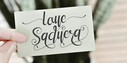 Katerlin is a handwritten font which feels incredibly elegant and flowing. It looks stunning on wedding invitations, thank you cards, quotes, greeting cards, logos, business cards and every other design which needs a handwritten touch. This font is PUA encoded which means you can access all of the glyphs and swashes with ease!
 - Dogiesland by Fype Co,
$14.00 Dogiesland! A cute and playful display font was created to bring a playful and little bit infantile feeling to any design. cute clean letters look simple and modern. All node was cleaned in fairly natural shape. Its friendly feel makes this font incredibly versatile, fitting a wide range of kids' design projects.
 - Sonderlina by Craft Supply Co,
$9.00 Sonderlina is a convenient and modern grotesk sans serif features low contrast details to cover small text purposes. It can be used to create almost all types of design projects like print materials. Just use your imagination and your project will become more alive and look great than ever with this typeface.
 - Atenta by Glen Jan,
$25.00 Atenta is a neutral sans-serif family based on techno-geometric forms in 8 styles. It supports Western, CE, Baltic, Turkish and Cyrillic encoding languages. All styles of Atenta contain small capital forms, case sensitive punctuations, lining, Oldstyle and smallcaps figures (including currency and math operators), superscripts and subscripts, numerators and denominators.
 - Pais by Latinotype,
$39.00 "País" is a contemporary and modern grotesque sans serif, inspired by the grotesques of the early 20th century, but more geometric and with a wider x-height than its referents; making it ideal for the current times. "País" comes in 2 versions, each with 9 weights, from thin to black, and matching italics, for a total of 36 fonts. The standard sans serif version is fresh, clean, and more ideally neutral. It's a perfect choice for editorial design, branding, headlines, or any other piece of graphic design. The "País Alt" version has more expressive and modern characters, with some giving it a much more playful image. It is ideal for logos, packaging, web and television use. País contains a total of 682 characters that make it possible to write in more than 200 Latin languages and basic Cyrillic.
 - Antoria Presidente by Fikryal,
$23.00 Antoria Presidente is a signature font that exudes elegance, sophistication, and class. This font is perfect for any project that requires a touch of luxuries, such as high-end fashion branding, luxury hotel marketing materials, or high-quality product packaging. The Antoria Presidente font is designed to resemble a handwritten signature, with sweeping curves and thin strokes that create a sense of fluidity and movement. Its tall, elongated letters are reminiscent of vintage calligraphy, while its clean, modern lines give it a contemporary feel. The font is highly versatile and can be used for a variety of purposes, including logos, headlines, titles, and body text. Its bold, expressive style makes it ideal for creating eye-catching designs that grab attention and leave a lasting impression. If you have any questions please don’t hesitate to contact me. Thank you best regards, Fikryal Studio
 - Periplus by PintassilgoPrints,
$26.00 I got rhythm, I got music, I got my swirls, who could ask for anything more? Periplus is quite an eccentric type, full of twists and nice oddities here and there. It is an all-caps font with 2 variations for each letter and number, stored at upper- and lower-case slots. For added amusement, every letter got not 1 or 2, but 4 swash variations. One can be reached through the OpenType swash feature: just select the letter and hit the swash button. The other ones you will access through a glyphs palette. All of them are neatly organized with the 'access all alternates' feature. The font is yet equipped with some stylistic alternates and ornaments. Have fun!
 - Bueno by FolkCraft Studio,
$21.42 Elevate your design game with the Bueno Font Family, a stunning creation by the talented team at FolkCraft Studio. From extra light to extra bold, each style boasts a unique, detailed, and handmade look that sets it apart. Dive into the world of possibilities with Bueno Font. Experience its captivating allure in all caps with wide spacing for a classy aesthetic, or let it shine in a mix of capital and lowercase letters for a timeless appeal that transcends trends. Envision the Bueno Font Family as the centerpiece of your creative projects. Its versatility makes it perfect for gorgeous logos, captivating displays, elegant headers, enchanting invitations, memorable save-the-dates, and timeless wedding designs. Imagine the impact it can have on titles, web layouts, and comprehensive branding strategies. Don't miss out on the opportunity to enhance your designs with the Bueno Font Family! Ideal for online uses and printing, this font collection is your ticket to creating sophisticated and stylish visuals that leave a lasting impression. Perfect for a wide range of applications, from logos to web layouts, this font family is a must-have for designers seeking to make a statement.
 - Melya by Stripes Studio,
$12.00 Melya Script, a modern hand writing, I hope you are interested in this font. It can be used easily and simply because there are a lot of features in it and contains a complete set of letters in lower and uppercase, assorted punctuation, numbers, and multilingual support. It also contains several ligatures and alternate style stylistic characters. To enable the OpenType Stylistic alternates, you need a program that supports OpenType features such as Adobe Illustrator CS, Adobe Indesign & CorelDraw X6-X7, Microsoft Word 2010 or later versions. And there are additional ways to access alternates/swashes, using Character Map (Windows), Nexus Font (Windows), Font Book (Mac) or a software program such as PopChar (for Windows and Mac). How to access all alternative characters using Adobe Illustrator: https://www.youtube.com/watch?v=XzwjMkbB-wQ How to access all alternative characters, using Windows Character Map with Photoshop: https://www.youtube.com/watch?v=Go9vacoYmBw Melya Script has given PUA unicode. Thank you for your purchase!
 - Toisy by Letrizmo,
$21.00When the right late seventies / early eighties message is needed, Toisy comes to the rescue. Founded on a mix of references from letterforms of the time, this new original nods to a style that defined an era. A sexy theme font that conveys a clear image of what was truly chic thirty years ago, this alphabet is deeply rooted in sultry memories of soft, endless nights. Exaggerate contrast between strokes and angular lines combine with rounded corners to provide a unique character and a look that sharply differs when set in all caps or lower case, thanks to an uncommon treatment of density and proportions. Set it real tight, as was typographically in fashion circa 1981. Toisy and Toisy Greek include a set of 13 matching images inspired in leisure stuff and the clothing of the last days of disco. They are different from the set included with Toisy Alt. - Priori Serif by Emigre,
$59.00 After the popular successes of Exocet and Mason, Emigre has once again teamed up with Jonathan Barnbrook to bring you his latest venture into type land. Priori is a logical progression from Mason, a typeface he designed around ten years ago. Where Mason was designed purely for display purposes and featured only caps, Priori includes lower case, companion serif and sans serif versions, alternates and, according to its creator, is shooting for text face status - a bold claim from a designer who loves to wear his influences on his sleeve and who has little use for typography that aspires to be "neutral" or "transparent." Like many of Barnbrook's typeface designs, Priori is based on his interest in British typography of the early 20th century. It is inspired by the work of famous British typographers, such as Eric Gill and Edward Johnston. But it also embraces all of the signage and lettering that Barnbrook observes in the streets, cathedrals, and public buildings of his London neighborhood. This mixing of native influences with a contemporary pop culture intent is what gives Barnbrook's types a distinct and unique flavor. Like its creator, Priori is a one of a kind.
 - Arsena by Apostrof,
$50.00 The font Arsena was designed for a contest on the creation of modern Ukrainian business font "Arsenal" and awarded the 3rd prize. A little squared figure which is enlightened from the middle, unobvious, but the existing modular grid, simplified, but not a primitive design of letters, mathematically defined optimum inclination angle, counterbalanced ratio of thickness, an optimum spacing and a manual kerning - all of this is for the best reproduction in any conditions as well as for the maximum clarity and readability. Asymmetric slab serifs make the font Ukrainian and at the same time have a modern and dynamic look. Besides its highlighting function, Italics also have an independent assignment. The Italics are made under calligraphic traditions in a modern style of mono-thickness (but optically compensated) and in particular, in combination with alternative initials of the same style and it is relevant to use it in a private letter, or in the design of the official greetings, etc. It is also promoted by four typographic ornamental motives. Due to the above-mentioned qualities this font can be used successfully for a wide range of tasks - from business to mass media, publishing, advertising and accidental.
 - Priori Sans by Emigre,
$59.00 After the popular successes of Exocet and Mason, Emigre has once again teamed up with Jonathan Barnbrook to bring you his latest venture into type land. Priori is a logical progression from Mason, a typeface he designed around ten years ago. Where Mason was designed purely for display purposes and featured only caps, Priori includes lower case, companion serif and sans serif versions, alternates and, according to its creator, is shooting for text face status - a bold claim from a designer who loves to wear his influences on his sleeve and who has little use for typography that aspires to be "neutral" or "transparent." Like many of Barnbrook's typeface designs, Priori is based on his interest in British typography of the early 20th century. It is inspired by the work of famous British typographers, such as Eric Gill and Edward Johnston. But it also embraces all of the signage and lettering that Barnbrook observes in the streets, cathedrals, and public buildings of his London neighborhood. This mixing of native influences with a contemporary pop culture intent is what gives Barnbrook's types a distinct and unique flavor. Like its creator, Priori is a one of a kind.
 - Merrivale by Greater Albion Typefounders,
$16.50 Merrivale is an ideal example of the benefits of keeping ones eyes open- it was inspired by the gilt-finished raised lettering on a late Victorian shopsign in Melbourne, Australia. The family of seven faces include upper and lower case forms, small capitals, all capital forms, and flamboyant display forms. Extensive Opentype features are incorporated. All faces are offered in incised forms inspired by the original lettering as well as in solid black filled forms. Thsee typefaces are wonderful for signage where either a period air or a dignified but legible feel are required. They also lend themselves to other display uses such as posters, book covers and so forth and are ideal for the title lines of certificates.
 - Liaisons by The Ampersand Forest,
$35.00 A Belle Époque humanist serif in two styles: crisp, high-contrast Haut-Monde and soft, low-contrast Demimonde… When you design a lot of display pieces, you’re often in need of tall, slim type. Liaisons provides that, in a distinct fin-de-siècle style inspired by the great posters of the Gilded Age from Sweden, Denmark, France, and Scotland. (The ampersand alone is a bit of a love letter to Charles Rennie Mackintosh!) Both styles use the same slim skeleton, and are named after the stratum of society where one might find… a “dancing partner.” HAUT-MONDE is a high contrast face of the sort that says “High Society.” Elegant and sleek, it speaks to the refinement of the moneyed classes of a bygone era. Great for high-end products, too! DEMIMONDE is soft and low-contrast — more reminiscent of hand-lettering on Art Nouveau/Jugendstil/Wiener Werkstätte advertisements and posters. A comfortably chic display face all around! Both typefaces feature full Western and Eastern Latin character sets, as well as full Cyrillic/Slavic ones. And, perhaps best of all, both typefaces feature capitals with high, middle, and low waists, so you can change up the look as you see fit! Part of The Ampersand Forest's Sondheim Series
 - Schneidler Latein by Spirit & Bones,
$33.00 The Schneidler Latein is a sharp and elegant Antiqua based on the ductus of the broad edged pen with a strong character. Running perfectly in paragraph text giving it something quite special and being effortlessly legible at the same time, Schneidler Latein works great in headings as well. Each glyph is a piece of art ready to be used in branding and blowup combining beauty and personality in a kick-ass blend. It is absolutely new to the digital world as it never has been digitized before. This new version digitized, further developed and extended by artist and graphic designer Lena Schmidt comes in nine styles from which there are four application-related ones like Subtext and Display and five weight-related ones like Bold and Heavy. Each style contains 948 glyphs, variations of numbers, three stylistic sets one preserving the historic forms of changed characters, small caps, open type features and superior and inferior characters. Designed by F. H. Ernst Schneidler the Schneidler Latein was released in 1916, the bold version in 1920 and the italics in 1921. Schneidler was born in 1882 in Berlin. He studied at the school for applied arts in Düsseldorf with professor F. H. Ehmcke and P. Behrens. He was as a painter, graphic designer and illustrator. In 1920 he was appointed as teacher in the school for applied arts Stuttgart. His students were Albert Kapr, Imre Reiner and Lilo Rasch-Naegele among others. Further well-known fonts from his hands are for example Legende, Amalthea, Schneidler Mediävel and Schneidler Antiqua. Lena Schmidt was born 1981 in Bremen. She is a german painter, graphic designer and illustrator mostly known for her huge wood carving paintings. From 2003 to 2011 she studied Fine Arts in Hamburg with professor Matt Mullican. From 2015 to 2019 she studied graphic design with a focus on type design at HAW Hamburg Department Design with professor Jovica Veljović. She lives and works in Hamburg, Germany.
 - Navuti by Twinletter,
$18.00 Introducing a Groovy font called Navuti. The Groovy Font is a bold and fun typeface. It is the ideal font for all your design requirements, such as branding, product packaging, or even just to add a touch of flair to your editorial work. This fine font features a contemporary design with a unique shape that will add elegance to any design. Incorporate Groovy Fonts into your designs right away! What’s Included : Standard glyphs Iso Latin 1 Simple installations We highly recommend using a program that supports OpenType features and Glyphs panels like many Adobe apps and Corel Draw, so you can see and access all Glyph variations. PUA Encoded Characters – Fully accessible without additional design software. Fonts include Multilingual support
 - In a Jar by Latinotype,
$29.00 In a Jar is a display typeface based in hand lettering. Inspired by the grandmother's kitchen, its colors, forms, smells and the new way for rescue this old things. Designed for use in short text and big sizes is perfect for brand design, headlines, labels, greetings cards and all kind of things related to kitchen and foods. In a Jar is a sweet little family that include alternates, compounds words, ligatures plus a serie of dingbats and ornaments very cute to compliment and accentuate the handmade design. Try and enjoy all fun in a jar! Designed by Coto Mendoza with technical support of Luciano Vergara.
 - Duskey by Craft Supply Co,
$19.00 Introducing Duskey Font Family + Extras. Duskey includes 4 Fonts styles. It can be used to create almost all types of design projects and printing materials. Just use your imagination and some graphic design sets in Extras and your project will become more alive and will look greater than ever with one of the Duskey Font. You want to make a greeting card or a package design, or even a brand identity, craft design, any DIY project, book title, wedding font, pop vintage design, retro design or any purpose to make your art / design project look pretty and trendy? Feel free to play with all style of this font!
 - Super League by Arkitype,
$12.00 Super League is a display typeface created for the sports industry. The typeface itself doesn't lean too much in a particular sports category direction which makes it versatile in use across various sporting categories. Super League has loads of. options to make use of including; small caps, stylistic alternates, ligatures for vs, st, nd, rd and th that are very useful when handling typography for sports in particular. Use Super League in all your printed material or on screen. Create badges or print names and numbers sports kits. All weights come with an oblique version which makes the total number of 16 fonts in this typeface.
 - DBXLNightfever by VetteLetters,
$- DBXL Nightfever was originally designed by Donald Beekman in 2001 for the disco-techno-house record label of the same name, an imprint of United Recordings. Geometric and gridded, with a solid sci-fi techno feel, Nightfever still contains a lot of soul. Three additional wider weights were added for more design flexibility, as well as italics for all widths. After the record label was terminated the Nightfever fonts were used for many other DBXL design projects. It was put online for free download first in 2008, this year (2019) the design got more refined with additional accurate kerning and spacing. All fresh and new, ready for a new space age!
 - Winnie The Hoop by LetterMaker,
$28.90 Winnie the Hoop is a bold, friendly and round display family inspired by a certain well known teddy bear. The family consists of three styles; Roman, Italic and Script, which are designed to be combined together. You can use any of the three styles as your main style and use the others to create multilayered typography that all share the same aesthetic. The typeface is well suited for branding and packaging design, advertisements, posters and even editorial design as a headline style. The Script is packed with ligatures and has Swash alternates that make it easy to customise your design. All styles include two sets of numerals.
 - Jansina by Twinletter,
$15.00 Jansina is a Japanese-style display typeface with a unique shape that is ideal for making your project stand out in Japanese culture. This typeface will make all of your projects consist of a graphic presentation that fits and is precise, but it is not restricted to that. Logotypes, food banners, branding, brochure, posters, movie titles, book titles, quotes, and more may all benefit from this font. Of course, using this font in your various design projects will make them excellent and outstanding; many viewers are drawn to the striking and unusual graphic display. Start utilizing this typeface in your projects to make them stand out.
 - Westside by Linotype,
$29.99 Westside was designed by Adrian Frutiger in 1989 and is a kind of wood type. It is reminiscent of dusty streets, Wild West heroes and swinging saloon doors. The origins of this kind of typeface can be found in the early 19th century. Called Italian or Italienne, these typefaces quickly became very popular. They are distinguished by square serifs whose width is larger than the stroke width of the characters. When the letters are set together, the heavy serifs build dark horizontal bands. Westside is a particularly decorative typeface which will have a marked effect when used expertly. It is perfect for headlines in larger point sizes, which will highlight its special character.
 - Antique Vignette by Putracetol,
$32.00 Antique Vignette is a quirky vintage script font. I call this font quirky font because the concept of this font uses a very visible difference in the thickness of the font. Because of its thickness, it makes this font look more unique and has a more vintage feel. The perfect combination of vintage/groovy style with classic lettering. So this font is suitable for your projects with vintage/retro/groovy themes. In addition, this font is also suitable for logos, branding, lettering, badges / emblems, quotes, posters, svg, book titles, packaging, t-shirts / apparel and others. Come with Opentype feature with a lot of alternates, its help you to make great lettering. This font is also support multi language.
 - Sabio by Greater Albion Typefounders,
$11.95 I regard Sabio as an evolutionary face. By this I mean that it merges elements of script and Roman design into one elegant whole. The design was 'evolved' somewhere between these two classic approaches. The resulting family of faces makes an excellent display family, but is also clear and legible at small sizes and can be used as a text face with a distinctive flair. Sabio is a wonderfully flexible face that can sit happily alongside artwork that owes its inspiration to any era from the Art Deco onwards. The regular form is gently and subtly oblique, and the glyphs have a slight hint of swash about them. Alternate and perpendicular forms are also offered. The regular, alternate and perpendicular forms are all in turn offered in regular, and bold weights as well as in a condensed form. All in all Sabio is a humanist face with which almost anything can be done offering flair and elegance for almost any project. Whether it's a distinctive way of setting paragraph text, or poster work that's eye catching yet flowing and clearly legible, Sabio offers the answer.
 - Queulat Condensed by Latinotype,
$- This font is the condensed version of Queulat, but keeping the same features as the original typeface. Queulat Cnd is a hybrid typeface that combines different styles, reflecting charm, freshness and, especially, a strong personality.. Since it is a condensed font, it is well-suited for publishing and subheadings. The font is inspired by Modern and Grotesk styles. The former is shown in some characteristic features such as teardrop terminals, which give the typeface an attractive unique look, making it an ideal choice for logotypes and labelling. The latter, with its rationality, makes Queulat Cnd a stable and strong face for headings and subheadings. The combination of styles can be clearly seen by comparing the Regular with the Alt version. The Regular version is more simple than the Alt one. Differently, the alternative version possesses more features of the Modern style, like teardrop terminals in ‘k’ and ‘v’.
 - Apricot by Canada Type,
$24.95 A. R. Bosco made Romany for ATF in 1934, when there was much demand for script types in advertising and publishing. It was the high times of Speedball lettering, and a casual script in that fashion was naturally very welcome. It became an instant hit and was used widely for a good part of the 1930s and 1940s. Apricot is not only a revival of Bosco's work, but also a major expansion of it. It contains very effective solutions to the many problems presented by the original metal type, which had to always be tracked too wide because of the forms of some of its letters. Solving these problems was not an easy task. A comprehensive set of alternates was designed to give the user the ability to replace some forms in certain uses, and a large set of two-, three-, and even four-letter ligatures was added to solve the awkwardness of some of the more common letter pairings. The resulting work is quite delightful, especially for those who like to take advantage of OpenType technology. Apricot is the rarest kind of script in digital type these days, the kind that is upright, round, bold, feminine, and distinctly young in appearance. A birthday cake for a teenage girl can certainly benefit from these letters. So can greeting cards, family show posters, diary covers, party invitations, women's shirts, toy packaging, celebration literature, and almost anything that needs that special touch of shiny happy youth. Apricot is available in all common font formats. The Postscript and True Type versions come in 4 fonts, which include one for alternates and two for ligatures alongside the main font. The OpenType version is one font that contains more than 380 glyphs and all the necessary programming for the palettes of OpenType-supporting applications. If you liked Canada Type's hugely popular font Dominique, you will love Apricot.
 - Magola by Andinistas,
$39.95 Magola is a creamy flavor font family whose purpose is to season with emotions the reading of words and phrases formed by puffy glyphs coated with a caramel of empty spaces external and internal. Independently or in groups, members of the family serve to decorate and organize packaging or advertising material in letters apparently crafted for food or entertainment contexts. Its starting point was to draw letters like a ballon fish evolved into a black version with empty areas and microscopic contrasted with colorful inflated and filled areas. Then the challenge was based on the sum transferred between full and empty into a lighter caliber. In that vein, its overall design adapted skeletons of italics and Roman calligraphy. Therefore, its regular, bold and black files have great height "x" with upwards and downwards extremely short and large internal counterblocks to facilitate reading. In this regard, to strengthen its objective and capture the reader's attention, its kind of contrast and simulated auctions flat tip brush strokes, and amount of contrast between thick and thin in the black version is slightly inverted. Its sizes, smooth strokes and irregular lines reinforce its traditional spirit, so it is favorable to shine the information on posters or large-format media. In short, its optical conformation based on a non-literal way, in metrics similar in all family members to be easily exchanged without changing the ìxî height. It is therefore a striking and versatile tool, that besides being useful in large sizes, can be used in small sizes as well. And more importantly, its general concept is more profitable when its members are mixed to nest headings, subheadings and short paragraphs, designed according to size, position, color and location in logos, covers, posters, ads and flyers.
 - Signorina by Talavera,
$20.00 Signorina is a funny font (a "funnty"?) not to be taken so seriously. It reminds me of slab serif designs, but jelly-stuffed instead of having wood. This font also works very well on small sizes because of it's tall x height. You can use this kind of font on both text and titles.
 - Hispania Script by HiH,
$10.00 Hispania Script is a distinctive and distinctly nineteenth century script. It was released by Schelter & Giesecke of Leipzig, Germany around 1890. Particularly noteworthy are the sharply-pointed legs of the upper case ‘K’ & ‘R’ that seem to be characteristic of the period. Similar strokes, often with a slight curve, may be seen in typefaces like Alt-Romanish and Tinteretto by Schelter & Giesecke, Artistic and Lateinsch by Bauer and Berthold and the poster lettering of Edward Penfield. The angle of this script (approximately 24 degrees) and the sharp delicate points must have made the manufacture of this face in metal type a challenge. The resulting type was probably quite fragile and subject to accidental damage. Additionally, the sharp points would be subject to wear. With digital type, these concerns are eliminated. As far as I know, no one has ever dropped a digital letter on the floor. Nonetheless, creating a digital outline for a typeface like Hispania Script, with many crossing strokes, can be quite time-consuming. Even with an accurate scan of a good quality original, it is usually necessary to construct each crossing stroke separately and then remove the overlap in order to obtain a sharp and convincing intersection. Steep internal angles are often defined with two points, rather than one, to minimize ink or toner fill that can muddy the rendering in smaller sizes. Like all formal scripts, Hispania Script is always useful for announcements and invitations. However, the distinctiveness of of this design strongly suggests that there are other applications that may benefit from its use. Step outside the box and try it in some unexpected places. It is the unexpected that often draws a person’s eye.
 - Nordeco by Leksen Design,
$29.00 Inspired by her Scandinavian heritage, Andrea Leksen created this modern geometric sans serif reminiscent of Scandinavian design and typography. With its tall x-height and monoweight strokes, Nordeco will be best showcased at large sizes, in headlines and other display uses. It contains 100 alternates with ornamental letters, borders, paragraph separators and seamless wallpapers for your designing pleasure. Designs include stripes, dots, art deco and leopard print. See some of the creative ways Nordeco can be used in this YouTube clip. Check out its cousin, Nordique!
 - Neutraface Condensed by House Industries,
$33.00 Richard J. Neutra became an icon of Modern architecture as an artistic visionary, social commentator and outspoken defender of the environment. He refined his unique approach to design, for which he coined the term biorealism, over half a century ago. Regarding humankind and its surroundings as two inseparable halves to a greater whole, Neutra created habitats with the welfare of man and nature as his utmost concern. His ideas of evolutionary growth and adaptability compelled House Industries to develop Neutraface Condensed, built upon the original typeface and driven by the enduring spirit of the revolutionary who inspired it. “I have tried to be a feeling observer of life in all its manifestations, not a cold rationalist.” House Industries adopted this precept of Neutra as the guiding principle when the foundry commissioned Christian Schwartz to draw Neutraface Condensed. Instead of being exactingly compressed, the new companion fonts were composed around a complementary structural framework in order to better reflect the sensibilities of their predecessor. The result is an individualistic design with a restrained exuberance that shuns stylistically ersatz imitation. This compact yet lively presence allows Neutraface Condensed to lend flexibility and economy to headlines without sacrificing the simplicity and charm of the original. Like all good subversives, House Industries hides in plain sight while amplifying the look, feel and style of the world’s most interesting brands, products and people. Based in Delaware, visually influencing the world.
 - Rotato by VIP Graphics,
$8.49 Rotato is a lowercase only geometric slab-serif typeface that brings versatility to any design. This minimalist but distinctive font is defined by its crisp composition and modern elements — designed for optimal legibility at all sizes. Out now in all lower case, Rotato leaves an understated impression of elegance & futurism. Currently available in three standard weights, more coming soon: Rotato Light - Clean and classy Rotato Regular - Elegant and elite Rotato Bold - Strong and classic FEATURES Three (3) Font Weights + Italics Numbers and Punctuation New (v2): Extended Ligatures & Nordic Character Set Special Characters Rotato is a dynamic font that works great across various applications: from branding & logos to technology & fashion — whether in a giant heading, or paragraphs of body text. Thanks for checking out Rotato; we hope you enjoy using it.
 - Sarisha Script by Solidtype,
$17.00 A new modern calligraphy font that features a varying baseline, smooth line, classic and elegant touch. Sarisha Script features 420+ glyphs and 256 alternate characters. It comes with a handy set of opentype stylistic, use the beautiful ligatures, alternates and swashes. You need a program that supports OpenType features such as Adobe Illustrator CS, Adobe Photoshop CC, Adobe Indesign, Microsoft Word 2010. It is perfect for logo, greetings, branding, quotes, prints, invitations and crafting. All lowercase letters include alternates, beginning & end swashes, that makes the font look fabulous! These are all coded with PUA Unicode. Mac users can use Font Book and Windows users can use Character Map to view and copy any of the extra characters to paste into your favourite text editor/app. Thanks and have a wonderful day :)
 - Kris by Characters Font Foundry,
$25.00 Kris is a powerful typeface based on humanistic minuscule with a touch of Uncial script. An alphabet with an unusual appearance. It is based on the paradigm of classical handwriting. Kris is handwritten with a broad nib pen and ordinary black ink. The somewhat fanciful shapes are created by lifting the pen randomly left and right. This causes unpredictable frayed edges that make the typeface exciting. It bursts with character and is very versatile. Kris is written by the Dutch calligraphy artist Corrie Smetsers. Corrie threw all basic characters in a plastic bag and René Verkaart built the typeface and created all remaining characters. “Most special about this project was collaborating with Corrie. She's an expert in handwriting and has developed writing systems for the educational sector for decades”, René says.
 - Martin by profonts,
$41.99 Martin, a condensed semi-serif with rounded edges and friendly serifs, shows its charme best in short, pointed sentences, in headlines set in about 20 to 36 p. The playing with serifs in a condensed, very characteristic type design is attractive and the technical skill is convincing. More styles are planned. The idea was to try to apply a given design criteria (also see Volker Schnebel's Marita and Manuel fonts) to every single character. In other words, start with a character and develop all of the others from it. This is quite easy for some characters but extremely difficult for others. This process generates creativity and the characters move away from the initial constructed sketch. Together in a typeface, the individual characters are now all of a piece and character.
 - Parnas by Larin Type Co,
$20.00 Parnas is an amazing font that can be used in a classic style or in a more expressive and elegant with alternative and ligatures, of which there are many. Set the style and mood of your design, because just a few touches can absolutely change it. With it, you can easily realize all your ideas. Parnas family includes a serif and sans serif font Classical forms, smooth lines, sharp serifs, weightless style, various weaves, long tails, all this and much more will give you many options for creating your project and will not leave indifferent even the most demanding. This font is easy to use, has OpenType features. This font has 900 glyphs and includes: - 190 Alternates for Uppercase - 168 Alternates for Lowercase - 74 Ligatures for Uppercase - 70 Ligatures for Lowercase - 10 illustrations - Multilingual support
 - Bedgan by Bungletter,
$10.00 Bedgan is a very cute, elegant and unique handwritten font. Expertly designed to be a true favourite, this font has the potential to take your creative ideas to the highest level! Bedgan is attractive because it is sleek, clean, feminine, sensual, glamorous, simple and very easy to read, thanks to its many fancy letter connections. I also offer a decent number of style alternatives for all letters. The classic style is very suitable to be applied in various formal forms such as invitations, labels, restaurant menus, logos, fashion, make up, stationery, novels, magazines, books, greeting/wedding cards, packaging, labels or all kinds of advertisements . for your purposes. . . . . . . Contains full set: -4 Type Font -Uppercase -Lowercase -Alternative -Ligatures -Punctuation -Number -Multilingual support. need help or have questions let me know. I'm happy to help.
 - Shington Script by Solidtype,
$18.00 Shington Script is modern script font that features a varying baseline, smooth line, classic and elegant touch. Shington Script features 950+ glyphs. It comes with a handy set of opentype stylistic, use the beautiful ligatures, alternates and swashes. You need a program that supports OpenType features such as Adobe Illustrator CS, Adobe Photoshop CC, Adobe Indesign, Microsoft Word 2010. It is perfect for logo, greetings, branding, quotes, prints, invitations and crafting. All lowercase letters include alternates, beginning & end swashes, that makes the font look fabulous! These are all coded with PUA Unicode. Mac users can use Font Book and Windows users can use Character Map to view and copy any of the extra characters to paste into your favourite text editor/app. Thanks and have a wonderful day :)