10,000 search results
(0.037 seconds)
- Balmecia by IbraCreative,
$17.00 Balmecia – A Tall Display Serif Typeface Balmecia is a distinguished tall display serif typeface that exudes a timeless elegance and sophistication. With its tall and slender letterforms, Balmecia commands attention and lends a touch of grace to any design it graces. The carefully crafted serifs add a classic flair, while the generous letter spacing ensures optimal legibility even in larger sizes. Balmecia’s vertical proportions create a sense of stateliness, making it an ideal choice for headings, titles, and other display applications where a touch of refinement is desired. This typeface seamlessly blends tradition with a modern aesthetic, offering a unique personality that captures the essence of both vintage and contemporary design sensibilities. Balmecia is perfect for branding projects, logo, wedding designs, social media posts, advertisements, product packaging, product designs, label, photography, watermark, invitation, stationery, game, fashion and any projects. Fonts include multilingual support for; Afrikaans, Albanian, Czech, Danish, Dutch, English, Estonian, Finnish, French, German, Hungarian, Italian, Latvian, Lithuanian, Norwegian, Polish, Portuguese, Slovak, Slovenian, Spanish, Swedish. **Uppercase
 - Geffroge Authentic by Ronny Studio,
$19.00 Geffroge Authentic is an elegant modern classic Sans Serif font. This font is impressive and features a clean and elegant font, professionally shaped, and as a result, it will easily match a variety of creations that require a different touch. Add it with confidence to your projects, and you'll love the results. This typeface is perfect for elegant logos, branding, travel promotions, layout magazines, beauty products, product packaging, quotes, or simply as a stylish text overlay onto any background image. 2 Font Style: - Regular - Italic Geffroge Authentic Features: - Uppercase - Lowercase - Numbers & Punctuation - Ligature - Multilingual Support - Simple installation All features and special characters of this font are included in one file. So that it is easily accessible by using a program or software that supports opentype such as Adobe Illustrator, Adobe Photoshop, and Adobe Indesign). This font is also very easy to use as it is compatible for all supported software even for non-opentype. Please comment us if you have any questions Thank you and have a nice day. Thank You
 - Milchella by Ronny Studio,
$19.00 Milchella is a luxurious and elegant Serif font. This font is impressive and features a clean and elegant font, professionally shaped, and as a result, it will easily match a variety of creations that require a different touch. Add it with confidence to your projects, and you'll love the results. This typeface is perfect for elegant logos, branding, travel promotions, layout magazines, beauty products, product packaging, quotes, or simply as a stylish text overlay onto any background image. 2 Font Style: - Regular - Italic Milchella Features: - Uppercase - Lowercase - Numbers & Punctuation - Alternate - Ligature - Multilingual Support - Simple installation All features and special characters of this font are included in one file. So that it is easily accessible by using a program or software that supports opentype such as Adobe Illustrator, Adobe Photoshop, and Adobe Indesign). This font is also very easy to use as it is compatible for all supported software even for non-opentype. Please comment us if you have any questions Thank you and have a nice day. Thank You
 - Quiller by Canada Type,
$24.95Quiller is another catch from the hot metal days, another one that managed to slip through the fingers of both the photo-typers and digitizers of last 4 decades. JJ Sierke’s Privat design from 1966 is now resurrected and heavily extended to be used by computer users everywhere. The original design was revived, and two whole new fonts were added to it - one with very unique swash caps and alternates, and one with many many ligatures and letter-combination ornaments. Quiller is a cross between brush calligraphy and very casual fast handwriting. It even has a slight Arabic simulation to it. Given such traits, the addition of a swash font and a multitude of ligatures comes in very handy to keep the natural flow of the font and maintain the elegance of its spirit. Those who like the auto-magic of OpenType’s intelligent substitution should like the fact that the OTF version is a single font with all the bells and whistles ready to go in the swash and discretionary ligatures features. If you use the latest versions of Adobe programs, the OTF version of Quiller is highly recommended. - Jatukiy by Twinletter,
$13.00 Introducing “JATUKIY Font” – Unleash Playful Creativity! Meet JATUKIY Font, your passport to a world of playful design possibilities. Designed with a whimsical touch, this display font brings a burst of fun to your projects. JATUKIY Font is your go-to choice when you want to infuse energy and a hint of cheekiness into your designs. Whether it’s children’s books, party invitations, or anything that needs a playful twist, this font is your creative ally. The distinctive style of JATUKIY Font is a visual treat. Its playful, bouncy characters instantly grab attention and leave a lasting impression. Let your designs speak volumes with the lighthearted charm of JATUKIY Font. Crafted with precision, this font’s unique design ensures that your message is delivered with a delightful twist. It adds a touch of humor and personality, making your content unforgettable. With JATUKIY Font, you have the power to create designs that stand out from the crowd. Infuse your projects with creativity, laughter, and a dash of whimsy, all with the help of JATUKIY Font. Elevate your design game and let your imagination run wild with this playful typeface. – PUA Encoded Characters – Fully accessible without additional design software.
 - Serial by TYPEHEIST,
$12.00 Serial: a killer font takes influence from the Son of Sam letters. Depicting an unstable mind and ill motives, this font is as erratic and discomforting as its author. Containing two similar but discernible font styles, you can mix and match to create your own story. Serial Regular is neater and more thoughtful. It is controlled and has an obvious flow. Serial Alternates illustrates a very different frame of mind - it is turbulent and rushed with little to no consistency. Serial Regular contains a secondary A-Z set, and a latin character set. Serial Alternates contains over 60+ ligatures (which gives it its natural handwriting style).
 - Blissful Beauty by Letterhend,
$17.00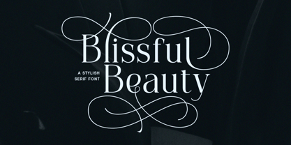 Blissful Beauty is a serif font that radiates elegance and sophistication. Its stylish alternates and delicate swashes make it the perfect choice for creating designs that demand a refined and chic look. From high-end branding to elegant wedding invitations, this font will captivate with its luxurious appeal. Features : Uppercase & lowercase Numbers and punctuation Alternates & Ligatures Multilingual PUA encoded We highly recommend using a program that supports OpenType features and Glyphs panels like many of Adobe apps and Corel Draw, so you can see and access all Glyph variations.
 - Kitsune Tail by Hanoded,
$15.00 Kitsune means ‘Fox’ in Japanese. It really has nothing to do with Japanese foxes, but I am going to Japan in a few weeks, so I figured a Japan-inspired name would be perfect. Kitsune Tail is a messy brush font with no real baseline. It is an all-caps font, but upper and lower case differ and can be mixed. It comes with a full set of alternates for the lower case glyphs and a really impressive language support! I hope this foxy font will bewitch you. Enjoy!
 - Ollivette Elite by Chank,
$59.00Fly your inner geek flag with this cool new "Eleet" typewriter font. It's kinda like a wonky internet translator that converts normal text into leet-speak, so you can exchange encoded love notes with cyber-hackers and goofy-gamers. The actual glyphs in this font are interchangeable with the more logical Ollivette typewriter font, but here the characters have all been moved around to create stylized interpretation of similar glyphs. So "ELEET" could also be typed "31337". Except you don't have to think about it. Get it? Got it? Good! 3NJ0¥ TH15 ƒØÑ+ & U53 !† 0FT3N. - CA Weird Stories by Cape Arcona Type Foundry,
$19.00 A font from outer space, CA Weird Stories - the perfect font for science fiction novels or to create a spooky atmosphere. A bit too weird and a bit too slanted for this world. Treat yourself with the ability to stack the two styles on top of each other to create great special FX. You may even consider to use the "fill" style on its own, it might look a bit uneven, as it was actually designed to be used in combination with the "shadow/regular" style, but hey – that's what this font is all about!
 - Sraben Grotesk by Yukita Creative,
$14.00 Sraben Grotesk is a beautiful, versatile font that's perfect for all kinds of projects! It features balanced and harmonious proportions, plus bold variations to make certain elements stand out. This font offers classic characteristics inspired by Grotesk typography, making it an ideal choice for posters, flyers, brochures, brand identity designs, and magazine layouts. Whether you're looking to create something new or bring a creative twist to an existing project, Sraben Grotesk can be the perfect choice. Let its clean aesthetic fuel your imagination and inspire you as you achieve your design goals!
 - NS Deckpress by Novi Souldado,
$30.00 Inspired from the letterpress achieve and printed media from the 19th century. We talk about headlines, labels, playing cards, postcards, book covers, signs, and many more. That's where the DECKPRESS has risen. An old vibes all-caps fonts, armored with the robust yet decorative ornamental slab-serif style. Double up the majestic, it comes with the layered style to give an amplification back to the vintage era. It is an inevitable partner for your classical heritage touch of visuals such as signage, logotype, sign painting, label, header, ornamental typographic design, you name it, old sports.
 - Golden Grotesque by moriztype,
$10.00 Golden Grotesque - Designed by Moriztype. The whole family consists of 9 Golden Grotesque Uprights, 9 Golden Grotesque Italic, 19 fonts in all. The font is informal and friendly at first glance and perfect for any display setting, but the straight, upright Golden Grotesque architecture also makes it perfect for longer copies. Due to its large x-height, it even works well in very small sizes. Golden Grotesque - This contemporary type family is ideal for use in retail, cosmetic, food and hospitality applications and advertising. Golden Grotesque is equipped for complex and professional typography.
 - LiebeLotte by LiebeFonts,
$29.90 Forget that hipster coolness for a minute and design something cute and charming with LiebeLotte! Go ahead and make beautiful things with her: birthday cards, wedding invitations, love letters, new signage for your deli—so many things look sweeter when you use this well-crafted handwriting font. We’ve put all of our heart and soul into this typeface—it took us a whole year to draw, refine, and interconnect all these loopy letterforms. We hope it’s really hard to tell that this is a typeface at all—the perfect connections and many swash variations make it look like you actually sat down with a pen. A pretty good pen in fact. LiebeLotte comes with a state-of-the-art character set. She also sports a variety of ligatures and alternative forms, available through OpenType features. (Please make sure your software supports ligatures for the letter connections and OpenType if you wish to use the advanced features.) Advanced designers, please take a look at our best-sellers LiebeErika and LiebeKlara: the all-new LiebeLotte makes a great companion for these popular fonts. We do think you’ll have plenty of fun with this versatile package of loopy letters for letter lovers. Or lovely letters for loop lovers. And hey, you can absolutely use LiebeLotte to make happy hipster designs, too! Promise!
 - Wildline by Mans Greback,
$59.00 Wildline is a fast logotype font, created to help you designing logotype or lettering that looks just like a hand-painted brush logo. Use it for designing signs, packaging, headlines, or a cool typographic print. Wildline has characteristics such as strength and confidence, while being dynamic, readable and very energic. Containing extensive lingual support, it covers all Latin European and Asian scripts. The font contains all characters you'll ever need, including all punctuation and numbers.
 - Zoney by Mans Greback,
$59.00 Zoney is a rustic slab serif typeface family. The lettering was hand-painted by Mans Greback between 2019 and 2021. It will give any project a handmade, natural and down-to-earth look. The font comes in four styles: Regular, Italic, Bold and Italic Bold It has very extensive lingual support, covering all European Latin scripts as well as Cyrillic. The font contains all characters you'll ever need, including all punctuation and numbers.
 - Alfie by Monotype,
$29.99 Alfie™ is lively, friendly, inviting and easy on the eyes. What more could you want in a script? How about four flavors of the same design? Alfie Script is a delightful connecting script with a touch of comfortable elegance. Use it for everything from social announcements to headlines and packaging. Alfie Casual is a little more laid-back with letters standing on their own. It works great in short blocks of text copy, subheads and navigational links. Alfie Informal has spirited serifs and its own demeanor, while Alfie Small Caps does a fine job of supporting its other siblings. There’s an immediacy to words and messages set in these lighthearted confections. Jim Ford was practicing drawing with a new brush pen when the inspiration for Alfie came to him. He had filled several pages in a notebook with letters and, at one point, realized that there might be a typeface among them. As it turned out, there were four. The process, however, wasn’t choosing one design and modifying it. The makings of all the designs were on the pages. It was just a matter of culling out the right collection of characters to build the foundations for the four flavors of Alfie. Because they share the same family roots, each design in the Alfie family can be paired and intermixed. Ford admits that there’s a hint of Emil Klumpp’s 1950s Murray Hill typeface (https://www.myfonts.com/fonts/bitstream/murray-hill/) in the Alfie family. Just enough to give the design a 50s vibe. (Some fashions never go out of style.)
 - Sofia Carolyn by Balpirick,
$15.00 Sofia Carolyn is a Modern Monoline Script Font. Sofia Carolyn is a delicate, elegant and flowing handwritten font. It has beautiful and well balanced characters and as a result, it matches a wide pool of designs. Fall in love with its incredibly versatile style and use it to create spectacular designs! Sofia Carolyn also multilingual support. Enjoy the font, feel free to comment or feedback, send me PM or email. Thank you!
 - Selfie Neue Sharp by Lián Types,
$29.00 INTRODUCTION When I started the first Selfie back in 2014 I was aware that I was designing something innovative at some point, because at that time there were not too many, (if any) fonts which rescued so many calligraphy features being at the same time a monolinear sans. I took inspiration from the galerías’ neon signs of my home city, Buenos Aires, and incorporated the logic and ductus of the spencerian style. The result was a very versatile font with many ligatures, swashes and a friendly look. But… I wasn’t cognizant of how successful the font would become! Selfie is maybe the font of my library that I see the most when I finally go out, (type-designers tend to be their entire lives glued to a screen), when I travel, and also the font that I mostly get emails about, asking for little tweaks, new capitals, new swashes. Selfie was used by several renowned clients, became part of many ‘top fonts of the year’ lists and was published in many magazines and books about type-design. These recognitions were, at the same time, cuddles for me and my Selfie and functioned as a driving force in 2020 to start this project which I called Selfie Neue. THE FONT "Selfie for everything" Selfie Neue, because it’s totally new: All its glyphs were re-drawn, all the proportions changed for better, and the old and somehow naive forms of the first Selfie were redesigned. Selfie Neue is now a family of many members (you can choose between a Rounded or a Sharp look), from Thin to Black, and from Short to Tall (because I noticed the feel of the font changed notoriously when altering its proportions). It also includes swashy Caps, which will serve as a perfect match for the lowercase and some incredibly cute icons/dingbats (designed by the talented Melissa Cronenbold, see also Selfie Neue Rounded for more!) which, as you see in the posters, make the font even more attractive and easy to use. You'll find tons of alternates per glyph. It's impossible to get tired with Selfie! Like it happened with the old Selfie, Selfie Neue Sharp was thought for a really wide range of uses. Magazines, Book-covers, digital media, restaurants, logos, clothing, etc. Hey! The font is also a VF (Variable Font)! So you can have fun with its two axes: x-height and weight, in applications that support them. Let me take a New Sharp Selfie! TECHNICAL If you plan to print Selfie Neue VF (Rounded or Sharp), please remember to convert it to outlines first. The majority of the posters above have the "contextual" alternates activated, and this makes the capitals a little smaller. I'd recommend deactivating it if you plan to use Selfie for just one word. Use the font always with the "fi" feature activated so everything ligatures properly. The slant of the font is 24,7 degrees, so if you plan to have its stems vertical, you may use Selfie with that rotation in mind. THANKS FOR READING
 - billieBoldhand by JOEBOB graphics,
$- BillieBoldhand was written at once with a fat marker. That's all there's to it... Caps only.
 - Jingo by Canada Type,
$39.95 This is the digital makeover and major expansion of a one-of-a-kind melting pot experiment done by VGC and released under the name Mardi Gras in the early 1960s. It is an unexpected jambalaya of Art Nouveau, Tuscan, wedge serifs, curlycues, ball endings, wood type spurs and swashes, geometry and ornamental elements that on the surface seem to be completely unrelated. But the totality works in a surprisingly loud and playful way that really defies categorization. Jingo is really five fonts in one: Over 1000 glyphs, four character sets, ornaments, swashes and ligatures. The forms are interchangeable in uppercase, lowercase and unicase settings. There is nothing low-key about this typeface. It is well suited for use on posters and book covers that require happy weirdness. But most of all it's great for those who like to fiddle with their type setting until amazingly conicidental pleasantnesses ensue. If you're that kind of designer and you know what you're doing, get Jingo, start up that glyph palette, and play away.
 - Caslon Antique by GroupType,
$19.00 Caslon Antique is a decorative American typeface that was designed in 1894 by Berne Nadall. It was originally called "Fifteenth Century", but was renamed "Caslon Antique" by Nadall's foundry, Barnhart Bros. & Spindler, in the mid-1920s. The design of the typeface is meant to evoke the Colonial era. Early printers would reuse metal type over and over again, and the faces would become chipped and damaged from use. Caslon Antique emulates this look. Despite the name, it is not a member of the Caslon family of typefaces. The renaming is believed to have been a marketing maneuver to boost the popularity of a previously unpopular typeface by associating it with the highly popular Caslon types. Caslon Antique is popular today when a "old-fashioned" or "gothic" look is desired. It is used by the musical group The Sisters of Mercy on their albums, for the logo of the musical Les Misérables, and for the covers of the books in A Series of Unfortunate Events. It is also frequently used on historical displays. It was used for the previous edition of the Warhammer Fantasy Role-Play. Most recently, it has been used on promotional material for the smash musical Monty Python's Spamalot on Broadway, the West End, and its tour of the United States. British 80's band The The also used the font in several of their music videos, usually displaying several lyrics from the song in the opening scenes. It used on the cover of Regina Spektor's album, Begin to Hope. This description was sourced (in part) from Wikipedia, the free encyclopedia.
 - TwentyFourNinetyOne by steve mehallo,
$19.91 TwentyFourNinetyOne [2491] is a reinterpretation of the alphabet of 1919 by Theo van Doesburg; the original a true rendering of the thinking of the Dutch-based art movement “de Stijl.” Jump forward to 1980 and prop lettering used on the Buck Rogers in the 25th Century television series; a vernacular typeface that was a utilitarian mix of geometry and pixel-based forms, used to symbolize the futuristic universe of 2491. At times it would appear on spaceships, laser guns, signage at space ports or in one episode, a Spandex tapestry. It only seemed logical to combine and rethink the letterforms, add ligatures + other extras, and see what the results would be. Futuristic, fun and bold to read! 2491: In the future, all type will look like this.
 - Plinc Swiss Interlock by House Industries,
$33.00 Swiss Interlock represents the extraordinary meeting of two disparate cultural phenomena of the mid-twentieth century. Its compact frame combines the International Style of the late 50s, which championed the clarity of sans serif, with the interlocking lettering characteristic of 60s counterculture aesthetics. The remarkable result is a tightly woven face with unexpected letter pairs that warm an otherwise cold industrial appearance. Swiss Interlock’s unusual origins make it comfortable on everything from album cover artwork and snack food packaging, to home improvement applications and automotive-themed advertsing. Like all good subversives, House Industries hides in plain sight while amplifying the look, feel and style of the world’s most interesting brands, products and people. Based in Delaware, visually influencing the world.
 - Hobi by Scholtz Fonts,
$17.00Hobi was influenced by Spaza. In it I tried to highlight the dissonance between the irregular outlines of the characters and the formality suggested by the serifs of the characters. Differences from Spaza are: -- character heights from the baseline; -- the presence of serifs; and -- variations in the character outlines to accomodate the different balance that the characters require in terms of the presence of serifs. Hobi is loose, funky and quite contemporary. The font can be used with great effect in a great variety of applications such as advertisements, flyers, posters, magazine pages and in movie credits. Hobi contains a full character set with all upper and lower case characters, numerals, symbols, accented characters and it has been carefully spaced and kerned. - Thing by Umka Type,
$19.00 Thing - A Display Font : Thing is a carefully crafted display font. It has Extended Latin characters. It created for poster, web, brand and social media designs. This is all Caps Fonts.
 - Dutch Mediaeval Book ST by Canada Type,
$39.95 Dutch Mediaeval Book ST is a special version of the popular Dutch Mediaeval Book text fonts, engineered specifically for science writing. It is equipped with SciType, a combination of additional characters and OpenType programming included in the fonts to help in typesetting science text. For more information about SciType, please consult the SciType FAQ available in the Gallery section of this page. The Dutch Mediæval design is the historically renowned one made in 1912 by S. H. de Roos. It stands out as one of the most classic Dutch text faces. This Book version comes in two weights and an italic, optimized for body copy use between 8 and 12 pt. Aside from the SciType additions, all the fonts contain OpenType features for ligatures, ordinals, automatic fractions, eight kinds of figures, and a few ornaments. For details about the functionality of Dutch Mediaeval Book ST, please consult its Access Chart PDF available in the Gallery section of this page.
 - Dutch Mediaeval Pro ST by Canada Type,
$49.95 Dutch Mediaeval Pro ST is a special version of the popular Dutch Mediaeval Pro family, engineered specifically for science writing. It is equipped with SciType, a combination of additional characters and OpenType programming included in the fonts to help in typesetting science text. For more information about SciType, please consult the SciType FAQ available in the Gallery section of this page. The Dutch Mediaeval design is the historically renown one made in 1912 by S. H. de Roos. It stands out as one of the most classic Dutch text faces. This digital version comes in two weights and their italic counterparts. Aside from the SciType additions, all the fonts contain OpenType features for small caps and caps-to-small-caps, ligatures, ordinals, automatic fractions, seven kinds of figures, and a few ornaments. For details about the functionality of Dutch Mediaeval Pro ST, please consult its Access Chart PDF available in the Gallery section of this page.
 - Boleo by Salsipuedes,
$19.00 Boleo is a typeface designed to work in short texts such as headlines, banners, logos, signs, packaging and posters. It is a display font but has a good legibility thanks to well-proportioned shapes which let it works fine both on paper and screen. Boleo’s shapes remind to ribbons in motion, so that its lines, all curved, can be traced all at once. Boleo displays in three weights: regular, bold and black.
 - Middle Ages by Mans Greback,
$49.00 Middle Ages is a hand-drawn medieval type, designed by Måns Grebäck during 2019. With its blackletter style it works great in many historical context typesettings, as well as for traditional Christmas projects. It has a Gothic style that also works well for rock music genres, or for tattoos and other rough graphics. The font is multilingual and supports all Latin-based European languages, contains numbers and all symbols you'll ever need.
 - Plena by Arodora Type,
$40.00 The Plena font offers a modern all-caps experience. All glyphs have incision and unified alternatives and can be shaped for your intended use. This font is crafted for different design trends and would look great for your large print banner headers. It can be preferred by the designer in accordance with its intended use and can be used impressively and strikingly with its large family on different platforms. Plena also offers multilingual support.
 - Bezura by Adam B. Ford,
$14.00 Bezura is a font designed with an emphasis on minimal nodes. All bezier curves in this font have reference points on 90° or 45°. All corners have a smooth curve to them. It would probably work great when used in vinyl-cutting applications on signage. While it has a very methodical construction, there is enough sway in the font to give it a loose feel for professional projects with an unprofessional feel.
 - Brossard by Greater Albion Typefounders,
$13.95 Brossard is a slab serif face redolent of French atmosphere and the design ethos of the 1920s. Use it for headines and posters that need that distinctive élan or where a Continental feel is called for. Regular and outline faces are offered.
 - Coconut Punch by Hanoded,
$10.00 Health Warning! Coconuts are not that healthy!! I always thought that coconuts were the new quinoa, but apparently they’re not that good for you. They are furry balls of saturated fat, sugar and calories, so don’t go all out with your coconut eating habits! Of course, eating a bit of coconut now and then will not kill you, so enjoy! Coconut Punch is a handmade didone-ish font. Nice and rounded and full of saturated brush strokes. Comes with all the diacritics you need too!
 - Lido STF by Storm Type Foundry,
$39.00Times with a Human Face: In my article of the same name which appeared in the magazine Font, volume 2000 I described the long and trying story of an order for a typeface for the Czech periodical Lidové noviny (People’s Newspaper). My task was to design a modification of the existing Times. The work, however, finally resulted in the complete re-drawing of the typeface. The assignment, which was on the whole wisely formulated, was to design a typeface which would enable “a smooth flow of information in the reader’s eye”, therefore a typeface without any artistic ambitions, from which everything which obstructs legibility would be eliminated. A year later Lidové noviny had a different manager who in the spring of 2001 decided to resume the cooperation. The typeface itself definitely profited from this; I simplified everything which could be simplified, but it still was not “it”, because the other, and obviously more important, requirement of the investor held: “the typeface must look like Times”. And that is why the above-mentioned daily will continue to be printed by a system version of Times, negligently adjusted to local conditions, which is unfortunately a far cry from the original Times New Roman of Stanley Morison. When I was designing Lido, the cooperation with the head of production of Lidové noviny was of great use to me. Many tests were carried out directly on the newspaper rotary press during which numerous weak points of the earliest versions were revealed. The printing tests have proved that the basic design of this typeface is even more legible and economical than that of Times. The final appearance of Lido STF was, however, tuned up without regard to the original assignment – the merrier-looking italics and the more daring modelling of bold lower case letters have been retained. The typeface is suitable for all periodicals wishing to abandon inconspicuously the hideous system typefaces with their even more hideous accents and to change over to the contemporary level of graphic design. It is also most convenient for everyday work in text editors and office applications. It has a fairly large x-height of lower case letters, shortened serifs and simplified endings of rounded strokes. This is typical of the typefaces designed for use in small sizes. Our typeface, however, can sustain enlargement even to the size appropriate for a poster, an information table or a billboard, as it is not trite and at the same time is moderate in expression. Its three supplementary condensed designs correspond to approximately 80% compression and have been, of course, drawn quite separately. The intention to create condensed italics was abandoned; in the case of serif typefaces they always seem to be slightly strained. I named the typeface dutifully "Lido" (after the name of the newspaper) and included it in the retail catalog of my type foundry. In order to prevent being suspected of additionally turning a rejected work into cash, Lido STF in six designs is available free of charge. I should not like it if the issuing of this typeface were understood as an “act out of spite” aimed against the venerable Times. It is rather meant as a reminder that there really are now alternatives to all fonts in all price categories. - Jouvencelle by Whitecube,
$22.00 Jouvencelle is a contemporary version of classic 18th-century typographic elegance, distinguished by its dynamic lines of force and the heterogeneous design of some of its typefaces. Its personality is expressed by its graphic richness, its whimsical harmony and the finesse of its strokes, making it ideal for large format, titling or textile printing. This unique, sophisticated and versatile serif family of 382 glyphs and 17 ligatures is perfect for branding projects, logos, apparel, packaging, magazine headlines, advertising, T-shirts, postcards and more.
 - Moron by Barnbrook Fonts,
$30.00 Moron is a distinctive and idiosyncratic display typeface: a winsome-but-nasty, old-and-yet-new drawing of Victorian sans-serif letterforms (with some 1970s sausage fonts thrown in). Moron started life as a sans-serif redrawing of Nylon but developed into a unique typeface with a character all its own. It is based, very loosely, upon Victorian Tuscan and Grotesque type found in the churches and cemeteries of the city of Glasgow. These letterforms originated before the dawn of modernism and at a time when the Arts and Crafts Movement was flourishing. In this age of early mass production and mechanisation, the Victorian ability to balance functionality with ornamentation had fascinating results. The typography of that period displays a unique combination of industrial heft and romantic decoration.
 - Monaz by Craft Supply Co,
$20.00 Introduction to Monaz – Bubble Font Monaz – Bubble Font, a playful and airy display font, is inspired by the lightness and roundness of bubbles and balloons. Perfect for creating eye-catching headings, logos, and children’s books, this font not only grabs attention but also serves as an ideal choice for fun and whimsical projects. Design and Aesthetics In its design, Monaz – Bubble Font features characters that resemble bubbles, with rounded edges and a bouncy feel. Furthermore, the letters mimic the floating appearance of balloons, thus adding a cheerful and lighthearted touch to any design. Additionally, its rounded forms are easy on the eyes, ensuring readability while preserving its playful charm. Versatility and Usage Monaz – Bubble Font boasts high versatility, fitting a variety of design needs effortlessly. Not only does it shine in party invitations and product packaging, but it also excels in promotional materials. Moreover, its effectiveness extends to educational materials for children, making learning engaging with its friendly appearance. As a result, its readability and unique style make it a top choice for designers seeking to add a fun element to their projects. Accessibility and Appeal Designed for a wide audience, Monaz – Bubble Font features a simple and clear style that is easy to read. It appeals to all ages, capturing the whimsy of childhood while still being sophisticated enough for adult projects. In summary, this font brings a unique joy and playfulness to any design, making it a valuable addition to any font collection.
 - FS Koopman Variable by Fontsmith,
$299.99New York to London via Europe The hardworking FS Koopman is a crossbred workhorse which draws inspiration from Swiss and Germanic grotesks, American gothics and early British grotesques, but refuses to fit neatly into any of these categories. Its neither one nor the other, but all of the above. Fontsmith designers Andy Lethbridge and Stuart de Rozario decided to take the characteristics they admired from each category and distill them down into one functional family. Neo meets Neue FS Koopman aims to swim against the tide of Helvetica-ish derivatives by bringing some personality and soul to a genre that all too often ends up feeling bland and sterile. FS Koopman subtly embraces the quirkiness and charm often seen in early twentieth century designs but pairs this with the functionality of later pioneers of the genre. It’s a grotesque isn’t it? The term grotesque surfaced around the early 1800s and refers to the early sans serif designs that many initially believed were strange or ‘grotesque’ due to their lack of elegant serifs. Later variations became known as neo-grotesques and this moniker stuck around even after they gained mass popularity. Some American variants became known as gothics. FS Koopman takes cues from all three categories and blends them into one cohesive design. - Imagine a font that tiptoed into a masquerade ball, wearing a disguise so charming and playful that every word it whispered seemed to dance off the page. That, my dear friends, is the essence of King...