7,057 search results
(0.029 seconds)
- Volta by Linotype,
$29.99Volta is a robust typeface from the 1950s. A revisit to styles that were en vogue at the turn of the century, Bauer type foundry designers Walter Baum and Konrad Bauer designed this type family in1955. The form of Volta's letters are similar to those in New Transitional Serif typefaces, like Cheltenham and Century. Developed after the Didone (i.e., Bodoni) style types, New Transitional Serifs speak more to the zeitgeist of the late 19th Cntury, and were typographic adaptations to it's newer technologies. Already in the period of mass production, typographers and printers at the dawn of the 20th Century had to cope with larger print runs on cheaper materials. The robust letterforms of New Transitional Serifs were designed to compensate for this, but they were also ingenious little inventions in their own right. Form the beginning, the new, peculiar forms of New Transitional Serif letters were adopted for use by advertisers. Their robustness also allowed them to be used in virtually all sizes. Volta was designed especially with advertising display usage in mind. The x-height of Volta's letters is higher than average for serif faces. It is recommended that Volta be used exclusively for shorter tracks of text, above 12 point. Headlines look dashing set in Volta. Four different font styles are available for the Volta typeface: Regular, Medium, Medium Italic, and Bold." - Dokument Pro by Canada Type,
$29.95 Jim Rimmer aptly described his Dokument family as a sans serif in the vein of News Gothic that takes nothing from News Gothic. Building on that internal analysis, Dokument Pro is the thoroughly reworked and expanded of the original main set released in 2005, with different widths still in the pipeline. This new version updates Jim’s work to six Pro weights and their italic counterparts, each of which takes advantage of OpenType stylistic sets to introduce different degrees of graduation from gothic to humanist. Dokument Pro is now a unique text sans family, with an adaptable personality suitable for the kind of edgy, uncompromising corporate and media typography that just tells it like it is, instead of having to resort to the common contemporary luring and baiting tactics. Dokument Pro’s range of weights, styles and features (over 775 glyphs per font, built-in small caps, alternates galore, and support for over 45 Latin languages) allows for multi-application versatility and clear, precise emotional delivery. This is the kind of straight-shooter sans that should be in every designer’s toolbelt. For more details on the fonts' features, text and display specimens and print tests, consult the Dokument Pro PDF availabe in the Gallery section of this page. 20% of Dokument Pro’s revenues will be donated to the Canada Type Scholarship Fund, supporting higher typography education in Canada.
 - Alimentary by Missy Meyer,
$12.00 Alimentary (adjective): relating to nourishment or sustenance. If you've seen my other fonts, you know I tend to lean into food-based names. This name has to do with food and science combined, so it's double nerdy in the ways I like to be nerdy! I started with Alimentary Medium, which was inspired by my shorter, wider font MacGuffin - I wanted something taller, narrower, with a hip and retro feel. When I finished the Medium weight, I felt like I wanted a Light weight. Then a Heavy weight. Then I figured, "what the heck," and made an outline version of the Medium weight too. In the end, I wound up with four members of the Alimentary family, each with over 700 glyphs! Not only do they all have the basics (A-Z, a-z, 0-9, and tons of punctuation), but they also each have 330 characters for European language support, and a limited selection of Greek, Coptic, and Cyrillic characters. Plus a double handful of alternates and ligatures to add a little variety to your designs! And of course, all of the Alimentary fonts are super-smoothed, with reduced nodes and clean curves, so whether you're cutting them out, printing them, engraving them, or using them in a way I haven't even thought of, these fonts will be sharp and crisp!
 - Bodoni Highlight by Image Club,
$29.99Giambattista Bodoni (1740-1813) was called the King of Printers; he was a prolific type designer, a masterful engraver of punches and the most widely admired printer of his time. His books and typefaces were created during the 45 years he was the director of the fine press and publishing house of the Duke of Parma in Italy. He produced the best of what are known as modern" style types, basing them on the finest writing of his time. Modern types represented the ultimate typographic development of the late eighteenth and early nineteenth centuries. They have characteristics quite different from the types that preceded them; such as extreme vertical stress, fine hairlines contrasted by bold main strokes, and very subtle, almost non-existent bracketing of sharply defined hairline serifs. Bodoni saw this style as beautiful and harmonious-the natural result of writing done with a well-cut pen, and the look was fashionable and admired. Other punchcutters, such as the Didot family (1689-1853) in France, and J. E. Walbaum (1768-1839) in Germany made their own versions of the modern faces. Even though some nineteenth century critics turned up their noses and called such types shattering and chilly, today the Bodoni moderns are seen in much the same light as they were in his own time. When used with care, the Bodoni types are both romantic and elegant, with a presence that adds tasteful sparkle to headlines and advertising. This version of Bodoni was done by Morris Fuller Benton for American Typefounders between 1907 and 1911. Although some of the finer details of the original Bodoni types are missing, this family has the high contrast and vertical stress typical of modern types. It works well for headlines, logos, advertising, and text." - Parma by Monotype,
$29.99Giambattista Bodoni (1740-1813) was called the King of Printers; he was a prolific type designer, a masterful engraver of punches and the most widely admired printer of his time. His books and typefaces were created during the 45 years he was the director of the fine press and publishing house of the Duke of Parma in Italy. He produced the best of what are known as modern" style types, basing them on the finest writing of his time. Modern types represented the ultimate typographic development of the late eighteenth and early nineteenth centuries. They have characteristics quite different from the types that preceded them; such as extreme vertical stress, fine hairlines contrasted by bold main strokes, and very subtle, almost non-existent bracketing of sharply defined hairline serifs. Bodoni saw this style as beautiful and harmonious-the natural result of writing done with a well-cut pen, and the look was fashionable and admired. Other punchcutters, such as the Didot family (1689-1853) in France, and J. E. Walbaum (1768-1839) in Germany made their own versions of the modern faces. Even though some nineteenth century critics turned up their noses and called such types shattering and chilly, today the Bodoni moderns are seen in much the same light as they were in his own time. When used with care, the Bodoni types are both romantic and elegant, with a presence that adds tasteful sparkle to headlines and advertising. Parma was designed by the monotype Design Team after studying Bodoni's steel punches at the Museo Bodoniana in Parma, Italy. They also referred to specimens from the "Manuale Tipografico," a monumental collection of Bodoni's work published by his widow in 1818. - Dynamic BRK Pro by CheapProFonts,
$10.00 Dynamic by name, and dynamic by nature - this sleek font is perfect for logos and hightech quotes. The original lowercase f had a big overhang - I redesigned it so it fits better with accented letters, but also kept the original shape as a contextual alternate: the font automatically uses the "large" f before any low letters... Also the lowercase j would crash into any preceding letters with a righthand descender - so I also designed an automatic alternate j. Result: no colliding letters! The Slanted version adds a touch of speed. ALL fonts from CheapProFonts have very extensive language support: They contain some unusual diacritic letters (some of which are contained in the Latin Extended-B Unicode block) supporting: Cornish, Filipino (Tagalog), Guarani, Luxembourgian, Malagasy, Romanian, Ulithian and Welsh. They also contain all glyphs in the Latin Extended-A Unicode block (which among others cover the Central European and Baltic areas) supporting: Afrikaans, Belarusian (Lacinka), Bosnian, Catalan, Chichewa, Croatian, Czech, Dutch, Esperanto, Greenlandic, Hungarian, Kashubian, Kurdish (Kurmanji), Latvian, Lithuanian, Maltese, Maori, Polish, Saami (Inari), Saami (North), Serbian (latin), Slovak(ian), Slovene, Sorbian (Lower), Sorbian (Upper), Turkish and Turkmen. And they of course contain all the usual "western" glyphs supporting: Albanian, Basque, Breton, Chamorro, Danish, Estonian, Faroese, Finnish, French, Frisian, Galican, German, Icelandic, Indonesian, Irish (Gaelic), Italian, Northern Sotho, Norwegian, Occitan, Portuguese, Rhaeto-Romance, Sami (Lule), Sami (South), Scots (Gaelic), Spanish, Swedish, Tswana, Walloon and Yapese.
 - Cowboy Wanted by Shakira Studio,
$19.00 Introducing "Cowboy Wanted" - The Ultimate Western Retro Serif Font! Saddle up and embrace the wild, wild west with Cowboy Wanted, the font that's taking the design world by storm. This font embodies the perfect blend of old-school ruggedness and contemporary flair, making it the hottest ticket in town for all your Western-inspired design needs. Each character in Cowboy Wanted is meticulously crafted to capture the essence of the Old West, from the sweeping serifs to the rugged lines. Whether you're working on a saloon-inspired logo, a rustic poster, or a themed event invitation, Cowboy Wanted adds that authentic Western touch that's so in demand right now. Don't miss your chance to lasso the trendiest Western retro serif font of the moment. With Cowboy Wanted, you'll be the sheriff of style in your design projects, standing out in the crowded frontier of design. Saddle up and make a bold statement with Cowboy Wanted today! Here's what you get: Cowboy Wanted Regular All Multilingual symbol Opentype features ( ligature, alternate ) Accessible in the Adobe Illustrator, Adobe Photoshop, Adobe InDesign, even work on Microsoft Word. PUA Encoded Characters - Fully accessible without additional design software. Multilingual character supports : (Afrikaans, Albanian, Catalan, Croatian, Czech, Danish, Dutch, English, Estonian, Finnish, French, German, Hungarian, Icelandic, Italian, Lithuanian, Maltese, Norwegian, Polish, Portuguese, Slovenian, Spanish, Swedish, Turkish, Zulu) Follow my shop for upcoming updates, and for more of my work, Thank you!
 - From The Stars by Typodermic,
$11.95 Welcome to the world of industrial design and technology with From the Stars, the pragmatic sans-serif rectilinear typeface that will take your design game to the next level. Inspired by the ultra-modern industrial design, From the Stars is a powerful typeface that features a tight style and closed curves, making it an ideal choice for designers seeking to create clean and contemporary layouts. This typeface is a perfect reaction to the popularity of open types in the 1990s and 2000s, offering a new level of sophistication and professionalism to your designs. From the Stars’ compact aesthetic and rounded rectangular form are tailored to complement new industrial design and technological gadgets. Whether you’re designing for digital products or creating prints, From the Stars is the ultimate typeface that will make your work stand out. With seven weights and italics, From the Stars provides unparalleled flexibility to your designs, allowing you to achieve the perfect balance between elegance and readability. Its versatility makes it suitable for various applications, from bold headlines to body copy, making it an excellent choice for designers looking to make a statement. Embrace the power of pragmatic design with From the Stars, the typeface that will elevate your work and make you stand out from the crowd. Most Latin-based European writing systems are supported, including the following languages. Afaan Oromo, Afar, Afrikaans, Albanian, Alsatian, Aromanian, Aymara, Bashkir (Latin), Basque, Belarusian (Latin), Bemba, Bikol, Bosnian, Breton, Cape Verdean, Creole, Catalan, Cebuano, Chamorro, Chavacano, Chichewa, Crimean Tatar (Latin), Croatian, Czech, Danish, Dawan, Dholuo, Dutch, English, Estonian, Faroese, Fijian, Filipino, Finnish, French, Frisian, Friulian, Gagauz (Latin), Galician, Ganda, Genoese, German, Greenlandic, Guadeloupean Creole, Haitian Creole, Hawaiian, Hiligaynon, Hungarian, Icelandic, Ilocano, Indonesian, Irish, Italian, Jamaican, Kaqchikel, Karakalpak (Latin), Kashubian, Kikongo, Kinyarwanda, Kirundi, Kurdish (Latin), Latvian, Lithuanian, Lombard, Low Saxon, Luxembourgish, Maasai, Makhuwa, Malay, Maltese, Māori, Moldovan, Montenegrin, Ndebele, Neapolitan, Norwegian, Novial, Occitan, Ossetian (Latin), Papiamento, Piedmontese, Polish, Portuguese, Quechua, Rarotongan, Romanian, Romansh, Sami, Sango, Saramaccan, Sardinian, Scottish Gaelic, Serbian (Latin), Shona, Sicilian, Silesian, Slovak, Slovenian, Somali, Sorbian, Sotho, Spanish, Swahili, Swazi, Swedish, Tagalog, Tahitian, Tetum, Tongan, Tshiluba, Tsonga, Tswana, Tumbuka, Turkish, Turkmen (Latin), Tuvaluan, Uzbek (Latin), Venetian, Vepsian, Võro, Walloon, Waray-Waray, Wayuu, Welsh, Wolof, Xhosa, Yapese, Zapotec Zulu and Zuni.
 - Board Of Directors by Typodermic,
$11.95 We are proud to introduce, Board of Directors. This striking, square display typeface is a true testament to the advancement of modern technology. Inspired by hi-tech logos of the 1970s, the tight curves and large x-height of Board of Directors truly set it apart from the competition. But it’s not just the aesthetics that make Board of Directors stand out. The stroke gaps were carefully crafted to lighten the perceived character weight, making it the perfect choice for scientific and technical applications. The flat sides of the A and V harken back to the dot matrix printer letterforms of the past, adding a sense of nostalgia and history to this otherwise futuristic typeface. Board of Directors is available in seven weights and italics, giving you the flexibility to choose the perfect weight for your project. From the lightest weight for subtle emphasis to the boldest for maximum impact, Board of Directors has you covered. We believe that Board of Directors is more than just a typeface. It’s a symbol of innovation, progress, and forward-thinking. With Board of Directors, you can take your message to the next level and make a statement that truly stands out from the crowd. Most Latin-based European writing systems are supported, including the following languages. Afaan Oromo, Afar, Afrikaans, Albanian, Alsatian, Aromanian, Aymara, Bashkir (Latin), Basque, Belarusian (Latin), Bemba, Bikol, Bosnian, Breton, Cape Verdean, Creole, Catalan, Cebuano, Chamorro, Chavacano, Chichewa, Crimean Tatar (Latin), Croatian, Czech, Danish, Dawan, Dholuo, Dutch, English, Estonian, Faroese, Fijian, Filipino, Finnish, French, Frisian, Friulian, Gagauz (Latin), Galician, Ganda, Genoese, German, Greenlandic, Guadeloupean Creole, Haitian Creole, Hawaiian, Hiligaynon, Hungarian, Icelandic, Ilocano, Indonesian, Irish, Italian, Jamaican, Kaqchikel, Karakalpak (Latin), Kashubian, Kikongo, Kinyarwanda, Kirundi, Kurdish (Latin), Latvian, Lithuanian, Lombard, Low Saxon, Luxembourgish, Maasai, Makhuwa, Malay, Maltese, Māori, Moldovan, Montenegrin, Ndebele, Neapolitan, Norwegian, Novial, Occitan, Ossetian (Latin), Papiamento, Piedmontese, Polish, Portuguese, Quechua, Rarotongan, Romanian, Romansh, Sami, Sango, Saramaccan, Sardinian, Scottish Gaelic, Serbian (Latin), Shona, Sicilian, Silesian, Slovak, Slovenian, Somali, Sorbian, Sotho, Spanish, Swahili, Swazi, Swedish, Tagalog, Tahitian, Tetum, Tongan, Tshiluba, Tsonga, Tswana, Tumbuka, Turkish, Turkmen (Latin), Tuvaluan, Uzbek (Latin), Venetian, Vepsian, Võro, Walloon, Waray-Waray, Wayuu, Welsh, Wolof, Xhosa, Yapese, Zapotec Zulu and Zuni.
 - Bunken Tech Sans Wide by Buntype,
$49.00 The Bunken Tech Sans superfamily: A reminiscence of constructed fonts of the modern age designed with considerably cleaner forms. •See other members of the Superfamily: Bunken Tech Sans •For further details, view the Specimen PDF. Bunken Tech Sans Wide follows in the best tradition of the straight-lined and somewhat angular structures of its predecessors while offering a much more open and mild design. The shapes of the letters are therefore reduced to the most essential elements: The spurs on a, b, n and other lower case letters occur just as little as decorative or style details, the lightly rounded inside edges are more pleasing to the eye than certain historic role models and make for a harmonic, flowing style. Use In particular Bunken Tech Sans Wide stands out as an easy, distinctive headline font with its straight-lined, technical design. Open counters and large x-height make it equally suited for use in shorter texts. It is also perfectly complemented by Bunken Sans or Bunken Slab in longer texts (available soon). Features Available in 16 styles with widths ranging from Light to Heavy with associated Italics. All of the styles are very extensive: Support for at least 58 languages, Small Capitals, 9 number sets (e.g. Lining, Oldstyle, Tabular and Small Cap Figures), ligatures, alternate characters, numerous Opentype functions, and lots of other small features that make it more pleasant to work with the font on a daily basis as well as fulfilling typographic desires. Each style contains more than 870 characters! Each style is available in a professional (Pro) standard (Std) and Small Caps (SC) edition with a different range of functions. (Language support, OpenType features and number of glyphs). Details can be found on the respective pages. Bunken Tech Sans Wide is part of the Bunken Tech superfamily and is available in Condensed, Normal and Wide. Also of interest: The slab serif variation Bunken Tech Slab Features in Detail: 16 Weights: -Light -Book -Medium -SemiBold -Bold -ExtraBold -UltraBold -Heavy and corresponding Italics 3 Widths: -Condensed -Normal -Wide Alternate Characters: A, E, F, L, S, e, f, t, s, y, etc. Small Capitals 5 Sets of Figures: -Lining Figures -Old Style Figures -Tabfigures -Old Style Tabfigures -Small Cap Figures Automatic Ordinals Automatic Fractions Extended Language Support and more...
 - Pauline Script by insigne,
$39.00 Pauline Script is a Vintage inspired Monoline script. It's a contemporary script inspired by the past, now available to the Instagram era. Pauline Script is a follow up to the popular Pauline typeface. Pauline was one of my first typefaces, all the way back in 2008. Inspired by a variety of influences, from Art Deco signage, to a simple spice label, Pauline Script has very little stroke contrast and was inspired by Retro connected scripts. Over the course of its evolution, it started to take on more influence from geometric sans serif typefaces and lost the connectors. There's a strong geometric streak, derived from 1930s sans serifs like Futura. Tall ascenders and descenders give it a unique look. Now, this script version has now come full circle, utilizing the original sans serif face design and adding connectors back in, with an optically corrected dynamic slant. For invitations, signage, logos or other applications, Pauline Script is there when you need something that stands out with a touch of class and a sense of uniqueness. Turning on Contextual Alternates (non connecting ending forms) and Discretionary Ligatures (better letter connections) is highly recommended. There's a wide range of weights available. It's a playful typeface with options to either have everything connected, or alternate forms which allow for letter connections that still maintain the sense of flow of a script. Includes plenty of ligatures!
 - Slenderline by Blankids,
$23.00 Introducing of our new product the name is Slender clean Signature font. inspired by signature and stylish handwriting, Slender font is good for logotype, wedding invitation design, badge, headline, signature, packaging and any more. Slender font have 336 Glyphs and many alternative character so you can mix and match like a you want, Slender font include 17 Mutilingual Support (Afrikaans, Albanian, Catalan, Danish, Dutch, English, Estonian, Finnish, French, German, Icelandic, Italian, Norwegian, Portugese, Spanisch, Swedish, Zulu)
 - Lemon Press by Attype Studio,
$7.00 Lemon Press is display font of fresh lemon, come up with two font regular and display. It is suitable for any summer event! Lemon Press is perfect for branding, logo, invitation, stationery, social media post, product packaging, merchandise, blog design, game titles, cute style designs, Book/Cover Titles and more. Multilingual Support included for Afrikaans, Albanian, Catalan, Danish, Dutch, English, Estonian, Finnish, French, German, Icelandic, Italian, Norwegian, Portuguese, Spanish, Swedish, Zulu. Hope you enjoy with our font! Attype Studio
 - Berlewi FA by Fontarte,
$39.00 FA Berlewi is inspired by stencil lettering of a vanguard creator, Henryk Berlewi, who was a precursor of contemporary typography, a painter and a creator of the mechano-facture (Mechano-Faktura) theory. In 1924 he designed a poster for his mechano-facture one-man show in Warsaw Austro-Daimler car salon. An attention-grabbing composition with stencil lettering was doubtless a real innovation and according to Berlewi - the first typographic poster to be made in Poland.
 - Westey by sizimon,
$12.00 Westey is a script signature, beautiful for wedding card designs, logotype, website header, fashion design and any more. Westey come with 73 Glyph alternates and 63 Swash Characters. It contains a full set of lower & uppercase letters, a large range of punctuation, numerals, and multilingual support. - PUA encode - Bonus Swash - Multilingual support : (Danish,Finnish,English,,Spanish,Dutch,German,Icelandic,Italian,Norwegian,Portuguese,Indonesian, Swedish) If you have any question please do not hesitate to contact me.Thank You!
 - Virtuose by Ckhans Fonts,
$34.00 Virtuose family consists of 18 styles (9 weights, 9 Italics), in each of which there are more than 543+ glyphs. In the typeface, each weight includes extended language support, fractions, tabular figures, ligatures, arrows and more. Perfectly suited for graphic design and any display use. Support for 28 languages: Afrikaans Albanian Catalan Croatian Czech Danish Dutch English Estonian Finnish French German Hungarian Icelandic Italian Latvian Lithuanian Maltese Norwegian Polish Portugese Romanian Slovak Slovenian Spanisch Swedish Turkish Zulu
 - Metricor by Hotam,
$40.00 Metrica circle is a sans-serif type family of five weights. It was designed by Hotam Mahmadiev. The fonts are based on simple and clean geometric forms. The font contains more than 1700 glyphs. Supported languages: Afrikaans, Albanian, Belarusian, Bosnian, Bulgarian, Catalan, Croatian, Czech, Danish, Dutch, English, Estonian, Finnish, French, German, Greek, Hungarian, Icelandic, Italian, Latvian, Lithuanian, Macedonian, Maltese, Norwegian, Polish, Portuguese, Romanian, Russian, Serbian, Slovak, Slovenian, Spanish, Swedish, Turkish, Ukrainian, Tajik, Uzbek, Vietnamese, Zulu, and other.
 - Gravitica Compressed by Ckhans Fonts,
$34.00 Gravitica Compressed family consists of 18 styles (9 weights, 9 Italics), in each of which there are more than 543+ glyphs. In the typeface, each weight includes extended language support, fractions, tabular figures, ligatures, arrows and more. Perfectly suited for graphic design and any display use. Support for 28 languages: Afrikaans Albanian Catalan Croatian Czech Danish Dutch English Estonian Finnish French German Hungarian Icelandic Italian Latvian Lithuanian Maltese Norwegian Polish Portugese Romanian Slovak Slovenian Spanisch Swedish Turkish Zulu
 - Jason Uncial by URW Type Foundry,
$49.99 Jason Uncial, a unicase font, was created by Dutch designer Coen Hofmann. Uncial hand writing began to spread in Europe at the time of the late Roman Empire (200 A.D.). It influenced both the Carolingian Minuscule as well as our present lower case letter forms. Uncial fonts are still very much in use. It is used for headlines, display, titles, certificates, and not surprisingly, very much in Ireland or for anything with a Gaelic/Irish or Celtic touch.
 - Devil Tail by Attype Studio,
$14.00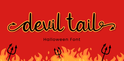 Devil Tail is a delicate and incredibly distinct handwritten font. Fall in love with its incredibly versatile style and use it to create spectacular designs! Devil Tail is perfect for branding, logo, invitation, stationery, social media post, product packaging, merchandise, blog design, game titles, cute style design, Book/Cover Title and more. What's Included : - Devil Tail.otf - Beginning & Ending Swash - Multilingual Support (Afrikaans, Albanian, Catalan, Danish, Dutch, English, Estonian, Finnish, French, German, Icelandic, Italian, Norwegian, Portugese, Spanisch, Swedish, Zulu)
 - Billistone by Ergibi Studio,
$14.00 Billistone is a unique handwritten font. Its natural flow and easy signature style makes it perfect to use for logos, signatures, quotes, badges, labels, packaging design, blog headlines or any other design project. What's Included : Uppercase, Lowercase, Numerals & Punctuations, Ligature Multilingual support for the following languages : Cornish, Danish, Dutch, English, Estonian, Faroese, Filipino, Finnish, French, Galician, German, Icelandic, Indonesian, Irish, Italian, Norwegian Bokmål, Norwegian Nynorsk, Portuguese, Spanish, Swahili, Swedish, Swiss German. If you have any Question please message me.
 - Wildcats by Blankids,
$25.00 Wildcats Typeface is a vintage sexy calligraphy style. Wildcats inspired from vintage labels, signage and packages. Wildcats is good for logotype, tattoo typograph, signage, wedding invitation card design and any more. Wildcats have 453 Glyphs and many alternative character so you can mix and match like a you want, also you can get ornament pack on EPS file. 17 Mutilingual Support (Afrikaans, Albanian, Catalan, Danish, Dutch, English, Estonian, Finnish, French, German, Icelandic, Italian, Norwegian, Portugese, Spanisch, Swedish, Zulu)
 - Gambero by Typoforge Studio,
$29.00 Say hi to new member of Typoforge zoo! Gambero family consists of 18 styles (including italics) with a subtle rounded finished details. Gambero is a stable, slab cousin of Kapra, Kapra Neue adn Kapra Neue Pro. It is ideally suited for advertising, editorial and publishing, offering new design potential. Font Gambero is inspired by a "You And Me Monthly" published by National Magazines Publisher RSW "Prasa" that appeared from May 1960 till December 1973 in Poland.
 - Wallgain by Keristyper Studio,
$14.00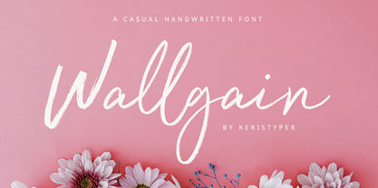 Introducing Wallgain A rustic, dapper handwritten font with a personal touch. With quick dry strokes and a signature style. Wallgain Handwriting Font multilingual support: Afrikaans, Albanian, Catalan, Danish, Dutch, English, Estonian, French, Finnish, German, Icelandic, Indonesian, Italian, Malay, Norwegian, Portuguese, Spanish, Swedish, Zulu, and many more. What’s Included : Standard & Multilingual glyphs Ligature Works on PC & Mac Simple installations Accessible in Adobe Illustrator, Adobe Photoshop, Adobe InDesign, and even work on Microsoft Word. Hope you enjoy our font!
 - Cordon by Garisman Studio,
$20.00 Cordon is a textured font that gives a feel of vintage, classic, old and handmade. Already PUA Encoded, this font is perfect for people looking for vintage aesthetic and suitable for any graphic designs such as branding materials, t-shirts, print, business cards, logos, posters, photography, quotes, and more. Cordon has support for 23 languages: Afrikaans, Albanian, Catalan, Croatian, Czech, Danish, Dutch, English, Estonian, Finnish, French, German, Hungarian, Icelandic, Italian, Norwegian, Polish, Portuguese, Slovak, Slovenian, Spanish, Swedish and Zulu.
 - Cervo Neue by Typoforge Studio,
$29.00 Cervo Neue is the new perfected and extended version of Cervo, containing 18 variants. It differs from the previous version with the higher accents over glyphs, enlarged punctuation, old-style numerals and the newly added varieties Semi Bold, Bold, Extra Bold and Black. Additionally, there is the variety of grotesque. Font Cervo is inspired by a “You And Me Monthly” published by National Magazines Publisher RSW „Prasa” that appeared from Mai 1960 till December 1973 in Poland.
 - Costyle by Ergibi Studio,
$19.00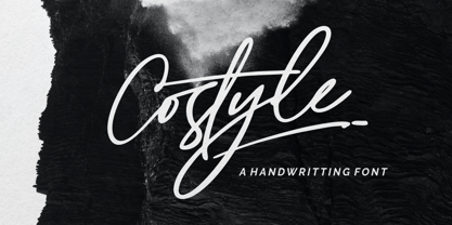 Costyle is a handwritten font. Its unique flow and easy signature style makes it perfect to use for logos, signatures, quotes, badges, labels, packaging design, blog headlines or simply use it in your next design project. multilingual support for the following languages : Cornish, Danish, Dutch, English, Estonian, Faroese, Filipino, Finnish, French, Galician, German, Icelandic, Indonesian, Irish, Italian, Norwegian Bokmål, Norwegian Nynorsk, Portuguese, Spanish, Swahili, Swedish, Swiss German. if you have any Question please Message Me. Big Thanks Ergibi Studio
 - Bone Master by Attype Studio,
$7.00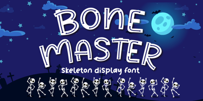 Bone Master is a Halloween display font with bone display on the glyph, perfect for any halloween events and promotions. Bone master is perfect for branding, logo, invitation, stationery, social media post, product packaging, merchandise, blog design, game titles, cute style design, Book/Cover Titles and more. Includes Multilingual Support for Afrikaans, Albanian, Catalan, Danish, Dutch, English, Estonian, Finnish, French, German, Icelandic, Italian, Norwegian, Portugese, Spanisch, Swedish, Zulu. Hope you enjoy with our font! Attype Studio
 - Sun Pride by Attype Studio,
$13.00 Sun Pride is script font with beginning and ending swash of sun flower and is suitable for any summer event. Sun Pride is perfect for branding, logo, invitation, stationery, social media post, product packaging, merchandise, blog design, game titles, cute style design, Book/Cover Title and more. Includes Multilingual Support for Afrikaans, Albanian, Catalan, Danish, Dutch, English, Estonian, Finnish, French, German, Icelandic, Italian, Norwegian, Portuguese, Spanish, Swedish, Zulu. Hope you enjoy with our font! Attype Studio
 - Kurtistown by Maulana Creative,
$12.00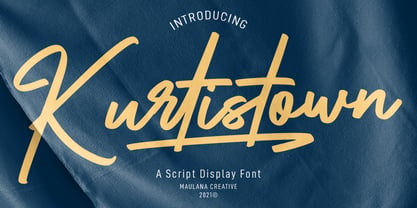 Kurtistown is a script font. With sharp felt-tip stroke, uslanted and fun character with a bit of ligatures and swashes. To give you an extra creative work. Kurtistown font support multilingual more than 100+ language. This font is good for logo design, Social media, Movie Titles, Books Titles, a short text even a long text letter and good for your secondary text font with sans or serif. Make a stunning work with Kurtistown font. Cheers, MaulanaCreative
 - Brans by Ckhans Fonts,
$34.00 Brans family consists of 18 styles (9 weights, 9 Italics), in each of which there are more than 543+ glyphs. In the typeface, each weight includes extended language support, fractions, tabular figures, ligatures, arrows and more. Perfectly suited for graphic design and any display use. Support for 28 languages: Afrikaans Albanian Catalan Croatian Czech Danish Dutch English Estonian Finnish French German Hungarian Icelandic Italian Latvian Lithuanian Maltese Norwegian Polish Portugese Romanian Slovak Slovenian Spanisch Swedish Turkish Zulu
 - Sovana by SG Type,
$19.00 Sovana is a modern, friendly display font with sharply angled serifs. It is fun, elegant, and contemporary. Sovana works great for headlines, logos, branding, posters, packaging, and much more. FEATURES Uppercase alphabet Lowercase alphabet 41 ligatures Big range of numbers, symbols & punctuation Comprehensive language support including: Albanian, Basque, Catalan, Croatian, Danish, Dutch, English, Finnish, French, German, Hawaiian, Icelandic, Indonesian, Irish, Italian, Latvian, Lithuanian, Norwegian, Polish, Portuguese, Romanian, Slovenian, Spanish, Swedish, Turkish, Welsh & more Individual kerning & extensive range of characters
 - Comenia Sans by Suitcase Type Foundry,
$75.00Comenia Sans was designed in the framework of a unique typographic project for all types of schools. It is a complementary face for Comenia Serif, released by our friends at Storm Type Foundry. Comenia Sans has a lot in common with its serif sister: the height of both upper and lower case, the length of ascenders and descenders, and the general weight. This makes the two perfect partners which work well even when set side by side in a single line of text. Comenia Sans does, however, lack all serifs, ornamental elements and stroke stress variation. All these elements freshen up the feel of long texts, but for shorter texts use, they are not necessary. Despite that, Comenia Sans retains the soft, friendly character of its big sister, as well as a few tiny details which lend it its unique character without compromising legibility or utility. Open counters give all letters an airy feel and permit enough variation in construction. This is why the face works well even in multiple-page texts. All its letters are easily distinguished from each other, so the reader's eyes are not strained. Diacritics and punctuation harmonize with both upper and lower case. As usually, all diacritical marks fully respect conventional shapes of accents and they are perfectly suitable for Czech, Slovak, Polish and other Central European languages, where a lot of diacritics abounds. Similarly to the renaissance italics which refers to the cursive forms, Comenia Sans introduces novel shapes of some characters drawing from the hand-written heritage. This is most apparent in the single-bellied a, the simplified g, and the stem of f which crosses the baseline and ends with a distinct terminal. In the text, emphasized words are thus distinguished not only by the slant of letters, but also by the shapes of the letters themselves. All twelve styles contain set of small caps, suitable for the names, in the indexes or the headlines in longer texts. Legibility in small sizes under 10 points was at the center of designers' attention, too. This is why the counters of a, e and g are large enough to prevent ink spread in small sizes, both on-screen and in print. After all, the font was specifically optimized for screen use: its sober, simple forms are perfectly fit to be displayed on the computer screen and in other low-resolution devices. When used in the context of architecture, the smoothness of all contours stands out, permitting to enlarge the letters almost without limit. A standard at the Suitcase Type Foundry, each style of Comenia Sans boasts a number of ligatures, an automatic replacement of small caps and caps punctuation, a collection of mathematical symbols, and several types of numerals which make it easy to set academic and other texts in an organised, well-arranged way. For the same purpose, fractions may come in handy, too. Apart from the standard emphasis styles, the family also contains six condensed cuts (each set has the same number of characters), designated for situations where space is limited or the need for striking, poster-like effect arises. Comenia Sans is the ideal choice for the setting of magazines, picture books, and navigation systems alike. Its excellent legibility and soft, fine details will be appreciated both in micro-typography and in poster sizes. Although it was designed as a member of a compact system, it will work equally well on its own or in combination with other high-quality typefaces. - Mount Hills by Ergibi Studio,
$20.00 Mount Hills, this typeface has been made carefully to make sure its premium quality and luxury feel. The many alternate character on serif makes this typeface unique and stands out rather than the regular sans font, perfectly for headlines, logos, posters, packaging, T-shirts, coffee shops, restaurants, magazine's headers, signs or gift/post cards, cafe's and weddings or any type of advertising purpose.
 - Gadevox by Twinletter,
$15.00 Gadevox Black Letter is a vintage-inspired font, everything and more. It’s bold yet elegant, soft yet striking. It has an old-world feel that is still very modern and I know you will love the vintage details on each letter. This font will complement your visual project and make it stand out so make sure to have it today!
 - Segikan by Areatype,
$- Segikan is a elegant and warm serif typeface with a nuance classic. This typeface was intended to improve upon the legibility. Included 14 Fonts, upright and slant. From light to black styles. OpenType features allow for the implementation of typographic such as ligatures and multiple language support. Good choice for branding, magazines, posters, advertising, print, packaging, headlines, web design etc.
 - Nefilt by Sarid Ezra,
$17.00 Introducing, Nefilt, a bold font with unique looks! Nefilt is a bold and trendy font that have unique and modern looks. This font contains uppercase, lowercase, number, symbol, and also ligatures. You can use this font for the magazine, poster, and suitable for headline. With stylish looks, this font will make your design more stand out. This font also support multi language.
 - Skullbone by Trim Studio,
$12.00 Skillbone Font is a quirky and unique display font. Add this font to your favorite creative Halloween themed ideas and notice how it makes them stand out! Its perfectly suited for crafter and graphic artist to complete their design such as invitation, advertisement, poster, logo, birthday, product sign, and many more! Skillbone Font also Lightweight, even so contains All Standard glyphs and punctuations
 - Ziboulateur by Kitchen Table Type Foundry,
$15.00 Ziboulateur is French slang for bottle opener. The word consists of two parts: Zibula (a word from Congo-Brazzaville meaning: ‘to decork’) and the French suffix -ateur. I thought this rather creative word would be a good name for this particular font! Ziboulateur is a handmade, all caps display font. It comes with extensive language support, including Sami and Vietnamese.
 - Jungle Giant by Rachel Kick,
$12.00 Jungle Giant is a quirky, hand-drawn sans and script duo. It has a playful and organic feel that works great for branding, social media, and marketing! The script includes over 35 alternatives with swashes and alternate styles. The uppercase print includes 2 styles - regular and italic so that it can match the tilt of the script or stand on its own.