10,000 search results
(0.03 seconds)
- "She Paints Me Blue" is a captivating font designed by Kimberly Geswein, a font designer renowned for her wide range of expressive and unique typography. This particular font is an embodiment of crea...
- TT Rounds Neue by TypeType,
$39.00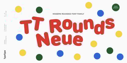 We have updated TT Rounds Neue! TT Rounds Neue was released as a logical continuation of the TT Rounds and TT Rounds Condensed fonts, more modern and technically advanced. In the update, we have preserved the visual nature of the font, the proportions of the letters and the balance between bold and thin faces. We have made the typeface even more functional and convenient by fixing technical flaws, expanding the character set and adding a full-fledged variable font. In the new version of TT Rounds Neue, you will find additional extended Latin and Cyrillic characters, updated kerning and hinting. The font can be used for headings or for text typesetting. The typeface is optimized for web, print and packaging design. Thanks to its soft character and rounded shapes, it is suitable for decorating baby food and eco-products. TT Rounds Neue consists of 3 subfamilies: Compressed, Condensed and Normal. There are 55 faces in the font: 27 upright, 27 italic, and 1 variable font. Variability is across all three axes, thickness, slope, and width. Each style has 684 glyphs. The font has 29 OpenType features, including ligatures, a set of alternative characters, old-style figures, and many others. ?Please note that we are removing the TT Rounds and TT Rounds Condensed fonts from the marketplace, but you can still get them by contacting TypeType's commercial department directly commercial@typetype.org TT Rounds Neue OpenType features: aalt, ccmp, locl, subs, sinf, sups, numr, dnom, frac, ordn, tnum, onum, lnum, pnum, case, salt, liga, dlig, calt, ss01, ss02, ss03, ss04, ss05, ss06, ss07, ss08, ss09, ss10 TT Rounds Neue language support: English, Albanian, Basque, Catalan, Croatian, Czech, Danish, Dutch, Estonian, Finnish, French, German, Hungarian, Icelandic, Irish, Italian, Latvian, Lithuanian, Luxembourgish, Moldavian (lat), Montenegrin (lat), Norwegian, Polish, Portuguese, Romanian, Serbian (lat), Slovak, Slovenian, Spanish, Swedish, Swiss German, Valencian, Azerbaijani, Kazakh (lat), Turkish, Acehnese, Banjar, Betawi, Bislama, Boholano, Cebuano, Chamorro, Fijian, Filipino, Hiri Motu, Ilocano, Indonesian, Javanese, Khasi, Malay, Marshallese, Minangkabau, Nauruan, Nias, Palauan, Rohingya, Salar, Samoan, Sasak, Sundanese, Tagalog, Tahitian, Tetum, Tok Pisin, Tongan, Uyghur, Afar, Asu, Aymara, Bemba, Bena, Chiga, Embu, Gikuyu, Gusii, Kabuverdianu, Kalenjin, Kamba, Kikuyu, Kinyarwanda, Kirundi, Kongo, Luganda, Luo, Luyia, Machame, Makhuwa-Meetto, Makonde, Malagasy, Mauritian Creole, Meru, Morisyen, Ndebele, Nyankole, Oromo, Rombo, Rundi, Rwa, Samburu, Sango, Sangu, Sena, Seychellois Creole, Shambala, Shona, Soga, Somali, Sotho, Swahili, Swazi, Taita, Tsonga, Tswana, Vunjo, Xhosa, Zulu, Maori, Alsatian, Aragonese, Arumanian, Belarusian (lat), Bosnian (lat), Breton, Colognian, Cornish, Corsican, Faroese, Frisian, Friulian, Gaelic, Gagauz (lat), Galician, Interlingua, Judaeo-Spanish, Karaim (lat), Kashubian, Ladin, Leonese, Manx, Occitan, Rheto-Romance, Romansh, Scots, Silesian, Sorbian, Vastese, Volapu?k, Vo?ro, Walloon, Walser, Karakalpak (lat), Kurdish (lat), Talysh (lat), Tsakhur (Azerbaijan), Turkmen (lat), Zaza, Aleut (lat), Cree, Haitian Creole, Hawaiian, Innu-aimun, Karachay-Balkar (lat), Karelian, Livvi-Karelian, Ludic, Tatar, Vepsian, Guarani, Nahuatl, Quechua,, Russian, Belarusian (cyr), Bosnian (cyr), Bulgarian (cyr), Macedonian, Serbian (cyr), Ukrainian, Gagauz (cyr), Moldavian (cyr), Kazakh (cyr), Kirghiz, Tadzhik, Turkmen (cyr), Uzbek (cyr), Lezgian, Abazin, Agul, Archi, Avar, Dargwa, Ingush, Kabardian, Kabardino-Cherkess, Karachay-Balkar (cyr), Khvarshi, Kumyk, Lak, Nogai, Ossetian, Rutul, Tabasaran, Tsakhur, Buryat, Komi-Permyak, Komi-Yazva, Komi-Zyrian, Shor, Siberian Tatar, Tofalar, Touva, Bashkir, Chechen (cyr), Chuvash, Erzya, Kryashen Tatar, Mordvin-moksha, Tatar Volgaic, Udmurt, Uighur, Rusyn, Karaim (cyr), Montenegrin (cyr), Romani (cyr), Dungan, Karakalpak (cyr), Shughni, Mongolian, Adyghe, Kalmykk
 - Sonrisa by CastleType,
$59.00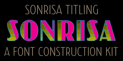 Sonrisa is a design that evolved from my sketches of the skeletal structure of Jakob Erbar’s Koloss, trying to discover its underlying essence without all the contrast and bulkiness of the original design. Sonrisa Thin was the resulting font, from which the other weights of the family were developed. Gentle curves, open counters, generous x-height, and sleekly tapered terminals give Sonrisa a very legible, modern, elegant appearance. When she saw the first draft of this typeface, the smile on my friend Jennifer’s face gave me the idea to call it “Sonrisa” (Spanish for “smile”). Jennifer, a clinical psychologist, described Sonrisa’s personality as: "happy, clean, clear, open, joyful, spacious, playful, calm. I can see it being used for body product lines such as oils and lotions. Can see it being used in home/travel magazines or even Architectural Digest. Yoga magazine, definitely." Sonrisa is what some foundries call a “Pro” typeface family with all the bells and whistles that provide typographic versatility: true small caps, oldstyle numerals, arbitrary fractions, discretionary ligatures, and other powerful OpenType features. All fonts in the family, except Sonrisa Titling, support most European languages, including modern Greek and languages that use the Cyrillic Alphabet. (Cyrillic glyphs designed in consultation with Ukrainian type designer, Sergiy S. Tkachenko.) Sonrisa is available in the original Thin, monoline version as well as six weights (Light, Regular, Medium, Bold, Extra Bold, Black), and a Titling font that is essentially a display font construction kit. If you enjoy using Sonrisa even half as much as I enjoyed creating it, then I know you will have a “sonrisa” (smile) on your face!
 - Charpentier Sans Pro by Ingo,
$41.00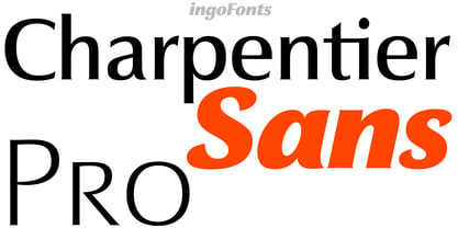 A humanistic sans serif The first version of this font was created in 1994 within the framework of the bid placed by the city of Graz to become the location for the Winter Olympics in 2006. Appropriately, its original name was ”Olympia.“ The font is intended to embody classic ideals as well as to meet modern demands. The proportions of Charpentier Sans are directly derived from Roman capitals and the humanistic book-face. The contrast between strokes and thin strokes is based on medieval uncial script. And thus, a modern serif sans was created emphasizing thick and thin strokes together. Thanks to its traditional form language, Charpentier Sans is very legible, adapts to various forms of content and expresses a kind of calmness and certainty. Details resulting from writing with the quill guarantee that the font doesn’t appear too rough and unemotional. Even the tiny, pointed mini serifs contribute to the unmistakable appearance of the font. They create an exciting contrast to the soft flowing forms of the letters and are, to a great extent, conducive to the legibility. Consequently Charpentier Sans always appears with an extremely sharp and clear outline. Charpentier Sans Italique has an even more distinct ductus derived from writing. Especially the rounded forms from a, e, f, g and y reflect the handwritten humanistic cursive. Charpentier Sans is comprised of many ligatures, including discretional ones, plus proportional medieval and capital figures for the normal type as well as disproportional tabular figures with a consistent width. Above and beyond the ”normal“ Latin typeface system, small caps are available as an especially elegant form of distinction.
 - Pinel Pro by URW Type Foundry,
$39.99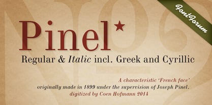 The characteristic ‘French face’ was originally made in 1899 under the supervision of Joseph Pinel. Thus, what was originally French 10 pt. Nº 2, got its present name. The Frenchman Joseph Pinel called himself a "typographical engineer", but was at the time employed as a type draughtsman at the Linotype Works in Altrincham. It appears that this and some other faces that he supervised, were, except for use on the Linotype, also meant for manufacturing matrices for the Dyotype. This composing machine was an invention of Pinel. The Dyotype was a rather complicated machine and consisted, like the Monotype, of two separate contraptions, a keyboard which produced a perforated paper ribbon and a casting machine which produced justified lines of movable type. Unlike the Monotype which has a square matrix carrier, the Dyotype had the matrices on a drum (in fact two drums, hence the name of the machine). A Pinel Diotype company was founded in Paris and a machine was built with the help of the printing press manufacturer Jules Derriey. As is often the case, a lack of sufficient capital prevented the commercializing of this ingenious composing machine. Coen Hofmann digitized the font from a batch of very incomplete, damaged and musty drawings, which he dug up in Altrincham. He redrew all characters, bringing up the hairstrokes somewhat in the process. The result is a roman and italic, while the roman font also includes Small Caps
 - PF Das Grotesk Pro by Parachute,
$79.00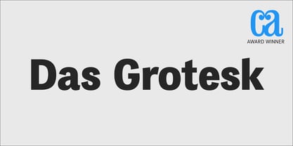 Das Grotesk was inspired by earlier nineteenth-century grotesques, but it is much more related to American gothic designs such as those by M.F. Benton. Due to their pure geometric structure, most grotesque typefaces tend to have a rather monotonous and lifeless appearance, thus failing to express the ideals of the modern creed. Das Grotesk on the other hand is a lively design with several distinguishable characteristics which attract attention when set at large sizes, whilst they become subtle and blend evenly at small sizes, fostering a neutral identity. This is a very legible and space-saving typeface with a narrow structure. It was designed with slanted curved ends and sheared terminals applied on several straight strokes. It has two-storey ‘a’ and ‘g’ but includes single-storey alternates. The family consists of 14 weights ranging from Extra Thin to Black (including true-italics). It provides simultaneous support for Latin, Cyrillic and Greek and is loaded with several advanced typographic features such as small caps. Download its complehensive PDF Specimen Manual for further details.
 - Arzachel by CAST,
$45.00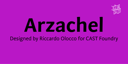 Arzachel is a humanistic sanserif with a big x-height and a specific organic look. Its design is scientifically sharp and efficient in small type sizes as well as rugged and dramatic in headlines. Arzachel’s essential feeling comes from several features: all the letters are slightly sloped, stem terminations are flared at the top, and the terminals in letters a, c, e, f… are widening with the inside parts completely flat. The stroke contrast is low in the regular weight while it increases in the black; finally the capitals have an inscriptional flavor. Despite being a sanserif (thus a product of recent typography) Arzachel’s roots stretch back to the Renaissance tradition: Olocco took inspiration from some of the early and rather weird types cut in Venice in the 15th century. Arzachel was conceived during Olocco’s MA in Reading to provide a companion for his Zenon for use in small type sizes. But instead of expanding the Zenon family with optical sizes, the designer decided on a sans with its own personality rather than a sanserif version of Zenon with chopped-off serifs.
 - Synthica by Volcano Type,
$35.00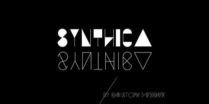 Synthica is the advanced version of a geometrically constructed typeface – designed for a thesis project in summer 2010 in Pforzheim. In the context of electronic music and the profound analysis of its parameters, this typeface is primarly based on a strict modular grid. Additionally, the ascender, descender and the x height had slightly been increased in order to even out a visual difference in size between the glyphs. The name „Synthica“ dervives from a basic principle in electronic sound synthesis. Sinus, triangle and square are some of the basic waveforms in the synthesizers’ oscillator section and were thus used as geometric modules for the grid. The modularity and geometry also derive from different structures of electronic music. The strong emphasis on diagonal lines creates a rhythmic typeface that connotates electronic music patterns with highly recognisable glyphs. The contrast between digital and analog is another basic idea of this typeface: while Synthica Outline has a more synthetic and fragile character, the filled version Synthica Black serves as the analog counterpart.
 - Hatmaker by ITC,
$29.99Jean Evans' interest in type design dates back to her third-grade fascination with fancy script writing. Years later, work at a sign-painting school she found in the Yellow Pages® cemented her relationship with letterforms. Evans went on to study with master calligraphers and type designers, including the likes of Donald Jackson, Hermann Zapf and Matthew Carter. Evans' designs have been exhibited and collected around the globe, and her distinctive calligraphic style has been lauded by leading trade organizations, annuals and publications. Hatmaker, one of Evans' more popular typefaces, was originally developed for the Boston-based broadcast design firm of the same name. Inspiration for the design came from Ben Shahn's famous hand-constructed alphabet. Shahn's alphabet, however, was limited to capital letters. Daunted by the idea of designing a lowercase that would measure up to Shahn's capitals, I developed a second set of caps-simple, quirky, yet almost classic-to work as 'lowercase' with the Shahn-like caps," explains Evans. Mixing the two in Hatmaker, creates a lively interplay of light and dark." - Manteiga by Plau,
$49.00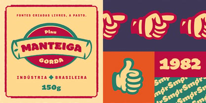 Julia Child once said: the secret to great french cooking is butter, butter, butter. Thus, we present to you Manteiga - butter in Portuguese! - a typeface for heart-melting, word-spreading goodness. The idea we had was to play with brush lettering - a style we love - and go as far as we can with the shapes of the letters while finding balance between positive and negative space. We wanted biiiig personality. And small inconsistencies - the ones that add texture and life to lettering. We left extensive OpenType features and technical stuff aside for a moment, adding later only what we thought was necessary, like different shapes for the Q, a and g - for example. All caps setting was something we wanted from the beginning. In text case, the x-height is rather short for a brush script, and this lends a quirky voice. Spacing is ultra tiiiiight so don’t go too small, but make it as big as you want! Ah! And there are some fun dingbats thrown in for good measure.
 - Margot by Eclectotype,
$36.00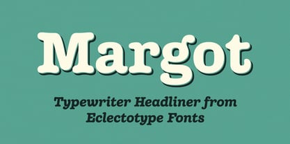 Like a lovechild of American Typewriter and Cooper Black, typewritten in melted chocolate, this is Margot. A bold single weight display typeface in roman and italic styles, Margot is boisterous but cuddly; warm but impactful. Margot comes fully loaded with a bunch of esoteric dingbats (grouped in the ornament feature), four figure styles (proportional- and tabular- lining, and proportional- and tabular- oldstyle), a spattering of swash capitals (K, Q and R), stylistic alternates and one discretionary gi ligature in the Roman. Stylistic alternates are split into stylistic sets thus: SS01 - alternate forms for ampersand and asterisk, and # changes to an attractive numero symbol. SS02 - in the Roman, a and g change to single storey versions; in the italic, the ae digraph changes to a less ambiguous double storey version. SS03 - the lining figure 3 gets changed to its alternate form. SS04 - the lining figure 4 gets changed to its alternate form. Margot is perfect for friendly headlines, logos, T-shirts (I love New York, perhaps?), food packaging and videogame apps. Margot gets its name from my equally boisterous and cuddly cat. Enjoy!
 - Hero If Plus by Ingo,
$12.00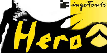 A type of “handwriting” discovered by chance, extremely abstract On April 8, 1948 a certain Walter Plaga wrote a crude poem about a hero on a commemorative plaque. The very poor reproduction of the handwritten original, etched into a metal sheet, produced extremely abstract forms so that — even if unintentional — a script completely void of bowls was created. That which originally was the normal clumsy handwriting of a layman thus transformed into a pseudo-modern deconstructive typeface, which in the 21st century appears contemporary. The capital letters especially reflect the original: in part they show forms labeled incorrectly ”old German“ handwriting, which is actually Latin, in the letters A D G I J K L S V W X Z , whereas C H N O P R appear very modern. Truly a form of handwriting: without joining the letters, especially between the lower case characters, a silhouette effect is formed. To a great extent Hero is impressive due to its driven-to-the-limit abstraction and to a lesser extent by retaining an antiquated and nearly illegible effect.
 - Faux Pas JNL by Jeff Levine,
$29.00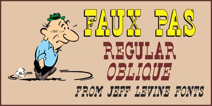 The lettering found on an 1878 Salt Lake City advertisement for the Forepaugh’s Circus inspired Faux Pas JNL, which is a bit of a pun on the circus’ name and also a commentary on how this unusual lettering style seems to break all of the rules on stroke width and balance. According to Wikipedia: “Adam John Forepaugh (February 28, 1831 - January 22, 1890) was an American entrepreneur, businessman, and circus owner. Forepaugh owned and operated a circus from 1865 through 1890 under various names including Forepaugh's Circus, The Great Forepaugh Show, The Adam Forepaugh Circus, and Forepaugh & The Wild West. In 1889, Forepaugh sold his circus acts to James Anthony Bailey and James E. Cooper and he sold his railroad cars to the Ringling Brothers. The Ringlings used the equipment to transform their circus from a small animal-powered production to a huge rail-powered behemoth, which later purchased the Barnum & Bailey Circus. Thus, in liquidating his circus assets, he indirectly contributed to the demise of his arch-rival.” Faux Pas JNL is available in both regular and oblique versions.
 - Mayonez by Sardiez,
$29.00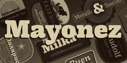 Mayonez is a typeface with rational structure and axis but softened with rounded contours and cupped serifs, getting as result a balance between seriousness and friendliness. The shapes have a soft appearance but without lacking definition. A more fluid structure influenced by calligraphy is proposed for the italic variants, in this case the uppercase letters adopted a simplified semiserif structure that works better with the lowercase letters. Also the figures are very different from the roman version and follow more faithfully the italic style. In an attempt to give Cyrillic lowercase romans a fresh look, symmetrical serifs inherited from the versal tendency are mostly avoided thus getting simpler structures closer to the latin forms. This type is good for commercial and editorial uses like advertising, packaging and pages with showy headlines where a warm touch wants to be given. The character set includes a group of figures and currency symbols with standard height and another suited to match better with lowercase letters. Mayonez was selected to be part of the Communication Arts Typography annual in 2015.
 - Mosquito Formal by Monotype,
$29.00Mosquito Formal, by Éric de Berranger, takes the original jaunty design of Mosquito and dresses it in a tuxedo. The stressed character strokes, simple, straightforward shapes, relatively large x-height, open counters and hint of Peignot are still there, but the cursive strokes and lively terminals have been replaced with traditional designs. The result is a more serious-and more sophisticated typeface. The idea," says Éric de Berranger, "was to assuage the drawing of Mosquito. To 'calm' it; and eliminate its idiosyncrasies while preserving character structure and general appearance." Although still distinctive, as Éric de Berranger puts it, "Mosquito Formal is more to be read than seen, it is more invisible and thus, more readable than my earlier design." He does, however, use both typefaces in his graphic design projects: Mosquito for headlines and in applications where the lively design is appropriate, and Mosquito Formal for those instances that require a quieter more sophisticated look. Mosquito Formal is available in three weights with complementary italic designs in addition to a suite of small caps and old style figures. " - Pepone by Storm Type Foundry,
$43.00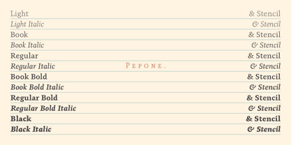 This typeface is primarily optimized for the setting of belles-lettres. The regular styles are balanced to suit small text sizes and enable the reading of long portions of text. The development of the typeface was guided by the goal of creating a contemporary, discreet book serif, with modern expression and numerous functions. Letters feature reduced contrast, the lighter styles may evoke wired letters, while the heavier ones bear distinct slab serif references. The extremes thus work in harmony and fulfil the demanding requirements of advertising and magazine layout. The typeface is suitable for bottle labels, invitations, exhibition catalogs and posters, for printed and online presentations alike. The name Pepone was chosen as an homage to Josef Kroutvor. Of course, the typeface isn’t solely reserved for the setting of the works of Josef K. On the contrary – we’d like to present a universal typeface suited for literature, catalogs and magazines. It wouldn’t be the first and the last example of a typeface created with a specific purpose in mind, which later became used universally.
 - Ma Braille by Echopraxium,
$5.00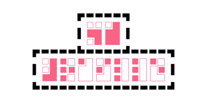 The "Ma" in "Ma Braille" is used as a minimalist way to say "Negative Space". "Ma" in japanese arts is an "esthetical usage of emptiness". Thus this font explicits the negative space around visible braille dots in each glyph. A. Font user guide a.1. Lowercase glyphs { A..Z } In these glyphs, dots are represented as "black squares" while the negative space is displayed as 1 or 2 white filled polygons. a.2. Uppercase glyphs { a..z } In these glyphs, dots are represented as "white squares" while the negative space is displayed as 1 or 2 black filled polygons. a.3. Digits: they are just the same than a..j, but the "North US version" is also provided in ascii codes 0xE0..0xE4 (1..5) and 0xE7..0xEB (6..0). a.5. "Dashed Border": a.5.1. "Black dashed" border glyphs; { £, ¥, µ, Â, Ä, Ê, Ë, Î, Ï, Ô } a.5.2. "White dashed" border glyphs; { Ö, Õ, °, ô, ö, î, ï, û, u, õ } B. Posters Poster 1: "Font Logo" version 1, it displays "Ma Braille" text surrounded by the "black dashed border" glyphs. Poster 2: "Font Logo" version 2, it displays "MA" glyphs in big size and smaller "Braille" glyphs within "M" and within "A" as well. Poster 3: the classical pangram to test a font "The Quick Brown Fox jumps over the Lazy dog". Poster 4: Article 1 of the Human Rights: All human beings are born free and equal in dignity and rights. They are endowed with reason and conscience and should act towards one another in a spirit of brotherhood. Poster 5: the "Glyph set" (Border glyphs not included) with A..Z, a..z, digits and special characters.
 - Turbinado by Aerotype,
$48.00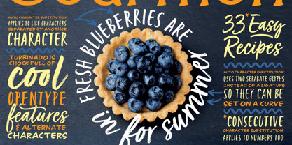 The ten font Turbinado™ Set was designed to be clear and easy to read with a friendly personality, ideal for advertising and packaging in both text and display settings. Included are three weights of brushed casual script, each with a dry version, two condensed all caps faces, another hand printed caps face and an Elements package with 100 brushed elements that include swashes, botanicals, shells, arrows, repeatable patterns and a few other doodads that play well with the fonts. Like our most recent release Fave, all of the fonts use the OpenType standard ligature feature to automatically differentiate consecutive lowercase letters and numbers, using separate glyphs rather than a single ligature so they can be set on a curve or colored separately, etc. They also automatically differentiate like characters that are separated by another letter when standard ligatures is enabled. The script fonts have alternate characters like swash glyphs for ends of words and a few ligatures too; single crossbar to unite the At and Att letter combinations etc. The two condensed faces also have a third set of less uniform glyphs that can be used to create a more quirky, fun and bouncy effect (see the ‘she sells seashells’ graphic above) when the discretionary ligature feature is on. The script fonts have 10+ lowercase t (and double t) crossbar alternates that can be selected from the OpenType glyph table manually, or you can enable the contextual alternates feature to automatically insert a bigger crossbar as the surrounding letters allow throughout a text box or document. Hello? Are you still there? :) And for those intrepid typographers who would rather fashion their own lowercase t to custom fit a specific design, all of the lowercase t ascenders and crossbars are also available separately in the glyph table, and can be combined manually.
 - Qatana by Ixipcalli,
$20.00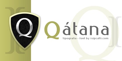 La tipografía Qátana es una tipografía inspirada en el estilo románico serif y sans serif. Su estilo elegante y de fácil lectura ha logrado ser una tipografía esencial para redacciones de documentos, textos o libros. Cuenta con tres pesos bien marcados que dan un juego visual de resaltados y tenues. Además de las formas itálicas. The Qátana typeface is a typeface inspired by the Romanesque serif and sans serif style. Its elegant and easy-to-read style has become an essential typeface for writing documents, texts, or books. It features three well-marked weights that give a visual play of highlights and lows. In addition to the italic forms.
 - Quickflio by Brenners Template,
$19.00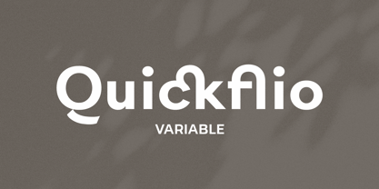 A font family with excellent visibility and aesthetic originality was developed after years of troubleshooting. It will be the best choice for designers as it contains a variable font with two axes. A variety of styles, including stem widths from 10pt to 220pt, will be an exciting attempt for unique typography. And, 44 beautiful and amazing ligatures will make your imagination deeper and richer. On the Typographic Foundation, it makes sense to break most of the ligatures used here into discretionary ligatures. However, in view of the trend of modern typography, in which the essential boundary between function and decoration is increasingly blurred, it may be meaningful to use them together. All ligatures of this font family are included in Standard Ligatures. Your choices become easier and clearer. Its name is Quickflio. OpenType Features 44 Ligatures : Am, An, Br, Cr, Gr, Le, Lo, Op, ad, am, an, at, ba, ck, ct, da, de, do, er, es, ff, fo, fi, fl, gh, ha, hn, hs, in, le, ll, lo, ma, ns, oe, om, on, re, sh, st, um, un, ve, wa Ordinals Oldstyle Figures Tabular Figures Fractions Scientific Inferiors Superscrpt
 - Century Gothic Paneuropean Variable by Monotype,
$209.99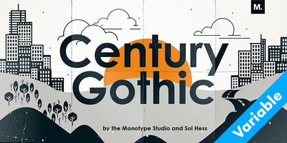 Century Gothic™ is based on Monotype 20th Century, which was drawn by Sol Hess between 1936 and 1947. Century Gothic maintains the basic design of 20th Century but has an enlarged x-height and has been modified to ensure satisfactory output from modern digital systems. The design is influenced by the geometric style sans serif faces which were popular during the 1920s and 30s. The Century Gothic font family is useful for headlines and general display work and for small quantities of text, particularly in advertising. Century Gothic family has been extended to 14 weights in a Pan-European character set from Thin to Black and their corresponding Italics. The already existing 4 weights of Regular and Bold with their Italics are additionally still available in the STD character set. For international communication, the W1G versions offer the appropriate character set. They contain Latin, Greek and Cyrillic characters and thus support all languages and writing systems that are in official use in Western, Eastern and Central Europe. Century Gothic Variable is features two axes: Weight and Italic. The Weight axis has preset instances from Light to Black. The Italic axis is a switch between upright and italic. Looking for the perfect way to complete your project? Check out Aptifer™ Slab, ITC Berkeley Old Style®, FF Franziska™, Frutiger®, ITC Legacy® Square Serif or Plantin®.
 - Century Gothic Paneuropean by Monotype,
$50.99Century Gothic™ is based on Monotype 20th Century, which was drawn by Sol Hess between 1936 and 1947. Century Gothic maintains the basic design of 20th Century but has an enlarged x-height and has been modified to ensure satisfactory output from modern digital systems. The design is influenced by the geometric style sans serif faces which were popular during the 1920s and 30s. The Century Gothic font family is useful for headlines and general display work and for small quantities of text, particularly in advertising. Century Gothic family has been extended to 14 weights in a Pan-European character set from Thin to Black and their corresponding Italics. The already existing 4 weights of Regular and Bold with their Italics are additionally still available in the STD character set. For international communication, the W1G versions offer the appropriate character set. They contain Latin, Greek and Cyrillic characters and thus support all languages and writing systems that are in official use in Western, Eastern and Central Europe. Century Gothic Variable is features two axes: Weight and Italic. The Weight axis has preset instances from Light to Black. The Italic axis is a switch between upright and italic. Looking for the perfect way to complete your project? Check out Aptifer™ Slab, ITC Berkeley Old Style®, FF Franziska™, Frutiger®, ITC Legacy® Square Serif or Plantin®. - ALS SyysScript by Art. Lebedev Studio,
$63.00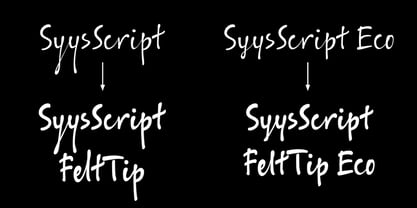 Handwriting of a strong Carelian personality revived: It’s autumn time once again, harvesting season, mushroom & berry time – the favourite season of my Karelian aunt Katri. A postcard she sent me more than twenty years ago had inspired me to SyysScript, “Script of Autumn” in Finnish. Katri had a very kind but also energetic personality, and I always thought her handwriting was a mirror of it. By making SyysScript I felt I could revive some of her unforgettable character. My Finnish autumn font has by now become a favourite for many and is branding fine food in both the Eastern and the Western hemisphere – even far beyond the arctic circle. “SyysScript“ is actually a growing family. For enhanced functionality in small sizes I added “SyysScript Eco” a year ago, a style with shortened extensions and simplified letterforms especially suited for packaging. And this autumn, a special one for Finland which is celebrating its 99th birthday, SyysScript grew again: Two long awaited newcomers, “SyysScript FeltTip” and “SyysScript FeltTip Eco” joined the family. They are bolder and softer than the previous styles but keep their positive, lighthearted feel. Use them to make a powerful individual mark on any background. – They are equally well suited for paper, packaging, a screen or even a concrete wall! Language support: Western and Central European, Extended Cyrillic.
 - Etruria by Dima Pole,
$34.00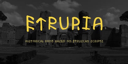 Font Etruria is based on a real Etruscan inscriptions and realistic accurately simulates the writing of the Etruscans. The idea of the font Etruria is to give an opportunity for anyone to touch the past of mankind! The character of the Etruscan alphabet involves the creation of a font with only uppercase letters. However, I did not limit this font by that. Etruria has not only a lowercase is different from uppercase, but an additional sets of alternative characters. In General, the main characteristic of Etruscan writing is randomness and diversity of characters. Differs from lowercase to uppercase is only the first step on the road to make randomness effect. Next to the aid of the OT features. To recreate the randomness effect, in Etruria there are several OT features (Contextual Alternates, Stylistic Alternates and Stylistic Sets), which built a script to simulate randomness. Additionally, another script creates the effect of random positioning. Together they create incredibly realistic Etruscan inscription. Thus, any of these features can be disabled at will. I also used a small line spacing, because it is characteristic of the Etruscan writing. Actually the Etruscan writings is a mirror of the writings compared with the current European alphabets. I didn't use this feature all the letters, because this would make the font difficult to perceive, but to make the font characteristic of the Etruscan style, Etruria has a few letters in mirror image. However, if for someone it may seem unusual, mirrored letters can be disabled instead of them will appear more familiar to them. Another feature of Etruscan writing is the use instead of a space dotacentered. Font Etruria has this feature, there is a OT feature Stylistic set ss03. Naturally, it also can optionally be disabled. All these features can be used together, separately, or turn it off. The main goal achieved! The text typed in Etruria, creates full impression of these Etruscan inscriptions.
 - SFT Sushka by Schrifteria Foundry,
$35.00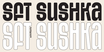 About SFT Sushka SFT Sushka is a narrow headline typeface that will look particularly good on the packaging of something delicious. 10 different widths and a variable font make it possible to fit the font into various limited spaces. Soft shapes and rounded notches make SFT Sushka cozy, friendly, and appetizing. But if you need a more concise and readable version, the Flat Subfamily without notches is available for you. The family forms a gradient from very narrow and quirky to wider, softer, and more fluffy styles. Therefore, the variation is not just in width and thickness, but in the overall mood as well. You can use the variable font without any concerns about unexpected intersections in the letters! Its structure is no different from static fonts. And last but not least, SFT Sushka allows for a very tight line spacing even in languages with diacritics! SFT Sushka has wide language support: 200+ Latin and 60+ Cyrillic languages. Language support Latin: Abenaki, Afaan-Oromo, Afar, Afrikaans, Albanian, Alsatian, Amis, Anuta, Aragonese, Aranese-Aromanian, Arrernte, Arvanitic (Latin), Asturian, Atayal, Aymara, Azerbaijani, Bashkir-(Latin), Basque, Belarusian (Latin), Bemba, Bikol, Bislama, Bosnian, Breton, Cape-Verdean-Creole, Catalan, Cebuano, Chamorro, Chavacano, Chichewa, Chickasaw, Cimbrian, Cofán, Cornish, Corsican, Creek, Crimean Tatar (Latin), Croatian, Czech, Danish, Dawan, Delaware, Dholuo, Drehu, Dutch, English, Esperanto, Estonian, Faroese, Fijian, Filipino, Finnish, Folkspraak, French, Frisian, Friulian, Gagauz (Latin), Galician, Ganda, Genoese, German, Gikuyu, Gooniyandi, Greenlandic (Kalaallisut), Guadeloupean-Creole, Gwich’in, Haitian-Creole, Hän, Hawaiian, Hiligaynon, Hopi, Hotcąk (Latin), Hungarian, Icelandic, Ido, Igbo, Ilocano, Indonesian, Interglossa, Interlingua, Irish, Istro-Romanian, Italian, Jamaican, Javanese-(Latin), Jèrriais, Kaingang, Kala-Lagaw-Ya, Kapampangan (Latin), Kaqchikel, Karakalpak-(Latin), Karelian (Latin), Kashubian, Kikongo, Kinyarwanda, Kiribati, Kirundi, Klingon, Kurdish-(Latin), Ladinlatinlatino-sine-Flexione, Latvian, Lithuanian, Lojban, Lombard, Low-Saxon, Luxembourgish, Maasai, Makhuwa, Malay, Maltese, Manx, Māori, Marquesan, Megleno-Romanian, Meriam-Mir, Mirandese, Mohawk, Moldovan, Montagnais, Montenegrin, Murrinh-Patha, Nagamese-Creole, Nahuatl, Ndebele, Neapolitan, Ngiyambaa, Niuean, Noongar, Norwegian, Novial, Occidental, Occitan, Onĕipŏt, Oshiwambo, Ossetian (Latin), Palauan, Papiamento, Piedmontese, Polish, Portuguese, Potawatomi, Q’eqchi’, Quechua, Rarotongan, Romanian, Romansh, Rotokas, Sami-(Inari-Sami), Sami (Lule-Sami), Sami (Northern-Sami), Sami (Southern-Sami), Samoan, Sango, Saramaccan, Sardinian, Scottish-Gaelic, Serbian-(Latin), Seri, Seychellois-Creole, Shawnee, Shona, Sicilian, Silesian, Slovak, Slovenian, Slovio-(Latin), Somali, Sorbian (Lower-Sorbian), Sorbian (Upper-Sorbian), Sotho (Northern), Sotho-(Southern), Spanish, Sranan, Sundanese (Latin), Swahili, Swazi, Swedish, Tagalog, Tahitian, Tetum, Tok-Pisin, Tokelauan, Tongan, Tshiluba, Tsonga, Tswana, Tumbuka, Turkish, Turkmen-(Latin), Tuvaluan, Tzotzil, Uzbek (Latin), Venetian, Vepsian, Volapük, Võro, Wallisian, Walloon, Waray-Waray, Warlpiri, Wayuu, Welsh, Wik-Mungkan, Wiradjuri, Wolof, Xavante, Xhosa, Yapese, Yindjibarndi, Zapotec, Zarma, Zazaki, Zulu, Zuni. Cyrillic: Adyghe, Akhvakh, Aleut (Cyrillic), Altaic, Andi, Archi, Avar, Bashkir, Belarusian (Cyrillic), Besermyan, Bosnian (Cyrillic), Bulgarian (Cyrillic), Buryat, Chechen (Cyrillic), Chukchi, Chulym, Chuvash, Dargwa, Dungan, Enets, Even (Lamut), Gagauz, Godoberi, Ingush, Kabardino-Cherkess, Karaim, Karakalpak, Karata (Karata-Tukita), Karelian, Kazakh (Cyrillic), Ket, Kildin Sámi, Kirghiz, Komi-Zyrian, Koryak, Kumyk, Lak, Lezgian, Macedonian, Moldavian (Cyrillic), Mongolian, Mordvin-moksha, Nanai, Nganasan, Oroch, Ossetian, Russian, Rusyn, Saami, Serbian (Cyrillic), Soyot-Tsaatan, Tabasaran, Tadzhik, Tatar Volgaic, Tindi, Touva, Tsez, Turkmen (Cyrillic), Udege, Udmurt, Uighur (Cyrillic), Ukrainian, Ulch, Uzbek (Cyrillic), Veps, Yukagir.
 - Rae's Monogram Family by Outside the Line,
$19.00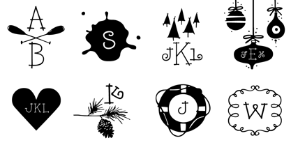 Rae's Monogram Family is a contemporary take on monograms. Rae's Monogram One letters are best used as the right and left letters. You can add Rae's Monogram Two for the middle letter. Rae's Monogram Doodles One are 50 small illustrations to use with the monogram. If you don't see the one you want take a look at over 1,000 others in Outside the Line's Doodle font library. Of course just because it was planned this way doesn't mean you have use them this way. Use your imagination! You can use just one font, or two or all three. Commercial Licensing: Rae's Monogram Doodles One uses Outside the Line's normal licensing if you are using an illustration alone or not in a monogram on commercial goods. Plz read the http://www.outside-the-line.com/license/ Rae's Monogram One and Two offers Impression Licensing. If you don't intend to sell any items made from these fonts you don't need an additional license. But if you do, to make it easier Outside the Line offers the added ability to buy this license upgrade at the time you place your order. Plz contact Rae directly to do that. By default, you're allowed to sell 250 items in total without any additional licensing required and should you intend to sell more items, additional levels of licensing can be purchased now or at any time in the future. To be clear, 250 items doesn't refer to how many different items you may create but rather refers to the number of total sales of any item or items created with these fonts. If you have any questions or need additional commercial licensing feel free to contact Rae at hello@outside-the-line.com She is always happy to hear from you.
 - Almoneda by Sudtipos,
$49.00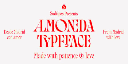 Almoneda: Sale at public auction of movable goods, generally used. And also: private and voluntary sale of jewelry and junk that is made without the intervention of justice. Formerly, it was nothing more than the market or sale of things and spoils won from the enemy in war. Nowadays, the almoneda is practically associated with spaces where the sale of "old things" takes place and, in Madrid, they are usually concentrated in the area of El Rastro, an open-air market that is set up on Sundays and some holidays in the center of Madrid. There, you can find everything and, if you walk around a lot and look hard enough, great typographic finds. It is there where I find a large number of elements (usually from the late nineteenth and early twentieth century) such as boxes, posters, books, etc.. in which appear uppercase letters with a variety of shapes, letters embedded, rare ligatures ... In addition, many elements extracted from street signs, tiles from bars and commemorative elements of Madrid have been used to complete this font design made with care and patience. Thus was born Almoneda, a modern typeface with a marked axis and great contrast, and an uppercase with several sets of characters to play with and enjoy. It also includes a large number of ligatures and discretionary ligatures. A Variable font is included with the full package license. Almoneda, a typeface that will not leave you indifferent. They take it out of my hands, hey!
 - Hollgates by Mozatype,
$17.00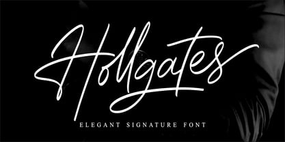 Proudly present our new font. It is named Hollgates - Elegant Signature Font. Hollgates is script handwritten style with a natural charm. This font which is a modern signature and unique style handmade comes with very beautiful character changes. To keep the maximum real hand-lettered effect, there were created 240 ligatures (you can see them among the presentation pictures). When creating the font, we should take into consideration that each letter should be able to be connected with other letters. For example, the letter "a" should be well connected as well as with "l" and "n" and with any other letters. This limits us: we have to start letter from exact one point and finish at exact second point. So here come ligatures. Hollgates font contains following ligatures: ab ad af ah ai ak al am an ao ap as at az az bh bl bk bt bx br cb cl ch ck cc cr cs ct co cx cz dd db dh dl dk dt dr ds dx dz eb ef eh ek el et ett er em en es ex ez ff fh fl fk fi fo fs ft fr fz fx gg gh gr gb gf gl gk gt go gs gz hf ho hs ht hz ib if ih ik il it itt ii in im ip is ir iz ix jo kl kk kh ko ks kr kt kx kz lo li ls lu lr lx ly lz mm mf mi mh ml mk mo mp ms mt mz mx nb ni nf nh nl nk no ns nr np nt nx nz ob of oh oi oj ok ol om on op os ot ott ou ox oz ph ppl pp ps pt pu pi pr po px pz rs rr st sh sl sk sb si sm sn so sp su sx sy sz oll all ell ill ull th tl tk ti ts tr to tu tx tz ty ub ul uh uk ul ut utt un um up us ux uz vh vl wh wl wo zz ee ll ff oo rr ss tt dd ff It’s the perfect fit for all luxury projects, such as wedding invitation, signatures, luxury logos, printed quotes, grettings cards, social media headers, product packaging and many more! It includes a full set of uppercase and lowercase letters, multilingual symbols, numerals, punctuation and ligatures. It is PUA encoded which means you can access all of the glyphs and swashes with ease! Fall in love with its incredibly versatile style and use it to create spectacular designs! Use this font for any crafting project that requires a personalized look! What’s Included : – Works on PC & Mac – Easy to use ( Installations ) – Easy Convert to webfont – Compabilty Windows, Apple, Linux, Cricut, Silhouette and Other cutting machines Thanks for downloading, and I hope you enjoy it!
 - Castelan Hispane by Ixipcalli,
$35.00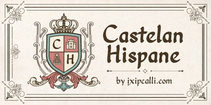 La tipografía Castelan Hispane es una tipografía inspirada en documentos y textos antiguos históricos españoles del siglo XVI. Los trazos semi-medievales - cursivos, le dan una apariencia antigua pero también moderna para los proyectos en los que se desee utilizar la tipografía. Cuenta con seis estilos y tres pesos, ligera, regular y negrita. Cada peso contiene también su forma “itálica”. The Castelan Hispane typeface is a typeface inspired by ancient Spanish historical documents and texts from the 16th century. The semi-medieval - cursive strokes give it an ancient but also modern appearance for projects in which you want to use typography. It has six styles and three weights, light, regular and bold. Each weight also contains its “italic” form.
 - Rabenau by Linotype,
$29.99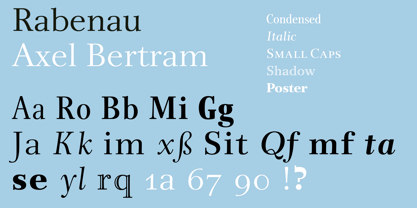 Rabenau (formerly Lucinde), the distinctly warm and legible type family For 30 years the graphic designer Axel Bertram worked at creating his typefaces: He developed complete new alphabets for magazines and typewriters as well as for the constant demand for typefaces for use by commercial artists. He has developed wall charts the size of advertising posters as teaching aids for training commercial and graphic artists to write in a clean, classic cursive script. In the eighties he used the American Chyron computer to design a screen font for television. In the mid-nineties he discovered for himself the fabulous possibilities offered by the Fontographer font software program and explored them playfully. From the results of these experiments, Axel Bertram selected a design for further development. From 2003 onwards the calligrapher and type designer Andreas Frohloff collaborated with him on the further development and production of the 16 fonts of the Rabenau™ typeface family.The Rabenau font was inspired by many factors: From the fonts used as book covers to typewriter fonts and even printed material from England dating from the beginning of the nineteenth century (e.g. those used by the skilled printer William Bulmer), Rabenau's relatively high contrast is offset by some organic tapers, subtley rounded bracketed serifs, and a fairly generous x-height. This makes for a typeface that looks especially good in print. Its broad repertoire of weights and styles - Condensed, Poster, and Shadow - give it added versatility, and make it ideal for setting both display and text in the same typeface. Throughout the heavier weights, the contrast is maintained. The Poster Italic sparkles, and will make a fine display type for dynamic headlines, or logotypes. This family of sixteen fonts works beautifully together. All Rabenau font styles have a large set of ligatures and thus cover typical letter combinations in many European languages. Besides the standard ligatures for ff, fi and fl, letter connections are also available for tt, th and fj or ffi, ffl and ffk. The range is completed with lovely arched transitions for the characters st, ck or ct. The latter gives the font that certain something, both in continuous text and above all in headlines.
 - Helios Antique by W Type Foundry,
$25.00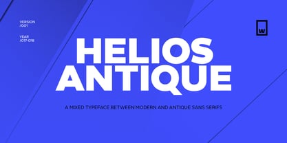 Helios Antique & Helios Stencil Check our PDF specimen for more details Helios type family is the result of a mixture between the early sans serif and the modern trends of our era. Its rational structure is subtly wider than the majority of the first sans, generating a higher impact in its uses. All the typeface terminals are more open in order to balance better the whites and blacks of Helios, and where the strokes meet it has a deeper contrast giving more legibility to the reader. Furthermore, in some letters it is possible to see some prominent features such as the leg of the "R" and the tail of the "Q", which are particular gestures that identify this type family. Helios Stencil is the tough version of this type family. All the stencil gaps were measured rigorously, thus in small sizes it conveys a neutral aesthetic whereas in big sizes a display logic appears. Helios Antique is composed by 36 styles, 782 glyphs and small caps. Besides, it has powerful OpenType features for each style, including alternates characters, ligatures, fractions, special numbers, arrows, extended language support and many more.
 - Cíclope by Andinistas,
$19.95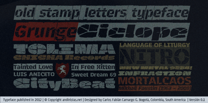 Cíclope is a typeface family designed by Carlos Fabián Camargo in 2012 and used to write the headlines. Its idea is based on an army of stone soldiers that with their size and strength cause earthquakes. Under this concept he obtained stencil and sans serif letters with monstrous shapes and torn counterforms. Its usefulness as well as readability consists in imitate rocks with scars and cracks. For that reason, Cíclope family has three sizes, each with their respective italics distributed at different levels of corrosion. In addition, each file contains 260 glyphs useful for designing words and phrases with systematically eroded treatments for advertisement material. Thus Cíclope works as a raw material in the exploration of new graphic design. Finally, Cíclope concept has grotesque, geometric and humanistics letters roots that seem disastrous but each and every detail has been planned with high definition drawing. Most importantly, it expresses a big amount of grunge style with cracked edges and medium contrast between thin and thick strokes. In that sense, the writing seems impaired and special for design of logos, posters, flyers, brochures and worn, crusty or demolished graphic design.
 - Niemeyer by Latinotype,
$36.00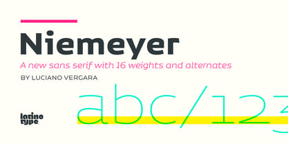 Oscar Niemeyer is one of the greatest architects of our time—his unique way of mixing straight lines and abstract curves gives rise to an unmistakable and characteristic style. This typeface is my own tribute to Brazilian architect Oscar Niemeyer. The design process started when my wife and I visited Brazil while she was running a series of workshops on calligraphy. In my spare time, I would walk through the streets of beautiful cities like Rio de Janeiro or São Paulo, enjoying the local architecture and urban life. I had also the opportunity to attend to some of the workshops during which I was able to observe the organic of calligraphy and people. Then, I started to draw some shapes that reflected everything about this beautiful place: Niemeyer’s architecture and work and, in his own words ‘the curves on the body of the beloved woman’. This versatile typeface comes in 8 weights with matching italics, alternative characters, oldstyle figures and much more! Niemeyer is well-suited for logotypes, advertising, publishing, branding and corporate use. Special thanks to everyone in the Latinotype Team (especially to César Araya) for their support, help with corrections and digital editing.
 - Veronika by Linotype,
$29.99Veronika is a semi-serif text face, available in three styles: Regular, Italic, and Bold. All three faces are available in OpenType format, with both lining and old-style figures. Grüger, a German artist and designer, first began the design of her typeface by writing out its letterforms with a wooden stylus. She wanted to create a new semi serif face that had uniform stroke widths, but still maintained some aspects of calligraphy. Veronika achieves this; the terminals that begin the first strokes of most letters are round and bulbous, as if the writing instrument added extra emphasis on that spot. This adds a dynamic, movement-like quality to texts designed with Veronika. Aside from some sans serif-ness, Veronika appears similar to old style typefaces from the renaissance: classical inscriptions inspired the proportions of the capital letters, and the lower case letters stem from Carolinian minuscule. These proportions allow Veronika to function very well in text and at small sizes. However, only when you design larger headlines, logos, or other elements with Veronika, will you notice all of its special qualities, like its weight distribution and stroke characteristics. - Mencken Std by Typofonderie,
$59.00 An American Scotch remixed in 27 fonts Mencken has twenty seven styles, divided into three widths, three optical sizes, romans and italics. Generally, optical size typeface families belong to a same common construction. It falls into the same category of type classification, while presenting different x-heights or contrasts. Mencken is unique because it is designed according to different axis and optical sizes. Firstly, Mencken Text is a low-contrast transitional typeface, designed on an oblique axis, asserting horizontal with featuring open counters. Its capitals follow Didots to better harmonize the rest of the family. On the other side of the spectrum, Mencken Head (and narrow variations) is designed on a vertical axis, high contrast, in a contemporary Didot style. The Mencken is therefore a typeface answering to different sorts of uses, whose design is different according to its uses: from oblique axis in small size to vertical axis in large sizes. Vertical proportions (x-height, capitals height, etc.) were calibrated to be compatible with many Typofonderie typeface families. Lucie Lacava and I followed the idea launched by Matthew Carter few years ago for some of his typefaces intended for publications. From Baltimore Sun’s project to Typofonderie’s Mencken It is a bespoke typeface for American newspaper The Baltimore Sun started at the end of 2004 which marks the beginning of this project. The story started with a simple email exchange with Lucie Lacava then in charge of redesigning the American East Coast newspaper. As usual, she was looking for new typeface options in order to distinguish the redesign that she had started. At the time of its implementation, a survey of the newspaper’s readers has revealed that its previous typeface, drawn in the mid-1990s, was unsatisfactory. The Mencken was well received, some reader responses was particularly enjoyable: “It’s easier to read with the new type even though the type is designed by a French.” Why it is called Mencken? The name Mencken is a tribute to H. L. Mencken’s journalistic contributions to The Sun. According to the London Daily Mail, Mencken ventured beyond the typewriter into the world of typography. Because he felt Americans did not recognize irony when they read it, he proposed the creation of a special typeface to be called Ironics, with the text slanting in the opposite direction from italic types, to indicate the author’s humour. Affirming his irreverence, the Mencken typeface does not offer these typographic gadgets. Henry Louis Mencken (1880 — 1956) was an American journalist, satirist, cultural critic and scholar of American English. Known as the “Sage of Baltimore”, he is regarded as one of the most influential American writers and prose stylists of the first half of the twentieth century. He commented widely on the social scene, literature, music, prominent politicians and contemporary movements. Creative Review Type Annual 2006 Tokyo TDC 2018
 - Sho-Card-Caps is a distinctive typeface designed by Nick Curtis, a prolific typeface designer known for his ability to capture the essence of vintage and retro typography with a modern twist. This fo...
- Kindah by Eyad Al-Samman,
$30.00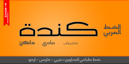 “Kindah” is a Yemeni ancient tribe with evidence of its existence going back to the second century B.C.E. The kings of Kindah exercised an influence over a number of associated tribes more by personal prestige than by coercive settled authority. The Kindites were polytheistic until the 6th century CE, with evidence of rituals dedicated to the gods Athtar and Kahil found in their ancient capital in south-central Arabia. It is not clear whether they converted to Judaism or remained pagan, but there is a strong archaeological evidence that they were among the tribes in Dhu Nuwas' forces during the Jewish king’s attempt to suppress Christianity in Yemen. They converted to Islam in the mid-7th century CE and played a crucial role during the Muslims' conquests of their surroundings. Among the most famous figures from Kindah known as Kindites are Imru' al-Qays (526-565?), al-Ash'ath ibn Qays (599-661), Hujr ibn 'Adi al-Kindi (?-660), al-Miqdad Ibn Aswad al-Kindi (589-653), and Abu Yusuf Yaíqub ibn Ishaq as-Sabbah al-Kindi (805-873) known as the Philosopher of the Arabs. "Kindah" font is a modern Kufic font comes in three weights (i.e., bold, regular, and thin) which is mainly designed to be used as a display Arabic font. The main feature of this typeface is the mixture of curves and rectangular shapes used in the designed Arabic characters. Kindah font was inspired by the design of the Yemeni modern windows of houses in which only top part of the arc is used for building such windows which reflects the originality of the architecture preserved in this part of the world. "Kindah" font is extremely outstanding when used in printed materials with big sizes especially for headline, titles, signs, and names of brands. Hence, it is suitable for books' covers, advertisement light boards, and titles in magazines and newspapers. It has also a Latin character set and it also supports several Arabic character sets which makes it proper for composing alphabetical and numerical words in Arabic, Urdu, and Persian.
 - Neutraface Condensed by House Industries,
$33.00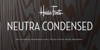 Richard J. Neutra became an icon of Modern architecture as an artistic visionary, social commentator and outspoken defender of the environment. He refined his unique approach to design, for which he coined the term biorealism, over half a century ago. Regarding humankind and its surroundings as two inseparable halves to a greater whole, Neutra created habitats with the welfare of man and nature as his utmost concern. His ideas of evolutionary growth and adaptability compelled House Industries to develop Neutraface Condensed, built upon the original typeface and driven by the enduring spirit of the revolutionary who inspired it. “I have tried to be a feeling observer of life in all its manifestations, not a cold rationalist.” House Industries adopted this precept of Neutra as the guiding principle when the foundry commissioned Christian Schwartz to draw Neutraface Condensed. Instead of being exactingly compressed, the new companion fonts were composed around a complementary structural framework in order to better reflect the sensibilities of their predecessor. The result is an individualistic design with a restrained exuberance that shuns stylistically ersatz imitation. This compact yet lively presence allows Neutraface Condensed to lend flexibility and economy to headlines without sacrificing the simplicity and charm of the original. Like all good subversives, House Industries hides in plain sight while amplifying the look, feel and style of the world’s most interesting brands, products and people. Based in Delaware, visually influencing the world.
 - Salad by Zetafonts,
$39.00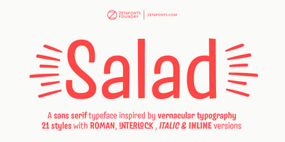 The island of Fuerteventura is more known for its white sand beaches and windsurf-friendly constant winds than for its typographic marvels. Still, it's on the walls of a ballroom next to its white-sand beaches that Debora Manetti found the hand-painted letterforms that she took as inspiration for her typeface Sala de Fiestas. The resulting font was a condensed sans serif full of curious details and a jumpy latino vibe that many years after still keeps its freshness and vernacular charme. Francesco Canovaro took the original typeface as a starting point for a grand tour into sign-painter aesthetics, developing a reboot of the original into a new type family: Salad. While being faithful to the original proportions and feeling, Salad provides extreme versatility through its five-weights range, its extended charset and its set of Open Type features including stylistic sets, alternates, positional numerals, small capitals and case sensitive forms. While the roman family with its italic counterpart provide a good workhorse tool for informal branding, packaging and editorial projects, the interlocking and the inline weights add additional possibilities for display purposes. This is enriched by the inclusion in the typeface of a set hand-drawn decorative dingbats that further complement the sign painting vibe of the family. All Zetafonts expertise in handmade lettering, typographic design and water sports has been put to test to assure Salad is the best typographical alternative to a a trip to Canary Islands!
 - TT Firs Neue by TypeType,
$39.00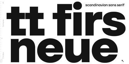 TT Firs Neue useful links: Specimen | Graphic presentation | Customization options TT Firs Neue is reborn! We have rethought the font to introduce the next-generation typeface. After analyzing each contour and graphic element, we rebuilt the font, preserving its best features while making any necessary adjustments. We have created a flawless and modern sans serif using the new technical capabilities of the studio. TT Firs Neue is a Scandinavian sans serif that combines expressive graphic elements with the versatility of use. In the latest 2023 edition, the font's display elements have become even more attractive, while the overall font balance has also been improved. This is the result of the visual research we did before working on the update. Here is what has changed. The visual elements of the font are now logically coherent. We got rid of the ones that did not suit the font's concept and kept the most attractive ones. The changes affected letters with diagonal strokes "M, N, И", and figures "2, 3, 6, 9". All round characters' shapes have been standardized for all font styles. In the previous version, all glyphs looked different: more square or oval, depending on the font's weight. We made the shapes consistent for the font to feel more integral. Glyphs containing bowls have also changed. We have worked on the balance, altering the height and shape of the bowls. Like rounded ones, we aspired to make the glyphs more balanced for all font styles. The shapes of the letters "J, M, N, S, W, З, И" and Black font style characters have changed. The individuality of these glyphs was slightly different from the whole set, which became apparent in larger sizes. We have improved the shapes and made them more suitable for the font's style. Letters with diagonal strokes and triangular glyphs, such as "A, V, Y, D". We have brought the characters to a consistent logic in their shapes by refining the angles and weight of diagonals in different font styles. The glyphs' terminals follow the same logic in the new version. We have preserved and perfected the old shapes. Ligatures and stylistic sets have been updated entirely and expanded. We have researched Scandinavian languages and designed ligatures and diacritical sets that would definitely be useful for designers. We have redesigned diacritical marks, figures, and punctuation marks. Now all characters follow the same logic and contribute to a well-balanced impression of the font. The character set in each font style has been increased from 934 to 1719, and the number of OpenType features—from 24 to 40. The new font includes 23 font styles: 11 roman, 11 italic, and 1 variable font. The variable font has also become a significant technological advancement for TT Firs Neue. We retained a warm sentiment towards TT Firs Neue's previous success while redesigning the font and implementing substantial alterations. The 2023 font has been developed according to new technical standards that have become significantly higher in the past 5 years. TT Firs Neue is a font well-suited for a wide range of contexts. It can be used for headings, text fragments, visual merchandising and building decoration, and the web. The font is visually aesthetic on podcast and video covers and is an ideal choice for packaging design and brand identity. TT Firs Neue OpenType features: aalt, ccmp, locl, subs, sinf, sups, numr, dnom, frac, ordn, tnum, onum, lnum, pnum, case, dlig, liga, c2sc, smcp, ss01, ss02, ss03, ss04, ss05, ss06, ss07, ss08, ss09, ss10, ss11, ss12, ss13, ss14, ss15, ss16, ss17, ss18, ss19, ss20, calt. TT Firs Neue language support: English, Albanian, Basque, Catalan, Croatian, Czech, Danish, Dutch, Estonian, Finnish, French, German, Hungarian, Icelandic, Irish, Italian, Latvian, Lithuanian, Luxembourgish, Maltese, Moldavian (lat), Montenegrin (lat), Norwegian, Polish, Portuguese, Romanian, Serbian (lat), Slovak, Slovenian, Spanish, Swedish, Swiss German, Valencian, Azerbaijani, Kazakh (lat), Turkish, Uzbek (lat), Acehnese, Banjar, Betawi, Bislama, Boholano, Cebuano, Chamorro, Fijian, Filipino, Hiri Motu, Ilocano, Indonesian, Javanese, Khasi, Malay, Marshallese, Minangkabau, Nauruan, Nias, Palauan, Rohingya, Salar, Samoan, Sasak, Sundanese, Tagalog, Tahitian, Tetum, Tok Pisin, Tongan, Uyghur, Afar, Asu, Aymara, Bemba, Bena, Chichewa, Chiga, Embu, Gikuyu, Gusii, Jola-Fonyi, Kabuverdianu, Kalenjin, Kamba, Kikuyu, Kinyarwanda, Kirundi, Kongo, Luba-Kasai, Luganda, Luo, Luyia, Machame, Makhuwa-Meetto, Makonde, Malagasy, Mauritian Creole, Meru, Morisyen, Ndebele, Nyankole, Oromo, Rombo, Rundi, Rwa, Samburu, Sango, Sangu, Sena, Seychellois Creole, Shambala, Shona, Soga, Somali, Sotho, Swahili, Swazi, Taita, Teso, Tsonga, Tswana, Vunjo, Wolof, Xhosa, Zulu, Ganda, Maori, Alsatian, Aragonese, Arumanian, Asturian, Belarusian (lat), Bosnian (lat), Breton, Bulgarian (lat), Colognian, Cornish, Corsican, Esperanto, Faroese, Frisian, Friulian, Gaelic, Gagauz (lat), Galician, Interlingua, Judaeo-Spanish, Karaim (lat), Kashubian, Ladin, Leonese, Manx, Occitan, Rheto-Romance, Romansh, Scots, Silesian, Sorbian, Vastese, Volapük, Võro, Walloon, Walser, Welsh, Karakalpak (lat), Kurdish (lat), Talysh (lat), Tsakhur (Azerbaijan), Turkmen (lat), Zaza, Aleut (lat), Cree, Haitian Creole, Hawaiian, Innu-aimun, Lakota, Karachay-Balkar (lat), Karelian, Livvi-Karelian, Ludic, Tatar, Vepsian, Guarani, Nahuatl, Quechua, Russian, Belarusian (cyr), Bosnian (cyr), Bulgarian (cyr), Macedonian, Serbian (cyr), Ukrainian, Kazakh (cyr), Kirghiz, Tadzhik, Turkmen (cyr), Uzbek (cyr), Lezgian, Abazin, Agul, Archi, Avar, Dargwa, Ingush, Kabardian, Kabardino-Cherkess, Karachay-Balkar (cyr), Khvarshi, Kumyk, Lak, Nogai, Rutul, Tabasaran, Tsakhur, Buryat, Komi-Permyak, Komi-Zyrian, Siberian Tatar, Tofalar, Touva, Bashkir, Chechen (cyr), Chuvash, Erzya, Kryashen Tatar, Mordvin-moksha, Tatar Volgaic, Udmurt, Uighur, Rusyn, Montenegrin (cyr), Romani (cyr), Dungan, Karakalpak (cyr), Shughni, Mongolian, Adyghe, Kalmyk.