10,000 search results
(0.048 seconds)
- Adolescent by Krakenbox Studio,
$12.00 Adolescent is a cute and playful handwritten font. Use this font to add that special cool touch to any design idea you can think of!
 - Hakaze by Phoenix Group,
$13.00 Hakaze is a font that symbolizes strength and is trendy, this font is depicted in a Japanese style with a modern, cool, and contemporary touch.
 - Shanty House by Ali Hamidi,
$14.00 Shanty House is a chunky fun and whimsical handwritten font. A little bit quirky, this font looks incredibly adept in a wide variety of contexts!
 - Simple Serif by Gerald Gallo,
$20.00 The Simple Serif fonts are designed as hand-lettered serif fonts. They are casual and informal and are ideal for use in conveying these qualities.
 - Ravioli by Arendxstudio,
$12.00 Ravioli combines fun fonts that will easily turn any design idea into a stand out! Fall in love with this adorable and versatile font family!
 - Grey Shadow by Forberas Club,
$16.00 This Grey Shadow font is create font special moment like wedding party, wedding invitation, happy party, book cover and something cute moment and lovely moment.
 - South Louisville by Sarid Ezra,
$15.00 South Louisville is an applicable handwritten font that contains uppercase, lowercase, number and symbol, also comes with ligatures and underline. This font support multi language!
 - Morgain by Umbra95,
$32.00 Morgain is a decorative vintage font with "celtic spirit". Morgain Is an experimental font, specific shapes and forms gives it a little hand-painted effect.
 - Revij Anovik by Stringlabs Creative Studio,
$29.00 Revij Anovik is a unique and modern decorative serif font. This playfully conceptual typeface font will look truly outstanding in a wide range of contexts.
 - Sakurata by Sealoung,
$10.00 Sakurata is a unique and chunky lettered display font. Add this font to your creative ideas and notice how it will make them stand out!
 - Hello Angel by Subectype,
$14.00 Hello Angel is a fun and whimsical paint brushed display font. This font is perfect for children themed designs, especially when combined with bright colors.
 - Redmoon by Krakenbox Studio,
$9.00 Redmoon is a cute and playful handwritten font. Use this font to add that special cool touch to any design idea you can think of!
 - Battom Glory by Sealoung,
$10.00 Battom Glory is a bold and distinct blackletter font. Add this font to your creative ideas and notice how it will make them stand out!
 - Alagereas by IbraCreative,
$17.00 Alagereas – A Scifi Display Serif Font Alagereas, a captivating Sci-Fi Display Serif font, seamlessly blends futuristic aesthetics with timeless sophistication. Designed for maximum impact, its sleek and angular letterforms exude a sense of technological advancement and avant-garde elegance. Alagereas strikes a harmonious balance between readability and artistic expression, making it ideal for immersive digital interfaces, space-themed designs, and cutting-edge editorial layouts. The font’s meticulous detailing and precision convey a sense of otherworldly precision, while its serif elements evoke a classic charm, resulting in a typeface that transcends the boundaries of conventional sci-fi typography. Alagereas is a bold and versatile choice that transports typography into the realms of the future, embodying the essence of innovation in every character. Alagereas is perfect for branding projects, logo, wedding designs, social media posts, advertisements, product packaging, product designs, label, photography, watermark, invitation, stationery, game, fashion and any projects. Fonts include multilingual support for; Afrikaans, Albanian, Czech, Danish, Dutch, English, Estonian, Finnish, French, German, Hungarian, Italian, Latvian, Lithuanian, Norwegian, Polish, Portuguese, Slovak, Slovenian, Spanish, Swedish.
 - Kolaron by IbraCreative,
$17.00 Kolaron – A Modern Condensed Sans Serif Font Kolaron is a contemporary condensed sans-serif font that effortlessly blends sophistication with modernity. Its sleek and streamlined design features condensed letterforms that exude a sense of efficiency and space optimization, making it an ideal choice for projects where legibility and style are paramount. The font’s clean lines and geometric shapes contribute to a polished and professional appearance, making it versatile for a range of applications, from corporate branding to editorial design. Kolaron’s balanced letter spacing and subtle yet distinctive details showcase a meticulous attention to typographic detail, ensuring a harmonious and eye-catching visual experience across various mediums. Whether used for headlines, signage, or digital interfaces, Kolaron stands as a testament to the elegance achievable in contemporary typography. Kolaron is perfect for branding projects, logo, wedding designs, social media posts, advertisements, product packaging, product designs, label, photography, watermark, invitation, stationery, game, fashion and any projects. Fonts include multilingual support for; Afrikaans, Albanian, Czech, Danish, Dutch, English, Estonian, Finnish, French, German, Hungarian, Italian, Latvian, Lithuanian, Norwegian, Polish, Portuguese, Slovak, Slovenian, Spanish, Swedish.
 - Mikanu by Twinletter,
$17.00 Mikanu is ideal for projects with a classic modernism serif vibe. This font’s exquisite and refined features can bring a touch of sophistication to your designs. Mikanu includes complex features such as ligatures and alternates to make your text more intriguing and unique. Not only that, but the Mikanu typeface supports multilingualism, allowing it to be utilized in a variety of languages around the world. As a result, you can quickly modify this typeface for other projects. By selecting Mikanu as the font for your project, you will receive a high-quality product that will enhance the visual message you want to portray. Use Mikanu right away to add aesthetic value to your design! What’s Included : - File font - All glyphs Iso Latin 1 - Alternate, Ligature - Simple installations - We highly recommend using a program that supports OpenType features and Glyphs panels like many Adobe apps and Corel Draw so that you can see and access all Glyph variations. - PUA Encoded Characters – Fully accessible without additional design software. - Fonts include Multilingual support
 - Kunire Grotesk by IbraCreative,
$17.00 Kunire Grotesk – A Modern Grostesk Sans Serif Font Kunire Grotesk is a contemporary sans-serif font that seamlessly blends classic grotesque design elements with a modern twist. Exhibiting a refined balance between simplicity and intricacy, Kunire Grotesk features clean lines, geometric shapes, and a distinctive grotesque aesthetic that exudes a sense of sophistication. The font’s letterforms are characterized by their sharp, angular terminals and well-defined strokes, lending a crisp and professional appearance to any text. With a versatile range of weights and styles, Kunire Grotesk caters to diverse design needs, from editorial layouts to branding and digital applications, making it a go-to choice for those seeking a harmonious fusion of timeless elegance and contemporary flair in their typographic endeavors. Kunire Grotesk is perfect for branding projects, logo, wedding designs, social media posts, advertisements, product packaging, product designs, label, photography, watermark, invitation, stationery, game, fashion and any projects. Fonts include multilingual support for; Afrikaans, Albanian, Czech, Danish, Dutch, English, Estonian, Finnish, French, German, Hungarian, Italian, Latvian, Lithuanian, Norwegian, Polish, Portuguese, Slovak, Slovenian, Spanish, Swedish.
 - Strateen by IbraCreative,
$17.00 Strateen – a Futurism Sans Serif Font Strateen, a Futurism Sans Serif font, encapsulates the essence of contemporary design with its sleek and progressive aesthetic. Its clean, geometric lines and minimalistic strokes evoke a sense of modernity, making it ideal for projects that seek a futuristic and cutting-edge look. The typeface’s letterforms boast a harmonious balance between simplicity and sophistication, enhancing legibility while maintaining a distinctive personality. Strateen’s sans serif nature contributes to its versatility, enabling seamless integration across various mediums, from digital interfaces to print materials. The font’s forward-thinking design not only aligns with the visual trends of the future but also ensures a timeless appeal, making Strateen a compelling choice for those in pursuit of a dynamic and forward-looking typographic solution. Strateen is perfect for branding projects, logo, wedding designs, social media posts, advertisements, product packaging, product designs, label, photography, watermark, invitation, stationery, game, fashion and any projects. Fonts include multilingual support for; Afrikaans, Albanian, Czech, Danish, Dutch, English, Estonian, Finnish, French, German, Hungarian, Italian, Latvian, Lithuanian, Norwegian, Polish, Portuguese, Slovak, Slovenian, Spanish, Swedish.
 - Hinnual by Jipatype,
$27.00 Hinnual เป็นฟอนต์ที่ผสมผสานระหว่างรูปทรงสี่เหลี่ยมและทรงกลมเพื่อสร้างสไตล์ที่ไม่เหมือนใคร ชื่อมาจากคำไทย 2 คำ คือ Hin แปลว่า หิน และ Nual แปลว่า อ่อน ผสมผสานองค์ประกอบที่แข็งและอ่อนนี้สะท้อนให้เห็นในแบบอักษร ซึ่งมีเส้นที่สะอาดตาและเส้นคมซึ่งถูกทำให้อ่อนลงด้วยมุมโค้งมน ฟอนต์มีให้เลือกถึง 18 แบบ มีตัวเลือกหลากหลายให้คุณได้เลือกใช้ Hinnual เหมาะอย่างยิ่งสำหรับใช้ในพาดหัวและพาดหัวย่อย ซึ่งลักษณะที่โดดเด่นสามารถช่วยดึงดูดความสนใจของผู้อ่านได้ เส้นสายที่สะอาดตาและสไตล์ที่เป็นเอกลักษณ์ยังทำให้เป็นตัวเลือกที่ยอดเยี่ยมสำหรับแบรนด์ โลโก้ และงานออกแบบอื่นๆ ที่ต้องการภาพลักษณ์ที่น่าจดจำ โดยรวมแล้ว Hinnual เป็นฟอนต์อเนกประสงค์และสะดุดตาที่ผสมผสานองค์ประกอบทั้งความแข็งแกร่งและความนุ่มนวล การออกแบบที่เป็นเอกลักษณ์ทำให้เป็นตัวเลือกที่ยอดเยี่ยมสำหรับนักออกแบบที่ต้องการสร้างผลงานที่น่าจดจำ Hinnual is a font that combines the square and rounded shapes to create a unique visual style. Its name comes from two Thai words - Hin, which means stone, and Nual, which means soft. This juxtaposition of hard and soft elements is reflected in the font's design, which features clean, sharp lines softened by rounded corners. The font comes in 18 styles, providing a range of options for designers to choose from. Hinnual is particularly well-suited for use in headlines and sub-headlines, where its bold and distinctive appearance can help to grab the reader's attention. Its clean lines and unique style also make it a great choice for branding projects, logos, and other design elements that require a memorable. Overall, Hinnual is a versatile and eye-catching font that combines elements of both strength and softness. Its unique design make it an excellent choice for designers looking to create impactful visual content.
 - Muggsy by Missy Meyer,
$10.00 I do a lot of taller, narrower handwriting fonts; this time around, I was inspired to make a wider, shorter handwriting font! MUGGSY has everything you expect from one of my fonts: clean and smooth curves, a full set of alternates, and a feeling of fun! MUGGSY has two uppercase-height alphabets (with a few lowercase-style letters like a and e in the lowercase set), plus a full set of 63 "smallternates" -- the same letters, numbers, and ampersand sized down to 75%, and beefed up in weight so they can be mixed in with the full-size letters. Plus 30 double-letter ligature sets, and a few additional alternates for variety! You also get a ton of punctuation, and my usual 300+ extended Latin characters for language support, for a total of over 600 glyphs! And just because you may want things a bit heavier, I've also made Muggsy Heavy, a bolder weight of Muggsy with all of the same alternates and extras. Enjoy, my fonty friends!
 - Vendetta by Emigre,
$69.00 The famous roman type cut in Venice by Nicolas Jenson, and used in 1470 for his printing of the tract, De Evangelica Praeparatione, Eusebius, has usually been declared the seminal and definitive representative of a class of types known as Venetian Old Style. The Jenson type is thought to have been the primary model for types that immediately followed. Subsequent 15th-century Venetian Old Style types, cut by other punchcutters in Venice and elsewhere in Italy, are also worthy of study, but have been largely neglected by 20th-century type designers. There were many versions of Venetian Old Style types produced in the final quarter of the quattrocento. The exact number is unknown, but numerous printed examples survive, though the actual types, matrices, and punches are long gone. All these types are not, however, conspicuously Jensonian in character. Each shows a liberal amount of individuality, inconsistency, and eccentricity. My fascination with these historical types began in the 1970s and eventually led to the production of my first text typeface, Iowan Old Style (Bitstream, 1991). Sometime in the early 1990s, I started doodling letters for another Venetian typeface. The letters were pieced together from sections of circles and squares. The n, a standard lowercase control character in a text typeface, came first. Its most unusual feature was its head serif, a bisected quadrant of a circle. My aim was to see if its sharp beak would work with blunt, rectangular, foot serifs. Next, I wanted to see if I could construct a set of capital letters by following a similar design system. Rectangular serifs, or what we today call "slab serifs," were common in early roman printing types, particularly text types cut in Italy before 1500. Slab serifs are evident on both lowercase and uppercase characters in roman types of the Incunabula period, but they are seen mainly at the feet of the lowercase letters. The head serifs on lowercase letters of early roman types were usually angled. They were not arched, like mine. Oddly, there seems to be no actual historical precedent for my approach. Another characteristic of my arched serif is that the side opposite the arch is flat, not concave. Arched, concave serifs were used extensively in early italic types, a genre which first appeared more than a quarter century after roman types. Their forms followed humanistic cursive writing, common in Italy since before movable type was used there. Initially, italic characters were all lowercase, set with upright capitals (a practice I much admire and would like to see revived). Sloped italic capitals were not introduced until the middle of the sixteenth century, and they have very little to do with the evolution of humanist scripts. In contrast to the cursive writing on which italic types were based, formal book hands used by humanist scholars to transcribe classical texts served as a source of inspiration for the lowercase letters of the first roman types cut in Italy. While book hands were not as informal as cursive scripts, they still had features which could be said to be more calligraphic than geometric in detail. Over time, though, the copied vestiges of calligraphy virtually disappeared from roman fonts, and type became more rational. This profound change in the way type developed was also due in part to popular interest in the classical inscriptions of Roman antiquity. Imperial Roman letters, or majuscules, became models for the capital letters in nearly all early roman printing types. So it was, that the first letters in my typeface arose from pondering how shapes of lowercase letters and capital letters relate to one another in terms of classical ideals and geometric proportions, two pinnacles in a range of artistic notions which emerged during the Italian Renaissance. Indeed, such ideas are interesting to explore, but in the field of type design they often lead to dead ends. It is generally acknowledged, for instance, that pure geometry, as a strict approach to type design, has limitations. No roman alphabet, based solely on the circle and square, has ever been ideal for continuous reading. This much, I knew from the start. In the course of developing my typeface for text, innumerable compromises were made. Even though the finished letterforms retain a measure of geometric structure, they were modified again and again to improve their performance en masse. Each modification caused further deviation from my original scheme, and gave every font a slightly different direction. In the lower case letters especially, I made countless variations, and diverged significantly from my original plan. For example, not all the arcs remained radial, and they were designed to vary from font to font. Such variety added to the individuality of each style. The counters of many letters are described by intersecting arcs or angled facets, and the bowls are not round. In the capitals, angular bracketing was used practically everywhere stems and serifs meet, accentuating the terseness of the characters. As a result of all my tinkering, the entire family took on a kind of rich, familiar, coarseness - akin to roman types of the late 1400s. In his book, Printing Types D. B. Updike wrote: "Almost all Italian roman fonts in the last half of the fifteenth century had an air of "security" and generous ease extremely agreeable to the eye. Indeed, there is nothing better than fine Italian roman type in the whole history of typography." It does seem a shame that only in the 20th century have revivals of these beautiful types found acceptance in the English language. For four centuries (circa 1500 - circa 1900) Venetian Old Style faces were definitely not in favor in any living language. Recently, though, reinterpretations of early Italian printing types have been returning with a vengeance. The name Vendetta, which as an Italian sound I like, struck me as being a word that could be taken to signifiy a comeback of types designed in the Venetian style. In closing, I should add that a large measure of Vendetta's overall character comes from a synthesis of ideas, old and new. Hallmarks of roman type design from the Incunabula period are blended with contemporary concerns for the optimal display of letterforms on computer screens. Vendetta is thus not a historical revival. It is instead an indirect but personal digital homage to the roman types of punchcutters whose work was influenced by the example Jenson set in 1470. John Downer.
 - Cow-Spots - Unknown license

- Esperanza™ - Unknown license

- Gaumont - Unknown license

- Manic - Personal use only

- Pea Marcie's Skinny Script - Unknown license

- Pea Girly Girls Script - Unknown license

- Pea Amy*Rica Script - Unknown license

- Pea Marcie's Skinny Print - Unknown license

- Pea XOXO from Karen - Personal use only

- Pea Girly Girls Print - Unknown license

- Better Delight by Zeenesia Studio,
$15.00 Better Delight - Handwritten Font Better Delight is a handwritten script font with a simple and classy style, this font is great for your next creative projects such as watermark on photography, logo design, wedding, invitation, quotes, book cover, business card, and many other design project. From business cards to photo watermarks.
 - All Americans by Mevstory Studio,
$25.00 Introducing All Americans Font Duo, a classy, contemporary pair of brush and sans fonts. With a stylish didot-style serif font and a free-flowing, expressive script companion, All Americans offers beautiful typographic harmony for a diversity of design projects, including logos & branding, wedding designs, social media posts, advertisements & product designs.
 - Oktagona by Sensatype Studio,
$15.00 Oktagona Modern Technology Futuristic Font is A Modern Technology Futuristic Font that we created special for Futuristic Technology needs. What's Included: Character set A-Z All Uppercase / Stylistic alternates Numerals & Punctuation Accented Characters (West Europe) Works on PC & Mac Recommended using Adobe Illustrator or Adobe Photoshop. Wish you enjoy our font. :)
 - The Kallman by Sabrcreative,
$25.00 Introducing The Kallman Font, a captivating display brush typeface that effortlessly commands attention. With its bold and dynamic strokes, this font adds a striking impact to your design projects. Perfect for eye-catching headlines, posters, logos, and more, The Kallman Font infuses your creations with a powerful and contemporary vibe.
 - Slashmine by Din Studio,
$29.00 Slashmine is authentic and modern blackletter font. The font is suitable for any branding project like logo, t-shirt printing and many more. Outstanding in a wide range of contexts. Featured : Alternates Accents (Multilingual characters) PUA encoded Numerals and Punctuation (OpenType Standard) Thanks for downloading premium font from Din Studio
 - Mariogalo by Balpirick,
$15.00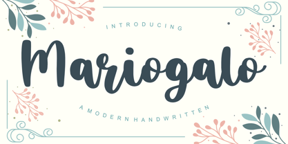 Proudly Present, Mariogalo Font. Mariogalo is a Modern Handwritten font. Mariogalo is perfect for product packaging, branding project, megazine, social media, wedding, or just used to express words above the background. Mariogalo also multilingual support. Enjoy the font, feel free to comment or feedback, send me PM or email. Thank you!
 - Spinach by Larin Type Co,
$12.00 Spinach - a new fun display font. This is a fun font that is perfect for creating your project, it can be used to create a beautiful inscription for t-shirts, children's books, branding, small business, book covers, stationery, marketing, blog, magazines and more. All characters of this font support PUA encoded.
 - DigiBo by Volcano Type,
$29.00 Inspired by a scoreboard of the public transport in London our best selling font family is the basic font for the german magazine Starshot and even earned feedback from Sports Illustrated. The technical look of the entire DigiBo family is making the font a worthy member of the Eurostile / DIN -league.
 - Cal Carolingian Minuscule by Posterizer KG,
$16.00 Calligrapher Carolingian Minuscule Font is one of the calligraphic group of fonts called “21 alphabets for Calligraphers“. All graphemes are taken from calligraphic pages written in traditional Carolingian Minuscule calligraphic style. This font is ideal for calligraphic sketches or for imitation of ancient manuscripts. It contains all the Latin glyphs.


