10,000 search results
(0.047 seconds)
- Lumina by Scholtz Fonts,
$21.00Lumina combines a fluid, informal look with an upright, fairly formal character structure. The font is reminiscent of leaded or stained glass, suggesting a trying to-be-solid outline with flowing inner spaces. Characters are softened by the use of staggered heights and slightly irregular widths, creating the impression of hand-crafted, ink-drawn shapes. Lumina is unusual in that it gives a medieval treatment to a modern character outline. The outline has been given an irregular, slightly hand-crafted look that is at variance with its modern character and hints at both the informality of a grunge font and the carefully hand-drawn quality of medieval illuminated scripts (hence its name). It is one of the few informal, compressed fonts that retains a high degree of legibility. Use it when you want your text to be both relaxed and readable, and yet take up very little space on the page. Lumina Regular is not an outline font in the usual sense, since it contains one or more rounded hollows or lacunae within its outline. Use Lumina for: —Ecclesiastical book headings and illustrations —Church posters —Book covers —Greeting card design —Advertisements —The "fine print" The font contains a full 256 character set (upper and lower case, punctuation, diacritical characters, special symbols and numerals), in which all characters have been fully kerned and letter-spaced. - Nova Quinta by Mans Greback,
$69.00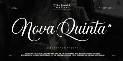 Nova Quinta is a breathtaking, enchanting formal script font that weaves an air of magic and sophistication into your designs. With its delightful swirls and exquisite swashes, this font radiates a lovely charm, perfect for adorning wine labels, farm produce packaging, and luxury branding. Imagine your design coming to life with the genuine elegance of Nova Quinta, transforming your work into an enchanting piece of art. The font's irresistible beauty and decorative allure make it a dreamy choice for projects that require a touch of refinement and grace. The Nova Quinta font family includes four mesmerizing styles to suit various design needs: Regular: A gracefully balanced, enchanting style Bold: A more assertive and captivating presence Italic: A whimsical dance of flourishes and movement Bold Italic: The perfect blend of boldness and flair Unleash your creativity with the advanced OpenType functionality of Nova Quinta. This font family ensures top-notch quality and provides you with full control and customizability. It includes stylistic and contextual alternates, ligatures, and other features to make your designs a vibrant, one-of-a-kind masterpiece. Nova Quinta embraces an extensive lingual support, covering all Latin-based languages, from Northern Europe to South Africa, from America to South-East Asia. It contains all the characters and symbols you'll ever need, including all punctuation and numbers.
 - Mellisthya by MonoLIne Calligraphy,
$21.00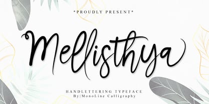 Mellisthya is interesting because the typeface is pleasing to the eye, clean, feminine, sensual, glamorous, simple and very easy to read, because there are many fancy letter connections. I also offer a number of decent stylistic alternatives for multiple letters. Classic styles are very suitable to be applied in various formal forms such as invitations, labels, restaurant menus, logos, fashion, make up, stationery, novels, magazines, books, greeting / wedding cards, packaging, labels or all kinds of advertising purposes. . . Mellisthya has alternative characters, including support for multiple languages. With OpenType features with an alternative style and elegant binding. The OpenType feature does not work automatically, but you can access it manually and for the best results required for your creativity in combining these Glyph / Character variations. Font Features : * Lowercase beginning and ending swash * Uppercase beginning swash * Initials * Intenational Language I heavily use programs that support OpenType features and the Glyphs panel such as Adobe Illustrator, Adobe Photoshop CC, Adobe InDesign, or CorelDraw, so that you can view and access all the variations of the Glyph. Mellisthya Font is coded with Unicode PUA, which allows full access to all additional characters without having any special design software. Mac users Mac users, and Windows users can use Character Map to view and copy any of the additional characters to paste into your favorite editor / application.
 - Madison Ave. by Funk King,
$10.00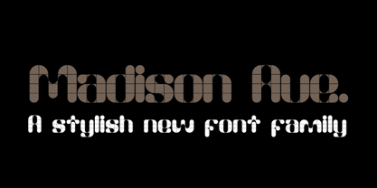 The Madison Ave. family started from Madison Ave. at Fontstruct.com. As my most downloaded font, this was an easy, although not necessarily logical choice to make – regarding taking an existing free font and attempting to offer it for purchase. The font is very basic and simple in its layout, but has achieved popularity over at Dafont with almost 80,000 downloads with its cool, understated nature and inherent sophistication. The original Madison Ave. is now 95 Madison Ave. A couple of glyphs have changed from the original, but mostly the set is the same. The big news here is the availability of multiple variations on the original. Ninety-five refers to the filter settings used to achieve the faint cross lines in the font. The sequence 95-100 provides a gradual fade to solid effect when used together. The other versions use variations on the filter settings that allow each its own distinctive flavor, while at the same time maintaining inherent characteristics of the original. Ninety-five is now joined by 55, 75, 97, 99, 100, 102, 105, 155, 175, 201, 202, and 275. 100 is the solid version which doesn’t contain the trademark lines found in 95. In 95-99, the line width varies to achieve subtle effects. 50 and 85 are distorted by reducing the filter settings in a somewhat minimizing fashion. In 102-205, these are distorted by increasing the filter settings above the normal which is what 100 represents. While some of the effects are extreme and challenge the legibility of text, these can be fun or edgy. They offer a cohesion that can be used to advantage for different projects that require the use of a modern font family.
 - European Soft Pro Variable by Bülent Yüksel,
$99.00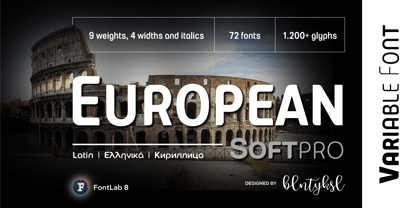 EUROPEAN SOFT PRO VARIABLE ABOUT FAMILY: What makes "European Soft Pro Variable" elegant, friendly and contemporary is its very rounded curves with very open terminals. "European Soft Pro Variable" has been designed with a higher "x-height" than other fonts in its class to make tiny readability more obvious in any use situation. It will be ideal for use in small sizes such as business cards or mobile applications. This typeface is also equipped with powerful OpenType features to satisfy the most demanding professionals. It has solid features like case sensitivity, small, true capitals, full ligatures, tabular figures for tables, old style figures to elegantly insert numbers into your sentences and more alternative characters to give personality to your projects. The extended, "European Soft Pro Variable" supports around 85 languages in the Latin, Cyrillic and Greek scripts, and its non-Latin components were developed with native consultants. With over 1200+ glyphs per style, "European Soft Pro" cares about localised letterforms and has the OpenType features to match. FEATURE SUMMARY: - 9 weights: Thin, ExtraLight, Light, Book, Regular, Medium, Bold, ExtraBold, and Black. - 4 widths: Normal, Narrow, Condensed, and Extra Condensed. - Matching italics (12º) for all weights and widths . - Matching small caps for all weights and widths. - Lining and old style figures (proportional and tabular). - Alternate characters (A, G, M, N, R, U, a, g, l, m, n, u, y). - Unlimited fractions. - Automatic ordinals (1st, 2nd, 3rd, etc.). - 24 Dingbats + 19 Social Media and Block Chain icons. - Extended language support: Most Latin-based scripts (including Vietnamese), Cyrillic, and Greek. - Extended currency support. You can contact me at buyuksel@hotmail.com, pre-purchase and post-purchase with questions and for technical support. You can enjoy using it.
 - DT Skiart Serif Leaf by Dragon Tongue Foundry,
$10.00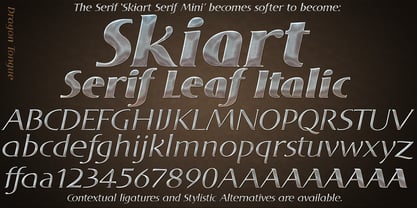 ‘Skiart Serif Leaf’ has been on a long growing path getting to where it is now. Originally inspired by the san serif font ‘Skia’ by Mathew Carter for Apple. ‘Skiart’ was designed to feel more like a serifed font, but without any serifs. It took a step between sans serif and serif fonts. Next on the path towards a serif font came Skiart Serif Mini, with tiny serifs added. This was a true serif font, although they were subtle. This font ‘Skiart Serif Leaf’ is the next in the series. After many reiterations, ‘Skiart Serif Leaf’ was built and rebuilt many times until finally, this version deserved to be presented to the world. Style and flow had been added to this font. It remained fully readable and feels as clean and normal as any of the best body copy serifs, and yet has an original modern flair to it. The font feels strong and solid while having a subtle organic flow in its form. If compared to one of the more commonly used serifs like ‘Times New Roman’, the ‘Skiart Serif Leaf’ lowercase is more open with a taller x-height, increasing its readability and friendliness. The serifs are smaller and less distracting. They are not pretending to be ligatures. This font may be organic but is not in anyway script like. Where ‘Times’ makes its p q b d forms out of a barely touching oval and stem, the ‘Serif Leaf’ forms are much more firmly attached, appearing clearly as single letters. The standard setting for the a’s and g’s are round single story, feeling warmer and more inviting in the ‘Serif Leaf’ font. Much more friendly than the stuffy double storied versions in fonts like ‘Times’ etc. ‘Skiart Serif Font’ comes with a somewhat organic italic.
 - FS Pimlico by Fontsmith,
$80.00 Born in the 70s Personal influences are unavoidable in type design and usually find their way through into finished fonts. At Fontsmith, one period in particular provides inspiration, according to FS Pimlico designer, Fernando Mello. “Jason and Phil have always known that I’m very into the visual language of the 70s. I know that Jason shares my love of the 70s and Phil will sometimes admit to being a fan, too. I think that’s the reason they were both so supportive in the development of this font. “And, of course, we all share an interest in good-humoured and intelligent design. We like to think it’s a Fontsmith characteristic.” Back from black FS Pimlico started in an unusual place: with a tubby, penguin-like lowercase “a” that Fernando Mello had been sketching. From “a” grew the rest of the alphabet – a bubbly, fat, friendly family with a brush-written quality that became FS Pimlico Black. The black weight certainly isn’t the normal starting point for creating a regular and bold weight, but Fernando pressed on, driven by a glut of influences: brush-writing; Letraset and early digital systems catalogues; the type of Herb Lubalin and Tony di Spigna; 70s clothes and vinyl; and 70s revival disco nights in London’s Pimlico and Vauxhall. Natural or flourished Not often do fonts come along that seem to span the ages. FS Pimlico is at home in an office environment providing a fresh clear identity in communications or providing text that’s clear and easy to read. But it likes to party, too, 70s style. With the OpenType features switched on, a designer can totally change the look of their work, and create point-of-sale, headlines and titles that stand out and get noticed.
 - Sancoale Slab Soft by insigne,
$24.75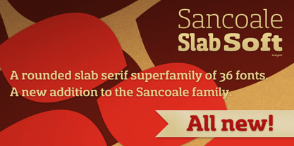 Ready for the designs of today, the Sancoale superfamily takes a softer turn with a rounded slab serif. Crafted from Sancoale’s simple geometry, new softened slab serifs provide a lively typeface that conveniently enhances its cousins: Sancoale Softened--a sans with blunted terminals; Sancoale Slab; and, certainly, the first Sancoale. The weights of each and every member are balanced diligently to be compatible with one another. When used alongside one another, the combination makes for robust and tight design. With weights starting with the slender thin ranging to the juicy black, Slab Soft opens the doorway to the vary of uses. Its design is legible and neutral enough for bodies of copy--both in print and on your website. The web font also stands out perfectly as a headline or a display face. Slab Soft carefully places a foot ahead, and doesn't overpower like many slabs. This font’s the choice to seize the day and get the job done. All insigne™ fonts are absolutely loaded with OpenType options. Sancoale Slab is geared up for pro typography, together with alternates with stems, compact caps and lots of alts, together with “normalized” capitals and lowercase letters. The font features many numeral sets, with fractions, old-style and lining figures with superiors and inferiors. OpenType-capable programs like Quark or the Adobe suite allow you to quickly change ligatures and alternates. You can see these options shown in the .pdf brochure. Bundled are compact caps, fractions, old-style and lining quantities, scientific superior/inferior figures, entire ordinal and inferior alphabet. The Sancoale superfamily also features the glyphs to aid a variety of languages, together with Central, Eastern and Western European languages. In all, Sancoale Slab supports around forty languages that utilize the Latin script, earning Sancoale the pick for for multi-lingual publications and packaging.
 - Initiate by Stiggy & Sands,
$24.00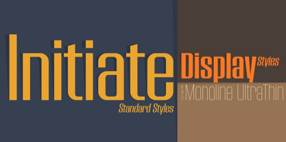 A Stylish Technology Sans Serif Initiate began as a digitization of a film typeface from LetterGraphics in the early 70's known as "Kent". The original specimen was only in a Black weight with a tall x-height and included standard Capitals, Lowercase, Numerals and minimal Punctuation. It was a techno style sans-serif, ripe with potential. As a single weight typeface, it yearned for so much more: from family weight development to stylistic variants. We also decided to create a more normalized x-height version as well, leaving the original design as the Display series. Extras we developed for this family are Unicase variants, High & Low hairline position glyphs, as well as other alternate styled characters. The Initiate standard family has 1154 characters per font, while the Display family and Monoline font has 685 characters per font. A comprehensive character map preview is at the end of the poster graphics collection. Opentype features for Initiate Family include: Ligatures Unicase Stylistic Alternate Set Stylistic Set 02 - Limited Alternate Characters (A,K,X,Y,k,u,x,y and variants) Stylistic Set 03 - Lower Hairline Characters (B,C,E,F,G,H,P,R,Æ,a,c,e,r,s and variants) Stylistic Set 04 - M & N alternates Stylistic Set 05 - I alternates Smallcaps Set Smallcaps Lower Hairline Set when Stylistic Set 03 is enabled Limitless Fractions Ordinals Superscript & Subscript Opentype features for Initiate Display Family & Monoline font include: Ligatures Unicase Stylistic Alternate Set Stylistic Set 02 - Limited Alternate Characters (A,K,X,Y,k,u,x,y and variants) Stylistic Set 03 - Lower Hairline Characters (B,C,E,F,G,H,P,R,Æ,a,c,e,r,s and variants) Stylistic Set 04 - M & N alternates Stylistic Set 05 - I alternates Limitless Fractions Ordinals Superscript & Subscript
 - FS Pimlico Variable by Fontsmith,
$249.99Born in the 70s Personal influences are unavoidable in type design and usually find their way through into finished fonts. At Fontsmith, one period in particular provides inspiration, according to FS Pimlico designer, Fernando Mello. “Jason and Phil have always known that I’m very into the visual language of the 70s. I know that Jason shares my love of the 70s and Phil will sometimes admit to being a fan, too. I think that’s the reason they were both so supportive in the development of this font. “And, of course, we all share an interest in good-humoured and intelligent design. We like to think it’s a Fontsmith characteristic.” Back from black FS Pimlico started in an unusual place: with a tubby, penguin-like lowercase “a” that Fernando Mello had been sketching. From “a” grew the rest of the alphabet – a bubbly, fat, friendly family with a brush-written quality that became FS Pimlico Black. The black weight certainly isn’t the normal starting point for creating a regular and bold weight, but Fernando pressed on, driven by a glut of influences: brush-writing; Letraset and early digital systems catalogues; the type of Herb Lubalin and Tony di Spigna; 70s clothes and vinyl; and 70s revival disco nights in London’s Pimlico and Vauxhall. Natural or flourished Not often do fonts come along that seem to span the ages. FS Pimlico is at home in an office environment providing a fresh clear identity in communications or providing text that’s clear and easy to read. But it likes to party, too, 70s style. With the OpenType features switched on, a designer can totally change the look of their work, and create point-of-sale, headlines and titles that stand out and get noticed. - Eksja by Protimient,
$29.00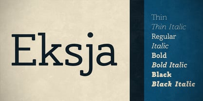 Eksja is a modern slab serif available in four weights, each with a corresponding italic. All the fonts in the family have small caps, the extended latin character set, diacritical f-ligatures, enclosed numerals (numbers in circles) and case-sensitive punctuation. The general design of the typeface has been with a strong human touch in mind. The ends of the serifs have been given a subtle rounding, just enough to take the edge off which, when coupled with the largely humanist structure of the design, creates an open, friendly and approachable design, abandoning the usual geometric severity commonly associated with slab serif typefaces. Eksja contains quite a comprehensive numerals system. Obviously, each font has the standard proportionally and tabularly spaced lining and old-style figures but, crucially, the tabular numerals share the exact same width in each font variant. That means that you can choose to use the thin, regular, bold, black and their italic forms all in the same setting and they will always line up. In addition to the 'normal' numerals there are super-script and sub-script numerals and OpenType fractions that can be automatically composed as you type. There are also the enclosed numerals, numbers inside a circle, that are useful for numerically listing items and, thanks to the wizardry of OpenType, they can contain any number of digits (typically, enclosed numerals are precomposed single digits, only encompassing the 0–9 range, the enclosed numerals in Eksja can go to double digits, triple digits or, in fact, any number of digits*). *The automation of the enclosed numerals is accessed via either "Stylistic Set #1" or "Stylistic Alternates" which requires the use of an application that supports OpenType stylistic sets or stylistic alternates, such as Adobe's InDesign or Photoshop.
 - Cabrito Inverto by insigne,
$-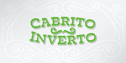 Life’s always more fun when you reverse the stress. The same goes for the new member of the Cabrito family. Cabrito itself is a recently developed slab serif made for the kid’s book The Clothes Letters Wear. Cabrito proved to be more popular than I thought, and I promised I would create an inverted style for this new addition to the font world--a variant that would pair well with the original or even stand well on its own. And so now, here it is. Cabrito Inverto, which features the reversed stress of the strokes from a font’s “normal” traits. Inverted stress fonts are most often associated with cowboys and the Old West. The inverted stress gives it a happy-go-lucky appearance, not to be taken too seriously. It’s a pleasantly rounded, not-so-strictly geometric typeface with handwriting-inspired forms. Whew, that’s a mouthful! Inverto’s bundle of alternates is accessible in any OpenType-enabled program. It contains a workforce of alternates, swashes, and alternate titling caps to embellish the font. Also bundled are swash alternates, aged design and style figures, and compact caps. Peruse the PDF brochure to examine out these solutions in action. OpenType-enabled purposes such as Adobe suite or Quark will allow ligatures and alternates. This font family also includes the glyphs for 72 different languages. Cabrito Inverto does pair well with Cabrito. There is even an extra font weight, Black, for when you want to punch it up a bit. Jeremy Dooley designed Inverto to be a welcoming, day-to-day font family. Use it to express friendliness on just about anything, from candy to food to children’s toys. Cabrito Inverto’s one-of-a-kind visual appearance brings a bundle of fun to the party. Buy Cabrito Inverto to give a boost to your designs every day of the week.
 - European Sans Pro Variable by Bülent Yüksel,
$99.00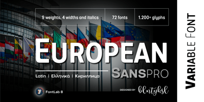 EUROPEAN SANS PRO VARIABLE ABOUT FAMILY: What makes "European Sans Pro Variable" elegant, friendly and contemporary is its very rounded curves with very open terminals. "European Sans Pro Variable" has been designed with a higher "x-height" than other fonts in its class to make tiny readability more obvious in any use situation. It will be ideal for use in small sizes such as business cards or mobile applications. This typeface is also equipped with powerful OpenType features to satisfy the most demanding professionals. It has solid features like case sensitivity, small, true capitals, full ligatures, tabular figures for tables, old style figures to elegantly insert numbers into your sentences and more alternative characters to give personality to your projects. The extended, "European Sans Pro Variable" supports around 85 languages in the Latin, Cyrillic and Greek scripts, and its non-Latin components were developed with native consultants. With over 1200+ glyphs per style, "European Sans Pro" cares about localised letterforms and has the OpenType features to match. FEATURE SUMMARY: - 9 weights: Thin, ExtraLight, Light, Book, Regular, Medium, Bold, ExtraBold, and Black. - 4 widths: Normal, Narrow, Condensed, and Extra Condensed. - Matching italics (12º) for all weights and widths . - Matching small caps for all weights and widths. - Lining and old style figures (proportional and tabular). - Alternate characters (A, G, M, N, R, U, a, g, l, m, n, u, y). - Unlimeted fractions. - Automatic ordinals (1st, 2nd, 3rd, etc.). - 24 Dingbats + 19 Social Media and Block Chain icons. - Extended language support: Most Latin-based scripts (including Vietnamese), Cyrillic, and Greek. - Extended currency support. You can contact me at buyuksel@hotmail.com, pre-purchase and post-purchase with questions and for technical support. You can enjoy using it.
 - Fioritura by Michael Rafailyk,
$11.00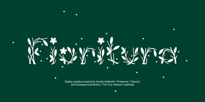 Fioritura is a floral display typeface inspired by Sandro Botticelli's "Primavera" ("Spring") and Guiseppe Arcimboldo's "The Four Seasons" paintings. Fioritura means flowering in Italian, and the character composition consists of stems, leaves, flowers, and flying pollen. Scripts: Latin, Greek, Cyrillic. Language count: 480+. Glyph count: 1103. Kerning: 936 class pairs. Hinting: Not applied. Contextual Alternates: AA BB CC DD EE FF GG LL MM NN OO PP RR SS TT ZZ aa bb cc dd ee ff gg ll mm nn oo pp rr ss tt zz. To keep the writing natural, every second of two frequently repeated letters is automatically replaced by its alternative version. Turned on by default. Contextual Alternates: ΆΈΉΊΌΎΏ. Greek uppercase accented characters lose their tonos accent and retain only dieresis in All Caps mode. Turned on by default. If you need tonos accents in All Caps then turn off Contextual Alternates (calt) feature. Stylistic Alternates: ABCDEFGLMNOPRSTZ abcdefglmnoprstz. Supported languages: Abenaki, Abron, Acheron, Achinese, Achuar-Shiwiar, Adamawa Fulfulde, Adangme, Afar, Afrikaans (Latin), Aghem, Aguaruna, Aja, Akan, Albanian, Alsatian, Amahuaca, Amarakaeri, Amis, Andaandi (Dongolawi), Anuta, Ao Naga, Apinayé, Arabela, Aragonese, Aranese, Aromanian, Arrernte, Arvanitic (Latin), Asháninka, Asturian, Asu, Atayal, Awa-Cuaiquer, Awetí, Aymara, Azerbaijani (Latin, Cyrillic), Baatonum, Bafia, Bagirmi Fulfulde, Balinese, Balkan Romani, Bambara (Latin), Baoulé, Bari, Basaa, Bashkir (Latin), Basque, Batak (Latin), Belarusian (Latin, Cyrillic), Bemba, Bena, Biali, Bikol, Bini, Bislama, Boko, Bora, Borgu Fulfulde, Bouna Kulango, Bosnian, Breton, Buginese (Latin), Bulgarian, Buryat, Bushi, Candoshi-Shapra, Cape Verdean Creole, Caquinte, Caribbean Hindustani, Cashibo-Cacataibo, Cashinahua, Catalan, Cebuano, Chachi, Chamorro, Chavacano, Chayahuita, Chechen, Chewa (Latin), Chickasaw, Chiga, Chiltepec Chinantec, Chokwe, Chuukese, Cimbrian, Cofán, Colognian, Cornish, Corsican, Creek (Muscogee), Croatian, Czech, Dagaare, Dagbani, Danish, Dawan, Dehu, Delaware, Dendi, Dholuo, Dimli, Dinka, Ditammari, Drehu, Duala, Dutch, Dungan, Dyula, Embu, English, Erzya, Ese Ejja, Esperanto, Estonian, Ewe, Ewondo, Falam Chin, Fanti, Faroese, Fijian, Filipino, Finnish, Folkspraak, Fon, French, Friulian, Frisian, Fula, Gagauz (Latin), Galician, Ga’anda, Garifuna, Gen, Genoese, German, Gikuyu, Gilbertese, Gonja, Gooniyandi, Greek, Greenlandic (Kalaallisut), Guadeloupean Creole, Guarani, Gusii (Latin), Gwich’in, Haitian, Hakha Chin (Latin), Hän, Hani, Hausa (Latin), Hawaiian, Hiligaynon, Ho-Chunk, Hopi, Hotcąk (Latin), Huastec, Hungarian, Icelandic, Ido, Igbo (Latin), Ilocano, Indonesian, Interglossa, Interlingua, Irish, Istro-Romanian, Italian, Ixcatlán Mazatec, Jamaican, Javanese (Latin), Jèrriais, Jola, Kabuverdianu, Kabiyè, Kabuverdianu, Kabyle (Latin), Kaingang, Kako, Kala Lagaw Ya, Kalaallisut, Kalenjin, Kalmyk (Cyrillic), Kamba, Kanuri, Kaonde, Kapampangan (Latin), Kaqchikel, Karachay (Cyrillic), Karakalpak (Latin), Karelian, Kashubian, Kazakh, Kekchí, Kenzi, Khalkha (Cyrillic), Khasi, Khoekhoe, K’iche’, Kikuyu, Kimbundu, Kinyarwanda (Ruanda), Kiribati, Kirmanjki, Kirundi (Rundi), Kissi, Kituba, Klingon, Kölsch, Kongo, Konzo, Koyra Chiini, Koyraboro Senni, Kpelle, Krio, Kuanyama, Kumyk, Kurdish, Kven Finnish, Kwasio, Kyrgyz (Cyrillic), Ladin, Ladino, Lakota, Lamnso’, Langi, Latgalian, Latin, Latino sine Flexione, Latvian, Ligurian, Limba, Lingala, Lithuanian, Lobi, Lojban, Lombard, Low German, Lozi, Luba-Katanga, Luba-Lulua, Luo, Luxembourgish, Luyia, Maasai, Maasina Fulfulde, Macedonian, Machame, Madurese (Latin), Makhuwa, Makonde, Makwe, Malagasy (Latin), Malaysian Malay (Latin), Maltese, Mam, Maninkakan, Manx, Maore Comorian, Māori, Mapudungun, Marquesan, Marshallese, Masai, Matsés, Mauritian Creole, Mbelime, Megleno-Romanian, Mende, Meriam Mir, Meru, Meta’ (Latin), Metlatónoc Mixtec, Mezquital Otomi, Mi’kmaq, Minangkabau, Mirandese, Mískito, Miyobe, Mizo, Mohawk, Moksha, Moldovan, Mongolian (Cyrillic), Montagnais, Montenegrin (Latin, Cyrillic), Mossi, Mundang, Munsee, Murrinh-Patha, Murui Huitoto, Mwani, Naga Pidgin, Nagamese Creole, Nahuatl, Nama, Nateni, Navajo, Ndebele, Ndonga, Neapolitan, Ngazidja Comorian, Ngiemboon, Ngiyambaa, Ngomba, Nigerian Fulfulde, Niuean, Nobiin, Nomatsiguenga, Noongar, Norwegian (Bokmål, Nynorsk), Novial, Nuer, Nyamwezi, Nyanja, Nyankole, Nyemba, Nzima, Occidental (Interlingue), Occitan, Ojitlán Chinantec, Old Icelandic, Old Norse, Onĕipŏt, Oromo, Oroqen, Oshiwambo (Ovambo), Ossetian (Latin, Cyrillic), Otuho, Páez, Palauan, Paluan, Pampanga, Papantla Totonac, Papiamentu, Pedi, Picard, Pichis Ashéninka, Piedmontese, Pijin, Pintupi-Luritja, Pipil, Pohnpeian, Polish, Portuguese, Potawatomi, Prussian, Pulaar, Pular, Purepecha, Qiandong Miao, Quechua, Rarotongan, Romani, Romanian, Romansh, Rombo, Rotokas, Russian, Rusyn, Rwa, Sakha, Samburu, Sami (Inari, Lule, Northern, Southern, Pite, Skolt, Ume), Samoan, Sango, Sangu, Saramaccan, Sardinian, Scottish Gaelic, Secoya, Sena, Serbian, Seri, Seychellois Creole, Shambala, Sharanahua, Shawnee, Shilluk, Shipibo-Conibo, Shona, Shuar, Sicilian, Silesian, Siona, Slovak, Slovene (Slovenian), Slovio (Latin), Soga, Somali, Soninke, Sorbian (Lower, Upper), Sotho (Nothern, Southern), Spanish, Sranan, Sukuma, Sundanese (Latin), Susu, Swahili, Swazi, Swedish, Swiss German, Tachelhit (Latin), Tagalog, Tahitian, Taita, Tajik (Cyrillic), Talysh, Tasawaq, Tatar (Cyrillic, Latin), Tedim Chin, Teso, Tetum, Ticuna, Timne, Tiv, Toba, Tojolabal, Tok Pisin, Tokelauan, Tonga, Tongan, Tosk, Totontepec Mixe, Tsafiki, Tshiluba, Tsonga, Tswana, Tumbuka, Turkish, Turkmen (Latin, Cyrillic), Tuvaluan, Tuvan, Twi, Tzeltal, Tzotzil, Uab Meto, Ukrainian, Ulithian, Umbundu, Urarina, Uyghur (Cyrillic), Uzbek (Latin, Cyrillic), Vai, Venda, Venetian, Veps, Vietnamese, Volapük, Võro, Vunjo, Waama, Waci Gbe, Wallisian, Walloon, Walser, Wangaaybuwan-Ngiyambaa, Waorani, Waray, Warlpiri, Wasa, Wayuu, Welsh, Wik-Mungkan, Wiradjuri, Wolof (Latin), Xavante, Xhosa, Xwela Gbe, Yagua, Yanesha’, Yangben, Yanomamö, Yao, Yapese, Yindjibarndi, Yoruba (Latin), Yucateco, Záparo, Zapotec, Zarma, Zazaki, Zulu, Zuni. The promo images used photos of Cottonbro, Maria Lindsey from Pexels, and Andreea Popa, Wyron A from Unsplash.
 - As of my last update, there is no widely recognized or documented font named "MacType" created by an individual named Timour Jgenti. It's possible there might be confusion or a mix-up with another fo...
- Nesobrite by Typodermic,
$11.95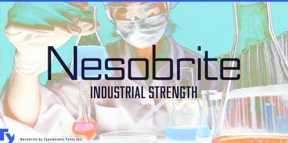 The Nesobrite typeface is a striking representation of the modern, boxy design aesthetic. Its linear, mechanical structure is the perfect embodiment of clean and neutral, with an austere edge that adds a touch of sophistication to any design. This font has been inspired by classic square-sans fonts, such as Bank Gothic and Microgramma, but with a contemporary twist that sets it apart. One of the most remarkable aspects of Nesobrite is its ability to imbue your message with a clear, professional, and authoritative voice. Its scientific vitality is sure to make your text come to life, whether it is for a technical report, a research paper, or a business presentation. The font’s versatility makes it ideal for conveying complex data and analytical information in a concise, clear, and easy-to-read manner. Nesobrite is also packed with useful features that make it an invaluable tool for any designer. Its small caps function is a useful addition for those looking to create designs that exude an air of formality and elegance. The font comes in five different widths and weights, as well as italics, which allows designers to use it in various contexts and settings. But what truly sets Nesobrite apart is its boxy design. The typeface’s clean and geometric structure is an ode to the modernist design movement, with its minimalistic and uncluttered aesthetic. Its sharp corners, angular edges, and right angles give it a distinct and eye-catching appearance that is sure to capture the attention of anyone who sees it. In conclusion, the Nesobrite typeface is the perfect tool for designers looking to create a sleek, modern, and professional look for their projects. Its linear, mechanical design, scientific vitality, and boxy design make it a versatile and dynamic font that is sure to elevate any project to new heights. With its range of weights, widths, and italics, Nesobrite is the perfect font for any designer looking to make a statement with their work. Most Latin-based European writing systems are supported, including the following languages. Afaan Oromo, Afar, Afrikaans, Albanian, Alsatian, Aromanian, Aymara, Bashkir (Latin), Basque, Belarusian (Latin), Bemba, Bikol, Bosnian, Breton, Cape Verdean, Creole, Catalan, Cebuano, Chamorro, Chavacano, Chichewa, Crimean Tatar (Latin), Croatian, Czech, Danish, Dawan, Dholuo, Dutch, English, Estonian, Faroese, Fijian, Filipino, Finnish, French, Frisian, Friulian, Gagauz (Latin), Galician, Ganda, Genoese, German, Greenlandic, Guadeloupean Creole, Haitian Creole, Hawaiian, Hiligaynon, Hungarian, Icelandic, Ilocano, Indonesian, Irish, Italian, Jamaican, Kaqchikel, Karakalpak (Latin), Kashubian, Kikongo, Kinyarwanda, Kirundi, Kurdish (Latin), Latvian, Lithuanian, Lombard, Low Saxon, Luxembourgish, Maasai, Makhuwa, Malay, Maltese, Māori, Moldovan, Montenegrin, Ndebele, Neapolitan, Norwegian, Novial, Occitan, Ossetian (Latin), Papiamento, Piedmontese, Polish, Portuguese, Quechua, Rarotongan, Romanian, Romansh, Sami, Sango, Saramaccan, Sardinian, Scottish Gaelic, Serbian (Latin), Shona, Sicilian, Silesian, Slovak, Slovenian, Somali, Sorbian, Sotho, Spanish, Swahili, Swazi, Swedish, Tagalog, Tahitian, Tetum, Tongan, Tshiluba, Tsonga, Tswana, Tumbuka, Turkish, Turkmen (Latin), Tuvaluan, Uzbek (Latin), Venetian, Vepsian, Võro, Walloon, Waray-Waray, Wayuu, Welsh, Wolof, Xhosa, Yapese, Zapotec Zulu and Zuni.
 - Steagal by insigne,
$24.75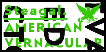 I love geometric sans serifs, their crispness and rationality. Le Havre taps into this style, but for a while, I've wanted to create a font recalling the printed Futura of the 1940s, which seems to have an elusive quality all its own. After seeing an old manual on a World War II ship, I developed a plan for "Le Havre Metal" but chose to shelve the project due to Le Havre's small x-height. That's where Steagal comes in. When Robbie de Villiers and I began the Chatype project in early 2012 (a project which led one publication to label me the Edward Johnston of Chattanooga!), we started closely studying the vernacular lettering of Chattanooga. During that time, I also visited Switzerland, where I saw how designers were using a new, handmade aesthetic with a geometric base. I was motivated to make a new face combining some of these same influences. The primary inspiration for the new design came from the hand-lettering of sign painters in the United States, circa 1930s through 1950s. My Chatype research turned up a poster from the Tennessee Valley Authority in Chattanooga, Tennessee, which exhibited a number of quirks from the unique hand and style of one of these sign artists. Completing the first draft of Steagal, however, I found that the face appeared somewhat European in character. I turned then to the work of Morris Fuller Benton for a distinctly American take and discovered a number of features that would help define Steagal as a "1930s American" vernacular typeface--features I later learned also inspired Morris Fuller Benton's Eagle. The overall development of Steagal was surprisingly difficult, knowing when to deliberately distort optical artifacts and when to keep them in place. Part of type design is correcting optical illusions, and I found myself absentmindedly adjusting the optical effects. In the end, though, I was able to draw inspiration from period signs, inscriptions, period posters, and architecture while retaining just enough of the naive sensibility. Steagal has softened edges, which simulate brush strokes and retain the feeling of the human hand. The standard version has unique quirks that are not too intrusive. Overshoots have almost been eliminated, and joins have minimal corrections. The rounded forms are mathematically perfect, geometric figures without optical corrections. As a variation to the standard, the “Rough” version stands as the "bad signpainter" version with plenty of character. Steagal Regular comes in five weights and is packed with OpenType features. Steagal includes three Art Deco Alternate sets, optically compensated rounded forms, a monospaced variant, and numerous other features. In all, there are over 200 alternate characters. To see these features in action, please see the informative .pdf brochure. OpenType capable applications such as Quark or the Adobe Creative suite can take full advantage of the automatically replacing ligatures and alternates. Steagal also includes support for all Western European languages. Steagal is a great way to subtly draw attention to your work. Its unique quirks grab the eye with a authority that few typefaces possess. Embrace its vernacular, hand-brushed look, and see what this geometric sans serif can do for you.
 - Alright, let's talk about Cocaine Sans by Chris Hansen. Imagine a font that not only captures your attention but also holds it hostage with its bold, unapologetic style. That's Cocaine Sans for you. ...
- bowellberalta - Personal use only

- Denne Threedee, created by Denise Bentulan, is a highly distinctive and creatively inspired font that instantly breathes life into any project it graces. This particular typeface stands out for its u...
- Drummon 3D by GemFonts | Graham Meade stands out in the bustling city of typography like a neon sign at a Las Vegas casino, beckoning the eyes of passersby with its undeniably bold and three-dimensio...
- Imagine a font that wakes up in the morning, blasts motivational anthems, and high-fives itself in the mirror. Meet "YES!" — the typographical equivalent of a double espresso shot infused with pure o...
- DDD Cubic is a distinctive and visually engaging font created by D3, which embodies a modern and geometric approach to typography. This font stands out due to its cubic and block-like structure, offe...
- Spoonbread by Hanoded,
$15.00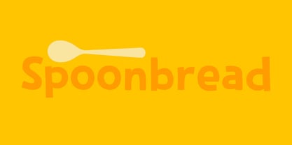 I originally wanted to call this font Instant Pudding. When I was a kid, we sometimes had instant pudding (the ‘add cold milk and rest in the fridge’ kind) for dessert. My brother and I loved the stuff, especially when some of the pudding powder had not dissolved and had turned into brightly coloured speckles! But this font, alas, did not ‘feel’ like instant pudding, so I hunted the internet for other, more obscure, puddings. I found Spoonbread. Apparently it is a pudding-like Southern American dish, made from cornmeal. I have never tasted it, nor do I particularly like corn (most of it is GMO anyway), but the font and the name became friends. And who am I to tear this beautiful relationship asunder? Spoonbread - use it for your packaging, your books, your posters and your games. And when you make Spoonbread, use organic cornmeal!
 - Marihouse Script by Lettersams,
$9.00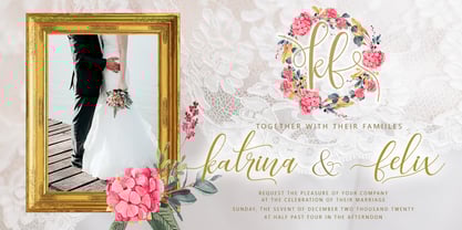 Marihouse Script is a beautiful calligraphy design, including Regular and italic. This font is enough with a sweep. Can be used for various purposes. such as logos, product packaging, wedding invitations, branding, titles, signs, labels, signatures, book covers, posters, quotes and more. Marihouse script displays alternative OpenType styles, ligatures and Various International for most Western languages. To enable OpenType Stylistic alternates, you support programs that support OpenType features like Adobe Illustrator CS, Adobe Indesign & CorelDraw X6-X7, Microsoft Word 2010 or later. Marihouse script is encoded with PUA Unicode, which allows access to all features without special design software. Mac users can use Font Books, and Windows users can use Character Map to view and copy extra characters to paste into your favorite app / text editor. If you need help or have any questions, please let me know or send email "lettersams@gmail.com" I am happy to help :) Thanks & Happy Designing!
 - Mountain by Volcano Type,
$29.00Mountain is a digital revival and extension of Teutonia, an old metal typeface released by the Roos & Junge type foundry (Offenbach am Main, Germany) in 1902. Teutonia’s design was popular during both the Art Nouveau and the Constructivist eras, where similar letterforms could be seen as far away as the Soviet Union. Although it slipped under the radar during the 1930s and 40s, this style feels extremely contemporary today. Mountain’s underlying geometric feeling is reminiscent of pixels and grids, suiting it for application with music and art, as well as history. Yet this typeface is not as static as it seems at first glance; playful diagonals—like those seen on the capitals D, L, P, and W—enliven the otherwise stern horizontal and vertical motion. Teutonia was a simple upper and lowercase display type. Mountain adds upon these by adding small caps and obliqued italic companions, rounding out this typographic toolkit. - Hello Georgina Script by Letterfreshstudio,
$15.00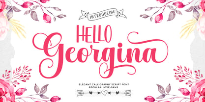 Hello Georgina Script is a new modern script font with an irregular base line. Trendy and feminine style. Hello Georgina Script looks beautiful in wedding invitations, thank-you cards, quotes, greeting cards, logos, business cards, and more. Perfect for use in ink or watercolors. Including initial letters and terminals, alternatives and support for many languages. To activate the OpenType Stylistic alternative, you need a program that supports OpenType features such as Adobe Illustrator CS, Adobe Indesign & CorelDraw X6-X7, Microsoft Word 2010 or newer versions. There are additional ways to access alternatives / swash, using Character Map (Windows), Nexus Fonts (Windows), Font Books (Mac) or software programs such as PopChar (for Windows and Mac). How to access all alternative characters: https: //www.youtube.com/watch? v = Go9vacoYmBw https: //www.youtube.com/watch? v = XzwjMkbB-wQ Need help or have questions, let me know. I am happy to help :) Thank you & Congratulations on the Design!
 - Gineso Titling by insigne,
$19.00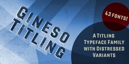 Before the Great War, there were great posters. Posters of elegance and grandeur. Posters calling people to the pleasures of sunny southern France and to the perfections of northern Italy’s dolce vita. Le Havre, based on a poster by AM Cassandre, was one of my first typefaces that took inspiration from this genre. Now, the golden memories of years past are the inspiration for insigne design’s new Gineso Titling as well. Gineso revives the retro forms of past poster design with its newly crafted sense of humanity, which is amplified by a great variety of texture options. While the new forms are perfect for posters, this titling font is also ideal for bringing the charm of pre-war Southern Europe to a new bottle of wine, to fine foods and beverages, and to high-end logotypes. For the grandeur and elegance you need in your titling, look to Gineso Titling.
 - Sirathal by Malindo Creative,
$9.00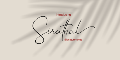 Introducing, Sirathal is a Signature types,with a Sirathal, making your design look very beautiful,it is suitable for all types of printing, clothing, invitations, mugs, books, business cards,etc. The Features includes: Alternates, Swashes, Ligatures, Stylistic Set. Linguage Support: €Š‹ŚŤŽŹ‘’“”™š›śťžźˇ˘¦§¨©Ş«®Ż±˛ąş»Ľ˝ľżŔÁÂĂÄĹĆÇČÉĘËĚ ÍÎĎĐŃŇÓÔŐÖŘŮÚŰÜÝŕáâăäĺćçčéęëěíîďđńňóôőö÷řůúűüý˙Ā¢àèêùˆ˚ This font is PUA encoded which means you can access all of the glyphs and swashes with ease! To enable the OpenType Stylistic alternates, you need a program that supports OpenType features such as,Adobe Indesign,Adobe Illustrator CS & CorelDraw X6-X7, Microsoft Word 2010 or later versions. If There Any questions, Please Let Me Know,Contact me,at malindocreative@gmail.com,Your support and suggestion is needed, And I am Happy To Help You. Thanks For Looking And support,Hopefully Useful,And Good Luck For You,Love you all.
 - Kimberia Script by Lettersams,
$10.00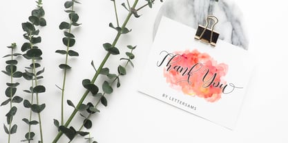 Kimberia script is a modern calligraphy design, including Regular and italic. This font can be used for various purposes. such as logos, product packaging, wedding invitations, branding, titles, signs, labels, signatures, book covers, posters, quotes and more. Kimberia script displays alternative OpenType styles, ligatures and Various International characters for most Western languages. To enable OpenType Stylistic alternates, use programs that support OpenType features like Adobe Illustrator CS, Adobe Indesign & CorelDraw X6-X7, Microsoft Word 2010 or later. Kimberia script is encoded with PUA Unicode, which allows access to all features without special design software. Mac users can use Font Books, and Windows users can use Character Map to view and copy extra characters to paste into your favorite app / text editor. If you need help or have any questions, please let me know or send email "lettersams@gmail.com" I am happy to help :) Thanks & Happy Designing!
 - Badhorse by Angga Mahardika,
$15.00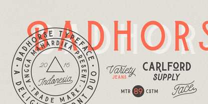 I created this font in 2016 with the name “Burtons”, and now here I am turning it into “Badhorse”. If you’re looking for the perfect touch of vintage flair for a design project, Badhorse is an exceptional choice. Pairing a rustic serif with a decorative handwritten script, Badhorse offers two distinct type designs that complement one another beautifully. This font duo is effective on product packaging, particularly for wares that prefer a handcrafted, artisan approach to their finished presentation. Badhorse is ideal for strong branding, identity, and logo design, as its letter forms effortlessly express a tone of familiarity, reliability, and timelessness. Advertising spreads and menu layouts will also take advantage of this modern classic, conjuring a sense of nostalgia and comfort in the viewer. Badhorse offers stylistic alternates and ligatures through OpenType, as well as symbols, punctuation, and international characters for additional language support.
 - Wintanceastre by Hanoded,
$25.00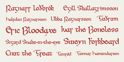 I am a HUGE fan of Bernard Cornwell’s ‘The Saxon Stories’. Ever since a television series has been made, the series of books is also know as ‘The Last Kingdom’. I have read them all, at break-neck speed and I can’t wait for the next book!! Wintanceastre (Winchester) is based on a 10th century Latin manuscript. I have tried to stay close to the original letters, but since Latin does not have all modern glyphs, I found myself designing the missing ones. So, before you scold me for having made a font that is historically inaccurate: it was never meant to be an exact replica, nor would anyone want an exact replica, as it would be useless for modern texts and designs. Wintanceastre comes with a whole bunch of ligatures and alternate glyphs. Use it for any design that needs a little ‘Dark Ages’ look!
 - Beautiful Day Script Duo by Letterfreshstudio,
$12.00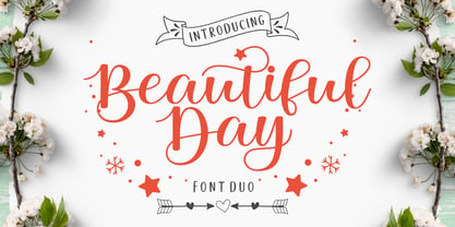 Beautiful Day Script Font DUO is a new modern script font with an irregular base line. Trendy and feminine style. Beautiful Day Script looks beautiful in wedding invitations, thank-you cards, quotes, greeting cards, logos, business cards, and more. Perfect for use in ink or watercolors. Including initial letters and terminals, alternatives and support for many languages. To activate the OpenType Stylistic alternative, you need a program that supports OpenType features such as Adobe Illustrator CS, Adobe Indesign & CorelDraw X6-X7, Microsoft Word 2010 or newer versions. There are additional ways to access alternatives / swash, using Character Map (Windows), Nexus Fonts (Windows), Font Books (Mac) or software programs such as PopChar (for Windows and Mac). How to access all alternative characters: https: //www.youtube.com/watch? v = Go9vacoYmBw https: //www.youtube.com/watch? v = XzwjMkbB-wQ Need help or have questions, let me know. I am happy to help :) Thank you & Congratulations on the Design!
 - Ambrossius Script by Zane Studio,
$20.00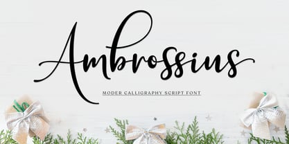 Ambrossius Script is a new modern script font with an irregular base line. Trendy and feminine style. Ambrossius Script looks beautiful in wedding invitations, thank you cards, quotes, greeting cards, logos, business cards, and more. Perfect for use in ink or watercolors. Including beginning and end letters, alternatives and support for many languages. To activate the OpenType Stylistic alternative, you need a program that supports OpenType features such as Adobe Illustrator CS, Adobe Indesign & CorelDraw X6-X7, Microsoft Word 2010 or newer versions. There are additional ways to access alternatives / swashes, using Character Maps (Windows), Nexus Fonts (Windows), Font Books (Mac) or software programs such as PopChar (for Windows and Mac). How to access all alternative characters: https: //www.youtube.com/watch? v = Go9vacoYmBwhttps: //www.youtube.com/watch? v = XzwjMkbB-wQhttps: //www.yo ... need help or have questions, let me know I am happy to help :) Thank you & Congratulations on Design
 - Threefortysixbarrel by Typodermic,
$11.95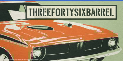 Rev your engines and get ready to add some muscle to your typography with Threefortysixbarrel, the ultimate typeface for those who live life in the fast lane. This high-octane typeface was peeled right off the air filter of a 1970 Plymouth Barracuda. With Threefortysixbarrel, you’ll be able to proclaim your message with confidence and authority. This no-nonsense alphabet is barely street legal, just like the muscle cars it takes inspiration from. And with three different styles to choose from, you can customize your typography to match your message perfectly. First up, we have Threefortysixbarrel. This is the serious, clean version of the font, with a powerful personality that commands attention. It’s perfect for when you need to make a statement that can’t be ignored. If you’re looking for a more vintage feel, Threefortysixbarrel Intake is the way to go. This style features a realistic rusty letterpress effect that will make your typography look like it’s been around since the golden age of muscle cars. It’s perfect for adding a touch of nostalgia to your designs. And finally, we have Threefortysixbarrel Exhaust. This style is raspy and faded, barely hanging on—just like a muscle car that’s been pushed to its limits. It’s the perfect choice when you want your typography to have a scruffy, worn-in feel. But that’s not all—the textured styles of Threefortysixbarrel also include custom pairs that will be substituted automatically in apps that can handle OpenType ligatures. This means that repeated character textures will be broken up, resulting in an even more realistic, scruffy effect. So what are you waiting for? Grab the pistol grip, slam the pedal down, and peel out with Threefortysixbarrel. This typeface is the ultimate choice for anyone who wants to add some serious muscle to their designs. Most Latin-based European writing systems are supported, including the following languages. Afaan Oromo, Afar, Afrikaans, Albanian, Alsatian, Aromanian, Aymara, Bashkir (Latin), Basque, Belarusian (Latin), Bemba, Bikol, Bosnian, Breton, Cape Verdean, Creole, Catalan, Cebuano, Chamorro, Chavacano, Chichewa, Crimean Tatar (Latin), Croatian, Czech, Danish, Dawan, Dholuo, Dutch, English, Estonian, Faroese, Fijian, Filipino, Finnish, French, Frisian, Friulian, Gagauz (Latin), Galician, Ganda, Genoese, German, Greenlandic, Guadeloupean Creole, Haitian Creole, Hawaiian, Hiligaynon, Hungarian, Icelandic, Ilocano, Indonesian, Irish, Italian, Jamaican, Kaqchikel, Karakalpak (Latin), Kashubian, Kikongo, Kinyarwanda, Kirundi, Kurdish (Latin), Latvian, Lithuanian, Lombard, Low Saxon, Luxembourgish, Maasai, Makhuwa, Malay, Maltese, Māori, Moldovan, Montenegrin, Ndebele, Neapolitan, Norwegian, Novial, Occitan, Ossetian (Latin), Papiamento, Piedmontese, Polish, Portuguese, Quechua, Rarotongan, Romanian, Romansh, Sami, Sango, Saramaccan, Sardinian, Scottish Gaelic, Serbian (Latin), Shona, Sicilian, Silesian, Slovak, Slovenian, Somali, Sorbian, Sotho, Spanish, Swahili, Swazi, Swedish, Tagalog, Tahitian, Tetum, Tongan, Tshiluba, Tsonga, Tswana, Tumbuka, Turkish, Turkmen (Latin), Tuvaluan, Uzbek (Latin), Venetian, Vepsian, Võro, Walloon, Waray-Waray, Wayuu, Welsh, Wolof, Xhosa, Yapese, Zapotec Zulu and Zuni.
 - North point - Unknown license

- 3 Prong Tree - Unknown license

- Bay Tavern by FontMesa,
$25.00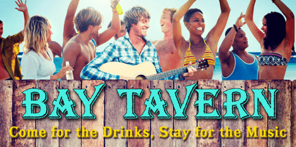 Bay Tavern is the first weathered version of our Tavern font that's based on Algerian. With three weights, open faced and outline versions to choose from you're sure to find the right style for your new project, restaurant menu, logo, t-shirt design or Pirate costume party. Bay Tavern includes all the same alternates as our regular Tavern font family. While our original Tavern font has been increased to include five weights additional weights for Bay Tavern will have to wait for now, adding the notched cut in's were all done by hand which causes a lot of cramping so a long break is needed before creating the extra weights. The Fill fonts in the Bay Tavern family are meant to be used with Bay Tavern Open fonts, if you're using Bay Tavern Open then select Bay Tavern Fill, if you're using Bay Tavern Open L then select Bay Tavern Fill L, if you're using Bay Tavern Open S then select Bay Tavern Fill S, if you're using Bay Tavern Open SL then select Bay Tavern Fill SL, the same rule goes for the Open X version.
 - Cora by TypeTogether,
$49.00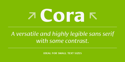 Cora is a sans serif with an experimental bent, offering a large x-height, some contrast of stroke weight, and capitals inspired by classical lettering. The large x-height gives it a voice with a little more volume so that those in the back of the room have no trouble hearing. Because the letters seem slightly large, Cora remains clear at smaller point sizes. It is a typeface intended to perform well on screen without losing its attraction in print and the nature of its shapes allows for condensation or expansion without becoming severely distorted. The uppercase exhibits classical proportions found in ancient Roman inscriptions, which provides opportunities for setting titles in all caps. Cora Opentype Pro has a full range of numerals for every use, small caps, the most common open type features and supports many languages that use the latin extended alphabet. It is available in a range of three weights plus Italics. CoraBasic is a reduced version of Cora. It is still an OT-font but without any particular features except of a set of ligatures, class-kerning and language support including CE and Baltic.
 - Roster by Fenotype,
$35.00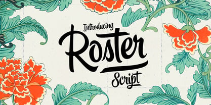 Roster is a strong brush script family of two weights, caps and a set of ornaments. Roster is great for any kind display use from advertising to packaging and from online to branding. Roster is clear and legible even in smaller sizes and works for longer texts too, but is at it’s best when used for shorter sentences or even just for one or two word display or logo use. Roster is equipped with plenty of Ligatures and Contextual alternates that are automatically activated as long as you keep Standard Ligatures feature on. These features help to maintain the flow and add on some variation when writing with Roster. If you need more than that there is at least three Alternates for each basic character: click on Swash, Stylistic or Titling Alternates in any OpentType savvy program or check out for even more alternates from the Glyph Palette. Since uppercase letters in Roster are mainly designed as initials I made Roster Caps for an all caps version of the capital letters. Roster Caps can be used on it’s own or to support Roster Script. Roster Ornaments is a set of swashes and brush strokes designed to support the font.


