3,203 search results
(0.021 seconds)
- Whitehall 1212 - Unknown license

- 1812 by Apostrof,
$40.00 '1812' type family is a revival and further development of the typeface '1812' by Lehmann Type Foundry (St. Petersburg). It was created for the centenary of the French invasion of Russia, known in Russia as the Patriotic War of 1812 along the lines of decorative engraved inscriptions and ornamented typefaces of that time, presumably by the artist Alexandre Benois. It was used mainly for the decoration of luxurious elegant publications. Later, in 1917, this typeface was used on the Russian Provisional Government banknotes. In the Soviet period of time '1812' appeared to be one of the few typefaces included in the first Soviet type standard OST 1337. It was produced for manual typesetting until the early 1990s. This typeface could be seen on Soviet letterheads, forms, posters and even air tickets. The digital version development was launched in 2010. The original version was supplemented with lowercase letters and alternative symbols, the extended Latin and Cyrillic alphabets were fully supported. The font was evolved into a family of 14 decorative styles which can refine any design giving it a festive and elegant but at the same time strict and nostalgic look. Despite its decorative nature, '1812' is perfectly readable in small emphasized text blocks due to its classic shape and careful spacing.
 - Marathon - Unknown license

- Maritha by Doehantz Studio,
$21.00 Maritha is a gorgeous, cursive and thick lettered handwritten font, crafted to give your headlines and logotype projects a stylish touch. This font reads as strong, confident, and dynamic and can add tons of nostalgic character to your designs. Maritha is PUA encoded which means you can access all of the glyphs and swashes with ease!
 - Marithin by DYSA Studio,
$19.00 Marithin is a New Modern Display Typeface. This another collection of Serif is perfect for your next branding project, excellent for your business. Marithin have a smooth edges, so this font gives an authentic handcrafted feel style.
 - Marthias by Maculinc,
$15.00 Marthias is a stylish font with a mix of modern and retro looks, very helpful for layout design projects, posters, logos, brands, packaging, vintage and modern style designs or for other designs. Marthias is displayed between uppercase and lowercase letters in the same form, and Marthias is also equipped with multilingual to support more of your needs. Mail support : maculinc@gmail.com Thank you! Maculinc
 - Maracay by John Moore Type Foundry,
$39.95 Maracay is a tropical typeface that works for texts or headlines, mainly as a display font and designed to work in layers of overlapping texts. Maracay is a unique design with nine fonts based creating a particular style of design and the combination of a couple different looks can be obtained eighteen. Thanks to the versatility of coloring matter, together form a coherent and attractive ideal for a variety of different projects such as invitations, menus, magazines, brochures, packaging, design, etc. Maracay provides alternate characters, swash, ligatures, icons, ordinals and fractions. Maracay has 4 shape styles : Regular Maracay base as essential as Tooled variations of brightness or wood with the appearance of a WoodType vintage wooden texture . Inner font as serves as Light or inner contour of the foregoing. Follow three fonts contouring as Outline, Shape and Umbra as a 3D projection. For decorative purposes Shape that there is a textured lines or Half as a split in the top half letter. Maracay has been carefully studied to provide the best combinations of the most of pairs and trios of glyphos avoiding undesirable extensions between ornate characters through its Opentype programming.
 - Maraton by Din Studio,
$29.00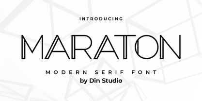 Maraton is a modern display font. Made for any professional project branding. It is the best for logos, branding and quotes. Every letter has a unique and beautiful touch. Includes: Maraton (OTF) Features: PUA Encoded Multilingual Support Numerals and Punctuation Thank you for downloading premium fonts from Din Studio
 - Marathon by Linotype,
$29.99Marathon was originally designed by Rudolf Koch in 1931 for Schriftgiesserei Klingspor. It is a roman with short ascenders and descenders. The serifs are small, but longer at the ends of the arms of E, F and L, M is rather splayed and is without top serifs, like M in other typefeaces designed by Rudolf Koch. The lowercase g has no link and an open tail, again like the g in other Koch types. U has the lower-case design. In the W the middle strokes cross, the lower case w has no middle serif. The figures are short-ranging. Ute Harder from the Fachhochschule Hamburg had redesigned Marathon with the help and supervision of Professor Jovica Veljovic. She has added a book weight to offer more flexibility with this beautiful typeface. - Mariachi by FontMesa,
$25.00 Mariachi is a new condensed version of our Maison Luxe font which is a revival of an old 1800's classic ornate French font. This new 2021 condensed version takes this old classic to an all new level by adding small caps, italics and a new solid black version. Mariachi is perfect for headlines and logos from advertising to product labels, t-shirt lettering and restaurant menus. Fill fonts are also part of this family, new to this font style is the half fill font for creating a two color effect on the letters, you'll need an application that works in layers to use the fill fonts in Mariachi. The regular fill font for Mariachi isn't meant to be used as a stand alone font so we've created a solid black version with thicker serifs on top and adjusted outlines throughout for a better appearance as a solo font. The difference between Mariachi and our Mi Casa font is that Mariachi has a squared off shadow on the top half of the letters. We hope you enjoy Mariachi as much as we did making it. Mariachi is a trademark of FontMesa LLC
 - Maretha by Arterfak Project,
$15.00 Introducing our latest creation, Maretha Font Duo, a set of two fonts designed for good combinations. Script and Sans, 2 different styles that allows you to make a great custom combination of lettering designs. These fonts include some features such like alternates, swashes and ligatures to give you more options accessible in Adobe Photoshop, Illustrator, CorelDraw, etc. Maretha Script also has individual swashes you can apply in any lowercase-letters by pressing 'underscore' and 'number 0-9'. These vintage minimalism fonts are great for any design project such as vintage logos, store fonts, clothing brand, label design, wedding invitations, quotes, craft and much more.
 - Harashi by Maulana Creative,
$11.00 Harashi is a Handwritting brush font inspired by the classic Japanese brush stroke, it is casual and cool font. Harashi includes opentype features Ligatures and Alternate lowercase. It support multilingual more than 100+ language. This font is good for logo design, Movie Titles , Books Titles and any awesome project you create. Make stunning work with Harsh Brush font. Thanks for use this font, MaulanaCreative
 - Melathy by Awan Senja,
$14.00 Melathy is a script calligraphy font. It looks stunning on wedding invitations, thank you cards, quotes, greeting cards, logos, business cards and every other design which needs a handwritten touch. Add it to your most creative ideas and notice how it makes them come alive!
 - Maritha by MJB Letters,
$17.00 Maritha is a classy handwritten script, it has beautiful beginning and ending swashes, this font is perfect for branding design, packaging, logo design, watermark, fashion design, wedding invites, and more. this font includes the full set of lowercase and uppercase letters, numeral, punctuation, multilanguage support, titling, and ending swashes.
 - Marthin by Subectype,
$18.00 Introducing Marthin - a new modern signature font with elegant lines that makes this font perfect for your personal branding and any awesome project, such as logos, invitations, stationery, wedding designs, social media posts, advertisements, product packaging, product designs, labels, photography, watermarks, special events and much more !
 - Shredded - Unknown license

- Shred by Canada Type,
$24.95 Shred is the result of staring at so-called three-dimensional shapes for days on end, then capping the meditation by eating the white light at the end of the tunnel and sweating it out a blade a second. Bliss is overrated. Sharpness is where it's at. Get slicin'.
 - Shrek by words+pictures,
$20.00 - Sheree by Typadelic,
$14.95 Inspired by mid-century greeting card hand-lettering, Sheree is a unique serif font with some really fun qualities. While some characters are distinctly calligraphic and conformist in nature, Sheree bounces all over the baseline, displaying an unconventional attitude all her own.
 - 1312 Sugoi by Ezequiel Filoni,
$10.00 Sugoi means super in Japanese, which it's what the design tries to show as well. A strong, easy-to-read, tittle font. *Uppercase
 - 1512 Initials by GLC,
$20.00 This set of initial decorated letters is an entirely original creation, drawn inspired by Italian renaissance patterns. It contains two roman alphabets : one drawn in white on black background and the other in black on white. We have included a few fleurons and decorative elements. It can be used as variously as web-site titles, posters and flyers design, publishing texts looking like ancient ones, or greeting cards, all various sorts of presentations, as a very decorative, elegant and luxurious additional font... This font supports strong enlargements remaining very smart and fine. It's prefered height is about one inch equivalent to about four lines of characters. This font may be used with all blackletter fonts, but works especially well with 1543 Humane Jenson, 1557 Italique and 1742 Civilite, without any anachronism.
 - 1312 Lamberet by Ezequiel Filoni,
$10.00 Lamberet is a geometric sans-serif typeface, all caps display font. Has a clean, sharp and emphatic form especially suitable for headlines, headings, branding, posters, packaging, titles, logos or whatever. It comes in its italics forms for regular sharp and soft versions. - Uppercase
 - Deva Ideal by DizajnDesign,
$49.95 Deva Ideal was inspired by women’s beauty. It didn’t come only from the desire to create a new typeface. It also seeks to materialize beauty in a visual form. Instead of imitating the shapes of the female body or other formal attributes, Deva Ideal is an abstract expression of the women’s beauty. The unique character of the typeface is achieved by the use of soft, almost invisibly bent strokes, since one of the priorities of the typeface is not to disturb the eye of the reader with odd design details. Deva Ideal excels in her cold beauty and shows her sex appeal. The soft curves present in Deva Ideal differ from the masculine and technical shapes used in most contemporary typefaces. Deva Ideal has ideal proportions (90 / 60 / 90) and its shapes are essential and simple. Because of this, it is ideal for setting text in all kinds of printed matter: catalogues, books and magazines. The letter forms are wide and open, so text can be set in small sizes and thus space can be saved, while keeping the same degree of readability. The author wishes to acknowledge František Štorm for his invaluable opinions. Also to Palo Bálik and Peter Bilak for their contributions. I am specially grateful to all the devas (archaic expression for beautiful young girl), who inspired me to design this typeface. This is dedicated to Janka Ráczová, Jarka Krajčiová, Mariana Felgueiras and obviously to Martinka Filípková! Every use of Deva Ideal is a little homage to these interesting women.
 - Martie by Canada Type,
$25.00From the heart of the Blue Ridge Mountains, by way of Toronto, comes Martie's handwriting. Martie Byrd is a school teacher in Roanoke, Virginia, and a friend of Canada Type's Rebecca Alaccari. After years of admiring the cheer and clarity of Martie's handwriting, we asked her to write out full alphabets for some cool font treatment. The intent was to do three different versions of her writing in two different pens, then use the auto-magic of OpenType to determine letter sequences and rotate character sets on the fly when the fonts are in use. A successful endeavor it was. Take a look at the images in the MyFonts gallery to see the character rotation in action, along with a visual explanation of why Martie is not just another handwriting font. Unlike other available felt tip and ballpoint handwriting fonts, the regular and bold variations are style-based, not weight-based. They are the handwritten expressions of two different Sharpie pens: The fine point one (Martie Bold), and the ultrafine one (Martie Regular). The style-based variation considerably helps the realism needed in design pieces that take advantage of the contrast of two different handwriting fonts. Weight thickening in handwriting is an obvious mechanical effect that only happens with computers. Weight changing by replacing pens is what happens in the real world. Martie Pro and Martie Pro Bold each contain three different character sets in a single font. Language support includes Western, Central and Eastern European languages for all three sets. This translates into each Pro font containing over 750 characters. Add OpenType code and stir, and you have true handwriting fonts with versatility unavailable out there in anything else of the genre. A software program that supports OpenType features is needed to use the randomization coded in Martie Pro and Martie Pro Bold. Current versions of QuarkXpress and Adobe applications (Photoshop, Illlustrator, InDesign) do contain support for the randomization feature. But if you don't have one of these apps, you can still use the interchangeable Type 1 or True Type fonts and change the characters manually to achieve the appearance of true handwriting. The Martie fonts come in a variety of price packages, from the affordable single fonts to value-laden complete sets. All the proceeds from these fonts received by Canada Type will be donated 50/50 to two primary schools: One in Roanoke (where Martie teaches), and one in Toronto (where the 10-year old, real Canada Type boss goes). So next time a design project needs a handwriting font, do the write thing and use Martie to keep it real. - Marat by Ludwig Type,
$45.00 Although originally conceived as a magazine face – with strong serifs and open character shapes for good legibility in small sizes, and compact letter forms optimized for narrow columns and tight headlines – Marat evolved into a comprehensive family for general use. This specific construction and the round forms of the letters create an elegant, soft and friendly appearance. The typeface suits a wide range of typography, e.g. editorial, brochures, packaging and corporate design. In particular, in bold weights it works surprisingly well, which is not always the case with serif faces. Marat includes oldstyle and lining figures (both proportional and tabular), a wide range of language support and various OpenType features (e.g. ligatures, case-sensitive forms, fractions, superiors and inferiors). It is the perfect companion for Marat Sans, a clean and lively sans serif typeface. Marat has been selected by the Type Directors Club of New York to receive the Certificate of Excellence in Type Design 2008.
 - Geometric 212 by Bitstream,
$29.99 - 112 Hours by Device,
$9.00 Rian Hughes’ 15th collection of fonts, “112 Hours”, is entirely dedicated to numbers. Culled from a myriad of sources – clock faces, tickets, watches house numbers – it is an eclectic and wide-ranging set. Each font contains only numerals and related punctuation – no letters. A new book has been designed by Hughes to show the collection, and includes sample settings, complete character sets, source material and an introduction. This is available print-to-order on Blurb in paperback and hardback: http://www.blurb.com/b/5539073-112-hours-hardback http://www.blurb.com/b/5539045-112-hours-paperback From the introduction: The idea for this, the fifteenth Device Fonts collection, began when I came across an online auction site dedicated to antique clocks. I was mesmerized by the inventive and bizarre numerals on their faces. Shorn of the need to extend the internal logic of a typeface through the entire alphabet, the designers of these treasures were free to explore interesting forms and shapes that would otherwise be denied them. Given this horological starting point, I decided to produce 12 fonts, each featuring just the numbers from 1 to 12 and, where appropriate, a small set of supporting characters — in most cases, the international currency symbols, a colon, full stop, hyphen, slash and the number sign. 10, 11 and 12 I opted to place in the capital A, B and C slots. Each font is shown in its entirety here. I soon passed 12, so the next logical finish line was 24. Like a typographic Jack Bauer, I soon passed that too -— the more I researched, the more I came across interesting and unique examples that insisted on digitization, or that inspired me to explore some new design direction. The sources broadened to include tickets, numbering machines, ecclesiastical brass plates and more. Though not derived from clock faces, I opted to keep the 1-12 conceit for consistency, which allowed me to design what are effectively numerical ligatures. I finally concluded one hundred fonts over my original estimate at 112. Even though it’s not strictly divisible by 12, the number has a certain symmetry, I reasoned, and was as good a place as any to round off the project. An overview reveals a broad range that nonetheless fall into several loose categories. There are fairly faithful revivals, only diverging from their source material to even out inconsistencies and regularize weighting or shape to make them more functional in a modern context; designs taken directly from the source material, preserving all the inky grit and character of the original; designs that are loosely based on a couple of numbers from the source material but diverge dramatically for reasons of improved aesthetics or mere whim; and entirely new designs with no historical precedent. As projects like this evolve (and, to be frank, get out of hand), they can take you in directions and to places you didn’t envisage when you first set out. Along the way, I corresponded with experts in railway livery, and now know about the history of cab side and smokebox plates; I travelled to the Musée de l’imprimerie in Nantes, France, to examine their numbering machines; I photographed house numbers in Paris, Florence, Venice, Amsterdam and here in the UK; I delved into my collection of tickets, passes and printed ephemera; I visited the Science Museum in London, the Royal Signals Museum in Dorset, and the Museum of London to source early adding machines, war-time telegraphs and post-war ration books. I photographed watches at Worthing Museum, weighing scales large enough to stand on in a Brick Lane pub, and digital station clocks at Baker Street tube station. I went to the London Under-ground archive at Acton Depot, where you can see all manner of vintage enamel signs and woodblock type; I photographed grocer’s stalls in East End street markets; I dug out old clocks I recalled from childhood at my parents’ place, examined old manual typewriters and cash tills, and crouched down with a torch to look at my electricity meter. I found out that Jane Fonda kicked a policeman, and unusually for someone with a lifelong aversion to sport, picked up some horse-racing jargon. I share some of that research here. In many cases I have not been slavish about staying close to the source material if I didn’t think it warranted it, so a close comparison will reveal differences. These changes could be made for aesthetic reasons, functional reasons (the originals didn’t need to be set in any combination, for example), or just reasons of personal taste. Where reference for the additional characters were not available — which was always the case with fonts derived from clock faces — I have endeavored to design them in a sympathetic style. I may even extend some of these to the full alphabet in the future. If I do, these number-only fonts could be considered as experimental design exercises: forays into form to probe interesting new graphic possibilities.
 - Dev Gothic - Unknown license

- LT Marathon - 100% free

- Marathon Serial by SoftMaker,
$15.99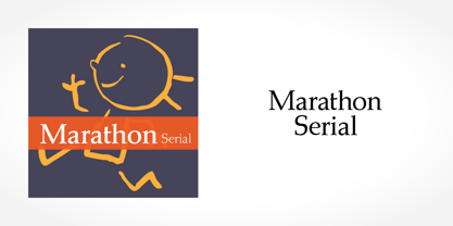
- El Mariachi by IKIIKOWRK,
$17.00 Introducing El Mariachi - Libre Type, created by ikiiko. El Mariachi is a unique typeface inspired by a Mexican vibe. A simple, bold sans serif typeface combined with attractive ligatures gives this font a strong character. This font is perfect to create layout for vintage design, mexican brand product, movie poster, food packaging, fashion product, and another fun project to a have unique or vintage look. What's included? Uppercase & Lowercase Number & Punctuation Ligature Multilingual Support Get also a good offer & FREEBIE at our site : www.ikiiko.com Enjoy our font and if you have any questions, you can contact us by email : ikiikowrk@gmail.com
 - Marthine Diamond by Timurtype,
$14.00 Introduced by Timurtype Studio! Marthine Diamond is a Modern Handbrushed Script Font This font unlocks the appeal of contemporary design with a modern handwritten font, a symphony of sophistication and spontaneity. This font effortlessly combines the precision of digital craftsmanship with the organic flow of hand-drawn elegance. Each letter is a brushstroke of innovation, adding a dynamic and bespoke touch to your project. The sleek curves and smooth lines of modern hand script fonts create visual harmony, infusing your designs with a sense of stylish authenticity. Enhance your creative expression, as these fonts integrate seamlessly into a modern aesthetic, offering the perfect balance between avant-garde pieces and timeless works of art. Let your words take on a new dimension, where art blends technology and tradition, giving life to a contemporary narrative that is visually striking and uniquely yours Marthine Diamond Font also supports multilingualism. Enhance your designs with our original fonts, feel free to comment or provide feedback, Enjoy the fonts 😊 Thank You
 - Art-Nouveau 1912 - 100% free

- Pea Martha - Personal use only

- Pea Martha - Unknown license

- Salty Malthy by MJB Letters,
$15.00 Salty Malthy is a beautiful display font it made with perfect combining of each characters and looks original and can be used for all your project needs.
 - Old Earthy by Gustav & Brun,
$16.00 Old Earthy is a hand drawn font inspired by the mid 19th-century art movement with William Morris and the Pre-Raphaelite Brotherhood in the front line. The art and the patterns from that time is reflected in Old Earthy. It comes with a set of basic English/Latin letters and some west European diacritics.
 - Martha Script by Hrz Studio,
$14.00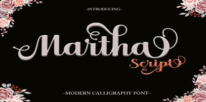 Martha Script feels equally charming and elegant. It looks stunning on wedding invitations, thank you cards, quotes, greeting cards, logos, business cards, and any other design that needs a handwritten touch. This font is PUA encoded, which means you can access all of the glyphs and swashes with ease!
 - Zeroes Three - Unknown license

- Three-Sixty - Unknown license


Page 1 of 81Next page