10,000 search results
(0.03 seconds)
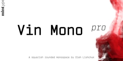
- Vin Mono Pro by Mint Type,
$35.00Vin (translated from Ukrainian as “he”) is a superfamily consisting of three robust typefaces with pronounced vertical stems and rounded corners. All three typefaces feature very large x-height for even more expression and assertiveness. Vin Mono Pro is a squarish monospaced font family with extra-large x-height and rounded corners. It is characterized by evident straight elements even in horizontal stems. Be sure to check other two typefaces of Vin superfamily: Vin Sans Pro and Vin Slab Pro . - Shocker by Vozzy,
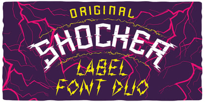
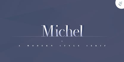
$10.00 - Michel by sugargliderz,
$20.00 - Psych Handlettering by Mysterylab,
$14.00Here's a font system distilled from the lettering styles of a thousand vintage psychedelic rock albums and posters from the swingin' sixties. All of the grooviness, but perhaps twice the legibility of some of the more "far out" examples from the genre. This family features an extensive character set and multilingual glyphs, so you can say "Trippy, Man." in many languages. The three versions allow you to harmonize letter bodies and highlight strokes with the color palette of your project Once loaded on your system, the three versions of the font show in your menu as the following three "weights": Psych Handlettering Bold, Psych Handlettering Incised, and Psych Handlettering Highlight. The 3-alphabet collection works together seamlessly to allow you to assign one color to the body of the letter, and a second color to the inset highlight lines. Just copy your text block, paste in place, reassign the font to the "highlight" version, choose a complimentary color, and off you go. - Excalibur SCF by Scholtz Fonts,
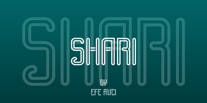
$21.00Let it be known that this font is named for Excalibur, King Arthur's Magic Sword. The font is derived from a note that Arthur hastily penned to his Queen, Guinevere, during a lull in one of his many battles against the Saxons. Arthur's armour was so hefty that he could not easily seat himself, and so to pen his letter to Guinevere he plunged his legendary sword Excalibur into the marshy soil on which he had been fighting and thereby steadied his writing hand with the hasp of his magical sword. This ancient and battle-weary font is based on the writing from a fragment of that original document. It has been heralded by modern scholars as "grunge" writing of great antiquity. The font Excalibur SCF contains a full character set and it is professionally letterspaced and kerned. Use this font to create a feeling of haste, of authentic ancient history, of magical times, of chivalry, of dragons and of brave battles fought. - Shai by Efe Avcı,
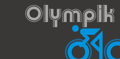
$19.00 - Olympik by The Northern Block,
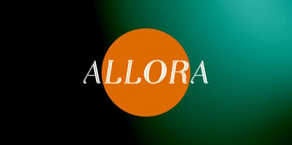
$16.70 - Allora by Etewut,
$30.00 - PIXymbols Signet Classic by Page Studio Graphics,
$29.00A font package to generate traditional three-letter monogram designs, or a single initial. Includes 29 borders, each accessed by a single keystroke on the computer keyboard. The borders will automatically line up with the initials. - Chocolate Pro by Sudtipos,
$79.00Most everyone agrees that chocolate is irresistible. Now the Koziupa & Paul tag team is offering you a choice of three irresistible flavors, from the bittersweet Amargo, to the mouth-watering Dulce, you now have three different possibilities for the pleasure of your taste buds. The OpenType versions includes de 3 flavors all in one. - Kubrickle by Discourse Type,
$29.00Kubrickle is an unique typeface release by the Discourse Type foundry. It comes in three styles a block, stencil and swash. The swash types comes with an large set of special ligatures that can give you titles an edge. Combine the three different styles to create dynamic typography suitable for album covers, magazines and flyers. - Mr Happy by Hipopotam Studio,
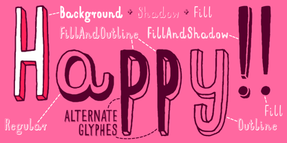
$22.00Hand drawn narrow typeface designed for one of our books. You can layer different styles over the background style to achieve lots of colorful effects. Use just one style to get a single color letter or set the shadow and fill over the background style to get a full, three color mode. Mr Happy has upper and lowercase characters with up to three alternate glyphs. Build in OpenType Contextual Alternates feature will automatically set alternate glyphs depending on frequency of appearance of the same character (even in web font but only in HTML5 browsers). The script doesn’t throw random glyphs. For example in the word “HIPPOPOTAMUS” you will automatically get three different “P” glyphs and two “O” glyphs. It really works great but of course you can always fine tune it by hand. - Digdope by Holis.Mjd,
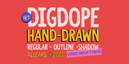
$10.00 - Sanseki by Hanoded,
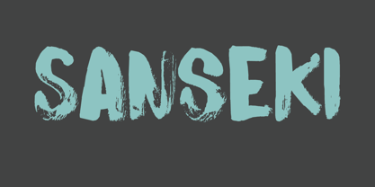
$20.00The term Sanseki (Japanese for Three [Brush] Traces) is used to describe three famous Heian period calligraphers: Yaseki, Gonseki and Saseki. Not that I would ever dream of comparing my messy brush-work with theirs, but the name stuck and I kind of liked it. I used Chinese ink and a high quality brush (which I got in a sale actually) to create this font. All glyphs were hand painted in one go! Sanseki is a very detailed brush font. Upper and lower case letters mingle and there’s even an alternate for every lower case glyph. Comes with an abundance of diacritics. - RaveParty Wide - Unknown license
- RaveParty Oblique - Unknown license
- RaveParty Narrow - Unknown license
- RaveParty Poster - Unknown license
- RaveParty Offset - Unknown license
- RaveParty Hollow - Unknown license
- Bubble Block by Sipanji21,
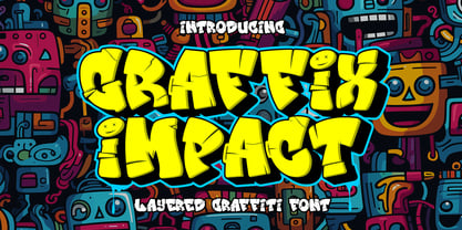
$15.00Bubble Block" is a 3D layered graffiti font that encompasses solid, shadow, and inner shadow styles, offering the tools to create a three-dimensional appearance in your text. Fonts with layered styles like this are often utilized in graffiti art, posters, or other designs that aim to create a prominent 3D effect. By using the solid, shadow, and inner shadow layers in "Bubble Block," you can add depth and dimension to your text, giving it a dynamic and visually impactful 3D appearance. This font enables you to create text that stands out prominently and grabs attention due to its three-dimensional effect and layered style. - St Atmos by Stereotypes,
$29.00 - Coreopsis by Andrew Harper Fonts,
$19.00 - Adobe Handwriting by Adobe,
$29.00A trio of fonts based on the handwriting of some of Adobe?s own designers. The three eponymous styles of the family ? Ernie, Frank, and Tiffany ? each have a unique flavor with its own rhythm and character. - Joanna Solotype by Monotype,
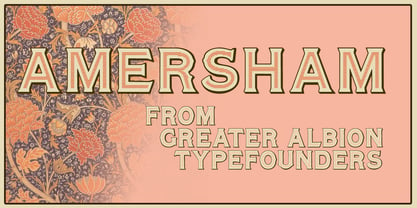
$29.99Joanna Solotype is a headline typeface with Art Deco influence. The geometric shapes of the characters are emphasized by the three-line thick strokes. Use the Joanna Solotype font for book jackets and posters, signage and packaging. - Amersham by Greater Albion Typefounders,
$16.00Amersham is a family of three copperplate display roman typefaces inspired by traditional sign writing techniques. The family consists of three typefaces which can also be overlayed to achieve multiple coloured typography. Use the Amersham family for headings, posters with a period theme and signage with flair. Just the thing for a retro-CD cover as well. - Troika by ArtyType,
$24.00Naming this typeface Troika, the Russian word meaning "group of three", seemed apt because the starting point in this design process was a three sided letter 'O'. This triangular type styling became a template guide for the rest of the character set. Troika is a highly distinctive, ultra modern typeface with idiosyncratic letterforms that make for striking headlines, particularly at large display sizes. Challenging, futuristic and experimental, always unique, and with caps as characterful as the lower case. Troika being derived from the French 'Triangle' and the Latin 'Triangulus' it seemed only fitting to design three weights: Light, Medium & Bold. - African Elephant Trunk by Dharma Type,
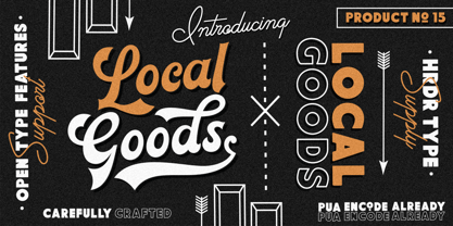
$14.99 - Local Goods by HRDR,
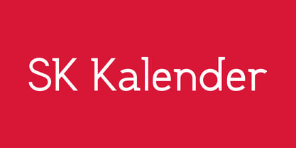
$10.00 - SK Kalender by Salih Kizilkaya,
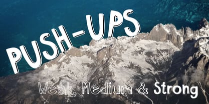
$9.99 - Push Ups by Gustav & Brun,
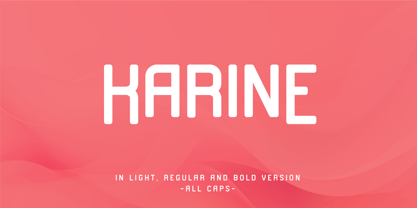
$10.00 - Karine by Mightyfire,
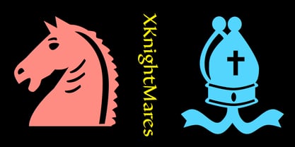
$10.00 - XKnightMares by Ingrimayne Type,
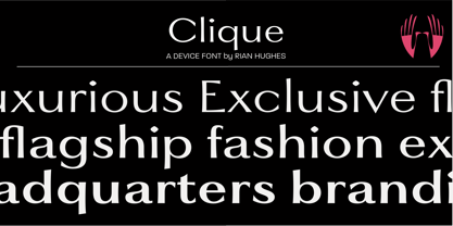
$6.00 - Clique by Device,
$29.00 - Artisan Roman by Monotype,
$29.99Artisan Roman is one of 10 typefaces in the Engravers 1 volume. Artisan Roman is designed to give a three-dimensional look. The Artisan Roman font has highlights on the thick strokes giving the letters a raised appearance. - Ultra Condensed by Outside the Line,
$19.00Ultra Condensed is a three-font family with a full character set. Ultra Condensed is a remastering of Tall Skinny Condensed from 1999 which continues to be a favorite. While similar, the fonts are not interchangeable. Shapes of some letters have changed, kerning and spacing are different. Tall Skinny Condensed does not have a full character set. Ultra Condensed Lettered is a hand lettered version of the hard edged Ultra Condensed. Ultra Condensed Line also hand lettered, is a thinner version of Ultra Condensed Lettered. These three fonts work well together or with a non condensed font, great for headlines at a large size. Works well for lots of copy in a small space. - AndrewAndyCollege by Ingrimayne Type,
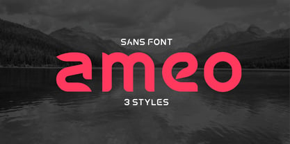
$13.95 - Ameo by artsterdam,
$5.00 - Groovy Happy by Haksen,
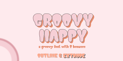
$18.00GROOVY HAPPY FONT A hand-drawn, bubbly font with a groovy look! There are three fonts included : Regular Outline Extrude. GROOVY HAPPY is perfect for: shirts, retro designs, procreate, stickers, logos, branding, greeting cards, Cricut projects, posters, magazines, social media, prints and more! Have a great day, Haksen - Compagnon by Hanoded,
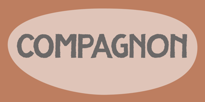
$15.00Compagnon is a friend, a partner. This handmade display font will come in super handy when you are working on that book cover, or the packaging of a product. It will shine on posters and websites and it will keep you warm at night. I guess that last bit is an exaggeration… Compagnon comes in three distinct styles: a ‘regular’ version, which is a bit rough around the edges, a ‘dirty’ version, with a juicy eroded look and a polka dot version. All three have their accompanying italics.
