10,000 search results
(0.135 seconds)
- As of my last update in 2023, no official font directly named "Ren & Stimpy" exists as it would pertain specifically to the iconic American animated television series "The Ren & Stimpy Show" which ai...
- As of my last update, there is no widely recognized or officially classified typeface named Brother Bear. However, the concept of a font named "Brother Bear" immediately invokes a specific mood and a...
- As of my last update in April 2023, "Safrole" is not widely recognized as a standard or famous font within the vast typography landscape. It’s possible that "Safrole" could be a bespoke or less commo...
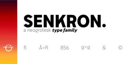
- Senkron by Gurup Stüdyo,
$19.00Senkron is composed of "normal" and a "blok" styles. Senkron ("normal") was designed as a pure and modern neo grotesk font. The anatomy of the letters are designed to achieve an equal text color. For this purpose, the legs of the letters “R” and "K" are designed with a vertical angle to prevent the white space that would occur in the middle of these letters. In the minuscule, the characteristic features of letters such as ‘a’, ‘l’, ‘t’ are concretized and legibility is supported in the text. Considerable attention has been paid to the harmony between the anatomical structures of the letters and the diacritical mark’s structure. Senkron Blok is arranged for situations which have diacritical marks overflow to leadings of the headline and headline typographical color is affected negatively from this situation. For this purpose, majuscule diacritical letters are resolved within the letter height. However, when this is done, new forms are obtained by integrated diacritical marks with letters instead of directly merging them. The idea behind this approach is to preserve the typographic value of diacritical marks and emphasize the semantic value of diacritical letters. 82 letters have been redesigned in this way. - HiH Firmin Didot by HiH,
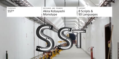
$10.00Before Bodoni, there was Didot. With the publication by Francois Ambroise Didot of Paris in 1784 of his prospectus for Tasso’s La Gerusalemme Liberata, the rococo typographical style of Fournier de Jeune was replaced with a spartan, neo-classical style that John Baskerville pioneered. The typeface Didot used for this work was of Didot’s own creation and is considered by both G. Dowding and P. Meggs to be the first modern face. Three years later, Bodoni of Parma is using a very similar face. Just as Bodoni’s typeface evolved over time, so did that of the Didot family. The eldest son of Francois Ambroise Didot, Pierre, ran the printing office; and Firmin ran the typefoundry. Pierre used the flattened, wove paper, again pioneered by Baskerville, to permit a more accurate impression and allow the use of more delicate letterforms. Firmin took full advantage of the improved paper by further refining the typeface introduced by his father. The printing of Racine’s Oeuvres in 1801 (seen in our gallery image #2) shows the symbiotic results of their efforts, especially in the marked increase in the sharpness of the serifs when compared to their owns works of only six years earlier. It has been suggested that one reason Bodoni achieved greater popularity than Didot is the thinner hairlines of Didot were more fragile when cast in metal type and thus more expensive for printers to use than Bodoni. This ceased to be a problem with the advent of phototypesetting, opening the door for a renewed interest in the work of the Didot family and especially that of Firmin Didot. Although further refinements in the Didot typeface were to come (notably the lower case ‘g’ shown in 1819), we have chosen 1801 as the nominal basis for our presentation of HiH Firmin Didot. We like the thick-thin circumflex that replaced the evenly-stroked version of 1795, possible only with the flatter wove paper. We like the unusual coat-hanger cedilla. We like the organic, leaf-like tail of the ‘Q.’ We like the strange, little number ‘2’ and the wonderfully assertive ‘4.’ And we like the distinctive and delightful awkwardness of the double-v (w). Please note that we have provided alternative versions of the upper and lower case w that are slightly more conventional than the original designs. Personally, I find the moderns (often called Didones) hard on the eyes in extended blocks of text. That does not stop me from enjoying their cold, crisp clarity. They represent the Age of Reason and the power of man’s intellect, while reflecting also its limitations. In the title pages set by Bodoni, Bulmer and Didot, I see the spare beauty of a winter landscape. That appeals to a New Englander like myself. Another aspect that appeals to me is setting a page in HiH Firmin Didot and watching people try to figure out what typeface it is. It looks a lot like Bodoni, but it isn't! - SST by Monotype,
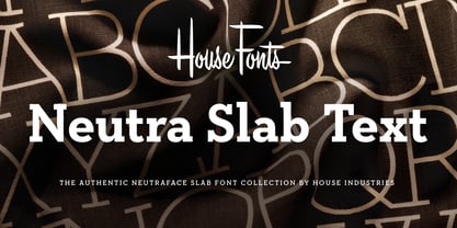
$82.99Designed for global branding and supporting 93 languages, the SST® typefaces blend the organic readability and controlled structure of modern sans serif designs. In combining these attributes, the SST family is understated, versatile – and sure to be a timeless design. The SST Pan-European family has 17 fonts in total, supporting the W1G character set. It spans six weights from ultra light to heavy, each with an italic complement. In addition, three condensed designs and two monospaced (typewriter) typefaces were drawn to further expand the family’s vast range of uses. SST’s subtle design traits provide a quietly handsome and consistently friendly typographic presence that can be used for just about any typographic application. Broad range branding applicability combined with coverage for almost a hundred languages, makes SST one of the most widely accessible and usable typefaces available. Originally designed in partnership with the global consumer brand, Sony, the SST family is one of the most comprehensive type families available. Since extensive multi-lingual support was a critical design goal from the beginning, Akira Kobayashi, Monotype type director and primary designer on the project, turned to a network of local designers around the world for their individual language expertise. As a result, the details – which could be as subtle as stroke curvature and width – are consistent across Latin, Greek, Cyrillic, Arabic and multiple Asian languages. SST performs equally well in print and on-screen and the designs can be used at very small sizes in packaging and catalogs; while massive print headlines – even complicated wayfinding projects pose no stumbling blocks to the family’s typographic dexterity. While the family is also large enough to manage complicated typographic hierarchy, SST pairs handsomely with typefaces as far reaching as ITC Berkeley Old Style®, Meta®, PMN Caecilia®, Malabar® and Neue Swift®. - Neutraface Slab Text by House Industries,
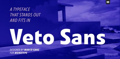
$33.00From fine print and red ink in corporate annual reports to huge three dimensional signage, Neutraface has become the definitive designers’ workhorse. Now this geometric juggernaut boasts even more font firepower with the addition of the Neutraface Slab family. Neutraface Slab features five display weights, four text weights with italics plus a unique stencil style that work together like a typographic symphony or can stand alone like accomplished soloists. Just like its sans-serif counterparts, Neutra Slab Text includes small caps, seven figure styles and a host of other sophisticated OpenType features that have been integrated in a single seamless package. The complementary display weights afford an uncompromising statement that can range from thin and delicate to bold and bombastic. FEATURES: MORE ALTS: Neutraface Slab comes with several alternate characters, accessed through either OpenType stylistic sets or through the Stylistic Alternates feature. TITLING ALTERNATES: The distinctive lower crossbars of the original Neutraface are included in Neutraface Slab as the Titling Alternates OpenType feature. TEXT FIGURES: All variations of Neutraface Slab Text feature seven figure styles. Included are text figures for use in running text, lining figures for use with uppercase forms and small caps figures. Each of these styles is supplemented with tabular figures for use in columnar settings. Plus, superscript and subscript figures are included for use in fractions, footnotes, etc. NEUTRAFACE SLAB CREDITS: Typeface Design: Christian Schwartz, Kai Bernau, Susana Carvalho Typeface Production: Ben Kiel, Hannes Famira Typeface Direction: Christian Schwartz, Andy Cruz, Ken Barber Like all good subversives, House Industries hides in plain sight while amplifying the look, feel and style of the world’s most interesting brands, products and people. Based in Delaware, visually influencing the world. - Veto Sans by Monotype,
$50.99Veto® Sans is both highly legible and handsomely distinctive – a rare blend in a typeface. It’s a design that stands out and fits in. Veto Sans is equally competent on screen and in print. It’s four carefully determined weights in both normal and condensed proportions, each with an italic complement, give the family an exceptionally deep range of applications. All the designs in the family are valuable design tools. None are superfluous. Advertising, brand, corporate, editorial and interactive design are all in Veto Sans’ wheelhouse. It also shines in wayfinding and other signage projects. And to all these, it brings a warmth and personality. An ample x-height, open counters, vertical stroke endings and subtly condensed capital letters enable Veto Sans fonts to perform with grace in print and digital environments while being space efficient. An added benefit is that all-capital typography set in Veto Sans is not only space saving, it’s also easy to read. Drawn as a complete reimaging of his earlier Veto design, Swiss designer Marco Ganz worked to create character shapes distilled to their purest forms while maintaining a relaxed and natural demeanor. Ganz, who is also a three-dimensional artist, is acutely aware that the negative space between letters and the internal space within letters is as important as the positive shape of the letters themselves. This dynamic balance between the negative and positive aspects of character forms gives Veto Sans a sense of immediacy without looking hurried. Ganz also took great care to draw a suite of italic designs that not only complement the roman weights perfectly, but also give the family a dynamic verve. A large international character set also ensures ease of localization. “Veto Sans,” says Ganz, “is a typeface for designers that search for a new and different solution to age-old typographic challenges.” - Text Tile by Tetradtype,
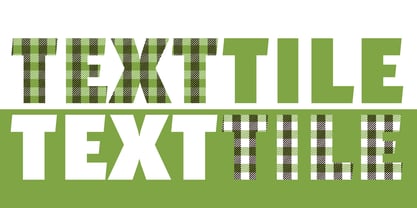
$25.00TextTile is a system of heavy sans titling faces which can be utilized to carry a repeating chromatic pattern across words and letters. It stands apart from other chromatic faces, where layered effects typically interact only within each letter and do not carry through from one letter to another. The pattern repetition across letters of varying widths is achieved through OpenType substitution, using conditional alternates for each successive letter to allow for a seamless appearance across words, regardless of letter combinations. Though the pattern exists on a strict grid and the letters' widths and spacing must be highly regular in order to preserve the pattern repeat, the letterforms themselves are not rigid; rather, they appear organic, lively. The initial release includes patterns inspired by a classic buffalo plaid, separated into its horizontal and vertical components to maximize the creative possibilities for layering one-, two-, three-, and even four-color plaid patterns. Kits are available to produce the plaid pattern in detail—with overlapping diagonal hatching fully visible—or as a simplified version in which transparency can be used to simulate plaid or to create a checkered or striped effect. The TextTile family of fonts is a flexible canvas for mixing and matching a broad array of patterns to create a unique look. Check back for more pattern releases and take a look at the online specimen to see what is possible with the current offerings. Usage Notes For best results use an OpenType aware program. Enabling Contextual Alternates will ensure pattern alignment. For patterns that are made up of vertical stripes or columns using the Stylistic Alternate/Stylistic Set 1 will shift the columns. Stylistic Set 2 will change 1-0 into blocks of patterns. - Journal Sans New by ParaType,
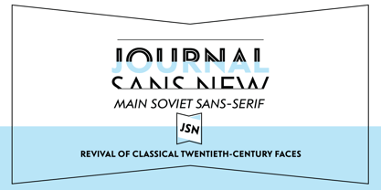
$40.00The Journal Sans typeface was developed in the Type Design Department of SPA of Printing Machinery in Moscow in 1940–1956 by the group of designers under Anatoly Schukin. It was based on Erbar Grotesk by Jacob Erbar and Metro Sans by William A. Dwiggins, the geometric sans-serifs of the 1920s with the pronounced industrial spirit. Journal Sans, Rublenaya (Sans-Serif), and Textbook typefaces were the main Soviet sans-serifs. So no wonder that it was digitized quite early, in the first half of 1990s. Until recently, Journal Sans consisted of three faces and retained all the problems of early digitization, such as inaccurate curves or side-bearings copied straight from metal-type version. The years of 2013 and 2014 made «irregular» geometric sans-serifs trendy, and that fact affected Journal Sans. In the old version curves were corrected and the character set was expanded by Olexa Volochay. In the new release, besides minor improvements, a substantial work has been carried out to make the old typeface work better in digital typography and contemporary design practice. Maria Selezeneva significantly worked over the design of some glyphs, expanded the character set, added some alternatives, completely changed the side-bearings and kerning. Also, the Journal Sans New has several new faces, such as true italic (the older font had slanted version for the italic), an Inline face based on the Bold, and the Display face with proportions close to the original Erbar Grotesk. The new version of Journal Sans, while keeping all peculiarities and the industrial spirit of 1920s-1950s, is indeed fully adapted to the modern digital reality. It can be useful either for bringing historical spirit into design or for modern and trendy typography, both in print and on screen. Designed by Maria Selezeneva with the participation of Alexandra Korolkova. Released by ParaType in 2014. - Burpology by Typodermic,
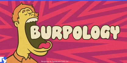
$11.95Hey, cats and kittens! Dig this groovy font we got for ya—Burpology! It’s the perfect typeface for all your cartoon headline needs. With its heavy weight, small counters, and tight spacing, you’ll be making a visual footprint that’ll knock ’em out! And that’s not all, daddy-o! Burpology comes equipped with automatic shuffling of three letter and numeric variations in OpenType-savvy apps, giving your words that cool, hand-drawn vibe. It’s like having your very own in-house cartoonist! So, if you want to add some serious pow and pizzazz to your headlines, just hit up your application’s contextual alternates or standard ligatures option and watch the magic happen. Don’t be a square, man—get Burpology and let your words do the talkin’! Most Latin-based European writing systems are supported, including the following languages. Afaan Oromo, Afar, Afrikaans, Albanian, Alsatian, Aromanian, Aymara, Bashkir (Latin), Basque, Belarusian (Latin), Bemba, Bikol, Bosnian, Breton, Cape Verdean, Creole, Catalan, Cebuano, Chamorro, Chavacano, Chichewa, Crimean Tatar (Latin), Croatian, Czech, Danish, Dawan, Dholuo, Dutch, English, Estonian, Faroese, Fijian, Filipino, Finnish, French, Frisian, Friulian, Gagauz (Latin), Galician, Ganda, Genoese, German, Greenlandic, Guadeloupean Creole, Haitian Creole, Hawaiian, Hiligaynon, Hungarian, Icelandic, Ilocano, Indonesian, Irish, Italian, Jamaican, Kaqchikel, Karakalpak (Latin), Kashubian, Kikongo, Kinyarwanda, Kirundi, Kurdish (Latin), Latvian, Lithuanian, Lombard, Low Saxon, Luxembourgish, Maasai, Makhuwa, Malay, Maltese, Maori, Moldovan, Montenegrin, Ndebele, Neapolitan, Norwegian, Novial, Occitan, Ossetian (Latin), Papiamento, Piedmontese, Polish, Portuguese, Quechua, Rarotongan, Romanian, Romansh, Sami, Sango, Saramaccan, Sardinian, Scottish Gaelic, Serbian (Latin), Shona, Sicilian, Silesian, Slovak, Slovenian, Somali, Sorbian, Sotho, Spanish, Swahili, Swazi, Swedish, Tagalog, Tahitian, Tetum, Tongan, Tshiluba, Tsonga, Tswana, Tumbuka, Turkish, Turkmen (Latin), Tuvaluan, Uzbek (Latin), Venetian, Vepsian, Võro, Walloon, Waray-Waray, Wayuu, Welsh, Wolof, Xhosa, Yapese, Zapotec Zulu and Zuni. - ALS FinlandiaScript by Art. Lebedev Studio,
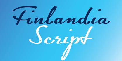
$63.00Some 40 km north of Helsinki, surrounded by meadows and a serene Finnish lake, lies Ainola, the former home and now museum of composer Jean Sibelius (1865–1957). I know the place quite well, since it is only a stone’s throw away from the art school where I began my graphic design studies. We sometimes went there after classes—a beautiful walk, especially in spring, when the days were getting longer, the snow melting in the sun and the ice cracking on the lake. The composer often professed his love for this landscape and found constant inspiration in its moods, sounds and scents during different seasons. For many people, Sibelius and his music, most notably his famous symphonic poem Finlandia, are a symbol of Finland. I decided to name the typeface family I’m presenting here FinlandiaScript, because it owes its influence to both Sibelius’ manuscripts and the Finnish landscape around Ainola. The shape of letters, their poise and the rhythm they create resemble Sibelius’ handwriting without copying it. The letters form gently flowing lines of text which is legible without giving up individuality. The font family comes in three styles: FinlandiaScript, FinlandiaScript Bold and FinlandiaScript Frost. Together they are perfect for magazines, websites and brands aiming to create a personal and sincere image. While the fine details of FinlandiaScript Frost are best suitable for display sizes, FinlandiaScript and FinlandiaScript Bold work well in both headlines and texts of smaller sizes. Hundreds of ligatures give them an especially flexible appearance. The FinlandiaScript family contains Western, Central European and Extended Cyrillic character sets and supports almost 100 languages. It is best suited for Opentype savvy programs with the “standard ligatures” and “contextual alternates” features turned on. - Monarda by Monotype,
$29.99Monarda™ is Terrance Weinzierl’s take on the loud and splashy brush scripts of the 1950s. It’s energetic, playful, and equally at home in hardcopy headlines as it is in interactive banners. In addition to the basic alphabet, OpenType® fonts of Monarda are also awash in super-sized swash caps, contextual alternate characters and ligatures. Pair Monarda with a mid-century structural sans like Trade Gothic® or a sturdy slab serif like Egyptian Slate™ to create typographic counterpoint that’s confident, compelling and memorable! Named for a riotous bright red flower that attracts butterflies and humming birds, Monarda is a rare combination of flamboyance and effortless beauty. Weinzierl describes it as “casual yet precise: a stiff denim jacket or perfectly white sneakers at a formal event.” Monarda clearly stands out – and always fits in. Well, almost always. Drawn for print, the design’s robust x-height, open counters and wide apertures also make Monarda screen-friendly. Monarda can be perfect for a wide variety of food and lifestyle applications as well as travel, stationery and packaging projects. Advertising campaigns and product branding are also well within its reach. Monarda works best when used large – but economically. Two or three words are its sweet spot. Think: product name, print headline or the lettering on the side of a truck. It could easily become your go-to design for projects that call for a script with a bright personality and fearless demeanor. The excellence of Weinzierl’s work has been recognized by the Type Directors Club and Print Magazine. When not working on creating new typefaces, he augments his professional practice through calligraphy, lettering, and letterpress printing. Monarda is another winner from Weinzierl’s creative mind and talented hand. - ITC Bolthole by ITC,
$29.99I fell in love at the age of twelve in Wales, recalls Bernard Philpot. "My father brought me to a small graveyard in the Welsh hills to show me two headstones carved by the great Eric Gill. I instantly fell in love with the beauty of the carving and the perfection of the letterforms. I still go back to marvel at these works of art." However, the ITC Bolthole™ design, Philpot's first commercial typographic endeavor, is quite unlike the works of Eric Gill that first captured his heart. Bolthole is a craggy sans serif with a definite grumpy attitude. It's not terribly legible, and, if more than a few words are set in the design, it's not very readable. To round out its cranky personality, Bolthole does not like to be set in small sizes. Like Cheez Whiz® and bullfights, you either love or hate this typeface. But whichever emotion dominates, there is no denying that Bolthole has a personality to be reckoned with - one with ample magnetism to ensure reader attraction. If used to set brief blocks of display copy, the typeface makes a powerful statement. Bolthole was originally designed to complement a whimsical ad for the Royal Society for the Prevention of Cruelty to Animals. As Philpot recalls, "although the ad didn't win any awards, the type attracted some very positive comments for its original look and feel." Philpot studied graphic design and typography at the London School of Printing, and soon after graduation found himself working in a large advertising agency in London. According to Philpot, "After designing type for everything from packaging to ads, I thought it time to convert one of my designs into a complete font - and Bolthole was born." ITC Bolthole could very well be the Shrek™ of typeface design - which might not be such a bad thing." - Nawin Arabic by Letterjuice,
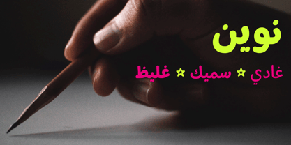
$43.00Nawin is an informal Arabic typeface inspired by handwriting. The idea behind this design is to create a type family attractive and ownable for children but at the same time a design that keeps excellent letter recognition for reading. Handwriting has been a great source of inspiration in this particular typeface. By emulating the movements of the pen, we have obtained letter shapes that express spontaneity. A bright group of letters create a lively and beautiful paragraph of text. To get closer to handwriting and the variety of letter shapes that we draw while writing, this typeface offers a large number of alternative characters, which differ slightly from the default ones. Because we have programed the «Contextual Alternate» feature in the fonts, these alternate characters appear automatically as you set a text on your computer. The proportions and letter shapes are flexible, escaping from tradition to increase expressivity and personality in the design. For instance, variability on vertical proportions between letters Alef and initial Lam, create movement in text and avoid the cold mechanical feel of repetition. Nawin is quirky and elegant at the same time. Letter recognition is relevant when reading continuous text. For this reason, we have added another contextual alternate feature with alternate characters that help to avoid confusion when letters with similar or the same shape repeat inside one word. For instance, this is the case of medial «beh and Yeh» repeated three times continuously in the same word. The alternate characters change in shape and length, facilitating distinction to the reader. Since this typeface is inspired by handwriting and the free movement of the hand while writing, we considered ligatures a good asset for this design. The typeface has a wide range of ligatures that enhance movement and fluidity in text making look text alive. - Neutraface Slab Display by House Industries,
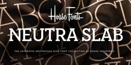
$33.00From fine print and red ink in corporate annual reports to huge three dimensional signage, Neutraface has become the definitive designers’ workhorse. Now this geometric juggernaut boasts even more font firepower with the addition of the Neutraface Slab family. Neutraface Slab features five display weights, four text weights with italics plus a unique stencil style that work together like a typographic symphony or can stand alone like accomplished soloists. Just like its sans-serif counterparts, Neutra Slab Text includes small caps, seven figure styles and a host of other sophisticated OpenType features that have been integrated in a single seamless package. The complementary display weights afford an uncompromising statement that can range from thin and delicate to bold and bombastic. FEATURES: MORE ALTS: Neutraface Slab comes with several alternate characters, accessed through either OpenType stylistic sets or through the Stylistic Alternates feature. TITLING ALTERNATES: The distinctive lower crossbars of the original Neutraface are included in Neutraface Slab as the Titling Alternates OpenType feature. TEXT FIGURES: All variations of Neutraface Slab Text feature seven figure styles. Included are text figures for use in running text, lining figures for use with uppercase forms and small caps figures. Each of these styles is supplemented with tabular figures for use in columnar settings. Plus, superscript and subscript figures are included for use in fractions, footnotes, etc. NEUTRAFACE SLAB CREDITS: Typeface Design: Christian Schwartz, Kai Bernau, Susana Carvalho Typeface Production: Ben Kiel, Hannes Famira Typeface Direction: Christian Schwartz, Andy Cruz, Ken Barber Like all good subversives, House Industries hides in plain sight while amplifying the look, feel and style of the world’s most interesting brands, products and people. Based in Delaware, visually influencing the world. - AW Conqueror Std Slab by Typofonderie,
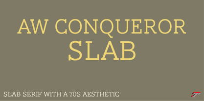
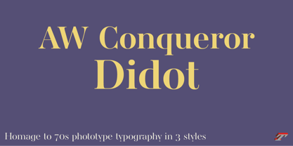
$59.00Slab serif with a 70’s aesthetic A version of AW Conqueror Sans, AW Conqueror Slab draws inspiration from geometrical slab serifs of the 1930s, of which Rockwell is a perfect example. Lubalin Graph, a reworking of the genre, came out in the wake of the Avant Garde wave of the early 70s. In recent years, ‘slabs’ have made a comeback in the graphic design world. AW Conqueror Slab advances the cause quite happily. AW Conqueror superfamily AW Conqueror Didot is part of a larger family, who include 4 others subfamilies with great potential: They’re but based on same structure, with some connection between them (width for example), to offer a great & easy titling toolbox to any designers, from skillful to beginner. Each of the members try their best to be different from the others because of their features. They should work harmoniously in contrast. Club des directeurs artistiques Prix 2010 European Design Awards 2011 - AW Conqueror Std Didot by Typofonderie,
$59.00Homage to 70s phototype typography in 3 styles The AW Conqueror typeface family is a nod to the spirit of phototype typefaces and transfer lettering from the early 70’s. Founded by Ed Rondthaler, Photo-lettering catalogs swarmed with more daring typefaces than the others. Both transfer letter and phototitling have liberated the principle of letter-to-letter spacing, previously impossible with metal type. Phototype allowed operators to position millimeters, on the fly, letter after letter: words, sentences according to the specifications of the art director. AW Conqueror superfamily AW Conqueror Didot is part of a larger family, who include 4 others subfamilies with great potential: They’re but based on same structure, with some connection between them (width for example), to offer a great & easy titling toolbox to any designers, from skilful to beginner. Each of the members try their best to be different from the others because of their features. They should work harmoniously in contrast. Club des directeurs artistiques Prix 2010 European Design Awards 2011 - Hollywood Stars (Volume 1) by Celebrity Fontz,
$24.99Hollywood Stars (Volume 1) is a unique collection of signatures of 92 famous Hollywood stars in a high-quality font. A must-have for autograph collectors, desktop publishers, lovers of the arts, history, movie buffs, fans, or anyone who has ever dreamed of sending a letter, card, or e-mail "signed" as if by one of these famous Hollywood celebrities. This font includes signatures from the following Hollywood personalities: Michael Jackson, Farrah Fawcett, Elvis Presley, Marilyn Monroe, Ben Stiller, Kate Beckinsale, Steve Buscemi, Mel Gibson, Helen Hunt, Paul Reiser, Angelina Jolie, George Kennedy, Larry King, Edward Norton, Mira Sorvino, Steven Spielberg, Kate Winslet, Daniel Day Lewis, Laura San Giacomo, Holly Hunter, Jane Fonda, Alan Alda, Robbin, Williams, Alan Rickman, Al Pacino, Drew Barrymore, Bob Newhart, Brooke Shields, Burt Reynolds, Keira Knightley, Cheryl Ladd, Basil Rathbone, Minnie Driver, Debra Messing, David Schwimmer, Clint Eastwood, David Hyde Pierce, Burgess Meredith, Donald Trump, Linda Evans, Tony Danza, Gene Wilder, Cameron Diaz, Judi Dench, George Clooney, Nicolas Cage, Timothy Hutton, Jennifer Garner, Jay Leno, Tony Curtis, Suzanne Somers, Connie Selleca, Donald Sutherland, Jack Klugman, Tony Randall, Matthew Perry, Jenna Elfman, Morgan Fairchild, Jack Nicholson, Chazz Palminteri, Dustin Hoffman, Anthony Hopkins, Walter Matthau, Larry Hagman, Lisa Kudrow, Bill Cosby, John Mahoney, Ray Liotta, Jon Voight, Christian Slater, Chris Cooper, Dwayne "The Rock" Johnson, Drew Carey, Eli Wallach, Douglas Fairbanks Jr., Amanda Seyfried, Danny DeVito, Gary Sinise, Mary Tyler Moore, Edward Asner, Will Rogers, Cuba Gooding Jr., Bela Lugosi, Charles Grodin, Victoria Principal, Winona Ryder, Tea Leoni, Matt Damon, Loni Anderson, Emma Thompson, Ed O'Neill, Karl Malden. This font behaves exactly like any other font. Each signature is mapped to a regular character on your keyboard. Open any Windows application, select the installed font, and type a letter, and the signature will appear at that point on the page. Painstaking craftsmanship and an incredible collection of hard-to-find signatures go into this one-of-a-kind font. Comes with a character map. - Mother VP by VP Creative Shop,
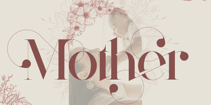
$20.00Introducing Mother Serif Typeface - 5 fonts Mother is named after all the moms and children left behind. This typeface is feminine, fragile typeface with 5 fonts loaded with ligature glyphs, alternates and multilingual support to enchant your next project. Very versatile fonts that works great in large and small sizes. Mother is perfect for branding projects, home-ware designs, product packaging, magazine headers - or simply as a stylish text overlay to any background image. Uppercase, lowercase, numeral, punctuation & Symbol Light Regular Medium Bold Black ligature glyphs ab ac ad ae ag ai al am an ap ar as at au ba be bi bl bo br ca cc ce ch ci cl co cr cs ct cu da de di do dr ea ec ed ee ei el em en eo ep er es et eu fa fb ffb fh ffh fj fk ffk ft fft ga gi gl gn go gr ha he hi ho hy ic id ie il im in io ip ir is it iv ka ke la le li ll lo lu ma me mi mo mp na nc nd ni no nt oc od ol om op or os ot ou pa pe pi po ra rc rd re ri ro sh si sm sp su ta te th ti to tr ts tt ul um un ur us ut ff fi fl ffi ffl st alternates Multilingual support How to access alternate glyphs? To access alternate glyphs in Adobe InDesign or Illustrator, choose Window Type & Tables Glyphs In Photoshop, choose Window Glyphs. In the panel that opens, click the Show menu and choose Alternates for Selection. Double-click an alternate's thumbnail to swap them out. Feel free to contact me if you have any questions! Mock ups and backgrounds used are not included. Thank you! Enjoy! - Bradstone-Parker Script by Intellecta Design,
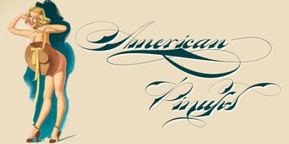
$64.90Iza and Paulo W (Intellecta Design) are proud to announce Bradstone-Parker script Script. A free interpretation of the golden age writing style from American classical penmanship. Inspired in Zaner and his contemporaries Bradstone-Parker has evocative (sometimes exaggerated) ligature forms and voluptuous forms. This enhanced OpenType version is a complete solution for producing documents and artworks with a evocative and voluptuous style of calligraphic script: - many stylistic alternates for each letter (upper- and lowercase), accessed with the glyph palette; - ornaments and tails (“rasgos”) in the typical style from the XIX to the first decades of the XX century writing style, all accessed with the glyph palette using the Ornaments feature; - an extensive set of ligatures (100s of contextual alternates ligatures) providing letterform variations that make your designs really special, resembling real handwriting on the page; - a tour-de-force kerning work: over 4600 kerning paris soft adjusted handly. In non-OpenType-savvy applications it works well as an unusual and beautiful script style font. Because of its high number of alternate letters and combinations (almost 700 glyphs), we suggest the use of the glyph palette to find ideal solutions to specific designs. The sample illustrations will give you an idea of the possibilities. You have full access to this amazing stuff using InDesign, Illustrator, QuarkXpress and similar software. However, we still recommend exploring what this font has to offer using the glyphs palette: principally to get all the power of the Contextual Alternates feature. You can get an idea of the power of this font looking at the “Bradstone-Parker Script Guide”, a pdf brochure in the Gallery section. Take a special look at the Bradstone-Parker Words (ready words). Bradstone-Parker Script has original letters designed by Iza W and overall creative direction plus core programming by Paulo W. - Corinthiago by 38-lineart,
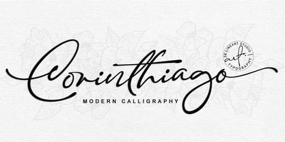
$19.00“Corinthiago” feels equally charming and elegant. This stunning handwritten font is a stylish homage to classic calligraphy. It features a varying baseline, smooth lines, gorgeous glyphs and stunning alternates Alternates to help enrich your designs: 1. Titling (titl) alternates, are accents for initial letters. is the first stroke that is long and and slightly curved according to the letters, both lowercase and uppercase. 2. Swash (swsh) alternates, is an accent at the end of a letter, is an additional stroke to end writing. 3. Stylistic alternate (Salt), is an alternative glyph to add style emphasis. 4. Stylistic set (SS), some additional glyphs for design alternatives. If you use a combination of two lowercase with a combination of tilt and swsh it will produce a harmonic letter that you can use for a logo, no problem also for a logo consisting of more than two letters, all you have to make sure is starts with a titl and ends with swsh. All glyph alternates (titl, swsh, Salt and SS) are also supported by multiple languages. Another OpenType that is also very important is Ligature (league), this font consists of 51 Ligatures including: Abe, Ade, Ale, Ab, Ad, Af, Aj, Ak, Al, Am, An, Ao, Ap, As, Ax, Ay, Az, aa, ar, be, cc, da, de, di, do, du, dy, ee, er, ii, ir, is, le, ll, lt, om, on, oo, op, or, ov, ow, ox, oy, oz, ss, st, th, tl, tt, ur and uu. We continue to see the possibility to update ligatures in the future. This font is the right choice for a modern design, can be applied to invitations, writing messages in the form of quotes, book and magazine covers, and of course for your brand logo text. - Asgard by Zetafonts,
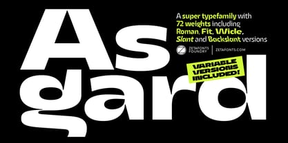
$39.00Francesco Canovaro designed Asgard as a way to mix his passion for the raw energy of extra bold sans serif typography with the expressivity of high contrast and calligraphy-inspired letterforms. He built the typeface around a strong geometric sans skeleton, to make the letters feel solid and powerful while using wood-type vernacular solutions to solve density through high contrast details. The typeface name was chosen as an homage to the mythical homeland of the Norse Gods, evoking a land of fierce warriors, power and strength - but also of divine, delicate beauty. Thanks to the help of Andrea Tartarelli and Mario de Libero the original design was extended along with the design space, expanding the number of weights and widths with a "workhorse typeface" approach, and adding also a slanted axis to experiment with italics. The result is a super-family of 9 styles of 8 weights for a total of 72 fonts, each coming with an extended set of 968 glyphs covering over 200 languages using Latin, Greek and Cyrillic scripts. The three variation axes (width, weight, slant) are also all accessible in a variable font version that is included with the whole family. This gives the designer a full range of options for typesetting, with the Roman and Fit widths providing basic display and text-sized alternatives, and the Wide width adding more display and titling options. The inclusion of backslant italic styles gives Asgard an extra chance to add its voice to the typographic palette. To complement this, all Asgard fonts have been given a full set of Open Type Features including standard and discretionary ligatures, stylistic sets, positional numerals and case sensitive forms. Dynamic and expressive, Asgard is a super-family that manages to look brutal and refined at the same time, quoting the vernacular typographic practices of letterpress print while expressing the contemporary zeitgeist. • Suggested uses: perfect for contemporary branding and logo design, bold editorial design, dynamic packaging and countless other projects. • 73 styles: 8 weights + 8 italics + 8 backslant italics, 3 different widths + 1 variable font. • 968 glyphs in each weight. • Useful OpenType features: Access All Alternates, Contextual Alternates, Case-Sensitive Forms, Glyph Composition / Decomposition, Discretionary Ligatures, Denominators, Fractions, Kerning, Standard Ligatures, Lining Figures, Localized Forms, Mark Positioning, Mark to Mark Positioning, Alternate Annotation Forms, Numerators, Oldstyle Figures, Ordinals, Scientific Inferiors, Stylistic Set 1, Stylistic Set 2, Stylistic Set 3, Subscript, Superscript, Slashed Zero • 219 languages supported (extended Latin, Greek and Cyrillic alphabets): English, Spanish, Portuguese, French, Russian, German, Javanese (Latin), Vietnamese, Turkish, Italian, Polish, Afaan Oromo, Azeri, Tagalog, Sundanese (Latin), Filipino, Moldovan, Romanian, Indonesian, Dutch, Cebuano, Igbo, Malay, Uzbek (Latin), Kurdish (Latin), Swahili, Greek, Hungarian, Czech, Haitian Creole, Hiligaynon, Afrikaans, Somali, Zulu, Serbian, Swedish, Bulgarian, Shona, Quechua, Albanian, Catalan, Chichewa, Ilocano, Kikongo, Kinyarwanda, Neapolitan, Xhosa, Tshiluba, Slovak, Danish, Gikuyu, Finnish, Norwegian, Sicilian, Sotho (Southern), Kirundi, Tswana, Sotho (Northern), Belarusian (Latin), Turkmen (Latin), Bemba, Lombard, Lithuanian, Tsonga, Wolof, Jamaican, Dholuo, Galician, Ganda, Low Saxon, Waray-Waray, Makhuwa, Bikol, Kapampangan (Latin), Aymara, Zarma, Ndebele, Slovenian, Tumbuka, Venetian, Genoese, Piedmontese, Swazi, Zazaki, Latvian, Nahuatl, Silesian, Bashkir (Latin), Sardinian, Estonian, Afar, Cape Verdean Creole, Maasai, Occitan, Tetum, Oshiwambo, Basque, Welsh, Chavacano, Dawan, Montenegrin, Walloon, Asturian, Kaqchikel, Ossetian (Latin), Zapotec, Frisian, Guadeloupean Creole, Q’eqchi’, Karakalpak (Latin), Crimean Tatar (Latin), Sango, Luxembourgish, Samoan, Maltese, Tzotzil, Fijian, Friulian, Icelandic, Sranan, Wayuu, Papiamento, Aromanian, Corsican, Breton, Amis, Gagauz (Latin), Māori, Tok Pisin, Tongan, Alsatian, Atayal, Kiribati, Seychellois Creole, Võro, Tahitian, Scottish Gaelic, Chamorro, Greenlandic (Kalaallisut), Kashubian, Faroese, Rarotongan, Sorbian (Upper Sorbian), Karelian (Latin), Romansh, Chickasaw, Arvanitic (Latin), Nagamese Creole, Saramaccan, Ladin, Kaingang, Palauan, Sami (Northern Sami), Sorbian (Lower Sorbian), Drehu, Wallisian, Aragonese, Mirandese, Tuvaluan, Xavante, Zuni, Montagnais, Hawaiian, Marquesan, Niuean, Yapese, Vepsian, Bislama, Hopi, Megleno-Romanian, Creek, Aranese, Rotokas, Tokelauan, Mohawk, Onĕipŏt, Warlpiri, Cimbrian, Sami (Lule Sami), Jèrriais, Arrernte, Murrinh-Patha, Kala Lagaw Ya, Cofán, Gwich’in, Seri, Sami (Southern Sami), Istro-Romanian, Wik-Mungkan, Anuta, Cornish, Sami (Inari Sami), Yindjibarndi, Noongar, Hotcąk (Latin), Meriam Mir, Manx, Shawnee, Gooniyandi, Ido, Wiradjuri, Hän, Ngiyambaa, Delaware, Potawatomi, Abenaki, Esperanto, Folkspraak, Interglossa, Interlingua, Latin, Latino sine Flexione, Lojban, Novial, Occidental, Old Icelandic, Old Norse, Slovio (Latin), Volapük. - 112 Hours by Device,
$9.00Rian Hughes’ 15th collection of fonts, “112 Hours”, is entirely dedicated to numbers. Culled from a myriad of sources – clock faces, tickets, watches house numbers – it is an eclectic and wide-ranging set. Each font contains only numerals and related punctuation – no letters. A new book has been designed by Hughes to show the collection, and includes sample settings, complete character sets, source material and an introduction. This is available print-to-order on Blurb in paperback and hardback: http://www.blurb.com/b/5539073-112-hours-hardback http://www.blurb.com/b/5539045-112-hours-paperback From the introduction: The idea for this, the fifteenth Device Fonts collection, began when I came across an online auction site dedicated to antique clocks. I was mesmerized by the inventive and bizarre numerals on their faces. Shorn of the need to extend the internal logic of a typeface through the entire alphabet, the designers of these treasures were free to explore interesting forms and shapes that would otherwise be denied them. Given this horological starting point, I decided to produce 12 fonts, each featuring just the numbers from 1 to 12 and, where appropriate, a small set of supporting characters — in most cases, the international currency symbols, a colon, full stop, hyphen, slash and the number sign. 10, 11 and 12 I opted to place in the capital A, B and C slots. Each font is shown in its entirety here. I soon passed 12, so the next logical finish line was 24. Like a typographic Jack Bauer, I soon passed that too -— the more I researched, the more I came across interesting and unique examples that insisted on digitization, or that inspired me to explore some new design direction. The sources broadened to include tickets, numbering machines, ecclesiastical brass plates and more. Though not derived from clock faces, I opted to keep the 1-12 conceit for consistency, which allowed me to design what are effectively numerical ligatures. I finally concluded one hundred fonts over my original estimate at 112. Even though it’s not strictly divisible by 12, the number has a certain symmetry, I reasoned, and was as good a place as any to round off the project. An overview reveals a broad range that nonetheless fall into several loose categories. There are fairly faithful revivals, only diverging from their source material to even out inconsistencies and regularize weighting or shape to make them more functional in a modern context; designs taken directly from the source material, preserving all the inky grit and character of the original; designs that are loosely based on a couple of numbers from the source material but diverge dramatically for reasons of improved aesthetics or mere whim; and entirely new designs with no historical precedent. As projects like this evolve (and, to be frank, get out of hand), they can take you in directions and to places you didn’t envisage when you first set out. Along the way, I corresponded with experts in railway livery, and now know about the history of cab side and smokebox plates; I travelled to the Musée de l’imprimerie in Nantes, France, to examine their numbering machines; I photographed house numbers in Paris, Florence, Venice, Amsterdam and here in the UK; I delved into my collection of tickets, passes and printed ephemera; I visited the Science Museum in London, the Royal Signals Museum in Dorset, and the Museum of London to source early adding machines, war-time telegraphs and post-war ration books. I photographed watches at Worthing Museum, weighing scales large enough to stand on in a Brick Lane pub, and digital station clocks at Baker Street tube station. I went to the London Under-ground archive at Acton Depot, where you can see all manner of vintage enamel signs and woodblock type; I photographed grocer’s stalls in East End street markets; I dug out old clocks I recalled from childhood at my parents’ place, examined old manual typewriters and cash tills, and crouched down with a torch to look at my electricity meter. I found out that Jane Fonda kicked a policeman, and unusually for someone with a lifelong aversion to sport, picked up some horse-racing jargon. I share some of that research here. In many cases I have not been slavish about staying close to the source material if I didn’t think it warranted it, so a close comparison will reveal differences. These changes could be made for aesthetic reasons, functional reasons (the originals didn’t need to be set in any combination, for example), or just reasons of personal taste. Where reference for the additional characters were not available — which was always the case with fonts derived from clock faces — I have endeavored to design them in a sympathetic style. I may even extend some of these to the full alphabet in the future. If I do, these number-only fonts could be considered as experimental design exercises: forays into form to probe interesting new graphic possibilities. - Averta Standard by Intelligent Design,
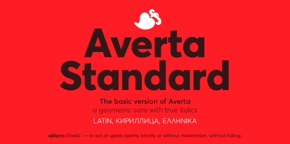
$10.00Averta Standard is the basic version of Averta. Bringing together features from early European grotesques and American gothics, Kostas Bartokas’ (Greek: ‘αβέρτα’ – to act or speak openly, bluntly or without moderation, without hiding) Averta is a geometric sans serif family with a simple, yet appealing, personality. The purely geometric rounds, open apertures, and its low contrast strokes manage to express an unmoderated, straightforward tone resulting in a modernist, neutral and friendly typeface. Averta Standard is intended for use in a variety of media. The central styles (Light through Bold) are drawn to perform at text sizes, while the extremes are spaced tighter to form more coherent headlines. The dynamism of the true italics adds a complementary touch to the whole family and provides extra versatility, making Averta Standard an excellent tool for a range of uses, from signage to branding and editorial design. Averta Standard comes with alternate glyphs, case sensitive forms and contextual alternates, in eight weights with matching italics and supports over two hundred languages with an extended Latin, Cyrillic (Russian, Bulgarian, and Serbian/Macedonian alternates), Greek and Vietnamese character set. It ships in three different packages offering different script coverage according to your needs: Averta Standard PE (Pan-European: Latin, Cyrillic, Greek), Averta Standard CY (Latin and Cyrillic), and Averta Standard (Latin and Greek). Averta's Cyrillic have received the 3rd Prize in the 2017 Granshan Awards in the Cyrillic Category. - Dear Sarah Pro by Betatype,
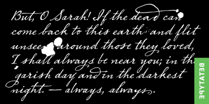
$119.00Carefully considered letters written long-hand, sealed in an envelope and sent across continents were once the only connection for distant friends and lovers. Dear Sarah is a type that evokes the emotion of those handwritten messages. Using alternates, ligatures and a complex system for randomization and natural connected characters, Dear Sarah seeks to push the boundaries of digital type. The guiding question that drove the design of Dear Sarah was whether it was possible to create a natural looking script that worked well in running text. Hand-written types often work for two or three words, but as soon you you look at them in a paragraph, their unnatural textures make them feel contrived. As one of the first serious types to explore OpenType for a connected script, Dear Sarah uses a unique system to create natural connections. Often script types rely on one connecting point to make sure that all their characters fit together properly. Characters that naturally connect much higher, such as the ‘o’ or ‘v’ are distorted to connect at the same point as an ‘a’ or a ‘c’. Dear Sarah uses multiple sets of lower-case characters to connect at multiple points, creating a much more natural looking script. OpenType is also used to create variety, by using randomization techniques to insert disconnected characters as well as alternates, ligatures, swashes and ink blots to create a natural rhythm across multiple lines. - Aquawax Pro by Zetafonts,
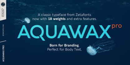
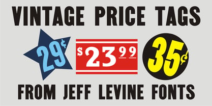
$39.00Aquawax Pro PDF Specimen Aquawax Graphic Project on Behance Created as a custom brand typeface in 2008 by Francesco Canovaro, Aquawax is one of Zetafonts most successful typefaces - having been chosen, among the others, by Warner Bros for the design of the logo for the Aquaman movie. Its logo design roots are obvious in the design details, from the blade-like tail of the Q and the fin-like right leg of the K to the intentionally reversed uppercase W, as well as the rounded edges softening the stark modernist lettershapes. While this details make the typeface extremely suitable for logo and display design, especially in the bolder weights, the open, geometric forms of the letters and a generous x-height make it extremely readable at small sizes, making it perfect for body text and webfont use. In 2019 the family was completely redesigned by the Zetafonts team, expanding the original glyph set to include Cyrillic and Greek and adding three extra weights and italics to the original six weights, for a total of 27 weights (including 9 pictograms). The restored and revamped version, named Aquawax Pro, also includes full Open Type features for Positional Figures, Stylistic Alternates, Discretionary Ligatures and Small Caps, and adds to the typeface new alternate glyph shapes, accessible as Stylistic Alternates. Optimized for maximum screen readability, it covers over 200 languages that use the Latin, Cyrillic and Greek alphabet, with full range of accents and diacritics. - Vintage Price Tags JNL by Jeff Levine,
$29.00Vintage Price Tags JNL comprises three sets of numbers in both ribbon, circle and star patterns which, when combined will produce point-of-sale price elements. The designs were re-drawn from examples found in an old wood type catalog, and are now collected in digital format. Ribbon-style numbers are found on the upper case keys. A through J have the large numbers, K through T are the smaller, underlined numbers. The remaining upper case keys contain the dollar sign, cents sign and the phrases "each", "for", "dozen" and "pair". On the lower case, the circle set of combination numbers are on the following keystrokes: The keys a through j are the left side semi-circle numbers and the "k" key is a blank left side semi-circle. The l through u keys are the right side semicircle numbers and the "v" keystroke is a blank right side semi-circle. The star set is on the standard numbers keys for the left side of the star, with the right side characters on the corresponding shift keystrokes for the number keys. In following the original design examples, a cents sign follows the numbers on the right side of the circle or star sets. The lower case w through z contain a left side star blank, a left side star with $1, a right side star blank and a right side star with small double zeros (to comprise a star shaped price tag for $1.00). - As of my last update in April 2023, "Houndtime" designed by Bree Gorton may not be widely recognized within the mainstream font databases or among popular typeface discussions. However, let me create...
- As of my last update in April 2023, there isn't a widely recognized or standardized font specifically known as "Pinocchio." However, let's indulge in a creative exploration and imagine what a font by...
- As of my last update, I don't have direct access to databases or the internet to provide real-time or highly specific descriptions of lesser-known or proprietary fonts, such as "PetalGlyph" by Essqué...
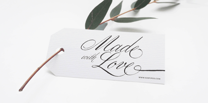
- Wordless Script by Sudtipos,
$59.00We are very happy to announce the release of our first collaboration with master calligrapher, designer and illustrator Gabriel Martínez Meave from México. The first in the series of new designs is Wordless Script, an emotional calligraphic typeface published by Sudtipos. Speechless. Breathless. Wordless. There are letters that transcend simple functionality and sheer legibility, to be recognized instead by their style, their charm, their emotion. It’s like when we don’t remember the exact sentences, but we recall the tone of the voice of a loved one: it just doesn’t matter WHAT he or she said, but HOW he or she said it. Wordless Script is the font of choice for writing those things that go beyond words. Based on the connected-scripts of late 18th-century England, this typeface preserves the irregular finish and gestural strokes of the pointed nib. It is, so to speak, a personal rendition of the English roundhand as originally executed with the bird’s quill. Imbued with a Rococo, neoclassical, romantic spirit, Wordless radiates the gallantry of a time when the celebrated «douceur de vivre» that Talleyrand was so fond of was still alive and well; echoes of which still haunt us in our eclectic 21st-century, which has once again come to appreciate these magnificent styles of old. Wordless features alternate variants of most letters, ligatures and multiple calligraphic endings, ideal for elegant labels, high-end packaging and personalized stationery, as well as compositions for selected brands, exquisite titlings, verses, letters and short texts, like those meant to be read with the eyes only or intended for whispering into someone’s ear. - MachineScript by De Nada Industries is a font that embodies the seamless merger of the mechanical and the artistic, capturing the essence of precision and creativity in every stroke. This font is a t...
- Wonton - Unknown license
- Roller Poster by HiH,
$12.00Roller Poster is named after Alfred Roller. In 1902, Roller created a poster to advertise the 16th exhibit of Austrian Artists and Sculptures Association, representing the Vienna Secession movement. The exhibit was to take place in Vienna during January & February 1903. The location is not mentioned because everyone in Vienna knew it would be held at the exhibit hall in the Secession Building at Friedrichstraþe 12, a few blocks south of the Opernring, near the Naschmarkt. Designed by Joseph Maria Olbrich in 1897, the buiilding has been restored and stands today as one finest of the many fine examples of Art Nouveau architecture in Vienna (see vienna_secession_bldg.jpg). Because of its dome, it is called “the golden cabbage.” The poster itself is unique. The word “secession” is in one type style and takes up two-thirds of the elongated poster. At the bottom of the poster are the details in a different lettering style. It is this second style at the bottom that is the basis for the font Roller Poster. In keeping with our regular naming conventions, we were going to call it Roller Gezeichnete (hand-drawn), but the wonderful play on both words and the shape of the three S’s in secession was too compelling. In November 1965 there was an exhibit of Jugendstil and Expressionist art at the University of California. Alfred Roller’s Secession Poster was part of that exhibit. Wes Wilson was designing promotional material at Contact Printing in San Francisco. Among their clients was a rock promoter named Bill Graham, staging dance-concerts at Fillmore Auditorium. Wilson saw the catalog from the UC exhibit and Roller’s lettering. Wilson adapted Roller’s letter forms to his own fluid style. The result was the poster for the August 12-13, 1966 Jefferson Airplane/Grateful Dead concert at Fillmore put on by Graham (BG23-1). Wilson continued to use Roller’s letter forms on most of the posters he did for Graham through May 1967, when he stopped working for Graham. The posters were extremely successful and the lettering style along with Roller’s letter forms were picked up by other artists, including Bonnie MacLean, Clifford Charles Seeley, James Gardner, and others. The Secession poster and the Fillmore posters have inspired a number of fonts in addition to ours. Among them are JONAH BLACK (& WHITE) by Rececca Alaccari, LOVE SOLID by Leslie Carbarga and MOJO by Jim Parkinson. Each is different and yet each clearly shows its bloodlines. Our font differs in two ways: 1) the general differences in the interpretation of the letter forms and 2) the modification of the basic letter form to incorporate the diacriticals within the implied frame of the letter, after the manner of the original design by Roller. We borrowed Carbarga’s solution to the slashed O and used it, in a modified form, for other characters as well to accomplish the same purpose. We recommend that you buy ours and at least one of the other three. According to Alaccari, a version called URBAN was released by Franklin Lettering in the 70’s (and is shown on page 51 of The Solotype Catalog). For comparison of our font to original design, see image files roller_poster_2s.jpg of original poster and roller_poster_2sx.jpg showing reconstruction using our font for the lower portion (recontructed area indicated by blue bar). Please note the consistency of character width. In the lower case, 23 of the basic 26 letters are 1/2 EM Square wide. The ‘i’ is an eighth narrower, while the ‘m’& ‘w’ are one quarter wider. All the Upper Case letters are 1/8 EM wider than the lower case. This is to make it easier to fill a geometrical shape like a rectangle, allowing you to capture a little of the flavor of Wes Wilson’s Fillmore West poster using only a word processor. We have also included a number of shapes for use as spacers and endcaps. If you have a drawing program that allows you to edit an ‘envelope’ around the letters to distort their shape, you can really get creative. I used Corel Draw for the gallary images, but there are other programs that can accomplish the same thing. The image file “roller_poster_keys.jpg” shows the complete character set with the keystrokes required for each character (see “HiH_Font_readme.txt” for instruction on inserting the non-keyboard characters). The file “roller_poster_widths.jpg” shows the exact width of each character in EM units (based on 1000 units per EM square). You will notice that the font is set wide for readability. However, most programs will allow you to tighten up on the character spacing after the manner of Roller & Wilson. In MS Word, for example, go to the FORMAT menu > FONT > CHARACTER SPACING. Go to the second Drop-Down Menu, labeled ‘Spacing’ and select "condensed' and then set the amount that you want to condense ‘by’ (key on the little arrows); two points (2.0) is a godd place to start. Let your motto be EXPLORE & EXPERIMENT. Art Nouveau has always been one of my favorite movements in art -- I grew up in a home with a couple of Mucha prints hanging on the living room wall. Perhaps because of that and because I lived through the sixties, I have enjoyed researching and designing this font more than any other I have worked on. Let’s face it (pardon the pun), Roller Poster is a FUN font. You owe it to yourself to have fun using it. - Salma Pro by Alifinart Studio,
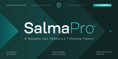
$-Introducing Salma Pro, a modern and sleek sans-serif font that boasts a new design and a strong character. As the successor of the previous version (Salma Alfasans), Salma Pro is an extended version that offers an abundance of features, good legibility, and a wide range of styles, making it perfect for any project. Crafted with great passion and conscientiousness, Salma Pro's unique design is a work of art. You will see beautiful details in every letter, making it perfect for branding, logos, and other design projects. Whether you're using it for headlines or body text, Salma Pro's good legibility ensures that it looks great at any size. Why you need Salma Pro in your font collection: Versatility: With 1400+ glyphs and three different widths to choose from, Salma Pro offers a wide range of styles and features, making it the perfect choice for any project. Reliability: This font is designed specifically for professional designers and offers superior functionality and quality. You can trust Salma Pro to deliver consistent and high-quality results. Unique Design: Salma Pro has a unique and authentic design that will make your work stand out. It's perfect for branding, logos, and other design projects. Good legibility: The font is designed to be highly legible, both at large and small sizes, making it a great choice for both headlines and body text. Language support: Salma Pro supports Latin Extended, Cyrillic, and Greek languages, making it a great choice for projects with a global audience. Multipurpose: It can be used for various purposes such as branding project, logo or logotype, promotion, e-pub, website, mobile app, and many more. Time-saving: With its abundance of features and styles, Salma Pro will save you time and make your job easier. Compatibility: Salma Pro is very compatible when used as a logo and branding projects. Because it has beautiful and authentic details. Passion and conscientiousness: Salma Pro is created with great passion and conscientiousness, giving you the best design result. In conclusion, Salma Pro is a must-have font for professional designers. Its versatility, reliability, unique design, and wide range of features make it an essential tool for any designer. Don't wait any longer, get your hands on Salma Pro now and elevate your design work. Upgrade your font collection today and experience the versatility and power of Salma Pro. Features: Small capitals Tabular and proportional lining figures Tabular and proportional oldstyle figures Scientific inferior and superior characters Numerator, denominator, and fraction characters Circled and squared numbers Standard and discretionary ligatures Arrows, triangles, squares, and circles symbols 16 stylistic sets Contextual alternates Slashed zero And many more advanced typography features. Language Support: Salma Pro supports Latin Extended (including Vietnamese), Cyrillic, and Greek. Suggested Uses: Salma Pro is ideal for branding projects, logos and logotypes, promotions, e-books, websites, mobile applications, and more. This versatile font can be used in a wide range of projects to elevate your designs and make your work stand out. ------ Alifinart Studio alifinart@gmail.com alifinart.com Instagram | Behance - Algol by Typodermic,
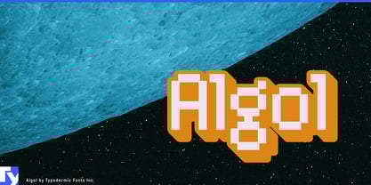
$11.95Get ready to be transported back in time with Algol—the low-resolution display typeface that takes inspiration from classic computer pixel fonts. But don’t be fooled, Algol is not just your typical pixel typeface– it adds a touch of elegance to the digital age. By overlapping intersections with rounded corners, Algol creates a softened effect that sets it apart from other pixel fonts. Say goodbye to the sharp, precise pixel junctions and hello to a font that works perfectly for vinyl-cut signage systems and other cases where a more gentle look is desirable. With Algol, you have the choice of three members of the family—Algol Regular, Algol VII, and Algol IX. For a truly dramatic look, layer Algol Regular and Algol VII in inventive color combinations that will leave an impact on anyone who lays their eyes on it. Algol IX, on the other hand, is more relaxed in its spacing, allowing the spectator to look directly through it. But don’t be fooled by its simplicity—hidden alternate letters with closed counters open up a whole universe of design options for you to explore. So what are you waiting for? Let Algol take you on a journey to the past, all while creating stunning designs that are sure to impress. Most Latin-based European, Greek, and some Cyrillic-based writing systems are supported, including the following languages. Afaan Oromo, Afar, Afrikaans, Albanian, Alsatian, Aromanian, Aymara, Bashkir (Latin), Basque, Belarusian (Latin), Bemba, Bikol, Bosnian, Breton, Bulgarian, Cape Verdean, Creole, Catalan, Cebuano, Chamorro, Chavacano, Chichewa, Crimean Tatar (Latin), Croatian, Czech, Danish, Dawan, Dholuo, Dutch, English, Estonian, Faroese, Fijian, Filipino, Finnish, French, Frisian, Friulian, Gagauz (Latin), Galician, Ganda, Genoese, German, Greek, Greenlandic, Guadeloupean Creole, Haitian Creole, Hawaiian, Hiligaynon, Hungarian, Icelandic, Ilocano, Indonesian, Irish, Italian, Jamaican, Kaqchikel, Karakalpak (Latin), Kashubian, Kikongo, Kinyarwanda, Kirundi, Komi-Permyak, Kurdish (Latin), Latvian, Lithuanian, Lombard, Low Saxon, Luxembourgish, Maasai, Macedonian, Makhuwa, Malay, Maltese, Māori, Moldovan, Montenegrin, Ndebele, Neapolitan, Norwegian, Novial, Occitan, Ossetian, Ossetian (Latin), Papiamento, Piedmontese, Polish, Portuguese, Quechua, Rarotongan, Romanian, Romansh, Russian, Sami, Sango, Saramaccan, Sardinian, Scottish Gaelic, Serbian, Serbian (Latin), Shona, Sicilian, Silesian, Slovak, Slovenian, Somali, Sorbian, Sotho, Spanish, Swahili, Swazi, Swedish, Tagalog, Tahitian, Tetum, Tongan, Tshiluba, Tsonga, Tswana, Tumbuka, Turkish, Turkmen (Latin), Tuvaluan, Uzbek (Latin), Ukrainian, Venetian, Vepsian, Võro, Walloon, Waray-Waray, Wayuu, Welsh, Wolof, Xhosa, Yapese, Zapotec Zulu and Zuni. - JT Collect by OGJ Type Design,
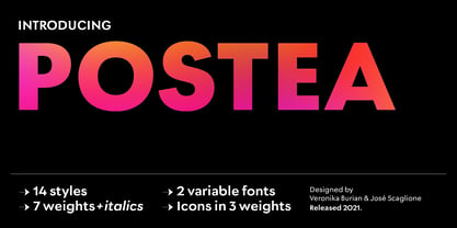
$35.00JT Collect is a hybrid sans-serif typeface for the 21st century that takes a playful approach to the type design heritages of Germany and Switzerland. Confidently built on a geometric structure and infused with elements from traditional grotesque typefaces, it hits the sweet spot between geo and grot. I developed JT Collect purely digitally, drawing from years of experience with analog type design. The letters aren’t based on one particular source but seek to merge different type genres from the first half of the 20th century and lift them to a contemporary quality level. JT Collect is less reserved than strictly geometric designs and brings some industrial workmanship and honesty into the game. The six weights plus three optical sizes of JT Collect offer what you need to make an impact. While cool and elegant in the Light weight, the fonts show more presence on the page as they grow bolder. To this end, I drew the letterforms with a slightly unrefined, brawny air in the bolder weights. This sets them apart from the perceived purity of more geometric designs. The Book weight is ideal for short texts and medium-length copy, and the forceful Bold makes wordmarks look crisp and lets headlines radiate cosmopolitan self-confidence. JT Collect is suitable as a primary typeface for branding, advertising, packaging, stationery, posters, documents, and websites from trades and industries as diverse as food & fashion, media & makers, culture & creators, games & gems, sports & startups. Use JT Collect for film titles or watch faces, for leaflets or store signs, for business cards or billboards: this font family is as adaptable as a chameleon (and like a chameleon, it’s never boring). Try it in different contexts. You won’t be disappointed. Its adaptability also makes JT Collect a great starting point for poised and persuasive font combinations. Even a sans/sans pairing is possible due to hybrid nature of JT Collect—something that’d be hard to achieve with most other sans-serif typefaces on the market. You can add to it a heavy slab from the OGJ library, like Temper Wide. You might go for a geometric or a grotesque typeface as secondary (text) typeface. Or you could set your body copy in a classic serif typeface such as Caslon, Sabon, or Plantin. That’s right: JT Collect is a true team player. Whether you need a grotesque or a geometric sans: try JT Collect. You can get the best of both worlds. - Postea by TypeTogether,
$47.00The Postea font family is Veronika Burian and José Scaglione’s take on German geometric typefaces, reshaped with the right attributes for setting paragraphs and headings, and perfect for branding and text use. Some typefaces are a rough tool, like a pumice rock: abrasive to the senses, unforgiving, and unhelpful for most reading situations. Postea is an obsidian: smooth and classy, with attractive nuances in any light. The classic curves and purposeful details keep its individuality intact while allowing it to fit an incredible range of geometric font needs. Because of these qualities, Postea makes normal reading in paragraphs a cinch and your branding memorable. Compared to midcentury attributes of restraint and a sparse appearance, Postea’s deliberate play between character widths injects life and distinctiveness into its personality. The default ‘t, f’ have lyrical doses akin to a robust evening drink and are rounded out with a serpentine ‘s’ and rotund ‘o, g, b’. Another nice surprise awaits: spacing for the Hairline weight is tighter for optimal use in large headings and titles, while the regular weights have the expected, slightly looser spacing for text. Setting the test word ‘bogarts’ brings all this together nicely, invoking a balance between a constructed and human feel while brushing away the dust from a century of derivatives. Postea is opinionated and its modern stylistic sets allow it to be accommodating with softer, specially-designed alternative characters. SS01 replaces ‘b, f, M, m, t’, while SS02 changes only the lowercase ‘a’ to the round style, and SS03 swaps out the angled ‘y’ for a straight version. The fourth and sixth stylistic sets are packed with wallpaper-worthy geometric patterns, ornaments, arrows, and symbols aplenty. Postea’s 14 styles (seven upright and italic) and two variable fonts are accompanied by an all-new family of icons in three weights, which we developed a new, easy way to activate. Simply bookend the desired icon name with colons (:arrowUp: :chargingStation: :aid: :firstAid:), making sure to capitalise each word after the first word, then highlight and activate SS05. Icons include wayfinding, social interface, sanitary precautions like face masks, thermometers, and hand washing, and much more. Postea is resilient in the number of ways the family can be used, and its recognisable characters make it a prime selection for branding, signage, corporate typefaces, and magazines. Beginning with midcentury virtues, Postea is the rational response for text — a lyrical take on geometric sans serifs. - Manises by Eurotypo,
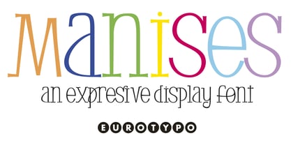
$32.00Located in the Valencian Community, Spain, Manises is very famous for its pottery. In the Middle Ages and the Renaissance, Manises was the most important production center for Spanish-Moresca ceramics, which was exported throughout Europe. At the beginning of the 16th century, Manises tiles were very commercially successful, especially of the heraldic type. Much appreciated by the Aragonese crown, Manises ceramics was also exported to France, Italy, and especially to Naples. As a big fan of Paterna and Manises ceramics, Naples influenced other Italian courts. Calixto III and Alejandro VI continuously commissioned Valencian pieces and tiles for the halls of the Vatican. The export also extended to Sicily, Venice, Turkey, Cyprus and even Flanders and the Baltic countries. The palaces of all the courts of Europe were enriched with this art. Many painters reproduced it in his paintings. It can be seen in the work of Hubert and Jan Van Eyck, and in the central panel of a triptych by Hugo Van der Goes (Uffizi Gallery, Florence). In this city there are also some frescoes by Domenico Ghirlandaio in which the Arabic-Valencian earthenware appears. Manises font is inspired by a text written on a 16th century tile, but adapting it to our times and giving it a very modern air. It is characterised by being able to combine uppercase and lowercase letters in a conventional manner, or use only capitals, or only lowercase letters, or, a random combination of both. It comes with an extra of many ligatures, stylistic alternates, and a set of very useful catchwords, to give more modernity to your text. This OpenType features may only be accessible via OpenType-aware applications, or the Character Map to view and copy any of the extra characters to paste into your favourite text editor/app. Manises looks lovely on wedding invitations, greeting cards, logos, posters, labels, t-shirt design, logos, children's material, in ink or water-colour based designs, fashion, magazines, food packaging and menus, book covers and whatever your imagination holds!
