4,635 search results
(0.036 seconds)
- Aulas by Eurotypo,
$48.00 Aulas's design is inspired by an ancient Roman lettering. This font is characterised by the strength and weight of its glyphs, in addition to its predominant height of "x", as well as the ascending and descending, with particularly short strokes. Aulas includes more than 200 alternative glyphs (swashes, stylistics sets, stylistics alternates), more than 70 ligatures, and a set of more than 30 ornaments, very easy to combine with the rest of the letters. This font offers good readability for use in editorial design, magazines, newsletters, and print. The strong personality of its glyphs is well suited to headlines.
 - Jessi Neue by Nois,
$18.00 Jessie Neue in a new Serif typeface inspired by popular '70s fonts mixed with grotesque touches. It has ligatures that make it more elegant and grotesque elements that give it a modern look and make it more versatile. Jessi Neue has a great performance in large body texts and also in high impact headlines. The family has four weights and also a variable version to give more creative freedom. It has 667 characters that covers the following languages: Basic Latin, Western European, Central European, South Eastern European, Vietnamese, Pinyin and Basic Greek. The italic version will arrive soon.
 - Prettywise by Creativemedialab,
$22.00 Prettywise - Modern Retro Family Unique and beauty Modern serif family including 30+ ligatures and 100+ alternates to mix and match for a stunning display or header. This versatile family consists of 10 weights, variable styles as well as multilingual support, numbers, and currency symbols. Suitable for use in many design forms, for example, magazines, logos, web design, DIY projects, quotes, packaging, postcards, vintage or retro look badges, old classic music, the 60s, 70s, 80s era, stickers, label, wedding theme and many more. We recommend using Adobe Programs. to access alternate Adobe Photoshop go to Window - glyphs Adobe Illustrator go to Type - glyphs
 - Hullstain by Letterhend,
$19.00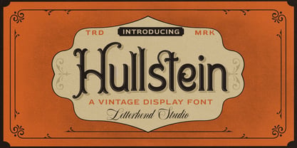 Hullstein is a ornamental serif with classy and classic look with vintage feel, inspired by 60s and 70s signages. This font perfectly made to be applied especially in logo, and the other various formal forms such as invitations, labels, logos, magazines, books, greeting / wedding cards, packaging, fashion, make up, stationery, novels, labels or any type of advertising purpose. Features : uppercase and lowercase numbers and punctuation multilingual & alternate PUA encoded We highly recommend using a program that supports OpenType features and Glyphs panels like many of Adobe apps and Corel Draw, so you can see and access all Glyph variations.
 - Trippy Hippie JNL by Jeff Levine,
$29.00 Don’t let the name “Trippy Hippie JNL” fool you. Although the type design fits well with the 1960s-70s hippie movement and the “love generation”, the design is actually straight out of a page from a vintage German lettering textbook entitled “50 Alphabete fur Technikur und Fachschulen” (loosely translated to “50 Alphabets for Technicians and Specialized Schools”). The novelty, free form shapes and stroke weights of this hand lettered alphabet fits well in creating 1920s period pieces or for designing a retro-inspired rock and roll concert poster. Trippy Hippie JNL is available in both regular and oblique versions.
 - Avantime by Supfonts,
$16.00 Charming 80's retro inspired typeface with wonderful versatility given it includes 30 fonts. This is a perfect for any project Inspired by magazine adverts from the 70's and 80's - this family fit right in with bringing retro back into the 21st century. Super-versatile - have a scroll through all the preview to see the very wide range of variety the Avantime back can manifest the possibilities are really quite endless :) Avantime Font Features: 30 fonts Full Set of standard alphabet and punctuation PUA Encoded - no special software needed to access extra characters Language support: All European languages Multilingual Characters
 - Puffy Chips by Say Studio,
$15.00 Hallo everyone, puffy chips! puffy chips - it's groovy,retro, bold, chubby, and playful, chubby typeface of circle in groovy style. Perfect for make any project like header, quote, layout magazine and other. Even better if you use it on 60s and 70s design project Embracing the psychedelia era combine with groovy style, open type features such as stylistic alternates and multilingual support What's you get? - Unique letterforms - Works on PC & Mac - Accessible in the Adobe Illustrator, Adobe Photoshop, Microsoft Word even work on Canva! - PUA Encoded Characters - Fully accessible without additional design software. Have a wonderful day, *Say Studio*
 - Fd Forever Young by Fortunes Co,
$12.00 Forever Young is A disco 70s retro font is a typeface that captures the bold, flashy, and vibrant style of the disco era, which was popular in the 1970s. These fonts are characterized by their unique design elements that reflect the disco culture. with funky shapes Disco fonts often feature unconventional and geometric shapes, such as curves, swirls, and exaggerated serifs. Retro fonts are widely used in various design projects, branding, posters, and packaging to create a sense of nostalgia or capture the essence of a particular era. They are versatile and can be customized to fit a wide range of creative applications.
 - Rhumba by Stiggy & Sands,
$24.00 A Lost Art Deco Style Reborn and Multiplied Rhumba began as a digitization of a film typeface from LetterGraphics in the early 70's known as "Barrio Lined". Originally only a single typeface, represented by our Rhumba Lined style, it was fun and offered more diversity to expand out the styles of this gem. Playing off the stylings of fonts like Prisma, Rhumba fills in gaps between the various lines of the original to offer 3 alternate looks. The Rhumba family contains 382 characters per font. A comprehensive character map preview is at the end of the poster graphics collection.
 - Nightclubber by Device,
$29.00 The late 70s and early 80s is sometimes considered to be the period when headline typography went off the rails. Growing up in that period, some designers may beg to differ. Many geometric designs were available in dry-transfer and for the typositor, and were used everywhere a youth-culture look was appropriate - annuals, comics, club flyers, high-street boutiques, TV-advertised compila tion albums. Nightclubber is a fond homage to the excesses of the period, and should be used back-lit in pink neon or at a rakish 45 degree slant across a blurred photograph of a glitter ball.
 - Reardon AOE by Astigmatic,
$19.95 Disco lives on in the alphabet stylings of Reardon AOE. From its uber-fat letterforms to its hole punched counters, Reardon AOE started as a digitization of a film typeface called Joyce Black by LetterGraphics. This flashback typestyle was taken from its limited A-Z and numerals set and fleshed out to include an expanded language glyph set. Reardon AOE finds itself thrown into a late 70’s-early 80’s flashback frame of mind, appealing to all of the disco and video game typography of that time, ready to throw down the vibe for your designs.
 - Bakey by Reyrey Blue Std,
$14.00 Bakey is a modern and bold script typeface inspired from 60's and 70's script lettering. With bold high contrast stroke, fun character with a bit of ligatures and alternate stylistic. To give you an extra creative work. This font is perfect for to create logos, branding, stickers, shirts, signs, posters, quotes, instagram posts, procreate designs and more! Note This font is not included with "Shadow/ Extrude", it was created manually for display purposes only. Features : · All Uppercase and Lowercase · Number & Symbol · Supported Languages · Alternates and Ligatures · PUA Encoded Hope you enjoy with our font!
 - Million Dreams by Sansakerta,
$13.00 Million Dreams is an elegant and bold display font. Unique, playful and versatile serif Fot that you can combine to get curves and beautiful shapes just in seconds. Play with the ornaments to create a more stunning display. This font is suitable for use in many design forms, for example magazines, postcards, logos, vintage look, old classic ,60s, 70s, 80s era, wedding projects and many more. We recommend using Adobe Illustrator or Photoshop. Fall in love with its incredibly versatile style and use it to create gorgeous wedding invitations, beautiful stationary art, eye-catching social media posts, and much more! Cheers! Sansakerta
 - Valeson by insigne,
$34.00 Feel the funk with the retro-inspired Valeson. This groovy mix of the ‘70s and ‘80s has an upbeat rhythm of its own that will make your project boogie. It’s loads of fun with its swashy, calligraphic twist. Push it to the max with plenty of weights. Denser weights are brawny and robust, fantastic for headlines, while medium weights are swell for short bits of text. With all its options, this fun, throwback personality is still streamlined and plenty useful for today’s jobs. It’s loads of fun with its swashy, calligraphic twist. Production assistance by Lucas Azevedo and ikern.
 - Feeling Things by Abbasy Studio,
$18.00 Introducing Feeling Things, A Modern Serif Font with Retro Vibes. It was inspired by retro typography designs in 70's. There are more than 375 glyphs in this font including Multilanguage Support. OpenType features with Stylistic Alternates, Contextual Alternate and ligatures in some characters that allows you to mix and match pairs of letters to fit your design. Feeling Things is perfectly suitable for made to be applied in logo, and the other various formal forms such as invitations, labels, logos, magazines, books, greeting / wedding cards, packaging, fashion, make up, stationery, novels, labels or any type of advertising purpose.
 - Smooth Soul by Get Studio,
$15.00 SmoothSoul is a display sans-serif font with a smooth shape and a retro style characterized by its lack of decorative lines, which gives it a clean and modern-retro appearance. The smooth curves of this font create a sense of fluidity and ease, while the lack of serifs makes it feel relaxed and informal. The retro style of this font is evocative of the 1960s and 70s, with a nod to the playful and carefree design sensibilities of that era. Overall, this font is perfect for conveying a sense of fun and approachability, while still maintaining a sense of professionalism and modernity.
 - Arturico by Letterhend,
$17.00 Arturico is a high contrast font with classy and classic look with vintage feel, inspired by 60s and 70s signages. This font perfectly made to be applied especially in logo, and the other various formal forms such as invitations, labels, logos, magazines, books, greeting / wedding cards, packaging, fashion, make up, stationery, novels, labels or any type of advertising purpose. Features : numbers and punctuation multilingual & alternate PUA encoded We highly recommend using a program that supports OpenType features and Glyphs panels like many of Adobe apps and Corel Draw, so you can see and access all Glyph variations.
 - TGL 31034-1 - Unknown license

- TGL 31034-2 - 100% free

- PiS Wanderlust by PiS,
$36.00 PiS Wanderlust is inspired by specimens from the book „Die Schriften des Malers“ from 1950 and by vintage hand painted signposts and guides found on hikes in the outskirts of Vienna and rural Austria, hence the name Wanderlust! Although classic, constructed modernist it features some charmingly unfashionable quirks and is available in rounded for a smooth and warm feel. Lace up those hiking boots, don't forget to pack some Landjäger and cool drinks and enjoy the view from above the treeline!
 - WT Solaire by Wraith Types,
$50.00 Inspired by the classical “Fell Types”, especially the charmingly quirky weights designed by Peter De Walpergen. WT Solaire is a liberal interpretation of those cuts, meant for the digital age. Its design reflects an elegant tension between tradition and modernity. Its elegance and sharpness make it a perfect fit for any project that requires impact and subtlety at the same time. It is especially meant for editorial design, be it magazines or books, but it also works well with images.
 - P22 Basel Roman by P22 Type Foundry,
$24.95 In mid 2001, P22 was approached by a Daniel Garrison, a Classics scholar at Northwestern University about possibly digitizing a long lost "Garamond" typeface. This font was used by Johannes Herbst (a.k.a. Ioannes Oporinus) in 1543 to publish Andreas Vesalius' "On the Fabric of the Human Body" (De humani corporis fabrica) in Basel. The story of the development of this font takes a few twists and almost becomes forgotten itself over time.Forteen years later it is available to the public.
 - WBP Cor by Studio Jasper Nijssen,
$25.00 Introducing the WBP Cor. A retro font based on the old drugstore signage (DROGISTERIJ). Many happy customers have observed it and is now made available for all. Accents have been added, and there quite are a few alternative glyphs. The A has two options for example: there's a sharp version consistent with the original signage, but also a rounded version consistent with the rest of de design. The font can be used to recreate retro signage or other niche designs.
 - MFC Billow Monogram by Monogram Fonts Co.,
$299.00 The inspiration source for MFC Billow Monogram is a beautiful letterset from the "Manuel de Broderies No. 179" by N. Alexandre & Cie. from the late 1800's. We've drawn out some flourishes and ornamental glyphs based on the original design in order to offer more versatility with this monogram. Experiment with the flourishes in different combinations. You may be surprised at what you can create! Download and view the MFC Billow Monogram Guidebook if you would like to learn a little more.
 - Etrusco Now by Italiantype,
$39.00 Etrusco Now is the revival of a lead typeface originally cast in lead by Italian foundry Nebiolo in the early 1920s. Heavily inspired by the design of the Medium weight of Schelter & Giesecke's Grotesk, Etrusco was, like Cairoli, an early precursor of the modernist grotesque superfamilies: a solid, multi-purpose "work-horse" typeface family that could solve a wide range of design problems with its range of widths and weights. When designing the new incarnation of Nebiolo's Etrusco, the Italiantype team directed by Cosimo Lorenzo Pancini and Mario de Libero decided to extend the original weight and width range to keep this "superfamily" approach. Etrusco Now has twenty-one styles widths in three widths of seven weights each, with matching italics; the original weights for the typeface have been collected in the Etrusco Classic subfamily. Etrusco Now new widths allowed the team to include in the design many nods and homages to other vintage classics of Nebiolo. The lighter weights of the normal width have been heavily influenced by the modernist look of Recta, while the heavy condensed and compressed widths refer to the black vertical texture of Aldo Novarese's Metropol. This infuses the typeface with a slightly vintage mood, making Etrusco at the same time warmly familiar and unexpected to eyes accustomed to the formal and cold look of late modernist grotesques like Helvetica. Contemporary but rich in slight historical quirks, Etrusco Now is perfect for any editorial and branding project that aims to be different in a subtle way. Etrusco Now's deviations from the norm are small enough to give it personality without affecting readability, while its wide range of open type features (alternates, stylistic sets, positional numbers) and language coverage make it a problem solver for any situation. Like its cousin Cairoli, Etrusco is born out of love for lost letterforms and stands like its lead ancestor from a century ago, at the crossroads between artsy craftsmanship and industrial needs.
 - Rameau by Linotype,
$29.99Rameau for classic elegance The type family Rameau™ was designed by Sarah Lazarevic She started with the italics; these she derived from the manuscript of the opera Les fêtes de l´hymen et de l´amour", the music for which was composed by Jean-Philippe Rameau in 1747. In the 18th century, musical compositions were published in the form of impressions from copper plates that had been hand-engraved in contrast with books and other texts, which were printed from moveable lead type. The italic letters of Rameau include many ligatures and are thus typical of the engraving style of the period. Rameau exhibits much of the harmonious rhythm associated with genuine manuscript. The marked Antiqua contrasts make the pages on which the font is used quite literally sparkle. This effect is enhanced by the excessively sharp terminals and the prominent serifs of the upper case letters. This highly legible and stylish type family can be used for printing high quality books, invitations, menus and all kinds of texts - anywhere the grace and elegance of France in the 18th century is to be invoked." - Future Tense by Borges Lettering,
$30.00 Future Tense is a modern type style that is perfect for logos, film, video games, packaging, signs, and more. Charles Borges de Oliveira & Vassil Kateliev's attention to letter forms insures extreme legibility without sacrificing this modern style. The 160 alternate letters will keep your designs looking fresh and different. A unique feature included in Future Tense is the small caps have their own set of small caps. This allows 3 different looks for each letter. What’s included in Future Tense: 160 alternate letters makes designing eye catching logos rewarding! The alternates are included in the small caps and second small caps as well. Future Tense is a titling face that contains small caps as well as a second set of small caps. Multilingual: support for over 200 languages. Over 2,500 glyphs make up Future Tense. PUA encoded. Take your designs to the next level with Future Tense. Please note: artwork is not included with font purchase. The images above show how Future Tense can be used in a design setting. Future Tense was designed and created by Charles Borges de Oliveira and Vassil Kateliev. This font is dedicated to Warrel Dane.
 - Sabor by Intellecta Design,
$59.90 Sabor is a voluptuous upright connected display font with mixed taste of script fonts. There were many inspirations for Sabor, but all started with a book from the 1950s about the battles of World War II. To that first sketches of a naive dense display typeface we, day by day, start to create a mixed style evolving some lettering concepts from 1950s, some calligraphy notions and the first display ideas. The feeling of this font is good to be used in many artworks, like logos, packaging, party invitations, layouts for t-shirts, magazine headings, and much more, since websites to and all kind of printed jobs. That font is not really a script, but, like the scripts we strongly recommends to use the caps only in the beginning of words and sentences, to contrast with the lower cases : it’s not designed for all-caps settings, so avoid that kind of use. This font has almost 700 glyphs and supports the most important Latin-based languages. We works hard in a tour-de-force kerning: over 12.000 kerning pairs soft adjusted handily. Its OpenType features include final forms, initial forms, special sets (upper and lowercase's), hundreds of contextual alternates ligatures providing letter-form variations and connections that make your designs really special, and ornaments (tails). Because of its high number of alternate letters and combination's, we suggest the use of the glyph palette to find ideal solutions to specific designs. The sample illustrations will give you an idea of the possibilities. You have full access to this amazing stuff using InDesign, Illustrator, QuarkXpress and similar software. However, we still recommend exploring what this font has to offer using the glyphs palette: principally to get all the power of the Contextual Alternates feature. You can get an idea of the power of this font looking at the “Sabor User Guide”, a pdf brochure in the Gallery section. Also available two sister fonts easy to use : SaborWords and SaborRasgosEscritura Sabor has original letters designed by Iza W and overall creative direction plus core programming by Paulo W.
 - Zebramatic by Harald Geisler,
$14.99 Zebramatic - A Lettering Safari Zebramatic is a font for editorial design use, to create headlines and titles in eye-catching stripes. Constructed to offer flexible and a variety of graphical possibilities, Zebramatic type is easy to use. The font is offered in three styles: POW, SLAM and WHAM. These styles work both as ready-made fonts and as patterns to create unique, individualized type. The font design’s full potential is unleashed by layering glyphs from two or all three styles in different colors or shades. Working with the different styles I was reminded of the late Jackson Pollock poured paintings—in particular the documentation of his painting process by Hanz Namuth and Paul Falkernburg in the film Jackson Pollock 51. In Pollock’s pictures the complex allure arises from how he layered the poured and dripped paint onto the canvas. Similar joyful experience and exciting results emerge by layering the different styles of Zebramatic type. Texture In the heart of the Design is Zebramatics unique texture. It is based on an analog distorted stripe pattern. The distortion is applied to a grade that makes the pattern complex but still consistent and legible. You can view some of the initial stripe patterns in the background of examples in the Gallery. Zebramatic POW, SLAM and WHAM each offer a distinct pallet of stripes—a unique zebra hide. POW and WHAM use different distortions of the same line width. SLAM is cut from a wider pattern with thicker stripes. The letter cut and kerning is consistent throughout styles. Design Concept Attention-grabbing textured or weathered fonts are ideal for headlines, ads, magazines and posters. In these situations rugged individuality, letter flow, and outline features are magnified and exposed. Textured fonts also immediately raise the design questions of how to create alignment across a word and deal with repeated letters. Zebramatic was conceived as an especially flexible font, one that could be used conveniently in a single style or by superimposing, interchanging and layering styles to create a unique type. The different styles are completely interchangeable (identical metrics and kerning). This architecture gives the typographer the freedom to decide which form or forms fit best to the specific project. Alignment and repetition were special concerns in the design process. The striped patterns in Zebramatic are carefully conceived to align horizontally but not to match. Matching patterns would create strong letter-pairs that would “stick out” of the word. For example, take the problematic word “stuff”. If Zebramatic aligned alphabetically, the texture of S T and U would align perfectly. The repeated F is also a problem. Imagine a headline that says »LOOK HERE«. If the letters OO and EE have copied »unique« glyphs - the headline suggests mass production, perhaps even that the designer does not care. Some OpenType features can work automatically around such disenchanting situations by accessing different glyphs from the extended glyph-table. However these automations are also repeated; the generated solutions become patterns themselves. Flip and stack To master the situation described above, Zebramatic offers a different programmatic practice. To eliminate alphabetic alignment, the letters in Zebramatic are developed individually. To avoid repetition, the designer can flip between the three styles (POW, SLAM, WHAM) providing three choices per glyph. Stacking layers in different sequences provides theoretical 27 (3*3*3) unique letterforms. A last variable to play with is color (i.e. red, blue, black). Images illustrating the layering potential of Zebramatic are provided in the Gallery. The design is robust and convenient. The font is easily operated through the main font panel (vs. the hidden sub-sub-menu for OpenType related features). The process of accessing different glyphs is also applicable in programs that do not support OpenType extensively (i.e. Word or older Versions of Illustrator). International Specs Zebramatic is ready for your international typographic safari. The font contains an international character set and additional symbols – useful in editorial and graphic design. The font comes in OpenType PostScript flavored and TrueType Format.
 - Scrubby by Typodermic,
$11.95 Welcome to the nostalgic ’70s with Scrubby, the typeface that will take you on a trip down memory lane! If you’re looking for a font that exudes softness, look no further than Scrubby. This typeface is inspired by the Bookman Italic, a font that was popular in the 1970s and remains iconic today. Scrubby is a typeface that embodies the spirit of the ’70s with its wild swashes and alternate versions of letters. The best part is that these are automatically substituted based on context, thanks to your application’s standard ligatures capability. So, whether you’re starting a word with “A” or ending it with lowercase letters like “k”, “h”, “m”, “n”, “r”, “v”, “w”, or “y”, you’ll get a fantastic curl on the left or a charming curl on the right respectively, adding a touch of softness to your text. If you’re worried about tail collisions or if you simply want more control over the swash effects, you can manually activate or deactivate them using your application’s OpenType swash or stylistic alternate settings. So, what are you waiting for? Relive the ’70s with Scrubby, and add a soft, friendly touch to your graphic design projects! You can easily access all the alternate characters by using your system’s character map or glyph panel. Most Latin-based European writing systems are supported, including the following languages. Afaan Oromo, Afar, Afrikaans, Albanian, Alsatian, Aromanian, Aymara, Bashkir (Latin), Basque, Belarusian (Latin), Bemba, Bikol, Bosnian, Breton, Cape Verdean, Creole, Catalan, Cebuano, Chamorro, Chavacano, Chichewa, Crimean Tatar (Latin), Croatian, Czech, Danish, Dawan, Dholuo, Dutch, English, Estonian, Faroese, Fijian, Filipino, Finnish, French, Frisian, Friulian, Gagauz (Latin), Galician, Ganda, Genoese, German, Greenlandic, Guadeloupean Creole, Haitian Creole, Hawaiian, Hiligaynon, Hungarian, Icelandic, Ilocano, Indonesian, Irish, Italian, Jamaican, Kaqchikel, Karakalpak (Latin), Kashubian, Kikongo, Kinyarwanda, Kirundi, Kurdish (Latin), Latvian, Lithuanian, Lombard, Low Saxon, Luxembourgish, Maasai, Makhuwa, Malay, Maltese, Māori, Moldovan, Montenegrin, Ndebele, Neapolitan, Norwegian, Novial, Occitan, Ossetian (Latin), Papiamento, Piedmontese, Polish, Portuguese, Quechua, Rarotongan, Romanian, Romansh, Sami, Sango, Saramaccan, Sardinian, Scottish Gaelic, Serbian (Latin), Shona, Sicilian, Silesian, Slovak, Slovenian, Somali, Sorbian, Sotho, Spanish, Swahili, Swazi, Swedish, Tagalog, Tahitian, Tetum, Tongan, Tshiluba, Tsonga, Tswana, Tumbuka, Turkish, Turkmen (Latin), Tuvaluan, Uzbek (Latin), Venetian, Vepsian, Võro, Walloon, Waray-Waray, Wayuu, Welsh, Wolof, Xhosa, Yapese, Zapotec Zulu and Zuni.
 - Steelfish Hammer by Typodermic,
$11.95 Welcome, esteemed customers, to our magnificent array of fonts! It is with great pleasure that we present to you the rusticized Steelfish Hammer, a variation of the popular Steelfish typeface. Its rugged appearance embodies the sincere and trustworthy nature of your message, evoking sentiments of the utmost assurance. With three textured letter variations that are shuffled automatically in OpenType-savvy applications, the Steelfish Hammer typeface creates an unparalleled realistic impression. To disable this effect, simply toggle the “standard ligatures” feature in your application. And oh, the compact letterforms of the Steelfish Hammer! They are nothing short of exquisite. Each of the five weights and italics of this typeface is a testament to the power and resilience of your message, with every character carefully crafted to achieve the desired effect. There are other kinds of Steelfish too: Steelfish Regular, Steelfish Rounded, Steelfish Steeled and Steelfish Unleaded. Come, delve into the world of typography with us and experience the unmatched beauty of the Steelfish Hammer. Let your message speak with confidence and authenticity, as it is our utmost priority to provide you with the best tools to achieve your goals. Most Latin-based European, Vietnamese, Greek, and most Cyrillic-based writing systems are supported, including the following languages. Afaan Oromo, Afar, Afrikaans, Albanian, Alsatian, Aromanian, Aymara, Azerbaijani, Bashkir, Bashkir (Latin), Basque, Belarusian, Belarusian (Latin), Bemba, Bikol, Bosnian, Breton, Bulgarian, Buryat, Cape Verdean, Creole, Catalan, Cebuano, Chamorro, Chavacano, Chichewa, Crimean Tatar (Latin), Croatian, Czech, Danish, Dawan, Dholuo, Dungan, Dutch, English, Estonian, Faroese, Fijian, Filipino, Finnish, French, Frisian, Friulian, Gagauz (Latin), Galician, Ganda, Genoese, German, Gikuyu, Greenlandic, Guadeloupean Creole, Haitian Creole, Hawaiian, Hiligaynon, Hungarian, Icelandic, Igbo, Ilocano, Indonesian, Irish, Italian, Jamaican, Kaingang, Khalkha, Kalmyk, Kanuri, Kaqchikel, Karakalpak (Latin), Kashubian, Kazakh, Kikongo, Kinyarwanda, Kirundi, Komi-Permyak, Kurdish, Kurdish (Latin), Kyrgyz, Latvian, Lithuanian, Lombard, Low Saxon, Luxembourgish, Maasai, Macedonian, Makhuwa, Malay, Maltese, Māori, Moldovan, Montenegrin, Nahuatl, Ndebele, Neapolitan, Norwegian, Novial, Occitan, Ossetian, Ossetian (Latin), Papiamento, Piedmontese, Polish, Portuguese, Quechua, Rarotongan, Romanian, Romansh, Russian, Rusyn, Sami, Sango, Saramaccan, Sardinian, Scottish Gaelic, Serbian, Serbian (Latin), Shona, Sicilian, Silesian, Slovak, Slovenian, Somali, Sorbian, Sotho, Spanish, Swahili, Swazi, Swedish, Tagalog, Tahitian, Tajik, Tatar, Tetum, Tongan, Tshiluba, Tsonga, Tswana, Tumbuka, Turkish, Turkmen (Latin), Tuvaluan, Ukrainian, Uzbek, Uzbek (Latin), Venda, Venetian, Vepsian, Vietnamese, Võro, Walloon, Waray-Waray, Wayuu, Welsh, Wolof, Xavante, Xhosa, Yapese, Zapotec, Zarma, Zazaki, Zulu and Zuni.
 - Imagine strapping on some roller skates, threading a floral headband through your hair, and gliding back into the era where disco and daisies ruled the world. That's the spirit captured within the wh...
- Dinner by Ingrimayne Type,
$7.00 Dinner is a family of novelty fonts in which the characters are formed from spoons, forks, and knives. Dinner-Regular was designed in 1990, one of the earliest fonts in the IngrimayneType collection. It contains a mixture of knives, forks, and spoons and the lower-case letters are smaller versions of the upper-case letters. In 2021 the family was expanded with Dinner-Knives in which all characters are formed by arranging knife shapes, Dinner-Spoons in which the characters are formed from spoon shapes, and Dinner-Forks in which the characters are formed from fork shapes. All three are caps-only but the characters on the lower-case keys are alternate versions of upper-case letters . Dinner is a decorative display family that needs to be used at a large size. The logical place to use it is for food-related items.
 - Giureska by URW Type Foundry,
$39.99 I always admired the beauty of Gothic letters, but lamented their low readability. The revivals of Gothic faces are beautiful, but they revive everything, including the traits that prevent readability. Blackletters are fine in ads and titles, but can’t be used in long texts (like books on Middle Ages, Medieval romances etc) where they would be the perfect historical choice. And I wanted to change this scenario. With Giureska, instead of taking one particular face to revive, I chose the best traits from many Gothic faces, i.e. the forms that were pleasant to look and easy to read. For the ‘small caps’, I studied uncial scripts and made a similar selection, adapting everything to make a unified font. With three weights, true italics and the uncials, Giureska can endure a variety of projects, bringing the appeal of Middle Ages much beyond the cover.
 - Ark Monogram SG by Spiece Graphics,
$39.00 Ark is a combination monogram set based on the ATF Virkotype design. By combining variously shaped characters, you can produce initials within an oval frame. Just select a left-hand letter, a center letter, and a right-hand letter. Then place all three on an oval frame of your choice. Great for stationery and company logos. The Ark Monogram Set comes with easy-to-read instructions and a useful character map. Additional alternate characters have been provided for better identification and letter fitting within each font. Ark Monogram is now available in the OpenType Std format. Some new stylistic alternates have been added to this OpenType version. Advanced features work in current versions of Adobe Creative Suite InDesign, Creative Suite Illustrator, and Quark XPress. Check for OpenType advanced feature support in other applications as it gradually becomes available with upgrades.
 - Brda by Linotype,
$29.99Brda originally designed by the Polish designer Franciszek Otto for the Powiat weekly newspaper. Powiat needed a new, dynamically drawn sans serif for its headlines, and Otto's Brda fit the bill. Combining traditional Grotesk letterforms with witty subtleties, like the notched-joint seen in the capital G, Brda displays a novel design that works best when set large. The typeface is named after the Brda river, which runs through Bydgoszcz, Poland, the city where Powiat is published. The Brda family includes three weights, each with a companion italic: Regular, Bold, and Extra Bold. The Brda family's Extra Bold weight was one of the winners selected in the 2003 International Type Design Contest, sponsored by Linotype GmbH. Franciszek Otto also teaches graphic design at the Secondary Art School in Bydgoszcz, where his typefaces rank among the students' favorites. - Chaco by Tipo,
$69.00 The idea behind the font called Chaco originated after testing the deficiency shown in road signs in Latin America. The design began after a long documenting period. Throughout the various stages of the work, there were several tests and checks conducted of the formal solutions implemented which, based on the results, would gradually be changed until we finally reached, in this way, its definite design. The original project for the font features three steps, namely: regular, light and bold, yet by making progress in the development, it was possible for us to perceive that by enlarging the black and thin variances, the family with 5 different weights could offer very good results in mass media, such as newspapers, magazines and television. In order to expand its possibilities of utilization, the set was completed with italics and small capitals.
 - Mandoul Script by Mans Greback,
$59.00 Mandoul Script is a sharp, active calligraphy typeface. With extra attention to quick letterforms and sharp details, this modern typeface turns any graphic project into a strong and confident work. It is provided in six styles, and three thicknesses: Thin, Regular and Bold, and each weight as Italic. Use underscore _ anywhere in a word to create a swash. Example: Hand_script Use multiple underscores for different swashes. Example: Bea__utiful (Download required.) Mandoul is built with advanced OpenType functionality and has a guaranteed top-notch quality, containing stylistic and contextual alternates, ligatures and more features; all to give you full control and customizability. It has extensive lingual support, covering all Latin-based languages, from North Europe to South Africa, from America to South-East Asia. It contains all characters and symbols you'll ever need, including all punctuation and numbers.
 - Baksheesh by HamburgerFonts,
$25.00 The Baksheesh family comes in three weights with accompanying italics and small caps. The catalyst for the development of the typeface came from the desire to create a contemporary family of constructed letterforms built upon a flexible system. The aesthetic of the font is influenced by the characters drawn by Wim Crouwel in 1976 for Olivetti’s typewriter font that could support varying character widths, hence Baksheesh’s faux-monospace appearance. Each of the characters has been designed according to an intricate grid, helping to rationalise the letterforms into a system that can be translated across the various styles. The flexibility of the grid also allows for optical adjustments to be made, for example stroke thinning at junctions and baseline/x-height overshoot for enhanced definition throughout. Baksheesh is suitable for setting small amounts of text as a distinguishable and legible headline font.
 - Arkais by Logitype,
$25.00 Introducing Arkais, a glyphic serif typeface inspired by the rhythmic construction of Gothic architecture. This unique typeface is characterized by slightly broken shoulder and bowl shapes, offering a fresh and classic feel. With contrasting brackets, consistent barb, and beak shapes, Arkais brings a touch of elegance to any project. Arkais features five weight variants—light, regular, medium, bold, and extra—as well as three width options: condensed, normal, and expanded. Each font family also includes italic styles, providing even greater versatility. Equipped with OpenType features, Arkais offers multiple character alternatives, ligatures, small caps, and more, ensuring a tailored look for your designs. Designed as an alternative to current trends, Arkais is perfect for creating strong headers or captivating display text. The typeface supports over 500 basic Latin glyphs, making it suitable for a wide range of projects.

