10,000 search results
(1.357 seconds)
- Sanshiro by Kereatype,
$19.00 Sanshiro is a geometric sans serif font family. Contain 9 weights from Thin to Black with matching Italics. Sanshiro Normal character shapes have optimized proportions and an improved balance perfect to use for text and the heavyweight has a strong character have a unique style with a smooth shape to use for any display. Sanshiro font can improve and be used for any display media to support your visual design. Latest Update: Version 2.001 • PUA Code update • PostScript hinting
 - 1479 Caxton Initials by GLC,
$20.00 This family was created inspired from the two sets of rough initials fonts used by the famous William Caxton in Westminster (GB) in the late 1400’s. As it was normal for the time, there were not any differences between I and J, U and V. It is not a mistake. We have reconstructed the few other missing characters. This font was conceived as a supplement for our 1479 Caxton but may be used with all our Blackletters fonts.
 - ZT Kofimoya by Zelow Type,
$14.00 ZT Kofimoya is a brand new font that offers two distinct styles to choose from. The first style features a stiffer sans concept with a somewhat square shape, giving it a modern and assertive appearance. The second style is a normal sans, with a slightly rounded shape, providing a softer and friendlier look. With these two different styles, ZT Kofimoya offers flexibility in design and can be used for a variety of purposes. Thanks for using this font ~ Zelowtype
 - KhaoSans by TypeK,
$35.00 KhaoSans is a Rounded typeface. The latin was inspired from Thai woodtype used as headline in old day Thai newspaper. The refined curve with some sharp end add uniquely beautiful touch to the typeface. In Thai language, ‘Khao’ (ข่าว) means ‘news’ and ‘Sans’ (สาร) means ‘message’. The font comes in 8 weights, ranging from a delicate ExtraLight to Black, with 3 widths (Normal, Wide, and Expanded). Matching italics are provided, resulting in a total of 48 styles family.
 - Foda Sans by Fo Da,
$25.00 FodaSans typeface is a Multi-language font family for a wide range of uses, comes with 126 weights with 463 glyph for each weight, supports Latin and Arabic language and covers OpenType features like Glyph Composition / Decomposition, Kerning, Standard Ligatures, Mark Positioning .. and more. The Typeface Have 6 Styles (Normal, Curved, Rounded, Solid, Solid Curved, Solid Rounded) with their obliques and italics ranging from Extra light to Black. Thank you for choosing FodaSans fonts from Fo Da Foundry.
 - Rock Star by AlfaBravo,
$25.00 Rock Star is a original sans serif family with a distinct personality. The family has 36 font styles, ranging from ExtraLight to UltraBlack in normal and narrow styles (including italics). A wide range of weights and widths offering tremendous typographic flexibility. Rock Star is a contemporary typeface with roots in the past. It based on the sans-serifs of the late 19th and early 20th century. It would look great for corporate branding, in books and magazines.
 - NorB Sketch by NorFonts,
$30.00 NorB Sketch is inspired from my NorB Felt Pen font, so trying a new technique of lettering. It is a handwritten text font witch can be used with any word processing program for text and display use, print and web projects, apps and ePub, comic books, graphic identities, branding, editorial, advertising, scrapbooking, cards and invitations and any casual lettering purpose… or even just for fun! It comes with 6 weights, Normal, Bold and Heavy each with their Italics.
 - Lalalo by Cuda Wianki,
$25.00 Lalalo is a casual, modern sans-serif font family based on hand-lettering. It's oval letter shapes provide soft and friendly appearance. Lalalo font is very legible with a warm touch perfectly suited for children books. Lalalo family consists of 6 weights ( Extra Light, Light, Regular, Semibold, Bold, ExtraBold). You can use it with normal fill or outlined. You can mix various colors and stroke widths to gain interesting results. There is also a set of nice frames available.
 - Caligari Pro by Elsner+Flake,
$99.00 The silent film »The Cabinet of Dr. Caligari« (1920) is undoubtedly one of the breathtaking milestones within the German Expressionist Movement, a time of extraordinarily creative works of art as a reaction to a world in rapid change. The original intertitles of Caligari were worked out by the set designers (and painters) Walter Reimann, Walter Röhrig, and Hermann Warm, using a unique expressionistic language of form for dramatic and iconic lettering. When in 2010 KOMA AMOK’s Joerg Ewald Meißner and Gerd Sebastian Jakob were commissioned by the Institut Mathildenhöhe Darmstadt and publisher Hatje Cantz to design the catalog for the exhibition »The Total Artwork in Expressionism«—showing works of art, architecture, film, literature, theater, and dance—it was soon perfectly clear that a new typeface, inspired by the Caligari intertitles, should speak for all the expressionistic arts. An intense process of research and analysis began. The original letters of the Caligari intertitles were individuals on their own. Furthermore, each of the three title designers had added his specific approach to the basic Caligari type style. From hundreds of different As to Zs a choice had to be made, which should be THE characteristic Caligari letter for a digital typesetting font. Finally the chosen letters were cut and drawn again, missing letters were added according to the formal priniciples, all-in-all 1000 glyphs were digitised to complete a usefull OpenType font ready for use. When in the autumn of 2010 the exhibition started successfully with great media interest, the posters all over Darmstadt announced »You must become Caligari!« – set in the brandnew typeface. The font Caligari Pro offers alternative forms for every letter and a whole bunch of ligatures, thus creating an expressive, individual image of headlines and text. By using included Stylistic Alternates the image will get even more vivid. Caligari comes with a complete set of expressionist ornaments and true old style figures—thus the heyday of the Expressionist Movement and the era of the silent films can be revived typographically by the means of today: »Express Yourself!«.
 - Aequitas by Fenotype,
$25.00 Aequitas is an expressive Roman Display typeface with three weights. Aequitas is great for fashion, branding, packaging or editorial use. Each weight of Aequitas is equipped with Swash & Titling Alternates.
 - JH Hadi by JH Fonts,
$70.00 JH Hadi is an Arabic Naskh typeface, including three weights; it is typical for long running text, headlines, branding & signage... The diacritic positioning is fine tuned per the publishers requirements.
 - Outlast by BoxTube Labs,
$24.00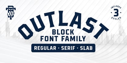 Introducing Outlast - A competitive sports font with three distinct and unique styles. Outlast was designed for creating powerful logotypes, sports branding, posters, apparel design, magazines headlines, labels and much more.
 - Comic Hand by Tom Chalky,
$16.00 Need to grab attention? Look no further than these three lovingly legible handwritten typefaces oozing with personality and style. Full of charismatic imperfections, this powerful trio is ready for battle!
 - Chervonec Uzkj BT by Bitstream,
$50.99Possessing a distinctive Russian appearance, Chervonec Uzkj, or Chervonec Condensed, is a hybrid semi-serif designed by Russian designer Oleg Karpinsky. The typeface family includes three weights with drawn italics. - Cambridge Round by AVP,
$29.00 Cambridge Round provides a rounded version of Cambridge, useful for headings and more informal texts. The family contains four weights in three widths with matching italic forms for all variants.
 - Lenga by Eurotypo,
$29.90 Lenga is a kind of beech originally from South America. The explorers who discovered this beech in Tierra del Fuego, thought it looked like a tree from their home country and named it 'Lenga'. Like many of southern hemisphere beeches, the Lenga beech is fast growing and hardy, making it an ideal timber tree. It regenerates easily after fires. The wood has good quality, moderate durable, and easy to work. The Lenga fonts were inspired in the nobility, robustness and flexibility of those trees. They have a distinctive personality within contemporary atmosphere. These fonts are quite appropriate for headlines, subheadings and with its text flow works very well for long texts. Their legibility is suitable for editorial purposes mainly in newspapers and magazines. Lenga comes in 16 styles carefully done in OpenType format. All styles contain standard and discretional ligatures, proportional lining figures, lining old style figures, scientific superior/inferior figures. The complete set supports Western European, Central and Eastern European languages.
 - CF Cozyscript by CozyFonts,
$25.00 CF Cozyscript is an even weighted connecting script. Created in the spirit of the Old Grade School cursive chart seen above the blackboard in the front of the classroom. Giving students a constant visual reference of the smooth flow of Caps and Lower case script. Neither formal nor casual but a combination of both styles. Cozyscript is currently available in 3 styles: Light, Medium & Rounded. The Light & Medium styles are best suited for Invitations, Notes, Advertising, Personal Letters, and Sensitive Subjects such as Movie Titles, Biographies, Wedding paraphernalia, etc. The Light & Medium Glyphs finish in squared-off ends, whereas the Rounded version is slightly bolder than the Medium version with rounded ends resembling a tubular look. The Rounded version lends itself to effective use in Sports, Music, and Advertising, Graphics, Signage, Branding, Neon effects, Logos, Titles, and Packaging. With over 300 glyphs applicable in over 100 languages, Cozyscript is available for use! Cozyscript is CozyFonts Foundry's 17th Font Family released and 2nd script font by Tom (Cozy) Nikosey, California Designer.
 - ATF Garamond by ATF Collection,
$59.00 The Garamond family tree has many branches. There are probably more different typefaces bearing the name Garamond than the name of any other type designer. Not only did the punchcutter Claude Garamond set a standard for elegance and excellence in type founding in 16th-century Paris, but a successor, Jean Jannon, some eighty years later, cut typefaces inspired by Garamond that later came to bear Garamond’s name. Revivals of both designs have been popular and various over the course of the last 100 years. When ATF Garamond was designed in 1917, it was one of the first revivals of a truly classic typeface. Based on Jannon’s types, which had been preserved in the French Imprimerie Nationale as the “caractères de l’Université,” ATF Garamond brought distinctive elegance and liveliness to text type for books and display type for advertising. It was both the inspiration and the model for many of the later “Garamond” revivals, notably Linotype’s very popular Garamond No. 3. ATF Garamond was released ca. 1918, first in Roman and Italic, drawn by Morris Fuller Benton, the head of the American Type Founders design department. In 1922, Thomas M. Cleland designed a set of swash italics and ornaments for the typeface. The Bold and Bold Italic were released in 1920 and 1923, respectively. The new digital ATF Garamond expands upon this legacy, while bringing back some of the robustness of metal type and letterpress printing that is sometimes lost in digital adaptations. The graceful, almost lacy form of some of the letters is complemented by a solid, sturdy outline that holds up in text even at small sizes. The 18 fonts comprise three optical sizes (Subhead, Text, Micro) and three weights, including a new Medium weight that did not exist in metal. ATF Garamond also includes unusual alternates and swash characters from the original metal typeface. The character of ATF Garamond is lively, reflecting the spirit of the French Renaissance as interpreted in the 1920s. Its Roman has more verve than later old-style faces like Caslon, and its Italic is outright sprightly, yet remarkably readable.
 - 1726 Real Española by GLC,
$42.00 This family was inspired from the set of fontfaces used by Francisco Del Hierro, to print in 1726 the first Spanish language Dictionary from the Spanish Royal Academy (Real Academia Española, Diccionario de Autoridades). These two Transitional styles are said to have been the first set of official typeface in Spain, like the French “Reale” (take a look at our "[/fonts/glc/1790-royal-printing/ 1790 Royale Printing)". In our two styles (Regular & Italic), fontfaces, kernings and spaces are as closely as possible the same as in the original. This Pro font is covering Western, Eastern and Central European, Baltic and Turkish languages, with standard and “s long” ligatures and twin letters in each of the two styles and a few Italic swashes inspired from the font used in 1746 by the same printer for another edition from the Royal Academy.
 - Skinner AOE - Unknown license

- Butterfly Chromosome - Unknown license

- Schrill AOE - Unknown license

- AntiChrist SuperstarSW - Unknown license

- Mysterio SWTrial - Unknown license

- Scrawn AOE - Unknown license

- Electric Hermes - Unknown license

- ID SupernovaSW - Unknown license

- Rusted MachineSW - Unknown license

- Golden Ticket by E-phemera,
$12.00Golden Ticket is a digitization of hand-drawn poster lettering by Otto Heim from 1925. The regular style is meant to be used on its own, but the other three styles are meant to be used one on top of another in three different colors to create a 3D effect. For best results, put the base style on the bottom, with the fill style directly on top of that in a different color, and the highlight style directly on top of that in a third color. - Bonaventure by Greater Albion Typefounders,
$9.95 Bonaventure is a Roman display family full of the spirit of the Art Nouveau era, and joins our popular related group of families which also includes Bonning, Bonnington and BonaVia. Three weights are offered, including a shadowed black form, in a choice of three widths: regular, condensed and Expanded. It's the ideal family for signage with a period feel, as well as for posters, headings and certificates. A combination of Bonaventure with Bonning and its other related faces will bring a harmonious design ethos to any project.
 - Movella by Greater Albion Typefounders,
$8.00 Remember those 1970s science fiction dramas which had such charming futuristic sets and backdrops? Remember the intriguing future lettering and signage the set designers would devise-often coupled with interesting futuristic spellings? Movella is a family of three typefaces inspired by that design ethos. The three faces- regular, italic and the 3D solid form are all capitals faces which combine a feeling of retro-futuristic design with easy legibility. Take your next project into the age of the Apollo Launches, sci-fi action drama and fun!
 - Sunrise by Haksen,
$18.00 Sunrise a serif hand-drawn font with a retro look! There are three fonts included : Sunrise Regular Sunrise Outline Sunrise Extrude You can use these three fonts to create your own retro quotes and words! Font Features : Regular version Character set A-Z in uppercase and lowercase Alternates Character Ligatures Numerals & Punctuation Accented Characters Multiple Languages Supported Sunrise is perfect for : shirts, retro designs, procreate, stickers, logos, branding, greeting cards, Cricut projects, posters, magazines, social media, prints and more! Have a great day, Haksen
 - Baguet Script by Melvastype,
$29.00 Baguet Script is a modern brush script family. It has three weights in italic and upright styles. The letters has soft terminals and slight bounce. Baguet Script has two sets of uppercase letters, one is more simple and the other is flashier. It has also three different types of matching initial and end swashes for lower case letters and multiple options for ascenders and descenders. So if you are looking for soft, friendly and modern script with lots of options and versatility check Baguet Script.
 - Limited Edition by KA Designs,
$10.00 If you are looking for a versatile modern retro font, look no further! Limited Edition was designed to bring together modern design and that popular 1960's retro style that everyone loves. This font includes interlocking letter pairs that are sure to make all of your designs stand out! There are three styles available - Regular, Outline and Shadow. Layer all three to create your own custom design! Limited Edition is perfect for branding, logos, editorial, magazines, signs, print, t-shirt design, stickers and more!
 - Vin Sans Pro by Mint Type,
$35.00 Vin (translated from Ukrainian as “he”) is a superfamily consisting of three robust typefaces with pronounced vertical stems and rounded corners. All three typefaces feature very large x-height for even more expression and assertiveness. Vin Sans Pro is a quite narrow rigid sans-serif typeface with extra-large x-height and rounded corners. It is perfect for any kind of short copy with lots of attention guaranteed. Be sure to check other two typefaces of Vin superfamily: Vin Slab Pro and Vin Mono Pro .
 - Masonic Writing by Deniart Systems,
$10.00Based on an ancient secret writing system. NOTE: this font comes with an interpretation guide in pdf format. - Half SunBurst-w4-02 - Unknown license

- Optimisti by Juliasys,
$26.00 Optimisti is Finnish for optimist – and it’s an optimistic, light-hearted feeling that this trio of handwriting fonts transfuses into all kinds messages and identities. Casual, playful and character-strong as they are, the three of them make a perfect team for headlines, slogans, teaser texts and brand naming. Besides the two original fonts – “Optimisti Smooth” and “Optimisti Sparkling” differing in outline structure and texture – “Optimisti Decor” now joined the game. Optimisti Decor is loaded with a multitude of artful elements that can convey a very festive atmosphere – or, on the contrary, ironically make fun of it. Its features are is especially striking when used in all-caps setting. Use the Optimists separately or together to make a humorous – or serious but always cordial impression in print, on the web, on packaging or even on your shopping bag … All Optimisti fonts have a Western European, a Central European and an Extended Cyrillic character set. They support approximately 100 languages.
 - Charcuterie by Laura Worthington,
$20.00 Charcuterie is a collection of ten distinct yet related typefaces, and three ornamental typefaces. Used individually or blended with other fonts from this large family, elements of Charcuterie are well suited for headlines, titling, logos, display, packaging, signage, or advertising. The entire collection lends itself to experimentation, acting as a complete and complex toolbox, enabling you to work in extraordinarily varied ways. Each Charcuterie typeface has different, yet complementary features. Engraved features 135 swash alternates and Cursive boasts 275. Frames offers a broad and endless approach to creating frames of any proportion and style. Catchwords features nine different styles for a total of 82 glyphs. 100 Ornaments include a vast array of arrows, brackets, rules, icons, ribbons and more. See what’s included! http://bit.ly/2c5OzoK *NOTE* Basic versions DO NOT include swashes, alternates or ornaments These fonts have been specially coded for access of all the swashes, alternates and ornaments without the need for professional design software! Info and instructions here: http://lauraworthingtontype.com/faqs/
 - Upbeat by Jeff Levine,
$29.00 The free-form Art Nouveau hand lettering on the cover of the 1918 sheet music for “Smilin’ Through” (from the MGM motion picture of the same name starring Norma Shearer) is the model for Upbeat JNL; available in both regular and oblique versions.


